On-Demand
Psychological Principles For Boosting Product Page Conversions
The most important page on your store is the product page.
There’s no surprise that business owners often ask: How does one build a compelling, high-converting product page?
OK so everyone has amazing design, great discounts and abundant social proof—it doesn’t cut it anymore.
In 2024, we need to understand how customers think and how to gently nudge them towards purchase.
We need to explore the subconscious biases and mental shortcuts that shape our decisions.
And this what this live session is about, we’ll discuss:
- Psychological principles to help you boost product page conversions
- Smart real-world examples of user psychology on product pages


About the speaker

Shekhar Kapoor
VP, Marketing
Convertcart
Shekhar Kapoor (VP at Convertcart) has worked with 500+ online brands, including Squatty Potty, Prep Expert, and USA Hockey Assn., and helped them boost sales exponentially.
Shekhar Kapoor
VP, Marketing
Convertcart
SESSION REPLAY: PSYCHOLOGICAL PRINCIPLES FOR BOOSTING PRODUCT PAGE CONVERSIONS
Morning, afternoon, evening folks. I know we have people joining in from all over the world. Actually, we have a ton of registrations for this one. I think this is a topic that I’ve wanted to cover for a long time, but I just felt I didn’t want to get too nerdy.
We chose this topic because we’ve spoken a lot about hacks and tricks, but not about what goes on in the customer’s mind when you implement some of the strategies that we give away in these webinars.
Let’s jump right in.
⚠ A quick disclaimer:
A lot of what I’m going to talk about today is going to be fundamentals. It’s going to be basics. It’s going to be stuff that you might or might not have heard before. But…the whole intention of doing this, the whole talk around user psychology, is: so that we change the way you think.
If even one of the ideas that we give you today makes you change the way you currently think… because what we strongly believe is that everyone who’s running a brand (including myself) has something we call availability bias.
Which means that you’ve looked at your site, your product page, your cart page, your journey so many times now, it’s practically impossible for you to find what’s going wrong with it.
And to help you beat that bias, to help you make sure that bias doesn’t completely take over, we do webinars such as this so that we can talk about some fresh ideas, look at what other industries are doing.
How Biases and Cross-Industry Learnings Shape Customer Behavior
We had a client that recently signed up with us that does sports products, and the biggest ideas we’ve implemented on their site that have worked are actually learnings we had from a hardware website, which is insane, which is incredible.
No relation between the two businesses, but interestingly, both businesses, like any other business, are trying to relate to… are trying to persuade humans to buy their products.
And I think, as obvious as it seems, psychology at the end of the day—if you understand it well, if you understand your customer’s biases well—I think you’ll be in a great position to put together an experience that converts well. So let’s jump right in.
I think we’ll first begin with how biases in general have been useful or have always been predominantly around us.
For example, wine shops and, generally speaking, alcohol shops try and influence you with classical music. They make you think like a connoisseur in order to make you pick up more expensive wine.
And the sophisticated atmosphere essentially influences the way you think. This is also true for how restaurants think of their music. This is also true for how they pick their colors.
There’s a lot of psychology that goes into it. The only difference is that enterprises spend an outsized amount of user research time to understand what exactly works for them. But smaller businesses cannot do that. You cannot pay 100 customers to come experience your product, give you feedback, or give 100 pieces of your product away. So even if you do it with 10 people, it might not be statistically significant.
So it’s important to understand, without having to do a lot of user interviews, how people function, generally speaking.
What does the average shopper look like within the marketing funnel 🤔
You have four or five… I’m just getting some basics out of the way, and then we’ll go to the good stuff.
I just want to make sure everybody is operating at the same level as far as fundamental marketing lingo and fundamental marketing stuff goes.
So the general marketing funnel is: awareness, interest, consideration, decision, action. And then after that is loyalty. But generally speaking, you run an ad, you make people aware about your brand, you make them curious about your brand. That’s when they click, they come to the product page. This is when you already have their attention.
Then there is interest: are you able to persuade them to stick around for 30 seconds, stick around for more than 8 seconds, which is what I normally look at as a benchmark?
How much of your traffic sticks around for more than 8 seconds? That’s the number you’re looking for. If it’s more than eight, you have gotten to the next step.
And the third step is essentially where people are going through the description, they are taking a look at the product images, and they are spending time?
I’m going to talk a lot about that as we go, but this is where they are considering buying the product. This is a big one. This is a very important one. This is the hardest one to crack.
Because when I randomly see, you know, a 12-pack of snacks and a Facebook ad promoting this keto snack pack that I should buy—I’m not even on a keto diet—but I see it, there’s no sugar, there’s no preservatives, and I’m thinking: “okay, do I even need this? Is it going to be good enough?”
They say they’re using whole wheat, but can whole wheat even make a good snack? They say it’s not fried, it’s not toasted, so what are they even doing? You know, I’m thinking all of these things. I’m not even at the decision stage yet. That’s the next one.
Because at this point, now I’m thinking: why should I buy what you’re selling to me?
Why should I buy it from you? And why should I buy it right now?
So the third question—the third most important question of convincing someone to buy something from you—is the decision phase. And it matters a lot because that’s what gets people over the line.
And the last one is, of course, action, where you’re trying to create urgency, and we’re going to talk about a lot of that.
So, what emotions do you need to target:
The emotions—the reasons people go through these stages—are even more important. There’s desire, there’s aspiration: I need this product, I want this product.
So fundamentally speaking, I’ve said this before in earlier webinars, there are three or four different types of purchases that people do.
There are routine purchases: your eggs, your bread, your grocery, that kind of stuff—stuff you need to survive.
There are planned purchases, which could be luxury products, there could be planned trips, there could be planned purchases of a fashion product or anything else, stuff you’ve been thinking about, you think you’re going to get it in six months. Could be a refrigerator—I just got one, so you know, it could be that.
There are unplanned purchases: so you’re walking in the mall, you see Nike’s come up with these amazing sneakers, they go extremely well with the shirt you’re wearing, and you’re like, you know what, screw it, 150 bucks, I’m going to get it.
And then the last one is emergency purchases. So the desire and aspiration to actually make a purchase—is your brand picking up the load to also create that desire, or does it already exist, in which case you’re only converting that desire?
Think about it. What are you doing with your marketing? What are you doing with your messaging? And what are you doing with your brand? That will make or break how you think of your experience.
Again, I told you before, the webinar is not about ideas; it’s about changing the way you think.
The last one was emergency buying, which is when you have no choice but to spend the money. A flat tire is an emergency purchase. So if you’re selling anything on those lines—you know, tire replacement for example—for the most part it’s an unplanned purchase.
Of course, if you’re getting performance tires for your Supra, that’s a different ball game.
But generally speaking, people don’t anticipate that their tires are worn out. Somebody at the service center tells you, “hey, you know what, you need to get a new set of tires”, and that’s when you find and go and buy it.
So it’s a need, it’s generally not planned. That’s a sort of emergency purchase, I would say.
Then there is excitement and curiosity. How can you create that?
Generally speaking, people throw offers to do this, but excitement can happen for a lot of other reasons.
For example, Apple does an event every year to create excitement about this… absolutely.
And there’s one statement you will always hear them say, which is: this is the best iPhone we’ve ever launched.
Of course, it is. You have taken 12 months to make the product better from what it was before, and it has to be the best iPhone you ever launch.
Sometimes it’s not. The customers know it, but that’s what they claim. So they create excitement on the back of product quality. They create excitement on the back of creating other feelings.
Which brings me to the next one: fear of missing out. Generally, it’s driven through out-of-stock related messaging, but there are other ways of doing that. TikTok, for example—I think 80 percent of us here would have downloaded it depending on your age, I don’t want to assume—but we would have downloaded it because of FOMO.
Everybody and their uncle is on TikTok. Our neighbor is dancing, our neighbor’s neighbor is dancing. So it's kind of crazy that we all downloaded it and now we’re all scrolling. God help us. But the point is: FOMO is a big emotion, and it’s hard to create. And we’ll get into how to create that slowly.
Happiness and satisfaction—really easy one. What are the benefits? What is the vibe that your business or your product gives to the customer?
And then the final one is trust and security. So if you really think… there is a Maslow’s need hierarchy theory. I think we all studied that in school. I’m not sure everybody studied that or not, but I'm assuming some of us did.
And so there are safety and security needs, you know, other needs that you have on top of that, and the final one is self-actualization.
So you have to think about your customer in that place.
Which need of the customer does your product satisfy? And then think of these emotions, and then go back to thinking of this funnel that I just spoke about.
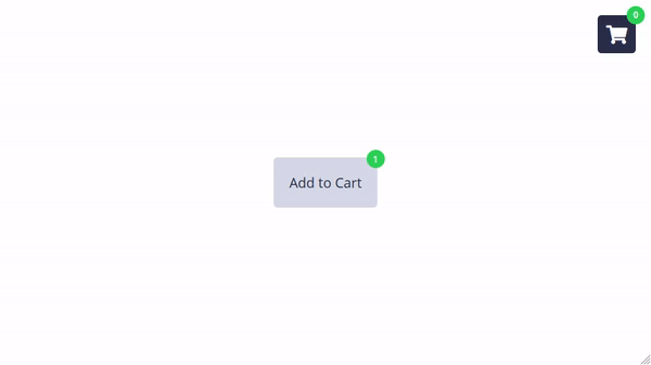
At the end of the day, the ultimate goal is that you get them to add to cart.
Where do shoppers look the most on the product page?
Okay, so let’s go to the next one. Also, another basic thing I want to get out of the way: this is normally how content is consumed. Always.
There’s a primary optical area, strong fallow area, weak fallow area which is the bottom left, and then the terminal area, which is the stuff that they’re going to come to and decide if they want to repeat that cycle again.
That’s the decision to repeat that visual cycle. That’s what you’re doing.
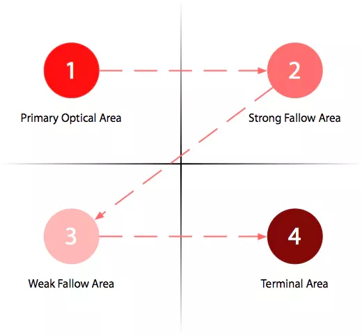
As I walk you through the document, notice how your eye movement is, and that’s generally what you’re doing.
Generally speaking, another thing I want to get out of the way is where shoppers spend most of their time.
And I’m going to get into the product page-related insights. But the biggest information I can give you is: this is desktop, but this is true for mobile as well. So there’s no difference really because this is information.
Product images are the most important part of your product. They are the most important part. I generally see, when I say that to brands, two months later they’ve hired a studio, they’ve done this mind-blowing photoshoot of their products, and they’ve uploaded all of those images. And they’re like, “Shekhar, you gave us this advice, and I appreciate that, I love how my website looks, but it doesn’t convert any better.”
And the number one answer I have to that is: your images are too nice. That’s what’s wrong with it.
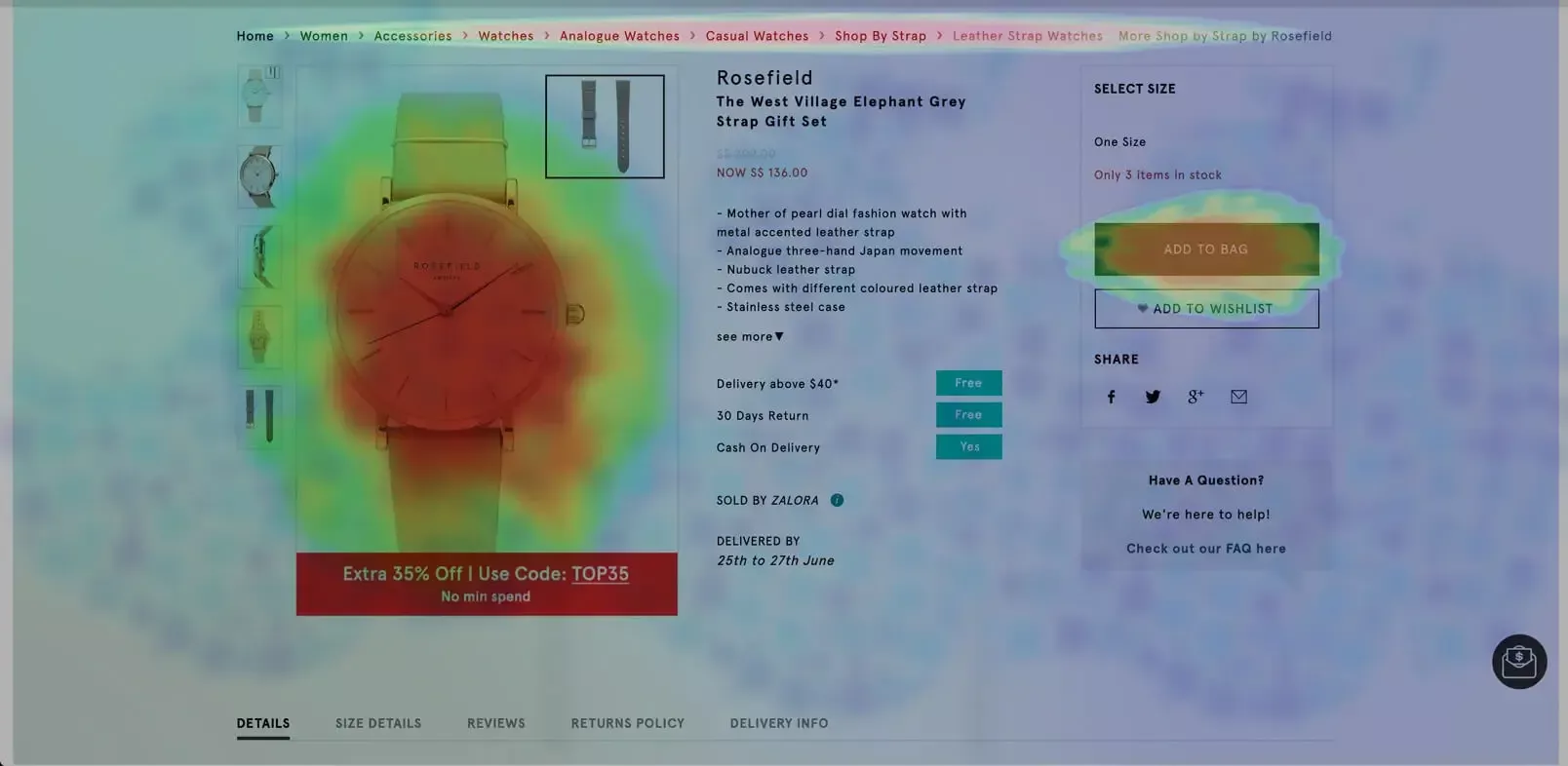
So you have to understand that product images—you can’t overdo it, you can’t underdo it, you do it just right.
I recently spoke to a gifting company that does bouquets and cakes and that kind of stuff. They deliver those to customers. And I was pretty annoyed with the fact that all of their images of all of the bouquets and cakes and everything else that they do… they were so good that they looked made up.
And the simple experiment that we did for them after they signed up with us is: we did an A/B test.
And we asked their customers—100 customers—to send pictures of them cutting the cake, of them receiving the bouquet, and so on.
So we did a campaign around it.
The customer did the campaign of course, we can’t help with that kind of campaign.
But what that yielded for us is amazing user-generated content.
So we let those images—the good ones—stay on the site.
We also added customer images. And that just completed the picture.
So my limited point is: you have to make sure you have product images, you have solid information around the most important stuff that matters—shipping, price, value prop, the basics, basic benefits of the product.
The product name is extremely, extremely important.
We’ll get into that. Navigation breadcrumbs are very important.
People use it significantly more than you think they do. You don’t use it doesn’t mean nobody uses it.
I can tell you this: we work with more than 400 brands right now. We run more than 8,000 experiments a year. Navigation breadcrumbs really matter. And then finally, of course, add to cart button—who doesn’t like that? At least we like it. The customer—we’re trying to make them like it, so I hope they like it.
Brandon, there’s no ideal number. It really depends on the product. I’m going to give you some advice about the images, so stick around. I’ll get there and I’ll give you a couple of other interesting advice about product images.
👉 Principles to apply Above the Fold
So let’s get into principles. What I’ve done here—and credits to the Convertcart team—what they’ve helped me do rather is put the entire content into principles, biases, and other psychological… voodoo, for lack of a better way to put it, so that we can just think through it clearly.
A lot of this is stuff that you might already know. As I said, the information will be obvious, the insight will be not so obvious. So let’s get into this.
1. Familiarity Principle
The first thing is the familiarity principle. Sometimes we try to do too much with our product pages.
I have seen people reinventing the wheel curve completely.
And I love that because, as a company, as a business that works on conversion rate optimization, it gives us a lot of excitement that people are taking conversion rates that seriously, right?
That validates us. But on the same line, I feel that sometimes there is too much for the customer to look at, and also there are too many preferences you’re trying to talk about—what they all might also like.
So I think generally speaking: stick to the basics. Don’t reinvent the wheel.
We’ve worked with businesses that do business cards and posters and that kind of stuff—fully customizable stuff—and I’ll come back to an example about this type of business later. But in their case, sometimes I see they just overcomplicate that whole customization experience.
There are products available out there that allow you to add customization to your product, whatever it is that you’re selling. If you’re selling a fashion product, people can monogram it, and the tech is available for people to add personalization information along with their order. But the important part is that sometimes they overdesign.
So the point I want to drive home is: if your conversion rate is bothering you, a designer might not be what you need. You might need an analyst first. You might need to first understand what’s broken. Because more often than not, I see businesses spending 15, 20, 25k on a site redesign, and it breaks my heart because that’s a lot of hard-earned money.
And you don’t renovate your house if you don’t like the couch. You know what I’m saying? If you don’t like the rugs, you don’t rebuild the whole house.
So just think about that for a second. Don’t do too much stuff that your customers might completely not relate to. In a lot of cases, your product is already a completely new thing for them to see, a completely new way for them to purchase. They’re seeing it probably for the first time. They don’t know you. They don’t trust you. If you also make them do more than that, then you’re asking for too much.
2. Control Theory
The next thing is letting people feel in control. I mean this in the best possible way: don’t annoy your customer. And when I say that, it really roots in doing annoying full-screen popups, doing annoying… I could say spin-the-wheels.
We do it too, full disclosure, but we’ve managed to figure out a way to do popups without annoying people.
So I… you know, I never break the script, I’ve never done this on a webinar where I’m loading different screens, but for example, again one of our customers—we wanted to gamify the popup for them. Fully custom.
You click a button, he kicks the ball, and even then we are not opting them in for an email. We are asking them what support they like and that kind of thing. And the benefit is pretty significant: it’s a $100 gift card.
But the point is: let the customer feel like they are in control.
More often than not, popups essentially say “give me your email and spin the wheel.” That’s option one.
Option two is “spin the wheel and give me your email.” So you’re essentially banking on the customer relinquishing control.
That’s why more than 3% of people don’t relinquish control on your site. They don’t give you their email. They don’t want to even indulge in that.
Also, how soon or how late you do that really matters.
So, I would recommend experimenting with launching your popups 10 seconds in, 15 seconds in, 30 seconds in, 45 seconds in, and so on.
Because I see too many people do too much. Most likely, you are using your email tool—maybe a Klaviyo or something like that—to set up the popup, but I feel your popups, everything that you forcefully show to your customer, needs some TLC.
Because your customers want to feel like they’re in control.
Brandon says,
👉 “Any suggestions on timing of popups? Is there a formula based on average time spent?”
I already gave the answer, actually. Think about it: 8 seconds is what you want to give your customer to determine if they are on the second stage, which is: are they biting what you threw at them? Do not disturb in the first 8 to 10 seconds, for sure.
And then if you want to see if they go past the consideration stage—you’re absolutely right, you’re on the money—I would analyze data and see what my average time on site looks like. And for people that bought generally speaking: how much time do they spend?
That data would pretty evidently tell you that the moment people cross 40 seconds on your site, maybe a minute on your site, the bounce rate or the drop-off rate instantly plummets to about 10% or 15%.
But before that point, it’s about 70%. So what is that point—the lapse point—where people stop dropping off?
That’s where you want the popup.
Because your user has now taken a bite.
They understand what you’re doing. They understand what you’re selling. So if you give them that 50 bucks off, it makes sense to them.
But if you throw that at them even before they know what you’re going to sell to them, it’s not going to mean anything.
3. Priming Effect
Priming: this is another very important one. Amazon product names and descriptions are the most outrageous.
If you’re looking for, for example, a cover for an iPhone 14, it’s going to show you a ton of options, and the product names would be: iPhone 15 robust unbreakable phone cover, military grade, premium 6-inch whatever.
So there will be so many adjectives. What they’re trying to do is: that name is visible to you even before you open the product.
So it’s visible to you from the collections page onwards. They have already primed you before you even get into the images, the reviews.
It’s maybe a three-star rated product, but they’ve already primed you.
Use words wisely—especially your product name.
I already mentioned that earlier. It really, really matters. If you call your product… for example, if you’re doing plain T-shirts, and the description says “plain T-shirt, amazing fit”—because the fit really matters to me—I would 100% click on it.
But if you’re going to say “premium slim-fit T-shirt,” it makes me doubt the fit.
When you say slim fit, it makes me doubt the fit instead of being convinced about it. So think about the words very, very wisely.
4. Status Quo Bias
Status quo bias—this is a very simple one. Generally speaking, people don’t want to do too much experimentation.
They want to maintain the status quo. So if you tell me something’s popular and thousands of other customers always buy that, customers would want to kind of pick that and go with it.
I’ll give you solid advice here when it comes to fashion especially—and I think I will allow you smart people to associate that advice with your industry or business.
When it comes to fashion, one of the doubts that people have generally speaking, which is something they’re able to get over—it’s not that they’re not able to get over it, because if that was the case, they would not be ordering—but the doubt is always fit. If I pick an XL on this site, does it mean an XL when I buy from Target or somewhere else?
So that doubt is sometimes too worrying, especially for people who don’t have a standard…you know, they’re not fit, right? So they don’t have a standard body shape. In that case, the simple thing you need to do is tell them how your sizes match up to the most famous ones.
One experiment that we did for one of our customers is—and this is purely an A/B test—I would recommend you think about it before you run it, because if you run it and your customers start to trust that, and they start to order too overconfidently, you would have too many returns.
So think about it before you run it.
But the test was: “89% of the customers who picked their size with us were happy with how it fit them.”
So, that gives you an instant feeling that, okay, their sizes generally work out, and it’s not going to be an issue.
You can also do a pop-up based on scroll, so when they get to a certain spot… of course, Nick, that’s right, perfect, you could do that. But generally speaking, when your customer is scrolling, they are either going through content or they’re looking for content to go through.
So you want to think about how it pops up and where it is on the page.
If it is on the homepage, it means product discovery is not complete yet. They have not found a product. So you’ve got to think about the messaging on the popup first. Also, if it is repeat traffic, you could do whatever you want because they’ve come back to buy from you, so it makes sense.
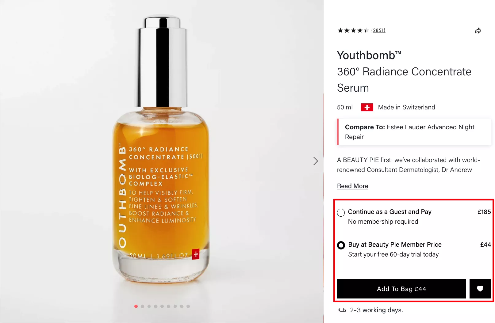
5. Choice Architecture
Choice architecture—the intention here is to highlight benefits and savings in each option. In this case, choice is sometimes the right way to make people decide.
I’m going to give you some very basic sales advice: never ask yes-or-no questions. That’s something we teach our sales team as well.
“Hey, can we meet at 9:00 p.m. tomorrow if you’re available?”
That’s a yes-or-no question. Saying no is easy.
Saying no is easy because you’ve given that as an option.
So instead of doing that, if you’re trying to ask people, “Hey, can we go out to dinner tomorrow?”—again, that’s a yes-or-no question. But you could replace that with choices:
“Hey, do you want to do pizza or do you want to do pasta?”
“Do you want to do pizza or do you want to do something else?”
What you’re doing is: you are completely eliminating the option of saying no. And I do that a lot. I hope my wife doesn’t hear me, but I do that a lot. Probably at unhealthy levels of choice architecture on my part.
6. Urgency Effect
Urgency effect—I think urgency really, really matters. But don’t overdo it. You could do it, and also do it in a genuine way.
I know a few websites—and I showed this in the last webinar as well—this is slickwraps.com. I’ve been seeing this website for the last five years. I challenge you to open this website tomorrow, and then the day after that, and then the day after that. They will always have a three-minute timer for the sale.
Always. It’s permanently there. So essentially, their offers have no trust left anymore for people, because they’re always on sale.
Don’t lose that trust. If you’re doing a time-bound sale, own it. Do it in an honest way, do it in a genuine way. That’s when it really makes sense.
You could also do conditional free shipping, so if you buy above a certain volume, there’s free shipping. There are ways to do that. Also, I think it really matters that you… like for example, if you look at this timer here, there’s an even better way to do this:
“If you order in the next 7 hours and 57 minutes, we’ll ship it the same day.”
Because I think a lot of us, as businesses that rely on third-party vendors for logistics, cannot commit a delivery date.
We cannot commit a delivery date straight away. Some of us can, but most of us cannot. And because of that, it’s important that you don’t commit the delivery date. Instead, commit the shipping date.
“It will leave your warehouse in the next 8 hours / 10 hours / 24 hours.”
If you can do that, that’s half the battle won. People at least know it’s going to leave you, so it’s going to reach them as well. People trust large shipping companies—there’s no doubt about it. And you can tell them you use FedEx or whatever you use to ship the product.
7. Endowment Effect
Endowment effect—this is again… I want to go back and double click on the printing websites that I spoke about. People who do business cards, flyers, posters, that kind of stuff—they thrive on the endowment effect. They thrive on it because… and IKEA thrives on it too.
Generally speaking, people tend to value items they own. They value items more highly where they have an investment in making those products or in customizing them for themselves.
So in this case, you know, I can add my dog’s name and kind of do that. I have a dog bed that looks very similar with my dog’s name on it. We love it, he loves it. And yeah, I think we probably need to replace it because it's really old now.
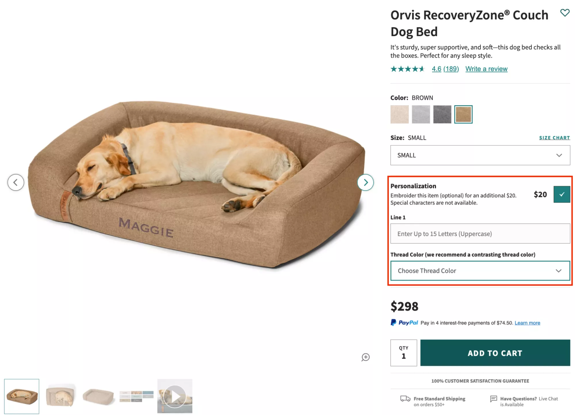
But generally speaking, printing companies rely on this a lot because you’re uploading a design, you’re writing copy, you’re doing so much. And because you’re doing so much, there is a high chance that people are going to go through with it.
Which is why, actually, abandonment in that industry is extremely painful—because you have abandonment after somebody has completed their design, and then they’re like, “Yeah, you know what, I’m not going to spend 100 bucks on visiting cards right now.”
IKEA, as I said, also thrives on this. It allows people to build their own furniture, which makes you feel invested in it, which makes you feel… you know, with that furniture, you are likely to feel more attached to it compared to any other furniture.
8. Perceived Value
Perceived value—this is probably the oldest trick in the book, the oldest marketing pitch of all.
Duty-free shops in airports play this a lot. They essentially sell a lot of alcohol and other stuff on the back of perceived value. Generally speaking, it would revolve around:
“If you buy two bottles of Chivas or if you buy two bottles of Laphroaig smoky whiskey, they give you this huge bag and a badge and so on.”
So you’re like, “Hey, you know what, this is pretty epic, I’m going to buy two bottles, I get a full suitcase, it makes a lot of sense.” That’s perceived value.
You can also imagine the margin on those products that they’re able to give that much away on a $100-something product.
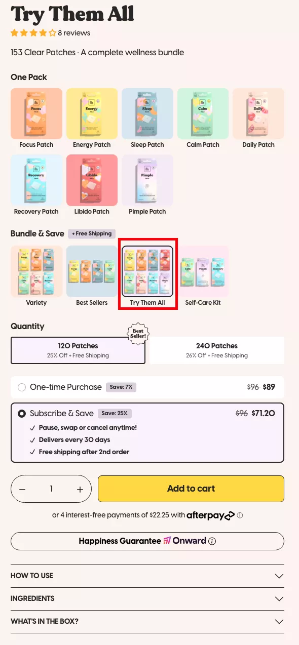
In this case, for example, The Patch Brand—instead of having you buy one or two patches, they have a pack where you can buy all of them together. And this is a tester essentially, so you can buy multiple of these in one go.
They’re also trying to upsell subscription. That’s a hard sell, but generally speaking, we’ve been able to figure out a way to create that perceived value with bundling products.
I was on a call yesterday with a customer—I don’t know if that customer is on the call as well, but I hope Lex, if you're there, I’m going to make an example out of your business, but that’s fine. This customer sells something—it’s a product. And their question to me was:
“Do you think it’ll work if we offer the product for free and charge shipping? Because we want to make sure that people try our product.”
And my question back was: Aren’t you taking a hit? Is that an honest business practice?
They said, “No, you know what, we’re charging them shipping and we want them to be delighted.”
So then what I mentioned in return is: the real thing I would do is first analyze why there’s drop-off and why you felt the need to give something for free. That would give you the answer to whether you should even do it or not.
Because I think of freebies as a retention strategy, not an acquisition strategy. It’s to make sure they come back—because it also acts as a reward for buying the first time. But not as an acquisition strategy. It’s extremely expensive to give a product away for free to a customer that you already paid Facebook or Google to bring to your site.
If they’re one of the 100 you paid for, and one of them is buying, and you're still giving it away for free—it’s bad business.
So I said: why don’t you just blow up the value you can show them in your product? Go all out in delivering the value. That would make more sense.
9. Scarcity Principle
Scarcity principle—I don’t think people leverage this enough. This is the number one way of creating trust. If you run out of stock, it means your product works. Right? And I think we’ve got to emphasize that enough to make sure that it kind of works.
There are very few cases when you find brands and products and jackets or maybe dresses that you truly like, and stuff like “final sale, few left” really works. Because they’ve stumbled across you on the internet, and they don’t know if they’re going to find you again. And a lot of people don’t even bookmark. So this kind of stuff really, really works.
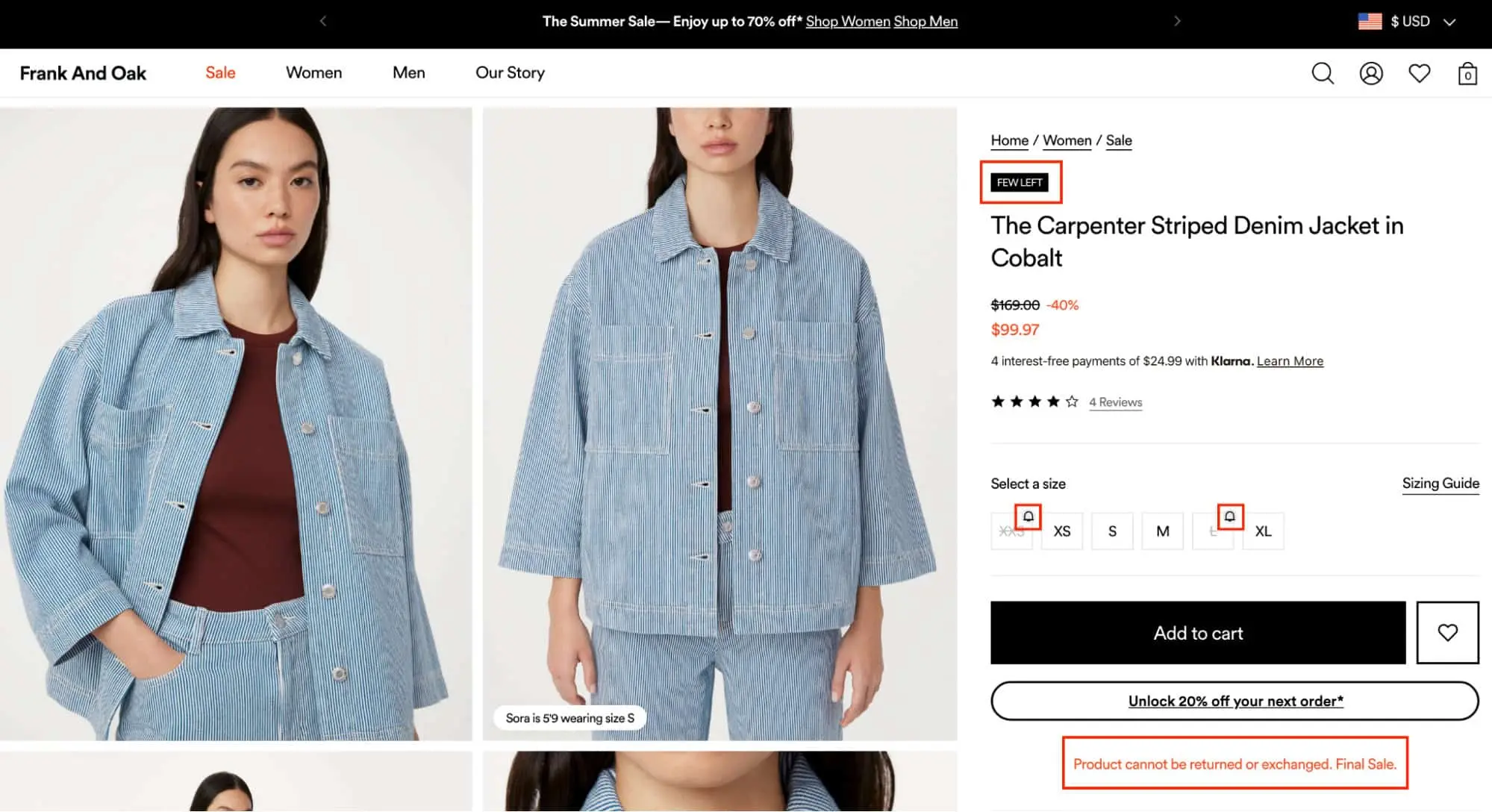
There is, however, a deterrent here, which is: “Product cannot be returned or exchanged because this is the final sale.”
This message validates the price. Why is it 40% off? Because it cannot be returned or exchanged.
So I just want to make sure we use all of this smartly. I would not have shown this message here so prominently.
I would have probably hidden it along with the price with a small… like you see these bells here, I would have done something similar here and then shown that message. Because I think it’s a huge deterrent, especially for a product in an industry where almost everybody tries and buys. You know—you can send back whatever you want whenever you want.
10. Bandwagon Effect
Bandwagon effect—following the trend. This is why we all downloaded TikTok, as I gave you the example earlier.
Generally speaking, this messaging 100% works if you do it in a genuine way. Recently, there’s a large travel booking platform in Europe that is under a lawsuit because of faking this. They would show the number of items left in stock or “only two seats left on this flight” to hurry people into buying, and they were hit with a lawsuit. You can imagine the amount of damages they would have to pay.
Don’t fake it.
When we do it, we connect it to transactions. And we try to do it in a way that it’s useful.
For example:
The likes. Have you ever seen a like button on an e-commerce site? Nobody’s ever seen it. I’m confident. And that is game-changing, because what you have here is the social media version of shopping. I think this is going to be the next big thing if everybody learns to do it well enough.
You can like a product without giving your email. So it’s not like a wishlist where you need to create an account. It’s frictionless.
Here, instead of showing “50 people bought this in the last month”—because that might not be true—we’re talking about views.
“40 people viewed this product in the last hour.”
And that creates trust. That tells you you’re not alone on this site. You’re not the only one shopping.
11. Reciprocity Principle
Reciprocity—kindness really works. The intention here is to find a way to show value in repeat buying.
In this case, subscription:
15% off on every subscription, free shipping, no commitment, cancel anytime. Save $36 → pay $30.59.
So much is happening here. There’s also a money-back guarantee. They’re making it an obvious choice to pick subscription.
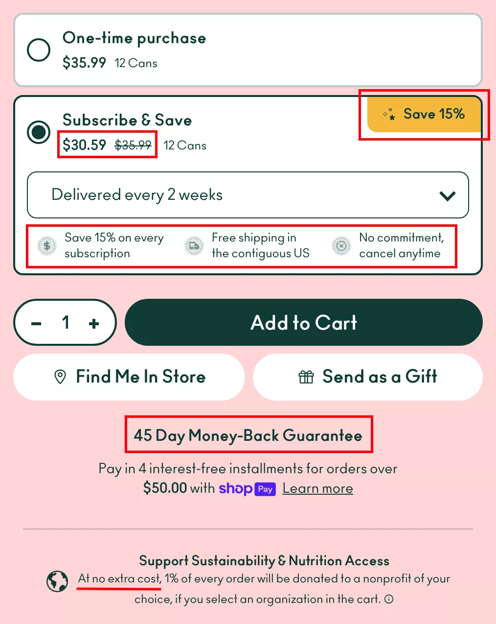
I could actually go and pick subscription for these 12 cans, get the delivery, and then cancel it. I’m essentially going to buy the product at $5 and some change less. And people do that all the time.
But what that does is: the product becomes the hero.
Because if people do that, they get the first 12 cans, they open it, they have it, they’re like, “This is pretty good.” They enjoy it over two weeks, then get the next delivery, and suddenly it becomes a habit.
So the bottom line is: if you have full faith in your product, you can give to the customer before you ask from them. Here, they’re making it a no-brainer to pick a subscription (because I can just pick up and cancel it immediately).
12. Warm Glow Giving
Warm glow giving—this is an interesting one. Emotional rewards go a long way. And this is combined with social identity theory. We all identify and associate our self-esteem with social groups that we might belong to. This is a big point, and I think this is true in today’s world more than anything.
So here’s what I want to do. I want you to take a look at jyoga.com—that’s again one of our customers. I’m going to bring it up just for good measure. I’m sure Dean will be happy that I’m showing his products to so many people. If you are into yoga, by the way, fantastic yoga mats. I cannot recommend them enough. They are incredible.
Now what they do is: they plant a tree for every mat sold.
And they have planted more than 2 million trees. I think if you have half a heart, you would buy this yoga mat just for that, isn’t it?
See, this was an exit-intent popup, by the way. As I was leaving, it recommended the product I was just seeing. That’s loaded from Convertcart’s platform.
In this case, there are two or three things happening.
You shop, we give—that’s the first messaging. A tree is planted every time you shop.
Then they’re using Convertcart branded content.
And then the next thing: cruelty-free, vegan, fragrance-free, etc. If that applies to your product, please be my guest and take care of that as well
13. Social Identity Theory
Then the next one is social identity. If most of your customers… there are a few things that are actually true for your customers more than anything else today. Nobody likes plastic anymore. Single-use plastic is a strict no-no. We all hate paper straws, but it’s okay. It’s better for it to taste slightly cardboard-ish than end up in the sea.
So what I would recommend is: if your product is not environmentally friendly, your packaging can be. If your packaging isn’t, your shipping can be. Because you can ask the customer to pay for carbon offset. Thirty cents—thirty cents—can offset carbon enough for one package delivery because the size is small and the carbon footprint negligible.
I strongly recommend doing that research. It goes a long way. If you put a simple message saying:
“There is no carbon footprint to this purchase because we offset it from our profits.”
It’ll cost you half a dollar. And it will take your brand a long way. It'll change the game.
14. Cognitive Load Theory
Cognitive load—really obvious one. Too much information is never good. Like I’m doing on this webinar—I’ve given you, I don’t know, 15 ideas so far. I hope you’ve retained at least one.
But I try my best to add value without being too cognitively heavy.
In this case, very simple: there are four options.
Flat woven, standard, cushioned, extra cushioned.
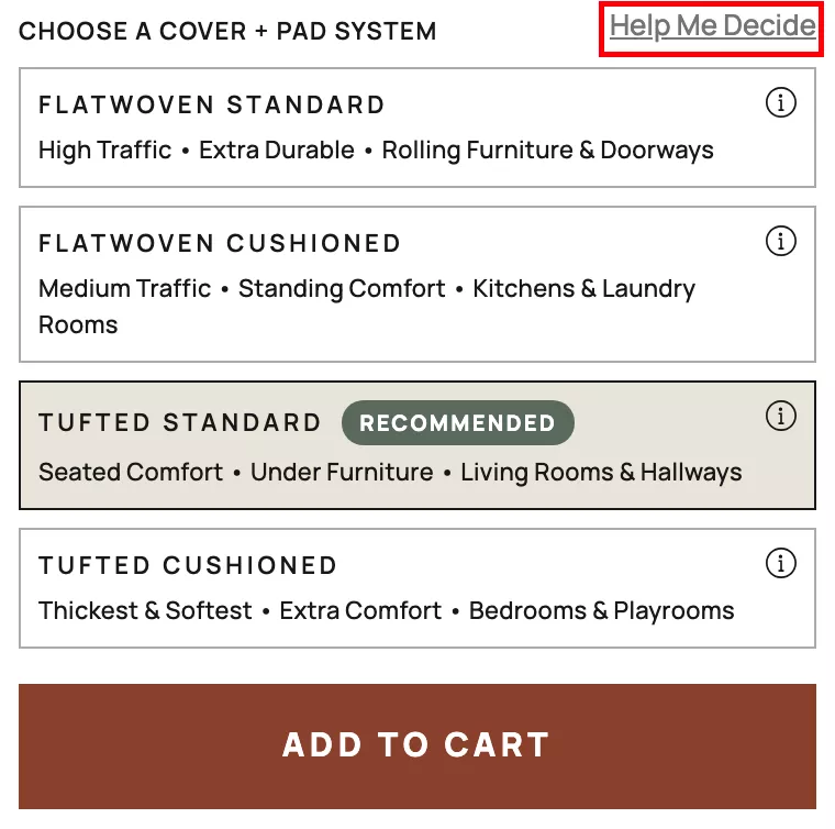
If I don’t know, the website helps me decide. It explains what each of these four mean.
So for people who want the load, who want to understand more and are in that decision stage—you give them that option. But for people who are not at that level yet, you’re not making the product page overly complicated for them.
And that works really, really well.
👉 Principles to apply Below the Fold
So that was everything above the fold. I’m going to speed up and leave the last 10 minutes for questions. So let’s get into principles for below the fold.
15. Fitts’s Law
Fitts’s law—this is a very interesting one. Generally speaking, the time required to move to a target area like a button is a function of the target’s distance and size. Very simple stuff.
The larger a button, the easier it is to spot and move to.
Don’t over-intellectualize it.
A sticky add-to-cart… a popup teaser for add to cart—for example on the bottom left you see the “$15 off”—there’s a high chance people will take it.
Actually, you know what?
The whole purpose of those popups is not to capture emails from people who are NOT interested in buying from you.
It is to capture emails from extremely high intent customers who are going to buy from you.
Tell them:
“You’re anyway buying this $35 product. Why don’t you take $15 off as well?”
It sounds bizarre, but hear me out.
When people pick up that coupon in exchange for their email, only 50% of them actually add to cart.
Then once they’re in cart, hopefully only 70% go to checkout.
And of those, only 60–80% will actually complete the checkout.
So of the 100 emails you collected, maybe 30 actually used the coupon.
The remaining 70 are left for you to recover.
That’s how cart abandonment works. That’s why popup messaging matters.
And that’s why Fitts’s law is important—if it’s not noticed, it’s not clicked. Always works that way.
16. Dual Coding Theory
Dual coding theory—you always want to use multiple modes. If there’s a hierarchy of content, there’s reading, there’s viewing, there’s listening.
That’s why videos are the highest.
Now VR and AR are even higher than that.
So VR/AR is the highest form of digital interface, followed by videos with audio, followed by podcasts, followed by books. That’s generally how it is.
Short-form videos on TikTok are so addictive because there’s so much information crammed into 10, 15, 60 seconds. It completely changes the game.
17. Halo Effect
Halo effect—we already discussed this in some cases. Whatever needs to stand out should stand out, and should deserve to stand out.
In a lot of cases, I see brands highlighting product variants that are actually not that good. They highlight things that aren’t the best sellers or aren’t the best features, hoping to convince people to spend $10 extra.
It’s not going to happen.
Positive association with standout features creates long-term impact.
Here they’re doing an Apple-to-Apple comparison with competition. Not everybody can do this. And if your customer doesn’t know about your competition—don’t bring it up. Unless the customer asks.
(Like in our case—we talk about our competition all the time because we know we’re going to beat them. So it’s up to you how you use that.)
18. Mere Exposure
Mere exposure—recently viewed. Another very interesting one.
Convertcart does a very cool implementation of recently viewed. One of our customers sells coffee. I’ve bought from them earlier.
As I keep shopping, there’s a drawer that sticks around on the right side. Same for mobile. No matter what page I’m on, I can see the products I recently viewed.
That works really well.
19. Heuristic Decision-Making
Heuristics are mental shortcuts. The question is: can you display information in a way that makes shortcuts easier?
Showcase items that are logically related. Show products that make sense to buy together. Bundle them.
20. Information-Gap Theory
FAQs are gold. They are extremely important.
Here’s some homework:
I want you to analyze your product page conversion rate.
Then analyze the conversion rate for people who visited the FAQ page.
I guarantee you: It is more than 10×.
Which means people who go to the FAQ and then convert are ten times more likely to buy. Why? Because sometimes anxieties need to be handled. FAQs do that.
So please have them on your product page.
And the final one—the last thing I want to talk about today—is authority.
21. Authority Principle
Borrowing trust is the easiest way of creating trust. If you have expert reviews, celebrity endorsements, anything that will allow you to come across as accepted by the norm, by the larger population, it really helps.
We have customers that do that using their own clientele.
One such example is this brand that sells dog beds. For all of their products, they have a ton of user-generated content. Their customers send in images of how these beds look. And these are adorable, of course. For anyone who likes dogs, these are brilliant. I would spend 20 minutes just looking at the dogs, let alone the beds. I’m sure the time on site is really high because of these.
Look at that—who doesn’t like that?
Authority really matters. There are ways to create it without having to hire a celebrity.
If you can get a shout-out, fantastic. If you can’t, that’s also okay.
Closing Notes
So those are some of the ideas. Now you know why we’ve been talking about some of these ideas in our previous webinars as well, and why they are so important—because the psychology behind them matters.
In the next one, we’re going to do psychology around emails, and that’s going to blow your mind, I can guarantee you. We do email marketing for more than 100 brands at the moment, and we’re able to drive 30% more revenue from emails for them without a doubt. There is no doubt about it.
So yeah—that’s what I wanted to walk you all through. I’m open for questions. I’m going to stick around for a few more minutes. I really hope this was helpful. I really hope I was able to add value and maybe make you think in a new way.
Thanks so much for spending this time with me. I hope the rest of your week goes well. I’m still here.
And yeah, Brandon—yes, we will. We are actually going to publish it with the video soon enough, so we’ll send it over once it’s done.
Watch Seaspiracy on Netflix for the plastic issue—definitely recommend it.
Alex—of course, for sure. I am very sensitive to that problem, to be honest. Yes, we rarely use single-use plastic, and we try and stay away from it as much as possible. I love animals, so can’t help it.
That is true—straws are just a very small percentage.
Q&A
👉 “I would love some insight on hero PDP image styles—look, etc. You mentioned “too nice” versus UGC, but what about flatlay hero, background color, infography?”
Yeah, all of that is fantastic. That’s actually a great point, Nick. Thank you for reminding me. I was supposed to talk about it.
I think people underuse their hero images. The images generally speaking are just the product. And I don’t know—I’m not a big fan of that.
Okay, so I’m just going to—this is not a Convertcart customer, but I’m still going to get into this. I’m going to show you what I mean.
Let’s look at this for example. There are product images. The complaint I have with this is: majority of the customers will engage with the images here, but they have put all of the important information everywhere else. The quality of the product, the genuineness, ease of installation—all of that information is parked away in places where the customer will probably never see it.
Do the skins affect functionality of the device? Why don’t these images say:
- “Perfect cuts.”
- “Insanely easy to install.”
- “We send two of everything.”
I have ordered from them—we send two of everything. So if you screw up the first one, you can still do a good job with the second one.
Images are a great place to communicate some really useful information. I think that’s sometimes ignored.
👉 “Among the principles, which is good for the target audience who are rushing and strongly goal-oriented?”
Can you elaborate? When you say TA you mean customers? Target audience?
I think I can maybe look at your product or business and then comment on it. But there are so many things. I think all of them are important. People who are goal-oriented would probably be triggered with accomplishment. So can you figure out a way to build that into the whole experience?
- How can you make them feel accomplished if they buy from you?
- Is there any accomplishment associated with purchase?
- If not, can you create that?
If you are a sports product, can you donate a dollar to that sport for every purchase?
Because that would immediately make people relate to what you’re trying to do. You would come across as significantly more mission-driven. That means a lot.
Some… in my personal capacity and as Convertcart, we feed more than 200 dogs a month. This is very unknown—nobody knows this—but there is a small amount of money that goes away from our profits and we feed 200–300 dogs every month. But we’ve not used it in marketing material because we don’t need to—it’s not relevant for B2B.
But if we were B2C, we would have used it on the front end.
👉 “Is there any psychology behind the add to cart buttons?”
There is no psychology behind color of cart buttons. I’m a strong advocate of not experimenting with something like that unless your business depends on it.
A lot of people tell us McDonald’s, KFC, Pizza Hut have red because it induces hunger. So does Lou Malnati’s in Chicago. So does Five Guys. So does Wendy’s. So does In-N-Out. But I don’t know. Colors are sometimes taken too far.
There’s no harm A/B testing if you want to. But we’ve seen that when you do that on a site, it generally returns as an AA test—no difference—because the problem is elsewhere.
The problem is that people are not convinced why they should buy a laptop skin.
It’s not that the button is green.
We have, however, seen that the “Buy with Shop Pay” button really stands out—like in this case. If this wasn’t there, if the Shop Pay button wasn’t a part of this website, you wouldn’t miss the add-to-cart button.
That is true. That is exactly what’s happening here.
Alex—you're putting messages in the chat, but you’re not selecting “everyone,” so nobody can see your copy. I have a few of the DMs as well—and a couple of them are compliments—so I’ll just take them.
What Alex says: the most important thing with button colors is visual hierarchy. It has to be the most prominent thing. It has to really stand out.
But I’m telling you—the button is not going to convince people to buy the product. You need to follow the funnel I spoke about. The button matters here—at the decision stage.
Point taken.
We’ve done a bunch of experiments where the add-to-cart button is shaky or moving, or animated. We’ve done that too. But more often than not, there is something more fundamental to test before button colors.
Okay, perfect. I love the fact that this was so interactive. Thank you so much for weighing in with your advice and questions, folks. And thank you so much for spending the time.
I really hope all of the insights were useful. I’ll see you in the next one. We’ll continue putting out solid content that helps you go and implement ideas immediately.
And yeah—if you’re looking for an audit for your site’s experience, please reach out to us in response to the email we’ll send after this webinar.
I look forward to seeing you in the next one. Thank you so much. Have a fantastic rest of your week. I hope you double your conversion rate.
And I wish you all the success.
Thank you.
Bye-bye.
Get Fresh ideas to boost your conversion rate
(stuff that works for hundreds of stores)
Request a Free Site Audit"Convertcart’s Audit Report was deep and insightful. We never thought they would spend so much time in building and sharing such insightful content, free of cost."


Logan Christopher
Lost Empire Herbs