On-Demand
CEOs' Masterclass - 20 Experiment Ideas You Can Implement Today
One main reason behind Amazon’s success was Jeff Bezos’s insistence on constantly testing and experimenting.
It goes without saying that all ecommerce stores should be running a lot of A/B tests.
BUT at the same time, you need to pick the most important areas to test — the areas that really impact user experience — the areas that actually affect conversion rates.
Randomly testing everything on a store is a common mistake many stores make.
And this is what we are discussing in this live session:
- 20 most important experiments that you can run on your store
- Conversion rate best practices for the same 20 experiments (insights based on actual tests that we’ve run for our customers)
- A lot of before - after examples and how it improved conversions


About the speaker

Shekhar Kapoor
VP, Marketing
Convertcart
Shekhar Kapoor (VP at Convertcart) has worked with 500+ online brands, including Squatty Potty, Prep Expert, and USA Hockey Assn., and helped them boost sales exponentially.
Shekhar Kapoor
VP, Marketing
Convertcart
SESSION REPLAY – CEOS' MASTERCLASS - 20 EXPERIMENT IDEAS YOU CAN IMPLEMENT TODAY
Hey folks, good morning, good evening, good afternoon, depending on where you’re logging in from.
So folks, I have some very interesting ideas to walk you all through today. We have about 20 ideas, and given that I’m going to spend about a minute and a half on each one of them.
So the intention of doing this, by the way, for people who are joining us for the first time, the intention of doing this webinar was that in the monthly webinars we’ve been having so far, there’s been a lot of ideas.
But not a lot of actual ways or visual examples of how to implement them.
So we thought, what’s the best way of hitting two birds with one stone, which was that we could cover them as experiment ideas.
So I have two variants of every experiment that I’ll show you today.
Two options, obviously, because they are experiments. And then, I also have some insights from our own experience.
We run more than 10,000 experiments a year for more than 300 e-commerce sites, so I’m sure I’ll have a lot of good advice to give you. I really look forward to doing that.
Let me quickly close the poll, and let me also make sure that my screen is not as cluttered as it seems to be here. Just a quick moment, and we can jump right in.
Alright, perfect. So let’s get into the first few ideas here. Let’s get into some of the experiments we have here.
Very interesting. So about 60% of the people today run experiments, and about 60% of them do it in-house. That’s brilliant. That’s awesome.
But the rest of us are either not running experiments (or they used to, which is a very interesting group that we have here)
Okay, perfect. Alright, so let’s get into the experimentation.
What I want to make sure that you go away with is that we’ve kept these experiment ideas overly simple.
And the reason is that you can go and implement it on your own. So none of them ideally would require a lot of development or a lot of coding for you to really do a successful implementation of any of these.
Let’s begin with the first experiment.
Experiment #1
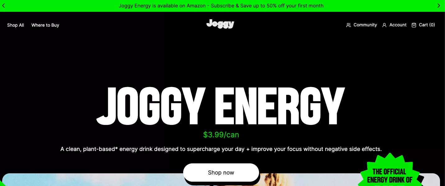
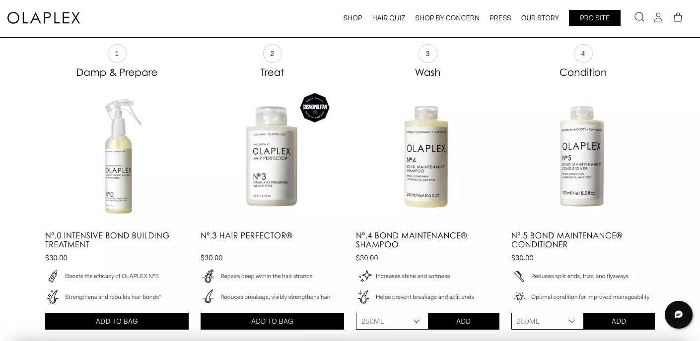
We’ll start with the homepage, the hero image, and how you want to kind of treat it.
One of the things that I’ve seen businesses do is use this real estate for communicating with customers.
Whereas if you really analyze your traffic and go into the data, you’ll realize that because of the way you’re running ads, in some cases because of the way you’re driving demand, a lot of your traffic doesn’t even see this.
Which means they’re either landing directly on the product page or some other page on the site, maybe a blog. So they’re not seeing your hero image.
So the first step of cracking the hero image is to look at:
- the traffic,
- the type of traffic that is coming and seeing the hero image.
For example, if you have a lot of organic traffic that lands on your homepage, that organic traffic is obviously searching for something and then landing on your homepage. There is some intent with which they land.
So I would recommend that we use this extremely important piece of real estate on your site for meeting that objective, for meeting that intent with something that people really want.
And why I’m emphasizing that so much is because more often than not, I see extremely boring carousels that have large images of very specific products or sales that are running, that are not relatable to all of your customers.
So generally speaking, you want to use this part of your site for direct traffic, which means people who are typing in your domain and coming because somebody told them about you, and then communicate your most important value prop as quickly as possible.
Now, the couple of examples that I have here, which I recommend you A/B test:
The first one is to do a single hero image. Forget about carousels. Do a single hero image. Communicate the most important thing you feel someone should know about when they come to the site. Keep the call to action extremely clear.
More often than not, we see call to actions placed on an image, and that makes the whole thing extremely confusing, and it doesn’t serve a purpose. So I strongly recommend we stay away from that.
In addition to that, avoid doing multiple CTAs or multiple images. Sometimes I see entire collages being shown. Anything that increases cognitive load, we are trying to stay away from that.
So that’s variant A.
Variant B is you do an actionable carousel.
So in this case also, don’t do an image carousel, don’t do collections or categories.
Because the thing is, even if each slide of the carousel takes 3 seconds or 4 seconds, and you have four or five such slides, you’re expecting people to just sit and watch that for 20 seconds.
That happens in cases where the user has an extremely high intent of purchase or discovery, which means they’re browsing, and they have a lot of free time, and they are doing it in a leisurely way.
So, depending on the category that you’re from, please consider making your carousel itself an actionable shopping space.
What’s happening here, for example, is there are categories and subcategories inside the carousel.
So if I just click this button, I would move from one category to another. And then the carousel would have, of course, a mid space so it makes it relatable, but it also has buttons. Make sure that you use buttons so that people can change through.
Please optimize for Windows as much as you optimize for iOS. I often see founders, people who run experiments, use Apple devices, and scrolling horizontally on an Apple trackpad or a phone is very easy. But try doing that on a Windows trackpad. It’s painful. And so what people are essentially doing is going and clicking on this arrow.
So, as much as you want to believe that people are horizontally scrolling, it's probably not happening. A lot of your customers are logging in from Windows devices, and they’re using these arrows.
So that’s my first experiment. Looking at how we’re going, I’m probably taking three or four minutes on each of them, so I’ll speed up. Please ask me to slow down as we go. And please don’t forget to ask me questions about any of the ideas that I’m throwing at you here.
Experiment #2
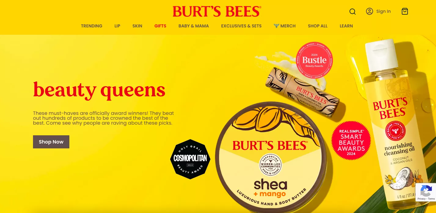
Let’s get into the next one. Make sure that your headline is extremely clear. I feel sometimes we become too passionate about the copy we write, and I, being in the CL business, we’ve seen so many businesses, so many sites, not clearly communicating what they do or what they sell immediately. And so that’s a problem.
For example, in this case, there’s a catchy message saying “Taste the good life,” and then it immediately segues into explaining what they’re selling. Right? Protein-packed snacks that will make you rethink jerky. This explains what it is, but not the benefits, really. So make it extremely clear what you’re trying to do.
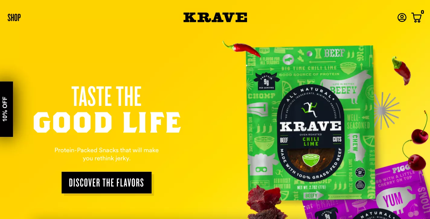
In this case, the CTA is you want people to go in and discover the different flavors your product is offered in. So that’s great.
The variant B in this case is that you are going in for a discount. Now, think about it. You have this prime real estate on your site. About 60% of the first fold is taken up by a banner. What would be the primary factor for you to either do a discount versus do messaging for your brand?
The answer to that question lies in who lands on that page. And so again, I would go into the data, figure out what kind of traffic lands on the page, and then optimize it so that you can nail the messaging.
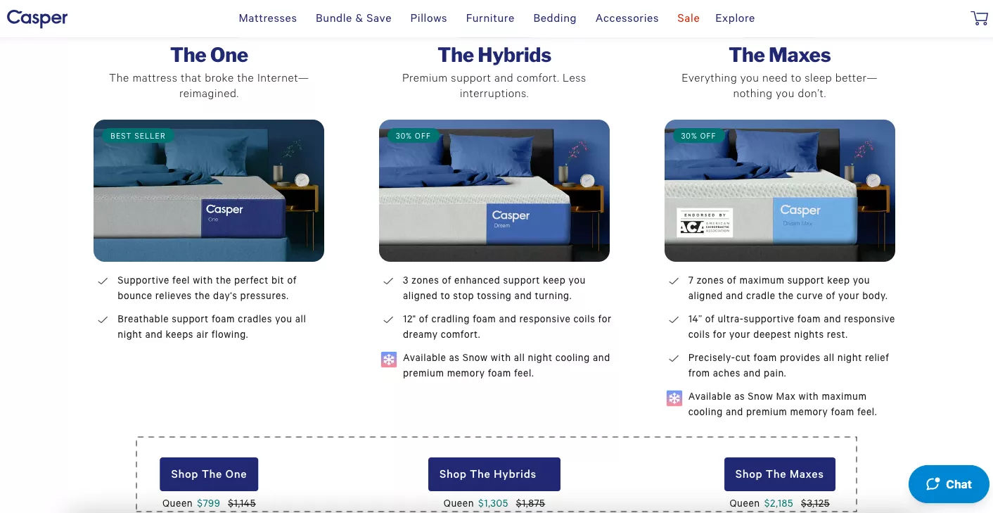
In this case, for example, Casper was running a huge Labor Day sale.
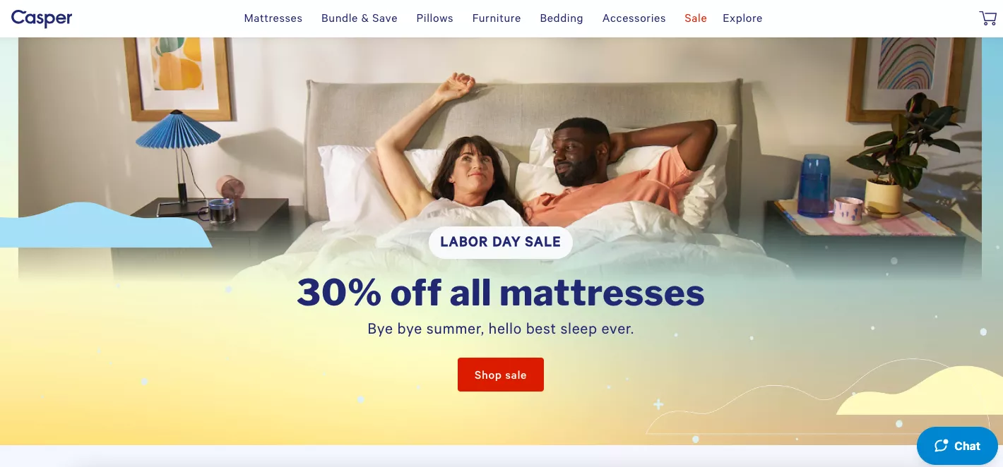
They ran promotions across the board for it, so they knew they had a lot of direct traffic landing straight away on the homepage, and they just wanted people to get in, shop the sale, and then go from there.
So the benefit is communicated clearly, and make sure that it’s fully communicated.
No surprises for the customer, essentially.
Experiment #3
The third one is: call to actions.
Now more often than not, and unfortunately, I actually was also in a call with a large corporation a few weeks ago, and one of the themes that I’m seeing with teams as they get larger for experimentation is: experiments get safer.
They get more and more safe. Why?
Because when you are proposing an experiment or thinking of running one, you feel you have too much to lose, and so you don’t try to change too much.
And while it’s not mandatory for experiments to have drastic changes made, it’s important that they at least influence user psychology or behavior sizably or notably, so that you can at least call, if something was successful or not.
Changing colors of buttons and headers and dropdowns, all of that stuff, the very small stuff, really will not move the needle.
Especially if you are a business that is under $20 million in revenue, because you don’t have that scale. If Target goes and changes the color of a certain call to action, they have a scale that is so massive that that might just move the needle. They might just have a meaningful enough test.
In this case, here, you could test ‘shop the maxes’ or the ‘shop now’ CTA.
We’ve seen notable changes when people see copy related to what they’re trying to buy versus copy related to just sending them to a collection as a whole, and then going and exploring it in as much detail as possible.
So that’s another interesting way of looking at this experiment. The idea here is that if you have your customer diving into copy — so if your time on page for that page is above 47 seconds, that’s the threshold — if somebody is spending 47 seconds with you, it means they are getting into the copy. They’re getting into finer details. Otherwise, they are skimmers. They’re just skimming through, and you don’t fully have their attention.
It’s like watching a reel or watching a TikTok. You barely see people watching the videos, hitting like, and then moving on, but you rarely take the time to go through the caption unless the content itself forces you to. “Here’s this amazing recipe of this amazing thing that I made, and it’s in the caption.” Like, damn, I’m not going to get into the caption, screw it, I’m not going to make this at all.
So just make sure that you are only doing this if you have enough people diving into copy. Otherwise, it might not work out.
Experiment #4
Bundling. Bundling is something that I think is going to be super important in the next few months.
We have holidays coming up, we have Thanksgiving, so there’s so much that’s happening. Bundling is a great way to improve your average order value.
I just feel that companies don’t do enough to give them the attention that they need to be given when they actually do it.
So if you are creating bundles, give them the priority they need to be given, because you’ve gone through the effort of creating these deals for your customers.
Put them front and center. You could highlight discounted bundles, or you could highlight a full-blown clearance sale.

That’s another thing that I see a lot. When there is a clearance sale running, think of yourself walking through Target. Think of yourself walking through Walmart, and then a section running clearance.
It’s so clearly visible that it’s extremely hard to miss. Even if you’re not looking to buy that product, you would still go take a look, pick up the product, feel it, touch it, and then throw it away, depending on whether you want it or not.
My limited point being: you’ve got to make this section extremely, extremely prominent if you are doing it.
So the A/B test I’m recommending is this: when you’re running a clearance plus some bundles, plus you have other categories, and you have new launches, and you have best sellers — you have to brutally prioritize depending on what your business goal is.
And when I say that, what I really mean is: when you are driving a lot of paid traffic to your site, a clearance sale, or great deals or offers is your best bet at converting them on their first visit. Or at least getting their email if not converting them.
But when you’re driving a lot of repeat traffic through email campaigns, and those email campaigns contain a new product that you’re launching, there is no reason that you prioritize clearance sales or any of those things.
So it’s important that you separate and kind of prioritize in a brutal way so that you are showing people what truly matters.
Experiment #5
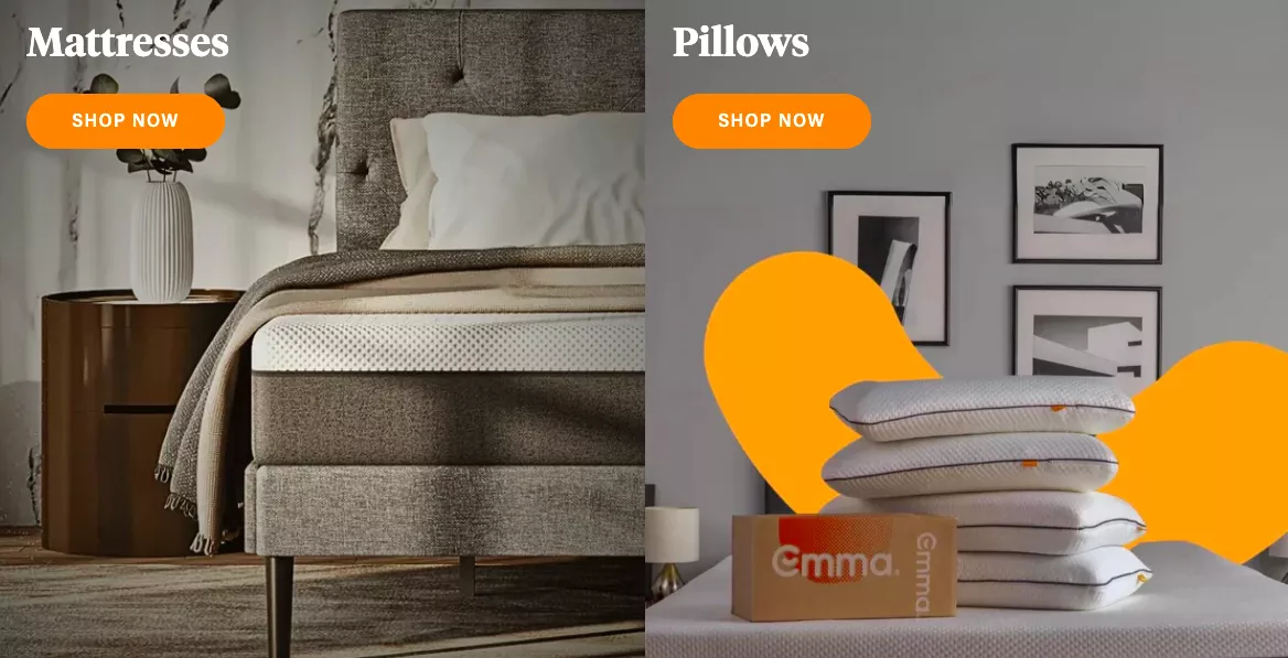
The hello bar, the notification bar on top, sometimes is what I would say is under-leveraged. So I have two experiments today with that. There are many ways in which people can use it. The most common is free shipping. I see that happening all the time, and it happens to the point that it doesn’t need to.
Because actually, if you publicize free shipping in this spot, and you’re expecting people to go through that and then get excited about the purchase, it’s probably not going to happen. And here is why: if I land on this site, and I’m still on the homepage, and I’m just learning about you, I’m learning what Good Milk is, I’m learning why I should use it, the benefits — I really don’t care if I have to pay for shipping or not.
Sometimes we tend to communicate stuff too early in the journey, and that’s why I feel there are better uses for this bar.
So the A/B test I wanted you to run — and I know for a lot of you, you probably already have this free shipping communication somewhere on the homepage — I recommend you run an A/B test, and you replace this with a ‘subscribe and save’ offer or an email opt-in of some kind.
I will later talk about email opt-ins in a lot more detail, including what your opt-ins can look like. But today’s talk is about experiments, so I’m going to keep rolling and keep walking you through ideas so that everybody has at least two ideas that they can go and implement immediately and get a big win. That’s what I would want from today’s webinar for you.
So: subscribe and save, 50% off your first month, whatever your most lucrative offer is — put it up there.
Experiment #6
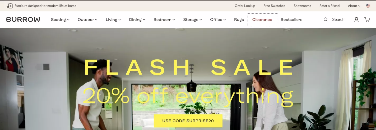
And if you see in this case, this notification bar is also a horizontal scroll. I’m not a big advocate of horizontal scrolls. I think they overestimate the attention span that a user has when they’re going through the site. So you’ve got to be extremely careful about that.
But I definitely recommend that free shipping is something that is important when the user has reached the consideration or decision stage, which is going to happen when they’re on the product page. Nobody’s going to buy before they’re on the product page. That’s where the free shipping communication has to be extremely strong.
Let’s go to the next one. So this is the other example that I wanted to give you. Generally, notification bars or hello bars are used only for one message, and that’s a good thing. But we have run experiments in the past where we have used it for multiple things, and it has worked really well.
Especially if aesthetically, your brand is really monochrome, simple, and minimal in nature. Then the notification bar helps you stand out, do something different from the rest of the aesthetic, without changing your brand or being obnoxious with the rest of the design.
So if your entire website is monochrome, the notification bar can have some color so that it stands out. And now you can use it for purposes beyond just publicizing an offer.
Like in this case, you can do a series of things. You can use geotargeting. You can nudge them toward an activity or something like that. Or you can use the notification bar as a CTA. So in this case, Shop Men’s and Shop Women’s, and then of course, in the middle, we are also highlighting an offer.
You can also toggle it so you can have multiple options within it. But again, I would want you to be careful about it. Don’t overestimate the time people spend.
I also think there is a mountain of data. See, when GA4 was launched, all of us hated it a little bit, but it’s grown on me now. Inherently, being somebody who’s very data-driven, I feel it’s a very capable system if it is set up properly and if you know how to play with it.
And so, one of the things that we do for our customers when they sign up with us is we also encourage them to spend a little on setting up GA4 at an amazing level, capturing all of the events that are important.
So then you can build custom reports and understand what people are engaging with or not engaging with. You really don’t need a lot of outside help, to be completely transparent.
You can execute reports inside of GA4 fairly easily.
Moving on.
Experiment #7
Press mentions. Trust is extremely important. So I’m going to show you — like in this case, High Key — here, the trust implementation is really simple. It’s press mentions. “Hey, you know what, the press talks about us.”
And I think all of us have seen these logos several times, and I don’t know what to make of them.
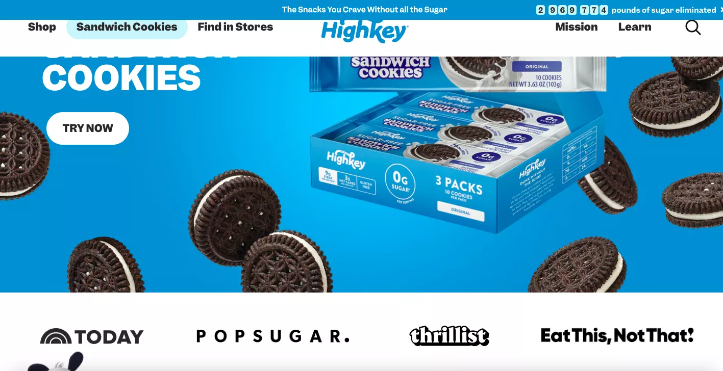
So I recommend you either try with press mentions being up top on the page, or I have another example, another variant that I can show you now, which I feel does a better job of creating trust.
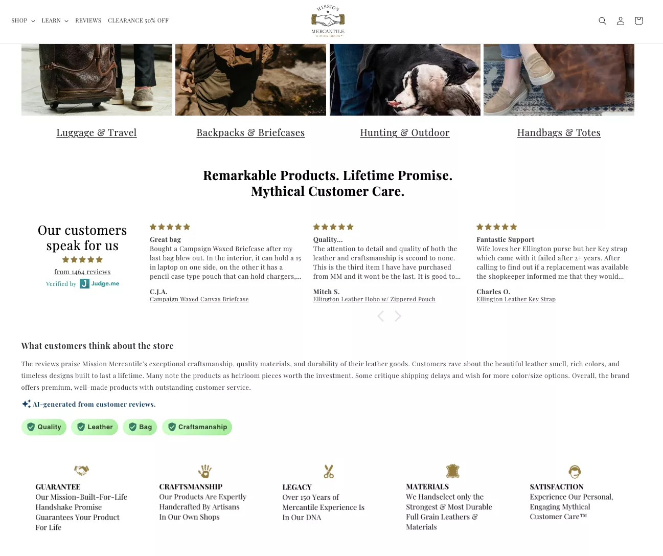
So this is one of our customers. We’ve done a few projects with them. I don’t know if Chuck is on the call today; he normally loves to join our webinars. Anyways, the list is so long — Chuck, if you’re there, just say hi — but yeah, Mission Mercantile, fantastic products. I love their bags, I love their products.
But look at how far they’ve gone to make sure people trust them.
So just under the first fold, they’ve flanked it with testimonials from customers, an AI-generated summary of the testimonials, followed by trust seals.
So I would say go out of your way to clearly communicate why people love you, and I think it would serve you well.
Sometimes we assume that people will just like the aesthetic or the product or the value prop.
And if you’re converting at, say, 1%, we blame the remaining 99 on all kinds of factors.
But you’ve got to sometimes toot your own horn. You’ve got to make sure that you say things that you feel people would already know, but you’ve got to sometimes explicitly say them.
So it’s always a good thing.
Experiment #8
Let’s get into popups. Popups are the most underrated thing in e-commerce even today. I have so many conversations with businesses that are doing popups that look like this, and I strongly disagree with doing popups that look like this.
You could do a discount box, or you could offer free shipping, or you could offer all kinds of different benefits in a popup.
I’ve seen people do lucky draws. Spin-the-wheel is the oldest trick in the book.
- Discounts on the order,
- cash discounts,
- store credit,
- sign up into the loyalty program,
- newsletters — all kinds of stuff.
But I’ll tell you why all of that performs roughly the same. And the reason is that whatever you put inside of the pop-up, if it looks like this, it’s not going to work. It’s not going to work at the level that it needs to.
So I’ll give you a benchmark that you have to achieve, which is: of the total traffic you’re getting — I’ll repeat myself, and I’ll correct myself — of the total new traffic you’re getting in a given month, you must be able to collect between 8 and 12% of their emails.
So, if you have 100k visitors in a month and 70k are new, you should be collecting anywhere between 5,600 to about 8 or 10,000 emails in a month.
And why I say that number is because how that’s going to happen is when you stop solving for offer and copy, and you start solving for popup engagement.
And when I say that, what I really mean is: when I see a pop-up like this — and we have seen data across several sites — when customers see a popup that looks like this, they don’t even read the copy. A large percentage of the customers are not even reading “15% off your first order,” “sign up for the email,” etc. They know you’re giving them a discount in exchange for their email.
So these popups are closed in under 3 seconds. That’s the number. It’s actually three and a half seconds, but either way, they’re not going through the copy because in 3 seconds, you cannot go through the copy. So they’re just closing the popup. Anything you give away is not working.
So the first recommendation that I have for you is: gamify your popup and fully custom build it. If you are a bicycle brand, or if you’re a brand that is selling T-shirts, pop a T-shirt up and let them click on it and turn the T-shirt inside out, and then show them the discount or something. There are so many ways to achieve that, it’s not even a joke.
We used to do an exit-intent — I think we are thinking of implementing it again — which is, if somebody is leaving the site, my and H’s and everybody else’s photo comes up with sad faces, like we’re so sad that you’re leaving. So things like that. Because this is the popup that online shoppers see twice a day, and they don’t even go through the copy, so please stay away from boring popups.
Let’s finish popups for good. Let’s make popups great again. For lack of a better way to put it, I would really want a popup revolution to happen because I’m sick of these myself as a customer, and I’m also sick of convincing people to give up on these popups.
Any which ways, coming back: you could do popup, you could do a lot of different things. Free shipping is a huge offer. I feel sometimes brands give away too much in discounts and undermine free shipping in a big way.
So here’s what I recommend you do: run an exit-intent survey on your product page.
What that allows you to do is the moment someone’s leaving, it allows you to ask them, “Hey, what could we do better?” And just give them a few options:
- “I think the shipping is too expensive,”
- “the pricing is not great,”
- “I’m not too sure about the quality,” etc.
And hands down, shipping is going to be a key deterrent, depending on what you’re selling and depending on the kind of product you sell.
Experiment #9
Recommendations and personalization. So we have a couple of things here on how that can be implemented. If I were you, I would do both. But if I were you, I would also A/B test and do the right thing — do the one that has the better impact.
So in this case, if you see what’s happening here, there’s the original cabin twist, there is the essential light cabin, and then there is the original trunk. But in the middle, you have long haul, the complete set, essential check-in.
So you have a full set entirely, and there’s a border around it. So what we’re doing here is we are nudging a recommendation while someone is in the category.
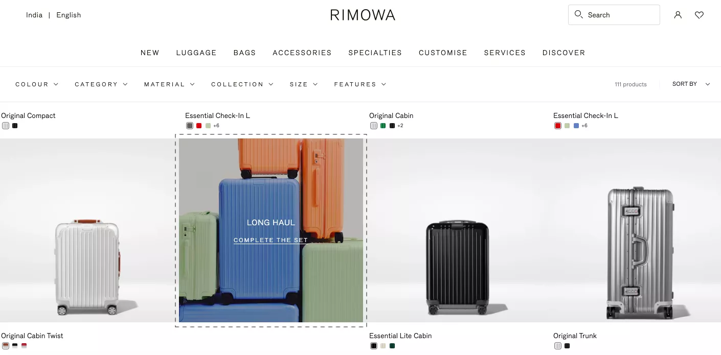
If you have a website that has more than 100 SKUs — anything more than 100 — and if it’s in the four digits or five digits… we have a customer that has more than six million SKUs. So one of the things we do for them is we know that the Pareto Principle applies everywhere.
It applies not only to the business as a whole, it also applies to every category.
Meaning 10 to 20% of the products in any category are driving 90% of the revenue. And then it also further narrows down to a few products.
So, recommend products that you know the customer might be looking for, instead of being creative. Because more often than not, I feel because we are passionate entrepreneurs, we sometimes go in and try to prioritize our collections based on new arrivals or based on price. And that’s not necessary.
Apple drives majority of their revenue from two products. And they’re not trying — for those people who walk in to buy those two products — they’re not trying to push them to buy a MacBook. They’re not doing that. So it’s important that you accept it, and then make sure you recommend those top two or three products in a big way.
Option two is that you do recommendations in this way, where you leave the rest of the category alone. And you do it as a drawer or a sticky CTA across the site, so they always have some recommendations coming up as they shop on the experience.
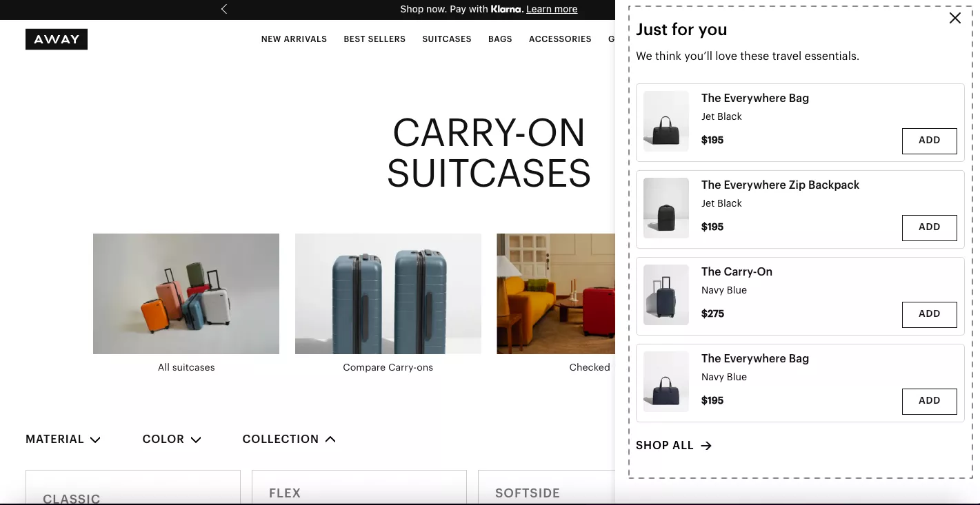
I think recommendations are insanely important. We run personalization actively on more than 400 sites today, and conversion rate for people who engage with personalized recommendations is four to five times the rest of the conversion rate. So essentially, that means the quality of recommendations is really important.
Experiment #10
Show multiple one-time buy quantity options. So this is something I want to talk about. The example chosen here is not a good representation of this idea. I think this is a fantastic idea.
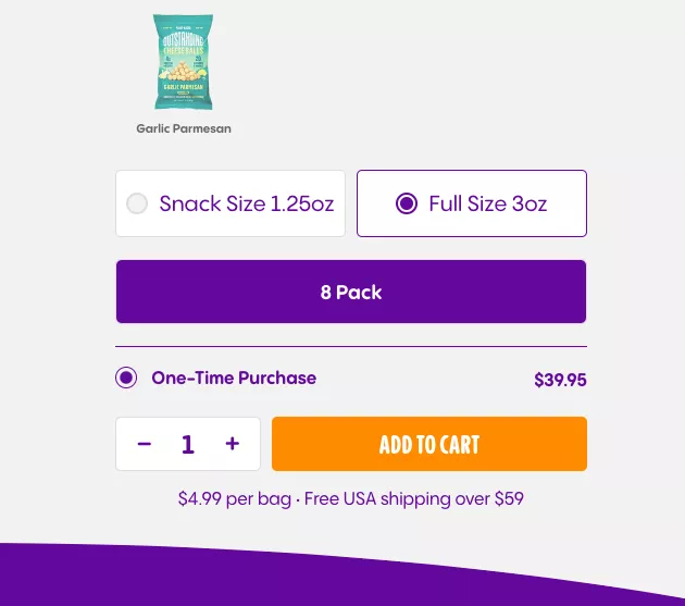
Let’s just say you’re selling black T-shirts like the one I’m wearing, and you will probably see me wearing in every webinar.
Not because I’m poor, or I don’t have any — that’s what I prefer to wear.
But we’ve implemented something like this, which is essentially multiple one-time buy quantity options. So you can buy one, or you can buy many.
We’ve implemented something like this for something as simple as T-shirts. Now, that sounds stupid because who’s going to buy five T-shirts? But they do.
And so what we did when a business asked us to figure out a way to improve their average basket size — and so far, what they were doing was what I showed you in my previous experiment idea, which is showing suggestions or recommendations in different ways — we said, “Hey, why are people not buying the same T-shirt twice?”
Because one of the things we were seeing is — and we saw this in one customer testimonial — “I bought two of these. Both my wife and I really love it.” And so that was a eureka moment for us.
So we added a nudge saying, “Hey, would you want to pick one up for your better half as well?” Like, yeah, that makes sense. And of course, a 20% off on the second one.
So what happened is every time the wife was buying, she was buying two. And every time the husband was buying, he was buying two. And that really worked.
Of course, it was only happening for a percentage of total customers, but think about it: if you are selling a product that is for personal use, that can be bought in twos, find a use case for why they would buy two of whatever you’re selling, and then make it happen.
So, Variant A is: show multiple buy options.
Variant B is: subscription, if that is the kind of business you are in.
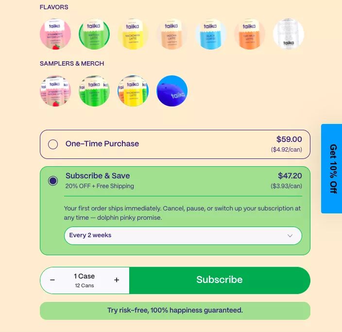
Subscription is a box of ideas in its own, so I’m going to hold myself back and keep rolling, because we’re already 30 minutes into the webinar.
Experiment #11
Lead product recommendations with social proof. That’s another interesting thing. Although I’m not a big fan of this example, I have a different example which I feel does a better job.
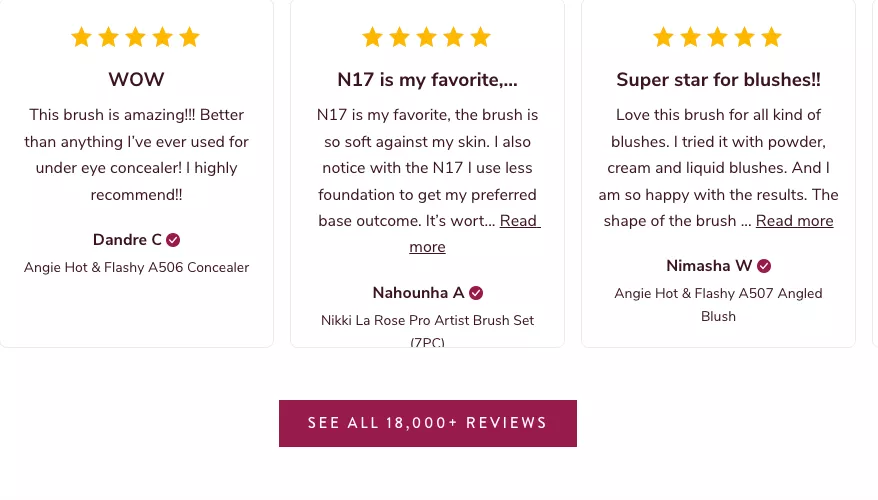
When you’re trying to do testimonials for a product, instead of doing fifteen of them, just do one.
Do one testimonial with the picture of the customer using the product.
For example, we had this brand that does jackets for pets, for dogs. So instead of doing twenty testimonials, we just put a picture of the dog and the owner and what they had to say. They had such a nice thing to say about it. “It’s fantastic, I got it, I was apprehensive he’s not going to like it, I put it on him, he loved it. Every time I put it on him he knows we’re headed out.”
There’s emotion, there’s a story, and that works better than expecting your customers to go through five reviews. It’s not going to happen.
For example, this has been on the screen for the last minute, and I’m confident nobody on this call — we have a big list of people here — nobody here has read through this. And that’s the truth. So essentially the messaging here comes down to “18,000+ reviews,” which is fine. You can still have that.
Option two is that you lead product recommendations with a theme. For example, Bed Bath and Beyond does this on fragrances that they launch. So you could always follow a theme that looks a little bit more cohesive as a whole.
So yeah, two options in how you can implement recommendations or product suggestions in the right way.
Experiment #12
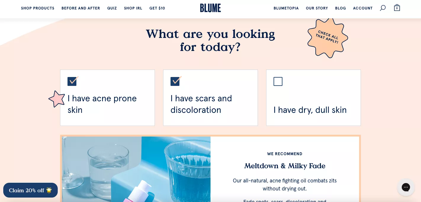
Quizzes. Quizzes are really powerful. I’m sure we all agree with that. This is a very quick one — I’m not going to spend too much time. You can start the quiz with a yes-or-no question or an A-or-B question.
Let me just throw a very short sales lesson for you. When we cold call customers — or when you cold call your customers if you ever do that — never ask a yes-or-no question. A yes-or-no question is “Do you want to go out to dinner tonight?” And it’s a, “Uh, no, I’m a little busy.” And that’s it.
The other way of doing it is asking an A-or-B question: “Hey, do you want to go out for some Chinese or would you prefer Mexican instead?” So now the question is not whether you want to go out or not — you’ve thrown two options at them and now they’re salivating thinking about what they want to eat.
So that’s why this is one way of starting the quiz. The other way of starting the quiz is showing them the first two options: “Do you have acne?” “Do you have scars?” And so on and so forth.
Experiment #13
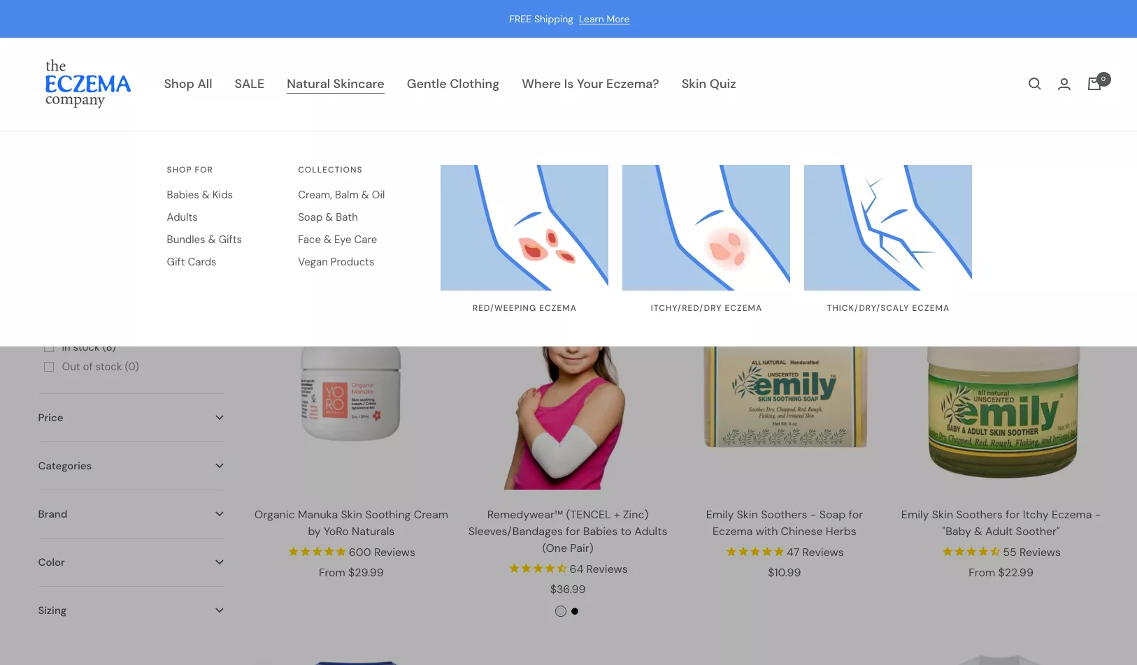
Visualizing category dropdowns. There are two ways of doing it.
First of all, if you’re not visualizing your category dropdowns, please do it.
People are extremely short on time, so they’re not going to go through a lot of copy. So visualize it.
This is one way of doing it if you have products that are hard to understand — like I didn’t know what a mulligan hat is till I saw this. So if you have something that needs visualization, please don’t refrain from doing it.
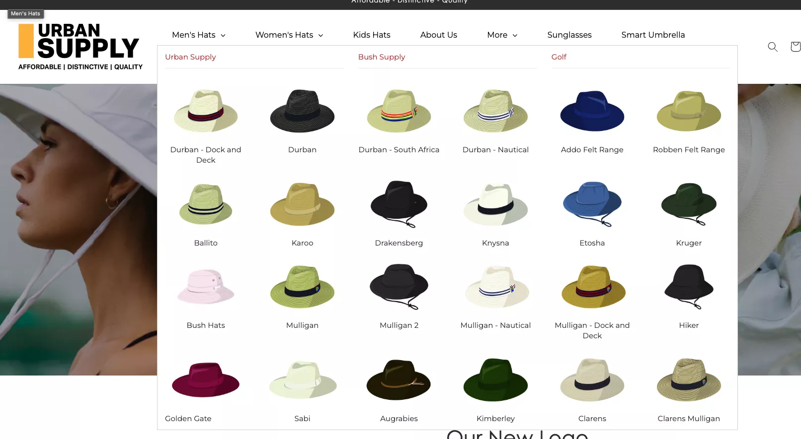
Option two is you could do a mix of the two things, where you could use both text as well as images.
In this case, keep customer intent front and center. So in this case, for example: whether you have redness, eczema, itchy, or is it just thick, scaly — essentially you’re appealing to the customer’s problem instead of trying to talk about your categorization.
Experiment #14
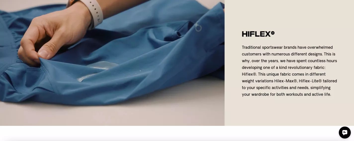
The next one is about videos. Videos are extremely powerful. If you’re not using videos to hold people back on your site, I strongly recommend you get that done immediately.
Forget about the A/B test. You must have videos. The engagement rates are off the charts. Give up on images. Have a video on your slider. You need it.

If you don’t want to have it on the slider, variant B is have a GIF that can highlight some parts of the product’s value prop. In this case, for example, the fabric is unique, so naturally they’re trying to show that in an auto-play GIF.
But my limited point being: you have to move away from just images and engage people in video in some form.
Experiment #15
The next one is about buying. Buy now, pay later is taking over the world.
And that’s one of the reasons e-commerce is continuing to grow. Because even though there are economy-related concerns all over the world, e-commerce continues to grow because people don’t need to pay up front.
And of course, this is a $20 product so it really doesn’t matter. But for high-value products it really, really matters.
So what I would generally do is: apart from what Shop Pay or Affirm, or any of these providers do for you, I would go out of the way and visualize the entire buy-now-pay-later breakdown.
If you are in September, you would say: first payment in September, then October, then November, and then December. So you’re paying four months or four weeks, whichever it is. I think it’s extremely important that you visualize it.
Option two is: you highlight various ways in which they can pay. In this case, the CTAs themselves send them to the right payment option. So that’s another big way of doing it.
I recently saw another business doing extremely high-value products, and instead of having people pay the entire amount, they said, “Hey, why don’t you pay a deposit and then we’ll call you to confirm the order?” And that deposit was like 2% of the total value.
So people were more than happy to do that because they had tons of questions about the product.
So they paid a refundable deposit, a call was made, the sale was closed, and then they went ahead and bought the product. The customer had the intent and the patience to talk to the team.
Experiment #16
Moving on.
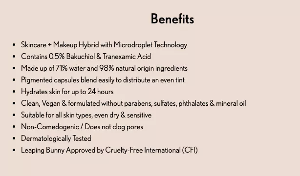
This is another really big one: adding actual results.
Generally, when you say that a product will nourish your eyes or make your skin better, they are empty claims if you can’t back them up with data.
So there are two ways of doing it. If you have a clinical study you can quote for your product, you could do that. I’m guessing that’s not true for a lot of you.
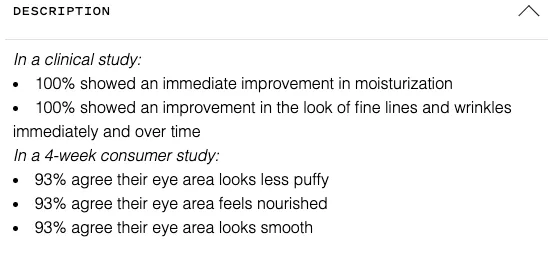
The other is that you could also quantify the benefits in some way. “Made up of 71% water,” “98% natural-origin ingredients,” etc.
You could quantify things. So the A/B test that I’m proposing here is: how do you present the benefits?
Option one is if you can quote a validated source.
Option two is you make your benefits sound original and true and more significant by quantifying them (either in the way they are created or in the way they are delivered)
And I’ll also give you an option three, which is: quote your customers talking about the benefits.
For example, if you’re selling fashion products, size is a massive consideration. It’s huge.
No matter how detailed you make your size chart, that’s always going to be a point of contention.
And that’s also the number one reason for RTO, which is return to origin — which is extremely expensive for a business, to have sent a product, and then it comes back because it didn’t fit.
And even before that happens, there are customers who don’t go through with the order because of that doubt. So what you want to do is give people extreme trust or create trust in your size chart and your sizing, especially if you sell oversized products or anything that has a margin of error, essentially.
So what I would strongly recommend you do is quote your customers saying, “97% of our customers love our sizes,” or “Our XL is similar to Nike,” or “Our XL T-shirts fit similar to how Adidas does,” or something on those lines. So, you are kind of drawing a parallel. “Hey, fantastic, I have a Nike XL. I have a real XL there. So I’ll straightaway order.” Good.
Experiment #17
Moving on. FAQs. Massive, massively underrated area.
I just want you to look at a simple data point: if you have an FAQ page, please tell me how many people visited that FAQ page and then converted. I’m sure you’ve not looked at that data, but it’s extremely significant. I can guarantee you the conversion rate is in double digits.
FAQs are very underrated. And sometimes I feel businesses do FAQs in a very salesy way, like they’re asking questions that they wish the customer was asking. “Will it really solve my problem?” And of course, it will solve your problem. So you’re trying too hard to sell.
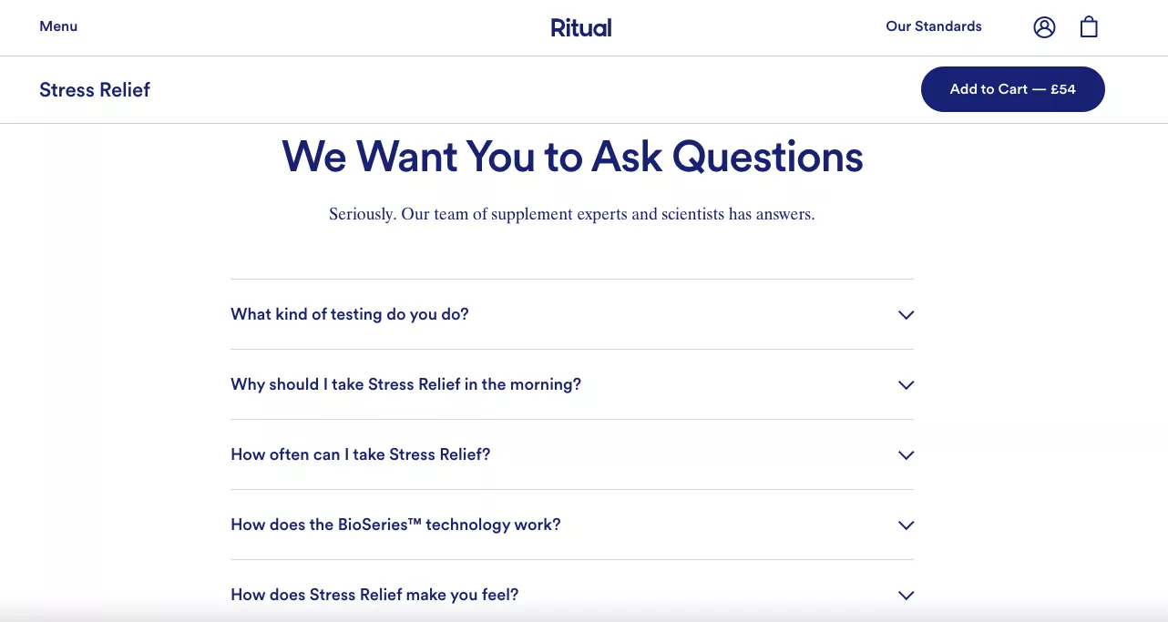
Instead, run a survey. Ask your customers what their biggest concerns are.
Or go to Perplexity or any AI and ask: “What does the internet think about my products?” It will bring in reviews from all over the place — Reddit, YouTube, wherever else — and give you the crux of what the internet thinks about you.
And I recommend, as brutal as it might be, address those things on your product page. You’ll do yourself a huge favor.
So you could do the FAQ that is brand-specific, or you could do a product-specific FAQ.
I would recommend you do both, but this is a plausible A/B test.
You could answer brand-related questions like: how does shipping work, how does warranty work, how do returns work.
And then product-specific questions, for example: “Where does the flavor come from?” “Is it safe to have during pregnancy?” That kind of really specific stuff that truly concerns your customers.

Experiment #18
Reviews. I already gave a piece of advice here. What is the best way to do reviews? There are so many plugins available on the market today for you to do that. You could feature a review snapshot — which is this — or you could show what percentage of people recommend the product. I already suggested this in the previous one as well.
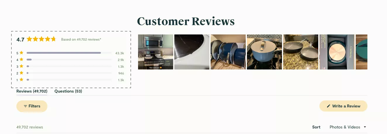
I’ll do you one better. I’ll give you a third idea — a third variant or a multivariant test that you can run here. Which is: how many reviews this product got in the last week.
Generally, it’s not hard for customers to realize that these review tools often have moderated reviews, which we all know they do. So they’re very hard to trust.
So please be honest about it. Leave some of those bad reviews in. It’s like when you are asked a question about what your weaknesses are in an interview. You say, “My weakness is I work too hard, I never give up, and sometimes I think that’s a weakness.”
You’re cringing the interviewer out. So don’t do that as a brand. Don’t appear to be this perfect paradise that’s going to solve all their problems.
It’s fine to be honest, because if you lose those three customers whose problem you’re not going to solve, they’re going to be sad about it. And they will voice that sadness somewhere on the internet at some point.
So yes, you could feature a review snapshot, or you could straightaway say what percentage of people give you fantastic reviews.
Experiment #19
Let’s go to the next one, which is featuring a sticky call to action. There are two ways of doing it. The first one is a sticky menu where you allow them to pick variants using the dropdown. So you could mention associated discounts with each pack size and stuff like that.

You’re allowing the sticky CTA to be productive.
Option two is: don’t do that. Just feature the most popular option and have them add to cart.

So you’re not putting the customer in an analysis-paralysis situation. You’re just letting them pick the best thing that you have available for them.
Experiment #20
And the final one is: don’t crowd your cart. I think there are too many tools available that claim to improve cart abandonment by 100% and change your life completely. No SaaS tool in the world can commit and deliver on that. There’s nothing.
If you see this cart, for example, there’s so much happening.
- There is a free shipping bar.
- There is a message saying there’s free shipping above sixty bucks.
- There’s the product.
- Then there’s a membership.
- And then you have your total.
It’s good to have the free shipping bar, but I would want to organize it in a way that it gets all the attention it needs. Otherwise, it won’t do its job.
In this case, I’m twenty-one bucks away from free shipping, but I’m not even looking at it because it’s so crowded. So do it well.
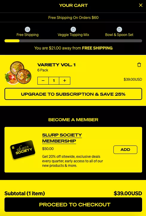
Option two here is you could do free gifts inside of the cart. Those really are delightful, and we’ve seen great feedback from customers. We’ve seen this implemented across multiple places. But don’t do everything all at once. That’s why experimentation is important.
As I close my last idea and start taking a look at questions, I want to leave you with a few thoughts.
We run about 10–12,000 experiments a year, and our experiment success rate is upwards of 45%, which means half or more than half of the experiments we run are successful. And the reason for that is because we don’t start with the idea in a lot of cases — we do admittedly — but in 95% of the cases, we start with data.
We look at, for example, how many people — or what is the TTP, which is time to product. How many people take how much time to reach the product. And there are so many of these data points that will give you the insights you need to come up with the right ideas.
Because more often than not, we are too focused on our competitors, we are too focused on design, we are too focused on aesthetics to be experimenting, because we want to make something look better because we think it’s right, versus where the customer insight is.
If you are a successfully running e-commerce business, at core, you are selling something the world wanted. So in the act of selling that on your experience, please make sure you’re doing changes and running experiments that the world wants — that your customers want from you — instead of stuff that just looks good.
So all 20 ideas times 2, which is 40 ideas, are great. But they mean nothing if your data doesn’t tell you to run them. If your data doesn’t go and ask you to solve that problem.
You might think cart abandonment is your biggest problem, but it might just be time to product — which means people are not finding products that they love, or you’re having the wrong people find products, so they’re not going to check out anyway.
That’s my parting thought. Happy experimenting. I really hope this was helpful. I really hope each of you got ideally more than two, but at least two ideas that you can go and implement and get a big win out of.
So thank you so much for your time, folks.
Get Fresh ideas to boost your conversion rate
(stuff that works for hundreds of stores)
Request a Free Site Audit"Convertcart’s Audit Report was deep and insightful. We never thought they would spend so much time in building and sharing such insightful content, free of cost."


Logan Christopher
Lost Empire Herbs