On-Demand
Fix Mobile Conversions before BFCM—15 Awesome Ideas To Steal
Last BFCM, brands lost an estimated $23B in potential sales due to poor UX on mobile devices.
There are studies out there that show that:
📉 67% of carts on mobile are abandoned before purchase
📉 Even a 1-second delay on mobile can drop conversions by 20%
But here’s the good news: fixing mobile isn’t rocket science 🙂
In this webinar, we're going to show you where shoppers get stuck—why—and UX improvements to prevent abrupt drop-offs.
What you’ll learn in this webinar:
- The hidden UI/UX traps that silently kill conversions during peak traffic.
- Real-world examples of mobile fixes that lifted checkout conversions by 20–40%.
- 15 proven mobile optimization ideas you can copy straight into your store.
Who should attend?
- eCommerce founders & owners
- Marketing and CRO teams
- Anyone responsible for revenue during BFCM
Don’t wait until it’s too late. One small friction point on mobile could cost you thousands in lost orders.


The speakers:

Shekhar Kapoor
VP, Marketing
Convertcart
Shekhar Kapoor (VP at Convertcart) has worked with 500+ online brands, including Squatty Potty, Prep Expert, and USA Hockey Assn., and helped them boost sales exponentially.

Delia Frank
Head of Customer Experience
Convertcart
Delia is our Head of Customer Experience. She's helped eCommerce stores improve their conversions and retention for over 5 years now.
Shekhar Kapoor
VP, Marketing
Convertcart
Delia Frank
Head of Customer Experience
Convertcart
SESSION REPLAY – FIX MOBILE CONVERSIONS BEFORE BFCM - 15 AWESOME IDEAS TO STEAL
So, hi everybody, and a very warm welcome!
Some of you might remember our last session on planning BFCM early in September. So, the topic we’re going to be covering is: fix mobile conversions before BFCM — 15 awesome ideas that you can literally steal.
So to be honest, we’re not going to reinvent the wheel today, but we are going to look at some of the major eCommerce businesses out there and how they have actually aced this.
I’ll also be sharing some examples of smaller businesses that have tried this, and it’s actually worked wonders for them.
Why focus on mobile during BFCM?
So the question I’m getting right now is why the focus on mobile?
In 2024, mobile made up for over 70% of eCommerce traffic and people were not just browsing, to be honest. Mobile accounted for more than two-thirds of orders as well.
So there it is. The trend is super clear. People are definitely using mobile. And by ignoring it, we’re leaving millions of dollars on the table.
So let’s not do that this BFCM.
On that note, let’s dive right in.
1. Cluttered navigation with too many deal options
So, I thought, let’s start with the front door to your store. That’s pretty much navigation.
In-app purchases often score better over mobile sites only because of easier navigation. And honestly, it’s grown by 14% year on year.
When I actually took a deeper look, what we noticed is that shoppers during this time especially struggle to prioritize what deal is best for them. It’s obvious you are going to expect a surge in traffic.
Very often, your menu does not load, causing another issue. Given the real estate on mobile, missteps are very common and ruin the whole user experience.
Now, what fixes can we focus on to ensure that this does not happen?
Firstly, please test load times and target an interaction delay below 300 milliseconds.
Use clear typography and spacing to visually separate categories. Ensure that menu items meet the minimum target size of 44 x 44 pixels. That’s been set up by Apple’s human interface guidelines.
In contrast to what we just discussed, if you look at Walmart’s mobile web on any Black Friday, you’ll notice that they prioritize a couple of high-impact areas, and they also have a specific section for Black Friday deals. Super easy, super clean.
Adding a dedicated Black Friday deals banner at the top of the menu also helps.
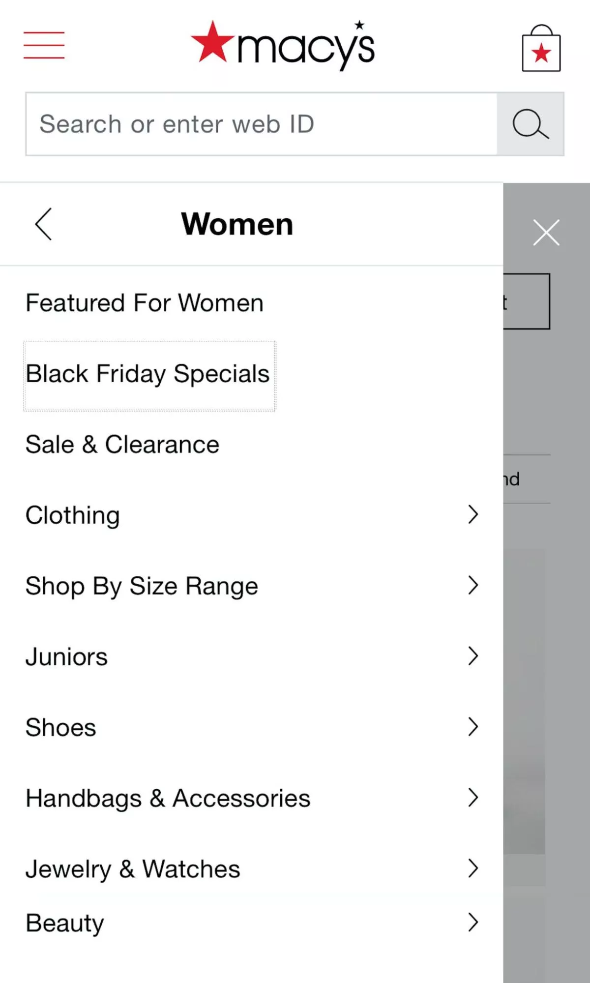
And of course, like Macy’s, if you can integrate predictive search in the menu area, we’re setting ourselves up for a sure win:
2. Malfunctioning faceted filters
Moving on to the second aspect: malfunctioning faceted filters.
This is something we hear from a lot of our clients. Filters work fine on desktop, but sometimes on the phone, especially when there are traffic surges, they notice that filters don’t apply or, worse, they have to keep reloading.
Essentially, I think I’ve covered most of these aspects here, which we obviously want to avoid.
How can we do that?
Firstly, use Ajax or similar technologies to apply filters without the frustration of reloading a page. Show filters that are applied and the number of products matching.
This business has done this so well. If you look at the price, color, and stem-type filter that’s been applied, it narrows down your options, making it super easy for a user to take a call.
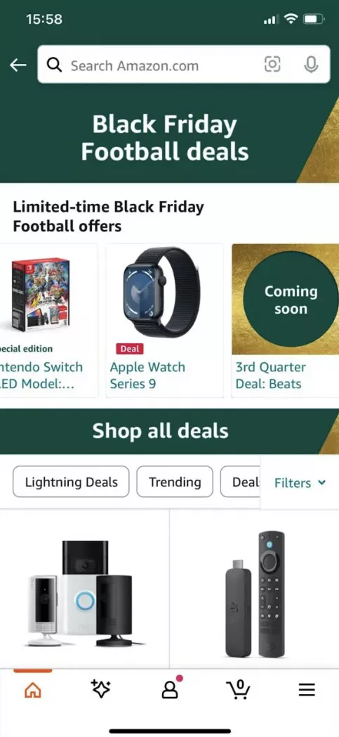
Amazon, I think, goes a bit further by floating active filters at the top of a page. So at any given time, you always know what’s applied. It’s clear, and you can even adjust it with a single tap:
3. Search results not showing in a mobile-optimized format
Search results not optimized for mobile.
When a lot of people come to us even for a regular CRO consultation, everything works fine and they’re using default searches as well. But when we optimize it, we’ve actually seen their conversion rates soar.
And needless to say, I think Algolia, that’s also a giant in that industry, has clearly figured that they’ve seen a 43% increase in conversion rates simply by optimizing search. So it’s definitely something we can’t ignore for the BFCM season this year.
But when it’s not optimized, a lot of businesses face the issue where key product details are just buried or, worse, truncated. Often images are too large, scripts are heavy, or there are a lot of unnecessary features which we obviously want to avoid here.
What fixes can you make right away to prevent this?
Ensure adequate padding, font size, and spacing to make scanning effortless. Maintain correct aspect ratios as well.
Also, search is another nice way for you to enable new shoppers to trust you better.
How can we do this? Highlight the reviews and the star count like this brand has done right here.
If I look at Sephora, they also have a very clear way of displaying their search results. But during Black Friday, they take it a step ahead. They include reviews as well as star ratings for the whole deal.

4. BNPL integrations failing under peak load times
Now this is something we honestly just cannot afford to ignore during BFCM. It’s just non-negotiable.
Research by eMarketer also points to the fact that this is going to grow by 15% this year.
And very often, we have a lot of our clients themselves come to us in vain because this has really not worked for them appropriately. Very often we see timeouts while shoppers are still stuck in the process of paying, partial payments processed at points, or, worst, delayed responses on payment completion.
What fixes can we focus on here?
There are some tools we’ve recommended, like Datadog, New Relic, etc., to track BNPL API success rates, latencies, as well as error codes.
You can also ensure that you can automatically switch to alternative payment methods to ensure that payments go through.
As an example, I think Nike does this really well.

First of all, they pre-validate your eligibility earlier in the purchase flow, perhaps when you add an item to cart or when you select BNPL as a payment option.
They also have multiple fallbacks; they’ll mention Afterpay, Klarna, Affirm, etc., to ensure that they don’t have any embarrassing moments with users who are trying to complete a payment.
5. Recommendations not adapting to real-time behavior
Coming to the fifth aspect we’re going to talk about today: recommendations not adapting to real-time behavior.
Now, the way algorithms work, yes, they do rely on past data to enable users to make a choice and present things that are more applicable.
But when it comes to BFCM, what we’ve particularly noted is that shoppers may behave unpredictably. Their behavior may change from what we know it to be.
And also attention spans are super short. So we don’t really get that cushion of extra time if we showcase something that’s not entirely relevant.
There’s also the problem of a cold start, typically on account of lack of data when it comes to new products or even shoppers for that matter.
I think in this case, use tools like Dynamic Yield to tap into pages viewed, clicks, searches, etc.
You can also use edge computing or in-memory data sources, like maybe an Apache Ignite or Redis, for that matter.
There’s a lot of focus here at Convertcart when it comes to identifying and optimizing micrometrics.
So this also works great when it comes to BFCM. Some of the things you can look at are these minute shopper trends: how many actually search for gifts under a given amount, or actively look for discounts or free shipping?
You can track these and maybe try to personalize these aspects on the go. You can also employ various behavioral triggers in recommendations.
For example, if you know that on average people view two to three products and then add something to cart, note the users that don’t and then perhaps add a suggestion like “top deals of the hour” or “most used,” etc.
I think Amazon is the master of real-time personalization.
Search for a gaming laptop during a Black Friday sale, and the recommendation will immediately shift to show you headsets, warranties, gaming chairs, etc., and it’s not going to look at the skincare products that you just purchased recently.
So it’s able to adapt really quickly.
6. Infinite scroll pushed as “modern” UX
The sixth aspect, we’ve all come across this, and we know how it can be: infinite scroll pushed as modern user experience.
Now, we’ve noted that situations like this can lead to one of the most painful things out here: 70% of cart abandonment, which we honestly cannot afford during BFCM.
When you actually break it down, when your scroll length is too much, people may actually go past products which they would have otherwise ordered.
And of course, at some points some websites may not be able to handle the traffic and pages may actually stop scrolling right after a few seconds — like we’ve seen on certain communities, people have actually posted messages like these: “Why does my landing page stop scrolling after a couple of seconds?”
So in order to avoid that, you can literally save face by adding a simple toggle, or improve perceived performance using visual placeholders.
Incorporating a progress bar may also make a lot of sense, the way Amazon does it.
Preserve your shoppers’ position in case they come back after clicking deeper. Target also uses pagination super well in order to ensure a good solid result here.
7. “Hard to configure” offers
Coming to the seventh idea: hard-to-configure offers.
When you look closer, there’s always a difficulty in displaying multiple products, promotional messages, and CTAs on mobile compared to desktop because of limited real estate.
Understanding offers also needs to be made super clear. Otherwise, it requires multiple taps, complicating the process. Sometimes, unclear layouts can also cause irritation and cause shoppers to miss specific offers.
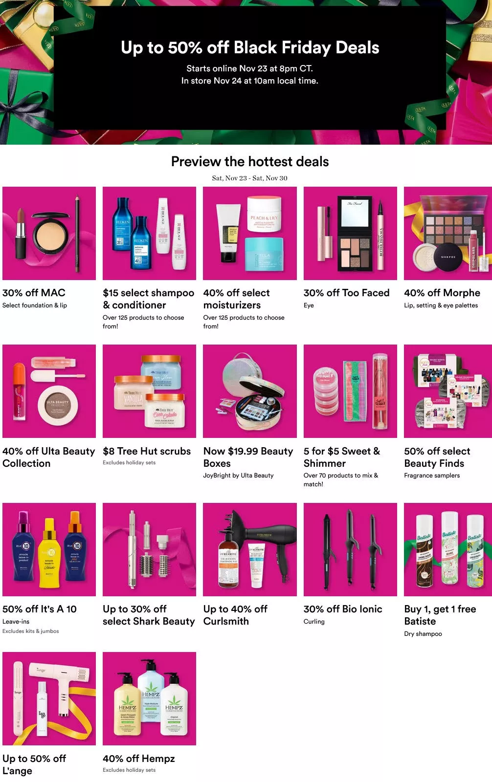
What we can do for Black Friday 25: I think the brand Alta Beauty does this really well because they have different kinds of offers running on Black Friday — from your buy-one-get-one to specific bundles.
So they mention it clearly at one go to prevent any confusion. You have your buy-one-get-one offers for specific brands. You have a percentage off for some others.
They also specify that at that point, if you buy one lipstick, you can get one free — they may specify it at the top of their page during the sale itself. So it makes things amply clear.
Apart from what this brand does, if you have any preconfigured offers, it also helps to mention that along with the bundles and add a very clear CTA to prevent confusion and enhance the whole user journey.
8. Personalization layouts designed for desktop real estate
All right, so moving on to the eighth aspect: personalization layouts designed for desktop real estate primarily.
When we actually delved into this further, we realized that the focus on desktop initially and trying to replicate the same thing on mobile definitely backfires in general, not just during BFCM.
Recommendation grids get stacked awkwardly — sometimes one on top of the other — or people have to swipe sideways incessantly.
CTAs sometimes are just hidden or get pushed behind a lot of long-form material. JavaScript-driven recommendation widgets often cause very slow load times on mobile as well.
This has been a pretty hot topic amongst communities as well, where they mentioned that initially they started to develop things just on mobile but at some point they also tried to perfect how it looks on desktop, and sometimes it just got mixed up or muddled there.
What are the fixes that we can look at here?
Of course, don’t stack too many recommendation carousels. There’s still time — you can still A/B test and prioritize the highest converting module. So you can choose between recommended, complete-the-look, recently viewed, etc.
If you’ve run A/B tests well in advance, you can move desktop sidebars into actual sections appearing before any long-form content. Preload two to three top products and lazy-load the rest, like we can see in this example as well.
You could also show two to three vertically stacked personalized products and add a view-all expander later.
So I guess Amazon pretty much does this super well. I think they mastered scaling personalization on mobile. Instead of dumping two to three different kinds of recommendation carousels, they’d show a small stack of two to three products, and then you can view all data as required.
9. Personalization breakdowns due to cross-channel inconsistencies
Coming to the next aspect: personalization breakdowns across channels.
The main problem is that carts often do not sync between your app, your mobile web, and your desktop. So personalized recommendations or deals vanish when shoppers switch devices.
Very often we’ve noted that push notifications might say one thing, but emails and your desktop notifications might just say another.
I think Amazon is definitely the gold standard here, and I’ll talk a bit more about that soon.
What are the fixes that we can put in place?
We could use server-side cart IDs tied to accounts or even cookies across devices. Ensure recommendation models pull from a central shopper profile and not device silos.
We could integrate rewards, discounts, promo codes, etc., across channels and encourage account creation or SMS sign-ins so preferences can be shared across devices seamlessly.
So if you add something to your cart on Amazon — which you may have noticed on your desktop — and then log in on your phone or tablet, it’s still waiting for you.
Kroger’s app actually does this well, too: your shopping lists, your coupons, even your reward points all carry across the app and the web interface excellently.
10. Mobile checkout too long to redeem time-sensitive offers
All right, that brings me to the 10th point: the mobile checkout’s too long to redeem offers.
As we all know, checkout is the most fragile part of the funnel, especially when offers are time-sensitive.
Very often we get frantic messages from clients who come to us on Black Friday, saying, “Oh my god, I think I really messed this up. What can I do?” and we’ve pretty much got to review their whole strategy.
But in a sense, very often what we have noted is that BNPL provider outages happen. Promo validation rules or cart eligibility mismatches sometimes show promotions as not valid, causing confusion.
Many clients feel cheated, and that’s really not a good vibe to have during a peak sale season.
Very often, merchants have also reported that discounts don’t render until the last second, so you’re causing a high level of anxiety there as well.
Best Buy actually fixes this well with an optimistic UI. As soon as you apply a promo code, it marks the discount as reserved for 15 minutes. That reassurance very often keeps shoppers from bailing, as per our experience.
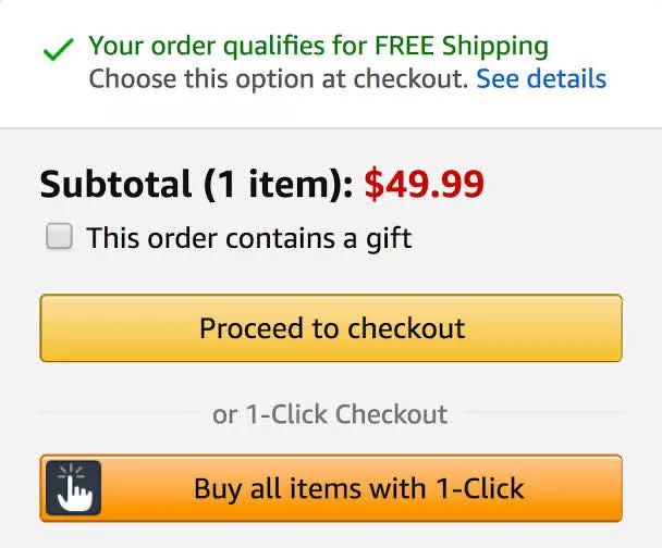
Amazon goes further: they have one-click checkout for logged-in users — no time wasted and no second-guessing.
So the fixes we could use, apart from the ones mentioned: pre-apply promo codes, preserve the cart state on the server side, reduce any heavy personalization widgets — let’s keep checkout super clean because you’ve got your shopper till here; let’s get them through. We really don’t want any distractions here.
Include a one-tap retry featuring other payment options as well if one plan fails.
Another interesting thing that we’ve tried and it’s worked brilliantly for a lot of our clients during this period is to integrate email and SMS marketing to retarget any failed payments.
Sometimes it’s beyond our control. One community we follow captured this beautifully: they mentioned they’re just a small business run by cricket enthusiasts, but clearly not website experts, because things did break.
There were glitches on their site, and they realized shoppers could not go through. To make up for it, they simply extended Black Friday pricing for one entire week.
And to entice users further or heal the shock because a transaction didn’t go through in the next 24 hours, they also offered an additional 10% off with the code “mybad.”
So I think this really worked for that business and for a lot of our clients as well.
This is something you definitely want to consider as backup because it removes the whole eCommerce element from it: you connect human to human, accept that something’s gone wrong, and put your best foot forward to fix it.
This really works, and it’s surely worth a try.
11. Device-level funnel analysis issues
All right, coming to the 11th aspect: device-level funnel analysis issues.
Mobile checkout errors sometimes look very small in percentages when you look at the bigger picture, but because of the number of people who are actually using mobile right now, you’re leaving thousands of dollars on the table.
Retargeting ads that show items people already bought on another device can really create frustration or confusion — you just wonder why it is not sharp enough.
If a shopper sometimes tries a promotion on a desktop and it fails, then later redeems successfully on another device, say mobile, analytics often only captures the success event.
What fixes can we use?
We always talk about segmentation at a very granular level — Shopify Plus also focuses on this super well. They break it down based on the mobile web infrastructure; they look at how many are joining in from Apple separately versus the app.
You should log a lot of micro events: cart additions, promotion use, checkout attempts under a unique customer ID, and not via device cookies, because if someone chooses to clear the cache or cookies for whatever reason, you lose a lot of that and have to start all over again.
Most importantly, something we can practice ASAP is to set alerts when a device-specific conversion dips. I’m not talking about minor changes we see on an ongoing basis. I’m talking about a massive difference.
Like if you notice a dip in checkout completion via Android mobile shoppers by over 15 or 20% in an hour, it’s definitely worth scrutinizing so you can solve for it before time.
Also, track the time to complete each step per device and not just your conversion rates. This insight will definitely help you capture other aspects in time during any heavy sale period.
12. Poor thumb zone design
Okay, this is one of the most underrated aspects when it comes to the mobile web: poor thumb zone design.
Research has noted that 90% of people typically use both thumbs for mobile navigation, followed by right-thumb usage.
Sometimes buy or checkout buttons or even important CTAs appear near the top of the screen instead of the bottom because of real estate issues. Tap targets are super small across various grids and carousels.
Very often, you find people clicking four to five times, especially during BFCM browsing. And of course, needless to say, left- versus right-handed inconsistencies where shoppers might prefer center-aligned actionables.
Now, what can we do to fix this?
Use a sticky bottom bar for add to cart as well as mini cart. You can also offer a bottom floating navigation bar. Simplify one-hand flows as well.
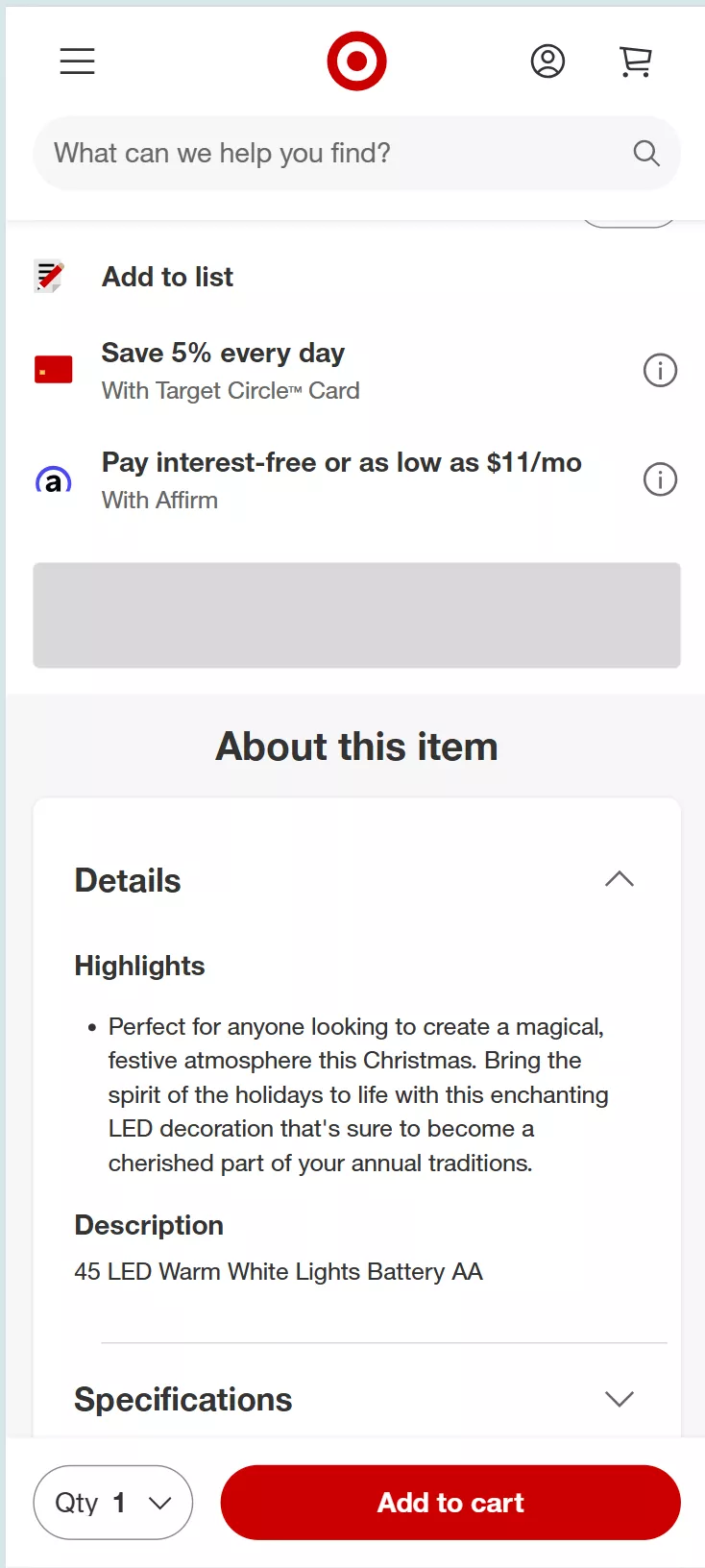
Apple’s human interface guidelines stress designing within the thumb zone. If I talk about some eCommerce giants that use this, it would be Amazon and Target — they follow this to the T. They both keep add to cart as a sticky bottom button which is always within reach.
13. Poor payment UX for returning customers
Moving on to poor payment UX for returning customers.
Returning customers, as we all agree, are the easiest sales you’re ever going to win, but only when payments work smoothly.
What we have noted is that saved payment details often don’t show up. Autofill often fails despite the shopper saving it during a previous transaction. OTP prompts often also happen multiple times, leading to frustration in the whole user journey.
Some fixes we can use:
For shoppers who are logged in, use stored tokens to reduce form fields to one-tap confirmations. Allow returning customers to check the option that uses their saved details.
You could also push returning customers to an app or PWA with saved payment tokens and, like Amazon does brilliantly, surface the last payment method first.
So if this user used PayPal, that pretty much surfaces first.

14. No BFCM-specific live chat support
The 14th aspect is no live chat support.
Research clearly points out that during peak times, 41% of customers would prefer live chat to get a solution quicker.
But very often the user experience is not that great: it doesn’t load right, agents are not available on time, and connecting someone who speaks the right language or is skilled enough to address an issue can be a challenge.
So a couple of ideas that are super useful:
Enable quick-reply buttons for things like order tracking, applying coupons, reward points applicability, etc.
Trigger proactive chat when you feel someone is lingering on your checkout page for too long without further action.
Integrate chat with the order API so agents or bots can check reserve stock, apply discounts, and create links easily.
Skip the generic questions that work during BAU. Focus on high-intent questions only for BFCM.
15. Misalignments between mobile app and mobile web
And that brings me to the last point of today’s webinar: misalignments between the mobile app and mobile web.
We’ve actually seen this even happen with some well-known eCommerce brands like Kroger.
When it comes to clicking coupons, it works on one and doesn’t work on the other — pretty annoying. Very often, items show as available on one, but not available on the other.
The app may allow quick guest checkout, but the mobile web gets very pushy about account creation. One-tap checkout works on one but doesn’t work on the other.
All of this destroys the user experience, given that everyone is a cross-device user nowadays.
What fixes can we apply here?
Real-time API syncing so any price change, coupon states, etc., reflect instantly across both.
Create backup promo logic for failed coupons — so say SAVE20 doesn’t work, you could mention that we’ve already applied your 20% so people don’t feel cheated during this period.
Initiate shared identity tokens to create persistent logins and carts across the web and the app.
And of course, train agents and bots quickly to detect mismatches and have resolutions like instant refunds and manual discount codes ready.
Summing it up
So I guess that’s a wrap. These are the 15 points we had in mind that have really worked and that I wanted to share with you.
The consistent theme, if I’ve got to summarize quickly, is: keep things fast, very clear, and consistent.
The good news is you don’t need the budgets of the giants to apply these lessons. You can start with the basics discussed today, and you’ll already be ahead of the curve this BFCM.
As part of that, we’d be happy to audit your store as well as your email marketing completely free of charge.
This year alone, we’ve completed over a thousand audits, so we know exactly what to look for.
So on that note, thank you for joining us again today. It’s been great discussing these aspects with you.
Get Fresh ideas to boost your conversion rate
(stuff that works for hundreds of stores)
Request a Free Site Audit"Convertcart’s Audit Report was deep and insightful. We never thought they would spend so much time in building and sharing such insightful content, free of cost."


Logan Christopher
Lost Empire Herbs