On-Demand
Holiday Conversion Killers (and the Fastest Ways to Fix Them)
Holiday shopping—everyone’s in a rush.
Stores are in a rush—to roll out offers—and they mess up user experience.
Shoppers are in a rush—to get the best deal—one small moment of confusion and they bounce off.
Hasty shoppers.
Stores with UX issues such as banner overload.
Not a good combination.
And we see these UX issues crop up every year (while running site audits during the holiday season).
It’s actually rampant—every year, ecommerce brands lose up to 35% of potential holiday revenue to simple, fixable issues.
Let’s make sure your store isn’t one of them?
Before you spend another dollar on ads—let's fix the UX leaks that cost you the most.
So, we’re going to talk about:
✅ 10 biggest conversion killers haunting ecommerce sites this holiday season
✅ Real-world examples of brands who fixed them (and the results they got)
✅ Quick, high-impact fixes you can deploy before the holiday season hits


The speaker:

Shekhar Kapoor
VP, Marketing
Convertcart
Shekhar Kapoor (VP at Convertcart) has worked with 500+ online brands, including Squatty Potty, Prep Expert, and USA Hockey Assn., and helped them boost sales exponentially.
Shekhar Kapoor
VP, Marketing
Convertcart
SESSION REPLAY – HOLIDAY CONVERSION KILLERS (AND THE FASTEST WAYS TO FIX THEM)
All right, perfect. I hope that was an energizing start, and we’re fully awake and ready for the session we have planned today. I think holidays are around the corner — we’re all going to plan sales, whether it’s for Thanksgiving, Black Friday, Cyber Monday in the US, or just the whole of December, or Boxing Day in London. There’s a mix of things we’ll all be doing, and I feel it’s better to be prepared.
We’ve also felt that there’s a lot everybody tries to do to make the most of this period — and sometimes, we end up doing a little bit too much. So I’m going to walk us through some things we’ve learned over a period of time.
At Convertcart, we run about 12,000 experiments every year for more than 500 businesses, and our learning is extremely data-driven. We’re able to look at funnels across industries and understand how traffic behaves — when it comes in organically versus when it comes in after having paid money to either Zuckerberg or somebody else. We’re able to look at the whole thing with a bird’s-eye view.
We have clients from more than 35 industries, so there are learnings that are common across these industries, and there are learnings specific to fashion, real estate, or home improvement. I’d love to share everything I know.
Also, for anyone attending this webinar — if you want us to audit your store, like a one-on-one audit of your funnel to find where you lose conversions and revenue, we’re more than happy to do that.
So let’s jump right in.
1. Blanket Discounts (Without Any Segmentation)
Now, the first thing that I want to talk about is blanket discounts. Now, storewide discounts are very common, and, generally, if not storewide, they are category-specific or collection-specific. And in those cases, what we've generally seen is that they have a lot of negative effects on the store.
The first thing is that generally, sitewide sales create some kind of waiting behavior in buyers, where they know that sitewide sales happen with the brand. And so, even for people who are loyal to you, they're going to wait till you put up a sale again before they buy from you.
And that's one of the reasons why about 70 to 80% of all merchandise sold in the US is sold in just a matter of a few weeks at the end of the year — because everybody knows they're going to get everything cheaper during that time. Nobody buys an iPad, nobody buys a computer — everybody waits for that time.
So while that's okay and it has created some predictability in the business, I feel all of us want to run a business that has cash flow throughout the year. So we have to think through how we do sitewide sales.
The second thing that it does is it brings a lot of bargain-only traffic. And of course, generally what I've seen is you create a lot of commotion traffic — advertising becomes cheaper, etc., because you're running a big sale. But it creates a lot of short-term gain — a lot of short-term attention that you get from people — but it doesn’t stay with you in the long run.
✅ Base offers on intent, not just time on site.
So I think one of the things that I recommend, and we always do, is we segment and personalize the way that we do offers — even during Thanksgiving or even during big sales. It is possible.
So, for example, for loyal buyers to be excited, it's important that you give them something on top of the discount that you would probably want to offer to them. Like, for example, even early access to discounts. Prime does it really well, right? We all know that Prime Day sales are live two days early for Prime members.
I don’t know if you know this, but Amazon Prime customers have a conversion rate of more than 65%, which means two out of three times they visit Amazon, they buy something. That’s phenomenal because they are made to feel special — free delivery, you feel like you have unprecedented access to the website, you can buy whatever you want, you won’t be charged, etc.
And you know, there’s a long story of how they created the whole Prime experience at Amazon and how they did that. There’s a lot to learn from it, but the focus for them was kind of loyalty being the backbone of the whole thing, and I think that’s a masterclass in how to do it.
People who are browsing with you for the first time — recent browsers or new visitors — they need trust. They need to feel like they belong. So what we need to do is personalize the deal to the collection or the category they are in. And I’ll talk about that a little more as I keep going.
And then of course, new visitors will need trust, so we’ll have to find a way to create that.
✅ Shift from “% off” to “value gained.”
Instead of also giving a flat percentage off, I recommend that we switch this year to an absolute dollar value — the amount that somebody is saving. Percentage discounts have a lesser impact. We’ve done this A/B test hundreds of times, and we’ve seen that dollar discounts — just absolute dollar value in discounts — work a lot better than percentage discounts.

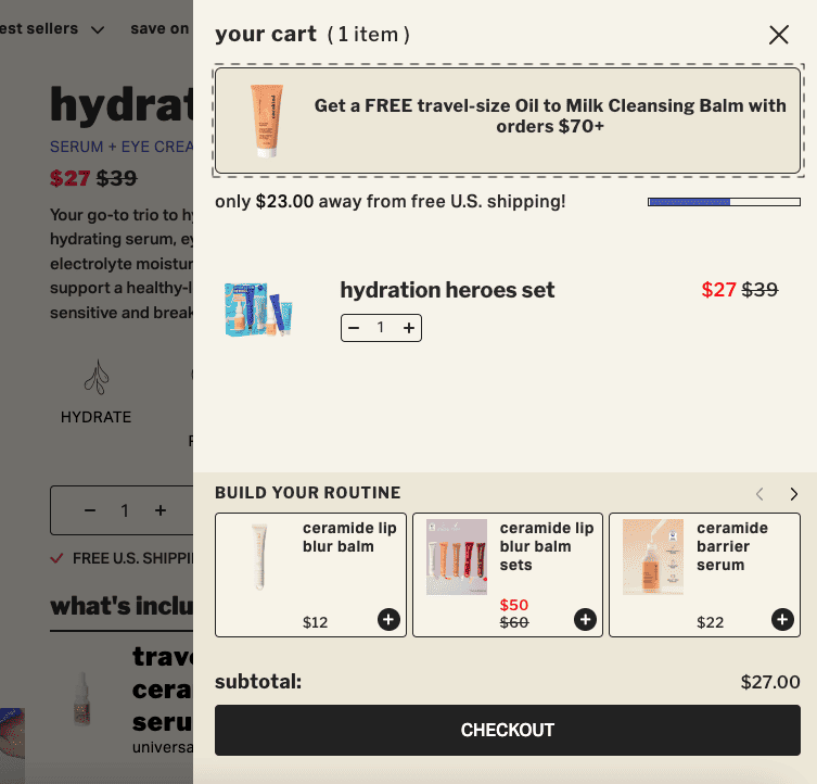
2. Too Many Competing Promotions
And as an extension to that idea, you’re likely to have too many competing promotions when you’re running big sales, and that doesn’t work. Because you know — a 10% off, a free gift, and an extra 5% off, or a page that looks like that.
Initially, it might seem like a great idea because you have a lot of sales going on, and it feels like a good achievement — but it isn’t. What you’re doing is creating contradictory priorities for the user.
You’re trying to say all of these collections are on sale, plus if you buy more than $300, I’ll give you this, plus there’s a free gift, and there’s free shipping. So there’s just too much happening, and the cognitive load is just too high on the customer.
What I would recommend we do instead is:
✅ Select the coolest primary placement(s)
If you give one offer, you focus on it really well — and then you remove everything else from in front of the screen to make it very easy.
Generally speaking, with A/B tests, we have seen that the hello bar (the one that runs on the top) and the cart page are a great way to communicate if you’re running a simple offer. You don’t need flashy pop-ups, you don’t need to revamp the entire website — you can keep it simple without destroying the UX or putting yourself through all the work of graphic design that you do every year.
I recommend you try it out one of the weekends before the actual sale weekend — and you’ll see that the impact is there.
✅ Select the secondary placement
The second thing is, you have to find a secondary placement for the offer — and you pick where you show which offer. For example, if you are doing the free gift, leave it in the cart because this offer will only apply to someone who’s already buying from you, and you’re trying to encourage them to increase the cart value.
So if there’s a free gift above a certain purchase value, it has to be in the cart. It cannot be anywhere else before — because it doesn’t really matter at that point.
Bundle and upsell sort of offers should not be in the cart, because I’m at my decision stage — you’re stopping me from making decisions, upselling and cross-selling, and confusing me. So, keep the bundling and upselling on the product page — that works a lot better.
And if there are any collection-specific discounts — like a 20% off on a whole category — make it felt in the collections page. Make them feel like they’re in a collection, or they’re buying at this time. So there’s an offer running on the entire collection, and I think that would go a long, long way.
✅ Tap into customer journey map + shopper psychology
The other thing is, the customer journey map is going to be important. For example, people who are just exploring — there has to be a broad draw-in message, as we call it, right? So “40% off on everything.” That’s what your Facebook ad will say — “40% off on the holiday collection.” That’s what will make them click and come in.
The comparers — once they’re at the second level in their journey and they’re comparing things — that’s when they’ll prefer something. Then they’ll kind of take a look at, “Oh great, if I just bundle it up, I’m getting a free gift,” or “You’re trying to gamify the shopping experience by saying, hey, if you buy two things together, you get a third thing,” etc.
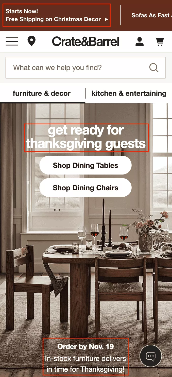
And then the final one is the decider — which is when they’re on the way out. Let them know the things that matter. For example: above this threshold, there’s free shipping, and we’ll make sure it ships before Christmas or before Thanksgiving. You’re giving them confidence just at the right time.
If you’re going to talk about free shipping above XYZ on the homepage — they’re not there yet. They’re not even thinking about shipping at this point. What matters is that they find a product they love — and that’s what your focus should be.
So having a good search on your site, making it easy to navigate, etc. — and I’m going to talk about that as we go.
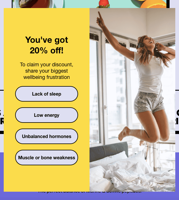
3. Overaggressive Pop-ups
Now the next one is overaggressive pop-ups.
I just want to officially say that it would be phenomenal if the world gave up on annoying pop-ups that don’t have a really big, visible close button. I think the world needs to just throw that into the trash can right about now — because we’ve seen mountains of data that show it does not work.
Full-screen pop-ups with no close button or a hidden close button tucked away in some corner — that just doesn’t work. And we’ve seen that over and over again across industries.
Do not interrupt the buying flow. Your customers are too precious — you don’t want to annoy them.
The second thing is, let’s not create friction in any way. Stacked pop-ups, for example — I’ve seen that happen now, where I see a pop-up for 15% off, and then I also see another pop-up asking me to sign up for the newsletter. It’s not that important.
At the end of the day, 100% of your traffic came to you because they were shopping — and now you’ve put them on a completely different track. So I think it’s important that we make that separation clear.
Also, just generally speaking, too many prompts feel pushy. They’re not festive, they’re not nice, and we just want to avoid them.
What you can do instead is create friendly pop-ups that build engagement. Like in this case — you’re capturing a problem: “What’s your biggest well-being frustration?” Lack of sleep? Low energy? So instead of thinking of the pop-up, the user is now thinking about those things. The distraction is kind of worthwhile — plus, you’re collecting some phenomenal information.
✅ Ensure easy dismissibility
Also, make it very easy to close the pop-up. You don’t need to hide the close button. If they just click outside of the pop-up, they should be able to close it without any issues.
✅ Do an “empathy UX sweep”
We generally call this an “empathy sweep” — when we look at a site, we browse through the experience to see if the website feels empathetic to the user or not.
If your pop-ups appear even before I browse — if they create feelings like irritation, frustration, lack of fluidity — all of those things point to a lack of empathy on the site. And we need to focus on creating empathy because that’s what buyers want.
✅ Run a timing & frequency check
Running a timing and frequency check is also very important. More often than not, I see pop-ups come up almost as soon as we enter the site — and that’s problematic.
Some of your most precious traffic is coming organically, and the moment they come in, if you’re going to ask them for their email — it’s a no-go. So please turn those pop-ups off. They don’t serve a good purpose. You might collect a few emails, but it’s not worth completely destroying the experience.
4. Forgetting About Dark Mode Users
All right, this is a very interesting one — and often ignored. I also use a Chrome extension that allows me to see everything in dark mode, except for this document. Because I was presenting, I switched it to light mode, but generally speaking, I prefer everything to be in dark mode — including my phone and other devices.
Even if your website does not have a dark mode, there are Chrome extensions that people use. About 25% of all internet traffic now uses extensions like those, which convert your website into dark mode — even without you actually doing it or Shopify doing it for you, if you’re on Shopify.
What that does is it creates an issue. First, I think you should totally consider having a dark mode. Second, even if you don’t, you have to make sure your website is dark-mode compatible.
So go to the Chrome App Store, install one of those apps — it’s free — and just open your website. And the first realization you’ll have is that there are invisible texts, the buttons may be vanishing, and so on and so forth.
So I think it’s important that you look at it and then optimize your experience so that it’s visible in dark mode.
Here’s a quick comparison: on the left is an email that looks great in dark mode, and on the right is one where the content looks washed out and doesn’t get the right kind of attention.
Especially during the festive season, you can’t take these risks. You’re going to see a 40% to 80% spike in traffic and demand — which means if you’re at 100k in traffic, you’re getting 100,000 extra people coming in during this period, and 25,000 of them are going to be on dark mode.
There’s no debating that they’ll use some kind of app or extension to view your site in dark mode — so you have to be cautious about that when you design.
Simple fixes will take care of it:
✅ Festive graphics being optimized
✅ Adding soft glows
And
✅ Ensuring the content doesn’t disappear.
It doesn’t need to be dull — you should consciously go and add a dark mode. But even if you don’t, you have to optimize for it.
That’s the big takeaway I want you to have from here.
5. Festive Overload (Design Chaos)
The second thing is design chaos. The picture here is pretty self-explanatory — we all have a friend who’s a little extra. And while they’re a great friend, they are a little extra. You don’t want to be that guy.
Now, if your brand is that — if that’s who you are — by all means, own it. Be that brand. But I still feel you have to make it easy for people to absorb everything that you’re doing.
For example, I don’t know if you’ve heard of JB Hi-Fi — it’s an electronics chain in Australia. The brand is extremely quirky. Everything they do — the entire branding — is extremely quirky. Really sharp colors, bold fonts, bright visuals.
But what they also do is that, where it matters, they pull back a little bit. For example, when I see a product listing with them — the moment I’m on a PDP — the brand personality is still there, but it’s not as loud. The information that’s important is still presented in a human, easy-to-read way.
That’s what I feel happens a lot during the holidays — people sometimes end up making their experience too cluttered. And I feel that we can solve that very easily.
You’re killing focus if you create chaos. Visual fatigue happens very quickly — because every website is doing something. There’s snowfall happening on screens, flashing banners, glittering CTAs — there’s a lot going on.
We really have to think through how much of that actually drives business and how much of it doesn’t. Let’s not feel cheap — let’s feel cheerful.
✅ Let products be the hero
You want to keep things simple and classy. The reason I say that is not to move away from your brand, but to make it easy for people to consume the information you’re showing them — and let your products be the hero. Let your products do the talking.
Make sure it’s really simple when people see your website. At the end of the day, they’re there to shop. Let them find something they truly love — let them do that easily, and then check out.
We’ve seen this a hundred times: some people even add sounds to their website during holidays. We’ve seen that that does not work. You can skip that completely and save that effort.
✅ Make it mobile-first
Also, think mobile-first when it comes to design clutter. In a lot of cases, I’ve seen design happen in a silo — away from the rest of the website. What I mean by that is the owner or the CMO instructs the design team to start putting together banners and creative assets for the festive sale.
Those banners and assets are exchanged over Slack or WhatsApp — in isolation. You’re only seeing the banner, not how it looks on the website. You only realize that when it hits staging — and that’s a problem.
When everything is put together and you switch to mobile, it looks horrendous.
So: think mobile-first. Focus purely on mobile. Desktop should be your second priority.
I know we all go to the office, but I think all eCommerce entrepreneurs should not log into their laptops first thing in the morning. The first thing they should do is open their website on their phone. Operate it as a customer would — and then get into everything else.
6. Manipulative CTAs
Now, manipulative CTAs — we’ve seen that a lot. I think I would have seen this a hundred times where I see that there’s a sale on a collection, and I click on it, and then I figure out that about 70% of it is out of stock.
And so, what you’re trying to do is break trust. Pushy lines like “Only a fool would miss this deal,” or guilt-based pressure — that’s not the flavor anymore. There was a time when everybody did that.
Now I think brands have also realized — once something starts to work, it kind of goes all over, and then it stops working almost immediately. Like one of those social media posts that everyone starts doing — where it says, “Official apology from the brand,” and then once you start reading it, it turns out to be a promotion.
That kind of stuff actually creates the opposite of a good feeling in the customer’s mind. People are smart. Most people are smart, and they’re going to see through it.
So, create warmth as a brand. Make people feel nice. Make people feel like you’re a generous company, and it goes a long way.
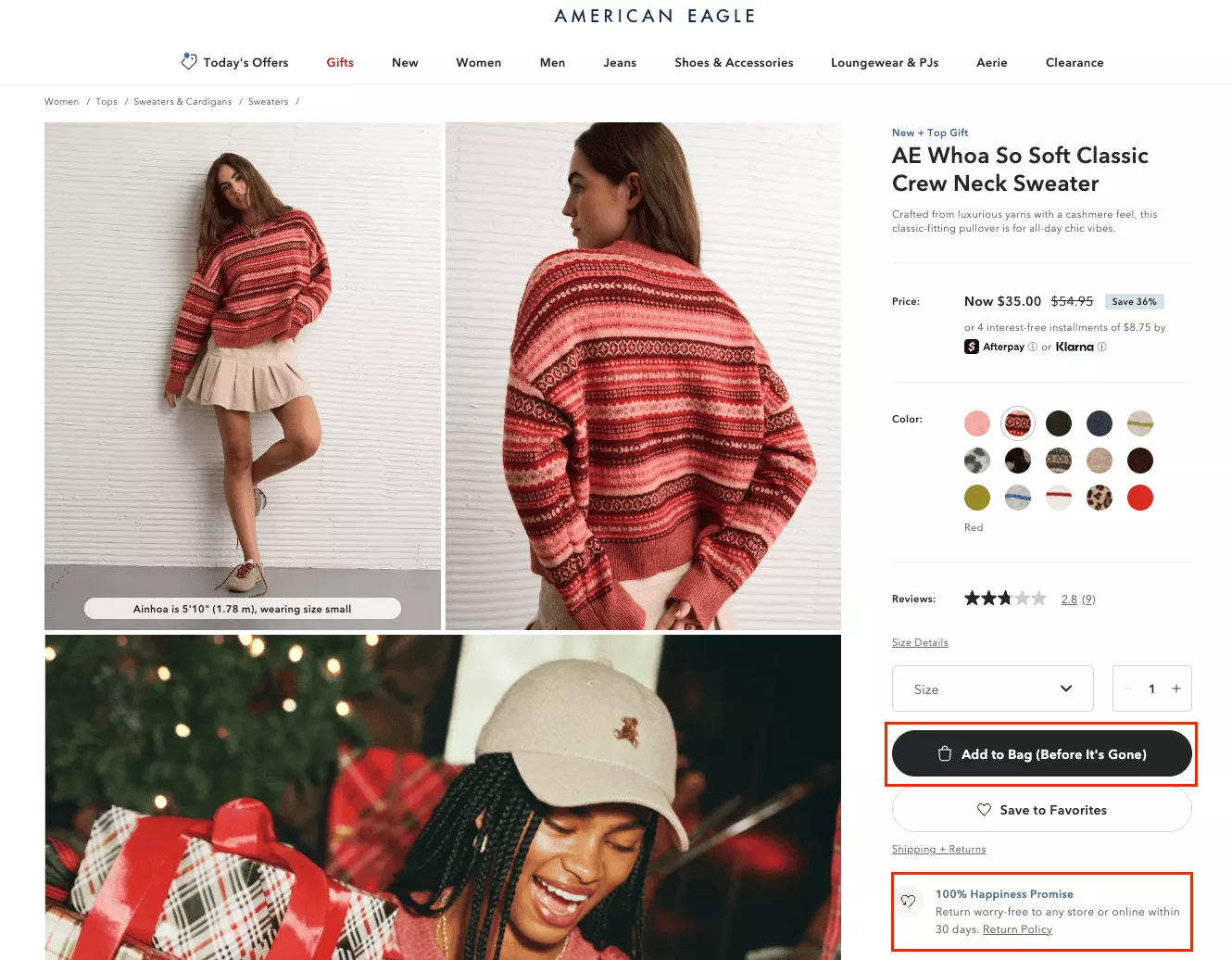
✅ Make CTAs feel confident, not cautious
What you want to make sure you do is make the CTAs click-worthy. Things like “Find the perfect gift,” “See the gift bundles,” “Explore the holiday picks,” “100% happiness promise,” and so on. Keep an optimistic, positive undertone across your messaging — and you’ll automatically stand out.
Because people will naturally gravitate towards that when you’re up against someone who’s doing one of those pop-ups that says, “No, I don’t want the discount. I’m stupid.”
Why would you want to make the customer feel bad about browsing the website? It just doesn’t make sense.
✅ Use calm, confident visuals
Holiday fatigue is real. Clean buttons, gentle animations, great deals, great products, great value — made visible and made easy to understand — that’s what’s going to be the winner this year.
7. Cluttered Navbar
Nav bars, search bars, and personalization are the three most important bets that you can make this year.
So if you’re looking to optimize before the sales even start and you have the bandwidth to do that — or if you’re using a conversion optimization team like Convertcart where we do this for our customers — this is going to matter a lot.
Because when you have sales running, you are essentially doubling up or at least growing your collections by 30 or 40%.
So currently, for example, if you’re a fashion store, you’ll have men, women, kids — you filter by sizes, by style, by whether it’s a top or a bottom, etc. When sales begin, you’re going to add more collections, right? So there will be sales, clearance, discounts, everything that’s 30% off, everything that’s 40% off, and so on.
You’re going to create more ways for people to get lost. And what you want to do is use your navbar to make things easy.
Make sure it’s not overloaded. Make sure you’re not creating too many links like “Gift by price,” “By mood,” “By color,” “For pets,” right? Don’t overwhelm — especially mobile users — and make sure that you’re on track with that.
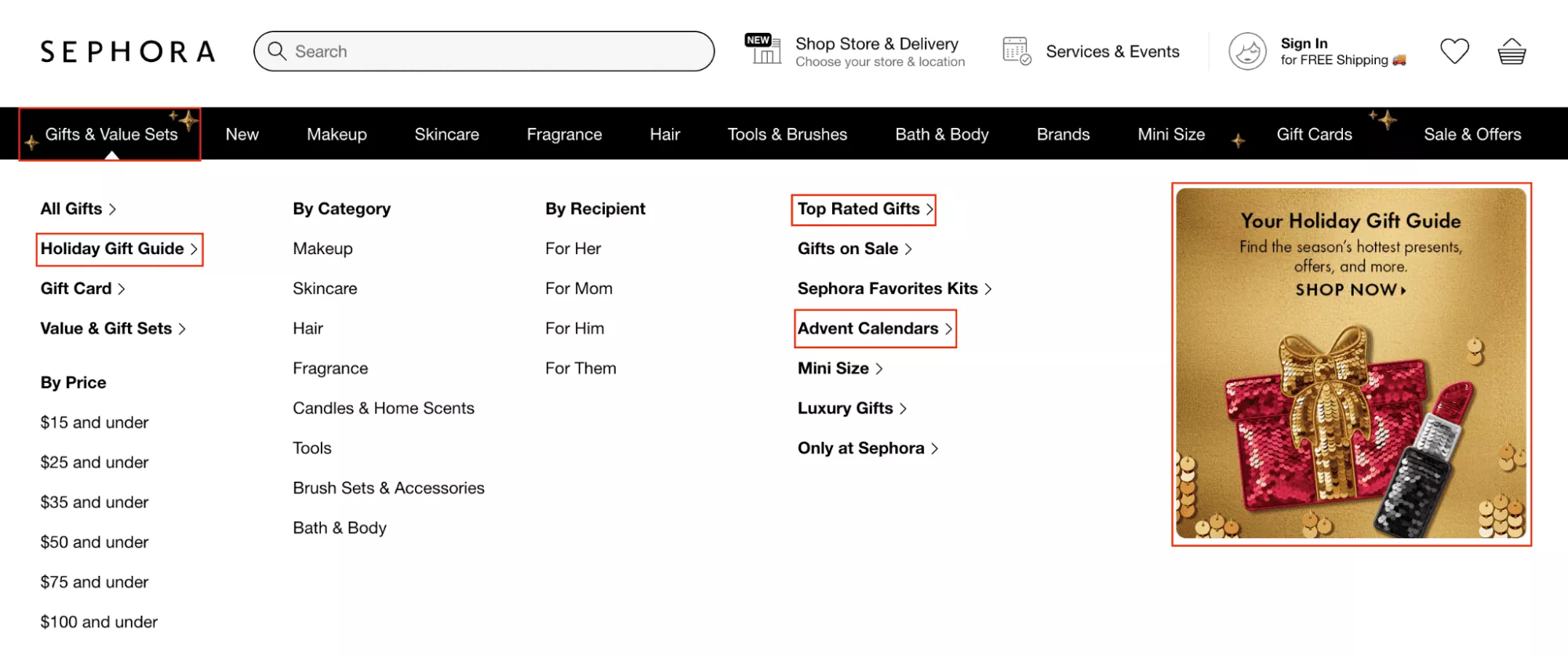
So the simplification of a navbar can be done very easily. Even this Sephora navbar is not something that is phenomenal, but I think they do a decent job. If you see, there’s still too much happening here as well. So you want to just keep it simple.
✅ Create a *distinct* holiday hub
Create a distinct holiday hub of sorts — where you have just the top two or three things that matter.
Example: if you’re a gifting store that does bouquets, wine packages, chocolates, and that kind of stuff — we have a very large company we work with that does that — in their case, we’ve done tests over the last four years and narrowed it down to something really simple.
There are only three things that people really care about.
The first is who they are gifting.
The second is how much the gift really costs.
So as long as you can help them choose gifts for “mom” or “wife,” and they can see something between $200 to $400, they’re good. That’s the two levels of filtration you need to give them.
And then let them dive into the catalog. Let them browse. Let them find something that makes sense to them.
✅ Use icons with care
Use icons with care. I often see that there’s an overload of emojis and icons, and there are bells hanging on the top, and there’s snowfall happening on the website, as I already said. So just be careful, be cautious about that.
✅ Test under pressure
And generally speaking, test the entire experience under pressure.
I often say this — do the “baby and mom” test. Hold a baby in your right hand and your phone in your left hand, and then browse your website. That’s the way to know if your site is easy to browse or not.
Because if your navbar is tucked away in one corner, and you have your left hand, it’s impossible to reach that navbar. So you’re going to have to design the site like a mobile application for it to be usable for a person like that.
8. Forgetting the Post-Purchase Experience
Forgetting the post-purchase experience — extremely important. You don’t want people to feel like they were sold something. You want them to feel like they made a fantastic decision.
For example, I don’t know if you’ve bought this — I tried it once, but I just want to give you a couple of examples of great buying experiences. Athletic Greens, although it’s a controversial health supplement, is very famous. But the purchase experience with Athletic Greens is phenomenal.
When you get the packaging, the communication that comes with it — they remind you to take it, they tell you how you’re supposed to be benefiting from it. The packaging is phenomenal, you get freebies with it.
So the thing is, with one transaction, you’re likely to win hearts instead of just winning customers. And that should be your focus with the post-purchase experience.
One of the things that happens is that anxiety replaces excitement almost immediately after somebody places an order. They start wondering if it’s going to reach them on time or not.
Do not create absolute silence. Continue to engage people.
Have a post-purchase funnel in place — set up a flow. We do that as well. We run email marketing for more than 100 customers right now, sending millions of emails every day — and post-purchase is a very key part of creating loyalty.
You’re losing repeat potential if the delight doesn’t carry forward after checkout.
So, how you could give the shopper a fantastic post-purchase experience:
✅ Set clear festive expectations
Right after checkout, give them reassurance — “Your order is placed, the team is working on it, we’re all hands on deck.” Put a photo of your warehouse — put a nice meme showing people taping boxes, something that says, “We’re on it. We’ll make sure it reaches you.”
✅ Turn delivery into delight
The second thing is — turn delivery itself into delight. Put a handwritten note in there. I’ve seen people we’ve worked with, back when they were small, do that so well that some of their loyal customers are still with them.
For example, there was a gentleman running a health supplement store out of Minnesota. During the holidays, he had four kids — and they’d ask the kids to write short handwritten thank-you notes. “Thank you for buying from us,” or “We’re so thankful you chose us for the holidays.”
And it’s fantastic — you open the package, and there’s a kid’s handwritten note in it. That takes the experience to the next level for sure.
✅ Proactively manage delays
Also, proactively manage delays. If weather or volume slows down shipping, you’ve got to make sure you compensate for that — maybe with gift cards or a digital note of some kind.
9. Price Points and Psychological Thresholds
All right, price points that breach familiar psychological thresholds — this is a very common misconception. People often think they can keep using these age-old pricing tricks to create excitement. I’m going to give you some new ones and a few things that might matter.
The most interesting thing you can do is take a look at your entire pricing — from your most expensive to your least expensive product — and then look at a product-level conversion rate.
And look at what products are getting the most clicks versus most conversions. Like I’ll just give you an example.
We had a jeweler that we were working with in New York — we still work with a bunch of jewelers out of New York — and on their website, they had a diamond-studded Wolverine necklace, which had Wolverine claws.
So, really an extremely specific product that’s not going to appeal to a lot of people, but that product had the highest traffic on their website. Because on social media, it would land up on someone’s story every once in a while — someone famous — and they’d say, “Hey, look at this ridiculousness.” And then people would visit that page.
So, when we saw that skew in traffic and looked at the traffic separately, there were pages that had lower traffic, but the conversion rates were extremely high.
✅ Audit your natural price bands
So I’m just saying you have to kind of look at what prices people are appealing to more versus less — what pages have higher traffic versus more conversions — and where the funnel works better versus worse in general, in terms of collections.
✅ Anchor both price and perception
Once you’ve done that, then create anchoring with pricing. For example, you’re saying, “Hey, everything is $149 here, but for the next three days, everything is going to be $99.” And so you’re anchoring the price at $149. The anchored value is much higher, so show the bigger price first and then the smaller price.
✅ Structure your store by spending tiers
Also, structure the store by spending tiers. I already said this to you earlier with that gifting store example, right?
This is a very easy thing to do. If there’s a gift corner that you’re creating in your store experience, you need to do the tiering — gifts under $25, under $100, under $200, and then so on.
And I think that would go a long, long way.
10. Non-Holiday Friendly Delivery/Return Policies
All right, delivery and return policies. I’m going to keep this really simple.
I don’t know why, but when brands go on sale, they often take away flexibility. I understand there’s cost involved, but when you add a sale and then take away flexibility — it reduces trust.
Sales, in general, are not a trust-building element. They’re an excitement-building element. When you run a 50% off sale, it doesn’t make anybody trust you more — it just increases your chances of them buying because now they need less trust to make that purchase since the price has gone down.
So when you also remove returns or delivery-related flexibilities, that takes trust away. Your sales don’t have a net positive impact if you take that away.
Generally speaking, gifting already makes people anxious. There will be people who’ll do things last minute, and there will be sizes that won’t fit. So if you’re very strict with your returns, it’s going to kill confidence.
And if you don’t have flexibility, it’s going to be an issue.
So I would recommend you sit down and do the math — think through what your RTO (Return to Origin) was the last two years, and what the cause of return to origin was, and how you can avoid that cause — instead of just creating a blanket “no returns” or “no returns on discounted orders” policy.
If that’s possible, policies can actually be a win-win.
Free shipping, free returns, 20% off — I know larger companies, since they’re flushed with cash, are more likely to do things like this. But I still feel we should bet on it, because the dividends it pays in higher conversion rates are going to be much greater than the cost you might incur by honoring these promises.
✅ Extend the return window
Give them the ability to return the product up until January.
✅ Be transparent about delays
If there are any, just let people know.
In fact, don’t promise deliveries as much as possible. What you could do instead is promise when the product will leave your warehouse. That way, as they say in Top Gun, “your ego will be writing checks that your body can cash.”
You’re making promises you can actually keep.
✅ Offer perks for early bird shopping too
Influence behavior in the opposite direction. If you don’t want people to be last-minute shoppers, give them a reason to buy early.
If you don’t want them to pick the wrong size, do a size comparison. For example, we have a client that sells snow boots, and they have a size chart that compares their sizing with Adidas and Nike.
It’s so counterintuitive — they’re putting competitors’ names on their own site — but they know everyone has bought Adidas, Nike, New Balance, or some other big brand before.
So they say, “Hey, if you’re a UK 11 or a US 12 in Nike, you’re a US 11½ in our brand.”
And it’s powerful because it creates so much trust. People pick the right size almost always, and there are no returns because of that.
So you’ve got to be smart about how you handle that.
11. False Urgency and Timers
False urgency is dead. There was a travel company that recently got fined more than a million euros in Europe because they were selling flight tickets that said, “Only three left,” or “Running out fast,” when that wasn’t true.
They had only three left with them — but the flight itself had more seats. That’s deceptive, and obviously problematic. And we all know European courts will come after you if you make the wrong promise.
But beyond legality, you shouldn’t kill credibility by saying something that’s not true. Don’t make your customers skeptical — the moment they see something like that, they start doubting you. They think, “Is this even real?”
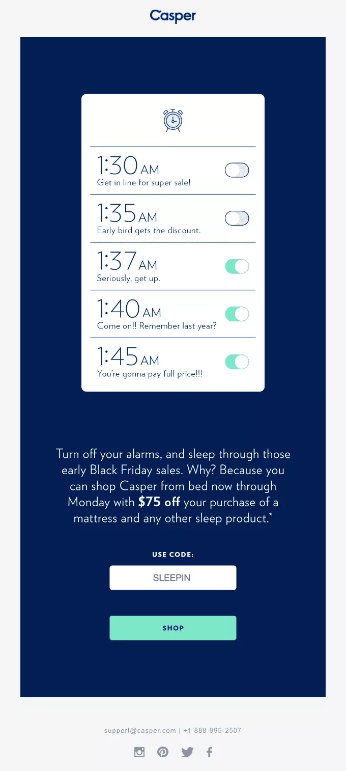
✅ Don’t turn excitement into pressure
Instead, do smart messaging. I really loved this example — it’s probably how most of our alarm apps look on an iPhone, right? Multiple alarms — you were supposed to wake up at 2:00 a.m., and you’ve set seven alarms leading up to it.
That’s great copy and great design play. It builds urgency without feeling manipulative.
So flip the tone. Say things like, “We’ve got you covered till all of Bright Friday weekend,” instead of “Hurry or miss out.”
12. Overlapping Timers
Also, if an offer repeats, just tell them it repeats — instead of running a fake timer.
I’ve seen a website — I won’t name it — that sells phone skins. They have a timer running on their site 365 days a year, and it resets every two hours.
Everyone knows it’s fake. It might have worked for six months, but once the repeat cycle starts, it’s completely dead.
Now, about timers in general — be cautious.
You have sales running from Thursday to Monday — Black Friday to Cyber Monday — but then you also have product pages saying the sale ends in four hours, or one product locked in for 15 minutes, and so on.
You’ve got to be careful about how you communicate that. Don’t overwhelm people. Keep it simple.
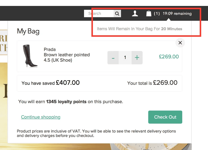
If you want to use a countdown timer, make it believable.
For example, “Items will remain in your bag for 20 minutes.” That’s subtle, realistic urgency. You’re not faking it, and you’re not creating unnecessary pressure.
✅ Pick a core urgency driver
Use a single line, a meaningful timer.
No fake resets, no false countdowns. Pair countdowns with context — for example: “Still time to order — it will ship for free if you order in the next 24 hours.”
And then actually end the offer in 24 hours. Don’t keep it running.
Closing
All right, perfect. So those are 12 ways in which you could avoid your conversions from getting killed.
I know there are some things you were probably planning on doing that we’re suggesting you don’t do — but yeah, I hope this was of value. I hope I was able to give you ideas that you’ll actually be able to implement.
Thank you so much for your time, everyone. Have a fantastic sales season. We’re going to do another one closer to Thanksgiving, I believe — or just after it. So I look forward to that, and we’ll be in touch very soon.
Get Fresh ideas to boost your conversion rate
(stuff that works for hundreds of stores)
Request a Free Site Audit"Convertcart’s Audit Report was deep and insightful. We never thought they would spend so much time in building and sharing such insightful content, free of cost."


Logan Christopher
Lost Empire Herbs