On-Demand
Nudge Marketing Masterclass - Persuading Shoppers Without Being Pushy
Like candy at an offline checkout, smartly-placed nudges on your store guide customers toward a purchase.
Nudge marketing uses prompts and cues (such as time-limited offers) to get customers into taking action.
It is a scientifically proven way of increasing conversions.
Unfortunately, a lot of stores end up overdoing nudge marketing.
While using nudges, we must be positive and encouraging—without sounding desperate—without causing any annoyance—and still getting traction—is what we will discuss in this live session.
A few things that we’ll talk about:
👉 The most successful types of nudges - dos and don’ts, what pages to use them on
👉 How to implement nudges without coming across as pushy (without annoying the shopper)
👉 Some great examples of nudge marketing on real-world ecomm stores


About the speaker

Shekhar Kapoor
VP, Marketing
Convertcart
Shekhar Kapoor (VP at Convertcart) has worked with 500+ online brands, including Squatty Potty, Prep Expert, and USA Hockey Assn., and helped them boost sales exponentially.
Shekhar Kapoor
VP, Marketing
Convertcart
SESSION REPLAY – NUDGE MARKETING MASTERCLASS - PERSUADING SHOPPERS WITHOUT BEING PUSHY
Okay perfect. I think that couldn’t have been better — just trying to get the Friday and the weekend vibes in with the “take it easy” vibe here.
Alright, so let’s jump right in.
Thanks so much for joining us, folks.
We’re expecting quite a crowd, so I’ll just let people join in as I continue to walk you through what we have here, and a little bit about why we picked what we picked.
So, nudge marketing — I just felt that that’s a field or an area that’s over-exploited yet underdone.
And the reason I say that is because everybody does popups and messaging on the site, but not a lot of psychology goes behind the way you should do it and the way it works.
So let’s jump in.
The Most Classic (and Familiar) Example of Nudge Marketing
Now, the whole idea behind nudge marketing was to, instead of prompting people to do things, persuading them to do it — and that’s why the sub-copy here.
One of the things that really stood out was: we thought, okay, what could be the best way to begin talking about nudges and give people the perfect example?
And I couldn’t think of anything better than the Netflix nudge.

In this case, you’re not even required to click. It just nudges you to watch another episode.
And if whatever you’re watching is good content — which it’s supposed to be if it’s on Netflix — you’re likely to stick around for another one.
For example, my wife and I were binging on MasterChef Australia. I don’t know for what reason — don’t ask me why — but it’s fun.
If you’ve not watched it, I highly recommend watching MasterChef Australia. Not any other MasterChef. Not Hell’s Kitchen, not Gordon Ramsay’s show. Go and watch MasterChef Australia. It’s really fun.
But anyway — the problem with watching something like that is it’s a black hole. You get sucked into it. And product managers do a good job of using nudges the right way, using them so they work the way they do.
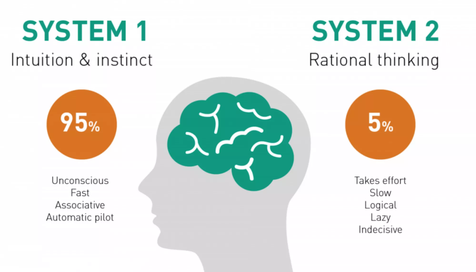
The Psychology of Nudges: Heuristics and System 1 Thinking
And interestingly, when you think about nudges, they are essentially built on the concept of heuristics.
Now, heuristics are mental shortcuts. For lack of a better way to put it, it’s essentially your mind deciding to do things very quickly, very efficiently, without having to process a lot of data, without having to think too much.
Right? It’s when you instinctively sometimes know things.
It’s not when you instinctively know you need to have a beer — that’s not a nudge, I’m sorry.
But yes, if you see a microbrewery while you’re driving and think, “Hey, you know what, let’s have some fresh beer,” they’ve essentially placed that entire apparatus outside so you see it and walk in.
Nudges are built on heuristics. Mental shortcuts.
So what you’re aiming for when you work on nudges is leveraging the two systems of the mind — specifically System 1. System 1 is unconscious, instant, generally on autopilot.
System 2 is the rational, deliberate system.
I don’t know if everyone has read the book Thinking, Fast and Slow. I highly recommend reading it. I think 99% of the people joining us today are entrepreneurs, and some of you are marketing leaders. It’s one of the books that really changed the way I think about things.
Generally speaking, with nudges — especially in a shopping context — you’re trying to influence System 1. You don’t need the shopper to sit back, process anything, do anything logical, or make a large intellectual decision. You’re going after intuition and instinct.
Now that we’ve established the psychological groundwork of how nudges work, let’s jump into it.
How to Use Nudges
So now that we’ve established the psychological groundwork of how nudges work, let’s jump into it. And we’re going to start with the not-so-great ways of doing nudges. And now it’s just ideas, ideas, ideas.
1. Nudge, don’t nag
The problem with doing nudges when there’s already too much information is: they’re going to get lost, and they’re going to increase what we call cognitive load on the person who’s looking at your product page or whatever it is you’re trying to sell on.
And that can create a lot of issues, because then you’re relying on the user’s ability to skim through the finer points that you’re trying to make.
❌ The bad way to do a nudge is, for example: in this case, there are reviews, there’s the “earn 22 Pink Points”.
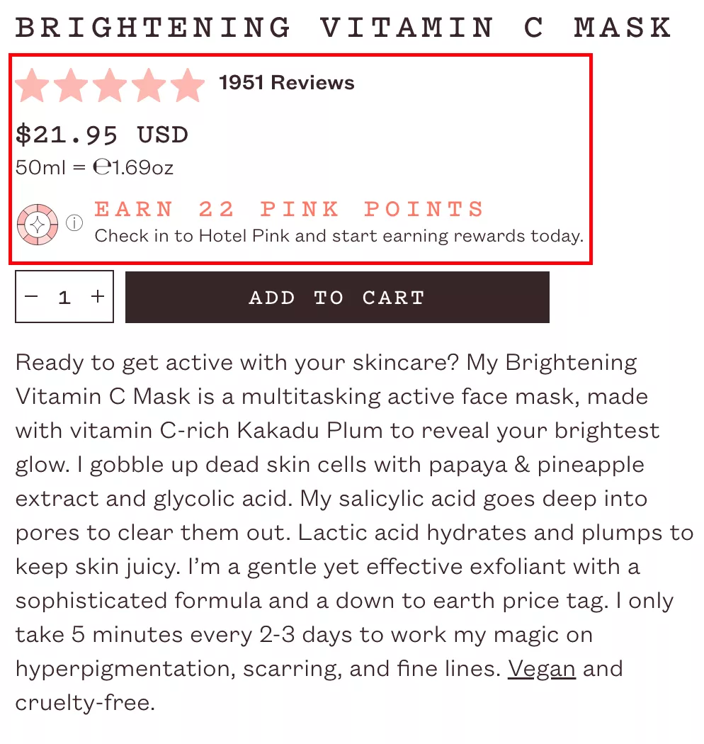
What does it even mean? It’s just too much that’s happening here.
And also, the copy doesn’t… they’re actually selling a vitamin C mask, and if you see the copy for their loyalty program, it says “check into Hotel Pink and start earning rewards today.”
So the marketer here is trying to be fancy, but I don’t think they need to be fancy. They can keep it simple.
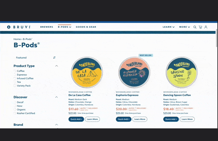
✅ And it’s important that you just do one thing at a time.
For example, in this entire page, it’s really simple: what you’re essentially trying to do here is move the customer from a one-time purchase to a subscription. That’s it.
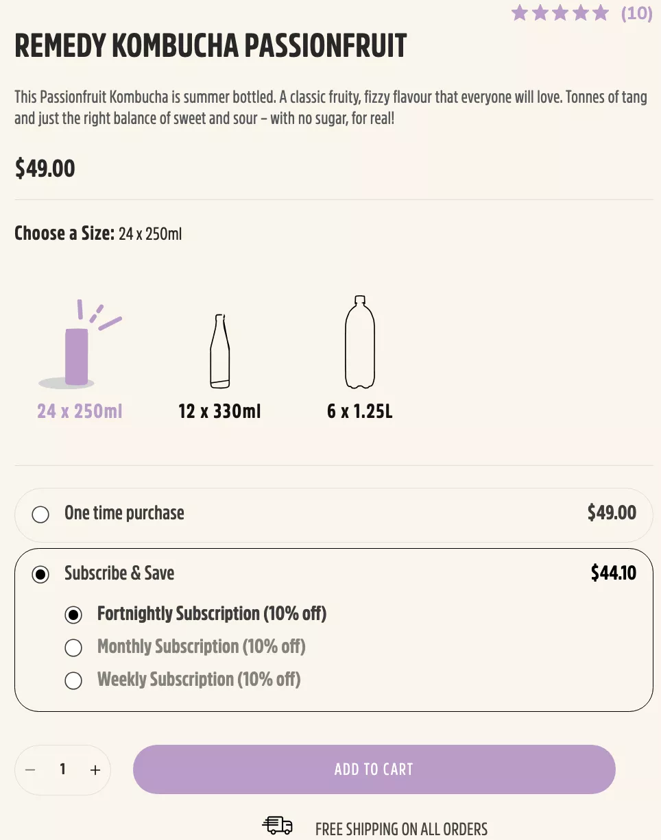
There’s not a lot happening. You’re not trying to do a loyalty and a subscription and ten other ways to buy the product, and here’s another variant. You’re not trying to do too much. Try to do very little and do it well. And that’s kind of going to be the theme as I continue to walk you through other ideas.
2. Don’t make nudges intrusive or overwhelming
Let’s move to the next one.
❌ Full-screen popups are a strict no-no.
They get results, but you lose traffic as well. And the problem with full-screen popups — not only on mobile but also on desktop — is if you lose traffic, especially senior traffic, which finds it hard to close the popup, right?
If you are in an industry that gets a lot of senior traffic, which means people who are older, then closing the popup can get hard for those people.
They will just leave, and you will lose traffic that has the capacity to buy and needs time.
✅ So it’s important that you use a hello bar at the top or at the bottom.
That’s the right way to do it. That’s the subtle way to do it. Or you could do a non-intrusive popup where the popup sits in one corner of the screen, and if they really want, only the people who spot it are the ones who are going to use it.
Full-screen popups — the other problem with people bouncing off your site, especially if that popup loads in the first 10 or 15 seconds — is that it sends a horrible signal to Google.
Which means: Google gives you a lot of credit if your time on the site is very high.
So if they came organically — they were looking for a vitamin C face mask, for example — and they landed on your site organically, and if they spent a minute or more, ideally more than five minutes or even more than that.
You know, the more the better… which is why originally blogs used to rank really well.
Because generally, people were looking for answers to their questions. For example: “How does the keto diet work?” And you would go on this blog that talks about how it works, what ketosis is, what kind of food you need to eat, and so on.
Generally speaking, that’s the reason those blogs would rank — because you would spend that much time on it.
But if you have a full-screen pop-up which makes you lose even 5 or 10% of your traffic, it sends a signal to Google that the content you showed after Google sent traffic to you was not relevant.
So you’re not going to rank for the stuff that people are coming for in that instant. I hope that makes sense.
3. Don’t replace the close button with a shaming option
❌ The other thing is, I think a lot of people try to shame their customers into using the popup.
“No, I’ll pay the full price,” or “No, I don’t like discounts,” and all of that.
I understand you’re trying to be smart. I understand a lot of pop-up tools have this template by default, and it’s okay.
But I just feel that conversion rate optimization has gotten to a point… it used to be about superficial stuff when the internet was new.
Tricking customers into doing stuff, clickbait, etc., was considered okay. And then people started to call it out.
Now, if you go to a YouTube video that uses a clickbait title, the comments are just hate.
Everybody hates clickbait. “This happened when I was in a Las Vegas hotel,” and nothing happens on the video.
And so you don’t want to do that.
✅ Similarly, you want to be kind to your customer.
So if you still want to do something like this, where you want to avoid one… see, the purpose this button plays is: generally speaking, people don’t even look at what’s written on the pop-up.
People don’t look at what’s written on the pop-up at all.
You’re just trying to make it harder for them to close, so they actually see the offer, which is the 10% off or some other incentive you’re trying to give them.
There are several other ways to achieve this.
And I feel it’s a function of playing with copy. I’ll let you come up with your own innovative way of doing this.
We can look at your site and come up with stuff that is specific to you. But generally speaking, we’ve seen that shaming your shoppers versus A/B… so we do a lot of A/B testing.
Of course, we have more than 300 customers, we’re running an average of two to three tests for them every month, so we’re running about 12,000 experiments a year.
We do this at scale, and we have exposure to a lot of data, which gives us the ability to say something is wrong or something is right.
4. Don’t leave room for doubt - don’t confuse shoppers
❌ “Don’t leave room for doubt.”
So this is again clickbait. In this case, you’re selling a shower gel, and you’re saying the pricing starts from eight pounds here.
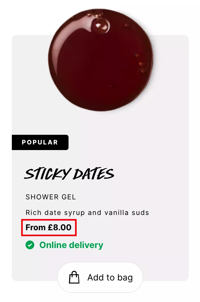
And the problem with that is: when you open it, that’s going to be the travel size. So it’s going to be this really tiny one-use bottle. So it’s obviously an expensive product, right? And you really don’t want to… again, don’t trick your customers.
When you want to nudge customers into understanding what the price looks like:
✅ you want to make sure your pricing looks smaller.
I have two other tricks for it — and we have a whole webinar we did for this the last time, which was purely about pricing tactics.
It’s recorded, it’s on our website. I recommend you go and check that out as well. It’s purely about smart ways to do pricing so that it is more convincing.
That’s what that webinar was trying to cover.
But in this case, a couple of ideas I can give you: generally speaking, on your site, place the most expensive products on the left.
So, if you’re on the collections page, and you have about nine products showing up:
- the first column has to be the most expensive,
- the second column less expensive,
- and the third column least expensive.
What that does psychologically is: you’re setting the expectation.
Because everybody consumes content from left to right. And psychologically, you’re setting the expectation that prices are high, and that makes the second and third product — it’s called anchoring.
For example: Apple launched these VR headsets, they called them the Vision Pro.
They’re going to cost you both of your kidneys. They’re so expensive.
Which suddenly made the Facebook — the Meta — headsets look significantly more value for money.
That’s what happened with my cousins and everybody that was talking about it.
The moment Apple launched the VR headsets, everybody went and bought the Meta headset.
There’s a lot that’s common; there’s a lot that this one is going to do that Apple’s not going to do.
There’s a huge difference between the two.
But still, everybody went and bought the Meta, because Apple anchored the price so high that it made spending $500 on something you don’t need obvious.
So that’s something to think about.
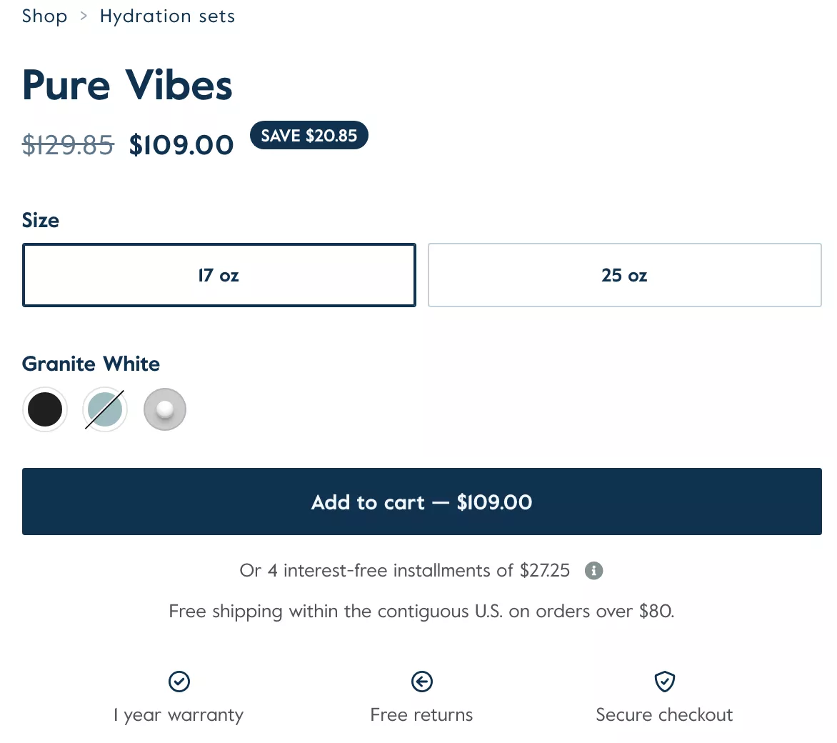
And keep things simple. Keep it transparent.
In this case, for example, a $129 product is available for $109, so you know how much money you’re saving.
There are two quantities, three colors, one not in stock. You can pay using installments. Shipping is free.
There’s warranty. The simplicity is something we’ve seen works really well.
In a lot of cases, we see Shopify stores, in the hope to optimize for conversions — in the hope to excite the customer or pursue the customer — just add stuff to the product page.
And sometimes addition can be subtraction.
Sometimes removing things can add a lot of value.
Spend some time on your product page today, and think about the pitch you’re trying to make to the customer who has never seen your product.
There are platforms like UserTesting where you can pay some money and get strangers to look at your product or your website, and then comment on what they like or don’t like.
Or you can take an audit from us — we’re happy to tear it apart based on our experience of having optimized hundreds of e-commerce websites.
5. Don’t sound bogus
The other thing that I feel businesses are doing more and more is:
❌ plugging in different tools or apps that essentially try to oversell.
And in this case, for example, this is a personalized recommendation. We were surfing this site, and we were looking at stuff that was completely unrelated to what you see in the recommendations here.
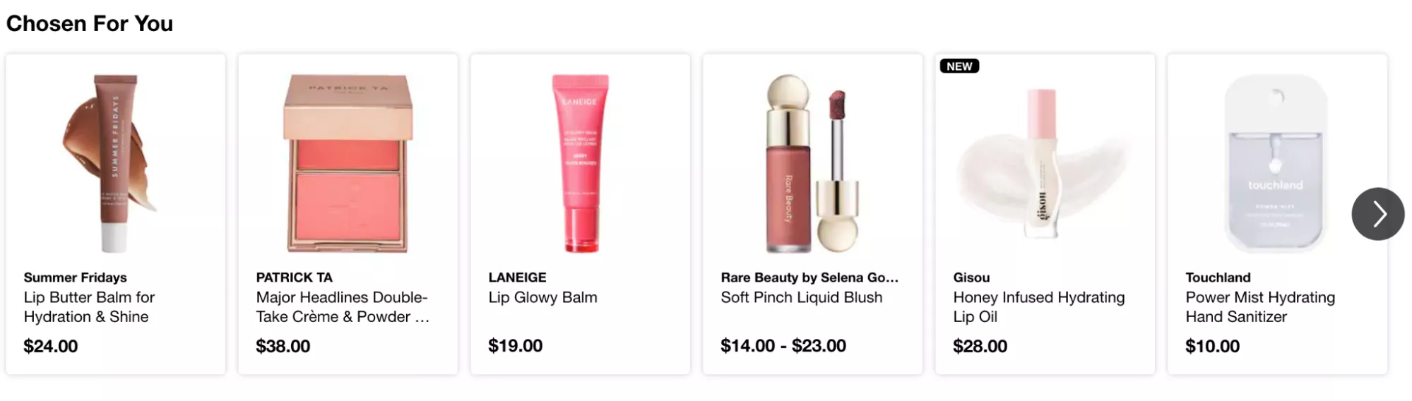
Now, the reason it was showing that is: it was probably working on a logic that was showing the shopper the most bought products or the highest purchased products from a different category.
So essentially, it was a cross-sell.
For lack of a better example: I’m buying leather bags, I’m looking for a laptop bag, and it’s showing me recommendations “chosen for me” of duffels and maybe a straw bath bag.
And that’s not ideal. It’s definitely not chosen for me. And the customer can see through that.
✅ So honest personalization goes a long way because it adds impact.
One of the easiest, most intuitive ways to do it is: ask the customer what they want.
And I feel that not enough companies do this.
We have a full-blown product built for this, so we do this for a lot of our customers.
We essentially build out a wizard, and it works like a dream.
In this case, for example, you’re just asking them: “Hey, where are you on your coffee journey? Are you a connoisseur? Are you pretty much a barista now?” And based on that, you send them to the products that make the most sense for them.
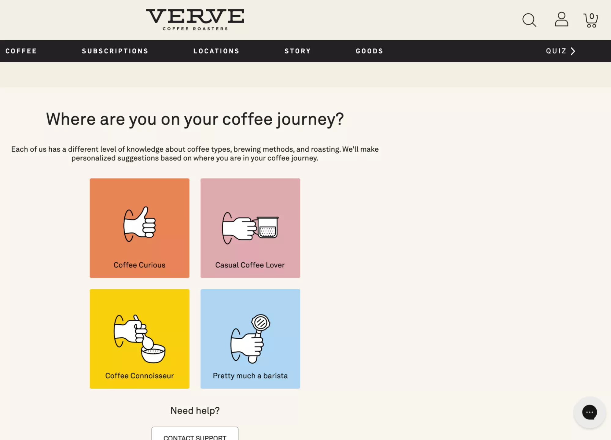
So for someone who’s a connoisseur, you can send them to these really small-batch coffee bean bags they can buy.
And for someone who’s just a casual coffee lover, start them off with bundles — instant coffee plus beans plus a crusher and maybe an AeroPress.
The intention is to put… it’s okay to ask your customers.
One of the other things I recommend doing — and there are multiple ways to execute something like this — let’s say you’re selling personal care products.
If you're selling personal care products, for example, the journey can begin with the problems the personal care products are solving.
For example: “How can we help you today?” And it says:
“I have dandruff,” or “I have dry skin,” or “I have oily skin,” or whatever it is.
So you can kind of list those out.
Then your customer is not shopping based on skin/hair categories — the traditional way a Sephora is laid out.
They’re shopping based on their problems.
And that’s one honest way to personalize, as opposed to just showing:
“Hey, you know what, we chose the products for you.
We don’t know anything about you, but we think we’re right.”
It just doesn’t seem right, and it’s better not to do it.
6. Don’t show vague nudges
❌ Also, vague nudges don’t matter.
I often see people have cart call-to-actions that are just shaking for no reason, or they’re popping out every time you add something to cart.
You’re just trying to push… psychologically, I don’t blame us. I don’t blame the fact that we all want the customer to just buy.
That’s what we all want at the end of the day.
We spend a lot of money driving the traffic we get on our sites, and we want the customer to buy, and so we try everything possible to move the customer along the funnel.
“Hey, I really wish this guy has added it to cart, I really wish that shaker goes to the cart,” and then you have that cart that’s shaking.
And it’s just a distraction.
So I recommend… all of that is not going to matter.
When the customer is ready to buy is when they will go to the cart.
And the reasons — or the real reason — they’ll actually buy ultimately will depend on:
- whether you helped them find something they love (product discovery),
- whether they are convinced that they want to buy it (do they trust you, do they trust the brand, do they trust the product),
- do they like the price,
- could they not find a competitor… it’s so easy to research these days.
Almost everything has a YouTube review — you wouldn’t believe it. Almost everything has a YouTube review.
And that’s the reason, especially for purchases above 100 bucks, everybody is watching reviews or doing their research and then buying.
Except, of course, if you’re selling luxury products.
In that case, you have customers or clientele that don’t care for reviews — they care for quality, and they’ll pay anything for it.
✅ So my point is: it’s important to nudge your shoppers towards distinctive actions.
A quick view on the collections page, showing them the cart once they've added something to the cart.
Like in this case, and then asking them:
- “Do you want to continue shopping?”
- “Do you want to view cart and check out?”
- “Hey, you might also like our socks,”
- “You might like this other product we’ve got.”
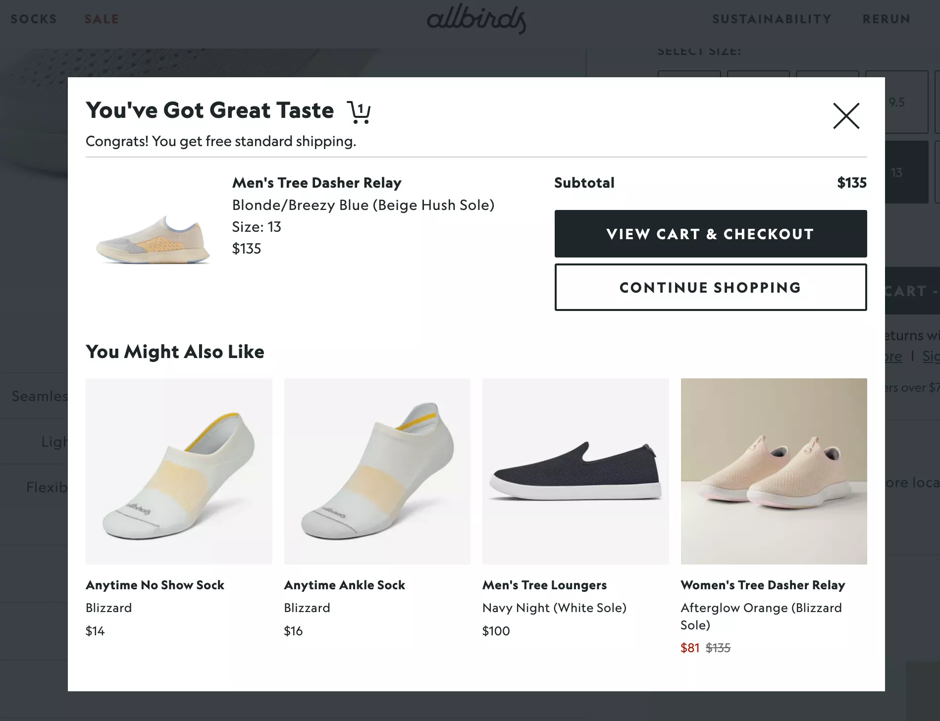
I feel doing it with ingenuity really goes a long way.
Let’s move to the next section. We are about 23 minutes in, and I want to take the next 15 minutes to walk you through some of these other interesting ideas we have, and then I’ll open it up for questions and answers.
This is by far the most important takeaway — or idea — I want to give you on the call today.
7. Nudge with unusual copy
I have a few friends who run copywriting businesses, and the impact they’re able to create is incredible.
I feel that product description, for example, is probably one of the most ignored parts of most e-commerce websites. It’s the only thing that helps you pitch your product, your story, really well.
And I feel businesses don’t do enough.
They spend an outsized amount of time on product packaging, product imagery, and just the basic stuff — including the way the price looks and the name of the product.
But the description is where you can actually convert what you may call a healthy skeptic — somebody who is diving into your site, who’s taking the two minutes to understand if they want to buy this product or not.
So it’s extremely important.
In this case, for example, Beardbrand says “get this product on us.”
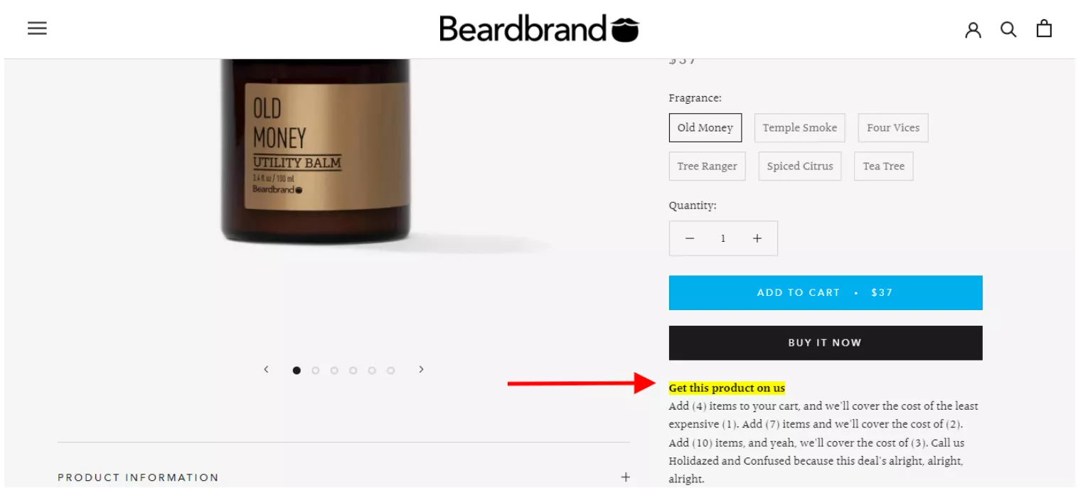
But what they really mean is: it’s free shipping. So you’re not getting the product on them — you’re getting the shipping on them. Interesting, isn’t it? And it’s highlighted in bright yellow, so you’re not likely to miss it.
Another reason why I feel this is the most important takeaway is:
even if you don’t have a brand story, and you’re just… if you’re a trading business, you're buying stuff and selling stuff, it’s important to still find that story in the products you sell.
For example, for all we know, your products are manufactured on US soil — or whichever country you’re from.
That could be important for your customers.
Or it could be that you have sustainable packaging — your product is probably leather goods, but you’re at least packing it in sustainable material.
Or it could be that you donate a dollar for every sale towards something.
I don’t know what it’s going to be, but the important thing is to use unusual ways of saying things to draw attention to the stuff that matters.
For example:
- “Add four items in your cart and we’ll cover the cost of the least expensive.”
- “Add seven items, we’ll cover the cost of two.”
- “Add ten items…”
It’s interesting what they’re trying to do. Generally, for me, for these offers, it becomes very hard to find the four items that I like. So that’s one interesting thing.
8. Build trust fast
❌ The other thing I feel businesses do wrong is: they think that if they say they can be trusted, they will be trusted.
And I think Convertcart is guilty of that too.
We used to run an ad for a long time that said “trusted by 200+ businesses.”
It works, but it doesn’t work on the really smart customer that you’re trying to appeal to.
✅ In this case, what’s really happening is: there is a review summarization.
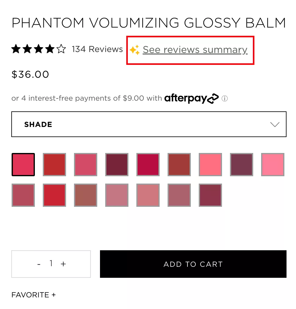
So if you click on it, it essentially has summarized and given you a couple of paragraphs.
We also have a similar feature — we use generative AI to analyze the reviews, and we show it in a popup. So if you click on it, you will see reviews that… it’ll essentially sum it up:
“Hey, the material is great, the packaging is great, it stays on for four hours, so it’s a fantastic product.”
But some people complained about how the shade might not be right for a certain skin color.
You can kind of spin it the way you want to spin it.
I feel there is a phobia of bad reviews, which is fine — obviously there should be — but you need to leave some of them in.
I feel everybody using Yotpo-equivalent tools to publish reviews on the site are just moderating all the bad reviews away.
So there are 50 reviews, all of them are five-star reviews.
And that’s not true. Your customers know it’s not true.
And if that is true, you should be doubling every six months in size as a company, because you’d have insane word of mouth.
But that’s not true. We both know it’s not true.
So leave some of those bad reviews in. And it shouldn’t be those obviously fake ones, like: “This product had too much quantity, we couldn’t finish it.”
It’s obviously fake. Your customers won’t believe you.
Please ensure you rely on what we call the blemishing effect.
By the way, a lot of these ideas — most of these ideas actually — came from our amazing content team. I recommend you check out our blog.
We put a lot of effort into writing A-class content.
Everything we write, we truly believe in.
We don’t use any AI to write content, and we do a lot of it based on our own optimization experiences.
I wholeheartedly believe you will learn at least five things if you spend half an hour on the blog today.
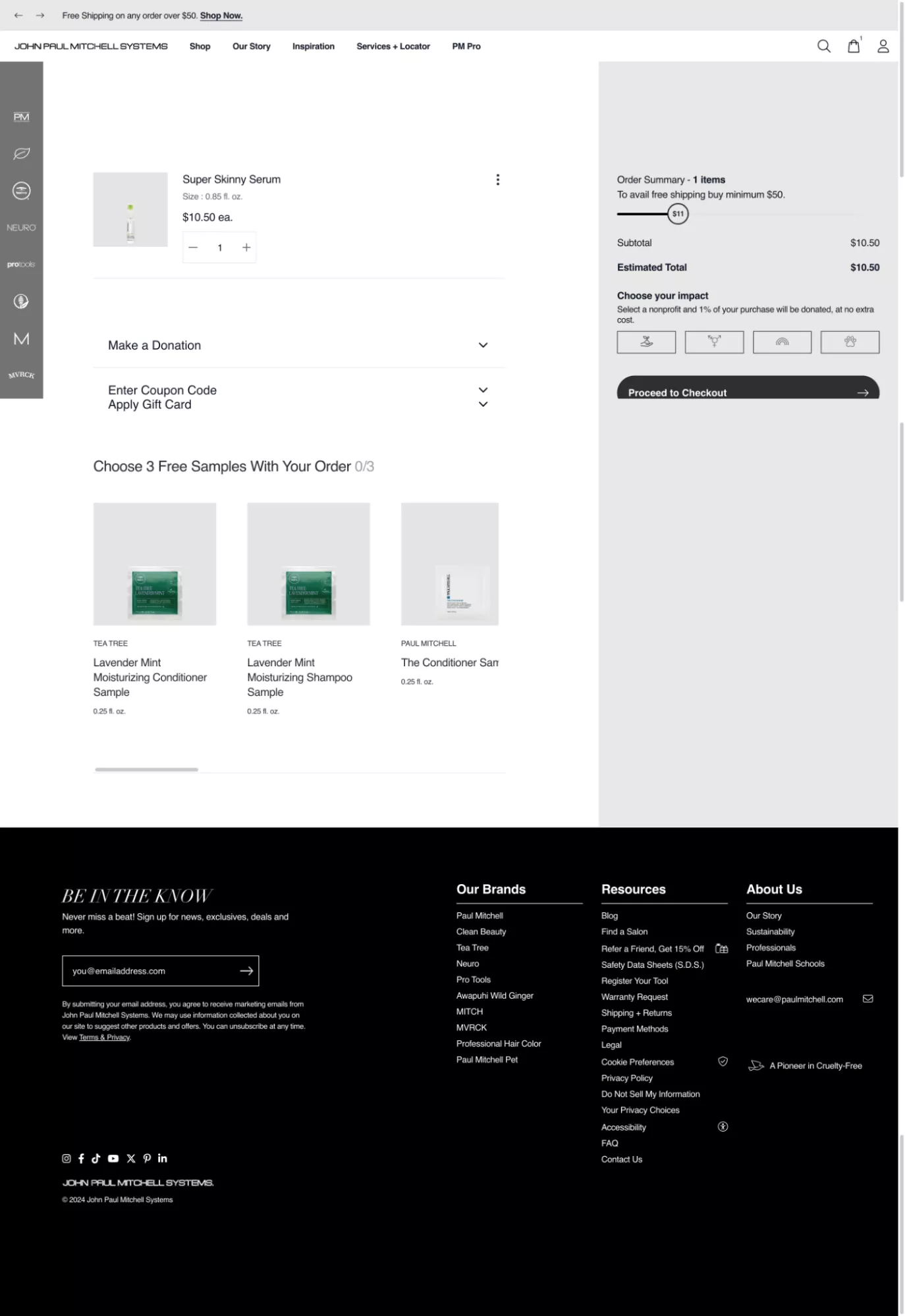
9. Pre-select choices (Help them choose faster)
Choices — now, the thing about selling products that have a lot of options is: you’re making it harder for the customer to buy, fundamentally.
For example, printing websites — websites that sell business cards — and we’ve worked with a bunch of those… it’s just crazy what they’re trying to do.
When you start building your business card, you start from a template. Then they ask:
- what kind of paper do you want,
- do you want rounded edges,
- do you want lamination,
- what is the text that goes on the card,
- what size of card do you want — square or rectangular,
- do you want 100 or 200 in number,
do you want free shipping or fast shipping…
There’s just too much happening.
So what I recommend is: create the most ideal combination of selections for your customer, and make it easy for them.
✅ In this case, for example, pre-select your bestselling options and make it obvious for them.
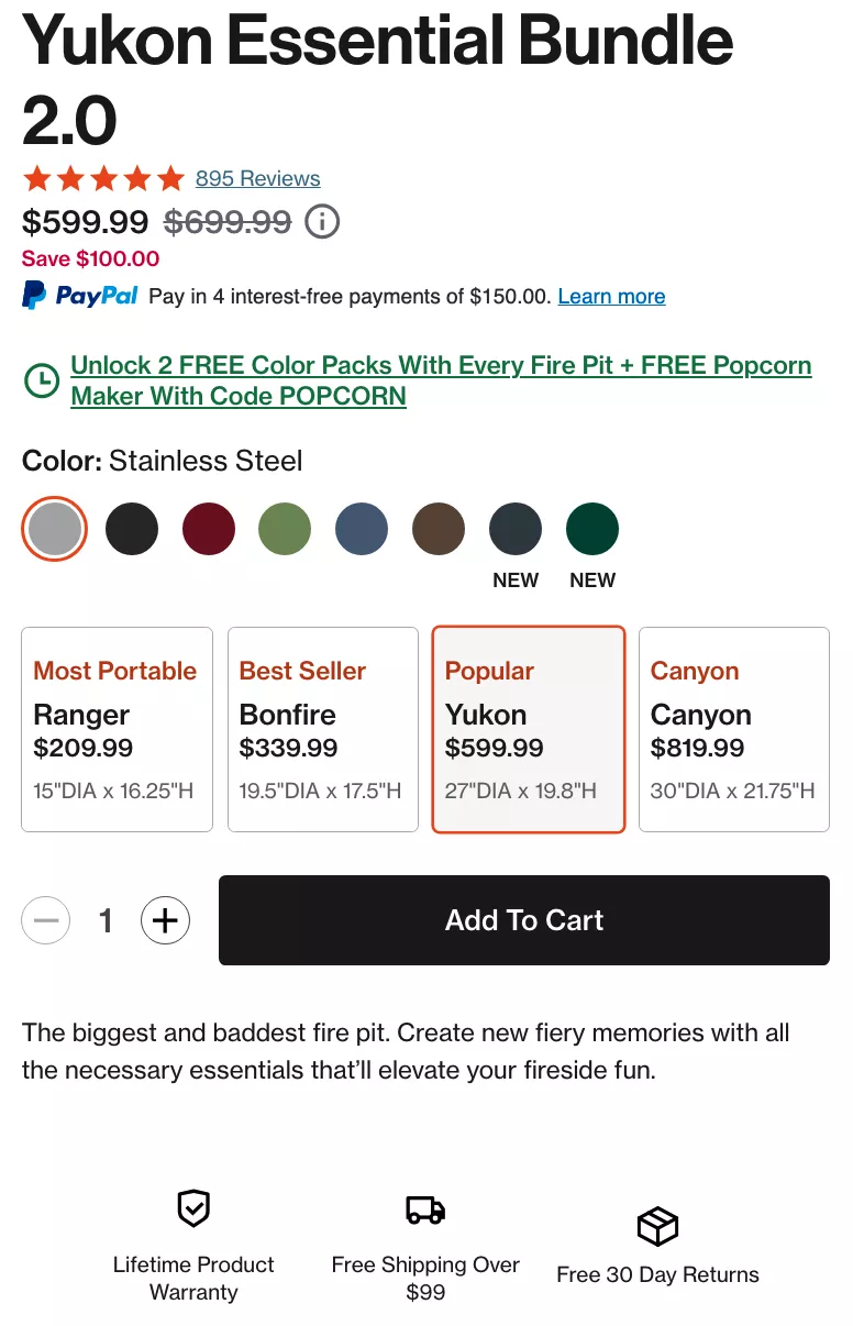
Interestingly, it’s also the second-most-expensive one.
The Canyon option is probably… and it’s also dependent on the size.
It’s what it is. But my point is: pre-select options for customers so it’s easy for them to make decisions. Don’t make your customer do the hard work.
Take advantage of the middle position
✅ Also, center-stage effect in options works really well.
Generally speaking, when it comes to options, keep the most important option right in the center.
Highlight it. That psychological nudge works.
One of the things I’ve seen — and we’ve done experiments for this — we used to work with this company called BackBlade.
They were also on Shark Tank. It’s a blade for you to shave your back. We’ve done a lot of experiments for them.
And interestingly, whenever we used to say “most people buy X,” it wouldn’t work as well.
Because most people would think:
“Okay, maybe most people are like that. I might not be that way. I might need the smaller blade size, or the much larger blade size, because either I’m a different shape of back, or maybe I’m too hairy,” and so on.
✅ So it’s important that whenever you’re nudging customers towards something, don’t be too opinionated.
For example, one of my friends runs a real estate business in Melbourne, Australia.
He buys land, constructs houses, sells them. One of the most important pieces of advice I gave him — and he agreed — is: stop building opinionated houses.
For example, having a ceiling with wood panels — nobody wants that.
So it’s extremely important to keep things neutral, and not make recommendations like “most people buy X.” There are people who don’t want to be most people.
10. Shopper shows intent - you should lead them on
Site search is extremely important. This number here is underrated.
We’ve seen cases where visitors that come to the site and make a search convert at least five times better. And so search can make a lot of difference to your business.
✅ One of the things you want to really do is make sure your search is easily accessible.
- Have a huge search bar.
- Make sure it’s sticky, so even if I scroll down, it continues to stick on the top.
- Make sure it’s immersive.
Convertcart, for example, has something called IntelliSearch.
I recommend you go and check either NewAir.com or AsaMarket.com — these are our customers — fantastic search deployments on both of them.
Make sure it’s instant, and you see a lot of options, and you can filter through them.
But even before someone has searched — for example, in this case — you already show them suggestions.
I just went to the search, and I’m seeing categories, and I’m also seeing new products. Very interesting nudge. I feel this is a great implementation.
11. Never let shoppers hit a dead end
✅ And never let shoppers hit a dead end.
Too many websites have “zero search result” pages that are boring and have essentially nothing. That’s obviously not a good thing.
12. Use Immersive Experiences
✅ Now, finally — does your brand or your business allow you to give your shoppers an in-store experience?
If that is relevant to you, there are a lot of SaaS products available that are not that expensive and will allow you to do something like this.
There are personalization tools.
There are tools that will allow your customers to upload their images, and so on. Please try and do this. Go the extra mile. Spend money on this. This part of the experience is irreplaceable.
13. Nudge shoppers to compare products
✅ Comparisons work extremely well.
Not many businesses do them.
If you’re on Shopify or any of the other major platforms, there are simple tools that can help you deploy comparison-related features.
But again: with comparison, your product description matters. The richness of information matters. So ensure you do it well.
14. Make the Page Come Alive (Visual Nudges)
Moving further — how can you make the page itself come alive?
We have a bunch of different clients that have tried to do this.
This is one such example: if you’re hovering on the product, you can see the entire product.
That’s an easy way to do it. It essentially loads a GIF, and that GIF lets you see the whole thing.
I’ve seen fashion sites where, on the collections pages, every alternate row is not product images but videos. So the entire collections page is essentially a bunch of GIFs or videos. Super cool.
Image flip and the quick-add option — instantly going to the cart — makes a ton of sense. This is a masterclass in nudges:
- you’re engaging them,
- you’re giving them the next step with the quick-add,
- and you don’t want them to go to the next level unnecessarily.
15. Involve customers in creating the product
✅ “Create the product with the customer.”
I spoke about uploading the customer image to pick glasses — if that’s relevant to your business, that’s one way.
This is an even more powerful one.
I’m sure all of you have shopped on Nike.com. And if you’re buying an Air Force One from Nike, for example, you have two options:
- Buy one of the ones they already have (which is what most people do), or
- Customize your own Air Force One.
There’s something called the endowment effect, which means if you’ve invested in the customer into the product, they are very, very likely to check out. This is also true for printing businesses.
I go back to my earlier example: a visiting card printing business.
I’ve entered my details, picked the paper I want, and I’m going next-next-next. Now I’m three steps into my customization experience — there’s a very small chance I’ll abandon.
Nike does this extremely well. If you customize your own Air Force One, you can come back… and they save that information.
So if you go back to the site, the first thing you’ll see is: “Nike Air Force One BY YOU.”
It feels pretty awesome that Nike’s website features a product that’s “by me.”
They have a massive personalization engine behind it, but you can do a lightweight version without spending millions.
16. Prominent (and easy) filtering options for mobile users
The other thing is filtration and sorting.
I feel that everybody is kind of sticking to their theme defaults.
✅ You could really go all-out with making filtration easy. Use color thumbnails. Make it sticky. Make it easy to access.
I feel it’s important to let the customer find what they want. Product discovery is by far the most important thing you need to solve for, especially if you have more than 30 products on your site.
Because if you haven’t solved that, then the customer hasn’t even found something they like, and there is zero chance they’re going to buy something.
So:
- If your problem is abandonment from the home or collections page, then laser-focus on product discovery.
- If your problem is people landing on product pages and leaving, then persuasion and everything else I’ve spoken about before this applies.
- And if your problem is add-to-cart but high cart abandonment, it could be a range of issues — maybe shipping is too expensive, lack of trust, maybe you incentivized them to add to cart but not to check out.
There could be several reasons.
17. Draw attention to product attributes
I’ve already spoken about this, but if you see — very subtle, almost no design effort. You can achieve this without a developer and without experimentation.
✅ The easiest way to do it? Edit the product image.
People don’t leverage their product images enough to make their website look better. For example, if you want to add trust seals to your product page, you don’t need a developer. You don’t need to add it to the product page template.
Just edit the hero image of your product. Add the trust seals to the image in Canva and upload it back on your site. Done.
Every product will then have trust seals — and trust seals specific to that product.
In this case, for example, the image says “Sustainable.”
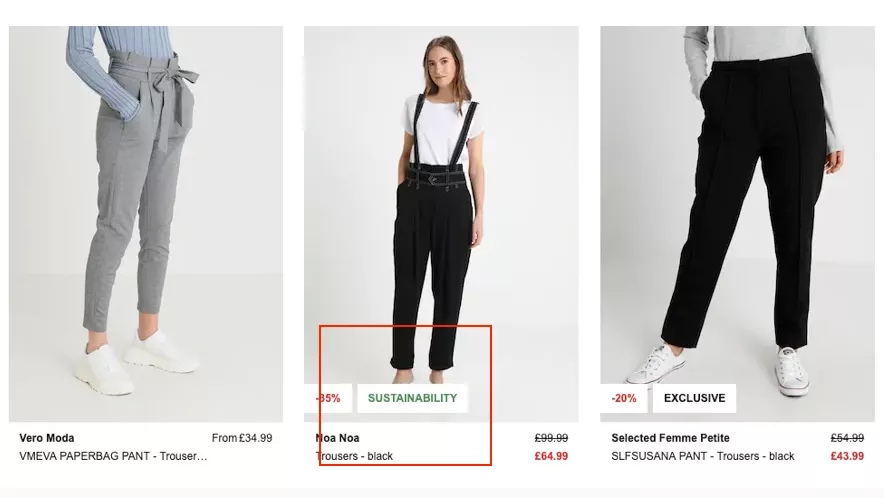
I would go ten levels deeper and talk about things that matter to that specific product. For example, if I’m selling linen goods:
- quality of linen,
- where it was produced,
- the age of the linen,
- and several other details.
It’s important that we do that.
18. Check out 👇 (CTA micro-action)
Moving further — in this case, for example, the moment I pick a variant, the “Add to Cart” button becomes black.
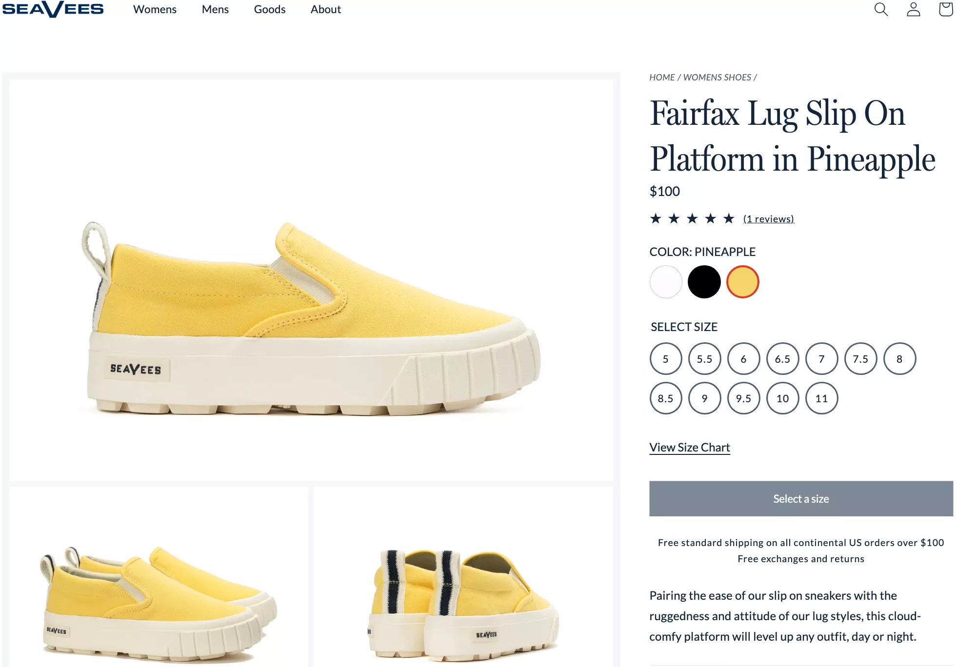
And this is a very subtle nudge. That’s why we’ve left the business logo in the example — I recommend you check it out after the call.
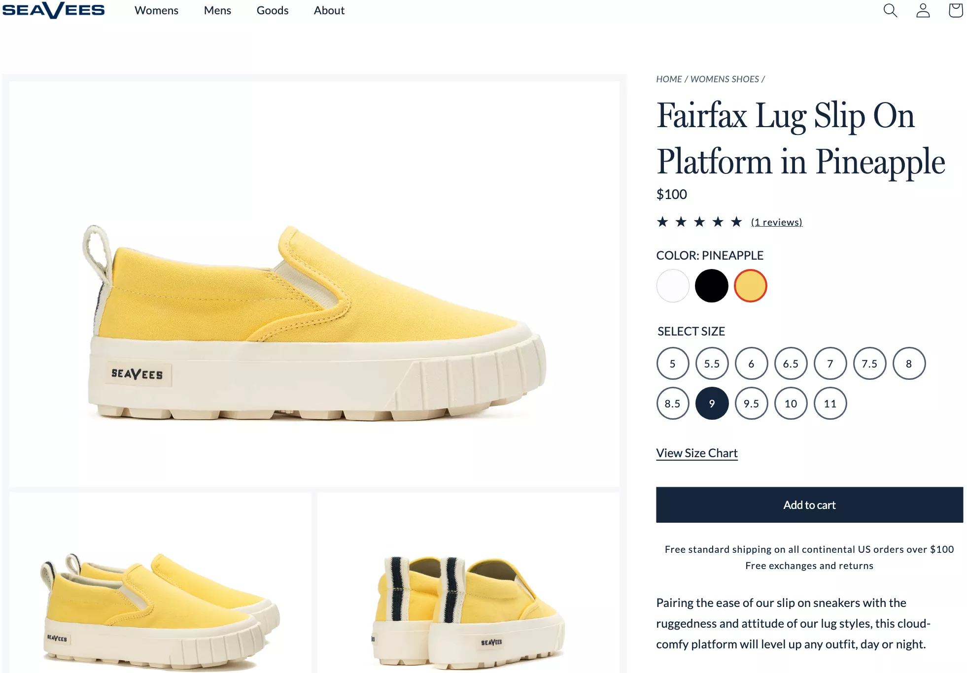
This is the easiest, most relatable example of what a real nudge is.
This is exactly what a nudge is supposed to look like.
We spoke about System 1 and System 2 earlier. This is where you’re not pushing the customer too hard.
19. Drive “urgency” in a subtle way
I’ve seen a lot of businesses do timers. I’m going to show you a timer example next — done in the worst way.
❌ There’s a timer running on the site probably all the time.
For example, there’s this site called SlickWraps.com, and I’ve seen this… you know what? The first time I saw this site was 2017.
It’s 2024, and they’ve had this timer for 2 hours and 49 minutes on the site for the last seven years.
They’re running the exact same thing for the last seven years. Can you believe it?
That’s how not to do a timer.
Now let me show you how to do a timer:
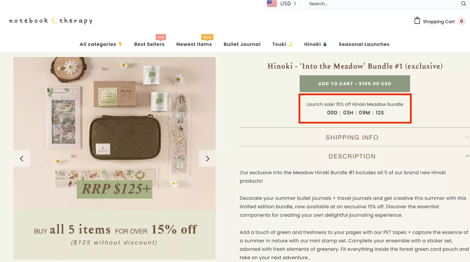
✅ Keep it extremely, extremely subtle.
Here’s a sale that’s running, and the timer is going to end — and it’s actually going to end. It’s never going to come back on your site unless you’re running a sale again. A real sale.
That’s the way to do a timer.
I’ll give you an even better example: Don’t do a timer for sales at all.
Just do a simple timer that says:
“If you check out by the end of the day today — by 5:00 PM — we will ship your product the next day.”
And just count down to 5 PM every weekday. That’s it.
What you’re doing is incentivizing the customer to check out so they get the product earlier.
Customers today are spoiled for choice. Amazon delivers everything probably five minutes after you order — or it’s going to start happening soon.
They’re going to drone products into your houses. Amazon is going to start delivering in minutes instead of hours.
So:
✅ Use timers wisely.
They don’t take away from your brand if you do them in a subtle way — design them well, make sure they look good.
20. Never skip the last-resort nudge (but correctly)
This is the way to do this without damaging your brand.
I see a lot of businesses not leveraging an exit-intent pop-up in the way it should be leveraged. For example, you could do exit-intent popups in 100 ways. This is one such way:
✅ “Hey, you know what? You can still get 20% off on your order.”
Now, we have an example.
We worked with a magazine store, and I’ve given this example before. In their case they had a very high cart abandonment rate. And for exit intent, for a month, we ran a survey.
So what we did is: the moment somebody was exiting, we loaded a survey on the screen asking them:
“Hey, why are you leaving?”
We gave them a bunch of options.
The business had a hunch.
The hunch was that either it was the product price or the shipping price.
And shipping is a huge area of contention — most businesses are trying to figure out a way to do shipping in a way that they don’t lose customers.
And here’s what we found:
About 2% of people filled the survey, and all of them said the shipping is too high.
So we had to solve it.
And how we solved it was:
We ran a popup similar to this one, saying:
✅ “If you check out in the next 10 minutes, we’ll give you 50% off on shipping.”
But we only did it for:
- people who had a $10 or more product in the cart,
- and were abandoning from the cart.
We didn’t do it for everyone.
What that did is:
It brought down their cart abandonment rate by 50%. They stopped losing half the carts they were losing because the customer got a 50% off on shipping.
So that’s—you could say—data-driven optimization. You’ve looked at several insights. You’ve looked at the cart abandonment rate being high.
You’ve looked at the survey responses. You’ve looked at the customer… the client itself… the business owner saying,
“Hey, I know this is the problem, because they can just walk down to the magazine stand nearby and go and pick up that magazine.”
“I’m trying to get suburban customers, and they feel that paying $4 or $5 or whatever it is for shipping is too much. And I don’t want to eat into my margin.”
I said, “Okay, how much money are you okay to give to your customers for shipping?”
“I can give them half. But only if I can… I cannot do it on all of my shippings.”
And okay, you know what? You’re not going to do it on all of them.
Customers that are already buying from you will keep buying because they’re not exiting.
✅ Only the ones that are exiting will get this offer.
So that’s the way to use exit intents, right?
21. Reinstate your brand philosophy - even in the cart
✅ Brand philosophy — brand story — should be everywhere, at all times.
What are the five things you stand for?
- Is it your quality?
- Is it your customer service?
- Is it your pricing?
- Are you the best, most aggressively priced product in your category?
Make sure you carry that through the experience.
I feel these subconscious nudges convince the customer as they go through the journey. And sometimes we forget about them on the cart page. And I think it goes a long, long way when we do that.
22. A free gift is an amazing way to nudge shoppers to complete checkout
Free gifts are amazing. This is one of the best ways.
I, in fact, thought of doing a free gift once, along with the timer, saying:
✅ “Hey, if you check out in the next 10 minutes, we’ll give you a free gift.”
But configure it right so that they never get it again — that’s the right way to do it.
Free gifts are fantastic.
For example:
You buy 100 espresso pods and you get a grinder or a coffee tin. That’s one way to do it.
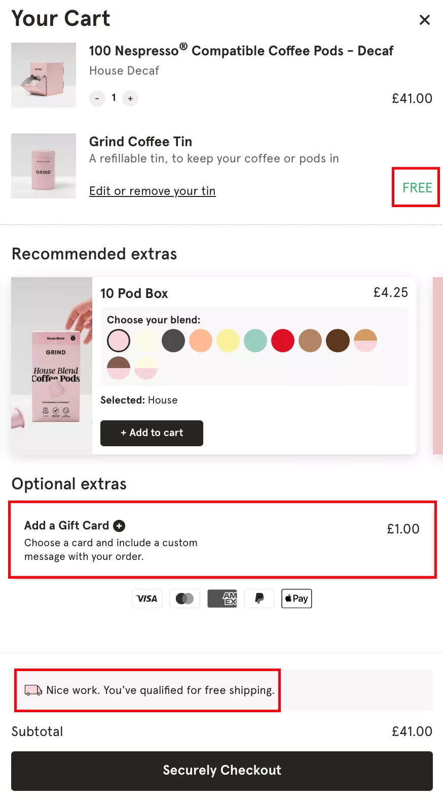
The other interesting way to do it is:
23. Let the customer pick their own gift
I, for example, buy food for my dog on this website called SuperTails.
✅ And every time I buy from them, they let me pick the gift I want for my dog.
It’s a really fun experience. And I have picked a gift every single time.
And trust me, I don’t buy dog food from anywhere else because of the delight attached to buying dog food from them.
Another example of this:
24. Ask to save the information for future orders
✅ And then finally: save information for future orders.
Really simple. This is a very, very simple nudge. But this improves repeat visitor conversion rate by at least 30%.
If you’ve saved the address information, and if you’ve nudged the customer to do that in the right way…
Shopify’s default checkout does a horrible job of this. There’s really no way to solve it within default Shopify checkout.
But yeah — if you can convince your customers to save their address with you, your repeat-visit checkout goes up significantly.
Because the checkout experience becomes that much simpler.
It’s essentially three clicks and they’re done. The card information is in there. The address is in there. All they’ve got to do is just go ahead and check out.
Q&A
Alright, so that’s everything I have today. A
gain, the intention is to get after your customers’ intuitive minds and not be… you know, in today’s ideas I want to make sure I emphasize that nudges can be done in a subtle way.
You don’t need to strangle your customer’s brain, you don’t need to push them to do something. You don’t need to lose out on the way your brand looks.
And I feel it’s important that we understand that. Also, every brand has a story. You just have to find it. So tell it well.
I’m open for questions. I think we have a bunch of time. I want to be able to gift as much of your time back to you as possible.
Thanks so much for joining.
Thank you, Simone. I hope this added value. But yeah — I’m here for questions for a few minutes, so please, yeah, bring it on.
Question:
“When it comes to listing your warranty, free shipping, and return policy on product pages, should you link to the pages that describe them, or describe it on the product page?”
Answer:
I would not link it. I don’t want my customers to go anywhere from the product page. I would, however, make sure that the information is adequate.
For example, a “30-day return” — the logo saying “30-day return” — is pretty self-explanatory.
Unless, of course, you have a fine print to the return, which is never a good thing. It should be a no-questions-asked return. Consumers are spoiled for choice, so you’ve got to kind of build that cost into the business and into the margins sometimes.
As they say, RTS — Return To Source — is one of the biggest problems that plagues DTC companies. A lot of customers have the luxury of returning products and they exploit it. Something to think about.
The right way to do it is not to redirect customers.
I’ll do you one better:
Look at the data. Build a funnel in your Google Analytics. GA4 — as much as we all hate it — is capable. We hate it because it’s new, nobody likes change unless it’s for good. But GA4, trust me, is powerful.
You can go to the Explore section in GA4 and build a funnel:
- Check how many people go to your FAQ page.
- And how many of the people who visit the FAQ page convert.
That conversion rate will be at least 50%, because only your highest-intent customers are going through the effort of scrolling all the way down and clicking FAQ. And that’s the problem.
So one of the other things I’d recommend is: move your FAQ into your product page.
The more information the better — but keep it subtle, keep it simple. Don’t increase the cognitive load for the customer.
As I said: Nudges are unconscious.
That’s the rule to follow.
Ask yourself: “Is what I’m adding to the site unconsciously visible to the customer?”
If the answer is yes, you can add it.
If it requires effort or thought, it adds cognitive load.
The only thing that should require the customer’s attention on the product page is the description. Everything else should be subconsciously visible.
Question:
“I’m a little unclear on the best way to implement the email popup. Have it pop up later? Not have it at all? What is the optimal way?”
Answer:
100% have email popups. Your email list is the single most important asset you’re going to build in the long run.
I know people — individuals — who have their own subscriber lists of more than 100–200,000 people, and they publish stuff they can sell to that list once a year and they make millions.
So your email list is the single, single most important asset. Please… 100%… I’m all for popups.
Here are the things I recommend not doing:
- Don’t have a popup in the first 30 seconds of the customer’s journey.
- Make it easy to close the popup.
- Make the incentive meaningful, but it shouldn’t hurt the business .That doesn’t mean “give more discounts.” It means the popup should have real value.
Here’s the thing:
If a customer is converting and is ready to pay full price, and the only thing your popup is doing is giving that customer a 10% off, there’s no use of the pop-up.
Because you’re going to get their email anyway when they check out.
The real goal of your popup is to get the emails of people who:
- are not ready to buy yet,
- maybe need another couple of visits,
- maybe need some thinking time,
- maybe need the nudge.
That’s the way to think about incentives. What we’ve seen work consistently
Gamification works really well.
You can do:
- mystery boxes,
- scratch cards,
- reveal-to-unlock offers,
- small interactive elements.
Let me give you a literal example from my bookmarks.
Example 1: Mystery Box
“Hey newbie, welcome to Support. Here’s an exclusive deal. Tap here to reveal.”
So the customer doesn’t know what’s going to happen.
I click on it.
I get my 10% off.
Enter email.
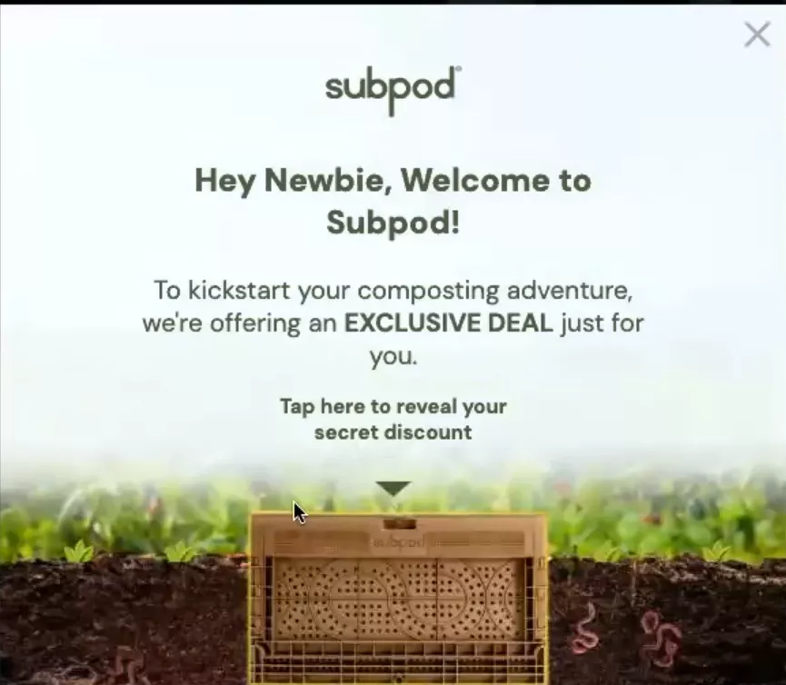
Now, I’m someone who saw this 45 seconds to a minute into my journey. I know what the product is, but I’m still thinking. I’m not decided yet.
The popup loads on the home or collections page — exactly where it should.
And I will give you my email because:
there’s a 30% chance I’m going to buy,
and if I buy, I’m going to need that coupon.
Here’s the Lamborghini key:
The fear is…if I close it, it might never come back.
So the best thing to do is add a tiny message:
“Once closed, this will not appear again.”
And make sure it never appears again.
Your email opt-in rate after this will hit 10%.
Your email list will grow 100% in the next six months.
Example 2: Scratch Card
In this case, it’s a scratch card. I can scratch it and see what’s underneath.
This works really well too.
It’s extremely intuitive, taps into curiosity, and feels fun.

And yes — if they don’t go incognito…You’re absolutely right, Brandon.
And I also want to fully disclose that I personally have never bought anything in my life from a D2C website without abandoning the cart first.
I always add to cart, go to cart, and abandon it.
Then the next thing you see is a 20% off coupon in the inbox.
And then you go and buy.
As people from the fraternity of e-commerce entrepreneurs, we’re allowed to do it.
Recap: Popup Best Practices
- Big close button
- Delay ≥ 30 seconds
- Incentive must feel meaningful
- Gamification works
- Curiosity works
- FOMO works
- Exclusivity works
- “Does not show again” works
- Make sure it actually doesn’t show again
Thank you so much for joining.
I really hope this was useful for you, and I really hope you’re going to go and implement some of this.
Thanks so much.
Have a fantastic weekend and the rest of your day.
And yeah — I’ll see you in the next one. The next one is going to be even better.
Alright. See you. Bye-bye.
Get Fresh ideas to boost your conversion rate
(stuff that works for hundreds of stores)
Request a Free Site Audit"Convertcart’s Audit Report was deep and insightful. We never thought they would spend so much time in building and sharing such insightful content, free of cost."


Logan Christopher
Lost Empire Herbs