On-Demand
Plateaued Conversion Rate? 20 Reasons That Keep It Low
You’ve done everything ‘right’ — good product, steady traffic, sleek website — and yet, conversions refuse to climb. Sound familiar?
Most eCommerce stores don’t fail because of poor marketing. They fail because of micro-barriers across the journey — and most founders never see them coming.
And this is what we are discussing in a quick 40-minute live session: micro barriers that slow down conversions.
What you’ll learn:
-From invisible UX blockers to buyer psychology misfires, I’ll show you what’s holding your store back.
-I’ll talk about problems that analytics won’t show you—why real people hesitate, stall, and drop off.
This isn’t another ‘optimize your checkout’ checklist. These are deeper, psychology-backed, friction-exposing truths.
Actionable insights, not fluff. You’ll walk away knowing where to focus next.


About the speaker

Shekhar Kapoor
VP, Marketing
Convertcart
Shekhar Kapoor (VP at Convertcart) has worked with 500+ online brands, including Squatty Potty, Prep Expert, and USA Hockey Assn., and helped them boost sales exponentially.
Shekhar Kapoor
VP, Marketing
Convertcart
SESSION REPLAY – PLATEAUED CONVERSION RATE? 20 REASONS THAT KEEP IT LOW
Perfect. All right. Awesome. Thank you so much for joining us, everyone.
I have some very interesting ideas to walk you through today, just like always. There’s a very specific reason why we picked this topic because Convertcart optimizes for more than 500 websites every year. We run more than 12,000 experiments. And we speak with a lot of eCommerce founders who are spending hours trying to crack this problem and trying to crack growth for their business.
They want to go from the first million to the next million. There are people who are in the first 10 million. They want to take it to the next 30 million and so on and so forth. So that 2x 3x jump that we’re really looking for after knowing that we have product-market fit, after knowing that we have a product that people want, is really hard.
And so, as entrepreneurs, it’s hard to make peace with the fact that you can’t grow.
My hope today is that I’m able to give you a few suggestions that you can go back and instantly implement, and hopefully, it creates that growth for you. So there are 20 things we’re going to walk you through today. So let’s jump right in without any further delay.
How do you know if your conversion rate has plateaued?
Conversion rate being plateaued. Getting plateaued is extremely common. It is everywhere, and it’s nothing alien to somebody who runs an eCommerce business.
But the thing is that it’s strange that it’s plateaued because everything changes. For most websites, 70% of your traffic is visiting you for the first time. So why should your conversion rate stay the same year over year?
I’m not saying month over month because your conversion rate can be different month over month. You might have a season that does well for you and another season that doesn’t.
So the first thing that you need to notice is if your conversion rate is the same for the period that you compare it for over a few years, and if that’s the case, then the problems that we’ll talk about today are very relevant.
Because that means, irrespective of you bringing new people to your site’s experience, that’s a metric that doesn’t change. It remains the same forever, so we look at what causes that.
1. Actual traffic entry point differs from what you’re optimizing
The first thing I’m going to talk about is not paying attention to the actual entry point of the traffic.
Generally, brands try to follow the classic funnel of home → collections → product → cart → checkout, and that’s how the eCommerce journey is measured.
In fact, if you look at the default funnel that Google has on Analytics, that is exactly that: the monetization funnel or the purchase funnel is exactly that — people who came into the homepage, collections, product, cart, checkout.
And that’s not the right way to do it naturally because your traffic doesn’t operate that way. For any business that’s running ads, you are sending traffic directly to your product page. Your product page, depending on what it is, is ranking. You have blogs that may be ranking. You have collections that may be ranking. You have other information pages that may be ranking.
Organic traffic? It can land anywhere. Paid? It can land wherever you want it to land. Direct traffic, too, can land anywhere. Then, you have referral traffic, etc.
Plus, you have emails, which are your highest converting traffic.
So if we don’t optimize in silos, what we are doing is basically optimizing everything together, and that doesn’t work like it used to in 2019 or 2020.
So you should not run global tests and experiments that span across everything. The biggest reason people do that is because there are a lot of seasonal spikes, so on and so forth, and they don’t want to go siloed.
What you want to do is focus on pages that have at least five-plus total site entries. They come from a scalable source, meaning if you’ve optimized them, you can then try and invest more in that source. Drive more demand, and see if that conversion rate continues to stay where you’ve put it.
And finally, pages that convert at or above the site average. Why that’s important is that if you already have high traffic and low conversion, you know that there could be some quick wins. If you have high traffic, high conversion, these are high-revenue impact pages. Even a 5% change will bring you massive topline growth.
Pages where you have active campaigns, where you’re already pushing traffic, are also easy to optimize because that’s where you want to see the most ROAS. So it’s super important that you think of it that way.
Do not optimize for the entire journey. Don’t optimize for the homepage. Don’t say, “Hey, I think my navigation dropdown doesn’t look that nice.” I’ve heard that a hundred times. Generally, looking at just the aesthetic of the website and making decisions from that is not the right way to think about this.
You have to look at the top 20% of your traffic: what path it lands through, and that tells you exactly what matters and what doesn’t.
2. Low product discovery
The next one is low product discovery.
This really does not mean not finding any product — it means not finding the product that matters.
- If you see a low percentage of shoppers moving from home to collections, and then
- How many people go from the collection to the product page
- If you have a low click-through rate on the collections page (which is below 2–3%)
— It means they’re not engaging with your listings.
Something’s wrong. They’re not convinced enough to go and see the product. So there’s a huge gap somewhere. Either the price isn’t right, the visuals aren’t right, the brand isn’t right — or maybe, something fundamental is not working on the collections page.
If you have a high site-search exit rate, it means the search doesn’t work – or it’s not throwing relevant results, or people are searching for keywords (which they think you have, but you really don’t have). That’s another important part to think about.
Search is probably one of the most important parts of your site, especially if you’re a multi-product site and multi-SKU business.
Low average page views per session is a simple metric. Often confused. The higher it is, the better — that’s not always true. If it is very low, they’re not seeing enough products. They’re not convinced. They don’t want to stick around.
If it is very high, you have a lot of horizontal traversal on the site — people jumping around but not deciding. That also isn’t good. You want to find that sweet spot where people find something they like, and then they want to commit.
A high bounce rate on the homepage or collection page means broken discovery. If somebody bounces off your homepage after entering (or from your product page after entering), it means there is a massive mismatch in the expectation you set with them.
From when they found you on the internet versus the expectation you deliver when they’re on the website. There’s some disconnect, and you have to find a way to eliminate that disconnect.
I’ll give you an example. We have been running an ad for our email marketing platform for a while now. For the longest time, we kept obsessing over how one needs to do really complex workflows that can touch various parts of the user journey.
But people were not caring about it that much.
Recently, we revamped that ad, and we realized one of our biggest strengths is that we can do beautiful-looking emails. We do some of the best-looking emails that you can find on the internet, and we’re very proud of that.
We started to advertise that, and the click-through rate on that ad is the highest I’ve seen in the last four years. But the thing is, we were sending them back to the landing page of our product, which talks about workflows, segmentation, A/B testing — and there was a massive disconnect.
So now we redid the landing page, and the campaign is a massive success. You just want to make sure the whole funnel connects.
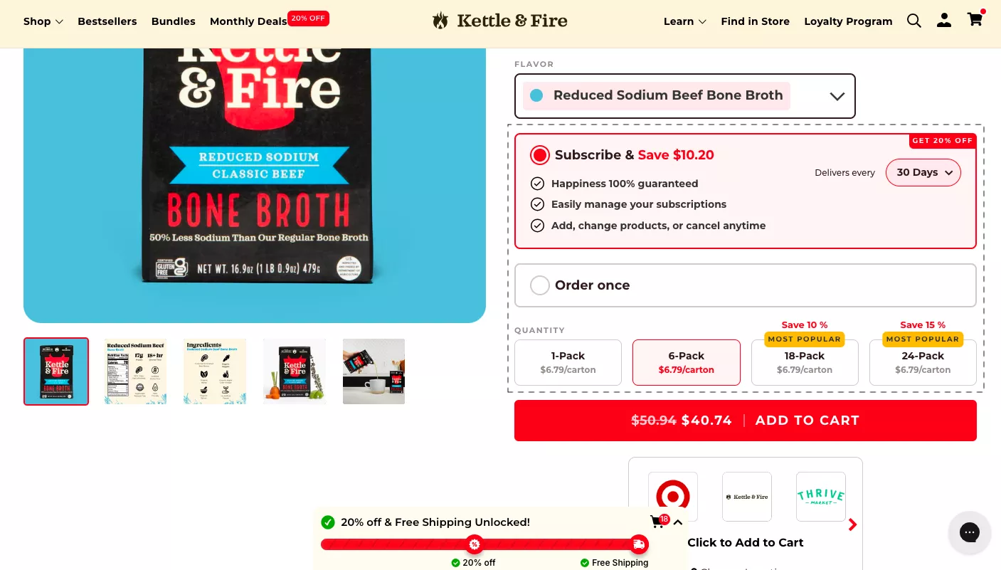
3. Are you revealing prices too soon? (on the product page)
One thing to always think about when we think about pricing is: it’s not really about the price you quote — it’s how you make it justified. The moment the customer has seen your product and the price, you are battling to make that price look small.
That could depend on two factors: the depth of the customer’s pocket and the depth of the value that you provide.
For example, iPhone is not an affordable phone, but most people are okay to pay for it because they see the depth of value and quality. Rimowa, as a luggage company, does not target everybody. The people they target are okay to buy a $1,500 carry-on bag because the depth of their pockets allows them to do that.
Samsonite could do exactly what Rimowa does, probably better in terms of warranty, and you would still pay for a Rimowa because you want to signal you have money.
For the average folk and for eCommerce, depth of value is the way to do that.
Two ways of doing that: one, you could show the pricing as an indication, saying our pricing starts at about $29, and then slowly reveal other cost-related cues only if your product allows you to do that.
Option two: if you’ve shown the product, make sure they don’t instantly jump to the price. They also see what’s inside: what you get in the box, accessories, free shipping, etc. Then the price looks justified.
Dbrand, a company that sells skins for phones, is a good example — check out their website after the webinar to see how they try to make the price small.
4. You’re asking for commitment too soon (on the product page)
The next one is commitment.
One thing I see brands do most often is push the customer. While that’s okay for the bottom 5% of your customers — I mean, bottom of the funnel, people who are already convinced — when you do that, you alienate the 95% that are not ready to buy.
People take time to evaluate products. They’re not sure instantly whether they want something or not. So generally speaking, don’t nudge them too soon. People need time.
What are those aggressive nudges? Loyalty programs, sign-ups, upsell nudges. People upsell and cross-sell all the time, thinking everybody wants a second product. Nobody wants a second product. Please don’t assume you can increase cart value by just doing an upsell.
We’ve A/B tested upsells a lot. More often than not, the dollar you make on cross-selling to five customers is less than the dollar you lose by annoying the bottom five who feel you were trying too hard.
Pre-order hooks without showing social proof — why should I pre-order? I don’t even know you.
Pre-selected options that feel pushy — for example, a six-pack pre-selected when I might only want one pack. I have to mentally compute price-per-unit, shipping, etc., and that’s cognitive friction you don’t want.
Caption: an example of a ‘bit too much’ – too many tappable elements
5. More than 50% of people drop off after seeing only 2 pages
I have a question. Would you put a price in a PPC social ad or always wait until they click and move to the next step?
I would always wait. The only reason to put the price in the ad is if you want to create exclusivity and exclusion, and you don’t want people that you don’t want.
For example, Beverly Hills jewelers that don’t want the wrong kind of walk-ins will never put a $200, $600, or even a $2,000 jewelry price on the front glass. They will put mid-priced $10,000–$80,000 diamond sets or super limited edition Rolexes.
So, they are not trying to appeal to the average tourist who’s just thinking they’ll pick up something on the way. That’s not their business. That’s not where they make their money unless they’re that kind of store.
In the physical sense that matters, where you want to bring people in and you want to use price for that. But in the digital sense, the role of advertising is to create curiosity and demand.
If you want to qualify demand, put the price in the ad. Otherwise, never put the price in the ad.
The job of the ad is to interrupt people while they are watching cat and dog videos and to try and bring them to your website. The best way to do that is to be visually shocking, extremely clear, exciting, and make somebody curious — don’t give them all the information.
That’s really the holy grail of digital advertising.
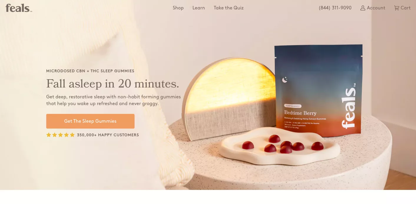
At least in my experience, 50% of people drop off after seeing only two pages. Now, why does that happen? We fail to show value in the first 30 seconds. We lose out on people who want options but can’t find them, or the site structure is too deep.
We want people to find relevant products in two clicks, instantly understand the value prop, find the product or collection that matters, and have the right calls to action.
A brilliant example: a product whose value prop is “fall asleep in 20 minutes, get deep restorative sleep with non-habit-forming gummies that help you wake up refreshed and never groggy.” The product feels almost like magic, and then you get into buying the sleep gummies. They’re extremely specific.
Easier said than done because they’re a single-product site. But think it through: why are you trying to convince people to buy your brand? You should convince them to buy one or two products, experience them, and then they’ll become repeat buyers.
6. The “Hidden Decision Maker” effect is at play
This is, I think, something that most of us personally experience. Not all decisions are made alone. Some of them have to be verified by your spouse, your partner, or whoever approves the household spending; maybe your boss, a manager.
Like in B2B sales, when we sell to our customers, when we sit down with them, not only do we give them a detailed audit — a completely no-cost, no-commitment audit of their site’s experience and their email marketing, which you can also opt in for, by the way — we also give them extremely detailed technical documentation.
If they want to go and talk to the CTO, if they want to go and talk to the CEO, give them revenue projections. And if they are the decision maker, in that case, we just give them the payment link.
But generally speaking, you have to enable — you have to make sure that you never win a customer, always win a champion, as they say.
“Spread the flu,” — and Seth Godin said this, one of the great marketing geniuses of our time. What they essentially mean is: if you enable people to make others fall in love with you instead of “buy that one product”, your entire perspective on this whole story will change.
How do you know if there is a hidden decision maker at play?
The best way to understand that is if the return visits are high but there are no conversions. People are copying links, people are sharing those links, they have a wishlist, or exit-intent surveys are telling you about it.
An exit-intent survey is a super important strategy that I don’t know why more brands don’t use. They make no-brainer sense to me. Why would you not ask someone who’s leaving why they are leaving and if they have any suggestions or feedback for you?
How do you solve for it? Make products easy to share. Try and put a share widget — that’s the easy way to do it — but also try and track it. Try and follow it through. Try and understand if you can capture some information.
One smart way we did it is we did a share, and then we said, “Hey, drop the email ID on which you want us to send this product”. We were trying to collect the email ID of somebody’s friend, if that makes sense.
It’s a little hit or miss. It really depends on the industry. We did it in a very specific place. We experimented. We ran an A/B test and then we got the success that it works.
What was happening was they were getting two opt-ins at once: one for me and one for my wife. That’s obviously genius because your opt-in rate instantly doubles overnight if you can achieve that. You essentially sell to the absent person.
Of course, FAQs on the product page — is it worth the money, will it fit, how durable is it, will it work — all of those questions should be answered immediately.
7. You’re relying more on logic, less on emotion
The next one is that you’re relying a lot on logic.
So, there are two ways in which the human brain thinks: system one and system two. I hope you’ve read the book Thinking, Fast and Slow — it’s one of the best books you will ever read, in my opinion.
The fundamental lesson of that book is that there are two brains: system one and system two.
System one is instantaneous, it’s impulsive, it’s emotional, and it’s sometimes wrong — it’s things that we do without really thinking much.
System two is logical, it’s reasoning-based, it takes time, it processes data, and then makes decisions.
You want to try and not go to system two a lot. You want to keep people in system one as much as possible. That’s the role of marketing. The goal of marketing is where logic stops making sense.
I’ll give you an example. A Porsche 911 versus a BMW M2.
I recommend that you test drive both of those cars. I had the opportunity to do that once, in a different country. The biggest difference is: Porsche 911 is double the price.
However, the BMW M2 has lower center of gravity. It is more powerful. It is phenomenal on the track and it has everything that a Porsche 911 has.
The only thing it doesn’t have is a Porsche badge. But I can assure you that 10 times out of 10 someone who has the money will choose the Porsche over the M2. That’s when logic doesn’t make sense.
Emotion is what makes you make that decision because as a child you’ve always wanted something, and then you get it. Then you’re like, okay, great! 🙂
So you want to keep the customer in system one as much as possible.
Don’t be too logical. Too many specifications, no story, price shown without comparison, technical language full of industry jargon — it doesn’t matter.
Cut-and-dry reviews, lack of rich media, no pictures of customers actually using the product, no pictures or testimonials from real humans, and a very linear visual hierarchy — generally there is no visual relief.
How to solve that: focus on the experience. Get the product and the payment out of the way, and then bring authentic energy and meaning into every gem. Help shoppers see a better future. Let them experience something before they’ve experienced it.
That’s what advertising is all about. When you look at YouTube videos of automobiles, some of the best ads make you feel happy, excited, and related to the product. It’s very hard to achieve that, but go back to GA and see how much average time somebody gives you.
Generally it should be about 1.3–1.4 minutes. If somebody’s giving you 90 seconds, that’s a long time for you to try and convince them.
Or at least show them what it feels like to use your product.

8. Copywriting that subconsciously creates exclusions
Copywriting that subconsciously creates exclusions. This is a very important one.
Sometimes we do things that exclude people. For example, using industry language. Language that idealizes the TG. Copy made for the girl bosses everywhere. What if I’m not a girl boss? What if I don’t identify as that strong person?
Using super specific geographic language — “perfect for July 4th barbecues”. What if I don’t do barbecues on July 4th? What if I’m not an American and I’m in the US?
Aspirational language that causes experiential distance, like “elevated skincare that feels like a spa day”. I don’t know how many people use or go to the spa that often, but there are a lot of people who don’t. And so I really don’t know how they might or might not relate to it.
And then, of course, there are signs that show that copywriting has exclusions. If you have a long time on page, the scroll depth is high, they’re looking for reasons to say no. Many cold zones.
I think if you just read through the copy on your site in a little bit more detail, you’ll understand what I’m trying to say.
9. Site search’s not doing a great job
People who come to your site and search convert at least five to ten times better than people who don’t. And that’s very, very interesting because that makes search probably the most important part of this. These are customers who are walking in, and they’re telling you exactly what they need.
As long as you can meet that need, they will convert.
So generally speaking, the things you want to focus on, depending on your niche, are mentioned here. We will also share this document with you later on.
For example, in fashion, you want to focus on making the search visual and matching colors.
In electronics, you want to make sure it’s specification-based.
Home and garden — again, you want to be visual.
Beauty and personal care, you want to filter people down. Like, “What is your skin type? Do you have a concern that we can solve for? Is there a problem you’re looking to solve for?”
Sports and outdoor — again, narrow people down. Is it activity-based? Is it weather-based?
Pet supplies — is it something that is breed specific? Are you in a certain life stage of your pet? Do you have an oldie, you know, an old dog maybe?
But generally speaking, track data for failed search queries. And most importantly, track how many people search and then bounce. If your search and bounce rate is greater than 20 to 25%, then you have a problem.
That means your search is not performing at the level that it should.
10. Overly optimized cart
Watch out for these red flags. I’ll just tell you this straight away. At Convertcart, we run a massive newsletter with more than 8,000 CEOs now, eCommerce CEOs. And we also run a lot of ads. We spend a lot of money on ads.
Invariably, whenever we talk about cart and checkout, everybody gets up and kind of takes notice. And it really hurts me — or you could say it really intrigues me — that they are really concerned about the last 10% people that are left on the site. They’re really not concerned about the 90% that have already left.
And even for those last 10% people, most cases we are over-optimizing.
“Only one left.” There’s a countdown timer. There’s a pop-up. There is an upsell. There is cross-sell. There are trust logos. Everything possible is being implemented to make the person convert.
I can assure you that it takes away trust more than it gives trust to your cart. And this is, for example, something that we found on an eCommerce founders’ forum. Stuff that has worked for them:
- Showing badges.
- Dynamic free shipping bar.
- Label calling out the cart saying it’s only going to be held for seven minutes.
But if you see, what they also mean is do something, don’t do everything. That’s really the point that we’re trying to deliver here.
11. Too many micro-decisions
Too many micro-decisions in the journey:
“Give me your email. Why don’t you filter? Why don’t you pick this? Do you want the slim fit or the modern fit? Do you want insurance? Do you want gift wrap? Do you want to opt into the newsletter? Do you also want to chat with us maybe? Oh, you’re exiting. Here’s another pop-up. Do you want to sign up for an offer? And if you buy it the second time, you’ll get a 5% off. And maybe if you leave a review, you get another 10% off.”
You see what’s happening? You are making them think. The only thing I want to think about as a customer is the product and how much I can desire it. That’s the only thing I want to think about. The only time I want to think about everything else is when I’ve decided that I want to buy it.
Apple, by the way, does a phenomenal job. The only thing that their product page contains before you click on buy — and that’s the only CTA they use. They only use buy as a CTA. So you will only click that when you’re sure. Everybody else who’s considering getting aware, finding it out, is given the most mind-blowing product pitch you could imagine.
They obsess over talking about things that matter. World-class screen, the camera, everything else. They just detail the value prop to the point where you have to be convinced, or you can just leave. And then you can go to the buy section, which is the transaction page, where you select the variant, and you can checkout.
That’s where they give all of that. Even then, they would never do a timer, any of those things.
Things you could do to make shoppers’ lives easier: show the most popular choices first.
Also, try and create some progressive disclosure.
What that means is don’t make the checkout form too complex. Don’t make it have 30 fields in one go — name, address, card details, shipping options, all of it in one page.
Make it progressive. So collect just the email first. Then go to the name and address. Then go to the checkout related information.
Also, make everything easy. Guest checkouts.
And also, what are the most picked shipping options? Don’t let them think about three different things.
12. Cross-device continuity issues
The next one is cross-device continuity.
There was an Adobe mobile report that said that people are 40% less likely to complete checkout on mobile when incentive messaging is different from desktop. When you think of it, that’s an extremely important data point.
For the longest time, when all the corporates in the world were trying to push mobile apps and there was — hey, why don’t you just download the app and transact on that instead — this was a revelation which said stop doing that.
People are trying to look at the mobile. Stop sending them somewhere else. Just focus on the mobile site so well that they don’t need your app in that way.
So the key signs that your store has cross-device continuity problems — the data points that generally speak:
- high cart abandonment on mobile relative to desktop, and
- low clickthrough rate on CTAs on mobile
Also, if they never go towards free shipping levels or if they’re not even adding to cart at the level, the volume, the value of cart is not even matching desktop, then there’s something seriously wrong.
And so the way to solve for it is to solve for hierarchy. I’ve seen on mobile most of the time, the key incentives get completely lost.
Shoppers are unable to access a promotion. And generally, just the desktop CTAs, everything else is much better.
I, for example, prefer to shop on a desktop, than a mobile, even today (except for some sites which are categorically better on mobile). So that’s something to think about.
13. Poor visual hierarchy
I think this is the concept that I feel people don’t obsess over enough. And this applies to homes. It applies to cars. It applies to websites. It applies to everything in life.
And I’m not going to go and nerd out on visual hierarchy rules, or there are some magic formulas to follow about sizes, etc.
But, generally speaking, if your visual hierarchy is too confusing, you’re doing too much, there are too many scripts and widgets running on the page, it creates a fundamental disconnect in the customer’s mind, and you want to avoid that.
When you’re trying to cram everything in the same place, trust signals are away from where trust is needed. Size, options, and stock availability are not easy to access.
What gets more conversions is a dominant hero image:
Section headers. Move from micro to macro: what does that mean, how does it work, real results, customer love, FAQs.
Super compelling microcopy around the CTA. Money back guarantee: if you don’t love it, send it back. That’s it. That’s what it says under the add to cart button. That’s the only thing it needs to say. Because when you say it that way, also the return policy is clear. It’s like, you don’t love it, send it back. It’s not, you don’t love it, we’ll pick it up from you. That’s not what we’re committing.
Product pages that open with the value prop and then let the shopper tap into the resolution before they focus on the price. That’s another really big one.
14. Visual cues not working the way they should
So what do we really mean by that? We mean, we generally try and do social proof and a bunch of other things, but it doesn’t work.
The number one reason why that doesn’t happen is: humans most humans generally read in the F or the Z pattern.
F pattern means I’m seeing this, then a little bit more, and then I’m going down.
Or the Z pattern, where I’m viewing the screen like this. You have to position your cues in these two patterns. This is a rule that you have to follow.
So I would recommend, as an eCommerce business owner, take a post-it note, write the letters F and Z on it, and stick it on your screen. Because every time you look at something, you have to evaluate how they do, and you will start to see some patterns. It’s a great learning exercise as well.
Product photos, generally speaking, should lead you to the CTA. So if they’re leading you away from the CTA, that’s a problem.
Popups coming up too quickly as soon as I enter. Generally speaking, you don’t want to show. You want to color-code to a good degree. Like the delete button, it should not show up in green, for example.
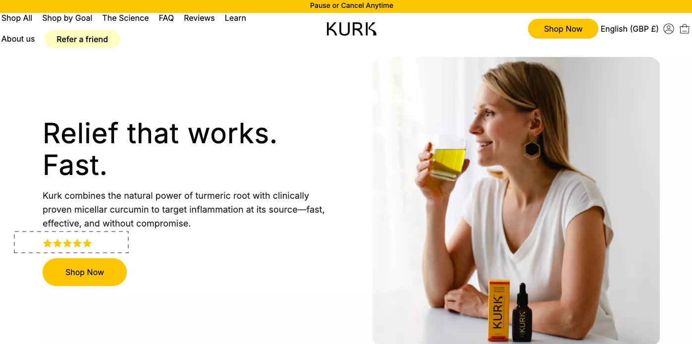
And the star rating looking fake. Like this is a completely fake star rating, for example. Only if that works fast. Copy is okay. It doesn’t say what it’s going to release.
So in this case, what they… look at, I think this is a great case study screenshot by the way. Kurk combines the natural power of turmeric root with clinically proven micellar curcumin to target inflammation at its source. Fast, effective, and without compromise.
So what they are essentially solving for is inflammation with the oldest trick in the book, which is turmeric. Which I think you might know for India and Indians is extremely common. But it took me 5 minutes to understand what it is.
So what should the title be? I think we can all think of what it should be. Inflammation relief that works fast. That’s it. They have not called out the fundamental problem, and that’s exactly what I’ve been talking about. The value is not instantly visible. It took me five minutes, and by then, they will’ve already lost the customer.
I saw this lady, she’s drinking some very not-so-nice-looking liquid, and it just doesn’t work. This page does not work for me.
What stores can do to sharpen visuals:
Reserve high-contrast badges for some critical signals: new arrivals, limited stock. Don’t do too many badges.
Place trust signals where they matter close to CTAs. Consistent cue language across the journey.
And of course, make sure that you test, make sure that you run experiments.
Don’t assume that you know. Nobody knows what works.
15. Product filters that feel like work
This is again a very easy fix. Make the filtration very easy. I think generally businesses don’t do this because their tagging and categorization is not very good.
So this is your signal. If you’ve been waiting for a signal, this is the signal. Please spend time on grooming your product catalog information. Everything that’s there — all the tags, the collections, subcollections, images, variants — all of it has to be absolutely pristine.
What that does for you is executing changes like these becomes extremely easy. So I think it would go a long way if you fix that because filtration is extremely important. People are putting in the effort to narrow down on a few things that matter to them. You’ve got to make it as easy as possible for them.
16. Too many urgency signals → skepticism
I think this is another really obvious one. Timers of all kinds. Trying to create fake urgency.
Only these many left in stock. These many people have it in their cart right now. Shaker from Chicago just bought it two minutes ago. And then instantly there is also Christian from New York who’s also bought it one minute ago.
I think all of that is done and dusted. The internet knows it doesn’t work. You should know that it doesn’t work. So I would not recommend falling for any of it.
17. Falling short of immediate competitor sites
And this is another one. I don’t know if you get anxiety about this at all, but I’ve met with founders who consistently are looking at their competitors, especially if they’re in a very competitive industry.
We’ve worked with a few health supplement sites that have very close competitors. Like, if they’re selling magnesium supplements, they have another site that’s very close to what they’re selling.
And there are some signals you can watch to know if you’re losing sales to competitors:
Abandonment happening earlier in the process. So they’re not reaching all the way to cart, but there’s a lot of upper funnel activity.
Previously engaged customers have not returned. No repeat purchases, so they’re switching.
Declining direct traffic. That’s another trend you have to watch for. Users exploring fewer pages per visit. Increase in single-page sessions — that’s another big one.
So how do you fix that?
First of all, you have to try and not appear to be generic. They have to pick your story. They have to pick your brand. They have to pick you over somebody else. And the way to do that is to tell a story. The easiest way to do that.
So I would recommend that if you are able to do that as a founder:
Go and tell your own story on your product pages and your website. Say, “Hey, here is where my brand originates. Here’s why I started it and here’s why I’m the best.”
I’ll, in fact, tell you about a leather goods store. You can say whatever you want about the way the site looks, but they have a brilliant story. They have taken the time and effort to tell that story.
And one of the best things I love about them is that they have this lifetime handshake guarantee. So basically, if you buy anything from them, all of their products, as they call it, are mission for life. They have a lifetime warranty. So they essentially are promising exactly what Rimowa promises, as I mentioned in my earlier point.
Other things that can frustrate people are complicated layouts, unnecessary signups, no pricing benefit of quantity purchases.
So I think you’ve got to kind of stand out. And those are the metrics you can watch that will matter.
18. Unclear CTAs or too many choices
Too many choices. That doesn’t work. It’s not a good thing.
So if you see, for example, what’s happening here, the green easily stands out, but then you can also click on the customer reviews. You can click on the add to cart, but also all of these look like you really want to click on them when you see them. So you want to keep things simple. You want to keep things smooth.
Now, how to find out if your CTAs are the reason behind low conversions? There are hovers. So heat maps are great for this. If multiple CTAs are getting similar clicks, that’s a problem. Your primary CTA should be the most by a large margin.
Many users bounce before scrolling. That’s a big one. Or there is scrolling that is very, very deep. So none of the CTAs convince them.
19. Showing the same site to new as well as returning visitors
This is the oldest thing in the book. This is the one that I personally find most disturbing. I don’t know why.
And for a lot of the screenshots that you saw, most sites operate that way. They treat product discovery the same for a new visitor as for an old one. And that’s absolutely broken.
I should see recently viewed right on the homepage. I should see a button that says begin where you left, start from where you left off. And I have to go deep into talking that language.
It’s the easiest thing to do for a store, to be honest. Swap out standard. So everything has to change. The headlines have to change.
“Discover our fall collection.” No. “That cozy cardigan you viewed is now back in stock.”
Imagine if your site could do this. And I’m telling you, it’s very easy to make this happen. We do this for more than 500 stores in a year. And we’re at a point where we feel that the world should actually already… we should have fixed the world by now. So that’s the place where we are mentally.
20. Pages beyond the homepage — often load slow on mobile
All right, we’re down to our last idea. I wanted to see if I can gift 10 or 15, 20 minutes back to you out of the hour that we’ve blocked with you.
This last one might sound trivial, and yet most stores don’t get it right, which is that pages beyond the homepage often load slow on mobile. Now you might not have heard of this before, but this is very, very important.
In most of the cases, what we generally do is: pick our domain and we put it in Google PageSpeed Insights or GTMetrix.
So you’re taking, say for example, convertcart.com, and you’re just putting it in, evaluating speed. And that’s wrong because that’s not where people are spending time.
Homepage is just… it’s like the steps to your house. People are not going to spend time there. They’re going to just get in, and they’re going to find the room that they want to be in.
What you really want to do is make sure that you evaluate the rate at which all of the pages load. Make sure that you have absolutely optimized every part of that. So generally, as I said, there’s a bias to improve the homepage.
Even in Google PageSpeed Insights, the first content load, everything else, there’s a huge bias for the homepage.
The second reason is: the homepage is often heavily optimized already. So generally, when the internet caches, the homepage is cached and not everything else. The internet has your homepage’s back. Stop looking at the homepage.
And then all of the other pages are neglected. Like the collection page, when you scroll down loads very slowly. There are a few product pages that load very slowly.
So I think there is a huge merit in just analyzing that and fixing that. And I’m confident it’s a very easy win that’s just waiting for you.
Those are the 20 points I wanted to walk us through.
Q&A
Question: Can you recommend a brand or website that is doing a good job segmenting B2C and B2B on the homepage?
Example: we sell direct to parents and B2B to family support organizations, schools, and want both to feel welcomed and served.
Answer:
Okay, that’s fantastic. I think I would want to look at your business and your industry and then recommend the right way to do it. The reason I say that is you can actually handle that in two ways.
If you see, the B2B buyer is also an individual. So there is no reason for you to stop them from completing their discovery just as fast as you would want to complete discovery for a B2C buyer, a D2C buyer rather.
So what I would recommend is if you are trying to split that customer at the start of the journey,
If you think, you don’t need to do that – try and split that customer a little bit later. Once they’ve found the product maybe. So maybe talk about quantities on the product page and then take them to the next level.
I will share some examples, but you could also do it a lot later. For example, even up until the cart, you can let them add whatever they want to add and then surprise saying, “Boss, you know, if you are a B2B customer looking for higher quantities, don’t place the order online.”
If they place the order online, fantastic. Get them a discount. But I’m just saying that filtration is your priority. It’s not their priority. So you have to reprioritize your priorities and let them take the journey the way that they should.
And then, yeah, you could do a quiz. That’s right. You could do a quiz. Actually, you don’t need a quiz because you will have some behaviors that will tell you if they’re a B2B or a B2C. For example, quantity is an obvious one. The type of product is another one.
So yeah, thanks so much for joining, and I’ll see you in the next one. Have a good one. Bye.
Get Fresh ideas to boost your conversion rate
(stuff that works for hundreds of stores)
Request a Free Site Audit"Convertcart’s Audit Report was deep and insightful. We never thought they would spend so much time in building and sharing such insightful content, free of cost."


Logan Christopher
Lost Empire Herbs