On-Demand
Plugging Leaks Across The Funnel (Product page, Cart, Checkout)
UX issues across product page, cart, and checkout—silently kill conversions and cost you revenue.
And it’s not easy to fix these conversion leaks. It takes more than a copy change or a new discount to get shoppers interested again.
You want to know what causes friction.
You want to nudge the shopper in the right direction.
You want to know if the shopper was ready to buy in the first place.
Additionally, these nudges must go beyond just onsite changes. You want to keep engaging shoppers after they have exited your store—and gradually foster a relationship.
And this is what we’ll discuss in this live session:
- Identifying friction points across product page, cart, and checkout—and proven ways of fixing them
- How to engage shoppers after they have exited your site—without being pushy or annoying 🙂


About the speaker

Shekhar Kapoor
VP, Marketing
Convertcart
Shekhar Kapoor (VP at Convertcart) has worked with 500+ online brands, including Squatty Potty, Prep Expert, and USA Hockey Assn., and helped them boost sales exponentially.
Shekhar Kapoor
VP, Marketing
Convertcart
SESSION REPLAY – PLUGGING UX LEAKS ACROSS THE FUNNEL
Thank you so much for joining us once again. We were expecting quite a crowd today, and we still have people joining in.
I have a lot to cover today, so I’m going to jump right in. I want to make sure I don’t take more time than what we’ve blocked with you.
So let’s get in without any gap here.
You know, the other day I was reading one of Amazon’s shareholder letters, and one thing that’s so true about what Bezos says is—you’ve got to invest in things that are going to be always fundamentally true, right?
For example, customers will always want lower prices. Customers will always want faster shipping.
And Amazon, as a company, is now a Goliath—it’s a massive, massive corporation. But it started from a small place. And you have to understand there are some fundamental principles that it imbibed to get there.
In my case, I’m not going to talk to you about something that fundamental. I’m going to talk about some simple psychological cues—some simple things that I think every eCommerce store should do a very, very good job with.
The reason we want to keep it simple is because that’s often what’s missing. There are one or two things happening:
Option A—you know this exists, but you’re not doing it because you’re not sure if it’ll look good or work.
Or Option B—you don’t know that it exists, so naturally, you can’t do it.
So, things that you know that you don’t know, and things that you don’t know that you don’t know. I hope I’m able to tell you some of both today.
And yep, we’ll jump right in.
Now, the reason we wanted to pick up “plugging UX gaps” and not “UI” is because UX extends beyond the website.
We have ideas talking about things that are broken probably on the experience as well as off the experience. Because if you’re not addressing the off-the-experience bit, that’s actually worse—because that’s your highest-intent customer. They’ve given you their email or their phone number, and it’s extremely important that you engage them.
But on-site is also super important—because that’s your window. That’s your window to actually make something happen.
So, we’re going to break this down into three parts:
The first one is going to be the Product Page, which is people who are in—you could say—the consideration stage of the funnel.
Right, so you have awareness, consideration, decision, and then loyalty, advocacy, and so on and so forth—that’s the classic marketing funnel.
They’re considering buying, but you want to do things that can get them over the fence. So we’ll address those. Then we’ll go to Cart, and then Checkout, and we’ll have something to do both on the store as well as off the store—which means things you can do once they’ve left.
So, let’s jump in.
I want to start with people who are considering buying—people who are still in the funnel for you. What can we do to fix some of those gaps?
So, on-the-store fixes for people who are considering buying.
Product Page Fixes
1. Try an Anti-Pitch section to build more trust
The first and most important thing I want to talk about is fixing the pitch.
Now, I often ask this to eCommerce founders—you might be selling something that you really believe in. And my question to an average eCommerce founder would be:
If I put you in front of 10 individuals—your ICPs, or ideal customer profiles—which means the age group, gender, location, pocket size of the customer you’re trying to go after—if I put you in front of 10 of them and you told them about your product, how many of them would buy?
And the answer generally is an incredible number, right? Eight of them would buy. It’s amazing, it works, it’s incredible quality, we source it from the best place, we’re ethical, and so on and so forth—whatever that pitch is.
But the thing is, when you put it like that, you’re leaving a lot on the table.
So one of the things you want to do is reinforce the user’s identity through the pitch.
And what we want you to try is something we call an anti-pitch.
It’s the classic: “Hey, you know what? This is not for you if…”
For example:
- “…if you prefer the cheapest.”
- “…if you prefer something that’s machine washable.”
- “…if you prefer something with instant delivery.”
- “…if you prefer something cookie-cutter.”
You get the idea.
It’s also something that we do at Convertcart. We sell conversion optimization and email marketing—two different products.
On the email marketing side, we normally say, “Hey, this is not for you if you’re looking to hire an agency. We operate differently—we focus on numbers a lot. We’re not an agency. We’ll just do this, and it’s going to work. But this is not for you if you’re looking for someone who’s going to get on a call with you every two hours and not get anywhere with it.”
So, the anti-pitch is super powerful.
One of the things I don’t need to help you with is the copy, because that’s the easy bit these days. I’m not underestimating quality copy in general—but I just want you to understand that these are not limitations.
Okay.
The next one is a Help Me Choose section.
2. Introduce a “Help Me Choose” section
Your product page should be rich with information.
One of the data points I recommended everybody look at in the last webinar is your FAQ-to-conversion rate.
Your general conversion rate on the website might be, say, 2% or 2.5%. I want you to check the conversion rate for people who have visited the FAQ page and then converted.
That number will be very, very high. It’ll be 6, 8, maybe even 10 times your normal conversion rate.
And the reason is that those are your most curious customers—they’re going through the pain of visiting the FAQ page.
So:
A. I’d want you to bring your FAQ into the product page.
B. The other way to do it is to add a Help Me Choose section.
You want to become a consultant on the website and guide them if they’re unsure.
This works very well even for extremely simple products—like t-shirts.
This is a new t-shirt I recently bought from a brand that only does black t-shirts. I wear black t-shirts a lot—it’s probably unhealthy how many I have—but I enjoy trying different types of necks, fabrics, etc.
And there are so many of these brands out there. It’s very easy to come across an Instagram or TikTok ad, click on it, and then realize it’s just one of those other brands.
But if you apply just the two things I’ve told you so far—I think I have about 30 things today—the anti-pitch (“Hey, this is not for you if you’re used to heavy t-shirts”) and the Help Me Choose (“Not sure? I’ll help you choose.”)—you’ll make a huge difference.
Ask them:
- What do you want to use it for?
- What’s your preferred fit?
- What’s your body shape or type?
- What fabric feels best to you?
Then either take them to the right product or tell them if the current product is right for them or not.
Either way, you’re helping them—and you’re capturing priceless information about the customer, which we’ll use later.
3. Introduce a “Why Not Buy” quiz
Now, Why Not Buy — this is a very underrated tactic.
I don’t know why most sites don’t do this, but I think nine out of ten sites don’t. It’s a simple exit-intent survey—not a popup that says “Don’t leave, here’s 20% off.”
They don’t even want to buy; the 20% off won’t matter.
Understand this: if your conversion rate is 2%, there are only about 20% of your visitors who even want to buy. The rest aren’t convinced. And the top 50% doesn’t even care. The top 30% is probably bots.
So, you have to laser-focus on the customers who are in the consideration stage.
One of my copywriter friends—an extremely good one—calls them “healthy skeptics.”
These are people who are there, but not quite there.
And an exit-intent survey is tricky, because not everybody fills it. But let’s assume the exit rate from your product page is about 50%.
If your product page gets 100K visits, that’s 50K people leaving every month. That’s a large number.
Just run an exit-intent survey. Give them a reason to answer. Ask, “Why are you not buying?” or “Is there something we did wrong?” and give them a few options:
- The price isn’t right
- The fit isn’t right
- I don’t trust the quality
- Delivery takes too long
- Other (with a text box)
That gives you a superpower.
Only 1%—trust me, not more—will fill the survey. But what they tell you will be priceless.
1% of 50,000 is still 500 survey fills.
If 300 of them said “fit,” for example, you instantly know what to solve for.
Then you go and do everything in your power to convince people that your product’s fit is fantastic.
That’s why exit-intent surveys are so important. You’re talking directly to the customer—it’s the product manager’s way of doing things, not the eCommerce owner’s way.
I’ve been an eCommerce owner myself, so I know how important that is.
4. Create urgency: around pricing
This is the oldest trick in the book, and I really think it’s only for brands that can afford to do it. Don’t deplete your brand.
So I’m not going to spend too much time on it, but generally speaking, instead of saying, “The sale lasts only three hours,” you need to play a slightly different copy game.
Say: “The price three hours later will be this much.”
So the price goes up, instead of saying the price is low only for three hours. You tell them, “It will go up in three hours.”
That’s one thing.
The second thing is, instead of doing a time-bound offer, you should do what I call a user-bound offer.
So, “Only for the next 10 orders, we’re doing an extra 15% off. This will never come back again.”
And be honest about it.
Your goal should be to get your product out to as many people as possible. If that’s the honest goal you’re running with, then even a single conversion matters. Every single conversion matters.
Exclusive offer for returning customers is another simple one.
And there’s also the “lowest price in 30 days” tactic.
This one’s fantastic. I’ve seen websites—and we’ve implemented this in one case—where we were able to show a price trend for the product right on the product page.
It said: “This is the lowest price this product has ever been.”
That worked beautifully. It instantly won trust and worked super well.
5. Bring in personalized urgency
Personalized urgency is even better.
If you remember, I mentioned earlier that you’re collecting user data—preferences, behavior, etc.
So now, you can say things like, “Hey, you’ve already looked at this twice. What’s holding you back?”
Being quirky is good—but don’t cross the line into creepy. Don’t spook people out. You’ve got to be conscious of that balance.
You can also remind them of what you know about their size or body type: “This will fit you perfectly.”
Amazon does this beautifully for automotive products. It knows what car you drive, so it keeps serving you accessories that fit your car—and they often run solid offers on those.
They move a mountain of stock using that strategy.
6. Use multiple CTAs—keep A/B Testing them diligently
Very simply put, there are three levels.
The first is conversion-focused CTAs — things like:
- “Get it today.”
- “Reserve my item.”
- “Unlock your steal.”
Really simple.
The second is urgency-based CTAs — for example:
- “Check out before the price goes up.”
- “Limited offer—claim yours now.”
Here’s an example from one of our customers:
They do drop-based sales. They’re not very big—they get about 200 orders per drop.
And a drop is successful only when it happens fast. It has to be instant.
So what we did was a countdown. Every time somebody bought, we showed that the stock was going down and displayed who was buying. It was real data, not fake scarcity.
It worked beautifully.
The third is engagement CTAs — things like:
- “Save for later.”
- “Ask a question.”
- “Chat with us.”
Chat works really well if it’s actually manned by an actual human.
You know, I’ve seen that conversion rate for people who chat is generally four to five times your overall conversion rate otherwise.
Send them to the FAQ. Send them to a sizing or fit check guide, right?
Show your product on different body types. That’s one of the other things.
I’m just trying to lean on fashion because I know you’ll be able to relate to that. But this applies to everything.
So, for example, if you’re selling home hardware, show your product in different settings. Show it sitting on grass versus sitting on a float, right? So, show it in reference to a chair or maybe a hang.
Those things are what make information useful. And that’s what your sizing guide should actually do if you’re going to send people there.
Delivery offers and CTAs — check delivery options.
Again, you’re doing CTAs which are trying to satisfy the users’ questions. In this case, they want to know what the delivery looks like, so make sure that’s absolutely clear.
Cart Fixes
Moving on — and I want to keep going because we have a lot to cover.
Now, someone asked — what about the pet industry?
That actually, I think, is a great example. The pet industry is one where you have information from day one.
If you — I have a dog, for example, and I regularly transact with one of these eCommerce stores. They sell dog food, toys, treats — all of that kind of stuff.
They are extremely accurate in recommending products.
So personalization has to be off the charts for someone who’s in the pet industry.
You know, I’m happy to audit your site or at least give you ideas on how you can achieve that off the store.
So — email marketing is powerful.
We realized this the hard way. We’ve been doing conversion optimization for more than six years, and email marketing for more than two and a half years now.
And I must tell you that almost every customer that we’ve worked with, we’ve been able to drive 30% of their revenue from emails.
So, I want to show you what are the things that work and don’t work.
I have some screenshots here — some that are horrible and some that are really good.
7. Consider sending a social proof ladder campaign
The first thing is — focus on a social proof ladder campaign.
One of the things that I feel emails don’t do enough is sell — they don’t use your existing customers to sell to your new customers.
So you have to put together a ladder campaign that has user-generated content throughout the ladder.
Which means — the first email has to talk about people using your product.
We just had a question about the pet industry — I think that’s so easy for you to achieve.
You have to ask your most loyal customers for pictures and just plaster them all over the place.
So, the first email talks about UGC.
The second one talks about a before and after, or gives a user the spotlight, or puts your Instagram browser in place.
And the last one — or the second last one — again, bring in some subtle urgency.
“Come back and shop with confidence.” But also add testimonials.
And the last one has to have some kind of a pushy CTA — “Grab yours before it’s gone,” “Running on an offer,” etc.
What you’re doing is you’re nurturing people.
One of the things we do, for example, is analyze how many people open which emails of the sequence — and how many of them open all.
Now, if you see, generally for a sequence of four emails, a very small percentage opens all four — obviously — but that’s who you’re after.
Those are the people that you must convert.
So you have to use those opens very well — and that’s why you have to experiment aggressively with copy and with how you execute the campaign.
8. Send complementary product suggestions to existing customers
So, this is again really simple.
First is — you already have their context.
“Hey, you bought this skincare last winter. We hope it was useful. Winter’s around the corner — do you want to buy it again?”
Something very simple.
And then the other one is — something that will add on to what they’ve already bought.
“Hey, you bought this pitcher appliance. If you get this, it’s going to level you up.” Or something on those lines.
When you’re doing this, it has to make sense.
I often see cross-sell emails going out without any sense — they’re just sending products.
That doesn’t work. Cause you’re spamming people.
And a small percentage of them mark you as spam, or block you, or unsubscribe — and that sends horrible signals to the gods of the internet, the gods of email. You know who I’m talking about.
And over time, your delivery rate dies. Your domain reputation dies.
Do not do that.
That is the problem of 2025.
I cannot tell you how many brands we’ve helped fix domain reputation issues in 2025 since February.
February was kind of the big wave when domains — everybody got hit.
Open rates went down because Google and Yahoo changed the rules on us. I think we all know that.
So you have to be careful.
9. Send “Today’s Price” emails (for most visited products)
This is a very small hack — “Today’s price” works very well.
Just that copy — the way it’s put — it works very well.
“This is the price today.”
“It’s going to last 12 hours — today only.”
Just send it out like that.
I think you must try this if your brand can afford to do it.
You have to show that it’s the final one — declare a time — and be clear that there might be shipping if it applies.
Be upfront when you say the price.
It can’t be that you say “$49 today only” — and then when they go to the site, they realize there’s shipping, payment fees, etc.
That’s not okay.
Never do that.
10. Try referral emails, and remember to offer group discounts
This one’s easy — set up a simple, easy-to-execute referral program.
There are many ways of doing that.
I normally like to do a one-to-three referral:
“Send it to three people. Even if one person buys, we’ll give you $100 credit.”
Everybody makes money. Everybody’s happy.
Interestingly, for smaller brands, referrals work much better than for larger brands — because awareness is limited when you’re small.
People see the value in distributing you.
When it’s a large brand, though, there’s that “corporate hate” thing — people don’t genuinely want to refer unless there’s greed or incentive involved.
But if they genuinely liked your product, give them a way to do that while rewarding them — so you can get them back as well.
People Adding to Cart but Not Moving to Checkout
Before I get into the ideas to solve this, I just want to take a step back and help you absorb the problem.
If somebody has reached your cart — they’ve added products — there’s one of two reasons they did that.
The first is, they liked it and they want to buy it.
The second is, they thought, “I’ll just keep it in the cart for now and figure it out later.”
So they’re using it as a holding bin — like a wish list, but not really.
And then they go to the cart, and then they abandon.
In my opinion, 75% of the reasons why cart abandonment is high happen before they even reach the product.
And 25% is on the cart.
So, we’re going to try and solve for both.
I’ve already given you a lot of things to do to get people through this step, and now we’re going to take a look at some micro-commitments in the cart and things like that.
11. Try: micro-commitment laddering
One of the things that we’ve seen is that add-ons work really well if they’re extremely low value.
Oftentimes I see that cross-sells that are run on the cart are very, very high value — or they’re the same value as the main product. That doesn’t work.
As a matter of fact, if you give them a $2 add-on or a $3 add-on, it makes the cart richer.
And I’ve done this A/B test many times — it really adds to the overall perceived value of the total dollar that someone is paying.
So, I’d want you to find a product that you can just throw in. A high gross-margin product that you’re ready to give up on, and you just want to throw it in with every order.
But don’t throw it in for free — make them add it as an add-on.
So, for example, if I’m a fashion store and I’m able to add a $5 cap — that’s ridiculous, right?
“Hey, become a champion for our brand — take the cap for $2 or $3,” whatever it is.
And that’s unreal, because when you’re totaling up the cart, it now shows about $53 — and it feels like I’m getting a t-shirt and a cap instead of just a t-shirt.
It works very well. Please try it.
If that works for you, we’re happy to see if you want to A/B test that.
12. Show free shipping progress
I think this is the oldest trick in the book — a free shipping progress bar.
I’m not going to expand too much on it. Very simple idea — it works, it’s psychological, and it always helps increase average order value.
13. Offer personalization in cart
Confirmation — this is again really great.
Instead of treating the cart as just a list of products and prices with a checkout button, look at it as a place to take things to the next level.
There are two or three things you can do here.
The first is — bring your calculate shipping right into the cart.
That way, you’re getting a micro-commitment from them, and you’re removing any anxiety related to figuring out shipping cost later.
You’re also keeping them in the cart a little bit longer.
The second is — instead of calling it just “Your Cart,” you could headline it with something like “Check if everything’s okay.”
Now you’re making them go through things, absorb information, and feel confident.
The other thing I don’t think most stores do is reinforce that their selection is fantastic.
I’ve been to countless fashion stores — physical stores — recently went to Europe as well.
And no matter what I pick up, the first reaction from the salesperson is:
“Yes, that’s a fantastic choice, sir. We have that in two more colors. I think it’ll look great on you.”
Even if I look like a clown after wearing it, they’ll compliment me on my selection.
There is no digital equivalent of that today.
So I think you have to create an experience that gives those micro “aha” moments — and the cart is a great place to achieve that.
14. Show a checkout preview
This is another powerful one.
Show a checkout preview — for example: “Here’s your total estimate.”
Because one of the biggest reasons for cart abandonment is that people have to go too far to find out how much it’s really going to cost them.
BigCommerce did a survey across all their stores and found that 50% of people who answered said they’d have liked to see more information in the cart itself — instead of having to go to checkout.
Now, Shopify’s default themes have limitations — I know that — but you have to figure out a way to solve it.
15. Bring in already-browsed items as cart recommendations
Bring in already-browsed recommendations into the cart.
Again, a simple but effective point.
“You’ve already looked at this — do you want to add something else?”
What you’re doing there is making the cart richer by adding more information.
You’re making the cart also a catalog.
It’s similar to how, when you’re at a physical checkout counter, you’re surrounded by products.
That’s so you don’t start reconsidering what you’ve already picked.
Of course, there are other reasons for that too — those are also the highest-margin items, generally overpriced.
We’ve all been taught capitalism is so bad, and yet here we are talking about it.
But one of the other goals it achieves is to keep people from overthinking their purchase.
While they’re waiting in line, you don’t want them to start wondering, “Do I really need this much shampoo?”
So you’re distracting them with smaller, tempting products — keychains, accessories, snacks.
That’s exactly what you should do digitally.
16. Show Back-In-Stock recommendations in the cart
If you have a bestseller, it should always sit in the cart.
If the user is buying it, great. If they’re not, keep showing it.
It’s a strong psychological nudge.
17. Show Dynamic Reassurances based on cart contents
For example, if there’s inactivity for a few minutes, show a message:
“Are you still thinking it over? Don’t worry, your items are reserved. Just leave your email — we’ll save it for you.”
That way, you at least have their email. It’s not a zero-information cart abandonment.
If size is a concern, address it — now you’ve already run the exit survey, so you know what the problem is.
“Easy exchanges — no questions asked. Above all, we want you to be comfortable.”
You want to make sure you make these promises sound convincing.
If it’s a first-time shopper, welcome them.
“First orders are covered by a 100% satisfaction guarantee.”
Reassure with things like:
- “Secure payment.”
- “Dermatologist-recommended.”
- “100% safe — no parabens, no sulfates.”
These things build trust — safety and security are key.
18. Feature ‘Wishlist Reminders’ in the cart
Wishlist reminders — we’ve already spoken about that.
But if they are a repeat customer, you want to essentially show them whatever they left in the cart right on the homepage.
Do not let them browse. Tell them, “Hey, this is what we saved for you the last time you came. Do you want to continue where you left off?”
So that would work really well.
Trigger wishlist reminders again — that’s an interesting one.
If a user leaves the cart either for 20-plus seconds or moves away from it, this is again a very simple one where you’re trying to find new ways of reminding the user about the business.
Cart Abandonment Emails
Right, so now for cart abandonment emails — the holy grail of email revenue.
If you do it well, it will make you more money than all of your other channels.
I wholeheartedly think that cart abandonment emails are not given the time, love, and attention they deserve.
They are the most important.
This is your bottom-of-the-funnel customer — someone who went as far as selecting products from you and then abandoned.
This is the most important customer on your website.
Of course, the checkout one is even more important — but I have to say this because I’m talking about it right now.
So, it’s the most important customer on your website until I start talking about checkout — then that’s the most important person on your website.
19. Use value as an incentive to buy
The thing is, if you give discounts first, then you’re doing what everybody else is doing — and you’re also depleting your brand.
So, I want you to go and educate people a little bit.
“Still thinking about this? Here’s what most people don’t know.”
It doesn’t crumble. It doesn’t lose color. It doesn’t change.
All of those promises you want to make — have genuine insights, no discounts.
Build authority. Build a brand. Tell a story.
The second email — go back to the social proof strategy we discussed earlier.
Show them customer stories.
Show them subtle scarcity — things running out of stock.
You’re going to the next level.
And of course, we don’t want to do a discount at this point either.
Then the next one is a conditional incentive.
“Since you are so interested — you’ve opened our third email, right? — and you want to go to the next level, here’s a discount you can avail within a time-bound manner.”
20. Send a wishlisting nudge for items in the cart
I think I want to take a quick step back and say that if you’re not doing wishlists, it’s extremely important that you do.
In this case, what you’re doing is a wishlist reminder.
You’re telling them, “Here’s what you wishlisted, and we just wanted to remind you about it.”
I just want to emphasize how bad this particular example is.
This example is a wishlist reminder from Net-A-Porter — we all know what Net-A-Porter is.
And in their case, if you see, the first fold of the email doesn’t even have the product — and that’s not acceptable.
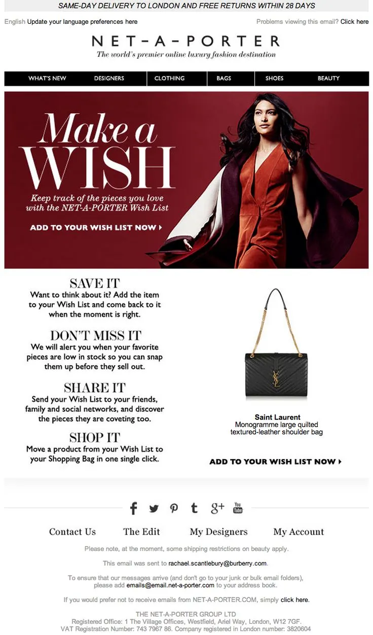
So this example, and I have two more later on, are examples of badly designed emails.
They don’t work.
If you see what they’re doing — “Make a Wish.”
First of all, we all know what “Make-A-Wish” is. Your business reminder email cannot say that.
It’s impossible. It takes my mind to a completely different thing.
“Keep track of the pieces you love,” etc., etc.
And I think it’s not a good idea in this case.
You’re reminding people to add it to the wishlist — even in that case, you want to show the product first.
Because that’s what they were there for — YSL bag, whatever it was.
21. Time abandonment emails super well
And if you must offer discounts, you have to time them very, very well.
Here’s some very simple data for you — this is conversion rate by the time you send an email.
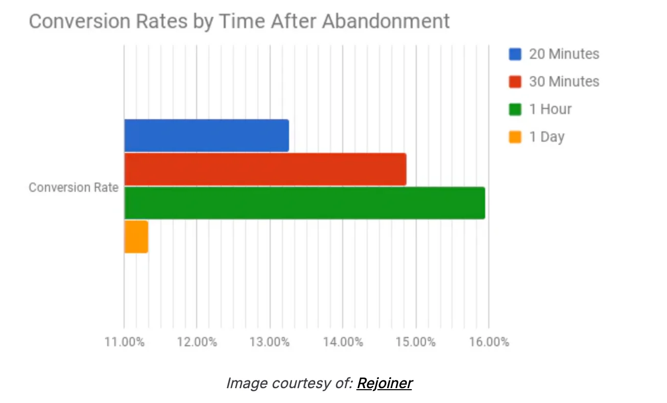
Generally, if you’re sending the abandonment email an hour later, it’s the most effective time to do it.
You’ve caught the user just at the point when they’ve started to forget about you — and this is the time to bring desire back into the game.
22. Create a grand opening with your visuals and structure
A grand opening — really high-quality visuals — works beautifully for emails.
So if your design team or your agency isn’t doing that, it’s very important that you fix it.
For example, one of the best subject lines I’ve seen:
“Get us out of your bag and into your hair.”
It looks like someone’s pulling something — it’s visual.
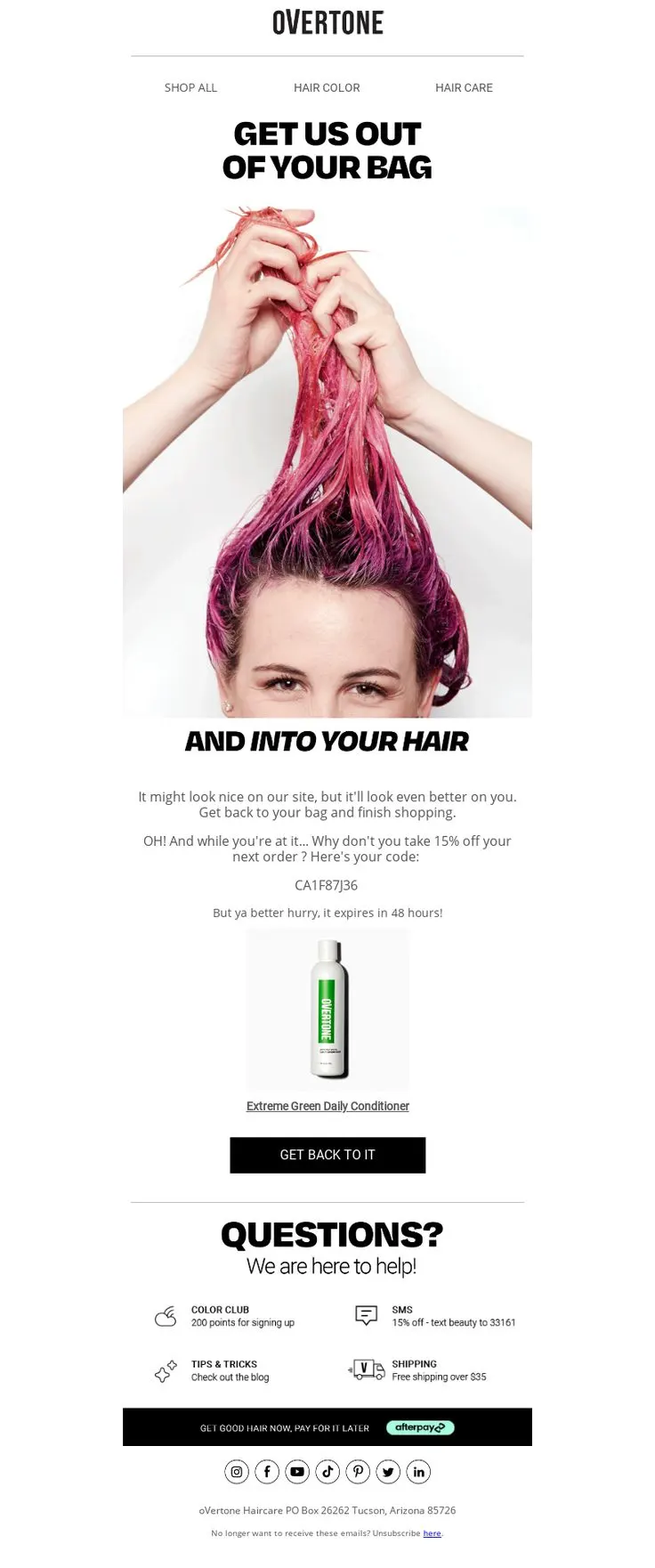
That kind of visual keeps you in the email.
So generally, an email has a three- or four-step process:
- The subject line just has to do enough to get the open — that’s it.
It should not have the offer or the brand — it just needs you to open it. - BR does a fantastic job with subject lines. The whole brand runs on this narrative that it’s run by robots — so it’s intriguing.
- Their emails are visually shocking, so you stick around when you open them.
Now you’ve got someone’s attention for six seconds — that’s what you want.
If the answer to both those things is yes — they opened and gave you six seconds — then you have someone actually looking at your pitch.
23. Rebuild the cart—within the email itself
The next one is rebuilding the cart.
I’m surprised by how many people don’t do this.
In this case, you have to essentially just send the cart back to them — in the exact same visual format as your actual cart.
That brings back memory — it brings back context — and they know exactly what they were trying to do originally.
On Store Checkout Fixes
Now, checkout — this is the most important group of people on your website.
There’s no doubt about it.
These people have gone really far.
So here’s a benchmark for you.
Your checkout abandonment must not be more than 20%.
If you’re in an industry with a high average order value — things like jewelry, luxury handbags, luxury products — you can be as high as 35%.
But there’s no chance your checkout rate should be below 65%.
And the reason I say that is because if there’s a problem in checkout, it has to be addressed before the user reaches that step.
So, I’m going to talk about things that you can do in the checkout to fix those problems.
And then we’ll continue to talk through some off-site ideas as well.
24. Ensure the cart is editable
First thing — checkouts are not editable in default Shopify themes.
So, people have to move back and forth between checkout and cart, and that’s unnecessary friction. It just doesn’t work.
Editable quantities, removing an item — removing, I think, is possible now.
Clickable product name and image, larger product images, clarity of which variant and size I chose — right?
These are simple things.
I might have chosen the wrong size, but it doesn’t show what size I chose. It just says “black t-shirt.” It doesn’t say that it’s a 2XL or a 4XL or whatever.
That obviously creates a problem.
25. Creating Urgency (the Right Way)
The second thing is you have to create urgency, but it’s important that you do it the right way.
My favorite here is the third one — the low stock and the limited time are old.
The interesting one is speed.
People want things faster.
So if they want it faster, they have to check out faster.
Tell them:
“If you check out before 2 p.m. today, or in the next 30 minutes — whatever works for your brand — you’ll get a same-day dispatch and it’ll reach you faster.”
Now, what you’re promising is a same-day dispatch, not a same-day delivery.
There’s a big difference between those two things.
26. Display Reassurances at Every Step
This is another very easy thing to achieve.
When I’m reviewing my cart, I’m talking about “No extra charges at checkout.”
“What you see is what you pay.”
This is by far the most important thing because, for a lot of stores, shipping and other charges are actually in the checkout.
That makes the experience worse.
Customer info — say, “Your personal info is 100% safe and never shared.”
“We don’t use any third-party cookie networks.”
Unless of course you do, in which case… I hope you’re not selling to Europe.
Shipping options — “Fast and trackable. Most orders are shipped within 24 hours.”
SSL-secured checkout.
Everything that can give them reassurance at all steps — display it clearly.
And finally, when they’re confirming, add:
“You’ll get an instant email confirmation plus tracking link.”
If that copy is written just under the checkout button, it will reassure them immediately.
Need help? Add “Our support system is here for you.”
Simple, but effective.
27. Offer Callback Options
This is another one.
“Have a question? Do you want a callback?”
I think this is a little bit hard to do for smaller brands, but I don’t know why more mid-size brands don’t do this.
Why can’t you just call the customer back and answer their questions?
That would make life a lot easier.
So that’s checkout.
Now, let’s go to off-the-store engagement.
This is where most people lose their high-intent customers — and it’s where the real money lies.
Off-the-Store Checkout Fixes
So, off the store.
The first one is again a very, very underrated one.
28. Send a personal email, from the founder’s email address
I think you are subscribed to the Convertcart newsletter. That’s what we try to do with the newsletter — we try to be honest, we try to say things that matter.
And in this case, instead of doing like a fancy checkout abandonment email, I think you can just send a heartfelt note.
Something like:
“Hey, you were literally seconds away from buying this. It took us seven years to perfect this product. I just want to know why.
And if you still feel the need to buy it, here is a special one from me — and you can buy it.”
I think not many brands do this.
A simple text email — no images — does really well.
29. Remind shoppers that you’re a trusted brand
This is another example of what a badly looking email is.
So in this case, for example, they’re trying to emphasize that they have more than 350 of the world’s leading designers, free and easy returns, so on and so forth.
But that information is the hardest to see here.
So they’ve numbered out the reasons I should not forget about them, but this email is just a general reminder about the product and then 1-2-3.
This is when a designer does the email and not a conversion optimization expert.
It looks great.
But does it perform well?
I think the jury is still out on that.
30. Sending an email summing up all the ways they stay safe
So this is another interesting one.
You have to kind of do the investment protection sort of thing.
“Your cart value is X, whereas you’re paying 189.
You’ve locked in 23% in savings.”
Or, “This bundle saves you so much money.”
I think emphasize the savings that they’ve left behind.
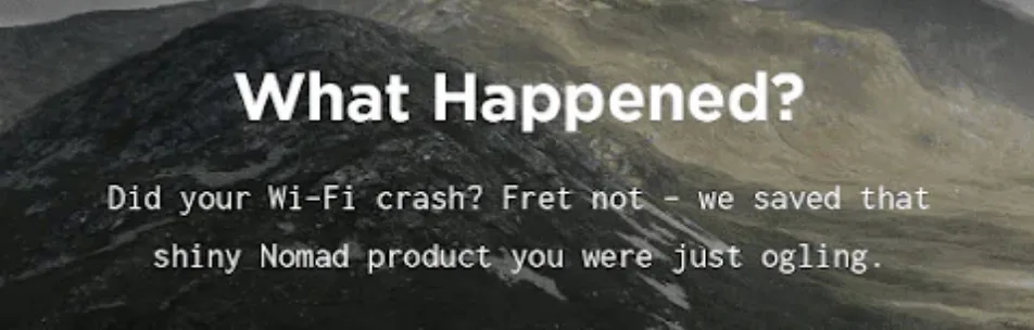
31. Get a little playful with your copy
And then my final two ideas are really simple.
The second last idea that I have is — be playful.
A lot of brands are just too serious and too boring.
And what that has done is — my inbox looks the same. Everything looks the same.
“You left something amazing in your cart.”
I think that email has come to me millions of times.
In fact, I consciously abandon cart because I know there’ll be a discount following me the moment I do that.
So, guilty as charged.
But my point is — the goal is to be a little bit different from what’s already out there.
“What happened? Did your Wi-Fi crash?
Fret not. We saved that shiny nomad product you were just ogling.”
Or,
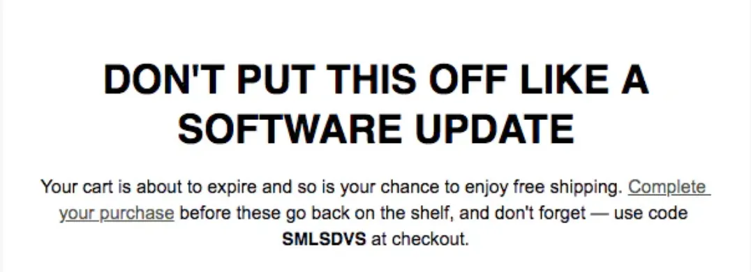
“Don’t put this off like the software update.”
Or,
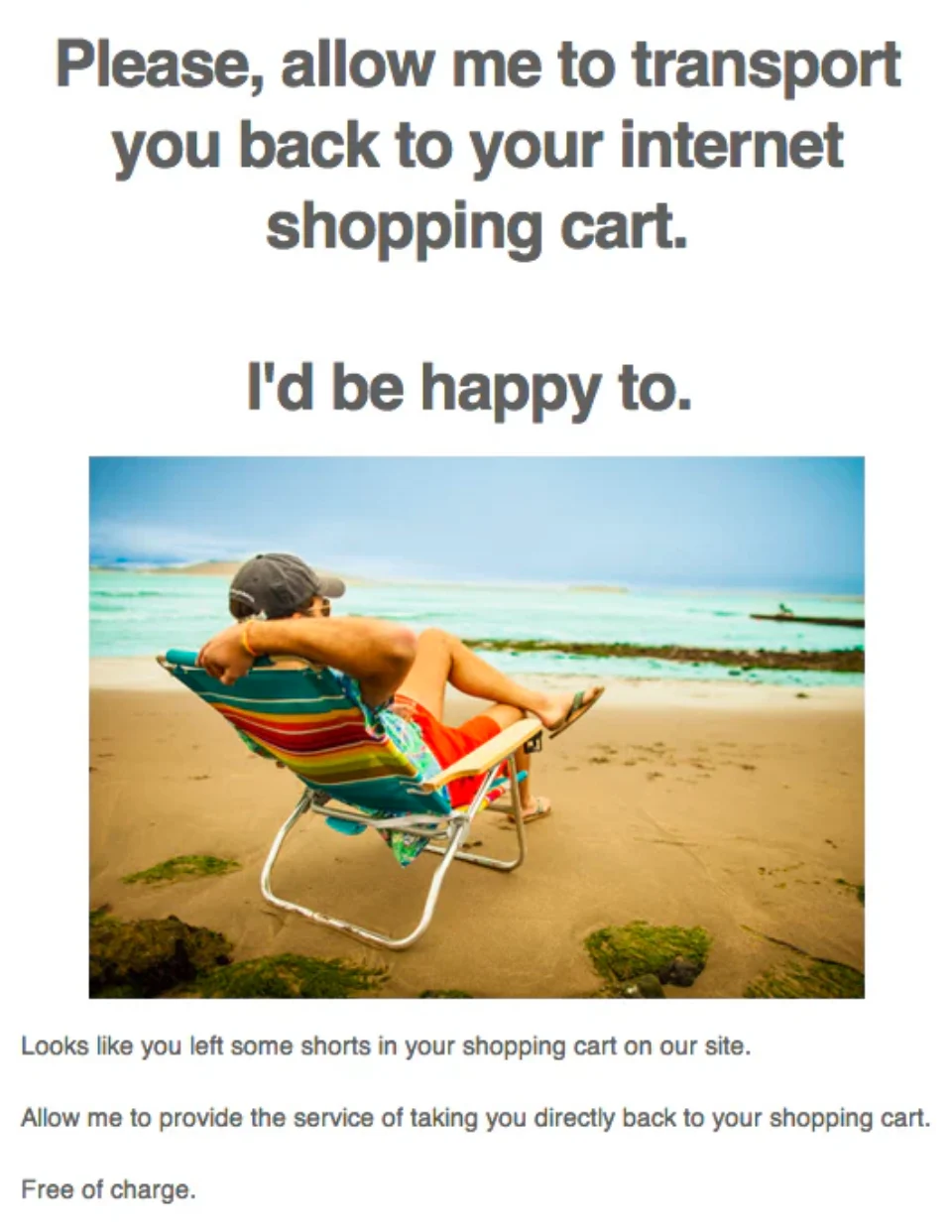
“Please allow me to transport you back to your internet shopping cart.”
So, I think keeping things simple goes a long way.
32. Test abandoned cart SMS
And the last one is SMS.
We’ve been doing SMSs for our customers for a bit now.
We’ve cracked all post-order SMSs.
But generally speaking, timing and copy matters a lot.
In this case, for example, it’s very obvious when you see this text — it’s very obvious what it’s going to say.
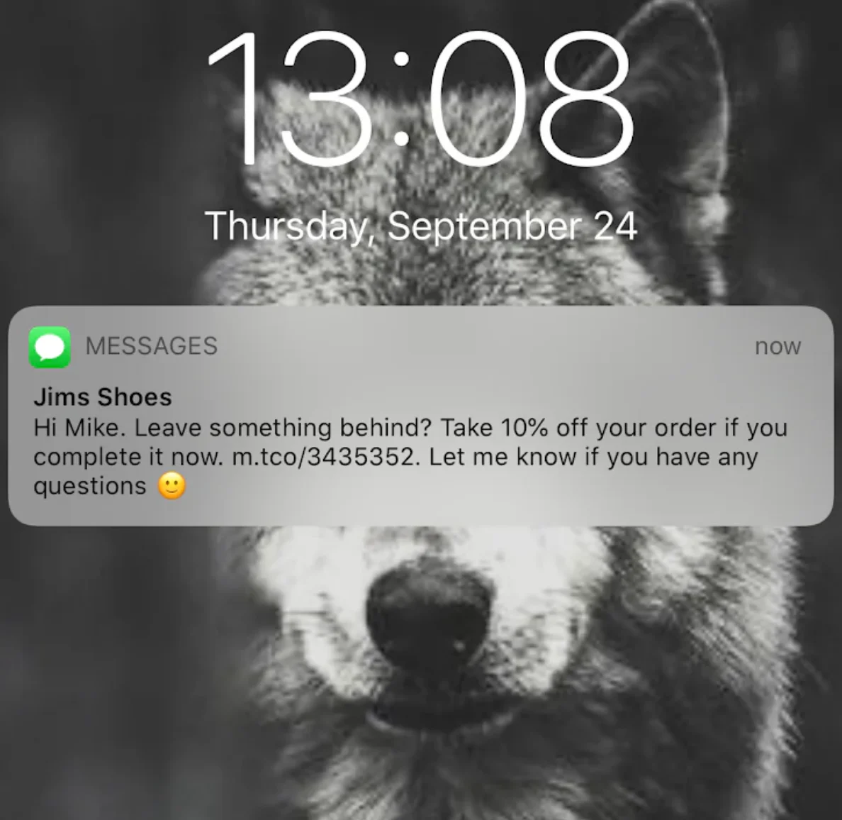
It shows where it’s from.
And then it says,
“Hey Mike, did you leave something behind? Take a 10% off on your order.”
So the moment you read these four words, you know what it’s all about.
I would actually — I’ll give you a copy example of what I would want to do with an SMS like this.
I would just say:
“Not $199 but $180.”
And that’s it.
And then I would just leave the link and say,
“Here’s the reduced price if you check out in the next 30 minutes.”
That’s it.
Just keep it extremely simple and try and be as different as possible.
So that’s the final off-the-site improvement that one could make.
Once again, I think we’ve had some issues with regards to my accent and my speed. I apologize for that.
I’ll try and do better.
We have people joining from all over Europe as well as the US — majority from the US — so we try our best to be as inclusive as possible.
But I hope these ideas were useful.
I hope you are able to implement some of these ideas immediately.
If not, we are happy to analyze your site free of charge.
We do audits.
So just reply to my post-webinar email saying, “Hey, I would like my site audited,” and we’ll jump on that.
But we also have a blog with over 600 pieces which is full of useful content that can help you take your business to the next level.
But yeah, thanks so much for your time and we’ll see you in the next.”
Get Fresh ideas to boost your conversion rate
(stuff that works for hundreds of stores)
Request a Free Site Audit"Convertcart’s Audit Report was deep and insightful. We never thought they would spend so much time in building and sharing such insightful content, free of cost."


Logan Christopher
Lost Empire Herbs