On-Demand
Founders' Chat: Spotting "Unnoticeable" Conversion Blockers on eComm Stores
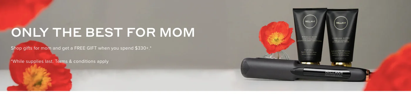
“No thanks, I don’t want to look my best.”
“No thanks, I want to keep using chemical-based moisturizer.”
These are copies from pop-ups on some popular eComm stores.
eCommerce sites often leverage shame to motivate shoppers to take action. They make the shopper feel guilty if they don’t comply.
Do stunts like these improve conversions? Well, they do the opposite. In most cases, they push people away.
And this is why we are doing this webinar:
>> To show you those unnoticeable things that are inadvertently pushing shoppers away.
What you’ll learn in this webinar:
- How to spot conversion blockers on stores—the ones that most store owners fail to notice
- A better alternative for each of these conversion blockers (a real life example)


About the speaker

Shekhar Kapoor
VP, Marketing
Convertcart
Shekhar Kapoor (VP at Convertcart) has worked with 500+ online brands, including Squatty Potty, Prep Expert, and USA Hockey Assn., and helped them boost sales exponentially.
Shekhar Kapoor
VP, Marketing
Convertcart
SESSION REPLAY: FOUNDERS' CHAT: SPOTTING 'UNNOTICEABLE' CONVERSION BLOCKERS ON ECOMM STORES
All right, perfect. Welcome, welcome everyone. Thank you so much for joining us again.
Instead of talking about the most obvious, most basic conversion optimization ideas, this time we wanted to focus on stuff that is normally unnoticeable and often overlooked.
I was recently talking to the Head of Experimentation at a Fortune 500 company, and it was a very interesting discussion because the way they would look at experimentation is very different.
As a matter of fact, I realized they have an 1100-person team that manages all of their digital assets. And in that team, there are 100 people focused purely on front-end related stuff — experimentation, revamping, creating new wireframes, even creating new parts of their own CMS. They have their own CMS, which is distributed across category teams that update things on the site.
What I realized is that they were at a point where they had essentially over-intellectualized absolutely everything — and everything needed approvals, everything was very risky because the stakes were so high.
And I realized that’s not only true for enterprises — it’s true for most companies. We are over-intellectualizing parts of the CRO and eCommerce experience and overlooking some of the most basic things.
That’s why we wanted to talk about stuff that’s really simple. It’s largely overlooked, often ignored, but adds a lot of value if you’re able to get some quick wins.
So that’s what we’ll focus on. Jumping in without further delay — I have 20 ideas to walk you through today, and I don’t want to spend more than a couple of minutes on each of them.
I’ll try to give back some of your time today because the ideas we’re going to talk about are really simple.
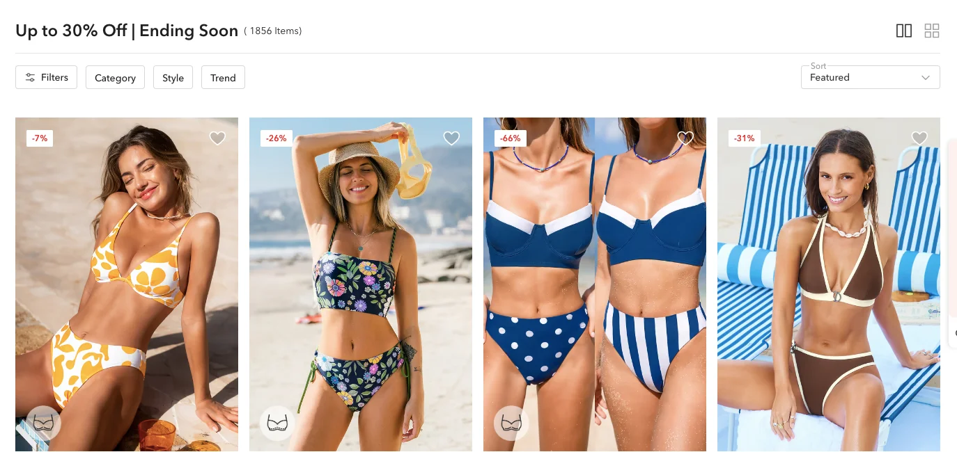
1. Showing too many discounted categories together
The first one is really simple. The idea here is not to create cognitive load.
What you’re trying to do when you’re running sales or discounts is to often do that across different categories. Like in this case, what’s really happening is you’re showing too many discounted categories together.
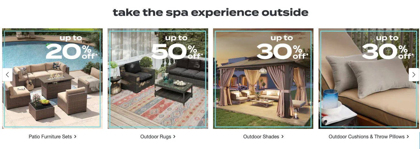
If you’re doing this, it doesn’t work — because you’re putting the customer in choice paralysis. You’re asking them to choose between too many things.
Whereas generally, if you think about it, people don’t decide on the basis of discounts — they decide on the basis of what they want. Do they want rugs? Do they want shades? Do they want furniture sets? And then within that, discounts start to matter depending on what value they’re getting.
So I think discounting at a meta level is a great way to get eyeballs and conversions. But categorizing through discounts in between is not a great idea.
How I want you to rather think about it is — focus on the most prominent, most lucrative sale or discount you’re running, and emphasize communicating that. Bring more attention to that hero product you’re running on sale.
That will allow you to send your lower-intent traffic to that product — in the hopes of converting even the lower-intent audience. For your higher-intent traffic, which already knows what it wants, focusing on having a great search, personalization, and easy navigation will actually affect your conversion rate much more than spending hours designing banners and putting them all over the site during sale season.
Because that’s not what sales are about.
Really, what you’re trying to do when running sales is to convert customers that are already in your funnel. They’re probably already on your email list.
So you have to be a little bit more tactical with discounts instead of just saying, “Hey, everything is on sale. Let’s go crazy.”
That’s a great way to bring people to the website. But if you’re doing that all over the experience as well, you’re creating choice paralysis, distracting people from what they actually want — and it’s not going to work.
As a matter of fact, today I want to emphasize something else — suppression testing, or testing by removing things. We’re going to talk about that as we keep going.
2. Fake “Recommendations for you” suggestions for first-time visitors
This is, I think, so common. I found it on Tumi as well.
I was actually shopping for messenger bags and it was showing me absolutely random stuff — including a Tumi carb, which is… I don’t even know what to do with an orange-colored carb. I think that’s because they have a partnership with McLaren.
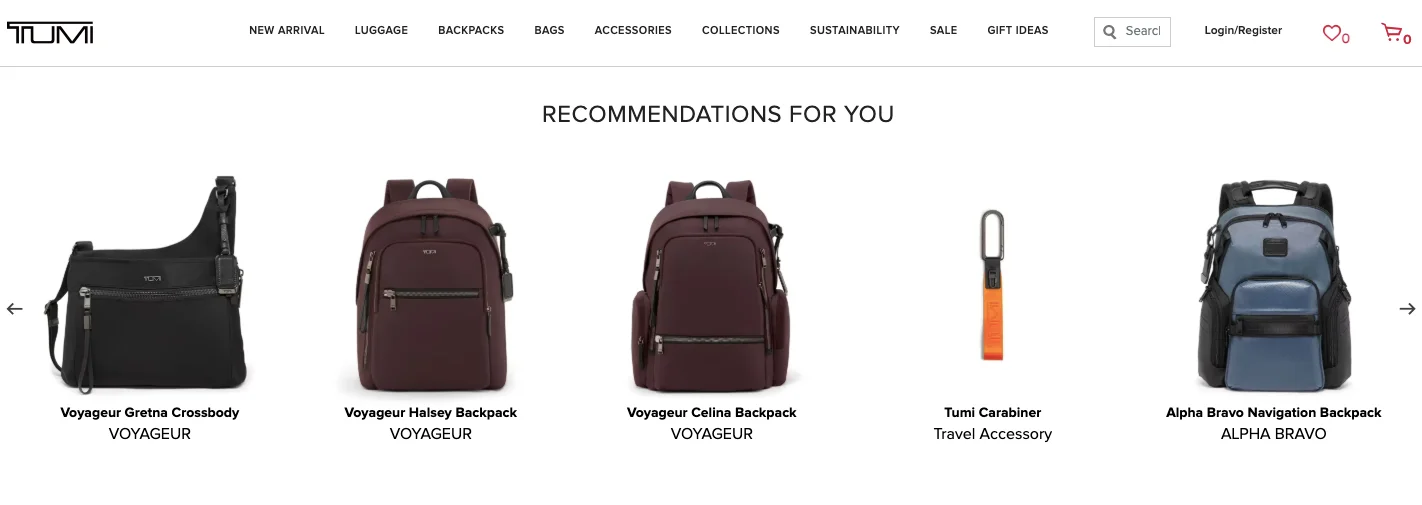
It’s impossible to show recommendations without collecting the right data. If you’re not doing that, your recommendations aren’t going to get you anywhere.
Quality recommendations actually really help. Picture this — you’re a furniture store selling sofas. I’m surfing for sofas, and I’m looking at a fabric sofa in the $1,000 to $3,000 range — it’s a two-seater.
So what kind of recommendations would matter to me? I’d want to see other fabric sofas, two-seaters, in that price range — preferably also in the same style.
If I’m looking at Scandinavian, I’d want to continue looking at that. If I’m looking at antique, I’d want to continue with antique-style designs.
Just think about that. If you’re using the default Shopify recommendation engine, chances are they’re not that relevant.
And they’re taking up very high-quality real estate on your site — creating a hindrance instead of adding value.
What you’d much rather want to do is use simple labels if you still want to suggest products — like “Top 5 customer favorites” or “Currently top-selling.”
That way, you’re not faking it. Because when you say “Recommendations for you,” it gets attention. And when they’re not relevant, it leaves a sour taste in the customer’s mouth.
3. Fake numbers that only seem to update…
Fake numbers — this happens a lot. As a matter of fact, there is a travel company in Europe which I’m not going to tell you the name of, but they were recently fined, I think, a couple of hundred million dollars because they were faking the tickets or how much of something was left in stock.
I don’t think that’s going to happen with you because they’re a large global business, but I just think that faking numbers doesn’t make sense. It actually loses trust more than it gains trust. It especially loses trust for your best customer.
Why I say that is, if you look at your own analytics you will realize that repeat traffic converts two to three times better than first-time traffic for you.
Because of that, it’s interesting when somebody who visited your site and saw a time-bound sale running or saw that only two of something was left in stock, and then they come back three weeks later because you sent them an email, and it’s still “two left in stock” one month later — they know it’s fake.
So it really is important that you think these things through.
I also think it’s very easy to add those $10 apps from the Shopify marketplace that will do things like this for you. I don’t think they add value. We’ve A/B tested some of them as well.
What you could instead do is just talk about what’s new this week — what generally is going on with the numbers that you’re trying to claim. In this case, I think the example we were trying to look at was “some 400 new arrivals,” which is obviously not true.
4. Cart recommendations that can’t be added to cart in 1 click
I often see upselling and cross-selling happening — but with no clear way for people to quickly act on it.
Like in this case, I’ve added a set of earrings to my cart, and I have three more suggestions that all look great and all look similar. In terms of the quality of suggestions, they’re great — but there’s no way for me to quickly add them to the cart.
That’s horrible because you’re taking the customer away from the cart — and that’s not good at all.
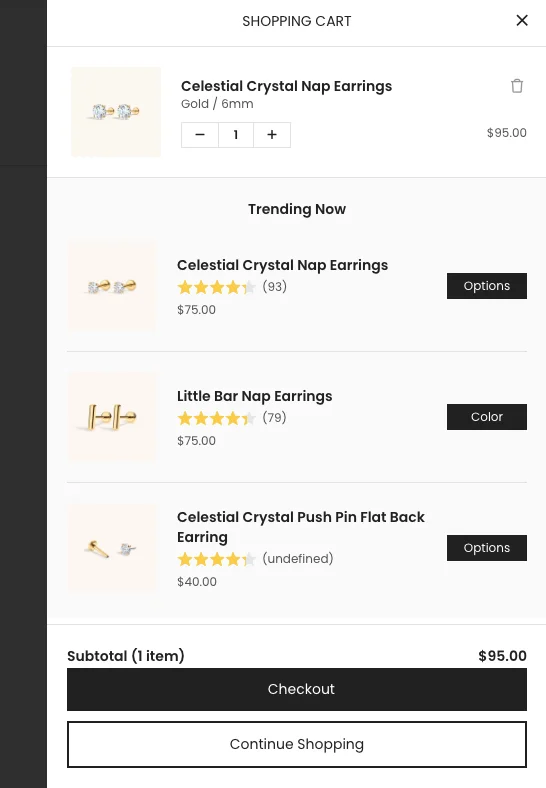
The easy fix is simple: allow the customer to instantly add it to the cart. There are ways to do this, like letting the customer pick a variant and add to cart right there in the mini cart itself.
The other important thing to remember is the difference in recommendation pricing.
In one example, I’ve bought a $95 product, and I’m being recommended a $75 product — that’s a significant decision to make.
But in another example, I’ve bought a $100 product, and I’m being sold a $14 pair of socks — very easy decision to make.
It’s an even easier decision if adding that $14 product makes shipping free for me.
So, you have to do things one step at a time and think things through — instead of just adding stuff to the site that doesn’t make sense.
5. Overlapping offers—turning the “usual free gift” into a “seasonal offer”
Usually, if you’re doing a free gift or running an offer, and you keep renaming it over time, hoping to convert customers — remember, your repeat traffic and most loyal customers already know that.
You can’t fool them. Customers are very smart. You have to be cautious.
What I really recommend is thinking things through. Instead of doing overlapping offers, tier the discounts.
It’s such an easy thing to do — and it makes the whole process simpler. You’re also making decision-making easier for customers.
I’ll talk about tiering again later, but right now I want to focus on something slightly more important — discounts that aren’t really discounts.
6. Highlighting minimal savings—to force conversions
You know, a $2 off on a $32 product really doesn't matter. I understand that's about 7 or 8% off, but generally speaking, 15% is the psychological threshold beyond which discounts truly start to matter. Anything below 15% will not matter.
For example, a 5% discount on a $1,000 product is a $50 saving — that’s meaningful, and it would work.
But if it’s less than that, it won’t have a psychological impact. What you’re doing instead is crowding your product information, your site, and creating unnecessary clutter that doesn’t help your conversion rate.
Try removing these smaller, pointless discounts and simplify the experience.
I can guarantee that it will:
A) improve trust — because you won’t look like a discount store, and
B) allow you to sell products at MRP more confidently.
Because if you’re always running discounts, when you actually run a real sale for Thanksgiving or something big, it won’t matter anymore.
So think this through.
What I recommend you do instead is focus on value deals — bundle products together, make people buy more, tier your discounts: “Buy 5 and get this.”
That kind of stuff is legitimate — it increases order value, rewards the customer, and rewards you too.
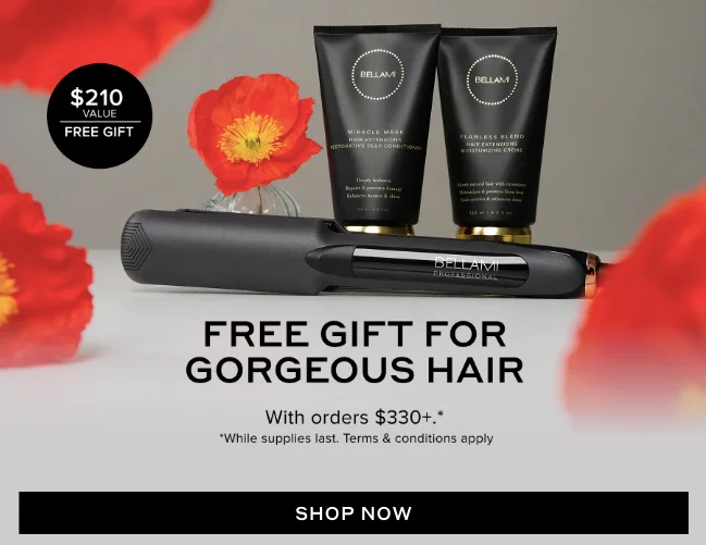
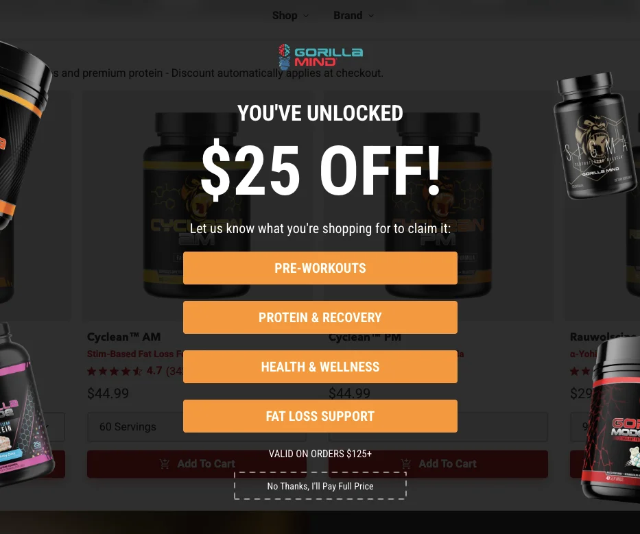
7. Over-promising pop-ups (that hide pre-conditions)
Now, this is very famous. You want $100 off. Yes, I want it. I give my email and I get an email saying you'll have to buy for $1,000 to get the $100 off. It's ridiculous.
You're lying, and it doesn't work that way.
Hiding these preconditions will never work — you're going to erode trust as a brand, so you have to be very careful.
I categorically like brands that are able to make promises that say “no conditions apply.” That's what people want. I mean, what would you want as a customer, right?
What I think you could do again is a tiered discount. So instead of saying, “Hey, $100 off if you buy a thousand,” think of the value that you're willing to give away. If you're okay to give away 20%, tear that down: give 10 on 100, give 20 on 200, give 30 on 300, and so on.
You could still run the messaging and still get away with giving a 10% because you're giving something.
You're not giving nothing. I feel that's a big one, and I've seen this happening on a lot of sites, especially sites that sell high-value products. We work with a lot of luxury watch sites, which are either selling established luxury brands or people trying to create their own brands from scratch.
8. Mandatory email sign-up for quiz results—that too without any real reward
This is again a really annoying one — primarily because I just filled up a lot of information to find out what works for me, and now I’m being asked to enter even more information.
That’s not great.
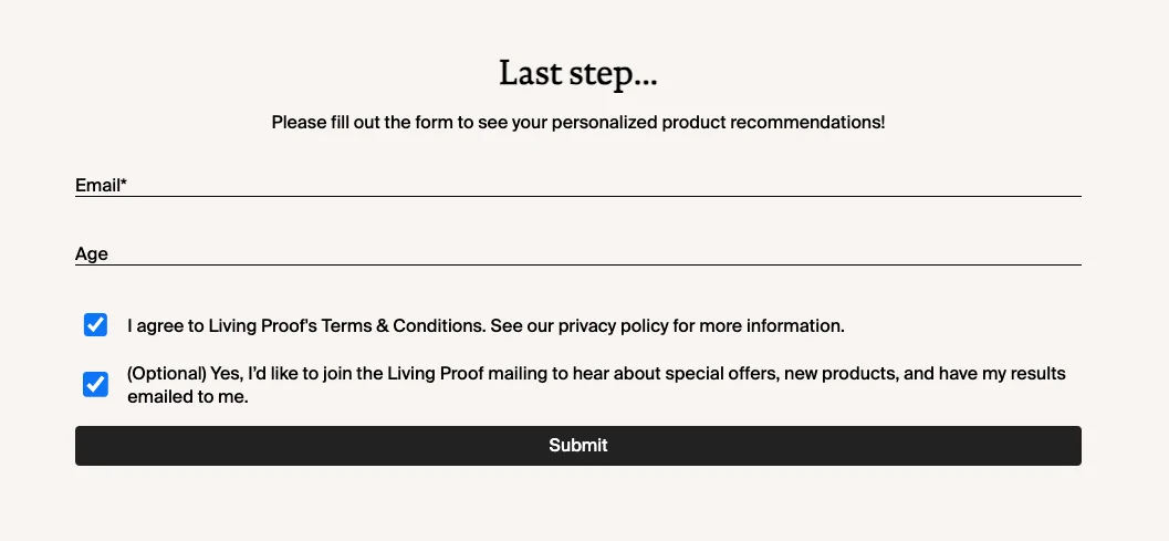
The way out — the solution for that — is to also add a reward.
So in this case, the last step could say: “We need your email in order to save Amber’s recommendations — plus we’ll generate a $5 off code.”
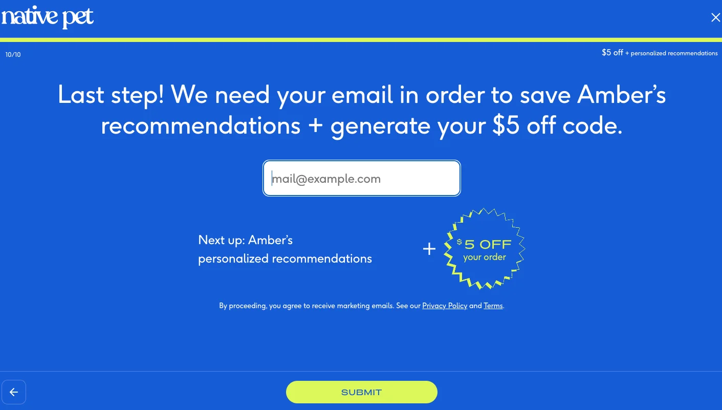
Or you could also give them the option to skip that. Let them see the recommendations.
What’s the point of giving a quiz if you don’t let them see the results?
The whole reason for giving a quiz is that you want to be a consultant — a digital consultant.
For example, if you’re a skincare brand, and I say, I have acne during this time of the year, this is my age, this is my weight, and this is the kind of supplements I’m taking — and then you’re trying to nail what kind of product would work for me.
So if you’re going to use that as a way to collect emails, that’s really not the point. That’s not the reason you did it.
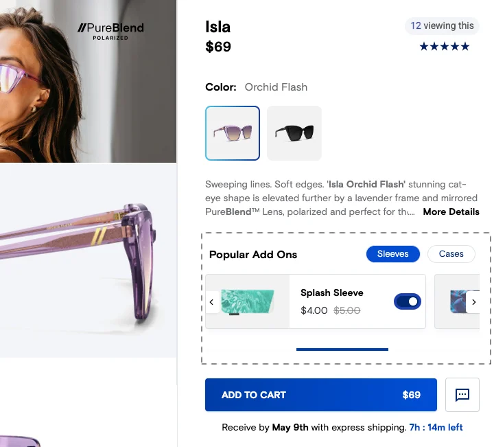
9. Pre-selected add-ons—that are also hard to notice = Deceptive
Pre-selected add-ons or deceptive add-ons in the pricing in any way — in this case, there’s a $4 sleeve for the sunglass that is added. Strict no. Do not add any add-ons.
As a matter of fact, you could just be smart about it and sell those add-ons in the right way. In this case: “Protect your sunglasses.”
This is a very simple one. I’m not going to spend too much time on it.
10. Reminding them of a free shipping threshold in an abandonment email 😟
Now here is an interesting take.
At Convertcart, we’ve been doing email marketing for more than 100 brands now. We send millions of emails every week, and we are able to do experiments at scale because most of our customers have high list sizes.
By the way, if you’re looking for an audit for your site experience or your email setup — even if it is on Klaviyo — we are happy to come in and do that for you.
But the reason I brought that up is this: through the experimentation we’ve been doing, we realized that cart abandonment and emails have become this way to remind the customer about things, and free shipping has become a way to push the customer to buy more.
And while that’s okay, and you want to do it in a tactical way, we’ve seen that putting your free shipping threshold when the abandoned cart value was significantly lower actually deters the customer from going to the next step.
So here’s what’s happening: I had a $25 product in the cart. I abandoned the cart. But then I also see that free shipping is on orders above $49.
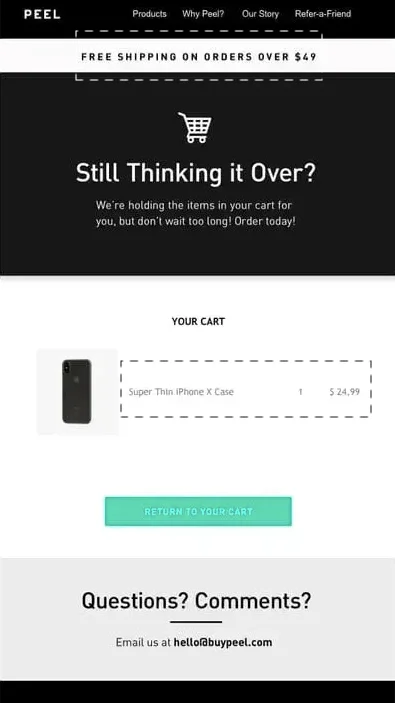
What that’s going to do for me is not make me buy double the quantity. No. It’s going to stop me from clicking — thinking, “Okay, this means that these 25 bucks are going to be this plus shipping.”
And when you’re selling between $20 to $80 value, trust me — people really care about the $3 or $6 or $7 you’re going to charge them for shipping.
So they’re like, “Forget it. I’m going to go to the mall this weekend anyway. I’m going to pick something up at that time.”
Especially if you’re selling something people really don’t need. The world is okay without whatever you’re selling. They’re not going to go through the effort of paying you double the money to get $7 off.
So think through how each and every part of your messaging works.
This is something we realized because we send millions of emails, and we’ve been able to experiment a lot with copy.
Copy is king. You have to have absolutely incredible copy — no matter what you write, where you write it. That’s why this idea really matters.
11. “Protection guarantees” mysteriously hiking up the price at checkout
This is something new. Actually, two or three months ago in a webinar, I recommended doing this — I essentially recommended helping people jump the queue.
So what happened is, I recently went to Europe, and almost all of the largest tourist attractions have two tickets.
If you’re going into the Colosseum or the Vatican, you can buy the normal ticket, line up, and enter — or you can pay a 10% premium and get skip-the-line tickets.
That allows you to walk right in without waiting.
The thing is, almost everywhere we paid that 10% premium, but in more than half the places it wasn’t even needed because the line wasn’t long enough. So I really just paid it — like that.
So a few months ago, I recommended to brands that they could add a small “top-of-queue” fee — like, “Hey, your order will be processed first, before all other orders, as long as you pay $2 extra.”
So it’s $2 extra per order, and we’ve seen very high conversions with that — about half the orders will convert with it.
So if you’re doing $1,000 orders a month, you’re talking about $1,000 in additional revenue — and the cost of that revenue is nothing.
It goes straight to the bottom line, because the only thing you’ve got to do is reorganize the way you pack and send.
But people took it the wrong way.
What I started to see was people selling guarantees that were automatically getting added to the cart. And that’s horrible.
In this case, what’s really happening is I’m getting a “Cuts Boost + Free Returns and Package Protection” added to the cart without my consent.
So what happens is: in the cart, I’m at $118, but in the checkout, I’m at $136 — and that’s really off-putting.
The checkout doesn’t allow me to remove it. So now I hate you — and I’m going to just leave.
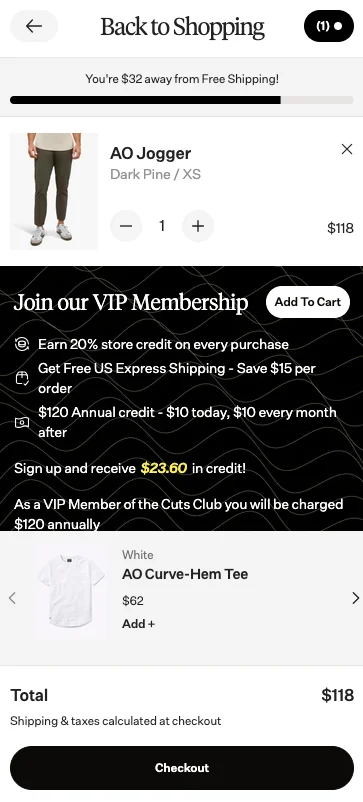
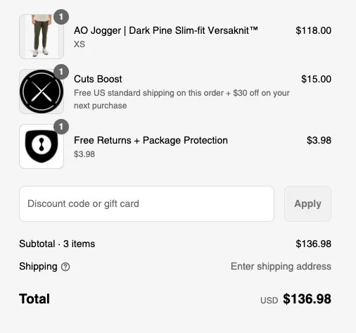
So let’s not do that. Be very careful about how we do this.
Also, when you do it — if you do it — make sure you sell it well.
For example: “95% of shoppers chose protection guarantee to make sure their product reaches them in top condition.”
That adds value.
The other thing you want to make sure you do is — when you add a guarantee like this, make sure that the people who don’t get it aren’t concerned or worried about what they’re doing.
Because if you’re offering a guarantee on one side, the other side shouldn’t feel like, “Oh, it’s probably unreliable to ship with these people.”
That won’t work well either.
12. Showing a “super inflated Retail Price”—to make “Member Pricing” more attractive
So yeah, I think this happens a lot on eCommerce stores that generally sit between a million to twenty million or fifteen million in revenue.
If you’re selling branded products, we try and show the MRP and then we discount it and sell it — and then there’s a member pricing on top of that.
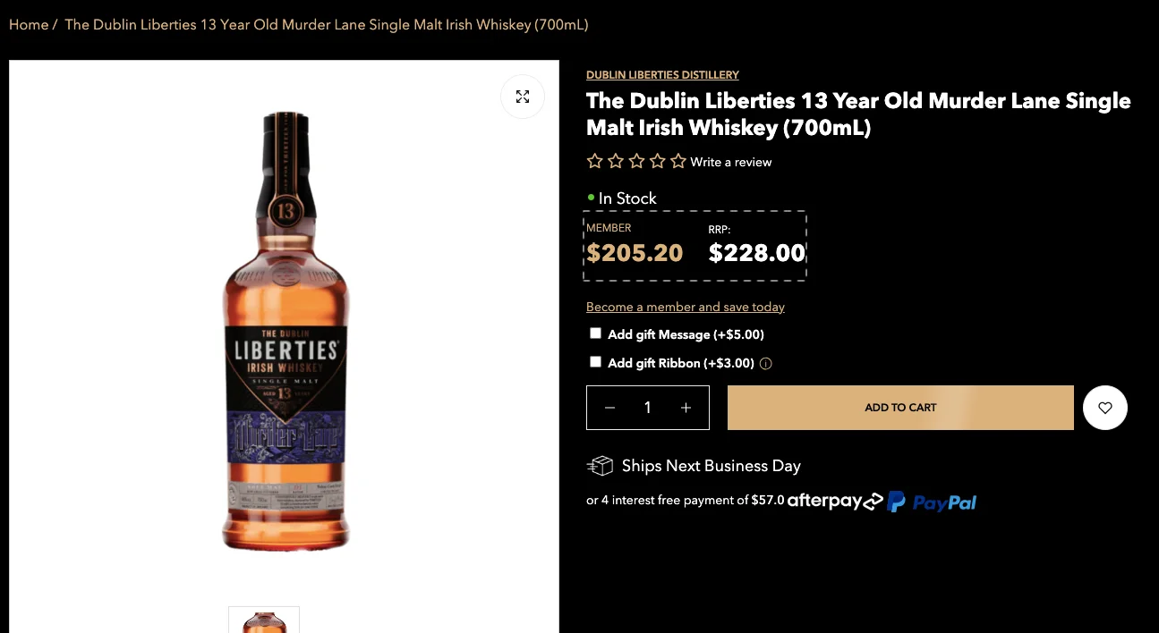
I recommend that we think through this. And the reason I say that is because of price. Let me just articulate myself in a more fundamental way.
The three or four most important things on your product page as a business are:
- The first most important thing is images.
- The second most important thing is price.
- The third most important thing is the title of the product.
- And the fourth most important thing is the value prop as a whole that comes out.
So the first most important thing is the image, and the second is the price.
If you’re selling a standardized product and you are pricing it above whatever the market is at — or people generally know what that product costs — then it instantly erodes trust.
You are then perceived as a place that’s selling expensive products, and you are never going to get a conversion from that customer.
Interestingly, your most discerning buyers know what things cost and what they’re valued at. And so you are losing your most discerning buyers by doing that.
You have to be extremely careful.
What you could do is highlight member pricing, but also, instead of focusing purely on the pricing, focus on the rewards.
Start a positive loop. Instead of increasing the price and discounting it, if you want to have a membership-level pricing, you could add extra perks — like exclusive drops, invites to community sessions, expert tasting events — whatever is relevant to your brand.
That’s when you create a real, valuable membership.
I also recommend adding all of those members into a Facebook group or creating a Slack community — and then taking it to the next level.
But playing with price can be dangerous.
13. A permanently discounted “Ending Soon” section on your store
I think this goes without saying — and I’ve been repeating this — but generally speaking, moving your slow inventory by overly discounting hurts conversions for all your other products.
You’ll have to work with someone really smart to help you experiment with this. We’re happy to do that for you, but generally speaking, if you have an “Ending Soon” or “Clearance” section that has products which don’t usually sell well, or aren’t fast-moving, and you’re doing like a 30% off — invariably you’ll redirect a lot of your quality traffic that was going to buy your bestsellers to the clearance section instead.
And then they’re going to judge you and your entire store based on what’s in that clearance section.
It also makes the rest of your store look significantly more expensive — and that’s a crime.
A bigger crime is if that section doesn’t refresh often or doesn’t change.
What you want to do instead is time the sale — make it a really specific event. Have only very limited options in it. Have just two or three. Don’t have twenty.
You could just call it something like “May Sale” and put three options in it. Have different options every month.
That becomes like a parked area for drops or timed pricing for different types of products — and that’s the safe way of doing it.
So that’s an interesting one to think about.
14. Manipulative language in the secondary CTA…
So this is, I think, one of the oldest CRO tricks in the book — either take the opt-in or click “No thanks, I’ll pay full price.”
Now, the thing is — we’ve come to realize that people have become more and more sensitive about the emotions they’re feeling while they’re shopping. Especially with brands that they’re engaging with one-to-one.
Because a lot of the discovery of your brand is probably happening on something like Instagram or TikTok.
And if that’s where they’re discovering you, they come with an expectation that wasn’t true some time ago — because earlier, a lot of brand discovery was happening purely through Meta ads.
The problem with coming in with that expectation is that it’s very easy to get hurt as a customer. So you don’t want to annoy them in any way possible.
Please don’t try and invade their inbox by doing something like this.
I always emphasize keeping things simple — and creating positive reinforcement.
How are you positively reinforcing someone for giving you their email ID?
For example: “We’ll never spam you.”
Although that’s a hard promise to make, you can at least promise what you’re going to do instead.
Say something like: “Get weekly drops and quarterly offers,” or “Get access to irresistible deals.”
That’s it.
You’re promising how much you’ll message them, instead of just taking their email, leaving them in the dark, and throwing them a discount.
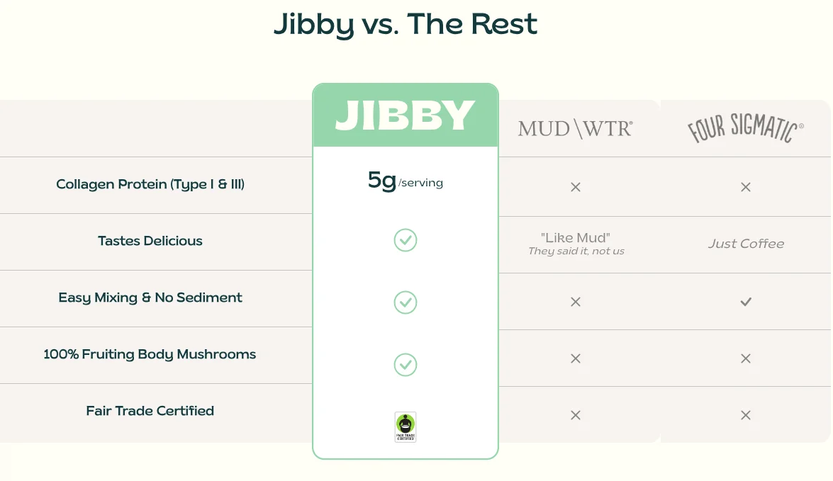
15. Comparison charts that don’t really add value
Very, very common — and really not the thing you want to do.
It’s like the sleaziest, old-school car salesman technique, right? “We’re the best car dealer in the city. This is the best car you’re going to buy. This is the best price you’ll ever get. Your life will change if you buy this car.”
And then everybody knows what happens after that.
It’s not true. There are fifty other car dealers. This is one of many cars you can buy. And this is one of many prices you can probably get for it.
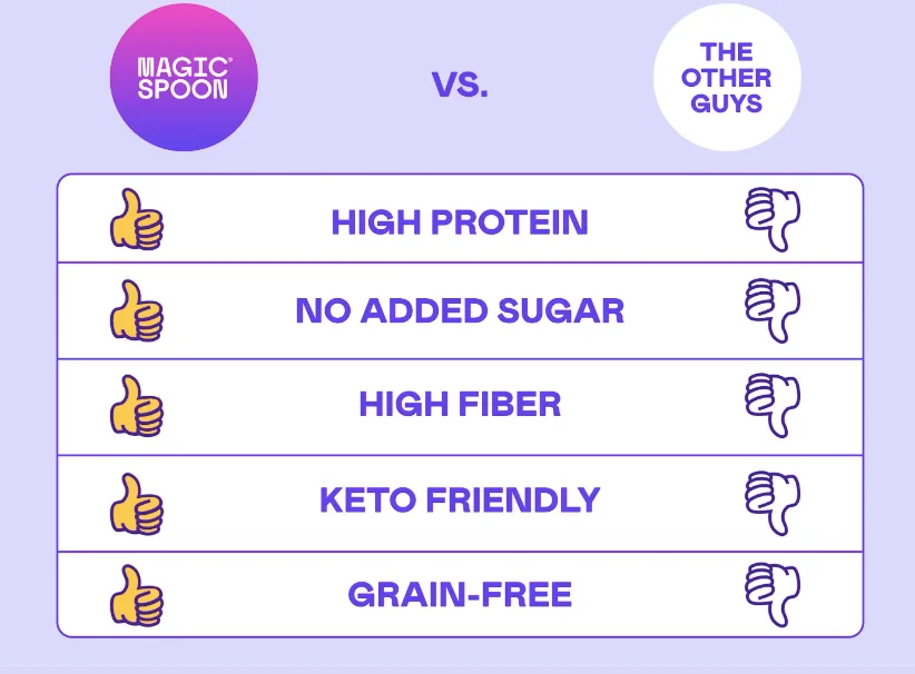
So what you want to do instead is make meaningful comparisons that actually make sense and have a clear differentiator.
For example, if you’re selling a supplement and taste is your USP, focus on that.
If you’re selling a fashion product and fit is your USP, focus on the fit.
Focus on the things you actually do well — instead of trying to say, “Hey, everything else is trash and I’m the best.”
That erodes trust.
Again, as I said, these are often ignored things — very simple things — but they really matter.
16. Try Suppression testing (testing by removing things)
Before I start talking about the next one, I had spoken earlier about suppression testing.
What I really meant is — I often see people experimenting or testing by adding things to the site. Adding things to product collections, adding things to the homepage.
But very rarely do we see people removing things.
And you have to trust me — some of the most powerful experimentation ideas originate from removing things.
Because, honestly, adding $10 or $15 apps has made it very easy to throw small hacks onto your product page or collections page.
But if you simplify, simplify, simplify — it just changes the game completely.
There’s a very famous quote that says: “The number one indicator of a very high intellect is how simple someone can make something.”
And I really believe that.
You have to look at the last atom of the reason someone visits your site.
What is it that they’re trying to buy?
Why is it that they would buy it?
And what matters to them most?
Is it price that matters?
Is it quality?
Is it speed?
Then just focus on that single problem alone.
17. Unspecified limited time offers
I’ve added this idea just so that we can remove the taboo around timers.
Timers work beautifully — if you do them well.
Right? So in this case, for example, they’re selling a cream and there’s a decent offer here — about 20% off — and it says “Limited Time.”
But then that’s it. There’s no actual limit visible.
It creates zero sense of urgency.
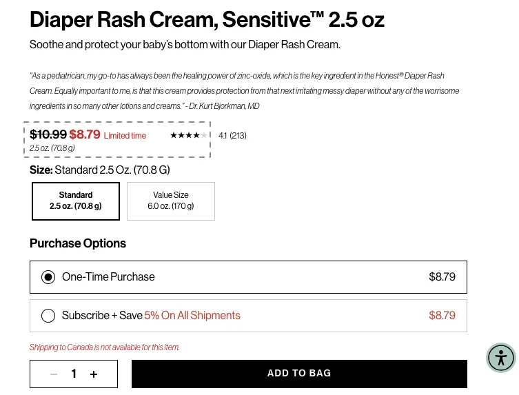
The other thing you see happening here is two deterrents.
One — the subscription option says “Save 5% on all shipments,” but the price is the same. If you see the price at the end, it’s exactly the same.
Two — there’s no shipping to Canada.
So now you’ve created two unnecessary blockers.
What you want to do instead is keep things simple.
If it’s a new customer, don’t even tell them what the subscription saving is. Get the first conversion first.
If you want them to switch to a subscription, it has to be exciting enough for them to do that.
And also, replace that “Limited Time” with a timer, because that would go a long way — just a very simple timer.
That’s it.
18. Unclickable review snippets that come up as pop-ups
There was this company called FOMO — they used to do FOMO pop-ups. I think they still do.
They’re those little pop-ups that come up on the corner of the screen, showing “Jason bought this from Albuquerque” or “Maria just purchased this.”
You wouldn’t believe it, but there are two interesting things I’ll tell you.
First — we’ve A/B tested running these kinds of pop-ups many times, and more than 60% of the time they actually reduce conversions because they erode trust.
Everybody knows those pop-ups are probably not real — even if they are real, people think they’re not.
That’s what the internet generally thinks.
And second — about that company itself: they got acquired some three or four years ago. They didn’t sell for that much money.
But here’s the kicker — 70% of the total value of that company at the time of acquisition was because of their domain, fomo.com.
So that tells you the business itself wasn’t worth too much.
Some interesting trivia for you.
What you should do instead is make those pop-ups clickable and actionable.
Try and make them relevant — I should be able to jump to the product, or there should be a small offer attached.
I’d still recommend not doing them at all, but if you do, at least make them serve a purpose.
Because “Jason bought this product from Albuquerque” — it’s a long shot.
19. Notification bar crammed with various % off messages
Okay, this one — I’ve seen this way too many times.
You know, convertcart.com was also guilty of doing this at some point.
But generally speaking — you’ll see things like:
“Free shipping,” “20% off on menswear,” “40% off on everything,” “20% off on fashion.”


It’s chaos.
The choice paralysis here is insane.
What you want to do instead is make it dynamic.
What we normally do is segment and run the notification bar differently for different types of visitors — because these bars work great.
They get attention, they’re bright, and everyone sees them.
They can work very well if done right.
So here’s what you should do:
For first-time visitors, switch it out with something like: “Free shipping on your first order — just for you.”
For repeat visitors, try: “Free shipping if you add two products.”
That’s it.
You just need to think through what perks or carrots will work for which type of visitor — and tailor your message accordingly.
You’ve got to do that segmentation.
20. Obstructions - to prevent shoppers from removing items from the cart
So there are two ideas here.
The first is — I don’t see a lot of brands actually doing anything when a customer empties their cart. And I don’t know why.
Did you know there’s a small percentage of customers that will actually empty their cart before they abandon it?
That data point is very often overlooked.
And imagine this — there’s somebody who’s going through the effort of removing something from their cart, and there’s really no deterrent to it.
When somebody clicks “Delete,” it just gets removed. That’s it.
No friction, no nudge.
So the first thing you should do is — do something about it.
Try to make that part of the experience meaningful.
What I’d want us to do is make the post-cart removal process a little more interactive — something that engages the shopper and gives them a reason to think again.
Now, that said, the ones who are doing it are sometimes going overboard.
Here’s an example of one that went too far:
“Wait, are you sure you want to empty your cart? You’re leaving behind items that are top-rated, low in stock, trending now. Your selected items include a free gift. If you empty your cart, we can’t guarantee these products will still be available.”
That’s like standing at the exit gate of a Walmart and shouting, “Don’t go!”
And that doesn’t work. Nobody’s coming back — you just look like a creep.
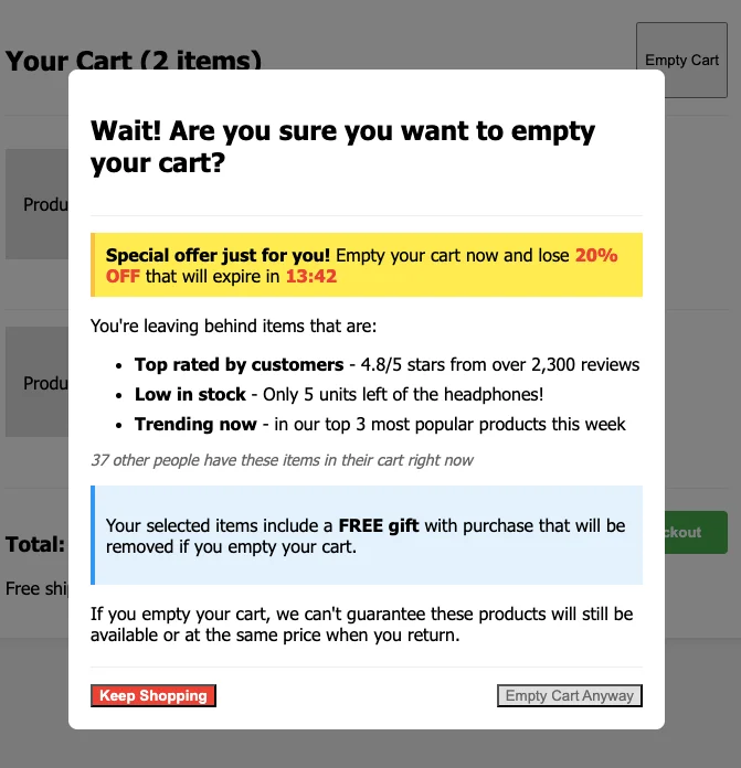
So, don’t do that either.
You have to find the balance.
21. Expecting people to explore an entire category
Now, there are so many problems with this example — so many gaps — that it just pains me as a conversion optimization geek.
I won’t say expert, because I’m always learning.
First of all, the general differentiation between the products is terrible.
The difference is — the first one is apple and sweet potato, then blueberry and carrot, and so on. But it’s so hard to make that out because they all look the same.
A large part of the attention goes to the brand, not the product.
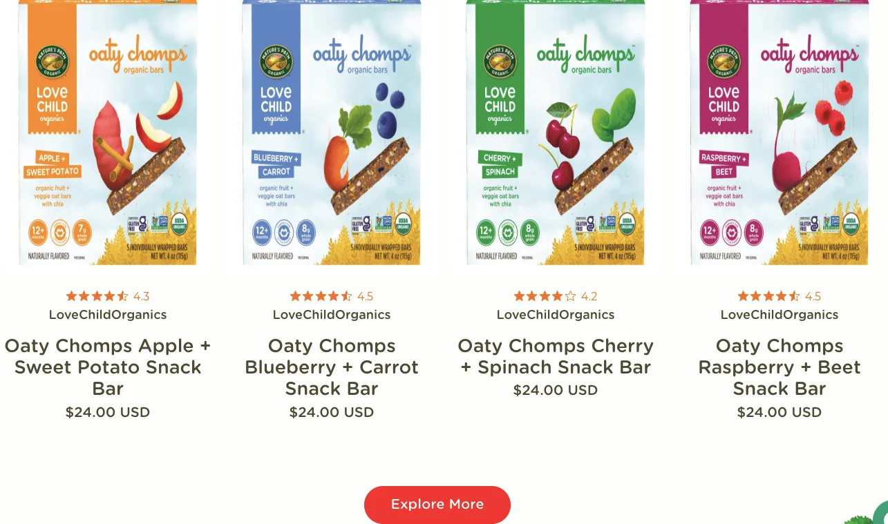
So I think they have a branding issue.
But more than that — on the website, they could have completely avoided this by simply showing the actual product instead of just the outer packaging.
It doesn’t matter what the outer packaging looks like — you want to see the actual product.
And this reminds me of something from my recent trip that I was just talking about — pasta in supermarket aisles.
I was in a supermarket, I think it was in Pisa, and I just asked this Italian guy because I was curious — “Which is the best pasta? Like, something that your nonna uses?”
He pointed me to a package that looked quite plain.
And I had earlier asked someone else a slightly different question — “Which is the bestselling pasta?”
And that was a different one.
The difference between the two was interesting: the best one — the one the Italian guy said his nonna uses — was fully closed packaging, looked clean and traditional.
But the bestselling one? It had transparent packaging. You could see the pasta inside.
No fancy logo, nothing.
And it sold more — simply because people could see what they were buying.
So I don’t understand why consumer brands don’t think this way.
If your product actually looks good, show it. Show the product as real as possible.
That’s one huge issue.
But the fundamental CRO idea here is this — when you’re expecting someone to explore an entire category, they have to go into every product.
If you look at what’s happening here — I’m seeing a catalog of products, and then there’s an “Explore More” button.
So I click it, and instead of four, I now see sixteen products.
You’ve just completely destroyed my journey.
If I were running this site, and I know they have a bestselling flavor — let’s say it’s cherry and spinach — then that needs to sit right on top.
Lead with one suggestion, one recommendation, and convert your first-time visitor who’s trying your brand for the first time.
Then, the next time, sell them a multi-pack with all the flavors so they can try more.
And then the third time, ask for a subscription.
That’s the chain that works.
But for starters, if you’re doing an experience like this — just have a simple “Quick Add” button or a “Quick View” button.
Something that allows me to get the key information right there instead of confusing me.
So that’s my final rant — final idea.
I hope that added value. I just wanted to make sure you have things that you can instantly implement.
Out of the 20, even if there was one that you can potentially implement right away, I think I’ve done my job — and that’s a big win.
Thanks so much for your time, everyone. I’ll see you in the next one.
Get Fresh ideas to boost your conversion rate
(stuff that works for hundreds of stores)
Request a Free Site Audit"Convertcart’s Audit Report was deep and insightful. We never thought they would spend so much time in building and sharing such insightful content, free of cost."


Logan Christopher
Lost Empire Herbs