On-Demand
"Underrated" Conversion Optimization Ideas for 8-Figure eComm Stores
What if hitting your conversion benchmarks didn’t mean endlessly scratching to bring in more and more traffic?
When done right, conversation rate optimization makes it easier for founders to hit their conversion benchmarks by turning more of the traffic they’re already getting into paying customers.
That’s every founder’s dream, right?
And yet, many eCommerce stores focus on common tactics—like free shipping, basic email retargeting or abandoned cart emails—but the real growth opportunities lie in overlooked strategies.
To stand out in a competitive market and boost conversions, eCommerce stores must implement less conventional strategies that tap into customer psychology, and create a sense of urgency.
We need to understand how customers think and how to gently nudge them towards purchase.
We need to explore the subconscious biases and mental shortcuts that shape our decisions.
In this live session, I will show you how to grow conversions by:
👉 Using more psychological triggers
👉 Getting more scientific with pricing
👉 Redesigning pages to reduce cognitive load
👉 Driving scarcity but subtly


About the speaker

Shekhar Kapoor
VP, Marketing
Convertcart
Shekhar Kapoor (VP at Convertcart) has worked with 500+ online brands, including Squatty Potty, Prep Expert, and USA Hockey Assn., and helped them boost sales exponentially.
Shekhar Kapoor
VP, Marketing
Convertcart
SESSION REPLAY: "UNDERRATED" CONVERSION OPTIMIZATION IDEAS FOR 8-FIGURE ECOMM STORES
Well, hello, thanks so much for joining again. We’re back with another webinar, with another set of things to talk about, another set of exciting ideas that I would love to share with you. And this time we are doing something different. We’re trying to be a little bit deeper with the insights that we share with you by sharing exactly why they work, and potentially also the psychological principles.
I have more than 20 items to share with you, and without further ado, I would love to get into it immediately.
It’s just me — that’s how we do it here. I get on a webinar every month, and we as a company run about 10,000 experiments a year. So we have a lot of data and a lot of insights on what works and what doesn’t work, why people leave a site, and what makes your customers drop off at different parts of their journey. And so my job is to distill all of that down to a few insights that you can immediately implement.
Now, there are two things that might stand out here. The first is “underrated.” Some of the stuff that I’m going to talk about is going to be pretty straightforward, basic stuff — but it’s underrated because a lot of companies either do it wrong or they just do it like a checklist item. There’s not enough thought that goes into implementing something.
The other thing is “eight-figure e-commerce store.” So whether you’re an aspiring eight-figure store or an already eight-figure store doesn’t really matter. I think the important piece is that these are for stores that are slightly sizable, that have enough traffic. We’re not going to solve demand gen for you — we’re going to solve converting the demand that you already have. Converting the paid traffic, organic traffic, and all the other forms of traffic that you already drive to your site.
All right, so let’s jump in.
1. Make your copy play on the Effort-Reward Heuristic
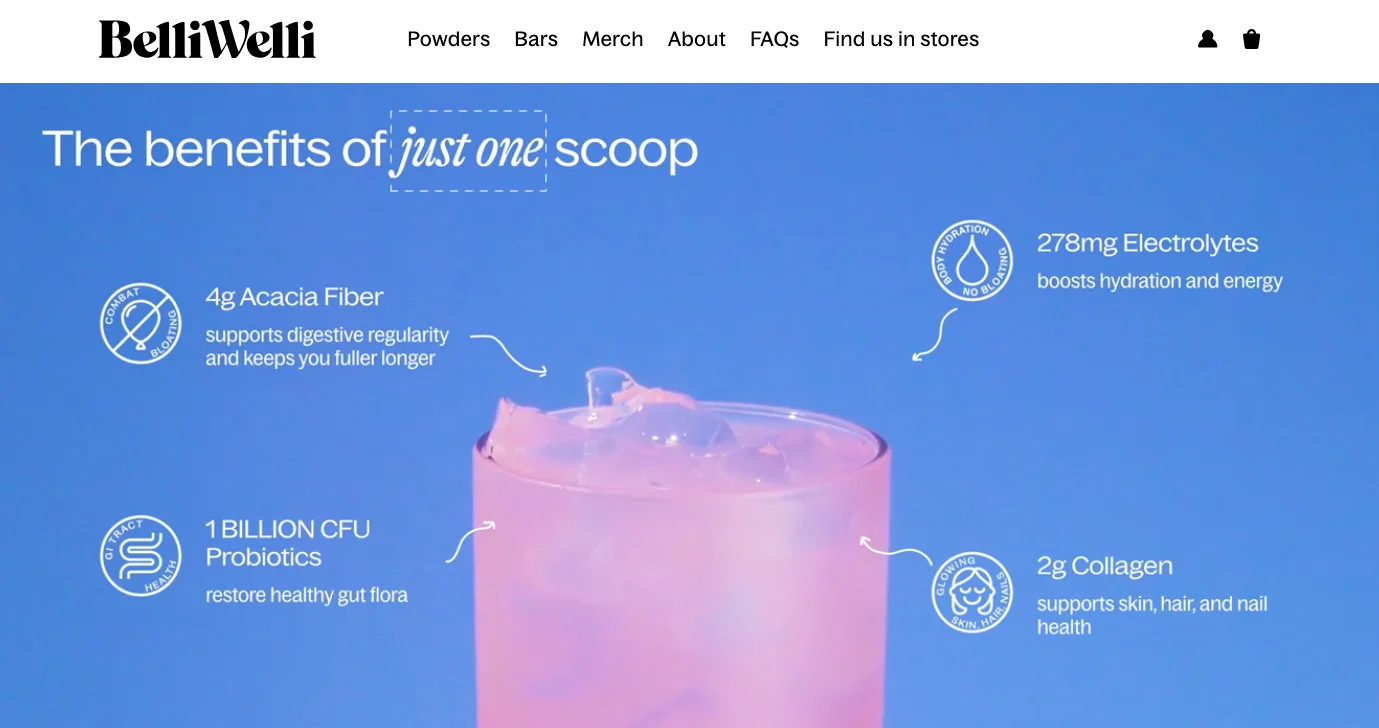
When you look at the various things that really matter in the world of marketing, copy is—at least for me—the most important. I think it’s one of the most important. And so one of the things that I’m recommending here is that you pay some attention to the effort–reward heuristic, which means that when you are expecting someone to click on something, you are asking for a small commitment.
For example, when you want them to click on “Shop Now,” you are essentially asking them to commit to shopping now. Really simple, but that’s a commitment, and there’s some effort involved. And “Is the reward big enough? Do I really want to shop?” is the question that they are essentially trying to subconsciously answer in their mind.
And if you want to make that easy for them — if you want to make answering that question easy for them — the best way to do that is to make this effort–reward heuristic a little bit easier to consume. So actions that are favorable: low on effort versus high on reward.
For example, in this case, we’re talking about just one scoop and there’s so much value that you would get. So this example — the image says this in the form of a product — but I think this applies in the form of call-to-actions as well.
Instead of “Shop Now,” you could — like for example Apple uses — “Compare Now” instead of “Buy Now” a lot. Because Apple wants you to take your time thinking through your purchase, thereby increasing the time you spend looking at the product and reading more details, thereby also consuming all of the different creative adjectives they use to explain simple features in the products.
So the thing is: “Compare Now” is a lower commitment than “Buy Now.”
Similarly, you could also use other things like “Explore Options,” “Shop the Look,” that sort of stuff. So that allows you to lower the psychological effort that goes into clicking or picking a CTA, but increase the reward they get from it because they’re taken to a collection of products. And hopefully, you all have great products to sell at great prices that people are going to love. So that, of course, you need — even if you want to have a small business.
2. Make existing loyalists buy more
The next one is how to kind of convert loyalists. One of the metrics that I feel businesses don’t track closely enough is the lifetime value of a customer — LTV. And the reason I say that is also because it’s not optimized for in an obsessive way.
The thing is: any brand has loyalists. And these are the people who will also — in the language of Seth Godin — be called sneezers. These are people who spread your brand like a virus. And so you want to make sure that they continue to stay loyal.
What you want to essentially try and do is create some kind of scarcity, even for your loyalists. That’s one thing I feel most brands don’t learn from larger brands like Rolex and Porsche, and so on and so forth.
For example, a Rolex will make you — if you love Rolex — buy a Lady-Datejust, then an Oyster Perpetual, then maybe another Oyster Perpetual for yourself. But if you want to buy a more exclusive Rolex like a Daytona or something like that, they would take forever to let you come to that level. And that, in turn, is A) making you buy more, but B) is also making you an even stauncher loyalist of the brand. Because the more you own of that brand, the more you will defend it and stand by it.
So think about it that way. I feel that not enough brands use scarcity on their most loyal customers. It works wonders. If you can do it by creating specific collections or categories for your loyal customers, it would go a long way.
3. Leverage the Framing Effect through competitor comparison
The next one I want to talk about is the framing effect. This is very interesting. It’s really about how you want to talk about the negatives and the positives in a very tactical way.
So the example that I’ve used here in text is imagining a medical treatment. Let’s say you were signing up for a medical treatment and I said, “Hey, you know what, this treatment has a 90% survival rate,” versus if I said that it has a 10% mortality rate. Now the difference is massive.
And that’s something that happened to us during COVID as well. We used to first think, “Hey, you know what, this thing has a 2% chance of somebody dying,” but it has a 98% chance you’re going to make it”. And the other ways in which people would spin that metric is “2 in 100” or “1 in 100,” and that makes you feel like something’s either larger than it is or smaller than it is.
So what Grind Pods is doing here in this image, if you really see, is just two simple things. It’s the fact that they have free shipping and that you can compost those pods.
Because one of the… I don’t know if you use Nespresso — I used to use Nespresso — and it feels really bad when you’re throwing those 10 or 15 pods in the trash, and you feel like you are to blame for a lot of the plastic and aluminum and all of that trash in the world.
So it was something that was on top of people’s minds.
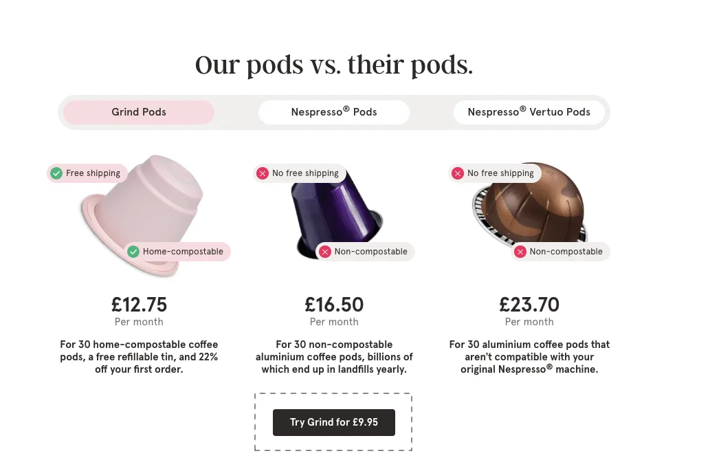
And I think what they’ve done here is not only have they affirmed the positive value — free shipping, home compostable — but also that if you pick the other option, not only is it more expensive, it is also no free shipping, and it is also non-compostable. So you’re really getting ripped off.
The way you frame things really matters. I think this goes a long way for your product descriptions, for comparisons if you’re doing that on your website, also your product naming. I think people generally don’t spend that much time thinking through that.
For example, if you look at the three descriptions here, the small descriptions, it is:
“30 home compostable coffee pods are free,” “refillable tin,” and “20% off your first order.”
So much packed into a simple sentence.
And then, of course, they’re trying to pull you away from the other option, which is:
“30 non-compostable aluminium coffee pods, billions of which end up in landfills yearly.”
So I think we all know which one feels better.
4. Bring an easy filtering system as a decision shortcut
So number four is bringing in an easy filtering system. Essentially, what you want to really do is: instead of letting people take the traditional journey into your site — using the drop-down menu in the category, or even going for search, which then ends up taking them to 60, 70, 80 products — you are better off trying to do some very easy filtration early on in the journey. And that allows you to let people into just a few selections of products.
I don’t think enough businesses put enough time and effort into narrowing down the average customer down into a few things. And it’s not necessary that you do this only on the homepage. It’s actually equally important that you do it on your product pages.
The reason it is equally important is because a lot of your traffic is actually entering from the product page. So if somebody lands on a T-shirt and they’re looking at it, it makes a lot of sense to immediately ask them: “Hey, what are you looking for?”
“I’m looking for slim-fit T-shirts,” or “oversized T-shirts for men.”
And then you just let them pick that from the product section down below:
“Not something you’re looking for? Pick one of the options below.”
And so you’ve got oversized men, oversized women, slim fit men, slim fit women. They pick one, and then you take them to the top five oversized T-shirts for men, and you’ve narrowed them down and hooked them with just that information.
So an easy filtration helps with decision shortcuts. You’re just kind of making life easy for the customer.
5. Employ Choice Paradox — with a last-minute pop-up modal
The next one is Choice Paradox. This is something we all obviously see. You’re just simplifying the decision-making by offering limited choices. This is extremely important.
Again, I often… and Amazon does this a lot — it does the opposite of this, rather — where it recommends too many options. So the variety and the sheer volume of inventory are Amazon’s play. When you’re trying to shop for, let’s say, a phone cover, if you search for iPhone 14 Pro or 15 Pro phone covers, I think Amazon would have 200,000 options. Amazon obviously wants you to filter and do all of that, but it shows you the most accurately priced, best-selling, highest-rated products right on top — of course, after the ads.
But I want you to think about it a little bit differently. You’re not Amazon. So you want to make sure that you’re making decision-making easy and fast. Instead of recommending 20, 25, or 40 products, I strongly recommend that you just suggest one or two. You keep the choices to a minimum and make life easy.
For example, in fashion: instead of, when you’re trying to show a T-shirt or a shirt, showing four shirt options, “Complete the look” with seven pant options, followed by accessories, caps, all kinds of things — you’re just doing too much. Why not just show one that goes really well and is lower priced than the product they’re originally buying? For example, with a shirt, no need to try and sell a cap, try and sell a muffler, and so on.
I would want you to apply that psychology to whichever industry you’re from. I know we have about 20 different industries on the call today, including health supplements and all kinds of things. But my limited point here is: simplify the decision-making process and reduce the stakes that people are essentially running with.
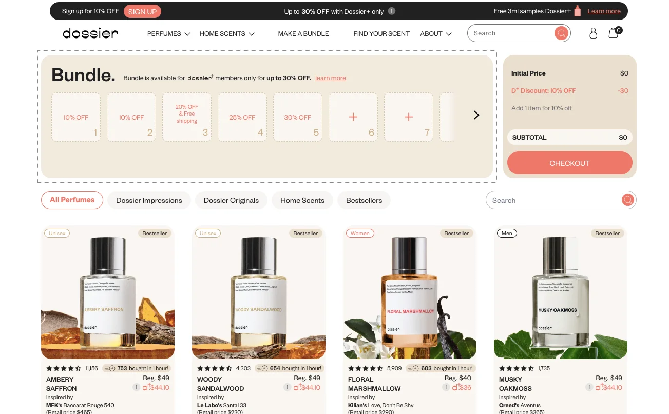
6. Offer more bundling options — activate the Anchoring effect
Bundling — I think bundling is a really simple one. I’m not going to spend too much time on this, but what I wanted to make sure I bring up is the anchoring effect.
When you share the first piece of information with your potential customer, it anchors the rest of their experience on the site. So if you show them a $40 T-shirt, you are going to find it very hard to upsell them on something that is more expensive. That same thing applies for bundling.
So I would recommend that you anchor the customer on a bigger bundle to sell smaller ones — and then so on and so forth.
This works, for example, in real estate a lot. When you're trying to buy a house, the first price that is given to you is extremely, extremely important. Depending on what part of the world you’re from, you're either quoted really high or quoted slightly high, and so on.
For example, one really interesting real estate market I was recently learning about is the Australian real estate market, which is very gruesome. It's very competitive. Most houses go for auction, and auctioning is super interesting. I recommend you check out YouTube videos for Australian house auctions — I think you're going to be pretty impressed with what you see.
7. Run a “warehouse sale” for slow moving items — and feature it judiciously
Running a warehouse sale — so the reason he brought this in is, there are two real reasons we wanted to keep this idea in for a discussion today.
The first is: I feel sale and clearance is the most overused tactic or method of trying to get your customers to convert. At the end of the day, you do the sale so that people feel excited about prices, they see more value, people who are already on your list come back and buy. That’s the reason you do a sale.
But the thing is: everybody else also does a sale. And unless you have a very well-differentiated brand which has a lot of appeal, sale loses its meaning. Because at the end of the day, you are competing.
So there are two things I want you to do.
The first is: position the sale a little bit better. In this case, for example, it is positioned like a warehouse sale, so it’s a little bit different, and it’s purely for slow-moving items. Nike, for example, does sales, and they generally would be selling their duffel bags and beanies, and all the other stuff that Nike doesn’t really sell that much. You would never see an Air Force One, you would never see your Jordan T-shirts, etc., on sale — but you would still see a sale. And it’s Nike, so of course they have fewer problems to solve than me or you.
What’s really important is that you try and position your sale a little bit better and a little bit differently. That’s point number one. And I’ll give you more ideas for that as we go.
The second thing is: try and avoid attentional blindness. What that really means is: when somebody lands on your site, you have a hello bar saying “free shipping,” you have a navigation bar talking about different categories, followed by clearance, and then a huge banner that says “sale,” followed by Best Sellers, followed by recommendations — the cognitive load on the customer is already very high.
So if you’re going to place a warehouse sale like this right on top somewhere, it’s going to get missed. That is attentional blindness because you don’t have their attention, or their attention is already too divided.
So I recommend you bring this warehouse sale in for customers that are already giving you their extra minute. Park it somewhere down below — maybe at the third or fourth fold of your collection, or maybe under a product page. And what that does for you is: only the highest-intent customers go there, and you give them a crazy discount and try and convert them.
So I think you have to use this tactic a little bit better. But there are two takeaways:
- Don’t do something that creates attentional blindness, which makes it harder for people to notice something you actually want them to notice.
- Position your sale a little bit better and a little bit differently.
8. Feature a Founder’s note on every high-traction product page
Founders' notes — I think this is extremely, extremely important if you’re selling products that you’ve sourced or created yourself. I feel customers deserve to know the creators, and that goes an extremely long way. This is by far the best way to create authority and trust.
So, for your bestselling products or your high-traction product pages, I recommend that you put your picture, put a small note on why you created what you created, maybe even a small story of your brand.
Try and talk about the history, maybe where you source your products from. Maybe you’re getting them assembled in India, or you’re trying to bring them in from China. Talk about ethics, talk about anything that truly matters to you and makes you look like an authentic store trying to sell things for a living.
There’s nothing that travels far and wide — more far and wide — than an actual human trying to emphasize the value they’re trying to add.
9. Feature your app as a “better place to buy”
Moving on — a better place to buy. So I think the thing is that apps are not for everyone. If you don’t have an app, I don’t recommend getting one. It’s a decision that has to be really calculated and then taken. But if you do have an app, here is an easy plug that helps you get more app downloads.
It’s very simple: it’s to plug your app, not when people first find you. Generally, we see, “Hey, download the app and get 10% off.” Let’s not do that. Instead, try and convert people on the app.
So when you have people that are going further into the funnel — they’re on the product page or they’re adding a product to the cart — that’s where you can tell them that if they want easy returns, they should be shopping on the app. Because you’re trying to get them to be a loyal shopper from the first transaction itself.

You can also do this for the second-order customer. You can do free shipping for all app orders — so app-exclusive offers which are not discounts. Because the problem with doing app-only discounts is that people who are extremely high intent and were anyway going to give you full price will just download the app and give you full price.
So you have to add a perk that does not break the bank for you, while adding a lot of perceived value for the customer — and makes it worth their time to download the app and go to the next level.
10. Super-localize product recommendations (based on geo location)
Super localized product recommendations — this is something that we have done for a lot of our customers. We have a recommendation engine that is live on more than 200 sites, and so we do this a lot. We pick up the IP, wherever it is available, and we are able to figure out where somebody is from, and then show them recommendations for what sells best in their area.
This creates what we call confirmation bias, which means we just confirm — we just try and make it look like they’re not the only ones doing something. And that goes a really long way.
11. Create a tiered sitewide sale - through price differentiation
A tiered sitewide sale — very simple. I’m not going to spend too much time on it, but the really important thing you’re doing here is you’re creating a really high discount level for stuff that doesn’t sell too well, and then you are tiering those discounts down.
So your low-sale, low-appeal product is going to be, “Hey, up to 80% off,” or whatever you want to call it. So in this case, the Impact Whey Protein has a 50% off for selected range, right, and 35% off on everything else, 25% off on the bestsellers, 15% off on accessories. And so you’ve created these tiers.
And then you can do something more interesting with it, which I’ll come to in a second. But generally speaking, what you’re trying to do is creating some kind of price differentiation and creating some kind of urgency when you’re trying to do this.
12. Use information gaps to arouse curiosity
Information gaps — this is, I think, by far the most important marketing knowledge, hack, trick, marketing psychology suggestion that I have ever received and I will ever give. The number one goal of marketing is to give all information minus three, minus four pieces of information at all times.
Marketing’s job is to lead people on to the next step, and then to the next step, and then to the next step. And so if you reveal everything at once, you are nothing but a flyer — a boring flyer — that nobody really reads. And so the strong recommendation that I have for you is: do not give the customer all of the information.
So in this case, for example, you have a bicycle and you have that plus icon. So it’s only when you hover on it that you see the information for what it means. What that does for you is it keeps people with you. They spend a few minutes looking at the product, they spend a few minutes absorbing this information, and then you can keep leading them on to the next level.
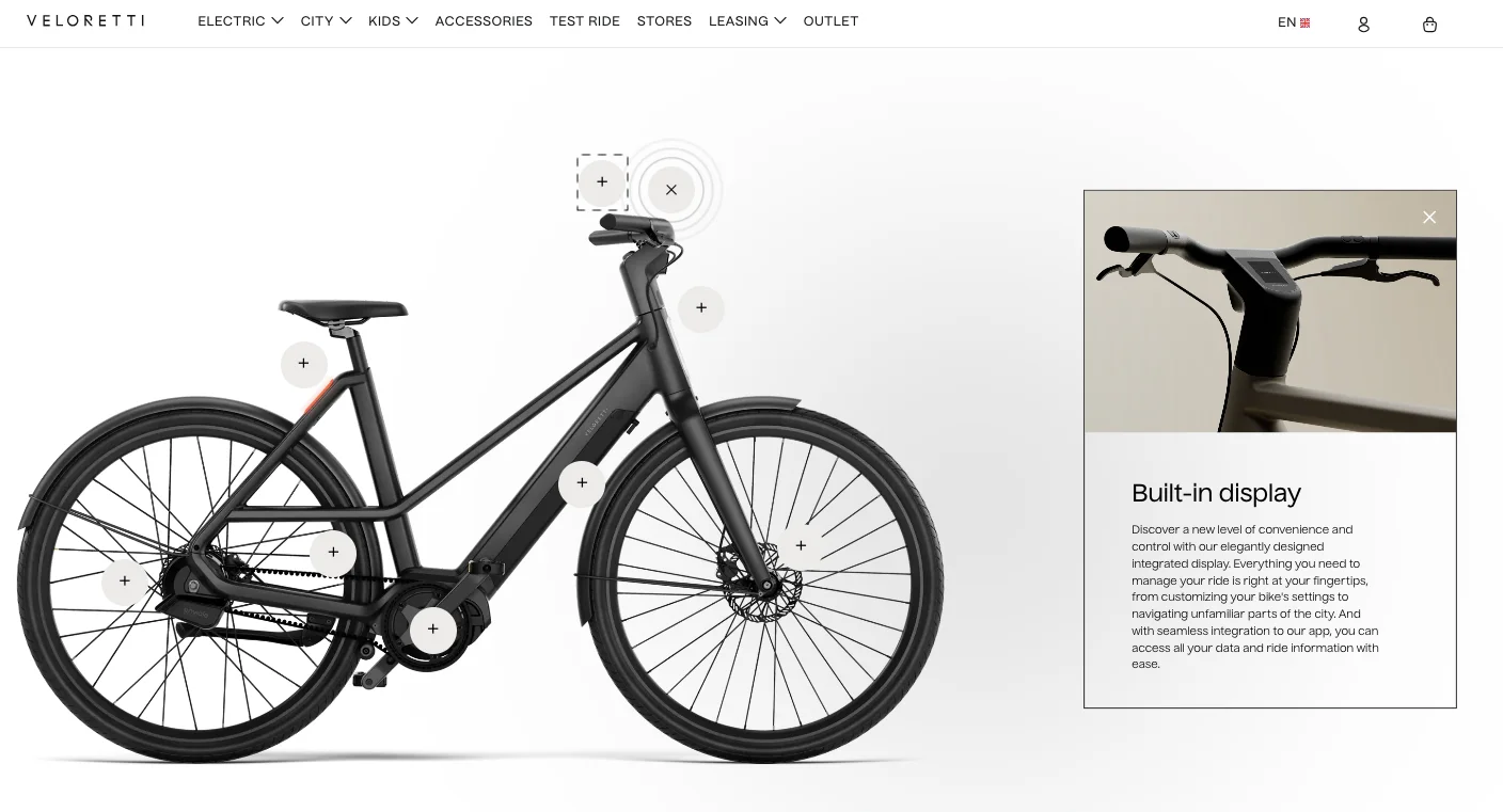
So the idea is: the distance between what shoppers already know and what they want to know has to be leveraged smartly. You have to infuse anticipation; you have to make sure that discovery is experiential.
And I think even the most basic businesses that sell T-shirts — if you were selling a black T-shirt like this one, a really simple one — you could still do this by just adding a plus button and talking about the stitching that goes in, or maybe the material, which is 98% or 99% cotton. I think this is a tool that everybody can use.
13. Leverage out-of-stock pages — to ‘get people to sign up’ for new launches
Out-of-stock pages are often ignored. They are also the highest bounce. They are the place where you lose a lot of customers. A lot of your great products — if you are a very high-selling brand — are often out of stock, and so that creates another issue.
So what I recommend you do is leverage out-of-stock pages to collect information and to recommend products that matter. In this case, for example, you have “Get Notified,” etc., but also… this is where you are normally in a product page. People are entering the page with the aim to decide to buy or not, but you’ve just taken them out of that mindset and you’ve put them in a mindset of: “Hey, it’s not available… what next?”
And so what you want to do is leverage that very smartly.
There are two suggestions I can give you:
- Capture their information and do that.
- Ask them if they’re okay to pre-order, and if they’re okay to give their details so that you can call them and place the order.
If your product is valuable enough for you to go through that effort of calling them, I strongly recommend it because I think relationship-building wise it works super, super well.
14. Recommend a single bestseller to convey social proof
Right, so the next is recommending a single bestseller to convey social proof. I think this is again similar to what I said earlier — do not recommend too much. So in this case, what you’re trying to do is give the shoppers a very clear choice that is extremely awarded: your best, absolute single recommendation.
And what that creates is something called a bandwagon effect. What you’re doing is reducing choice paralysis. You are just showing the consumer one thing which you truly, truly recommend.
So Peak Design, for example, is a company that sells backpacks and luggage now. And they have the Peak Design Everyday Backpack — that’s the most recommended, most bought, most famous product that everybody loves. So there is no chance that if someone buys it, they won’t like it. And so they recommend that as the first purchase that you make with the brand.
I recommend checking out the Peak Design experience. I think they have a great shopping experience.
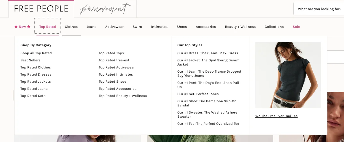
15. Spotlight a separate “Top Rated” category
The next one I’m going to talk about is the halo effect, which essentially happens if you put something on a pedestal. And how to do that in a digital experience is by creating a category purely for top-rated products. This is where you are bringing all of your bestsellers and top-rated products into a single place.
I wanted to show this example because this is a poor execution of how that has to be done. It is not a good execution. They’ve created a category, there’s a drop-down which has: top-rated clothes, top-rated dresses, jackets, jeans, sets, etc. But the first two words of this entire category don’t matter. Everybody’s going to read the third one and then make a decision. It’s not visualized. There’s too much text. There’s too much confusion.
Also, on the right, if you see what’s happening, it’s:
“Our number one dress,” “number one jacket,” “number one jean,” “number one pant,” and so on. But there’s so much explanation there. The G&M, the Max — it really doesn’t matter if you call it “Opal Swing Denim Jacket.” It really doesn’t matter. It’s a denim jacket, and that’s what matters.
So this is creating too much cognitive load. It’s making decision-making harder. But again, the halo effect is a success here, where they’re creating a category just for top-rated products and displaying them in isolation.
16. Reserve a homepage section — to look like a product page
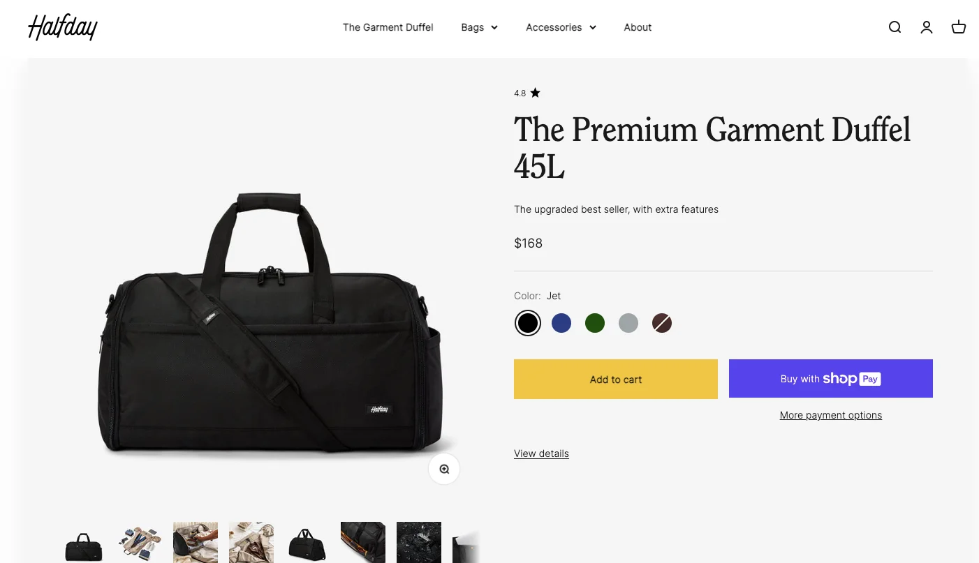
Another very important effect you have to consider: showing just one product. Reserve a page — or a part of your homepage — to show them just one product that is high-rated, is an easy decision, and gets them to explore. Try and do this in the second or third fold. It works really well when you’re trying to push people into the funnel and get them to learn more about the product.
I also recommend that you learn a few things from this example. If you see what’s happening here with the premium garment duffel — 45L — they could have just called it “The Duffel 45L.” There’s that angle. Second, they have about five colors, so if anybody wants to see more colors they will probably go and look at the other information.
Also: Upgraded Bestseller, Extra Features. So the images become the obvious next thing you engage with. The gallery is rich with images, lots of different options. This is actually a fantastic bag. It opens up fully like a coat, so there’s a lot that’s happening. And I think it’s very well executed. If this is an isolation they’ve created on the homepage, it’s very well executed.
17. Announce a high % sale for a single customer segment
This is another very interesting one — where you try and use identity affirmation to create a sale. So a high–percentage sale for a specific consumer segment.
I’ll give you an example of what happens when this happens with me. For example, you could do: “Hey, 30% off on all double XLs.” And that creates instant relatability. I’m like, “Hey, fantastic — this is exactly who I am.”
In this case, this example — they’re doing 60% off for people who travel. And if you look at the imagery, if you look at the categorization, it’s for people who travel. Now, that brand might do more things than just travel-related products, but they’ve created a specific collection to appeal to a specific ICP or ideal customer profile or customer type. And this goes a long way because, of course, you have to research and make sure that you are appealing to somebody who is truly your customer, instead of just creating a random category.
So think it through and do an identity-affirming sale which adds value to whoever it is that you’re trying to appeal to.
18. Make recommendations “desirable” through Centerstage Effect
So, you know, the thing is that recommendations and personalization are a thing of the past — not everybody can actually implement something like that. It’s not hard to do and so on. But the thing is: you want to make sure that you highlight the ones that truly matter.
I think this whole subscription experience, center stage, is the most obvious one — where you highlight the most selling or the best selling. But really, what you’re also trying to do is upselling. Because when you say that something is the best selling, it’s the most recommended, it’s the most complete, you’re doing two things. You are recommending something that sells the most, but you’re also telling them that they’re not supposed to go for the cheapest option. The cheapest option is not for you.
And I feel that converting somebody for a higher tier in your product — whether it’s a premium option, a premium subscription, or a premium version of your product — would only happen if you make the basic version look a little bad. And so the center stage effect allows you to do that. You essentially establish that the premium version is the better-selling one, and that’s what most people buy. And so if you’re going for basic, you are essentially not most people, and you’re not unique as well because you’re going for the basic one.
So I think we all know what that means.
19. Use a quiz to drive interest in a sitewide sale
Use a quiz to drive interest in a side-by-side sale. I think it’s a really simple suggestion, but I just want to double-click on this in a way that I feel quizzes in general are under-leveraged.
So this is a quiz in quiz form, where you go on Bear and you’re trying to look for a mattress. You’re talking about: do you have back ache, what kind of weight do you have, do you sleep cold or do you sleep hot, and all of those things. But the more important aspect here is you’re getting the person to commit to something or narrow their search down.
One of the things you can do, if you don’t want to do a quiz like this, is just create a product selection wizard that allows you to tier people down into a narrowed-down journey. So, for example, if you’re doing cell phones — I’m just giving you the cell-phone example because it’s easier — “What kind of phones do you prefer?”
- “I prefer larger screens or smaller screens. Android or iOS.”
- “What kind of budget do you have in mind?”
- “Do you have a color preference?”
- “Do you have a preference for 5G versus 4G?”
- “How often do you change your phone?”
And then you can just lead them into what the best option is.
“How important is camera for you?” for example.
So if somebody says, “Hey, I want something below $700–800, should have a decent camera, Apple or Android doesn’t really matter to me,” you would probably send them to a couple of options. And that’s what a quiz allows you to do — it allows you to let the customer elaborate on what they want, and then give them a solution that really matters.
This also allows you to draw more attention to the sales that might be running on the site. So that is another added value.
20. Round up your reviews as compelling stats
If you have any questions, please start thinking of them and put them in the chat or the Q&A section. I would love to take questions once we are done with this, because we will have enough time to do it.
And I want to talk about the next five things.
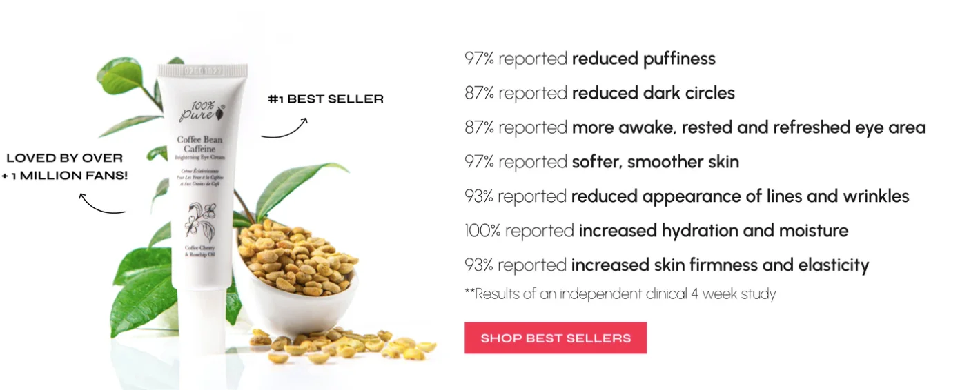
Rounding up reviews as compiling stats — I think this is a really big one, and I’ll give you a very small example of this, although there is an example right in front of us right now.
The simple example I want to give you is: when buying fashion online, the biggest anxiety or the biggest constraint that people will have is size. Because for some reason, that’s not standardized. A Marks & Spencer XL in the UK is not equal to an American Eagle XL, is not equal to any other XL, a Levi’s XL, and so on. So that creates anxiety. That creates lack of confidence in purchase.
And so what if you just simply said:
“98% of people reported picking the right size when they picked one size lower,” right?
You can essentially use these statistics and precise numbers to guide the customer in a confident way.
So in this case, for example:
- 97% reported reduced puffiness,
- 87% reported reduced dark circles, and so on.
You are being extremely specific, and you are triggering what is called precision bias.
I also want to give you another hack, which is: odd numbers are more trustworthy than even numbers, so use odd numbers more often.
21. Make your secondary CTA equally powerful (as the primary one)
Often, make your secondary CTA equally powerful. “Learn more,” “Shop all,” all of those things really are okay, but you should really frame your options well. If you are doing just one CTA, you are essentially making the customer make a yes or no decision. Whereas if you’re doing two CTAs, you are helping the customer make a “this or that” decision — which is obviously the better one because you’re trying to keep them in.
So I think it’s a very simple tactic. What you’re doing is option framing. You can influence the shopper’s decision by attributing some kind of emphasis to something, and I feel it really matters. When you’re doing “Shop all plans,” or “Shop plans on sale,” or “Clearance,” or “Travelers — shop for travelers,” like the categorization that I showed you earlier, all of those are great options.
22. Feature “sold out” products in the clearance section
The other thing is: if you still want to do clearance and sale, I feel a lot of people don’t create enough trust in the sale by doing sales of too many products together and there’s nothing that’s out of stock. So I think the number one way of creating a lot of trust in your clearance sale is by having 70% products that are sold out in the sale. And that’s the number one thing you could do as an online shop to create trust in the sale you’re running. If you don’t have sold-out products, then you’re not a big enough store. So I feel that goes a long, long way.
I also think there is a reason. I’ll just give you an insight: Apple iPhone sales have fallen this year, right? So think about it for a second. For the last four years, Apple has sold the same number of iPhones — it’s 25 billion dollars per year in sales from iPhones, flat for the last four years. However, every September they launch a new iPhone, and in October it is sold out all over the world.
Do you think Apple is not smart enough to think of having enough supply to get to the sale they're going to get? I think so. I think that's definitely not possible. So the sale is not growing, and they still can’t figure out their supply chain, and they still go out of stock?
I think there’s something fishy.
So my point is: sold out is a very, very important psychological lever, and you have to use it to your advantage — especially if you’re running sales a lot. People don’t want to lose out on things. And you might trigger some loss aversion, and you might get those conversions that you’re looking to get.
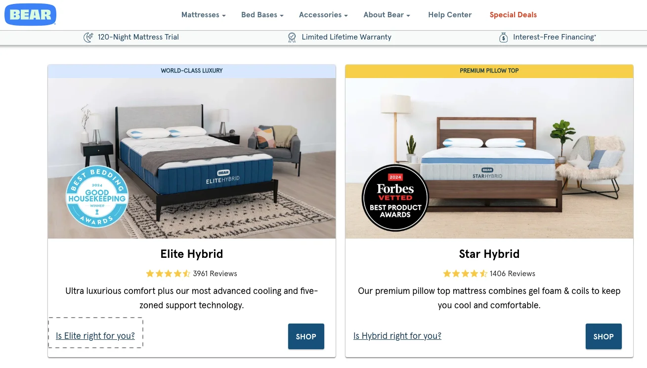
23. Nudge new visitors towards quicker consideration
The other thing is using questions really well across the site. I feel anybody who has done quality A/B testing and experiments — and we do a lot of that — uses copy to guide the user instead of pushing the user. So a question hook goes a long way. And it also tells you if people care about the things you think you’re solving for them.
So in this case, for example, it just simply says: “Is Elite right for you?” or “Is Hybrid right for you?” And then it kind of gives you a comparison. But really, the important part here is: can you create some questions or some information that is relevant to only a set of your customers? And so that goes a long, long way.
24. Leverage in-group bias (People lean into opinions of others)
I have another example similar to this, but really you’re trying to do this. I recently spoke to a company that does equipment for pizza chefs, and that’s extremely specific, but they’re trying to break into the household market and home goods and all of that kind of stuff. And one of the things that I recommended was: “Hey, you know what, most of the people that you’re trying to sell this to are not nerds — they’re not pizza nerds. They really don’t know this is for them. Why don’t you just create literature and plug it everywhere across the experience to educate them?” It would go a long way, and I think that worked wonders.
So yes, I think questions are a powerful way to engage the customer and take them to the next level.
We are on our second last item: leverage in-group bias.
Essentially, you are trying to psychologically force people — not force, rather — but psychologically group people in certain sets to create some kind of bias. It’s not manipulative, but it’s kind of fun in the way that you’re trying to capture preferences or behaviors by putting people in groups.
For example, vegans are a group of people. They have certain sets of values and principles that they feel strongly about. And so, if you are shopping on, say, Whole Foods, and you have an entire section for vegan meat — all vegan meat, essentially the fake meat — or if you have a section for vegan snacks, you are making the experience better for them. But also, you are grouping people into two sets. You’re saying: all the vegans can go in this direction, non-vegans can go in this direction. So you’re making life easy for both.
In this case, for coffee loyalty:
- “I’m loyal to my flavor.”
- “I’m ready, I’m okay to switch it up.”
- “I always try a new one.”
And what that does is allow you to recommend products on the basis of the kind of buyer somebody is when they’re shopping with you.
I also think it creates more trust in the brand because if people think that you are understanding them well, they will trust you more. They will trust your authority. So that’s another one.
25. Gamify your tiered discounts
The last one is gamification of tier discount. I had spoken about tiered discounts earlier — this last one is about gamification.
So what you really see happening here is: if you bundle products, you get a higher tier. So the first two are 10% off, the third is 20% plus free shipping, the fourth is 25%, and so on. We call this perpetual fluency, where essentially we are trying to create a very clear visual structure to make it easy for customers to realize the perceived value, the actual value, as well as, generally speakin,g the kind of value they would earn if they were to follow the journey — follow the experience that we’re having them follow. So that goes a long way as well.
I think there are many ways to gamify this. You could do it based on transactions, you could do it for bundling, you could do it for the type of product they’re choosing, or even the dollar spend that they have with you. But I think most brands rely on template loyalty apps and that kind of stuff to do something like this.
I think it’s worthwhile to think of something that is either unique to your brand or at least unique to the customers that are shopping with you. When they see you, they should be able to see that as a differentiator at least — so that should really stand out.
So yes, these are some of the unconventional and underrated conversion optimization ideas for eight-figure e-commerce stores. The intention, as I said, was to expose you to some fresh ideas and also talk about some psychological triggers that make them worthwhile. In a lot of cases we think we see websites doing these things, but they’re not thinking of the psychology that goes behind implementing something as simple as a bundled sale, or something as simple as tiered discounts, or just a sale for that matter.
I want you to think about these ideas in relevance to your own business, and I’m happy to take questions
People also asked
“Do you have any app recommendations for loyalty programs?”
I can’t recommend any apps for loyalty. There are apps like Smile and a few other decent ones. But I think it’s interesting to know that apps are a one-size-fits-all solution. So I would recommend you try it, but before you plug anything up and start it — because people are going to start opting into it — loyalty apps generally want to keep them with you as a customer for a long time. So a lot of loyalty signups will mean you will find it hard to move from one place to another. So just look through the journey, take a trial, maybe think through how it will get implemented possibly, and that would really greatly help you.
“What strategies do you think will work?”
I think it’s really about you picking the strategies that you feel will work for you. Depending on the industry you’re from, you will have to really think through it. So I want you to think of them as principles and just high-level ideas, and how you customize them and implement them for your business is something that is purely up to you. There are, of course, industries where this might not work, so you have to kind of pick and choose. And that’s why A/B testing is important — that’s why we do more than 10,000 experiments a year.
If you would like, I’m happy to… and the offer that I would like to give everybody attending this webinar is: if you would like for us to audit your site and look at the funnel and find problems or pitfalls or where you lose customers and revenue, we’re happy to do that. So I will email everyone after this webinar. You will get an email for feedback as well, and please feel free to get back. I’ll be more than happy to make sure we arrange a comprehensive audit of your site’s experience.
Any other questions, folks?
Okay, perfect. Thank you so much for your time, everyone. The recording as well as the document will be available — although not very soon — so the moment it is ready, we will send it over.
Thanks so much for your time. Have a fantastic rest of your week, and I will see you in the next one with something more interesting.
Get Fresh ideas to boost your conversion rate
(stuff that works for hundreds of stores)
Request a Free Site Audit"Convertcart’s Audit Report was deep and insightful. We never thought they would spend so much time in building and sharing such insightful content, free of cost."


Logan Christopher
Lost Empire Herbs