On-Demand
30 UX Changes To Make Before The Holiday Rush
Holiday shoppers have extremely short attention spans.
Anyone who lands on your store—you want to make sure they buy from you.
We all know how much money it takes to bring that traffic.
The good news is - even small changes in your store’s UX can lead to:
- longer browsing sessions
- increased engagement
- fewer drop offs
- higher conversion rates
And this is what we’ll discuss in this session:
👉 How to simplify your navigation - so the people spend more time on your store
👉 Ways to improve product discovery - to help you grow your AOV
👉 Smart examples of UX changes - that actually improved conversion rates (real world examples)


About the speaker

Shekhar Kapoor
VP, Marketing
Convertcart
Shekhar Kapoor (VP at Convertcart) has worked with 500+ online brands, including Squatty Potty, Prep Expert, and USA Hockey Assn., and helped them boost sales exponentially.
Shekhar Kapoor
VP, Marketing
Convertcart
SESSION REPLAY – 30 UX CHANGES TO MAKE BEFORE THE HOLIDAY RUSH (2024)
Thanks so much for joining us. We are expecting a bit of a crowd today, so I think as people join in, it's a good thing that we get started. I can see some familiar names, so that's awesome — welcome.
All right, so I think what we wanted to do is something slightly different.
Generally, we talk about 10 or 15 ideas and then I really double-click on each idea and talk in a lot of detail every week — every month — when we do a webinar.
But this time, we wanted to just make sure that we give enough information that at least something sticks with everybody who's on the call.
Because in a lot of cases, you know, we've seen people who've joined the call from niche industries, and they don't get enough good advice from the webinar. So I want to make sure everybody gets something.
We have about 30 ideas. I think some of them are really basic, and you should be able to actually implement them.
If you're not able to implement them, we're happy to help you.
But generally speaking, the goal is for you to get a couple of quick wins before the holiday rush actually begins.
So let's kick this off. I'm Shekhar. I'm one of the co-founders and the marketing and sales, and revenue leader at Convertcart.
You know, we work with more than 500 e-commerce businesses, help them optimize their conversions, and run their email marketing through our platforms.
The company runs about 9 or 10,000 experiments a year, and that gives us a lot of data on what works and what doesn't work.
Our goal with this is to collate as much of that as possible and make an information-rich webinar for you.
We do one every month, so we'll obviously keep reminding you as we continue to do them.
Let's begin.
Key Holiday Dates and Pre-Rush Basics
So before we get into the holiday rush, let's get some basics out of the way. What are some of the key dates? You can see them on the screen — starting with November 28th, 2024.
Then, of course, 24th, 25th, 26th, going all the way to January 2nd with Kwanzaa.
And the reason I'm bringing all of this up is because we've got to make sure that we cover the full spectrum of everything that's there. As I run through everything else, I'm going to walk you through more.
Holiday rush obstacles to prep for
If you look at the basics, that you want to make sure you get right before the holiday sales, make sure you're ready for traffic surges.
If you're set up on a Shopify or a BigCommerce or any of that, you're good — they will scale their servers, they already do that.
You don't need to worry about anything. But if you are a custom store, and you're trying to run a big sale, the last thing you want is things not working out. So make sure you're set as far as that goes.
Make sure your shipping partners are aligned with any last-minute purchases that people end up doing. You will also have not only more orders but also more complaints, returns — more chats, more emails, and more calls than normal. That’s going to be another one.
And then product-related, stock-related issues — just make sure that when people see you, when they see your product, they are prepared to spend the money that you're expecting them to spend.
There are articles every day talking about what the economic sentiment looks like.
If you've seen the kind of numbers being published by banks in the US — by the way, most of our webinar attendees today are from the US — we also have people from all over Europe, we have the UK, so that's awesome.
But I'm just going to keep talking about the economy as a whole.
The world is going through some challenging times, and hopefully the future is better, but I think it's good to keep that in mind and then proceed from there.
Types of festive-season shoppers
Also, the important thing that you have to look at is: when people are shopping with you, what are the different ways or different types of festive season shoppers you're likely to see?
You've got the early bird — always looking for bargains. They will generally snap up a gift or a festive season item whenever they find one, so they are the ones already on your site.
Traditionalists — they are likely to go towards things that are related to nostalgia, want to see something familiar and relevant.
Self-gifter — people buying for themselves.
Last-minute bandits — they just want to make sure everything arrives on time, always late about everything. Like me — I have a wedding to attend in three weeks and I have no idea what's going to happen. I don't even have my bookings done. So I’m one of those last-minute bandits.
The rookie host — someone who's trying to buy for the house, for friends.
And then someone who’s always shipping things — they’ll essentially do all their shopping online.
Keeping that in mind — because you've got to keep your ICP or your persona in mind — let’s get into the UX.
We are soon going to jump right in. We have 30 to go through, and I want to make sure I don't take up the entire hour that we have with you, so we'll try to gift back some of your time. But let’s jump in.
UX Idea 1: Feature a quiz-like filtering system—for easy product discovery
The first one is a quiz. So the idea of doing a quiz is generally done in two ways. The first one is: you are selling something that generally needs a consultation, or people are not sure about the product, so you are eliminating all kinds of doubts before somebody picks something.
The other is: you do a quiz or a wizard in order to ensure that people find it easy to find what they want.
I'll give you one such example of Repairs Universe. In this case, you could come to the site and say, “Hey, I'm looking for a screen for my Apple iPhone — iPhone 15 Pro,” and I'm taken straight to the product. So that's one such example of a quiz.
But the other way in which a quiz can be done is: “Hey, I'm looking for plants, and I don't get enough light. I do own pets, and I want something low effort.” So you show them all the different plants they can buy.
UX Idea 2: Aim for engagement (sales will follow)
The next one is aim for engagement. Now this is a very, very important one. I'm going to give you a benchmark to follow: make sure you're collecting emails from at least 10% of your website's traffic. Right — so that's the benchmark you have to meet.
And when I say website traffic, I really only mean new traffic, not the total traffic, because repeat visitors — you're likely to already have their emails. So if you're getting 100K visits and 70,000 of that are new visitors, you should be collecting 7,000 emails a month, which means you should have close to 100,000 emails in that year.
And how you make sure you do that is by not focusing on the opt-in exact. So generally what I see people do is really boring popups offering a 10 or 20% off in exchange for an email. I strongly advise you against it. I strongly think that brands need to stop doing that.
Focus on the engagement. Forget about the opt-in.
Generally, what we have seen with data is: when people see a pop-up that says “10% off, give us your email,” customers or users are closing those popups within three seconds — which means they're not even reading the copy. So you’ve got to make sure you use that pop-up extremely well.
In this case, for example: “Are you team Android or are you team iPhone?”
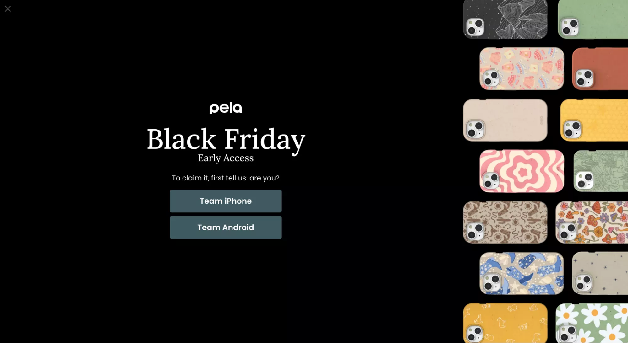
You could do a lot of different types of gamification when you're going for a pop-up.
I have like 100 examples that I can show you, but this is one such quick example that we implemented for a customer: there's a player, there's a ball, you click the ball, the player kicks it, and that’s where you see the next level of engagement.
The engagement rate on something like that is about 50% — half of the traffic will engage with it, and then a certain percentage of that will actually give you the email.
UX Idea 3: Use visual cues alongside the price
Moving on. Use visual cues alongside the price. You know, there's a way in which you can make the price smaller, right? You've got to do a bit of a car salesman here.
When you ask a car salesman, “How much is that four-year-old Jaguar worth now?” he's going to say: that car, with its wheelbase, 2,000cc engine, puts out 200 PS of power, 600 Newton meter of torque, it has brand new tires just a year old, the trunk has this much space, the back seat is like a sofa — all of that brought together is just $115,000.
And you're like, boss, that's definitely not true. But my point is: you have to add more value to the price you pitch to the customer.
In this case, for example, free beauty gifts, triple insider points, and up to a $500 gift card. There's so much that I'm curious to go to the next step and see why I should spend this money.
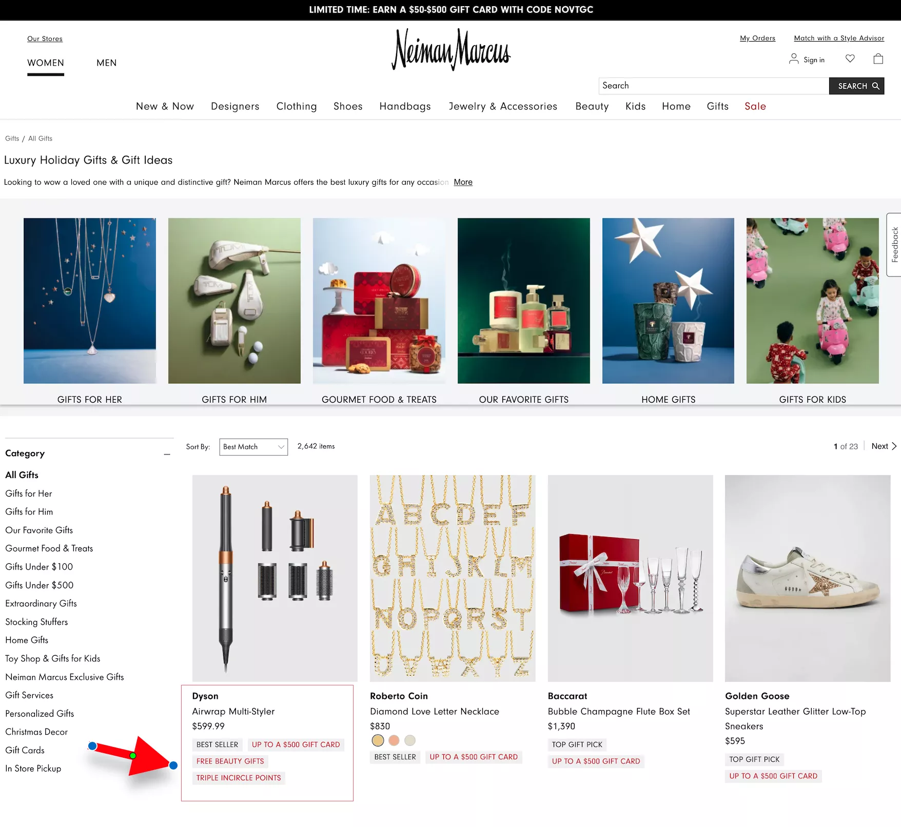
Remember: the reason this part of the year is important is not because there are sales and discounts — it's because people are most happy to spend money during this part of the year.
There is a reason why the most recent iPhone was launched just a month and a half ago.
There is a reason why Apple dropped the latest Macs just 10 days ago. There's a reason why all other technology companies — all other companies — launch their newest, greatest, latest products this time of the year.
Because this is when people want to just give up.
You know, people are like, “Hey, you know what, enough. I've spent the entire year being frugal, thinking about what I want to spend on, not want to spend on, savings, investments, stock market, following Elon Musk, figuring out what's really happening — I just want to give up. I just want to splurge. I want to go and buy whatever I want to buy. I don't want to—”
….so you know, it's essentially that energy you're trying to tap into and making sure your prices look smaller than they actually are.
UX Idea 4: Feature collections for holidays across cultures
Also, ensure that you are inclusive of other cultures. Sometimes I feel we stick to Christmas and we forget that there are other offers that could be running.
In this case, for example: “The holidays are almost here.”
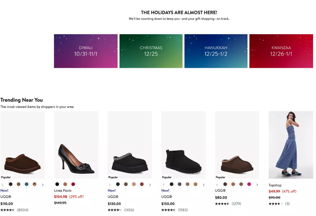
You're trying to be inclusive. You're trying to make sure your messaging is in line with whoever you want to welcome to your site. Diwali, for example, is mentioned here. Trust me — Diwali is for Indians what Christmas is for Americans.
So, I think it's important to bring that in as well, because this will ensure your sales start a month early, since Diwali is at the end of October.
So yeah, that boat has sailed, but keep it in mind for next year.
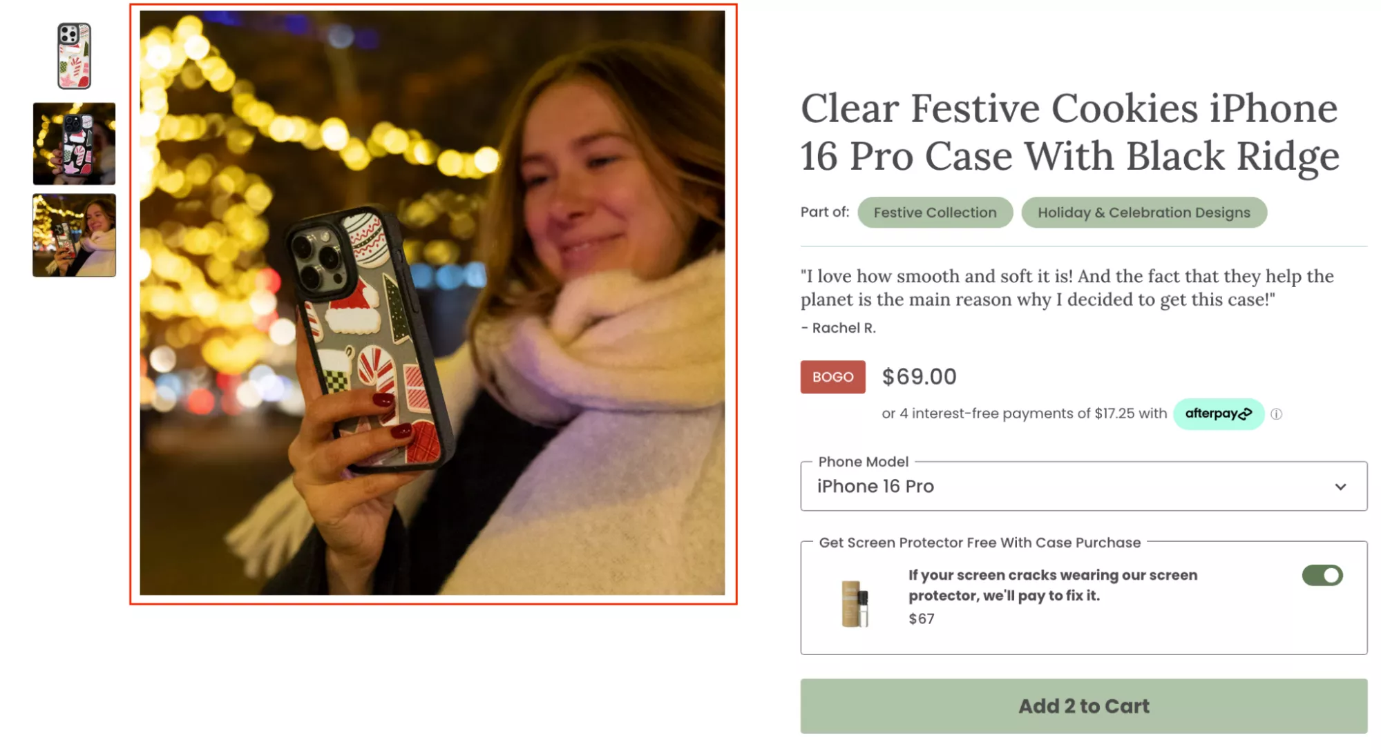
UX Idea 5: Update product images to reflect the holidays
It's a lot of effort to do this one — which is to update your images to reflect holidays — but if you can do it for your top 20% of the products that drive 80% of your revenue, I think it's worth the effort. You will see a marked difference between what your conversion rate was and what it is.
So if you can do it, I think it would be worth it. Worth the effort.
UX Idea 6: Highlight reviews that talk about ‘gifting’ and ‘holiday’
Talk about reviews that are specifically about gifting and holidays. We have a lot of customers that do that. We used to work with this company called Mission Mercantile, and I think their website still has that.
So if I go into their site, if you look at any of the products — if you see this top testimonial here: “Excellent shave kit. I gave this to my family for Christmas, last year, and they have been thanking me all year.”
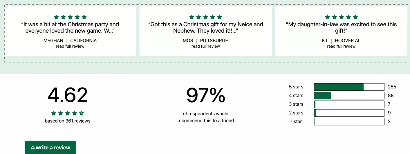
Imagine — a shave kit changed their life completely. But you get the point.
The intention is that you want to make sure that trust is built in line with what people are buying your products for during this time of the year.
UX Idea 7: Place a floating banner on the homepage—for easy access to holiday products
Floating banners. So in this case, for example, there was a button that says “Shop for gifts,” and when you click on it, it changes into a holiday gift guide.
Similar to what I showed you on repairsuniverse.com — you could actually do a quick call-to-action catalog like this, where you allow them to narrow down based on price or based on who they are trying to buy a gift for.
UX Idea 8: Use the top bar to draw attention to the best offers you’re running
Use the top bar to draw attention to the best offers you're running. This is, I think, a really easy one. Sometimes, top bars are ignored.
I'll give you a quick hack for making sure your top bar works: just make it say “Don’t click.” That's it. Just say “Don’t click.” That’s the copy it has to say. And when they click on it is when you take them to the sale page.
Your top bar does not need to say “20% off sitewide,” “Free shipping above $50.” Nobody's reading it. Nobody's engaging with it. The clickthrough rate on your top bar — of your total traffic — is about 4%, if you're lucky 8%, but under 4% for sure.
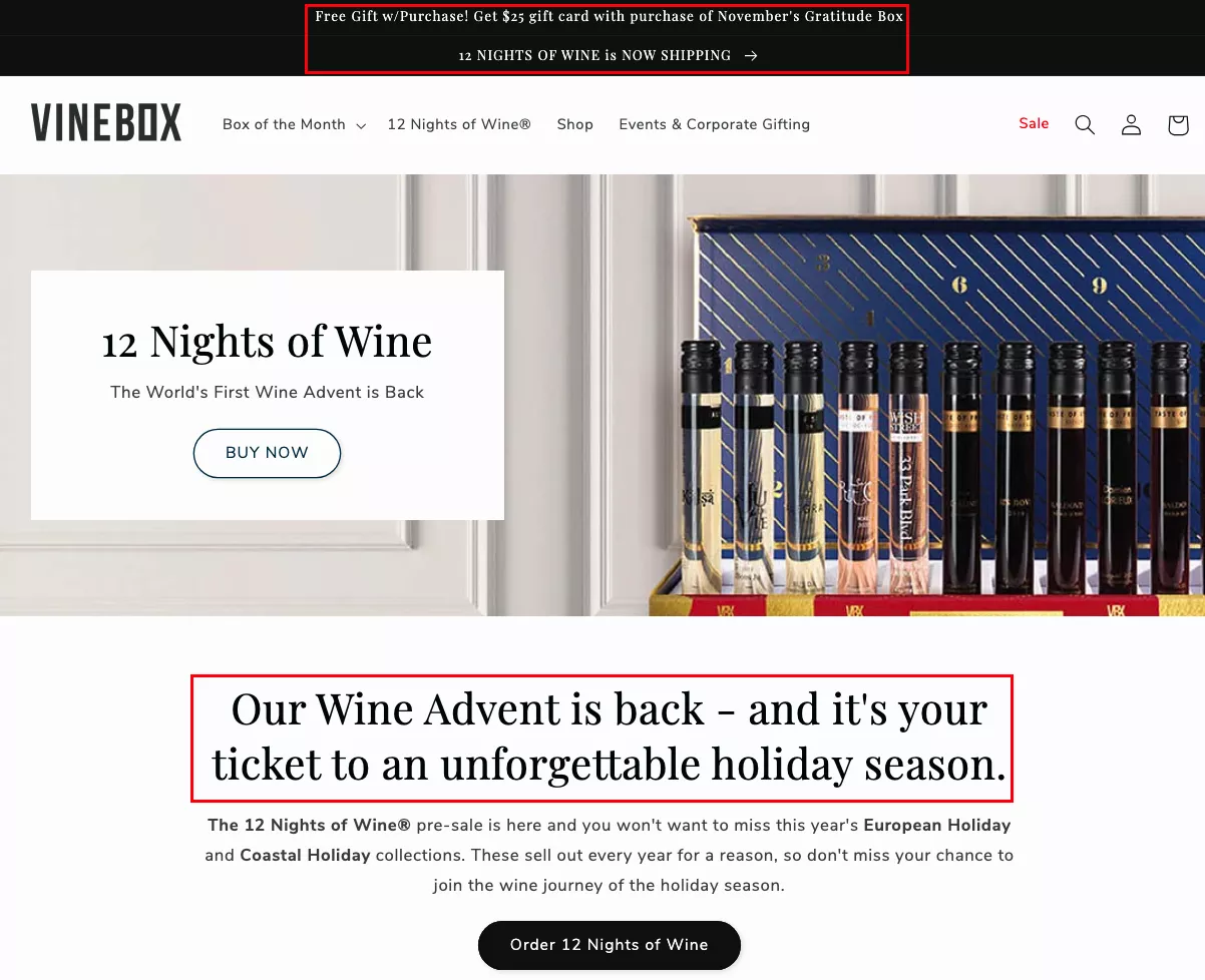
So instead, just say “Don’t click.” That’s all it needs to say. And then see the clicks go up. People will do exactly what you don’t want them to do, so that can be interesting.
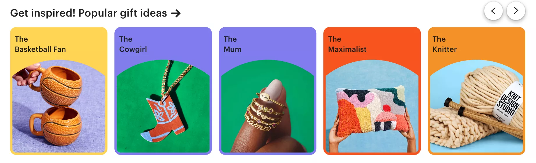
UX Idea 9: Attract shoppers by starting a conversation about their “personality”
Attract shoppers by starting a conversation about their personality. So I spoke to you about the types of festive season shoppers — this is kind of an interpolation of that idea.
You're trying to call out the ICP, the ideal customer profile, of the actual shopper that's on your site. Is it the basketball fan, the cowgirl, the mom, the maximalist, or the knitter, right? And then you try and slot them.
So think about this: what are the top five or ten types of customers that buy from you? What are their use cases? Do they identify with those use cases? And then you go to the next level.
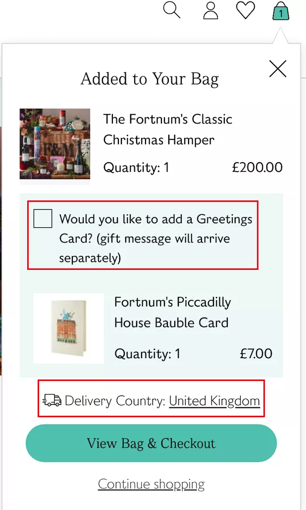
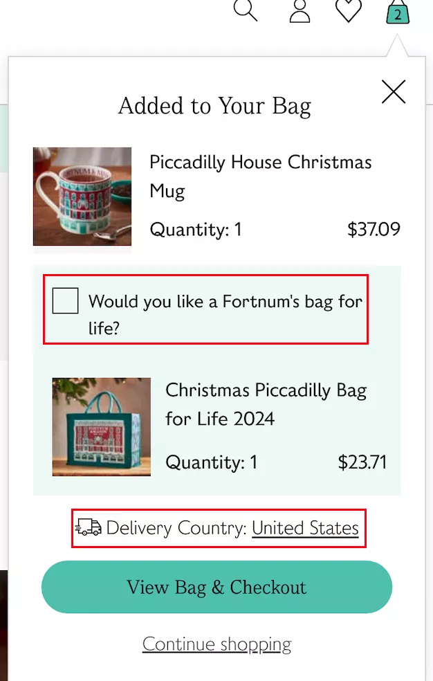
UX Idea 10: Personalize upselling according to the shipping country
Moving on. Personalize upselling and cross-selling according to the shipping country. This is an interesting one. If you're shipping across the ocean, then you cannot send large gifts, or you cannot upsell something that is larger in size, whereas you can do that if you're shipping locally.
So I think it's important to upsell and cross-sell. It's easy to do it at this time of the year. There are interesting ways in which you can upsell and cross-sell — I'll talk about them as we go — but that's another one you definitely need to look at.
UX Idea 11: Keep your quizzes super short
Keep your quizzes short — like the one that I just showed you today. I’ve seen quizzes that last… they’re just too much of an effort. You're going through one question to another, and then they want you to fill a form before they actually show you the results.
Don’t annoy people. People have several options. Think of it this way: if you're a site that sells cosmetics, Facebook knows, Instagram knows, and Google knows you sell cosmetics.
If someone has visited your site, and you're going to lose them for a reason like this — where you've created too much friction for them to go to the next level — they will drop off.
But the next minute onwards, Facebook, Instagram, TikTok, and Google will show them ads for other cosmetic sites, for other people trying to sell similar products or products from the same category. And that's essentially you creating the demand and then losing it to someone else.
So it's super important how you treat your new traffic. It's also super important why email opt-in will be very important.
I want you to do an exercise — it's going to be hard to do it, but do this exercise:
How many people came and bought from you in November and December last year and never bought from you again?
So they only came for the sale. Now, of course, there'll be a certain percentage of people like that.
But then also look at what traffic you were generating during November and December that was new traffic, first-time traffic — and then those people never came back again. The number is even larger.
And the way to bring that number down is to make sure that you opt in, collect emails, or intent, or something else from that traffic that’s new and coming to you for the first time.
They're discovering you for the first time this holiday season. What are you going to do to make sure they remember you? That's the question you've got to answer.
UX Idea 12: Show a ‘preview’ to hype up the actual holiday campaign
Show a preview to hype the actual holiday campaign. Very easy — but don’t do it in the same boring way.
Generally, I see people completely revamping their banners like this and making a lot of noise about the sale they’re running. There's nothing wrong with it, but when I say preview, the real thing I think we can do is: if your sale starts from next week, send out an email and send out the new pricing that you're going to do next week.
What you're doing then is: all of the low-intent part of your email list — you're at least exciting them by saying, “Hey, you know what, next week we're going to do instead of the $99 that we normally sell at, we're going to do a $70 X,” right?
So you can just kind of create some curiosity there by keeping it hidden. But I think it would make a lot of difference if you were to make some noise about the sale before it has even happened.
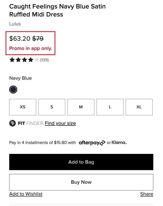
UX Idea 13: Highlight all split payment options, and special discounts - on the homepage's first fold itself
Moving along. Highlight all split payment options. I think this is super important. BNPL is massive. If you don’t have a BNPL provider, please go and get one. Sign up with one — it won't take more than four days for you to get set up, whether it is Klarna or Clearpay, or any of the other stuff.
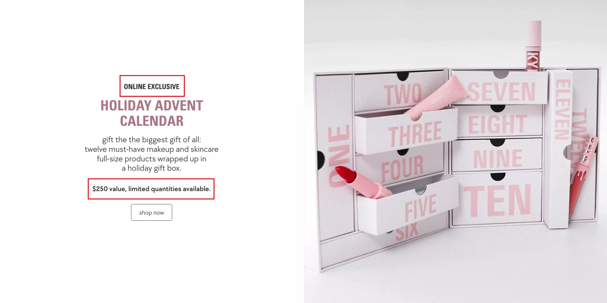
UX Idea 14: Use exclusivity and limited stock nudges generously
Use exclusivity and limited stock nudges. Of course — I think that's what the watch industry, for example, is thriving on. They manufacture half of what the world wants, and then, of course, everybody wants them even more.
So if you can create an exclusive range that is specific to the holidays… if you can try and do limited quantities and actually be honest about it — “Hey, you know what, we're launching this for the 2024 holidays, and we're never going to do it again, ever” — it works extremely well.
It's somewhat like Starbucks mugs. I recently met someone who collects Starbucks mugs — I didn’t know that was a thing, but they do it as a hobby. This person travels a lot, so they have one for every country they've been to.
And then they also told me that there are a few mugs they had that were super limited edition — they bought them for like 50 bucks, and now they can sell them for 150 bucks.
I was very surprised — but then also not so much because we recommend this to our customers a lot, and it works really well.
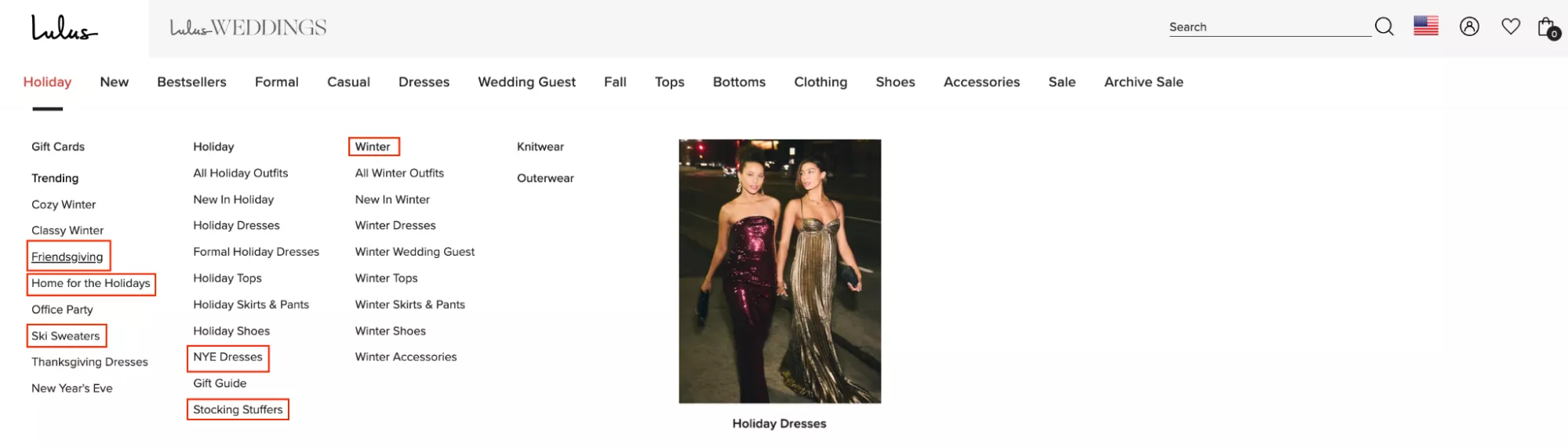
UX Idea 15: Use holiday-themed keywords as subcategories & attributes — in your main menu
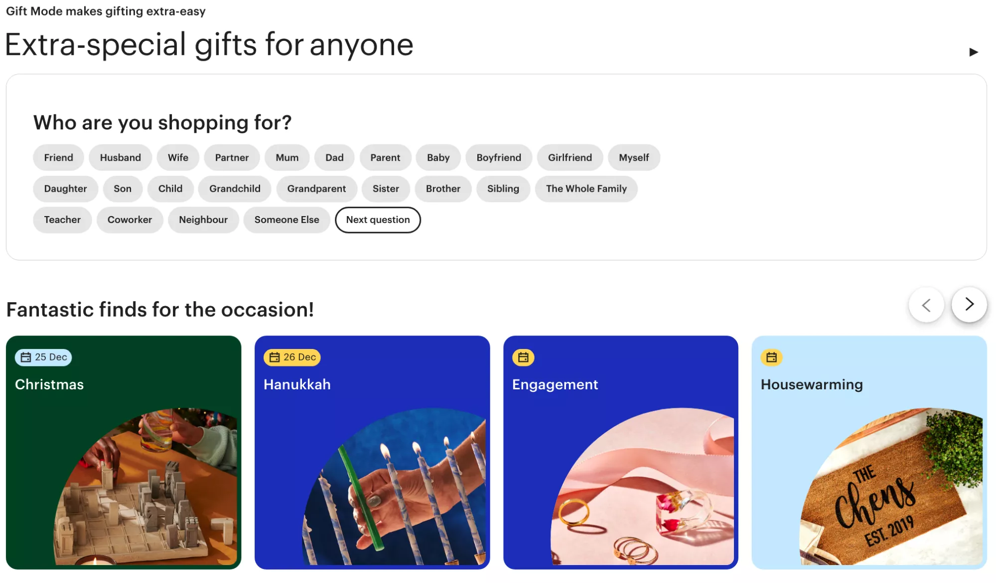
Use holiday-themed keywords and subcategories and attributes. Right — Friendsgiving, Secret Santa gifts, stocking stuffers. Can you try and solve for holiday-specific use cases?
Is there a possibility to bring in use cases like: if you're buying for your mother, if you're buying for your husband, if you're buying for your son? So you could create subcategories around that as well.
But the point is making discovery on your site relevant to the use case or the purpose for which someone is trying to buy something.
UX Idea 16: Use subtle animations wherever possible
Animations and videos. I'm a huge advocate of this. The hierarchy in which humans consume content is truly following its natural motion.
Originally, we were consuming text. Then we went to images. Then we went to images with audio. Then we went to full-blown videos. And so obviously, videos are extremely high engagement.
That's also why podcasts are now bigger than newspapers and written media — because they’re easier to consume. You can do that on the go. And so it's obviously a higher form of content in that way.
UX Idea 17: Target budget shoppers with clever copy
Target budget shoppers with clever copy. A lot of people are just trying to buy that $20 gift — gifts for their office, tax, or Secret Santa.
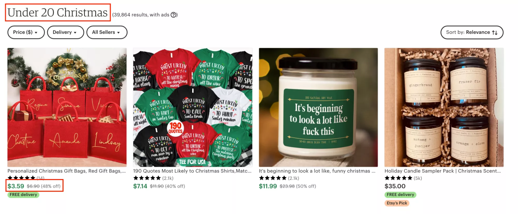
A lot of people give away gifts. We have that culture here in Diwali, for example: to have something you can just give away to people who are in need, or just people you come across.
So yeah — that’s another important one.
UX Idea 18: Highlight tiered discounts to drive more awareness about savings
Highlight tier discounts to drive more awareness about savings. This is an interesting one — bulk savings. Very simple, but I often see that this is not communicated too well.
I'm sure all of us here have seen a shipping bar or a shipping timer that says: if there's free shipping above $100, and you've added $60 worth of product to the cart, it says “Add $40 more and you get free shipping.”
Can you try and execute that, but for bulk discounts?
“Add another $40 and get a $10 off.”
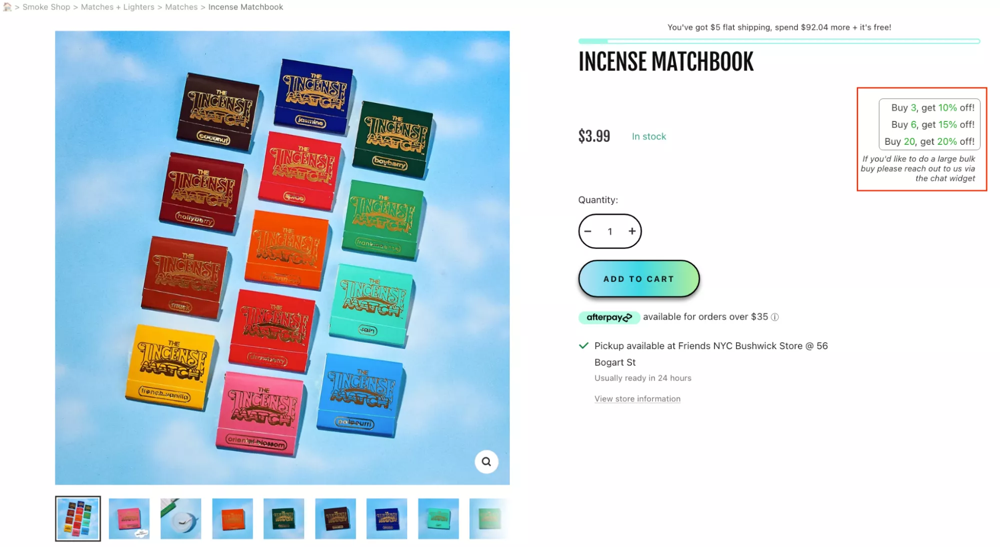
If you can execute that, I think it would be a great average order value driver for your business. It would categorically apply very well to businesses like these, which can actually sell volumes.
UX Idea 19: Create urgency with a countdown timer
Timers. It's a very controversial thing — a lot of people find them gimmicky. Let me tell you, they work extremely well. Timers, if they're done in a subtle way like here, and if they're done for the right reasons, work super well.
For example: “Order in the next three hours and get it shipped the same day.” Or, “The sale ends in the next three days,” and you run a timer.
I know a few sites that run timers throughout the year whenever you visit them. One such site is Slickwraps — they sell wraps and that kind of stuff. I can actually… if you see, I can see your pop-up, which means I haven't visited this site in a long time.
So I can open this site at any time of any day, and it will have a two-hour timer trying to make me buy.
And it's interesting that they do that, but it really works for them. They still do it. They are always on sale, and they are always running a timer. So that’s a fake timer.
Your loyal customers will not fall for it. And loyalty itself will become difficult.
But if you've never done a timer, when you do it for the first two or three times — especially if you do it for something like a Thanksgiving or a Christmas sale — I think it will hit the nail on the head, and you will see the impact on your bottom line.
UX Idea 20: Use category pages to draw attention to gift cards
Use category pages to draw attention to gift cards. Gift cards are the best thing you can do if you are in a category that actually has gifting as a use case.
And the number one reason I say that is: it essentially wins you two customers. It wins you the customer who is buying the gift card, and the customer who is going to use it.
If you can ensure that it's really visible — and you're not… because, you know, especially when you're buying products like these, it's very hard to choose for someone else. Some of us even hate it if people choose things for us.
Like, if someone were to gift me a pair of goggles, I would probably not talk to them ever again — because why are you doing that? You don't know what's going to work for me. So instead of choosing a pair of goggles for me, just give me a Sunglass Hut voucher or something like that, and I’ll figure it out. You know what I'm saying.
So yes — focus on gift cards, and try and use your category pages to draw more attention to them.
UX Idea 21: Help indecisive shoppers with ‘personalized gifting’ guide
Help indecisive shoppers with personalized gifting. Yeah, of course — I think the idea here is similar to the quiz, but taken a notch down.
The way to make this happen is by leveraging categorization to help people narrow down just one step. Right? If you are not trying to identify the shopper, identify the use case. If not the use case, identify who they're trying to shop for. But try and narrow them down one level when they're on the site.
UX Idea 22: Combine “special price” and “free gift” nudges
Special price, free gift — I think a lot of us are very tired of this messaging. This is where playing with copy is going to be very important.
This is one such example: “This is the best price of the year.” An interesting way to put the same thing. And I think it would matter if you were a bit more creative with the way you articulate your discounted price instead of just saying “40% off.”
For example, when brands say “40% off only till stocks last,” it does bring you that effect of “never before sale” or something like that.
There’s a lot of very run-of-the-mill copy now. We have robots that can write copy, so I recommend you tap into that. But be a little bit more creative with how you place your discount next to the product, so that it does not dilute value — and at the same time, it shouldn’t be boring.
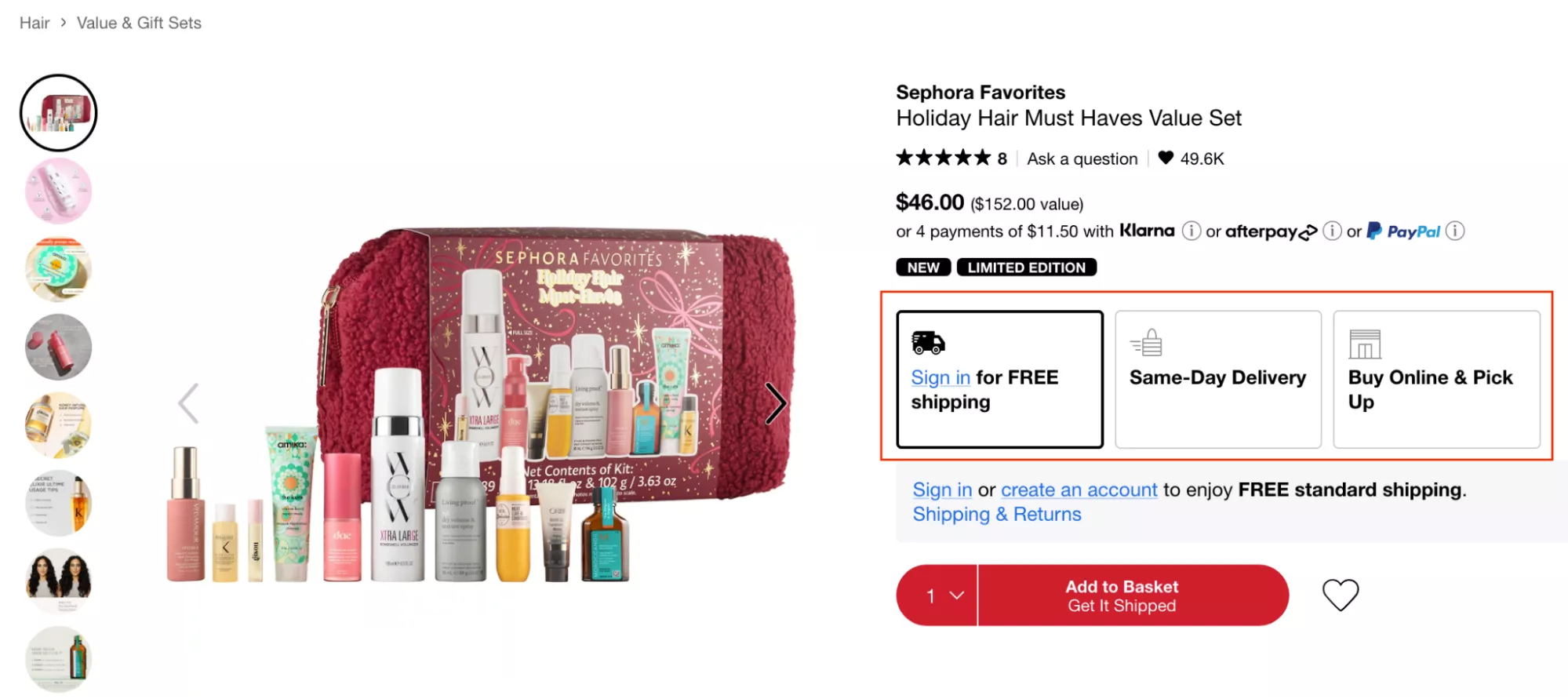
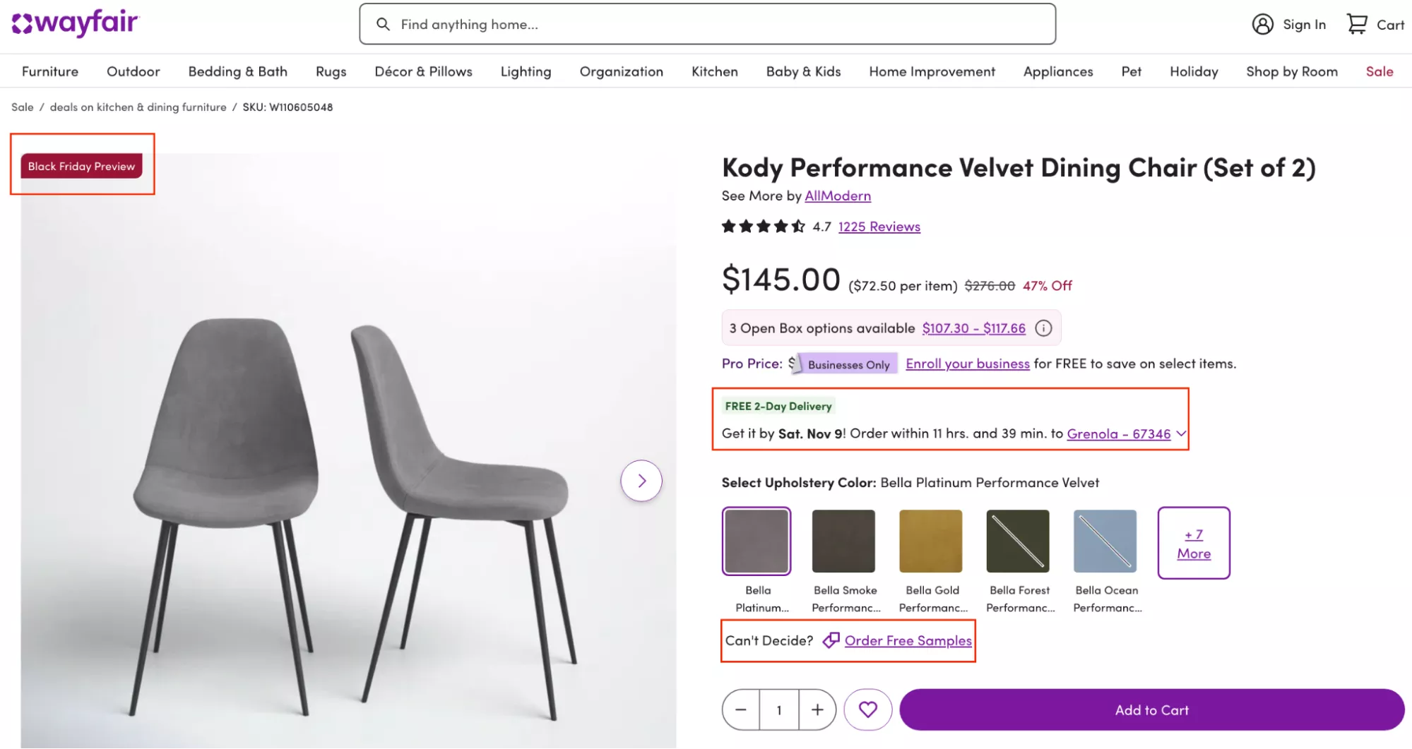
UX Idea 23: Present as Many Shipping Options as Possible
Present as many shipping options as possible. So I have two things here. There is, of course, same-day delivery, buy online and pick up — this is a business that can afford to do that. But can you also afford to do that?
I think by far the most important information you will provide to your customers today is: “Receive it in time for Thanksgiving” or “Receive it in time for Christmas” — if it is later in the year. That's the most important piece of information you will provide.
I was actually looking at a site today… I'll actually show you what I was looking at. We were looking at a site that had a certain problem on the product page, and I'm just going to point that out for you.
Oh — interesting. I think they got rid of it, which is great. I'm going to check their US site to see if the US site has that problem. This is a pretty large business — I don't know if you already know about the brand — and I generally don't break script, so this is a special webinar here. But let's… okay, great, fantastic.
So the problem with this whole piece is this orange button right here. Their own website conversions are getting cannibalized because someone decided to change this to Amazon. And the problem with that is: when I put my PIN code here, it’s actually going to ship to me tomorrow — and I am a Prime member.
Whereas here, they don’t even mention when it's going to get shipped. So giving visibility to people on when you're going to ship the product, when they're going to get it — at this time of the year — is going to be very important.
That’s also a great way to make more money. And that is this example. In this case, they're expecting their customers to pay $2 extra for priority processing — “Put my order at the top of the queue.” What that does is it does not prioritize shipping, it does not prioritize delivery — it just prioritizes packing and sending it out. And it's just $2 per order.
So then I think I would let you do the math on what that would mean for your business.
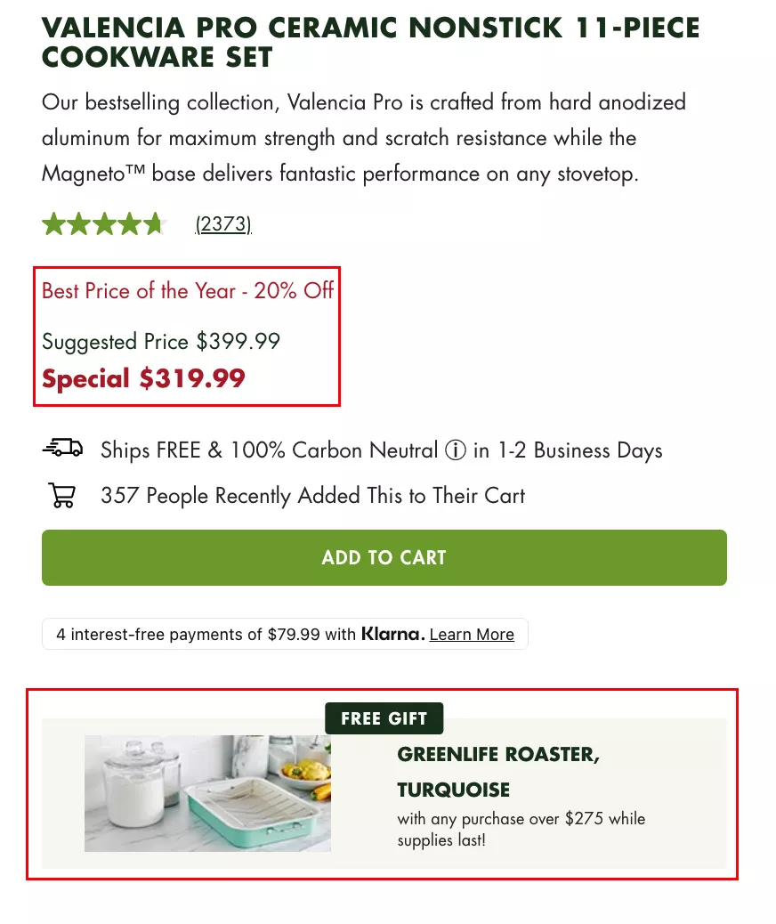
UX Idea 24: Use compelling copy to draw attention to discounts
Use compelling copy to draw attention to discounts. I think this is a really easy one, but the copy I'm trying to draw attention to here is:
“Get the bestselling Titanium Always Pan Pro for the lowest price this year.”
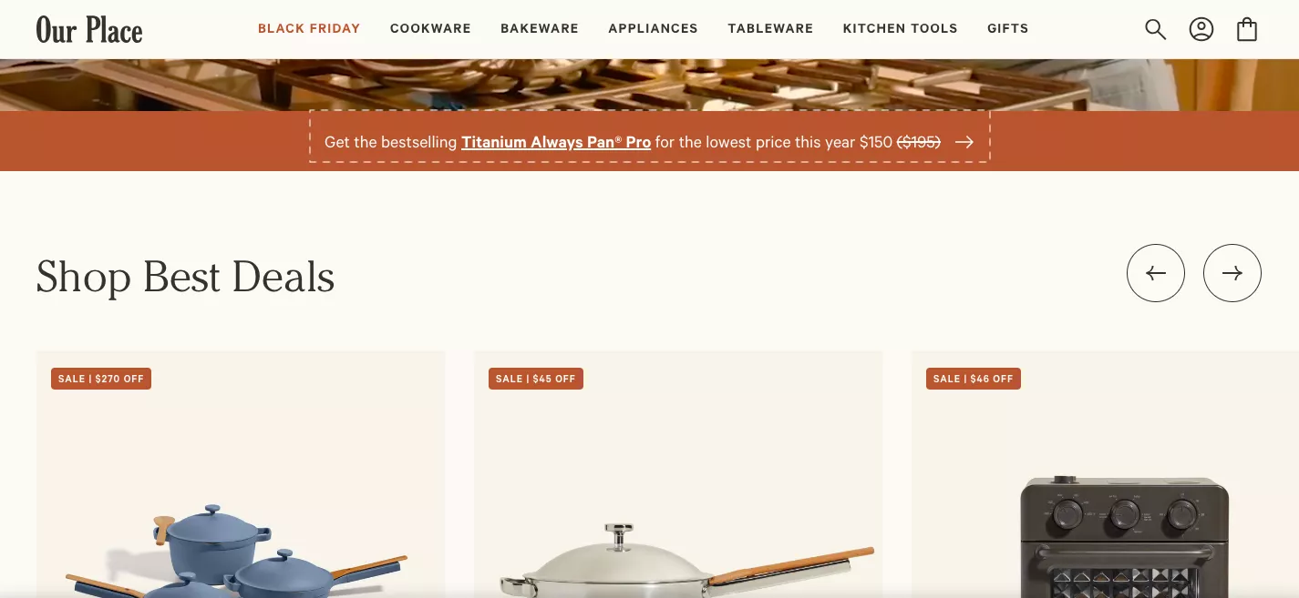
Again — similar to the one I showed you earlier. Copy is king. Copy is the most important lever for you to use to influence buyers about how they look at your product, your price, your collections, and your brand as a whole.
The moment you fall for something that's quick and dirty — “The biggest Thanksgiving sale ever!” — sort of basic stuff… you are missing out on a chance to differentiate yourself. You're missing out on a chance to stand out. And you're missing out on a chance to convert.
So it's really important that you do that.
Another way to think of this:
Let’s say your conversion rate is 2%, and let’s say your potential maximum conversion rate is 6% — three times the business you do today. That means 94% of the traffic on your site is anyway not going to buy. They’re not going to buy. They’re not there to buy — they’re just checking, looking, browsing.
Sixty percent of them bounce. So that leaves an even smaller percentage, about 36%, for you to actually look at.
So let’s ignore those 94% or 96% — and focus on the 6% who are there to buy.
Let’s do a good job convincing them.
Copy will do that for you.
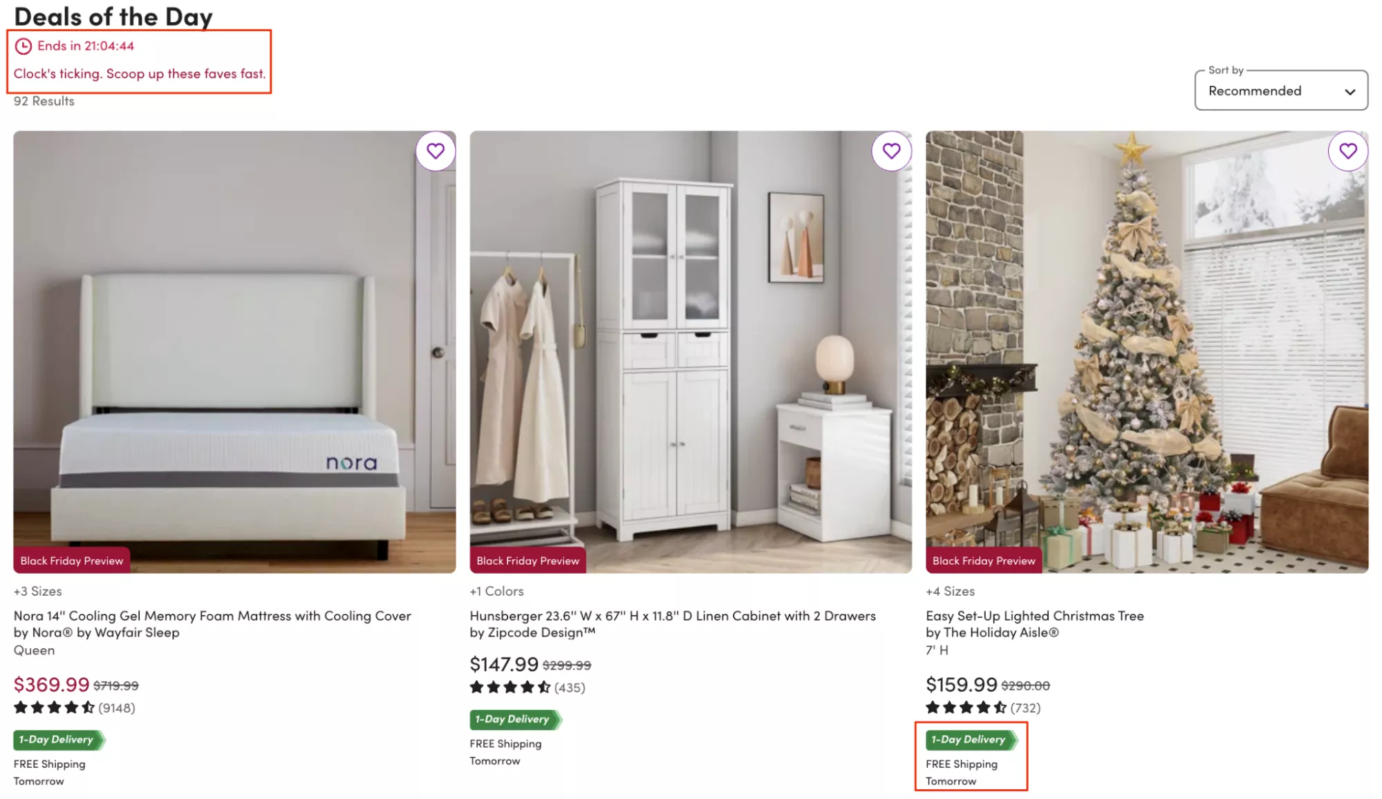
UX Idea 25: Use tags on images to show which products are marked for holiday sales
Use tags on images that show which products are marked for holiday sales. Very simple — very, very simple.
I will guarantee that your clickthrough rate on products will go up.
This tag should also be visible when people search. It should be visible in categories. It should be visible in dropdowns — everywhere.
And if you can add all the other magic, that would be fantastic. For example, in this case:
Black Friday Preview • Free Two-Day Delivery • Get it on time
And then you go… if there are other samples that you can order, that kind of stuff.
Although this is not a very gifting sort of Christmas/Thanksgiving product, trust me — a lot of people are going to have a lot of guests over. They're going to buy all kinds of stuff they were not going to buy.
Signaling is the number one reason capitalism is so successful.
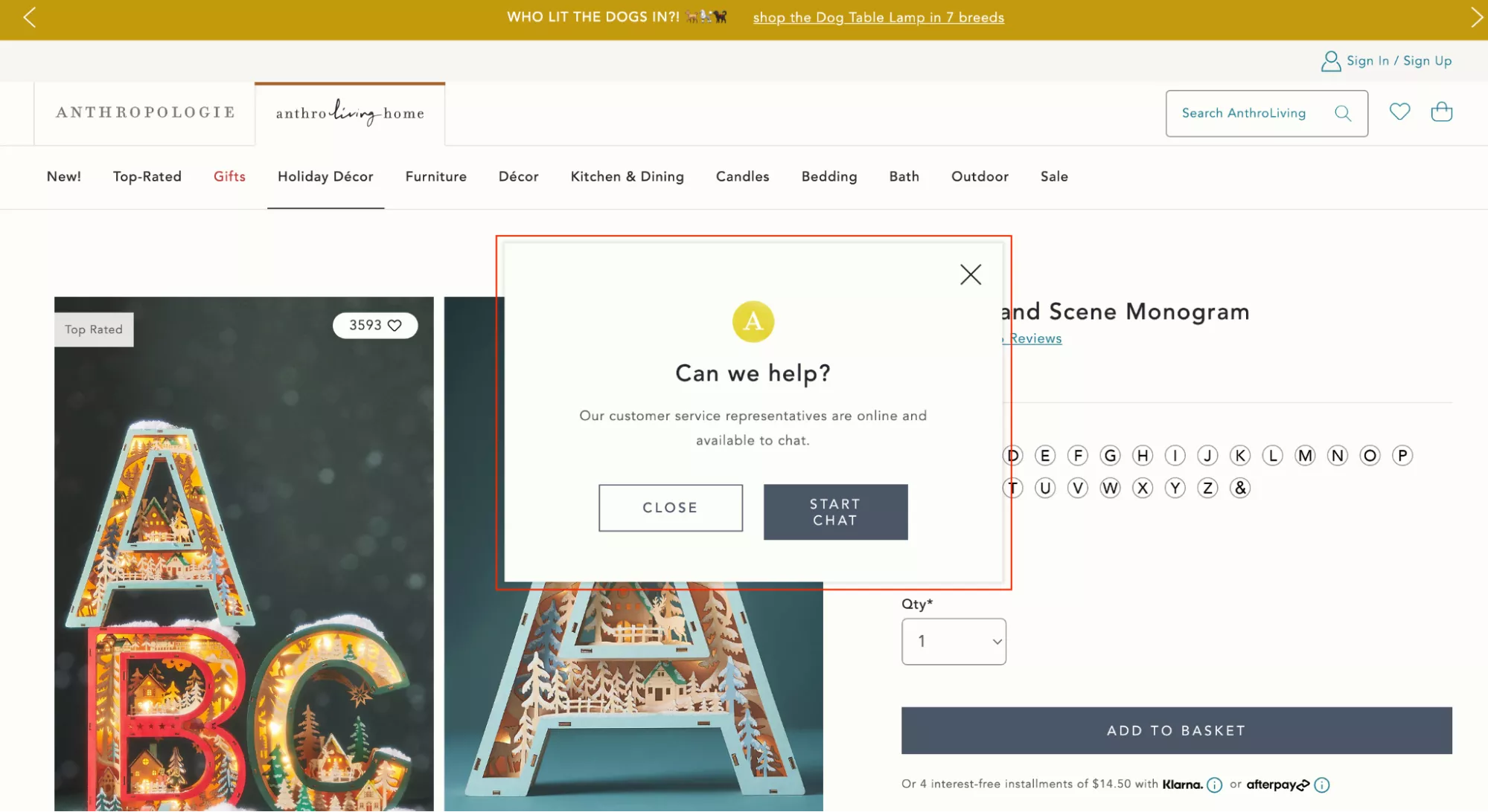
UX Idea 26: Prompt a chat request when shoppers hang around a page over 1 minute
Prompt a chat request when shoppers hang around a page for over one minute.
Very simple. I think chat is something that is very, very underrated.
The number one reason I say that is because people feel it's clunky and people really don’t chat. I recommend you launch a chat on your site and maybe hire a team that runs it for you — and then see the magic.
And then track a metric which is:
- total conversion rate,
- conversion rate for people who search,
- and conversion rate for people who chat.
Chat will be the highest.
UX Idea 27: Boost App Sales With App-Exclusive Discounts
Boost your app sales with app-exclusive discounts. Instead of “app sales,” you could actually boost your app installations.
So if somebody is on your website, and you want them to use the app — if you already have an app — you could do something like:
Website price: $60
App price: $50
Lose the $10 for the install, and then you have that customer — and you're on their phone for a long time. You also have push notifications, app push notifications, for you to talk with them.
This is not me asking you to go and get an app. If you don’t have it, don’t get it. I don’t know how many brands can do justice to having an app. Are you a brand that people want to have an app for? Will they keep you on their phone? How much space will you occupy on their phone?
So those are the considerations you need to have — but only if you already have an app. This is a great way for you to acquire customers on the app.
UX Idea 28: Pitch your loyalty program by showing benefits beyond holiday pricing
Power your loyalty program by showing benefits beyond holiday pricing.
Of course — I think this is another reason I said that of the total people who will visit you throughout the holidays, about 70% of those will be new. They’ll be visiting you for the first time. And because they'll be visiting you for the first time, it is imperative that you collect their information — or at least give them a reason.
I strongly, strongly recommend that.
I think launching a loyalty program will be hard because you have all of 10 days. But the easy way out is: you opt them into the program using an opt-in popup and at least capture their details — and then give them a free gift in return or something on those lines.
UX Idea 29: Help Shoppers Calculate Shipping on the Product Page
Help them calculate shipping right on the product page.
This is generally great advice — and the reason I say that is because this is the number one reason you have checkout abandonment. I'm not talking about cart abandonment, but Shopify checkout abandonment.
The number one reason for it is: shipping cost is calculated too late.
And that's the classic example of expectations not being set properly.
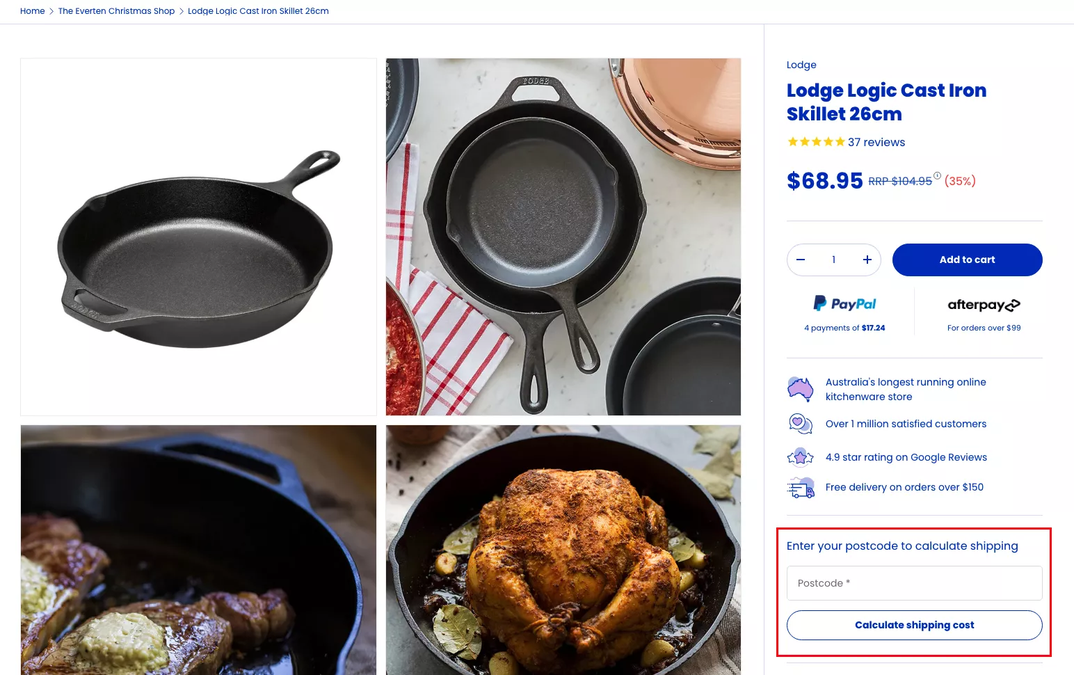
When I normally look at cart abandonment and checkout abandonment numbers, it's normally an expectation issue — not a conversion issue. It’s the fact that a lot of people are reaching the cart and checkout just to make sure they have all the information about this purchase.
So I, for example, recently bought a new coffee machine, and I was buying accessories for it from NCD, which is this amazing brand. I added $100 worth of products to the cart, and then I went all the way to the checkout to find out that the shipping was $30. Can you believe it?
And just because of how annoying I found it to be, I didn’t buy it. And then of course I found the same products on Amazon with free shipping and I got it the next day.
Had that brand told me that the shipping is that much — and if you order directly from their website, they give you two free coffee puck screens… I know a lot of you might not know what that is, but they're essentially screens you put on top of the coffee puck — they said they give you two of those for free, they’re also worth $30, so your shipping is free. I would've gotten free stuff. But they never said it.
So they lost me as a customer on the website. They ended up paying commission to Amazon. They never get my details. They can never email me. It's the end of the world.
But yeah — I think they'll learn from it. I sent them an email about it, and I offered to do CRO for them. So hopefully their life will change for the better as well.
UX Idea 30: Offer an easy option for gift wrapping and premium shipping
Offer an easy option for gift wrapping and premium shopping.
I think this is a great upsell. It is a fantastic way to improve your AOV just a little bit. And if you can, you can do multiple versions of this:
- Do you want a gift wrap?
- A gift wrap with ribbon?
- A gift wrap with ribbon and a card?
So that's $2, $4, and $6 that people would add to their cart immediately.
BONUS: Give Your Customer a Free Gift
And finally — my final suggestion.
Give your customer a gift. A free gift from the brand.
Let them try a product. Let them see something new.
It could be a bag. It could be the way you pack and send the product. It could be anything. You don't even need to show it in the cart — you can just send it to them. If you do show it in the cart, it’s a great conversion driver. People feel delighted while they are shopping.
In the example here, they're able to do it because their average order value — their product value itself — is very high, 50 bucks. So they can afford to spend 10, maybe 20 dollars on a free gift.
If you're not able to do that as a brand, that’s okay. But I still recommend you throw something in — some extra delight — for the person who is ordering.
If nothing else, I would do a handwritten note:
“Hey, I'm the brand owner. Thank you so much for ordering. Our Christmas is a little bit better because you chose us, and I hope your Christmas is a little bit better because you choose us.”
But you get the point.
Closing Remarks
So those are some of the ideas that I had.
I hope you have a fantastic holiday season.
I'm open to taking questions. I'll stick around for five to seven more minutes, depending on how many questions we're getting. I hope I was articulate enough, and I hope these ideas will add value. I think there’s a lot of good business to be done, but we all need to level up so that we can prepare for the holiday season and deliver a next-level experience.
By the way, we are happy to go in and take a look at your store for absolutely no cost and do an audit of where you lose customers and revenue. We are fantastic at it — we've done more than a thousand audits this year already. We'll completely look at every part of the site.
We are also happy to do that with your Klaviyo account or Omnisend, or whatever it is you're using to look at your email marketing — that's going to be a key revenue driver for you. So if you need help in either of those places, our inbox is open. I will anyway be emailing you after this.
Q&A
Do you have a recommended loyalty program?
Yes, man, I don't actually — but I think some of the ones that are the largest are pretty straightforward. I think you've got to think of a loyalty program that fits into the use case you're using it for.
I would generally connect loyalty to frequency.
Frequency meaning: DoorDash, in my case, would have a frequency of thrice a week, Uber would have a frequency of five times a week, and Amazon would have a frequency of once in two weeks. Their loyalty programs would have to adapt to that frequency — so they don’t over-reward or under-reward me.
So, Smile.io or any of those tools that allow you to adjust this according to the category or type of product you're selling will be the right loyalty program for you.
Should you make big changes right before the holiday season?
No big changes, right?
No surgeries before the wedding, right?
No large changes. It's too close. There will be 10,000 issues if you do that. Your organic ranking will tank immediately.
Yes, yes, it will. But… yeah.
Re-platforming is not a good idea almost ever. You have to do it at a time when you know the business is already going to be bad, because it hurts the business in many ways.
It completely destroys your organic rankings because the way Google has indexed you changes completely — your URL structure, internal linking, etc. Your loyal customers are thrown at a completely new experience. Almost always you will spend at least 20 days fixing bugs — maybe more, depending on how good your developer or team is.
Only if you can handle that as a business should you do it.
But this is the worst time to do it, to be honest.
You can do CRO.
You can do A/B tests.
Oh, 100%. You could add a holiday-specific page, a category, a collection.
That’s actually part of the earlier points that I spoke about.
Thanks so much for joining once again — and have a good one.
Bye-bye.
Get Fresh ideas to boost your conversion rate
(stuff that works for hundreds of stores)
Request a Free Site Audit"Convertcart’s Audit Report was deep and insightful. We never thought they would spend so much time in building and sharing such insightful content, free of cost."


Logan Christopher
Lost Empire Herbs