On-Demand
Why Your Product Pages Aren’t Converting (And How to Rescue Them)
Studies show that 68% of eCommerce visitors drop off product pages without adding anything to cart.
There’s one major reason behind it—the page makes their brain work too hard.
Even if your PDP looks “beautiful,” it may not feel effortless to buy from.
Why we’re doing this live session:
We’ve studied thousands of product pages, and we realised one thing:
- A lot of behavioral psychology + UX lapses are not easy to spot (with an untrained eye).
- We want to take this opportunity to show you HOW we spot problems on product pages.
What we’ll discuss in this live session:
👉 15 silent conversion killers hiding on your product pages—and how to eliminate them fast
👉 Our favorite product page optimizations that lifted conversions 20%+ (with real examples)


The speaker:

Delia Frank
Head of Customer Experience
Convertcart
Delia is our Head of Customer Experience. She's helped eCommerce stores improve their conversions and retention for over 5 years now.
Delia Frank
Head of Customer Experience
Convertcart
SESSION REPLAY – WHY YOUR PRODUCT PAGES AREN’T CONVERTING (AND HOW TO RESCUE THEM)
All right, thank you so much, everybody, for joining us today. I can see a couple of familiar names from the last time — thanks for joining us again, and a warm hello to all those who are joining this webinar for the first time.
If we’ve not met yet, I am Delia. I work with the customer success team at Convertcart, and over the years, we’ve done numerous audits across clients — a thousand plus this year itself.
And this is a topic that’s honestly something we’ve worked on extensively. So today, what we’ve tried to do is put in the top learnings that we’ve got across our audits for you. We’re not only going to cover the pitfalls — we’re also going to see evidence-backed data about how we’ve overcome them.
So without further ado, let’s dive right in and figure out why your product pages aren’t converting, and how you can rescue them right away.
1. Hero messaging not tailored to traffic source
All right, great. So, let’s start at the very top — hero messaging.
Now this is something you’d think most people would get right, given that it’s right at the top. However, in my experience, I’ve seen a lot of people spend thousands of dollars getting their ads right, getting their social media traffic to pour into their website — but the problem happens when they see really high bounce rates.
Shopify also verifies this — they see bounce rates of over 50% when traffic comes in from display ads or social media.
When we looked a little closer, the problem has several nuances. I’m just going to focus on them one by one.
The first aspect I want to talk about is continuity.
Now imagine you’re looking for engagement rings, or promoting a specific category. People look at that ad and come to your website — and just take a look at this banner.

Now, it’s perfect, right? But it resembles “timeless jewelry” a lot more compared to engagement rings. So what happens is that the hook phrase that actually got them hooked in the first place isn’t really met. There’s that element of discontinuity — and trust basically breaks at this point itself.
So it’s no surprise that even Shopify noted that we see these high bounce rates in this case.
And in some cases, what’s even worse is when a Facebook post talks about a rose gold engagement ring — we go excitedly to figure out what it’s all about, just to find out that the page you’re looking for has been removed or relocated. Instantly, there’s discontinuity, and trust breaks.
✅ What Can We Do to Fix This?
Now, you have traffic coming in from different sources with completely different mindsets.
Typically, those coming in from paid search have the highest intent. Out here, you definitely want to lead with what makes you different.
People coming in from email would also have relatively warm intent. So at Convertcart, through our email marketing platform Engage, what we do is try to lead with exclusivity.
I’m not just talking about “15% off just for you.” We try to take that a step further by ensuring that the coupon code is dynamic, so every user gets a separate coupon code — that leads to a better sense of exclusivity.
And of course, for all other traffic, there’s definitely informational intent, which you could lead with social proof — and I’m going to talk a little more about that in the points to come.
Also, use UTM parameters.
Another aspect we can look at in today’s day and age is your UTM parameters — specifically the source and the term.
For example, if someone’s seen sneakers on Instagram and then landed on your page, a simple note like “The sneakers you saw on your feed — now back in stock!” adds a lot of authenticity and completes the journey for them.
You could also understand the keywords they look for.
Now this given brand, Tikva, creates various health drinks specifically for people diagnosed with high BP or cholesterol. So should they use these words — these keywords — in their Google Ads?
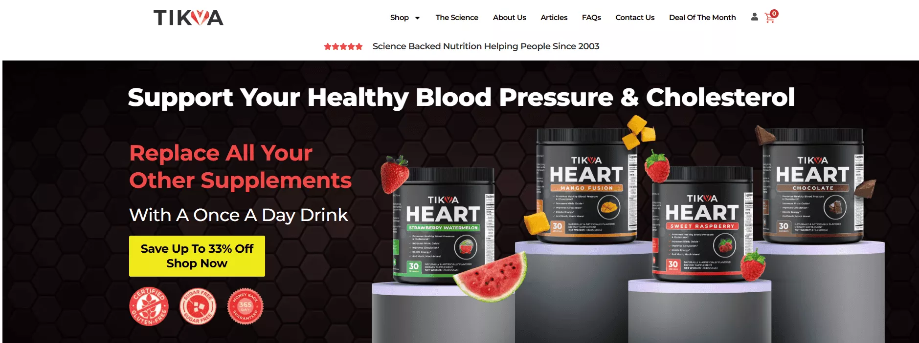
What they can simply do is analyze UTM parameters and show different hero images to people coming in for BP versus cholesterol — and actually customize or personalize the experience to a great degree.
Right? So we don’t want to make it generic. We don’t want to make it look like someone’s entered the wrong party.
There’s this book written by Steve Krug called Don’t Make Me Think, where he clearly mentions that users don’t exactly read everything on a website. They scan — and while they’re scanning, you’ve got to complete that picture for them in order to ensure that they purchase at the end.
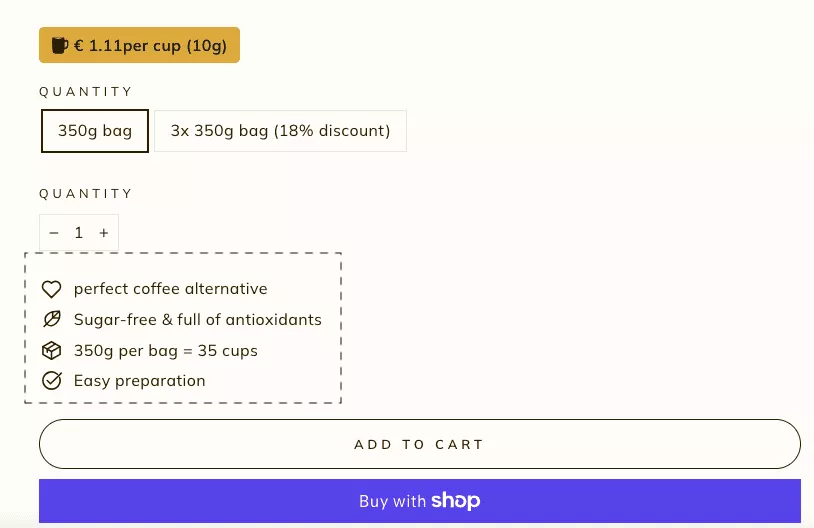
2. The page is high on imagery and low on persuasion
Moving on to the next image.
Now, I’m sure we’ve all come across those websites that have those picture-perfect images — cinematic lighting if I may say. And I also know a lot of clients who have spent a lot of money getting super high-resolution images and putting them out on their website.
But the sad part is that 42% of users actually abandon purchases purely due to trust concerns.
Now, the imagery may be fantastic — we’re not doubting that. But what’s actually lacking out here is the sense of persuasion, the trust in a brand, the trust to take things forward.
So very often when we see that perfect image, there’s nothing sticky for visitors to scroll past. Nothing undifferentiated about the product. And trust triggers are often hard to find — especially in that first fold, where you’re looking for trust in the first place.
✅ What Can We Do to Fix This?
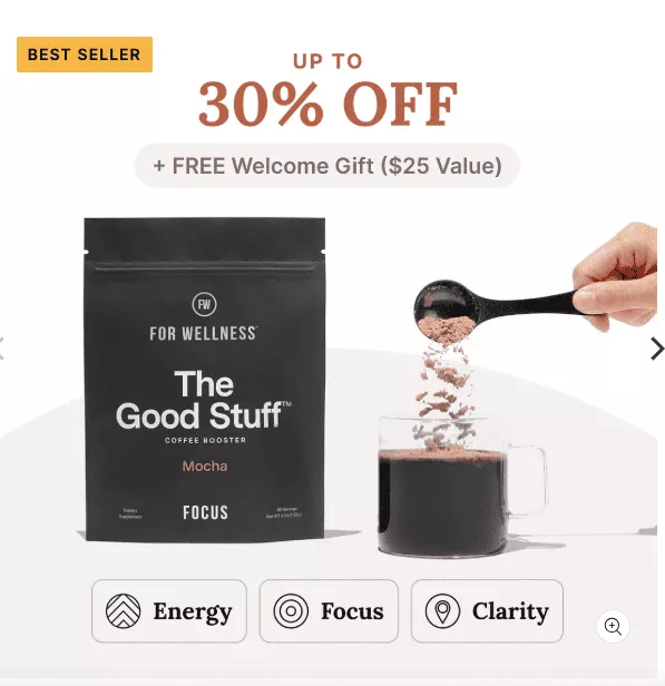
By no means am I saying don’t have high-res images or rich imagery. Definitely leverage that to your advantage — but design it as an infographic, especially at this phase.
For example, The Good Stuff has done this rather well. They’ve taken an image of their product, placed it perfectly, spoken about what differentiates it from the other products. They also have a bestseller tag and the value proposition right there in the first fold — the first thing you see when you log on.
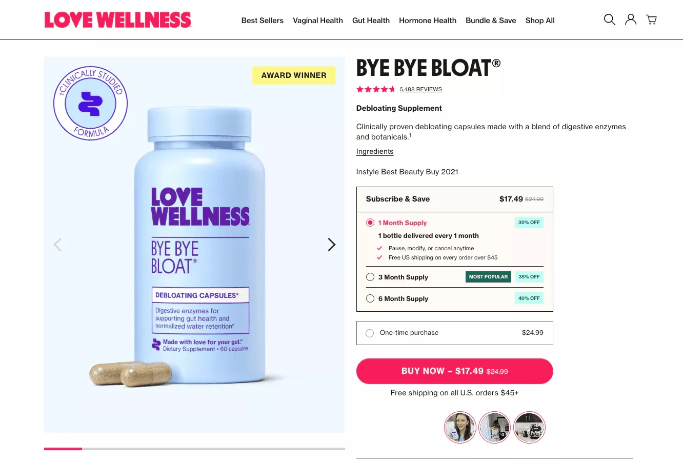
Another brand, Love Wellness, that deals in various kinds of health supplements, also does this well.
Now, given that they’re in the supplement industry, they ensure that trust triggers are highlighted in the first fold.
If I look at this example, I can see the ingredients right there, a clear subscription plan, user reviews, shipping details — all in one fold.
And of course, we could use progressive disclosure. You don’t have to disclose everything at one go. Show the main stuff up front — and it can always expand on click.
3. No post-purchase ownership narrative
Great. Now coming to this one — I think it’s relatively quiet compared to the other two aspects we just saw.
When I think about any product that I’ve purchased, I always tend to link it to the reward. And the author Nir Eyal captures this perfectly in his book Hooked — that if you want to inculcate a habit, the easiest way to do it is to help people understand the reward, and what they stand to gain.
Now, when I think about it as a user — I picked up a fitness band lately, and I didn’t think much about the specifications. What I tried to think about more was the experience I’m going to have after that.
You know — am I going to be more regular with my jogs? Can I compete with my colleagues and friends? Maybe in a couple of days, because I’m more focused on it, I’ll receive compliments about the weight I’ve lost thanks to being more regular with exercise.
So very often, the focus lies too much on product specifications, especially if the product is a technical one — and there’s a sheer lack of focus on what the reward is going to be. How is my life going to get better by purchasing this product?
✅ How Can We Change That?
Firstly — add an ownership moment.
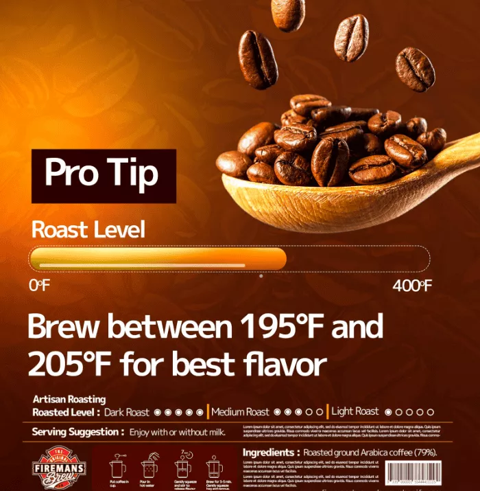
For example, Fireman’s Brew understands that there are a lot of coffee enthusiasts or connoisseurs that visit their website. So they add a welded banner with the product and give details about what temperature you can brew the coffee beans at in order to get the best flavor.
You could also break down the ownership experience through snappy copy.
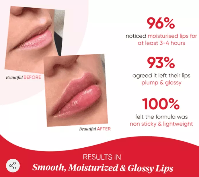
The brand Key does this well. It talks about percentages and also uses a lot of action words — words like “noticed,” “reward,” “benefit.”
People have also agreed that their lips felt a lot better, and that the formula was non-sticky and lightweight.
Also, in this case, ownership-oriented social proof makes the biggest difference.
Now, when we work with some brands and they tell us, “Yes, of course, we’ve tried social proof — but it’s not really working for us,” when we delve deeper, we realize the kind of social proof they run is extremely generic.
For example, I worked with a brand that showed me their product page and mentioned: “10,000 people are currently viewing this page.”
Now that doesn’t solve any of my doubts as a new user coming onto the website.
So, when we talk about social proof, we always try to make it ownership-oriented at Convertcart.
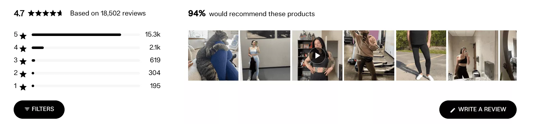
If you look at this brand right here, they’ve put in details, pictures, as well as videos of actual customers. When you click this, it tells a story of its own — what it’s like to own the product — so people can associate themselves with the reward in a better manner.
4. Zero optimization for related discovery
Zero optimization for related discovery.
In this case, discovery just stops cold. And in our experience, this is definitely an issue when it comes to brands where new visitors form a good portion of their traffic.
I’ve seen brands leave as much as 10 to 20% of AOV on the table because people typically come in, visit a given product page, but beyond that, there’s no contextual discovery. It just stops cold right there.
There may be a lot of static recommendations like related products, but people can’t really figure out how to take it further from there. It may not be connected to what they’re looking at — and bundle prompts may also be missing.
So if I’m new to the industry as well as the brand, it’s not really helping my cause right now.
✅ What Fixes Can We Apply Here?
Compare similar products.
If I’m looking at office furniture — I’ve purchased tables, now I’m looking at chairs — help me figure out which chair would make the most sense for me, given the number of office hours anyone would typically work.
Show what different quantities of a product might look like.
Give users a better assessment of what would work best for their need at that point.
Track interaction rates and A/B test positioning.
This is something we do extensively at Convertcart — we pretty much let data drive the way.
So, we not only track interaction rates, but with reference to discovery, we A/B test where different product recommendation carousels would look best.
In our research, and backed by the majority of what’s worked for our clients, mid-page seems to be the best.
We had a couple of cases where brands proposed putting it a little higher up — but that honestly affected their CLS scores pretty badly.
So, if it’s mid-page versus bottom, for most businesses I’d say mid-page is a clear winner.
5. Missing the Brand Differentiator Card in the First Fold
Missing the brand differentiator card in the first fold — I think this one is purely about branding, folks.
Users obviously spend 80% or more of their time in the first fold, right? So we definitely want to win their trust as soon as possible. Because they’re obviously ready to pay a lot more — in fact, 46% are ready to pay for a brand that they trust.
When we look at this closer — now, I’m sure product managers work really hard to build a fantastic product, no doubt there. But very often we see that the focus is too much on product features.
Brand recall overall is missing, and this can be a pretty detrimental factor, especially for brands that rely on subscriptions — I’m talking eBay, makeup, supplements, etc.
And of course, the lack of trust icons can also not really work to your advantage here.
✅ What Are the Fixes We Could Look At?
A simple “Why You” — and not something that I’ve already looked at before on another website — can make the biggest difference.
This brand, SMA, has clearly mentioned its core differentiators within the first fold: handmade, paraben-free, not tested on animals. So it caters directly to the majority of their interested audience right there.

Guarantee a safe checkout. Don’t always assume that people know your website is safe and has the right checkout medium. Just specify it, highlight it, make it easier, and remove that bit of friction for your users.
Try using microcopy overlays over your hero image.
For example, certain embroidery and pottery products — when the hero image clearly specifies “Hand-finished in Portugal”, it gives it a different sense of authenticity and trust.
Now, Foodie, an Australian brand focused on ready-made food — when this brand was taking off, they tried and tested different kinds of microcopy over their hero image.
What worked best was when they related it to the Zero Waste Campaign that was also running out there.
So they focused on “Zero Waste, Maximum Taste” — to cater to the working population — and it really worked for them. Their conversions definitely went up here.

6. No immediate nudges for impulse buyers
All right, this is a fun one — impulse buyers.
We’ve seen impulse buyers actually change the game for a lot of small and medium enterprises, especially during the holiday season. But the key factor here is that it works great only when checkout is made frictionless.
In fact, 49% of online purchases can happen on impulse, as per Cloud.
Now, when we look at the problem closer — typically impulse buyers have a high clickthrough rate, which means they’re keen on understanding a bit more.
But very often, we don’t see a very good add-to-cart rate at the end of the day.
Sometimes, certain brands I’ve noticed try a bit too hard.
For instance, there was a brand that sold fragrances and really wanted to convert people on impulse — but they went a step ahead and said there’s only one unit remaining.
Now, what if people wanted to buy more than one unit for gifting? It was the holiday season.
So this is where things can look really inauthentic, and we don’t want that to happen.
And then — no targeted microcopy justifications as well.
✅ What Are the Fixes We Could Use?
I think the key here is to find middle ground.
Micro-nudges can help — maybe talk about what’s left in stock, but in a way that’s connected to your product features. Mention the right number, or perhaps mention shipping time if they order within a given time span.
Tiny Rituals, a small LA-based jewelry brand, actually did this well. They even increased their conversions by 21% by simply mentioning a limited quantity along with a non-intrusive option to get a personalized offer on their website.
We also work really hard on highlighting the CTA.

Immediate incentives can be put there directly — and of course, offer one-tap checkout options.
This US skincare brand added Apple Pay and actually saw 70% more mobile purchases.
7. Poorly optimized information blocks that delay decisions
All right. Let’s talk a bit about the information layout now — because I think nothing breaks a shopper’s momentum more than poorly organized information or chaos at the end of the day.
Very often, we see 68% of shoppers abandon product pages purely because information is not relayed in the right way.
We’re talking about maybe too much text, or key information that a user needs — like benefit-driven information, returns, delivery details, etc. — being apparently missing or buried way lower than required.
✅ How Could We Sort This Out?
Firstly, accordions are of great help here.
If you have a lot of aspects to talk about, simply organize them using an accordion — so users can click the dropdown and get whatever information they need.
Understand your customer objections using user-generated content as much as possible, and see that they’re addressed around the primary CTA itself — like this brand has done right here.
You could also secure and move expert quotes mid-page, like this brand has done — placing quotes by The New York Times, Forbes, etc., right in the middle of their product page.
It definitely serves as a great way to showcase what your brand has done and what top brands are saying about it.
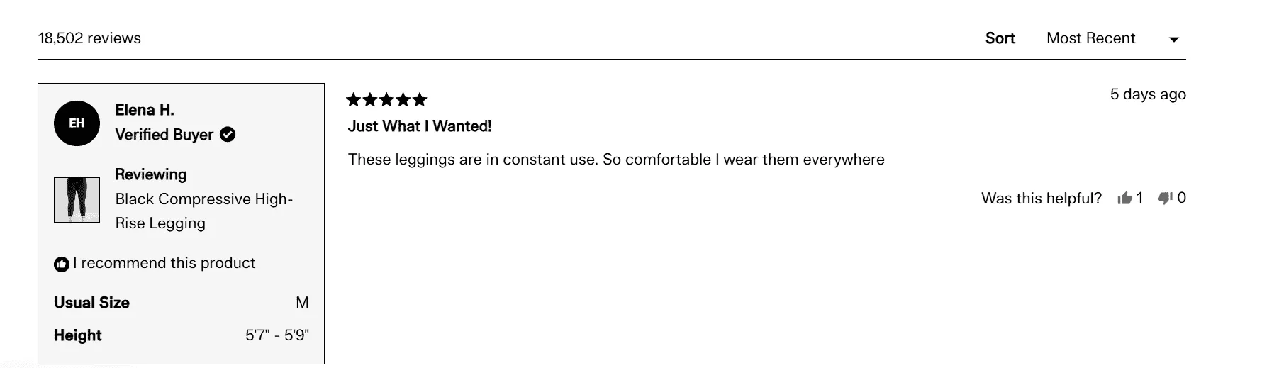
8. Presence of UGC (User-Generated Content) That Isn’t Shoppable
I think user-generated content is like gold in this scenario — but when used correctly, it can definitely influence a lot of purchasing decisions.
In fact, 79% of users are influenced by UGC, but only if they can quickly identify and act on it.
Now, I once worked with a clothing and lifestyle brand who did everything right — and in this case, we also had a lot of users put out pictures on Instagram proudly wearing their outfits, which is great.
But when you actually go to click these pictures, they take you nowhere — whether it’s on their website or otherwise.
So yes, they definitely inspire trust, they look great, real people and all — but they can’t be clicked.
The Shop the Look option, which is very popular nowadays, was also missing.
This is definitely something we want to avoid — and we want to overcome this friction when it comes to our product pages.
✅ What Can You Do to Fix This?
You can turn every UGC tile into a clickable path.
The brand Girlfriend Collective does this in an amazing way — one of the best we’ve seen online.
In their review section, which falls just below their product, if I click this right now, it takes me to that exact product page — the same style, same size, and same color.
So I don’t have to start from scratch. I don’t have to shop from scratch and figure out what to do next.
You could also create UGC mid-page with a CTA that says Add to Cart, or simply add the Shop the Look function where you create a look.
Instead of asking people to check out your products from scratch and pick them one by one, you could add them together — so users can just select whatever they like and complete that look.
It eases the process and definitely works as a major boost to sales on the whole.
9. No Intelligent Opt-ins for Later Sales
No intelligent opt-ins for later sales.
Now, when many businesses come to us, the first question we ask them — typically when it comes to email opt-ins — is: “What have you worked with before? What’s been your success rate?”
Very often, they mention, “Of course, we’ve got opt-ins.”
We’re like, great — let’s take a look at them.
And sometimes it’s just a generic “Subscribe to our emails” — which is sent to new users, repeat users, and once in my experience, I’ve even seen it sent to cart abandoners.
So, you know, it’s great that 20% of visitors may convert on the first visit, but 60% may need that personalized nudge at a later point in time.
You definitely don’t want to have non-contextual popups, or something that’s too generic or not differentiated based on the purchase funnel — and where I stand in that funnel right now.
✅ What Are the Fixes We Could Use?
Use behavior-based triggers. Ensure that people have at least been on your website for some time, understand what you do — and then show them the popup.
You can also review intrusive vs. non-intrusive options depending on the nature of your visitors.
Contextual copy is key. If I’m running various certificate courses, “3 months of a free course” is something that’s definitely going to make sense to me — rather than just a “Subscribe Now” option.
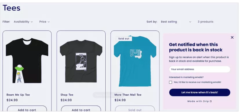
If I’m selling T-shirts, for that matter, and something most users like is sold out, I could definitely ask for an email address with a clear CTA that says “Let me know when it’s back.”
So you’re giving something relevant and contextual to their stage in the purchase journey.
Connect opt-ins with cart recovery emails. This is something we at Convertcart do very often.
The second we capture someone’s email ID, we ensure we don’t send annoying, repetitive emails.
We try to customize it — add the user’s name into the subject line.
And when it comes to cart abandonment emails, we even try and accommodate the name of a product or two that the user left in their cart — so it feels personalized to their journey, not something generic that people would mark as spam.
10. Price–Value Perception Gap
So — the price–value perception gap.
Now, very often people land on a website that may really look great — awesome-looking PDP — but they don’t purchase, primarily because there’s just no reference point.
They don’t know if it’s worth spending that much at that point in time, so they pretty much hit the brakes on a purchase.
Here, people may be unable to see what’s included in the product, or they have no reference point with respect to pricing — basically competition, market rates, etc.
Also, the reward is very unclear — so they look at it more like a gamble at the end of the day, rather than a gain, something that’s going to make their life better.
✅ What Can You Do to Fix This?
You can highlight aspects like returns and warranty — that’s your non-monetary cost saving.
Don’t be shy about mentioning that shipping is free. Everyone’s doing that, yes — but we can’t assume shoppers know that at first glance.
If you have financing options, highlight them right beneath the product name, or perhaps near the CTA.
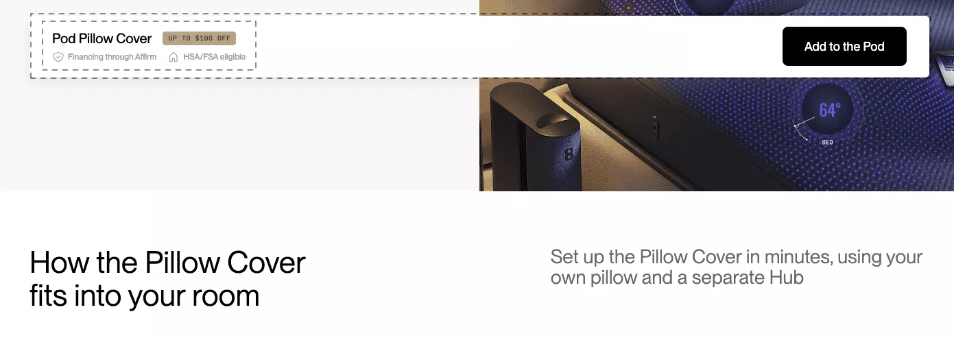
That would work to your advantage — especially for businesses selling high-value products — because it helps reduce cost anxiety and makes sure whatever options you’ve got are visible, clear, and out there.
11. Too Many Variant Choices
Too many variant choices.
I’m sure we’ve all been in that spot where we enter a parlor and there are too many ice cream flavors — you just don’t know which one to choose.
That’s decision fatigue in real life right there.
And frankly speaking, when it comes to conversions, it can cause a huge number of drop-offs — we’re talking 38% of cart drop-offs, right?
It’s called the paradox of choice, and you don’t want that on your website because ultimately, it’s just going to confuse people.
We’re talking endless colors, sizes, no tags that tell you what’s a bestseller, trending, or most popular — or variant names that can be a bit too technical.
✅ What You Could Do Here
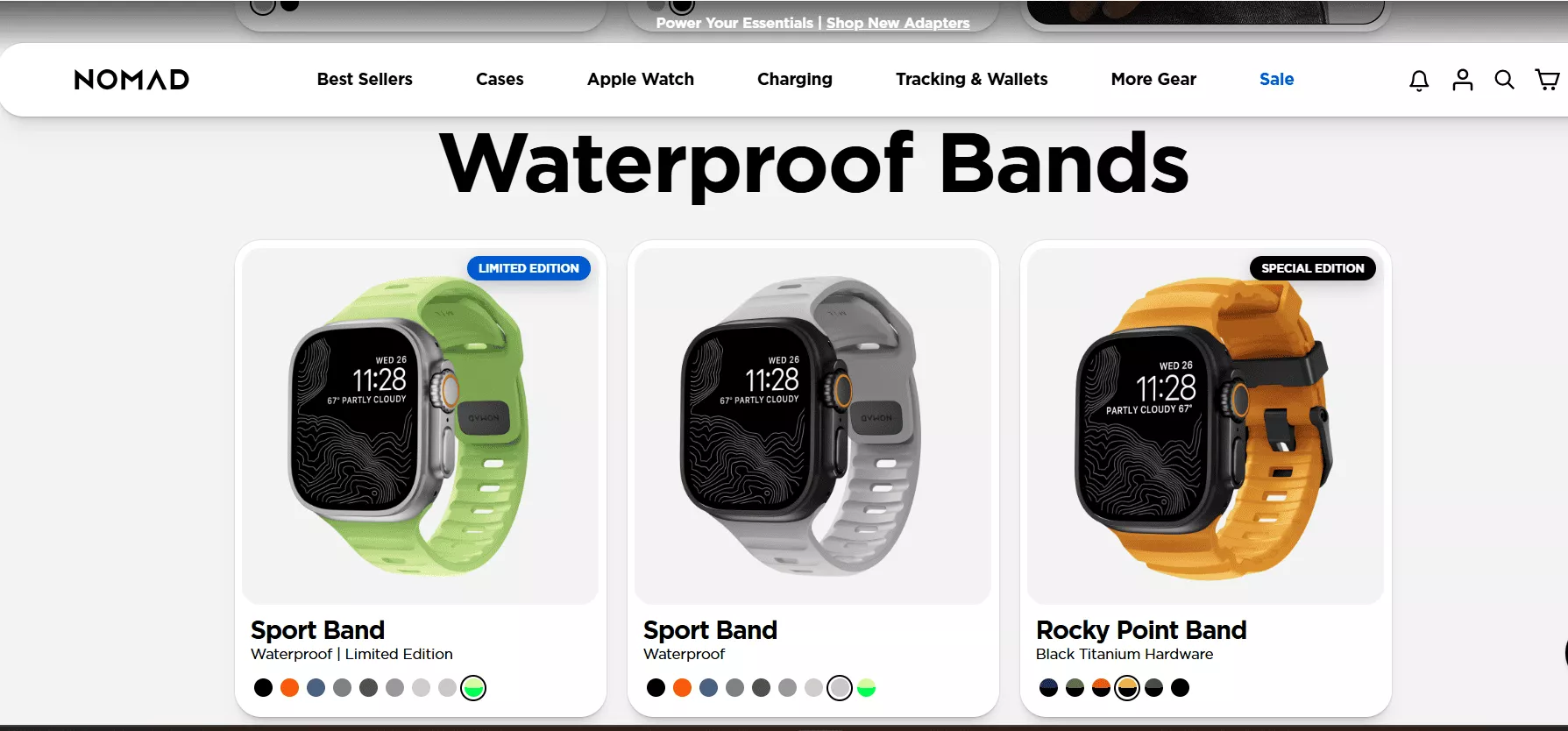
Use useful tags, like this brand Nomad has specified — “Limited Edition” or “Special Edition.” It’s available in different colors, so you can select whichever one works for you right there.
You could show clear labels and even include bundles to avoid confusion.
And definitely add short variant descriptions, so users know what they’re looking for and how to get it.
12. Too Many Different Buying Nudges
Nobody likes to end up on a site that pulls them in different directions — two to three CTAs, two to three time-bound offers popping up, and other newsletters fighting for attention with the add-to-cart button.
We don’t want that. It gets too confusing and overwhelming, and ultimately leads to a high drop-off rate.
✅ How to fix this?
Needless to say, the best solution here is to have one nudge per fold.
This brand Bulletproof has done it well — they’ve used contrasting colors so the CTA catches your eye directly, and they’ve mentioned their coupon code right above the CTA.
That’s a smart strategy to adopt.
Ensure that your CTA text aligns with your buyer’s state.
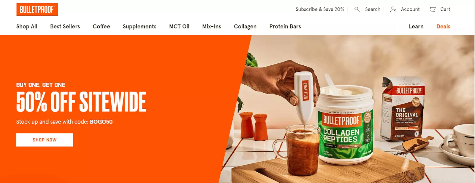
For this brand, they actually improved clicks by about 15% simply by adding the right CTA — just one CTA, kept clean.
For example, if they run out of a given ceramic product, instead of “Purchase It,” they’ll give you the option to pre-order if it’s out of stock.
That’s a smart way to adjust your CTA and address the customer exactly where they are in their purchase journey.
Of course, keep it clean and suppress too many overlays during sale periods or even during business as usual, since that can just lead to a poor overall site experience.
13. Upsell and Cross-sell Clutter
Upsell and cross-sell clutter.
Now, we’re all about upsell and cross-sell in general. Product recommendations, when done right, have actually yielded a lot of revenue for different businesses we’ve worked with.
However, adding too many too soon, and without the right data backing it up, can actually have a detrimental effect and even reduce conversions in some cases.
You don’t want your product display pages to be overloaded — too many cross-sells appearing before the primary CTA, and contextually irrelevant add-ons.
✅ What you can do?
At the end of the day, try and delay your upsells until your cart or checkout confirmations — just so you understand the user a bit better, right, and can then recommend things also better.
Use contextual copy.
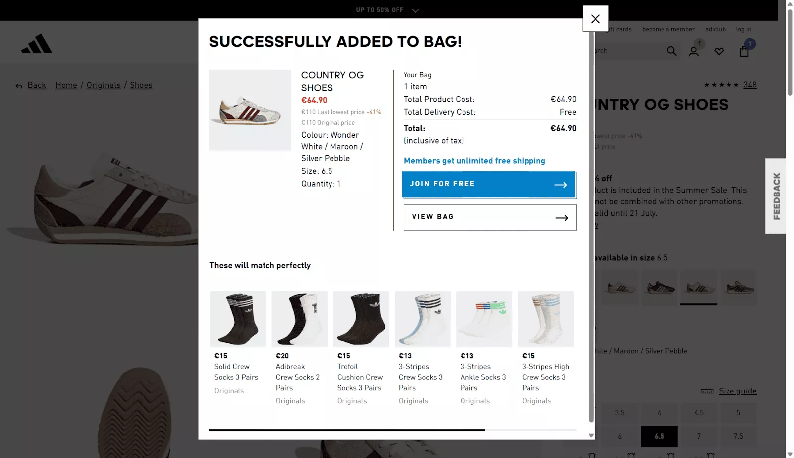
I think Adidas sort of nails this because once you add the right shoes to the cart, they’ll actually put in the right copy saying “These will match perfectly” — and showcase socks which will actually go well with the pair of shoes that you’ve selected.
And of course, show a maximum of three relevant accessories, just so we don’t overwhelm the user at any phase.
14. Problematic mapping of features with benefits
Coming to the feature versus benefit issue.
Now, most users — when we did a survey — actually preferred benefit-led descriptions, but still, many brands are very focused on the features of a product.
We worked with a suitcase brand that spoke about how they’re using first-grade aluminum that can also be used by airplanes, for that matter — and they missed out on the actual focus, on the benefit.
They wanted to talk about how it’s durable and lightweight, right, and can be carried anywhere for different kinds of trips.
So, technical jargon sometimes can dominate the copy — and very often, we focus a lot on the feature and just miss out on the reward or the emotional framing, per se.
✅ What Can We Do to Fix This?
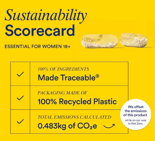
Ritual Vitamins, which is a brand that sells numerous supplements, ensures that they’ve registered this — actually it’s a registered trademark — Made Traceable, wherein every product they talk about includes the ingredients, and you can actually note what’s going into something that you’re going to consume.
Translate features into outcomes. Maintain that emotional frame — because that’s what people are going to connect with a lot better.
You could also use visuals and icons to make this happen.
This furniture brand actually conveys this superbly — they have awesome imagery, and their copy is also very catchy: “Make room for a better living.”
They’re automatically focusing on the reward.
So rather than feature-based selling, they’re talking about the benefit of moving to this brand.
Of course, you could use different kinds of icons to denote how your product may be more luxurious or cater to a specific crowd.
15. Lack of Contextual Trust Signals
And finally — lack of contextual trust signals, typically where hesitation peaks.
Now, at Convertcart, we’ve understood that clients often go through different phases of the trust funnel, and as users, I’m sure we can all connect with these aspects — especially when we come across a new brand.
You start thinking — does it look sketchy? Am I paying too much? Are returns allowed? What’s the delivery like? What sort of information do I have to give if I’m expected to create an account?
Very often, we see cases where certain essential information may be two to three folds deep, and people don’t really scroll beyond 60%.
Brands often don’t understand the aspects that are actually causing the anxiety, so they’re unable to reassure users at the right time.
And of course, the trust cues can be really weak in most cases.
✅ How Can We Overcome This?
Focus on the top product benefits right after the primary CTA.
The prerequisite here, of course, is to understand what those benefits are — so you don’t end up addressing things that aren’t really a problem.
This one’s also worked great with most of our clients — flank the image gallery with a short, high-rated review.
Nothing boosts trust more than actually having someone who’s tried and tested the product talk about it.
So keep that right there, just below what somebody is looking at.
And always make your money-back guarantee look more dependable — in contrast to the call to action.
Like we can see in this brand, it makes the trust signal instantly stronger and much more believable.
Wrapping Up
So, I think that brings me to the end of my presentation.
If I’ve got to sum up all of this today for everyone on the call — what I’ve realized is, there are a lot of points and a lot of fixes that have worked for our clients across industries.
But the common thread out here would be empathy at the end of the day.
Users definitely want to go onto a website or a product page that says: “I see you, I understand you, and I’ve solved all the questions you might have — or reduced the friction points that might come up.”
So brands that focused on reassurance actually saw better conversions.
Now, yes, there are a lot of fixes today — but the good news is, you don’t have to implement all of them at once.
We’ve seen incremental improvements move the needle in terms of conversion rates — even by implementing just a few, strategically, and driven by data.
So, we’d love to open up for questions right now.
We also do free website audits, so we’d be happy to take a look at your website and conduct an audit completely free of cost by our CRO experts — and of course, help you in your conversion journey.
So, with that, I’d like to open it up for questions.
Thank you so much, everybody, for joining — and have a great day ahead.
Thanks again — until next time!
Get Fresh ideas to boost your conversion rate
(stuff that works for hundreds of stores)
Request a Free Site Audit"Convertcart’s Audit Report was deep and insightful. We never thought they would spend so much time in building and sharing such insightful content, free of cost."


Logan Christopher
Lost Empire Herbs