On-Demand
Plan BFCM Early : 20 Winning UX Changes You Can't Miss
Every BFCM, ecommerce businesses leave millions on the table—not because of traffic, but because of leaks in the user experience.
Let’s change this for good 🙂
We’ll show you 20 winning UX changes that top-performing ecommerce brands use to:
- Capture shopper attention instantly
- Reduce decision friction
- Boost add-to-cart rates
- Maximize checkout conversions
What you’ll learn:
- The highest-converting homepage tweaks to capture attention instantly.
- Collection page fixes that help shoppers find products faster.
- Product page optimizations that double add-to-carts.
- Cart & checkout changes that reduce drop-offs and boost AOV.
- Real-world examples from 8-figure ecommerce brands.


About the speaker

Shekhar Kapoor
VP, Marketing
Convertcart
Shekhar Kapoor (VP at Convertcart) has worked with 500+ online brands, including Squatty Potty, Prep Expert, and USA Hockey Assn., and helped them boost sales exponentially.
Shekhar Kapoor
VP, Marketing
Convertcart
SESSION REPLAY – BFCM UX CHANGES
So, yeah, we’re back again with the hopes of preparing you early for BFCM.
Now, you can’t ever be too early. But we feel that this is the right time to think about this, to plan in advance, to come up with ideas that can matter at that time, to test those ideas, and to make some changes.
If something has to break, break it now. If something has to work, know that it works now, and then you can always go to the next level.
All right, so let’s jump right in.
I have 20 winning ideas that I’m confident will make a big difference. The reason it’s called 20 winning ideas is because we’ve either implemented them somewhere or helped A/B test them in some way or form, and we know for a fact that they work.
We have data. We have evidence that these ideas work.
Now, does that mean that all 20 of them will work for you? Obviously not.
There are a few that might not be relevant to you, but most of them are ideas that you can go and implement straight away, and you won’t have to wait for someone to come in and explain it to you or to develop it for you in a really detailed way.
I think they’re worth the effort. Some of them are higher effort, but I feel they’re worth it. I’m going to jump right in and spend a couple of minutes on each of them.
Okay. All right. Let’s jump in.
Why does a store’s UX need a change before BFCM?
The number one thing we have to remember about BFCM is that when you run a sale — and I think we already know this — when you are running a big sale for Black Friday and Cyber Monday, you are one among many.
Everybody else is doing that.
It’s extremely easy to get lost.
It’s extremely easy to get ignored.
Your most loyal customers will love you for the deals that you run, but acquiring customers is going to be the most expensive. Ads are going to be expensive. The competition is going to be at its peak. Email inboxes are going to be super cluttered, and attention spans will be shorter.
People will be on holiday. They might not be spending as much time looking for things or doing things as you would imagine.
LinkedIn, for example, and a lot of social platforms see higher engagement during weekdays than they do on weekends.
That’s because when people are at work, interestingly, they have more time. They have more time to surf the internet. They’re sitting in front of a system. So the chances of them exploring, learning, and doing things are a little bit higher.
Of course, there are days when it’s even higher and days when it’s low. But regardless, the goal from the get-go for BFCM 2025 for you has to be to find a way to stand out.
And once you stand out and have the customer’s share of attention, you need to capture that and convert it.
So we’re going to spend a lot of time on capturing and converting that attention because I’m assuming everybody’s going to invest a truckload of money into getting that attention.
UX Change #1: Which Products To Feature On The Homepage For BFCM?
The first thing to think about is your homepage. A lot of your traffic will be direct. A lot of your traffic will enter through the homepage because either customers who already know you will be sharing your brand or you’re going to be driving traffic to a product or some other page, and people will go and look at other things that you have.
So it’s important that you look backward — at past data to understand which categories and which products really worked for you. Look outward at what everybody else is doing.
And when I say everybody else, I really mean Amazon, Best Buy in the case of electronics, Etsy — all of these large internet businesses. They kind of set the theme for the holidays really well.
For example, given the viral trends that run on social media throughout September, October, November, and December, the toy market and the manufacturing for the gifting season are greatly affected. So we have to pick up from where they are and then establish what’s going to work for us.
We, of course, can’t start offering products from a completely different category, but there’s a lot to learn from these large companies that have mountains of data on what works.
For example, the latest trend these days is Labubus, Chinese-made toys. They’re expensive, and everybody’s kind of putting them alongside luxury items, and naturally, that has to play a role this holiday season. So we’ve got to keep an eye out for those trends.
Looking inward is important. Your customers already have wish lists. Over the last six months, they would have told you if they looked at a product that was out of stock. They requested stock reminders.
How can you use that data?
You can also think about business-first filters: filter by profit, filter by the amount of discount you can give. Can you find a way to push high-margin products?
Generally, I’ve seen that this advice can be counterintuitive because 80% of your sales come from 20% of your products. The power law applies everywhere.
A large part of your revenue comes from a few products, and there’s no reason for you to use the sale period to try and push everything else besides what works.
If you know something works and there are a few products that customers prefer, then stick to promoting those, and innovate from there.
UX Change #2: Create A “Holiday” Storefront
When it comes to a holiday storefront, there are a few things we’ve tried that work very well.
The first is a daily deal reveal. Instead of running a flat sale, think of doing deals on a daily basis or every two days. You could refresh the deal every 48 hours.
What that does is make every deal time-bound. People know it won’t be there forever, and it creates urgency to buy.
Second, you consistently keep people engaged or gamify the deal experience.
We’ve published calendars leading up to Black Friday:
- On Monday, this collection will have a sale
- On Tuesday, that collection will have a sale
- And on Wednesday, another collection will
The sale runs until the stock runs out. We limit stock so people know it’s only for today.
If you are a brand that has overused timers in the past, this will not work for you. If you’ve never done it, this is a great time to start because it works well. People trust it if you do it well.
Another idea is building bundles. Allow people to drag and drop items and buy a few things together — that picks up well during the holidays.
It’s not purely a CRO idea; it’s a UX change and a little harder to execute, but it works if you’re in a category where you sell complementary products.
Gift-finder quizzes are another example: shop by budget or shop by collection, and then lead people into something that will work for them.
A product selection wizard — for example, looking for a t-shirt in a certain size for a certain body type — and then recommending two or three products that make sense. That personalizes the experience and takes it to the next level.
The idea is that your new storefront needs to look like an event destination, not just a collection page.
Often, you’ll see a huge banner that says BFCM sale — everything 70% off — and then products and categories below. We don’t want that.
We want to let people take the next step in their shopping journey and lead them to the right products.
UX Change #3: Build Banner Tiers
Prevent banner overload. That happens a lot.
There are too many things trying to be communicated at the same time: 70% off on everything, 40% off on t-shirts, and so on.
Then, when you get into collections, most of it is like 15% or 20%, and there’s an obnoxious-looking banner on something that never sold. That’s disappointing.
It takes time, and people don’t remember your brand the right way. They also have no incentive to share it with someone else because you’ve annoyed them.
Keep the top banner simple. If you want to talk about free shipping, talk just about that.
If you want to talk about today’s deals, talk just about that.
The secondary banner should be for less urgent information: bundles, the main sale event, or the main collection.
Later, once you have more data and context about the customer, you can do contextual reminders.
That’s the right way to think through messaging.
UX Change #4: Design Guided Shopping Paths
Guided shopping paths are another important idea. We’ve looked at tons of data and realized that during sales, a lot of people are impulsive.
They land on your site without really knowing what they want.
What works well is guided shopping paths, where they can quickly narrow down what they’re looking for.
Think of it this way: analyze the last 1,000 orders and plot the journey of each order. The aggregate of those journeys gives you your most frequented or most intended purchase path.
The classic funnel is home, collection, product, checkout, but that’s generally not how people shop. Many visitors land directly on product pages because that’s where you’re sending paid traffic.
When you look at that, you can find gaps in how easy it is for people to follow the path.
For example, put collection or category tiles on the product page itself. I would put “shop by budget” on a product page — if someone scrolls down and is not sure about the product, “shop by budget,” or “shop by lifestyle,” or occasion-based navigation can help.
You’re taking them away from the product page, which is counterintuitive, but you’re sending them somewhere where they may find something better and become more excited.
Build a list of permutations and combinations that make sense. There’s a big opportunity to keep traffic on your site and, despite running massive sales and low attention spans, still have a high time-on-site metric.
UX Change #5: Use Progressive Disclosure On Product Pages
Progressive disclosure is by far the most underrated technique that people don’t use enough.
The number one place we already use this is ads. Any good ad agency uses curiosity as a big tool to drive results.
The job of an ad and the ad copy is not to convert the customer; it’s to convince them to click and see more information on the site.
The thumb rule is to show less information up front. That does two things: it cleans things up and it sparks curiosity.
This is opposite to what many people believe — that your product page should have everything in one place: add-to-cart button, trust symbols, testimonials, shipping information, product images, product title, brand trust information, and quality claims.
Yes, those things should be available, but you should leave two, three, or four questions in the customer’s mind. Leave them unanswered enough to keep them interested so they go deeper.
Have an FAQ section on your product page, a hero image to showcase the product, and expandable sections.
Use progressive social proof: instead of showing all reviews, show review highlights that answer likely customer thoughts.
Progressive visual storytelling works too. For example, a sleep product that promises “your best sleep yet” then uses short claims like “fall asleep fast” and “wake up refreshed” — that makes you curious and gives the user 60 seconds to understand why and how the product achieves that.
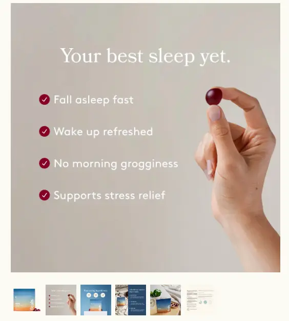
You won’t click add to cart immediately, but you’ve convinced the user to go deeper. If the next images and copy answer those questions, conversion follows.
UX Change #6: Create a Premium Experience for High-Value Shoppers
High-value shoppers, I think the one exercise that I recommend we all do is go through a list of customers and slot them into different buckets.
The number one bucket that I feel we should all have is a VIP bucket. These are people who are big spenders.
If you just make an Excel sheet of all your customers and the top 300 or top 500 that have given you the most revenue or the most amount of money they’ve spent with you, they are your big spenders.
So you need to look at frequency and purchase history.
What that gives you is that you have to reward them.
You need to call them out and bring them in, saying, “Hey, you are a VIP and we’re giving you the BFCM sale two days early so you can block whatever you want before the rush is on.”
Amazon does this for Prime customers. Obviously, Amazon does not have a bigger tier, and Prime is not special at all. Most of us have it, and I think we use it in some way or form.
But the thing is that these VIP deals and this VIP access — if you truly make it VIP — the conversion on this basis is very high.
You’ve essentially convinced the already convinced to spend even more with you, and you’ve given them their extra attention that they will really appreciate.
So I think putting this together, working on an email story for just these people, putting together an SMS campaign for just these people, will go a very long way.
UX Change #7: Segment Your BFCM Lifecycle Emails Like A Champ
Similarly, you can also segment your lifecycle emails. And the way to do that, for example, and I have a few examples here, feel free to steal all of these examples.
The first is people who are VIP, and they’ve abandoned the cart. These are people who are your best customers, but they also didn’t buy. In this case, your VIP picks are waiting at checkout before they’re gone.
The next is VIP and the collection preference that you have for them. These are your VIP customers who buy, or they’ve looked at the specific collection lately.
Now we generally track all of this data for our customers. So creating these segments for us is very easy, and it’s very quick, and we do this as an exercise every year.
But I’m confident that putting in the effort to narrow your list down to these 1500 people and then sending a meaningful enough email to them is going to go a long way.
Another example is highly engaged subscribers. People who open emails, but they’ve not really purchased in a while.
So people who open but haven’t bought. A very simple angle. In this case, you could just simply say, “Hey, we know you’ve been looking at us. We thought we’d say hi.”
Have quirky copy that you can call out the behavior, and that way, they feel that it’s personalized to them.
And again, unengaged subscribers, but people who bought on discount earlier. These are people who love deals. They love discounts, and so you’ve got to focus on that.
All right. If you have any questions, once again, please put them in the chat as we go. If you don’t, that’s fine. I’ll take them up at the end.
But I’m just going to keep going, and if you feel I should slow down or if you have any other feedback for me, please DM me on the chat, and I’ll be happy to slow down (or anything else that you might need).
Perfect.
UX Change #8: Decide Your Discount Mechanics, Not Just Depth
Decide on the discount mechanics. Doing a sitewide 40% off is the most boring thing you can do.
I think if you are a brand that people will be okay to engage with a little bit more than normal, like if you’re extremely transactional, then you cannot do this.
But I would recommend you create some kind of mechanism for the discount.
For example, threshold freebies, the oldest trick in the book. If you buy above 100 bucks, you get a free gift. Exclusive tote bag with purchase today only. Free gift.
Time-based mechanics: we’re running an extra 10% off just till 2 p.m.
Also, if you ever do something like this, please be honest about it. Don’t run it again the next day and then again the next day. Be clear about the fact that if it’s time-bound, it’s going to happen only once. It won’t happen again and again.
The simple thing is when you want to prepare for something like this, first build and test a flash sale logic.
Ensure that prices can flip on schedule. This is important because if it doesn’t work for you, you want to be able to revert back.
That’s why I say that you should be able to experiment with stuff like this beforehand. And as I keep going, I’m going to show you how to do that as well.
Run a soft promo. Sometimes we just give away too much discount.
A 5% email opt-in, 5% off discount email opt-in, for most brands that are higher in ticket size, converts just as much as a 15% email opt-in. But you don’t need to give out three times the revenue to actually make it happen.
Segment VIP lists. I’ve already spoken about it.
And there has to be some kind of value-add mechanic. Whether it’s personal styling or a free gift or free gift packaging or maybe an engraving — all of that can work out.
UX Change #9: Plan for “Alternative” Urgency Triggers
Then there are alternative urgency triggers.
What this means is we’re doing something specifically for Black Friday — we’re going to plant a tree for every order you place with us.
Or instead of a discount, you can choose one of two things. Do you want to get a 20% discount, or do you want us to donate that 20% to a charity of your choice?
Two things happen. The first is that you understand what kind of customers you deal with. Who is ready to give up their discount for a good cause?
Second, you add more value to the world if you do something nice. That works really well. It also completely changes the way people see your brand. That’s another huge outcome.
Pick the right driver. Will it be driven by SKU capacity?
It’s also important to make sure that you have the right hook when you run something like this.
If there are any optional perks you want to add, like loyalty points, that works great.
And then after your sales are done, make sure that you tell people how much value they added.
Spotify does a Spotify wrap. I don’t know why more brands don’t take inspiration from that. They should just send a year-in-review to all of their customers, saying, “Because of you, we funded 100,000 meals or planted 10,000 trees.” That would be phenomenal. That’s almost like planting a forest.
UX Change #10: Use Returns As A Full-Fledged Marketing Strategy
Use returns as a full-fledged marketing strategy. This is underrated.
Most brands during the sale period don’t do returns. If you can stand behind the quality of orders you’re getting, you can offer extended holiday returns.
Cartier does three months worth of returns. If you buy a Cartier product, you can return it three months after you’ve bought it, even if it’s bought in November or December.
Make sure your returns policy is extremely visible.
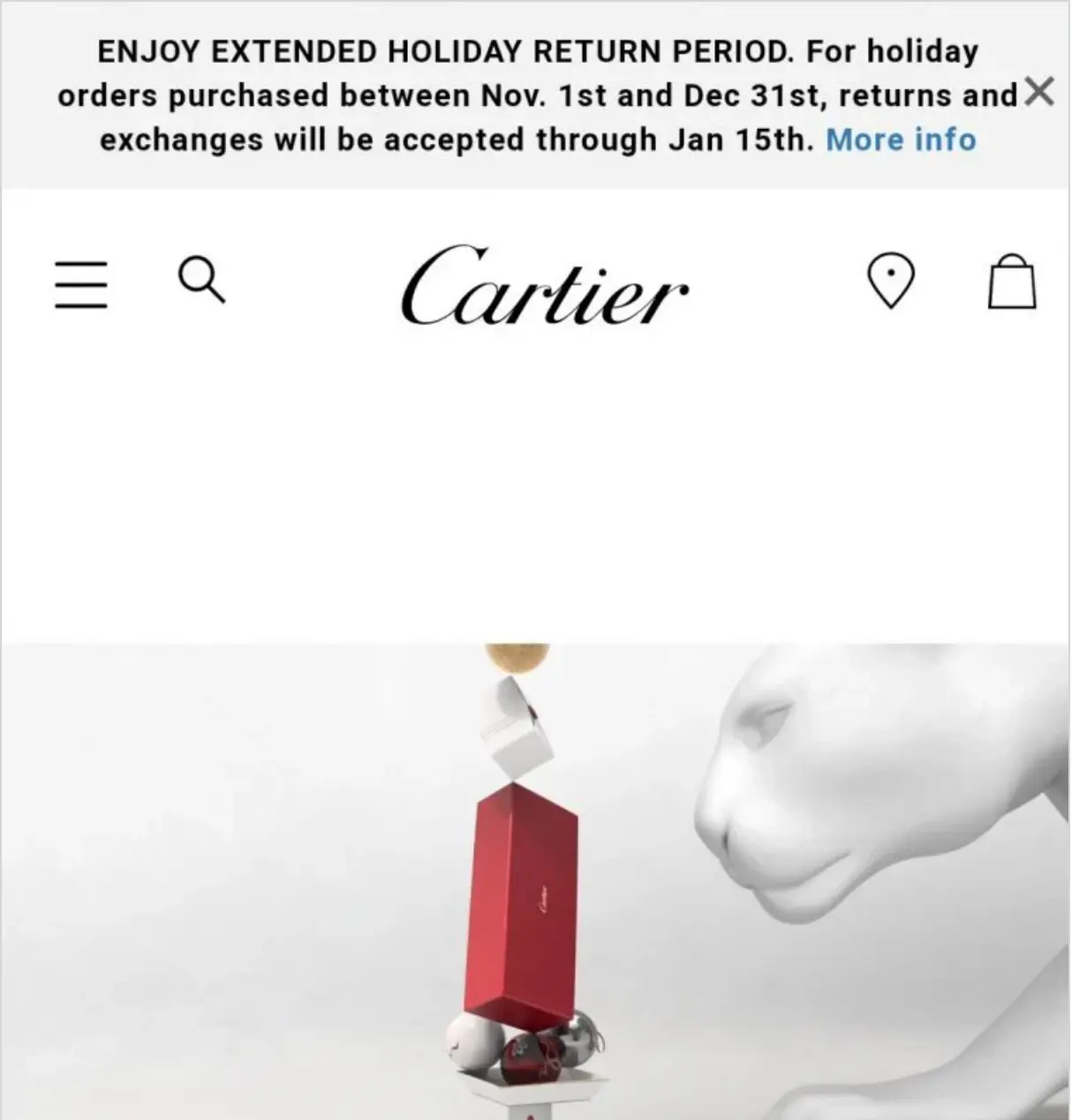
One of the important things about returns is that you have to make it extremely transparent and easy. You will automatically be different from what everyone else is doing.
UX Change #11: Invite Shoppers To Engage With You
This is another really good one.
In this case, what you’re doing is building a wish list.
For example, Black Friday sale is coming in the next 15 days. Why don’t you opt in and build a wish list of the products that you want during Black Friday, and for anything that’s in your wish list, we’ll give you an extra 10% off.
What that does is you get a lot of opt-ins and engagement beforehand. But first, think through how you want to do it because this is easier said than done.
Be careful about how you’re going to get people excited about the campaign. Do they even want to make a wish list in advance, and are you going to offer something like an extra carrot for them to go through that effort?
If you have a solid fan following, you can also convert this into a community.
You can announce, “We’re launching this new product this Black Friday and Cyber Monday. If you want access 48 hours before we launch it, you can opt in.”
Let’s say you have 2,000 opt-ins; you can bring all of them into a single list.
Now, that’s your loyal fan base. These people want you before anybody else. So you have your early adopters, and all your launches should actually go through them.
UX Change #12: Cross-Channel Remarketing (Always Worth the Effort 🙂)
The next one is cross-channel. This is super underrated.
I don’t know why everybody sticks to email only. SMS works well if you’re doing automations. They work very well if you do them the right way.
I know there are people here who have probably tried SMS, and it hasn’t given the kind of revenue results you were hoping for.
That’s probably because you saw it as a promotion channel and not an engagement channel.
The moment you start to look at it like an engagement channel, you’ll realize that it’s actually not that bad.
Ensure that the timing is right. Normally, if your cart abandonment email is going the next day, in BFCM, it has to go in the next two hours because the window of attention is very small, and you have to convert the customer.
You cannot give them too much time to think about it.
UX Change #13: Prep Your Customer Service to Function On Steroids
The other thing that I feel is very underrated is customer support or chat.
I think chat is just super deprioritized in general, and it’s extremely important that you give it the attention that it needs.
Put your support on steroids. Ask people questions while they are shopping proactively.
You should trigger chats. You should initiate the conversation and ask them what they want. Ask them if they need help. I think it goes a long way.
If you are able to track the metric for chat to convert — which means conversion rate for people who chat with you — that conversion rate will be at least 15 times the conversion rate that you normally have on your site.
And so that should tell you enough about how seriously you should take chat.
I think generally people have a chat, but it’s kind of this thing where you’ve added it because you should, and if I chat with you, it’s going to ultimately end up in an email, and somebody’s going to reply to it maybe tomorrow.
So I feel that it’s important that you find a way to man that chat in reality. Maybe use a resource from somewhere, outsource it, or offshore it to some other country.
UX Change #14: Use Your Halloween Sale as BFCM Warm-Up
This is again a great idea. Halloween sale should be a BFCM warm-up.
You should also use the Halloween sale as a testing pad for all of the crazy ideas you might want to implement.
For example, you can initiate your VIP list sign-up during that time. You can do your BFCM list creation during this time, looking for solid deals. Don’t forget BFCM — sign up now and get the deals 24 hours early, and so on.
I think that goes very well.
You can also claim that it’s actually a warm-up. This is just the start. Things are going to get bigger.
But be cautious about this because if you tell people that things are going to get bigger and we’re going to be doing great discounts in BFCM, then they don’t convert right in that moment.
So you’re delaying the conversion, and that’s never a good idea.
The other thing that’s a huge phenomenon, and we have already covered two points dedicated to that.
UX Change #15: Reduce “Deal Regret”
The last point I’m going to talk about is also this, but generally speaking, post-purchase regret is one of the biggest reasons some brands don’t do well during the season.
The topline revenue might work, but there’s a lot of RTO (return to origin). There’s a lot of dissatisfaction with purchases, and that’s really because the prices are so low, you’re wondering if this is the lowest or not. 🙂
They are also thinking about: “Is the best possible deal?”, “Was it the best possible decision or not?”
So I think the right way to make sure that you curb that (not let people get into that regret mode) is: first, give them confidence that they’re getting a great deal.
“You got it for 139. It’s smarter than paying full price. You got the best deal. You are buying it at the lowest price this jacket has been at in the last 30 months.”
That simple copy on your product page will convince people to pay whatever price you ask of them because you’ve given them the confidence that it is the lowest for that specific product.
Send confirmation emails as well:
“This item sold out in under 12 hours last year, so you’ve just got it. You’ve killed it as a customer. You are great. This is our best offer of the year, guaranteed.”
Just give them confidence that they have the best possible deal.
UX Change #16: Keep The Thumb Busy (Fitts’s Law)
Last five ideas. We’re going to focus on mobile. This is super important.
I know most of your traffic comes from mobile. Maybe the last time we should do 15 on mobile and five on desktop, but I think they’re great ideas nonetheless.
The thumb has to be kept busy. This heat map that you see here is a great example of that. If you hold your phone in your right hand, which you probably are right now, only the green part is easy to reach. Everything else isn’t.
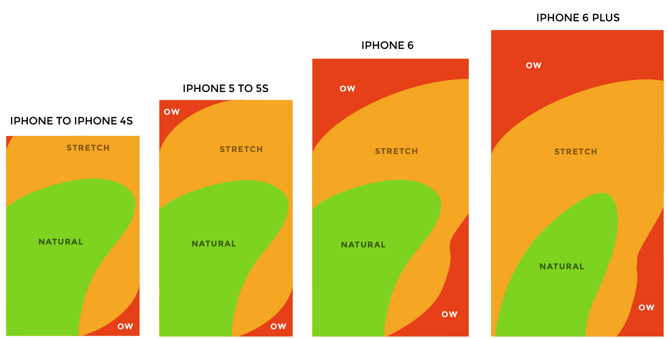
Now, open your website. I’m confident the search is tucked away in the top right. The hamburger menu is in this top section. And so what that does is you’re expecting slightly more effort from the customer.
So keep the buttons in the center of the screen. Place search and checkout and that kind of stuff at the bottom of the screen.
Design the site layout like an app so that it’s easier to use and you’re not stretching out your thumb too much. Really simple advice.
UX Change #17: Offer More Swipeable Choices—Fewer Dropdowns
More swipeable choices. In general, the gesture you want to rely on with mobile is swipes and not clicks.
I’ve seen people doing a lot with buttons, but really, touchscreens are gesture-friendly, and desktops are not.
A cursor needs a click. Your finger really doesn’t. So I would find a way to use scratch or swipe a little bit better.
In fact, use scratch cards for pop-ups. We do that all the time for our customers, and those work really well.
UX Change #18: Harness Micro Interactions
Harness micro interactions.
Generally speaking, find a way to do ripples, animations, things that move, things that shake, colors that change.
I know it sounds a little bit ridiculous that you’re treating the customer like a little baby and trying to get their attention using sounds and all kinds of different things.
But these things work wonders because not many people invest time and effort in doing that.
They don’t invest enough time and effort in playing with shadows under the buttons, CTA transitions, or page load animations.
Because attention spans are going to be really low, you’ll have 100,000 goldfish on your site. You’ll have to be sure that you’ve captured it.
UX Change #19: Build a “Speed Layer” For Mobile Checkout
Two last points. The first is to build a speed layer for mobile checkout.
How you do this is very simple. First, audit your current checkout step process on at least three different mobiles. And it can’t be three different iPhones. Do an iPhone, do a Samsung, and maybe a OnePlus or something like that.
Once you’ve done that, focus on stripping out everything you don’t need, all of the optional fields.
Think of reducing scroll depth. Do multiple pages, maybe. If possible, implement a one-click checkout.
But most importantly, don’t do the testing on a desktop using ‘Inspect Element’ or any of that. Use an actual phone.
Finally, autofill is extremely important on mobile. On mobile, if you’re not using autofill, you’re losing conversions straight away.
If there are any keyboard issues — like keypad not turning into numbers when you’re entering the zip code or mobile number, or auto-capitalization not working really well — all of those things will annoy the customer a little bit.
You just want to make sure you can get to the closure as quickly as possible.
And once you’ve done that, the final point is to reduce post-purchase anxiety as much as possible.
There are going to be a few things that I’m going to talk about here. I know it’s going to be a little bit difficult to implement, but you must try.
UX Change #20: Reducing Post-Purchase Anxiety: Mobile-Only Ideas
Unboxing Simulator
The first thing is to try to do an unboxing simulator.
The moment they check out, show them what the package is going to look like. Maybe auto-play a video in the checkout screen or thank you page saying, “Hey, this is what happens when your package arrives. You take out the box, you unpack it, gift wrap opens, and then you get your product box.”
You can only do this if you have a standardized product size and packaging, like in the case of t-shirts or jewelry.
Pre-Unboxing Surveys
The next one could be a pre-boxing survey.
For example, you can instantly ask them a question: “Where will you use the product first?”
That also helps you capture some information. If you’re selling household products and they say living room, then you can show them other products depending on what they choose.
Your thank-you page should also be a shopping experience because they’ve already committed to your brand.
We’ve actually seen this with somebody who was able to manage this on the back end.
We have been able to cross-sell post-purchase. For example, if somebody bought a tablecloth, on the thank you page, we were able to get them to buy table mats or some other accessory and add it to the same order they had just placed.
That was pretty awesome. It bumped up the AOV almost instantly and worked very well.
“Swipe-to-Reveal” Perks
Swipe-to-reveal perks. This is easy. This is pretty straightforward.
I’ve already spoken about how you have to prioritize gestures on mobile.
Countdown Unlocks After Checkout
And the last one is a countdown to unlock something new.
What you can do is: “Thank you for your purchase. In the next 1 hour and 29 minutes, check back, and we have a special gift waiting for you.”
Do a nice graphic with the product covered under a black cloth. AI can help you do that.
Add a “remind me” button below so you can send them a reminder about the product you’re going to unlock for them.
That engagement really works. They’ve already placed an order with you.
Your whole goal of doing this is to not get order cancellations.
Order cancellations go up by two to three times during the season. I don’t know if you’ve already noticed that but it does happen.
Please analyze that data point for yourself and try to avoid that from happening.
Get Fresh ideas to boost your conversion rate
(stuff that works for hundreds of stores)
Request a Free Site Audit"Convertcart’s Audit Report was deep and insightful. We never thought they would spend so much time in building and sharing such insightful content, free of cost."


Logan Christopher
Lost Empire Herbs