
Hubman and ChubGirl

45+
Experiments run
33%
Success Rate
40%
Overall Website Gain
About Hubman & Chubgirl
Hubman & Chubgirl (hubmanchubgirl.store) is a niche ecommerce brand in the art supplies/stationery / journaling space, offering a curated range of playful, collectible products designed for creative planners and stationery enthusiasts.
The store is built around high-browse, discovery-led shopping behavior, where customers explore multiple items before purchasing and often return to repurchase favorites. The brand also drives retention through recurring purchase models like its subscription offering, supported by strong community-style merchandising and loyalty messaging.
The team at Hubman and Chubgirl decided to work with Convertcart because they wanted to improve conversions across their site and mobile experiences. They were seeing friction at key moments—like browsing, product comparison, and checkout—that was causing hesitation, drop-offs, and ultimately, lost revenue.
Our Customized Solutions:
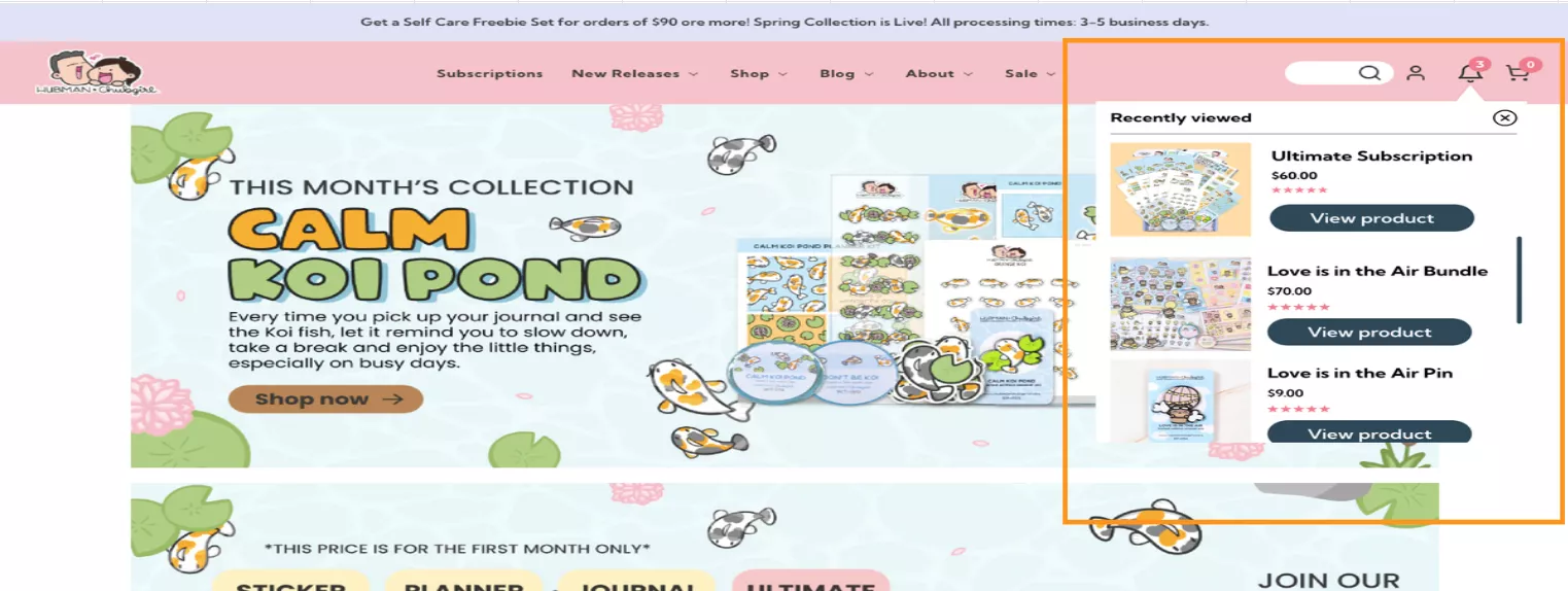
Recently Viewed
Problem
Change Implemented
Results
| Device | Duration | Campaign Gain | Website Gain |
|---|---|---|---|
| Mobile/Tablet | 40 days | +28.47% | +6.45% |
Post this experiment, browse abandonment fell by 4% as this snippet supported non-linear browsing and helped users make decisions more easily in a large catalog.
Social Proof
Problem
Change Implemented
Results
| Device | Increase in Orders | Campaign Gain | Website Gain |
|---|---|---|---|
| Desktop | 78% | +29.64% | +3.95% |
| Mobile/Tablet | 103% | +16.30% | +2.94% |
Using Social Proof made the purchase feel less risky and showed that the products were already in demand—increasing the order completion rate by 90% on an average, across devices.
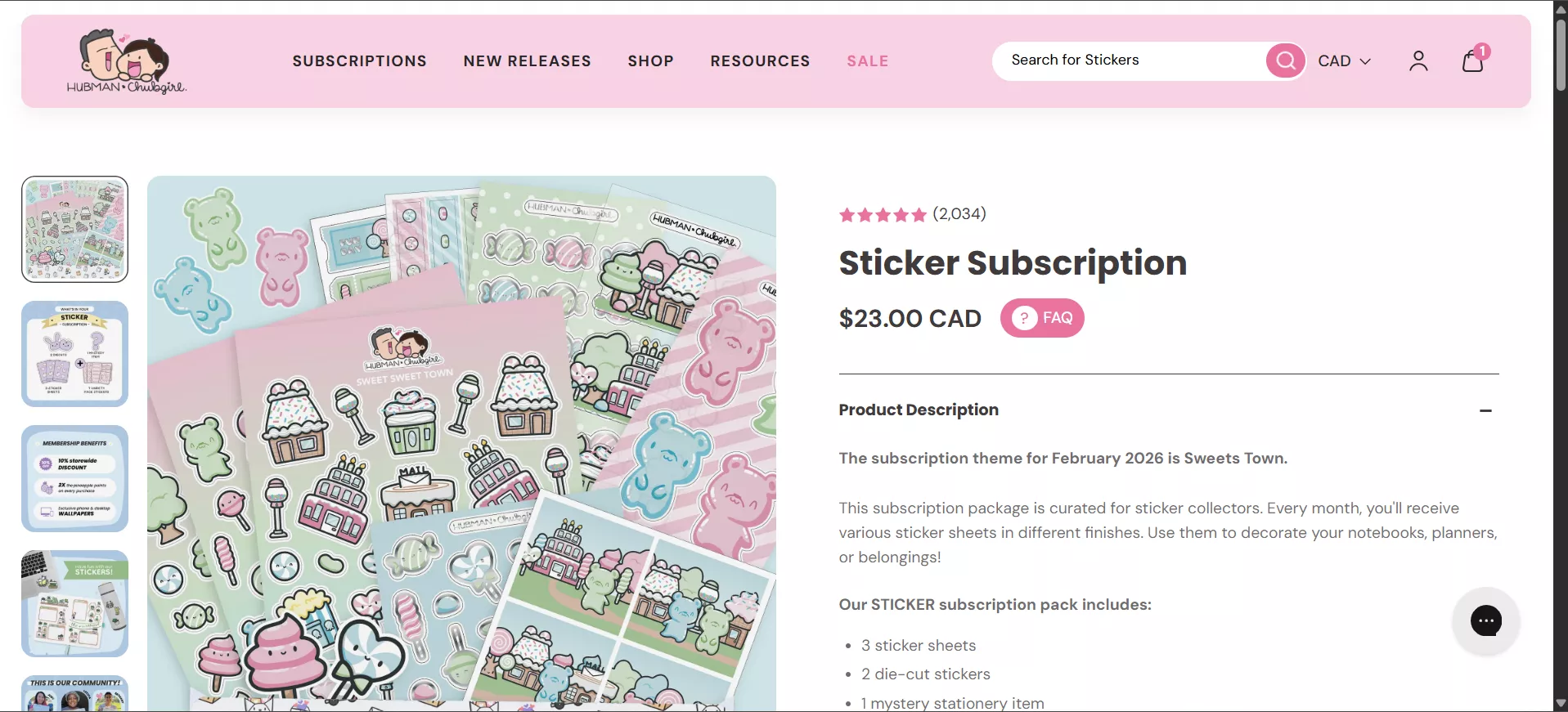
Review Rating on Collection Page
Problem
Change Implemented
Results
| Device | Category > Product Funnel | Campaign Gain | Website Gain |
|---|---|---|---|
| Desktop | 5% Improvement | +27.74% | +3.16% |
Apart from making comparisons easier, showing ratings upfront also built trust while browsing, which resulted in 5% more users moving to product pages.
Highlight FAQs on Subscription Page
Problem
Change Implemented
Results
| Device | Duration | Campaign Gain | Website Gain |
|---|---|---|---|
| Desktop | 30 days | +30.19% | +3.10% |
| Mobile/Tablet | 30 days | +8.76% | +2.51% |
Highlighting FAQs worked because it addressed concerns right when users were deciding, reducing hesitation. Making key information more transparent also boosted confidence, helping more users commit to subscribing.
Pineapple Points Communication
Problem
Change Implemented
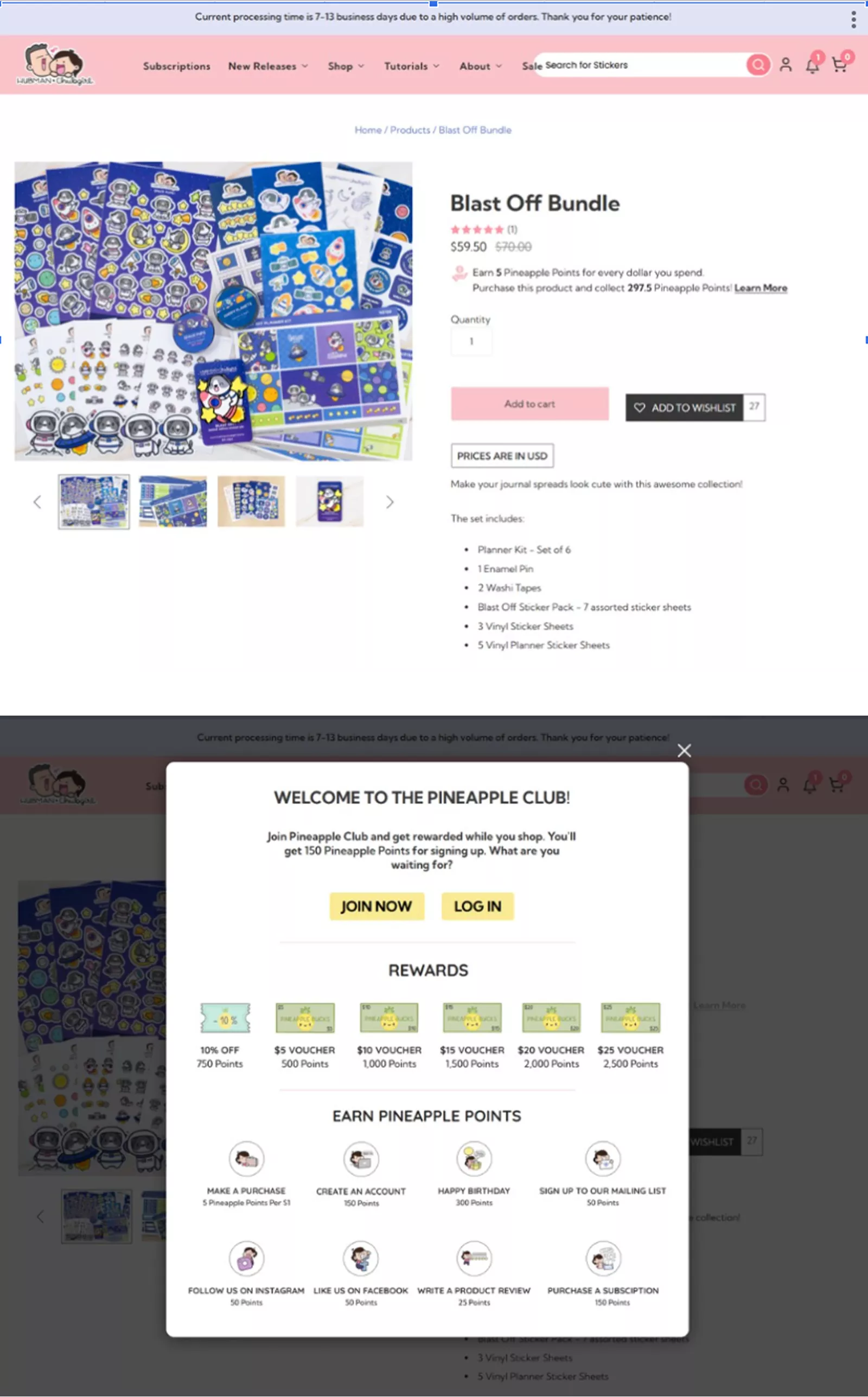
Results
| Device | Improvement (Add to cart clicked) | Campaign Gain | Website Gain |
|---|---|---|---|
| Desktop | 43% | +21.11% | +2.53% |
Communicating this reward program, helped users see the long-term value of their points, reducing hesitation, and reinforcing brand loyalty. This experiment reduced drop-offs by 17%.
Sticky Add to Cart
Problem
Change Implemented
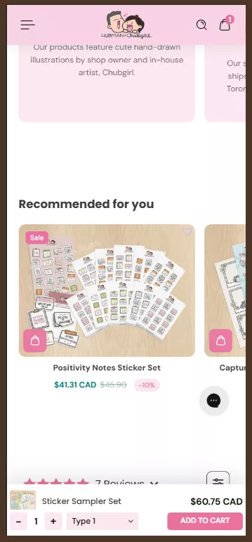
Results
| Device | Increase in Orders | Improvement (Add to cart clicked) | Campaign Gain | Website Gain |
|---|---|---|---|---|
| Mobile/Tablet | 66% | +57% | +3.65% | +2.41% |
Keeping the ‘Add to cart’ CTA visible reduced scrolling friction and made the action available when intent was highest. This increased orders by 66% and reduced abandonment by 7.89% post the experiment.