On-Demand
Secrets To Delivering Amazing User Experience On Mobile
Mobile eCommerce now makes up to 60 percent of all eCommerce sales.
And yet:
- the conversion rate on mobile devices is just 50% of desktop conversion rate
- mobile cart abandonment (85.60%) is higher than desktop (73.07%)
It does not add up.
It should be the other way around, right?
About time we took mobile user experience more seriously.
And this is why we are doing this webinar. We’ll talk about:
👉 proven ways to prevent drop-offs from mobile devices
👉 psychological hacks to get shoppers to engage with your store
👉 some high-converting mobile stores (examples) and what we can learn from them


About the speaker

Shekhar Kapoor
VP, Marketing
Convertcart
Shekhar Kapoor (VP at Convertcart) has worked with 500+ online brands, including Squatty Potty, Prep Expert, and USA Hockey Assn., and helped them boost sales exponentially.
Shekhar Kapoor
VP, Marketing
Convertcart
SESSION REPLAY – Secrets To Delivering Amazing User Experience On Mobile
Welcome & Opening Remarks
Well, hello everyone, thanks so much for joining us again, yet again, for another webinar.
I’m so glad to be able to do this in the early part of Feb, because we're trying to do two this month, so the next one's going to be even better.
I'm going to tell you more about it as we go.
Okay, so we picked this topic after a lot of thought.
We've covered, actually, a lot of very interesting areas over the last few webinars, and you can please go to our website and check some of those out.
But generally speaking, the intent was to focus purely on mobile.
With the hundreds of customers that we work with, a large part of the experimentation that we do for them and the work that we do with conversion data optimization is focused on mobile because a lot of their traffic is on mobile — number one.
Number two, a lot of the paid traffic is on mobile. Click rates on mobile are pretty high.
So, you know, I'm sure you're analyzing your ad spends — device broken down by device — and you analyze other data points about your business broken down by device as well.
And what we see is mobile is getting the lion’s share of traffic across the board for almost all industries except for a few here and there.
Mobile vs. Desktop
In fact, we work with clients in a few more unconventional industries or specific industries — say, for example, hardware, or extremely high-value industrial products — and even for them, interestingly, while desktop traffic is high, mobile is still higher.
And it puzzles us and them as well because what we've realized is that a lot of the discovery happens on mobile, but conversions happen on desktop.
And so the experiences have to tie in together well.
And that's what I think the industry has tried their best to do with what is called a responsive web experience — which I'm not a big fan of.
So that's going to be one big takeaway. I'm going to talk a little bit more about why I said that.
But generally speaking, conversion rates on mobile are about half of what they are on desktop, or maybe less for some unfortunate businesses.
So, we wanted to focus purely on some ideas.
I have about 30 of these ideas.
I'll spend ideally a minute or less than a minute probably on some of these.
And what I want you to do is: each of those ideas, we have tried to pull up visual examples, so instead of jumping from one tab to another, all the examples will be on the screen itself.
And I'm going to walk you through them in as much detail as possible and add a lot of context that I can add given our experience of optimizing more than 800 e-commerce sites — all of them upwards of about seven figures — and most of them converting significantly better than what they were converting before they started working with us.
So I'm going to jump right in.
We want to kind of cadence the entire conversation into four parts — obviously:
- home,
- category,
- product,
- checkout flow.
That's not the general journey your customers take, but we'll still start with home and then understand what are the things that we can learn from some of the examples that we have here.
Homepage
1. Feature key product categories in the first navigation layer
Very, very simple idea: don’t limit your categories to the boring tree of categories that you have.
For example, if you're into fashion, and you have men and women as your two wide categories — maybe kids and baby — don’t limit your categorization to that alone.
So in this case, for example, the navigation layer also adds shoes, handbags, accessories, jewelry, and then there is a sale and clearance.
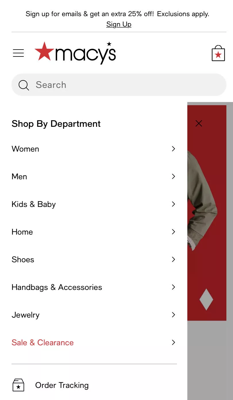
So the category navigation is being used smartly.
You're not essentially just replicating whatever your categories are and just putting them in the form of a list on mobile. That's not the idea.
You have to put more thought.
And in this case, for example, the brand is trying to bring more attention to the top four or five categories that drive business for them — number one.
Number two, it could be an experiment as well.
It's a very interesting experiment: what if I have a lot of homepage traffic, and I'm trying to give them a next step?
Give them an obvious next step. Give them a few choices to make in terms of where they want to go from here.
And obviously, we're trying to make that whole thing easy by adding a few categories apart from your general breakdown of the way you're doing things.
I'll give you another example.
For example, if you are an automotive parts website — we work with a few of those — or if you're a bags website, instead of just having briefcases, backpacks, and duffles, you could also have a sale and clearance.
And you could also have “our most selling handbag.”
That's it — a single bag. You're sending people to a single product, which is your most-selling product.
And there's no harm in doing that. There's no harm in experimenting with that.
So you're kind of giving them more options, and you're thoughtful about it.
So that's really what the intent is here. And this applies to both mobile and desktop, but in this case, we're going to focus a lot on mobile, of course.
2. Highlight popular sub-categories
The next one we want to talk about is highlighting popular subcategories.
So in this case, I think the category navigation has been used a lot better because some subcategories are also being highlighted.
We've actually run AB tests related to this — spent time on ensuring that the category options that are visible to people are broken down in several different ways.
Do you want to show just the meta categories? Do you want to show the subcategories? Etc.
And you wouldn't believe it, but the problem with a fully digital shopping experience on a small screen is that people…so there are two problems.
- The first is a problem with the user: everybody has the attention span of a goldfish.
- The second problem is the device: you have only so much you can show the user at a time.
So you can either use that as a problem or as an opportunity, and make sure that you use it well.
3. For every navigation layer, feature a “view all”
So in this case, for example, there's so much happening on the screen.
There's a men and women section — so I have a wider categorization.
Below that, I have spotlight, featured, and current curation.
So there's three breakdowns between the new.
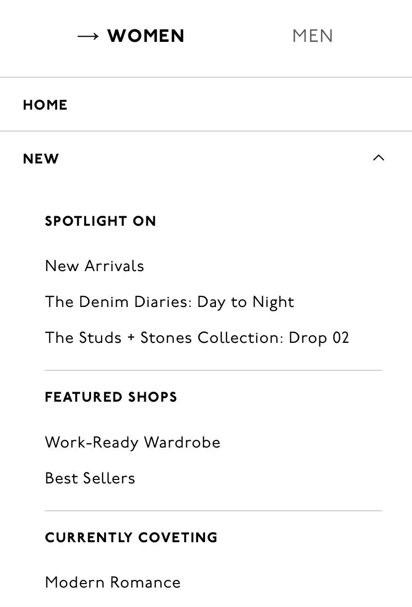
And then if I close the new option, then there are other categories that I can see.
So it's kind of instant — how I can go deeper into the experience without having to spend countless minutes, countless seconds on finding what's next for me.
It’s similar to when you walk into a big box store.
One of the things most people do is they look up because they know the categories of the store are laid out that way.
You want to go to electronics — you start walking in that direction instantly.
So imagine how much information you're able to consume visually the moment you walk into a big box store.
It’s instant, right? You know exactly where to walk, and you start in that direction.
So it’s either the product that helps you make that decision or the visual categorization you're trying to achieve.
You can't get there fully on mobile, but we're trying to be as close to that as possible.
4. Showcase your main categories as a carousel (top)
The next one is…you know what's happening here is we are actually, instead of forcing people into a subcategory, allowing them to go to a mega-category.
And I'll show you what value that adds in the next example after this.
So in this case, I'm within furniture, and I'm not mandated to choose living room, bedroom, dining, patio, etc.
I'll give you an example.
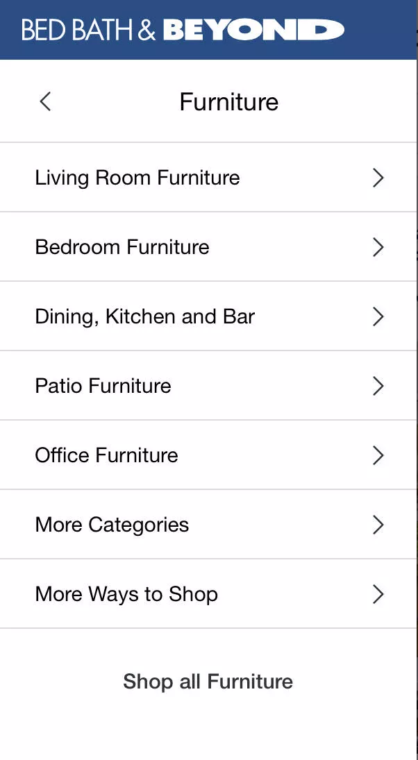
We have a living room, a study, and then we have another small formal living room.
So it's kind of an odd layout we are living in here.
But the thing is that what we wanted the other day was not really living room furniture.
It was more of what you would call study furniture — but we wanted it to be a certain size.
So now I'm stuck, right? It’s not study, but it's not living room as well.
I just want to see all the different types of tables you have, for example. And there's no way for me to do that. I should be able to go to the larger category without a problem.
And when I do that — once I've chosen to go to the larger category — I'll skip a couple of examples here or actually come back to this.
Once I've done that, I can then show the category page in a way that allows me to narrow down further.
This is another very interesting and obvious example. Some interesting e-commerce themes are also doing this by default now, but this is an experiment we've run for a lot of our customers.
And my advice to you when you see this is: don't just go and do it.
Because normally when I show this to customers — and you know, we do free audits.
So just for your knowledge, for businesses that qualify, we sit down with you for 30 minutes and do a full teardown of your site for free. We don't charge you for it. We're happy to do that for you as well, if you're interested — we'll reach out.
But the thing is: we give them ideas, and then they start going and implementing them. And that's not how it works. That's not how it normally works or should work.
So in this case, for example, what I'm proposing is a category square-out. Very simple idea. But what I feel is important when you execute this is that you pick the right way of doing it.
For example:
We have a health supplement customer where they have magnesium and a few other different types of minerals you can buy supplements for.
And instead of breaking their website down by these minerals, we've broken the categorization down by symptoms.
We've also tried to do it by use case. We've tried to do it for businesses that… for example, for fashion, we've done it by weather.
Normally, it's always tank top, tops, bottoms, shoes — which is so boring.
Because tops means everything.
It means everything that goes on the top half of your body, which means all kinds of clothes.
So you can be smart about categorization.
And I always encourage experimentation for this reason.
We have a lot of customers that sign up with us because they want to aggressively experiment.
But generally speaking: please don't refrain from trying things out.
But also don't just go and implement because then you're just making visual changes on a hunch, and you don't have a way to measure if they work for you or not.
5. Running a product discovery quiz? Use large sections + a progress bar
Moving further — if you're running a discovery quiz of some sort, I wanted to bring this in. I know only a few businesses do that, but we brought this point in because we had registrations from a few sites that run quizzes.
Whenever you register with us, we take the time to go through your sites.
We're not just kind of… which is why this whole thing is on a Google Doc — because it's manually put together, and we just want to make sure there's depth in the content and not care so much about the way it looks.
But I hope it looks good. I hope I'm doing a good job.
If you're running a quiz, normally, what we see is with quiz or wizard-related experiences, businesses don't take the time to adapt them to the mobile experience. I think that's… it's kind of a little lazy.
So please take the effort, time, invest the money to design it purely for mobile. Have a progress bar. And make buttons massive. Make them fill the screen. Give people a bold experience.
Why? Because you don't want to spoil people for choice, and you don't want to make it hard for them.
Their attention span is very, very low. So they're not going to spend time zooming in, fiddling with a small button. Imagine the amount of user motivation you're expecting them to have.
It's like… have you ever tried to web check-in and pick a seat, and pay for a seat on the browser? It's the most painful thing ever.
Unless of course it's some really nice airline — probably a new airline maybe — but generally speaking, it's the most painful experience ever if you do it on the browser.
Why? Because they're not building for mobile. They are building responsive experiences. They're trying their best — nothing against it — but I'm just saying.
So make buttons really big, make them interesting, and make them useful. That's when your wizard will actually work.
6. Consider a product selection wizard
And that same point goes to building out a product selection wizard. I would give you this recommendation not only for mobile but also for desktop. But generally speaking, the same idea I gave you about categorization: help people go through a journey so that they find something they like.
Okay, I'm going to break away from the script and show you a client experience.
In this case, for example, I'm looking for a screen for my Apple iPhone 14 Pro, and it takes me straight to the product. Right?
Now if you're a fashion business, I could say: I'm looking for a top — the occasion could be “occasion,” it could be weather, it could be price, it could be size, it could be anything. So you're just taking them to a collection of products or one product and making life easy.
That's really what it is.
When I… one of my best friends runs a massive e-commerce business, and he asks me — I always tell him: build the experience for a three-year-old and then market it to adults. That's when you have a great shopping experience.
7. Turn your homepage into a “mini catalogue” (Give shoppers scrolling pleasure)
The next one is how you could turn your product or your homepage into a mini catalog. I encourage you to go and take a look at Novus.

They're one of our customers — they're one of the leading companies in the anti-aging space. Some fantastic work that they are doing.
Don’t do it right now. Stay with me. I'm going to… you know… go faster as I… although please, if you feel I'm going fast, please let me know in the chat so that I can slow down. I'm happy to slow down. I'm just trying to make sure that I can cover as much as possible because we have 30 points and we're only at seven so far.
So, the idea here is: use your homepage.
Normally, when I give a lot of tactical advice to e-commerce businesses, what we end up seeing is a lot of call-to-actions, product recommendations — so tactics take precedence over story, over brand. And that's also not right.
You have to be able to tell your story without giving up on conversion rates.
I encourage you to take a look at this experience. And also, I can confidently tell you that because of the nature of the product here, they are able to do it. So if this does not apply to your brand, please just scratch it and go to the next advice.
8. Use an expanded search box
The next one is using an expanded search box. Very simple — and make it sticky.
I'm going to skip this point — it's a very simple point. When you scroll through your page, keep search accessible.
A very simple insight is: visitors that use the search bar convert five to eight times better than people who don’t. And this is the truth.
So I recommend, if you have GA4 set up by a professional, they would have set up a report for you that allows you to track people who used search and did not use search. If you don't have a good GA4 setup — first of all, get it.
There's no data. It's like driving with the headlights off. You have to have data.
But generally speaking, encourage people to use search and make it easy for them.
9. Structure the page with reachability in mind
And the reason we say that is because most businesses don't have reachability in mind when they are building a mobile experience.
Okay, so while I walk you through the next few points, I want you to open the mobile site on your phone. Don’t open TikTok or Instagram — open just the site, okay? So that we're focused.
Now you would see that your menu is going to be on the top left.
So you're going to touch that hamburger icon.
And it’s a stretch for your hand to do that because the other hand has your bag or something else when you're on the train. Or maybe you're just eating, right?
And the most naturally accessible area of your phone has almost nothing.
So, an example I wanted to show you is here. If you see what's happening here: they also have the hamburger icon on the top left, but there's a carousel of categories in the middle. Those are actually subcategories. The categories are at the top under the search bar.
The search bar is prominent.
And then because you're a new user or repeat user, you can also go and take a look at recently viewed products — which is right at the bottom.
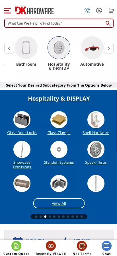
And then — they are a B2B company. So DK Hardware is a B2B company. They're an old client of ours. And in their case, a lot of people just want a quotation. So they just go and ask for a custom quote.
So you see how the page is tailored so that it serves the customer of that business.
That's the point we're trying to drive home: you need to structure your page with reachability in mind, and not just let it be the mobile experience that came with the theme.
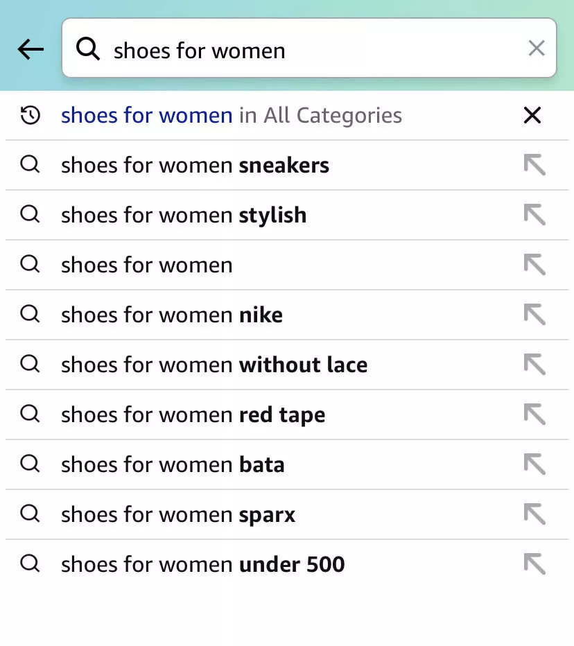
10. Optimize search to show multiple results within the same category
Have an intuitive search. In this case, for example, if I search for “shoes for women,” I'm seeing multiple ways in which… is it sneakers?
Do you want them to be… Nike? Without lace? Different brands? Under $500?
Whatever it is — right? Different ways in which categories are being shown.
An even better experience — and something we've done for a long time for our customers — is visualizing search.
The way we set up search, because we have our own product, is: you start searching, results come up, and there are filters. So you can run filters in the search results. It's very interactive.
11. Don’t wait for the footer - to talk about the brand
The same point I said about Novus applies here as well. Don't wait for the footer to talk about the brand.
When you talk about your brand and emphasize the story and emphasize why you exist and why someone should buy from you — you are doing the biggest service you can do to your customer.
Because they are actually looking for that information — especially if you are a smaller brand, which they've probably just discovered in the last two weeks.
They deserve to know your story. And that's actually why they would probably end up buying from you.
I don't know why a lot of brands choose keeping the experience transactional as compared to telling them why.
In fact, I was looking at a website today with very high traffic.
It was a hot sauce brand.
And in their case, they had done a brilliant… so what they had done brilliantly was: every product had a story.
There are three products, and the homepage did a phenomenal job of not only telling why that hot sauce brand existed but also each of those.
I'll send that example to you after the webinar.
But it was phenomenal. They did not give up on telling their story just because they were trying to make the experience useful. And because of that, you are intrigued — and then you click on the product, and you want to go to the product page and understand more, and then purchase.
Curiosity plays a role there.
12. Make sure pop-ups are non-intrusive
And then finally, popups. Everybody hates them — but everybody uses them.
Emails are your biggest asset. I'm telling you, going into 2024, third-party cookies are dead.
So retargeting ads are going to be all over the place — number one.
Number two, generally speaking, emails and the audience you build… okay, email marketing for bad brands and wherever email marketing is managed poorly — for all of those businesses, email marketing will die this year.
Because you know, Google, Yahoo — all of the gods of email and the internet rather — are changing the rules.
And they're changing the rules because they can.
We'll get into that conversation some other day.
But the point is: for brands that have been using email, to underestimate the long-term effect of having a massive email list is really shocking. Because it's the biggest asset you can have as a business.
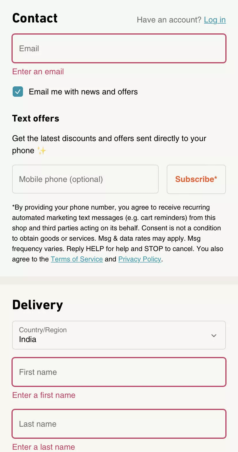
So I strongly recommend you still collect emails while on mobile. Just keep your popups non-intrusive.
Okay, so I also wanted to do some mental math.
Assume you are a $50,000-a-month brand.
That’s how much money you're making — so you're a small, not-too-big brand. And about $10,000 out of that is emails.
And you have an email list size of, let's say, 50,000 emails. So each email in your list — essentially, if you oversimplify it — gives you 20 cents a month.
You send them promotions, you run workflows or flows or whatever you want to call it, and 20 cents an email is what you make because of your email marketing.
If that list grows by 10,000 emails over the next 3 months — if you apply the same 20-cent logic — you have $2,000 more per month in revenue. Recurring revenue. Forever.
Now, if you're a larger brand, extrapolate that by 100. That's the kind of impact we are able to see.
We run email marketing for about 100 brands. I'm telling you, there's incredible amounts of money that people can make on email. And I think it's just underrated how well people are treating it at the moment.
Category Page
Category page — we won't spend a lot of time here.
Analyze your site, and you will know that not a lot of people actually spend time on your category pages.
I'm just trying to go through… there’s actually a long list of names, so I'm trying to see if I know any of the websites or remember where category pages are categorically important. But generally speaking…
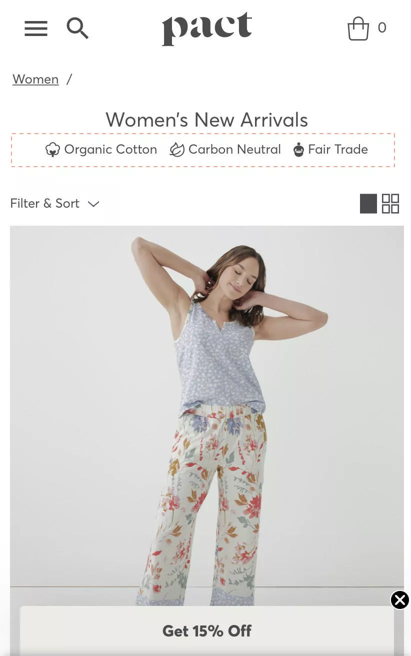
13. Feature trust seals right at the top
Featuring trust seals is the obvious idea.
But the twist I want you to give that is: do it for your brand. Don’t do the boring “easy returns,” “quality guarantee” sort of stuff.
Do something that is true to your brand.
In this case, it's organic cotton, carbon-neutral, and fair trade.
That's what they stand for — so they do it that way.
But do it — and do it well.
14. Feature subcategories early (build stickiness)
The next is the subcategory.
Now, I had spoken in Idea 4 about sending people directly to categories.
The second step after that is making it easier for them to narrow down from there.
So if I were to jump to “All Furniture,” after I've gone there, I should instantly be able to filter or go to the next step.
IKEA does a phenomenal job of this. You can endlessly browse on the IKEA website because of how they move you around. I recommend you check that out.
That's what this idea essentially means.
15. Highlight one deal per screen
Okay, this is another very interesting one.
Normally when we… you know, we also have a personalization tool, and when we are implementing that for our customers, they have this laundry list of ideas they want to implement.
“Hey, can we run best-sellers? Everything that's on sale? The best most compatible products?”
They want to recommend everything to the customer.
I'll give you a counter-intuitive experience. Imagine yourself standing in Best Buy, looking at all the phones that are available. You have a $500 or $600 budget, and you want to buy a phone. Let's say it's for your friend.
You're looking at all these options, and then the sales guy comes along and says:
“Here are the five phones I think you can choose from.”
They are not making your life easy.
Versus somebody else coming along and saying: “Here is this phone. It's called the Samsung something. I think it's exactly what you're looking for. It has a great screen, it has a nice battery, plus we are running 20% off on it today — just today.”
You won't consider the five other options. Your decision was just made easy.
So the number-one advice:
If you want to take one thing away, stop recommending 10–20 products. Recommend just one — and make it a good recommendation.
Your fastest-moving, easiest-to-buy, highest-converting product. Then you're in a solid space.
Moving further — this is again a really big one.
What we saw with our clients’ data is people were traversing back and forth on the site. Right?
So there is vertical traversal and horizontal traversal — which means people are going:
category → product → category → product, or home → category → product → back to home, and so on.
We were puzzled why that's happening. We analyzed it. And then we figured out that when we put the stock data next to the customer bounce-rate data for pages…
Your highest bounces in the website — when we analyzed data for people bouncing away from the product pages, but not bouncing out of the site, but going to some other page — when we matched that to out-of-stock…
It was pretty simple:
There was no way for the customer to know on the category page if something is in stock or not.
So they were just moving back and forth.
16. Distinguish out-of-stock CTAs from in-stock ones
That learning was pretty big for us. The biggest advice I can give you is: make sure they know that before they even enter the page.
Make it very, very obvious. Don't just have the standard Shopify “Out of stock” text. Your CTA needs to change. There has to be a smarter way in which you implement it.
17. Don’t revamp your site just because something looks off
Okay, so before I talk about the next idea — we've actually written a very detailed blog about revamping or redesigning e-commerce sites.
If you were to ever ask me on a non-recorded call: I will never ask anybody to revamp their site as a solution to making it conversion-friendly. I can fundamentally tell you that.
Of course, if it's broken to the point where the load time is crap, and it’s just bad code, and you’re set up on a custom platform, and every time you want to change something you have to call a guy in Bangladesh — I am sorry for you.
So yes, you have to move to a better solution or figure out what’s better for you.
But generally, when I give a lot of advice to people, they instantly think:
“Oh, my site is really not that nice. I might need to move out to something else.”
And I strongly advise you against that unless you really need to.
You know, in fact, we have a client; I'm not sure if we have that client joining us today.
But, you know, this gentleman went and re-platformed themselves on their own over a period of two weeks, and he built the entire site on his own.
And it's incredible what he's done, and he's not a techy; he's just a really smart guy.
So, generally speaking, for them, it was pretty clear because their older site was slow and there was a lot of there was a huge reason for them to actually, go through the re-platform.
However, generally speaking, refrain from doing that…
You will lose SEO ranking.
Your conversion rate will not instantly get better.
You will have a lot of SEO-related errors because your URLs will change.
So you have to wait for Google to come back, crawl you again, and recalibrate everything.
There are a lot of downsides.
So there’s a huge blog we've written about it. We will send that to everybody who’s attending the webinar.
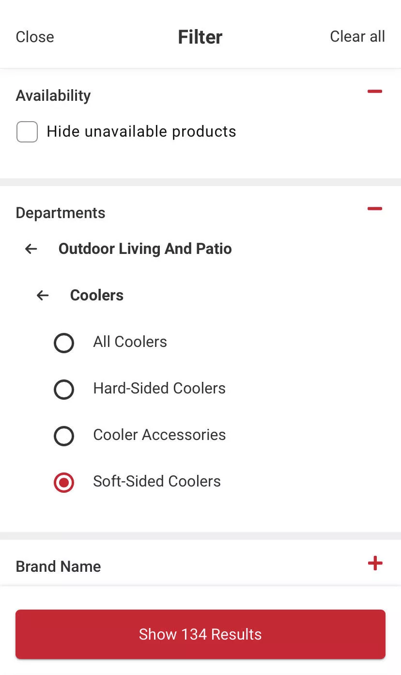
18. Offer filtering to hide unavailable products
This is again very simple: offer filtering to hide unavailable products. Make it very easy.
It’s a very, very simple piece of advice. We just wanted to bring it in because you'd be surprised how many people don’t do it.
19. Offer multiple-criteria sorting
Offer multiple criteria sorting and also make sorting easy.
Normally, when sorting is offered, it’s tucked away in the same place for every website — the top-right corner of the category page.
But after your customers have scrolled down all the way to the bottom… see this: 166 results on the category page, two in a row, so it's 80 rows down. Let's say I go halfway through — 40 rows down — and now I want to sort because I've seen products across different price ranges.
To sort, I have to come all the way back up.
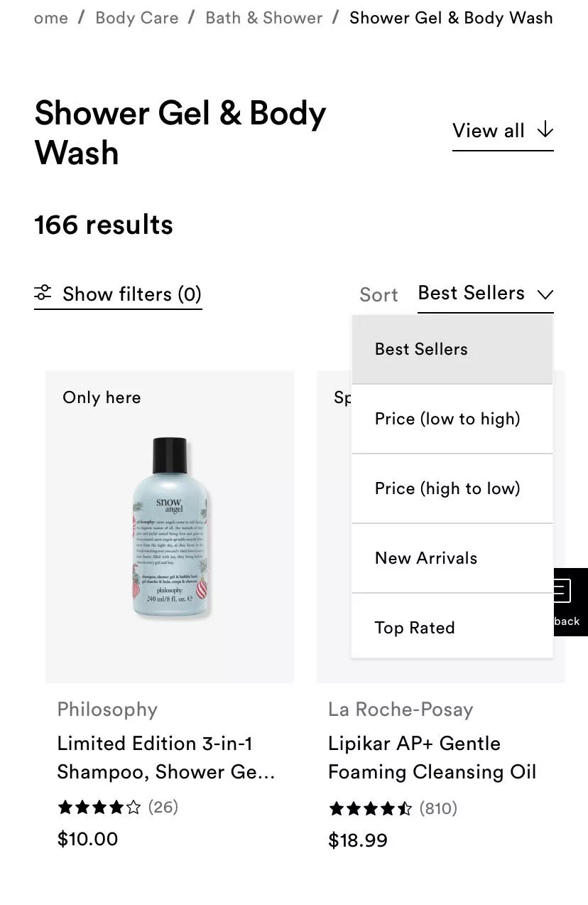
Your sort also should be sticky — which means when they scroll, the sort option can stick around at the top. They should be able to tap it. And if they hit that, you scroll them back to the top, and they can see low-to-high pricing or whatever they chose.
And if you have really well-off customers, maybe they'll sort high-to-low — but I don't know how many people do that. It depends on the brand and the industry, and what you're selling.
Product Page (+ Cart)
20. Use prominent breadcrumbs, make sure the whole thing shows up
Breadcrumbs — I think this is a blast from the past. I don't know why e-commerce companies have decided this is not a good idea.
It is a phenomenal idea. It makes navigation easy.
Your highest-intent customers — especially customers who are more aware of older web experiences, slightly more in the later part of their life rather — they engage with breadcrumbs all the time.
It also has amazing SEO value. And if you make it prominent, it becomes a navigation plus.
I am very convinced about this.
21. Overlay brand highlights (or trust seals) on image gallery
Okay, this is another interesting thing. This is a quick hack — although I'm not a fan of the word “hack” — but it's a very quick one.
When we ask people to make changes to the product page, they feel they need to go through the developer, find a theme.liquid guy, and take care of that.
Not needed.
The one thing that is in your control is images. And if you have a gallery of images on your product page, that's something you can endlessly customize.
So please play around with that and make sure you're using it smartly.
In this case, for example, trust seals are added to the image itself. So you don’t need to design or figure out where to add it — it's just really simple. It's done.
We recommend doing this for product dimensions. If you have some really next-level testimonials, you can do it there also.
On mobile, these trust seals are not going to be tucked away in some corner — they are front and center exactly where you want them to be.
22. Offer multiple ways to view the product image
This is another hard one — I actually left it in; I didn’t intend to.
In this case, because of the kind of product it is and the value that it is, you can see the product in several different ways. You can see it in AR, you can see it in 360°, so there are many ways in which you can show it.
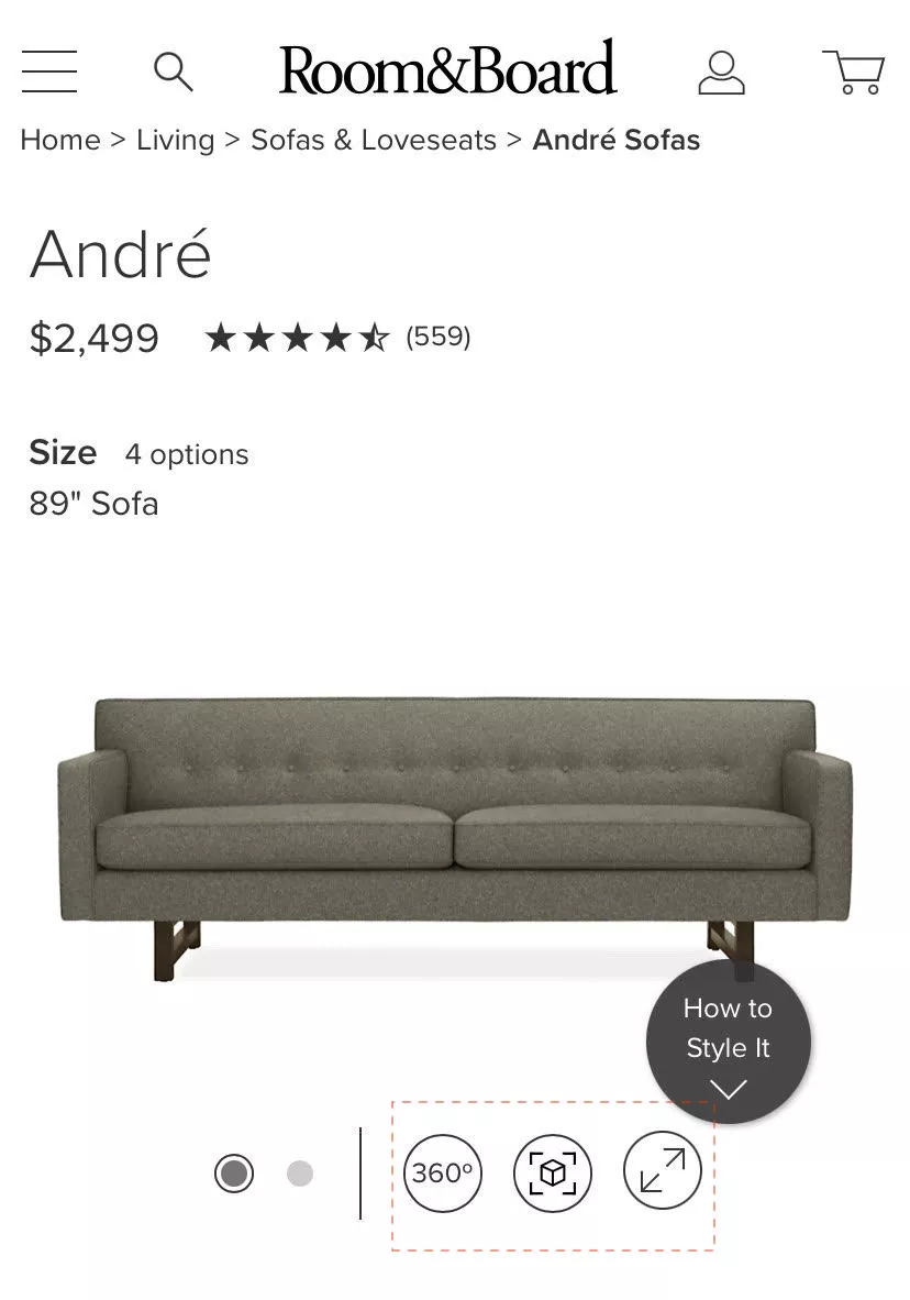
I strongly recommend you do this if it is relevant to the brand.
For example:
There is this really simple $20–$30 tool that allows you to do a spectacle try-on for specs and goggles. You can just plug it into your site, and you're done.
If you're selling eyewear — the eyewear try-on has become a SaaS tool now, and it's really simple, really cheap. It's not expensive. And your highest-intent customers would love to try on eyewear.
The SaaS universe is trying its best to offer point solutions and solve these things for us.
23. Feature-compatible cross-sells (not generic ones)
So in this case, again, very simple example.
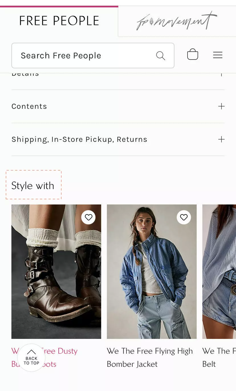
Counter-intuitive — this is kind of the opposite of what I said earlier.
I said recommend one. In this case: recommend, but recommend relevant.
So in this case, “What could you style something you're buying with?”
Very simple example. I'm sure all of us have seen this in several places.
The one thing I want to recommend you do here differently is: you could actually rely on an algorithm to do this — but I want to advise against it for a second.
You are the product owner of the brand.
We work with this Australian company that does amazing dresses for women. Their repeat rates are incredible. Generally speaking, the founder has a fan following and the dresses are amazing.
In their case, the recommendations — they don't let us run the personalization based on data.
It’s counter-intuitive.
But it works.
Why?
Because the lady knows exactly what people will like if they were looking at something.
Also, the dresses are bespoke — so they run out of stock a lot
They want to make sure the recommendations people see when they looked at a pink dress and now want a summery dress… the recommendations don’t need to be other pink dresses. They need to be the kind of style the dress is.
Sometimes doing it the old-school way — manual suggestions — there's no harm in that.
24. Have the chat icon ride over a clean side panel
Chat is very… I think going into 2024 I can just tell you that with all of the AI and everything else around us now — they're trying to make us wear goggles so that we don't even see reality anymore, if you know what I mean — and also take $3,500 from you to be able to do that…
I don't think there's a replacement for talking to a real human if your product value is high or if your product is something that is for personal consumption or can warrant questions from people.
So I would recommend having chat.
We have a vendor, for example — a partner — that does chat extremely well. I'd be happy to connect you to them.
There are two points I’m trying to make:
- Consider using chat — it's underrated.
- Position it well.
I see so many cases where chat is parked in the corner on top of the Add to Cart button, or just three or four buttons floating… one popup on the left side, chat on the right side, some recently viewed coming from somewhere… there’s just too much happening.
So find a nice place where you can park it.
And then thoroughly test it across categories, products, and other pages so that it’s not interfering with the overall experience.
25. Showcase side-scrolling reviews
I’m just going to take a pause — I hope my speed is okay. I know a few more people have joined us since I started, so I hope I'm okay. Please interrupt me, put it in the chat, and I hope I'm able to add value. You're all here — I'm guessing I am able to add value. We'll see.
So scroll — scroll is a very natural experience to mobile.
I strongly recommend having a scroll in the horizontal sense.
This is another very simple example of that. It’s a widget.
26. Use a pop-up between cart and checkout to improve decision-making
Yeah, so this is another interesting one.
What's happening here is: after I've added a product to cart, instead of having the customer go to the cart to do anything like that… we've A/B tested this for a bunch of clients.
In 70% of the cases it was working.
30% actually had negative results, because their customers were likely to keep browsing before they conclude the purchase.
But in this case, what's happening is: I added the second product to cart, so now my cart has two items. And it shows a popup saying:
- Do you want to proceed to checkout?
- Or do you want to continue shopping?
And within checkout as well, there’s GPay and PayPal. So it's one click. You’ve skipped a lot of different steps for the customer — you’ve skipped the cart, skipped the extra friction.
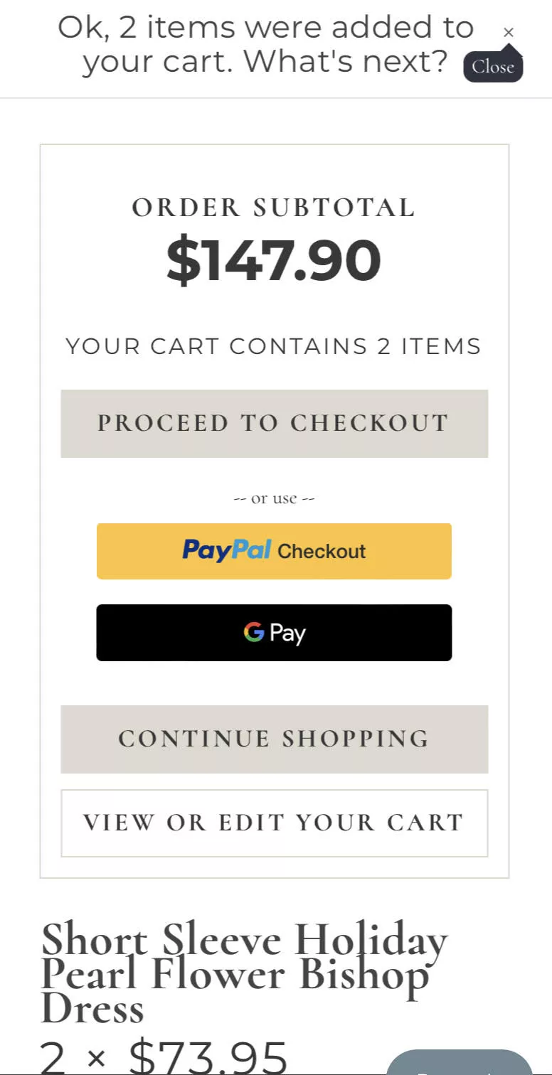
You just made life a lot easier for them.
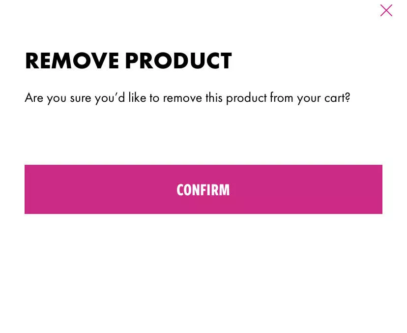
27. Check with them if they remove a product from cart
The next one is removing products. This is… let me put it this way: every sale is important. Every single transaction that comes to the site is important.
This is the fastest, simplest way to lose five or six sales — probably more.
What happens is: the customer accidentally, on the cart page, hits the trash can button next to the product by mistake. Because it's a touchscreen at the end of the day. They hit it, and the product’s gone.
So now I, on my phone, have made it that far in the experience… and I’ve lost the product.
So have that check — where you're able to ask the customer if they really wanted to remove the product from the cart or not.
It’s a very important one. If you're not doing that already, please do.
Checkout
28. Feature a “show order summary” dropdown
The other thing that we've seen is showing an order summary.
So I'll tell you where these two pieces of advice are coming from.
After we're done with the webinar, go to Amazon. Add something to cart. Go to checkout. And then try going back to the cart.
You will not be able to do that.
They don’t even let you click the Amazon logo.
There is no way from the Amazon checkout that you can go back to the cart page except for hitting the back button twice or thrice.
Even Amazon knows this:
Once the user has made the decision of what they want — which is, they have added something to cart and they’re moving further — don’t distract them.
Don’t give them a reason to go back and forth.
Which is why Amazon’s checkout is one of the most informative checkouts you will see. It says everything you need to know:
- where it will get shipped
- how it will get shipped
- the time it will take
- the different options you have
- the price of the product
- the taxes
- shipping
- Amazon Pay balance if any
It is the most informative checkout available.
Unlike Shopify, for example, where in checkout it almost always says:
“Shipping is calculated at the next step.”
So you are essentially putting your customer in a position of discomfort with the information you’re making available to them.
Then they’ve got to move page by page.
It’s friction.
What we're saying here is:
The order summary should be in the checkout page itself.
I should not have to go back to the cart to see why I’m spending $17.25.
If you can't customize your checkout because you’re on Shopify — it can’t help you — but Shopify already has a default way of showing the order summary.
Please activate that if you don't have it.
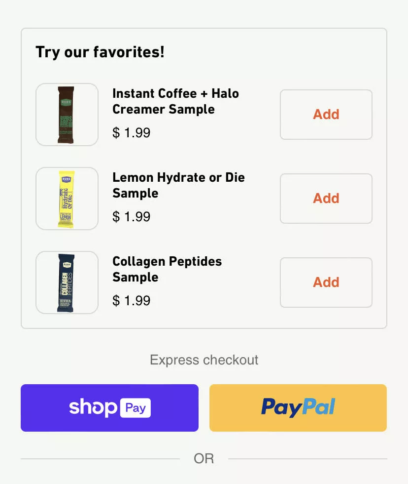
29. Feature only inexpensive upgrades before express checkout
Upgrades and upsells. This is an A/B test we've run several times.
Once we started with the customer, they were already running some kind of upsell or cross-sell on their cart. And we said:
“Hey, have you ever tested this? Have you experimented with this?”
“No, we just installed an app and saw AOV go up.”
But how has it affected conversions?
Not sure.
So the simple advice I have for you is: no need to stop doing it. But at least do it only for the low-value, very simple products.
In this example, I would add more context.
“Collagen peptide sample,” or “Instant coffee halo creamer sample”—
I would need more context for what I’m adding even for $2. Because this popup assumes the customer already knows what that product is.
That might not be true.
So if you're going to upsell something — especially small items — help them understand it in a single glance.
30. Stop forcing users to scroll up on forms
Normally, when there's an error on the form, the customer is force-scrolled to the top and shown:
“You’ve missed some details. Please go and add them.”
In this case, make it simple:
Show them the three things they missed right there.
It’s a very simple change, but it makes the experience a lot less painful.
What we are trying to do with mobile is reduce pain — because mobile is painful as it is.
There are two kinds of audiences. Let me break this down.
- Mobile-first generation — kids who were basically born with a cellphone in their hand. For them the experience is native. They might excuse you for some UX oopsies.
- Everyone else — even mobile natives have the least attention span, least patience, and the most dopamine rushing through them.
So in their case too, if there's an oopsy, don’t make it hard for them to correct it in the journey.
So, that's what we're trying to really say.
31. Keep trust signals visible during checkout
Okay, so for your cart as well — this is extremely subtle and simple.
If you see what’s happening here:
The order summary is visible to me. I can move further and pay now.
But I’ve scrolled down, and I have testimonials… and I have trust seals running consistently as I go through the experience.
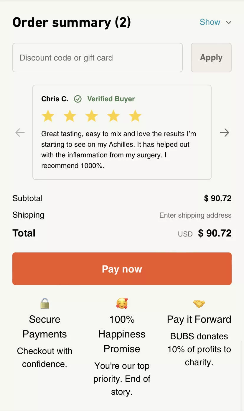
It might look a certain way, but these are things your mind can see — even when your eyes sometimes miss them.
It helps create trust, undoubtedly.
32. Block backward navigation on mobile checkout
And the final advice — connected to the Amazon piece — is:
Don’t give your customers a way to go back from checkout on phone.
Because with phones, this is very likely to happen. The amount of information they can see at a time is limited, so to consume more information they will traverse back and forth.
Two things you MUST do:
- Provide all information on each screen. Checkout should have order summary, total amount, shipping, everything.
- Stop them from moving back and forth. Because you have only a few seconds.
Go check your time on site — session duration — and the number of pages viewed on mobile vs desktop. There’s a world of difference.
Desktop has more information and is more immersive. Mobile isn’t.
So don’t give them an exit.
Closing Thoughts
So those are the 31 ideas we wanted to walk you through. I hope they were useful.
AI, VR, AR… all of that is going to continue to happen. The world is not going to change overnight. When the metaverse was announced, I remember people doing verbal somersaults about how the world would change.
We’re still here optimizing site experiences with A/B tests.
2024 is going to be an amazing year for e-commerce. I hope the economy also gets better globally.
I'm happy to take any questions you might have. Please put them in the chat. There's also a Q&A section.
I'm going to wait three to four minutes for you to type the questions you might have. They could be specific to your business as well. And if you want to DM me the question, I'm happy to take that as well.
As an aside, folks — as I said, we run very thorough teardown audits of your site experience. We're happy to do that for you.
Convertcart has been running our Engage product — our email marketing product — for a long time. And we are wildly successful with it.
I’m a convert from “who even opens emails?” to “we are driving upwards of 25% of revenue through email.”
Across the 110 or so customers we run email marketing for, we're driving more than 25% of their revenue on email alone.
It's really underrated what you can achieve with email.
We're also happy to audit your email strategy, your Klaviyo setup, whatever you have.
Q&A
“Are there any budget or beginner tools?”
It depends on your traffic and your volume of conversions — whether you can run A/B tests or not. Because if you want to run A/B tests but you don't have the volume of traffic or conversion rate, your results might not be statistically significant. That would be a problem.
I'm happy to take a look at your site and recommend something. There are entry-level A/B testing tools like AB Tasty and a couple more.
But I would be cautious before you set up an A/B test — to be sure your volume is enough.
“Do you have a YouTube channel?”
“We don't have a YT channel, but we have a very detailed blog.”
We cover a very wide range of topics about e-commerce, growth, and email marketing. I strongly recommend checking that out. We're extremely proud of the work we've done building an amazing, very in-depth content repository.
The YouTube channel is a good idea — a couple of customers recommended it because they found a lot of value in the webinars.
“Any other questions, folks?”
…
…
And then:
“Alright folks, I think we conclude. Thanks so much for your time.”
Get Fresh ideas to boost your conversion rate
(stuff that works for hundreds of stores)
Request a Free Site Audit"Convertcart’s Audit Report was deep and insightful. We never thought they would spend so much time in building and sharing such insightful content, free of cost."


Logan Christopher
Lost Empire Herbs