Why your UX needs an update before Black Friday arrives?
The human attention span (which is already close to that of a goldfish) goes down even further
Customer acquisition cost skyrockets (mainly on paid ads), and inboxes get fuller
Most traffic will land directly or on product/landing pages
This means your UX across your emails, on-site, and even your communication has to actually stand out. If that isn’t a challenge enough, you have to convert whatever attention you hold.
Here are some ideas that will help 👇
20 Proven UX Changes To Make Before Black Friday Arrives
1. Put the ‘Hot’ Products on The Homepage
New shoppers will click back from product pages to see what else you sell, and email/direct traffic will land there, too. So, your homepage’s gotta guide right.
How to use this UX idea during BFCM:
Look back at your own data and find out which categories had the biggest lifts in terms of wishlists and stock reminder signups
Look outward at market trends and competitor data (gifting season’s here), like Amazon Movers & Shakers, TikTok Trending products
Feature products by profit margin and inventory; start with limited-quantity bestsellers, clear out variants and slow movers with steeper discounts, and bundle fast and slow movers to protect margin
Pro Tip: Ask why the viral products are blowing up – are they collectible, playful, or giftable? Use these cues to shape your own holiday lineup. Take Labubus, the mega viral product, that showed up everywhere – and ended up clipped onto limited edition luxury handbags. 🙂
2. Create a Holiday Storefront
Your homepage banner ain’t got enough space to give away every bit of information about your BFCM sale. Plus, with the holidays right around, this BFCM UX change makes sense.
How to adapt this UX idea for BFCM:
Create a separate BFCM sale page from the homepage banner
Reveal daily deals (refresh every 24–48 hours) to gamify urgency — show a grid of “doors” that unlock each day (if you’ve overused timers, avoid this tactic)
Add a gift finder quiz: ask “Who are you shopping for?” and “What’s your budget?” to return tailored recommendations
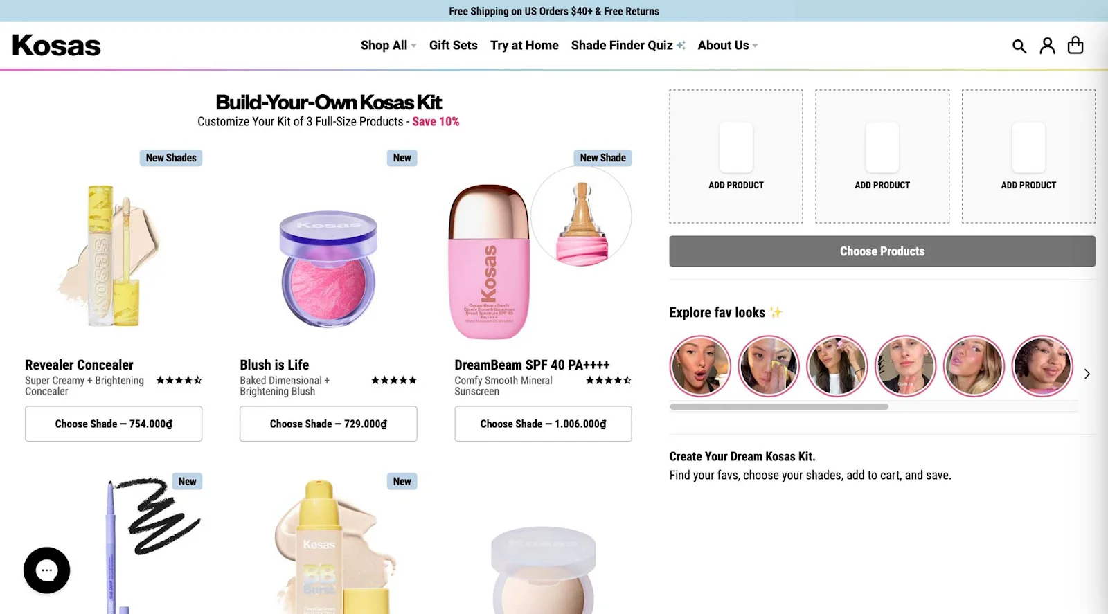
Let shoppers build bundles with a drag-and-drop or dynamic interface to increase AOV with complementary SKUs – here’s a great example of this BFCM UX change from Kosas:
Pro Tip: Use quiz results to build wishlists and targeted pre-launch offers during BFCM to improve the on-site shopper UX.
3. Use Tiered Banners to Prevent Choice Overload
If your homepage shows 3 banners with different promotions, shoppers won’t know where to click — good ol’ choice overload starts knocking. 🙂
How to use this UX idea during BFCM:
Keep the top banner simple (one promise: “Free shipping” or “Today’s deal”)
Use a secondary banner for less urgent stuff – explain what the sale’s about, what’s on sale, bundles, gift guides, etc.
Use your banners to retarget shoppers who land back on your store – the idea here is to create deep contextual reminders and say something like, “Only 2 days left to use your BFCM discount” or “Final hours to claim 2-for-1 deal”
Pro Tip: If you want to avoid users completely getting overwhelmed, just avoid carousel banners during BFCM at all costs (or overusing the notifications bar to feature rotating promotions).
4. Lead with Guided Shopping Paths
Most BFCM shoppers may land directly on product pages (especially from ads), not your homepage. Guided paths help them find what they actually want (and sometimes taking them away from the product page to the right product increases conversion).
How to adapt this UX idea for BFCM:
Analyze last year’s BFCM data (or full-year if you’re new): check where drop-offs happen with analytics, heatmaps, and session replays
Place collection/category tiles at the bottom of product pages to redirect unsure shoppers (“Shop by budget,” “For Travelers,” “Last-Minute Gifts”)
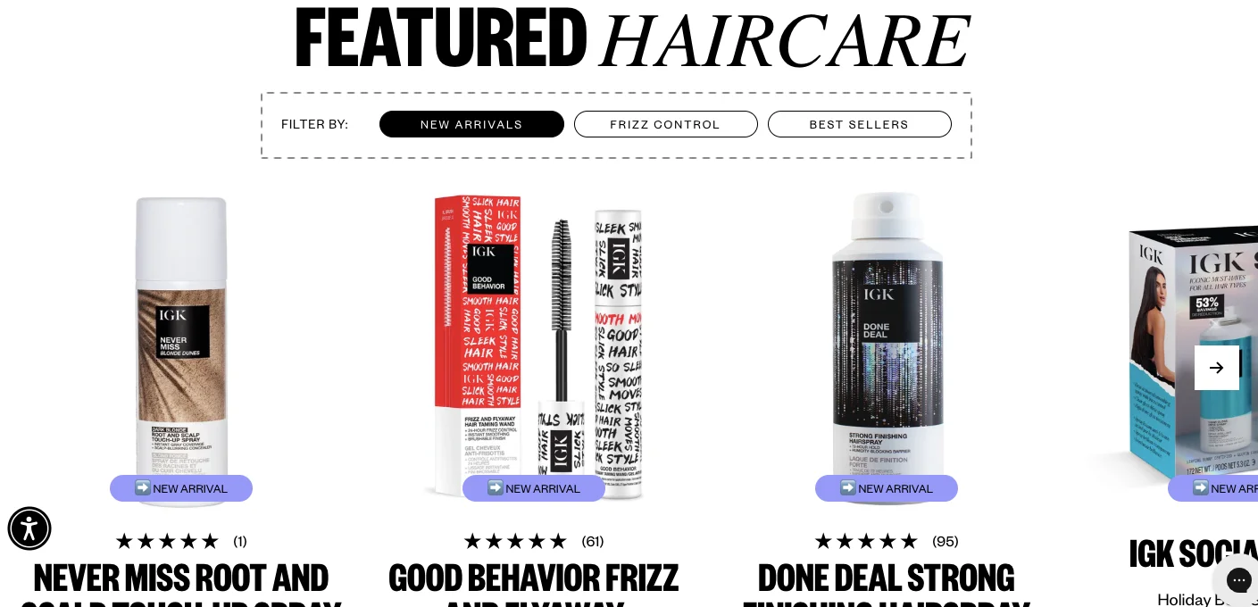
Build guided navigation paths by lifestyle or occasion, so shoppers who bounce on one product still find something they’re actually excited about – like IGK Hair does:
Pro Tip: List all product permutations that make sense (budget, lifestyle, occasion) — keeps shoppers onsite longer, even with short attention spans.
5. Use Progression to Lead Shoppers In
Progressive disclosure is all about curiosity. The number one place we already see this is in ads. It’s not about showing everything in the ad; rather, it’s giving them just enough to click, visit the site, and check what’s happening.
How to adapt this UX idea for BFCM within your product page:
Just keep the basics above the fold like: a clear product title, a short description, your main image, the price with any discount, the add-to-cart button, and a promise of quick delivery or shipping
Keep expandable sections below the fold, to fit details some shoppers may want to read, like a full description, specs, reviews, and FAQs
Surface a few “review highlights” and an option to expand to full reviews
Use micro-highlights like “Bought this for travel — fits perfectly” as clickable snippets (rotate reviews by device used)
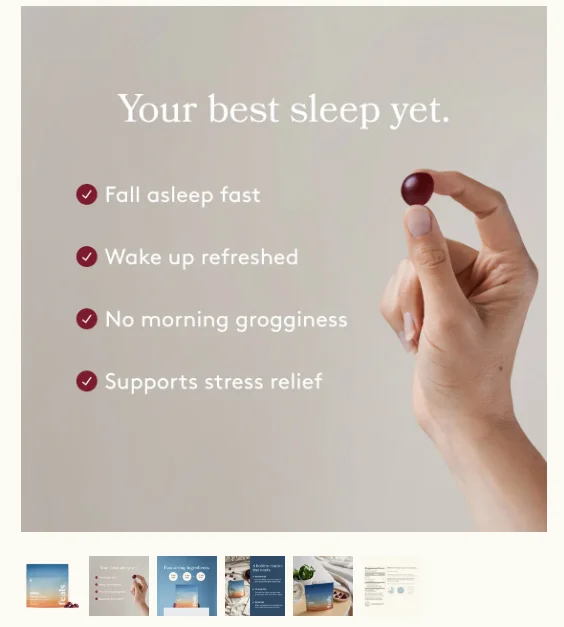
Use progressive visual storytelling. Start with the main product image. Only if the user clicks, expand into: a hero image, then unlock lifestyle shots, comparison tables, or 360° views
Pro Tip: Curiosity buys time. Check how this example leads with benefits (“Your best sleep yet”), and then reveals the “how” in later images to keep shoppers exploring longer:
6. Create a Premium UX for VIP Shoppers
Your biggest spenders can convert at sky-high rates if treated like VIPs. Why? They are already dialled in, and since they’ve already spent before, a right nudge will keep them going during BFCM.
How to implement this UX idea for BFCM:
First, figure out who your high-value shoppers are: the top 5–10% spenders, those with 3+ orders in the last year, your loyalty members, and frequent visitors
Reach out directly over SMS or email with a reward, like: “Welcome back [First Name], your VIP access is unlocked”
Always personalize the onsite experience for VIPs once they click through. For example, you can dynamically change the banner copy on your homepage to “Welcome back [First Name], your VIP access is unlocked” or show navigation tabs like “VIP Deals” (only visible when logged in)
Pro Tip: Personalization for VIP shoppers can go beyond homepage banners or smart recommendations; ensure you also feature a faster checkout path with saved payment options and priority (and preferably free) shipping.
7. Customize the UX on Your Lifecycle Emails
Like segmenting VIP shoppers within your audience, you can also segment your BFCM emails across the customer’s lifecycle.
How to adapt this UX idea for BFCM:
VIP + Cart abandoners: These are people who are your best customers, but they didn’t buy. Try a copy angle: “Your VIP picks are waiting — checkout before they’re gone. Extra gift inside just for you.”
VIPs with a collection preference: These are your VIP customers who have looked at a specific collection/category (skincare, skincare, t-shirts, etc.). Try an angle like “Exclusive VIP pricing on [category] — just for you this BFCM”
Highly engaged subscribers: People who open emails but haven’t purchased in a while. Try a copy angle like, “Hey, we know you’ve been looking at us — we thought we’d say hi.” or “We see you’ve been browsing — this BFCM, let’s make it official. Here’s a comeback offer.”
Unengaged subscribers who are discount buyers: These are people who love deals and’ve bought on discount before. Focus your communication on discounts, urgency, and offers. Like, “Your BFCM exclusive: 40% off. Open this email before midnight or you’ll miss it.”
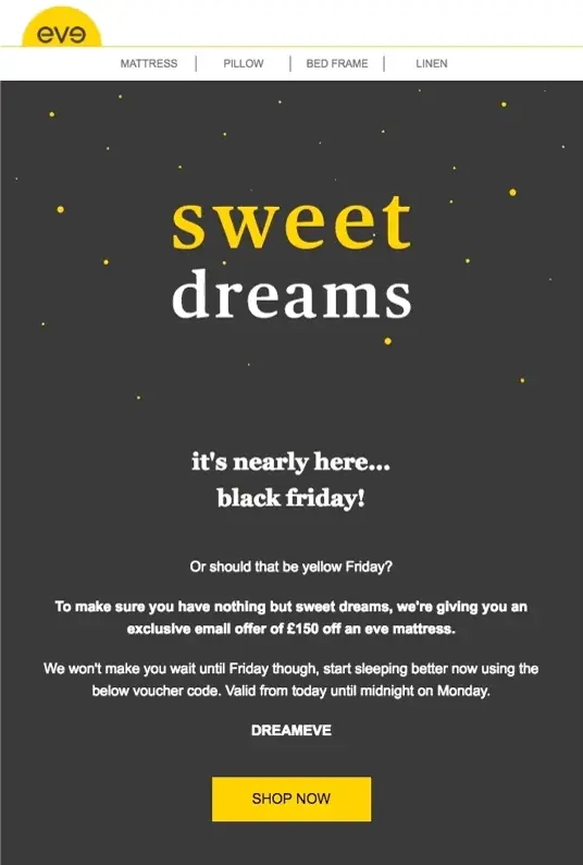
Pro Tip: For “openers but no buys,” use quirky personalized copy referencing their behavior (“We noticed you stalking our socks…”) – check this awesome Black Friday email example:
Also read: 38 Slightly Different Black Friday Email Examples (That Actually Get Attention)
8. Create Promo Mechanics That Create a Cohesive UX
Doing a sitewide 40% off is the most boring thing you can do. Don’t just decide “how much” to discount. Decide “how” you want customers to earn, unlock, or perceive that discount.
How to use this UX idea during BFCM:
Use threshold freebies: “Spend $100, get a free gift” or “Exclusive tote with purchase today.
Add time-based mechanics: “Extra 10% off till 2 p.m. only” (don’t overuse this tactic)
Or, offer value additions, like: free styling, gift packaging, engraving, or bonus items
Test promotions on flash-sale logic: schedule price flips, but ensure you can revert quickly if needed
Pro Tip: Test the discount amounts as well. There’s no point in offering more discounts – for example, a simple 5% opt-in can convert just as well as 15%, especially for high-ticket products.
9. Use Alternative Urgency Triggers
Discounts aren’t the only way to drive urgency. Sometimes the best hook is to show shoppers the impact they can create.
How to adapt this UX idea for BFCM:
Tell them: “We plant a tree for every order this Black Friday.”
Give them a choice: “Take 20% off or donate that 20% to a cause you care about.”
Anchor it to the right driver — SKU limits, loyalty perks, or social impact
After the sale, close the loop with results: “Because of you, we funded 100,000 meals.”
Pro Tip: Add measurable follow-ups (year-in-review emails) to amplify long-term brand value. Think Spotify Wrapped — give customers a “year in review” that shows the bigger story they were part of.
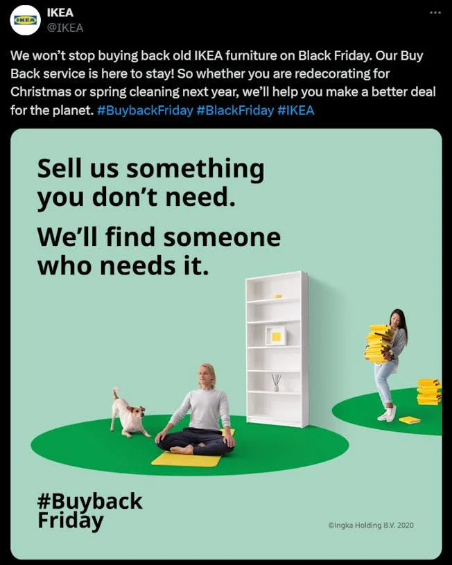
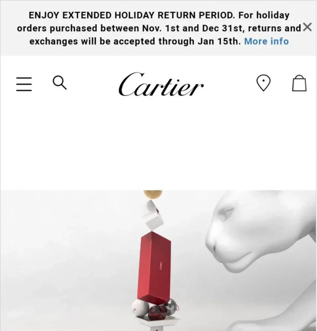
10. Use Returns as BFCM Marketing
Most brands during the BFCM sale period don't do returns.. That’s exactly why offering it can set you apart in your store’s UX during Black Friday
How to use this UX idea during BFCM:
Check if your returns policy is visible on pretty much every single scroll on your store
Offer extended returns windows to VIPs or free return shipping, or instant refunds
Pro Tip: Highlight the no-risk element on product pages and ads – especially for high-ticket items – say something like“Try it risk-free with our extended holiday returns.” For example, Cartier allows three-month returns, even on holiday purchases:
11. Invite Shoppers to Engage With You
Instead of waiting for the sale to start, get shoppers involved before BFCM kicks in. Plus, pre-holiday engagement builds a fan base that converts early and often (and you know which products to stock up on).
How to implement this UX idea for BFCM:
Offer early perks: extra discounts, first dibs, or 48-hour head starts – for example, “News: For anything that's in your wish list. We’ll give you an extra 10% off during Black Friday.”
Retarget every wishlist opt-in when your Black Friday sale goes live
Segment your wishlist retargeting based on the number (and type) of products in the wishlist – for example, if shoppers already have products, suggest more products or bundles they can add – empty wishlists can get reminders of what they’re missing out on
Pro Tip: Release wish-list-building guides three to four weeks before BFCM to give customers time to plan their purchases.
Here’s how Gymshark ran their BFCM wishlist campaign – note how they carefully mention the terms and conditions with a clear mention of the discount and starting dates (with a subtle nudge on how shopping in a hurry can be hard):
Pro Tip: If you get 2,000 opt-ins for your BFCM wishlist campaign, bring all of them into a single list. Now, you will have your loyal fan base – shoppers who’ll want your brand before anybody else. Simply put, you will have your early adopters, and all your future launches should actually go through them.
12. Cross-Channel Remarketing
Inboxes are already crowded during BFCM. Normally, if your cart abandonment email goes next day, in BFCM, it has to go out in the next two hours.
Why: The window of attention is very small. You have to convert the customer quickly. Plus, you cannot give them too much time to think about it.
How to adapt this UX idea for BFCM:
Pair cart abandonment emails with SMS, push, and even in-app nudges if you have them
Instead of just coupon codes, use SMS to engage shoppers. Personal check-ins land better when combined with a coupon code (instead of “Your BFCM deal: 20% OFF. Use code SAVE20” say, “Hey Sarah 👋 we saved your cart with the jacket you liked — still want it? Grab it now with 20% off before midnight”)
Remember: The retargeting window is tiny, and every extra hour you wait gives competitors a win.
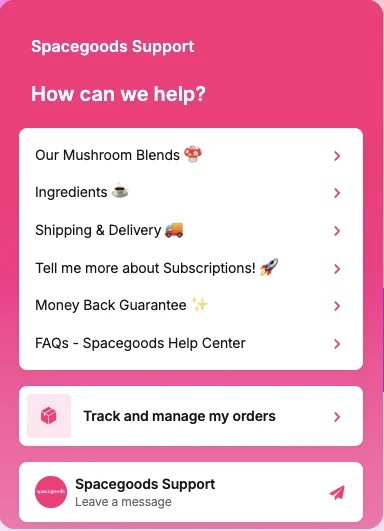
13. Customer Support on Steroids
One of the strongest conversion drivers – your chat can be a real-time tool not only in stopping abandonment during BFCM, but also in changing your store’s shopping experience completely. Here’s how:
How to use this UX idea during BFCM:
Ask and guide with the inquisitiveness of a store assistant, ask questions: “Looking for the right size?” or “Need help picking between two products?”
Use proactive triggers based on where shoppers have stopped (e.g., a shopper idling on the shipping step can trigger a customized nudge like “Need help with shipping?”)
Find a way to man the chat in real time – don’t let chats turn into delayed emails. If needed, borrow resources or outsource to cover the rush (or send an SMS)
Note how Spacegoods primes their live chat support to automate their support and act as a one-stop customer support dashboard:
Pro Tip: Measure conversion rate of users who chat vs. those who don't — you will often see chat users outperform your site's average CVR by a factor of 10–15x.
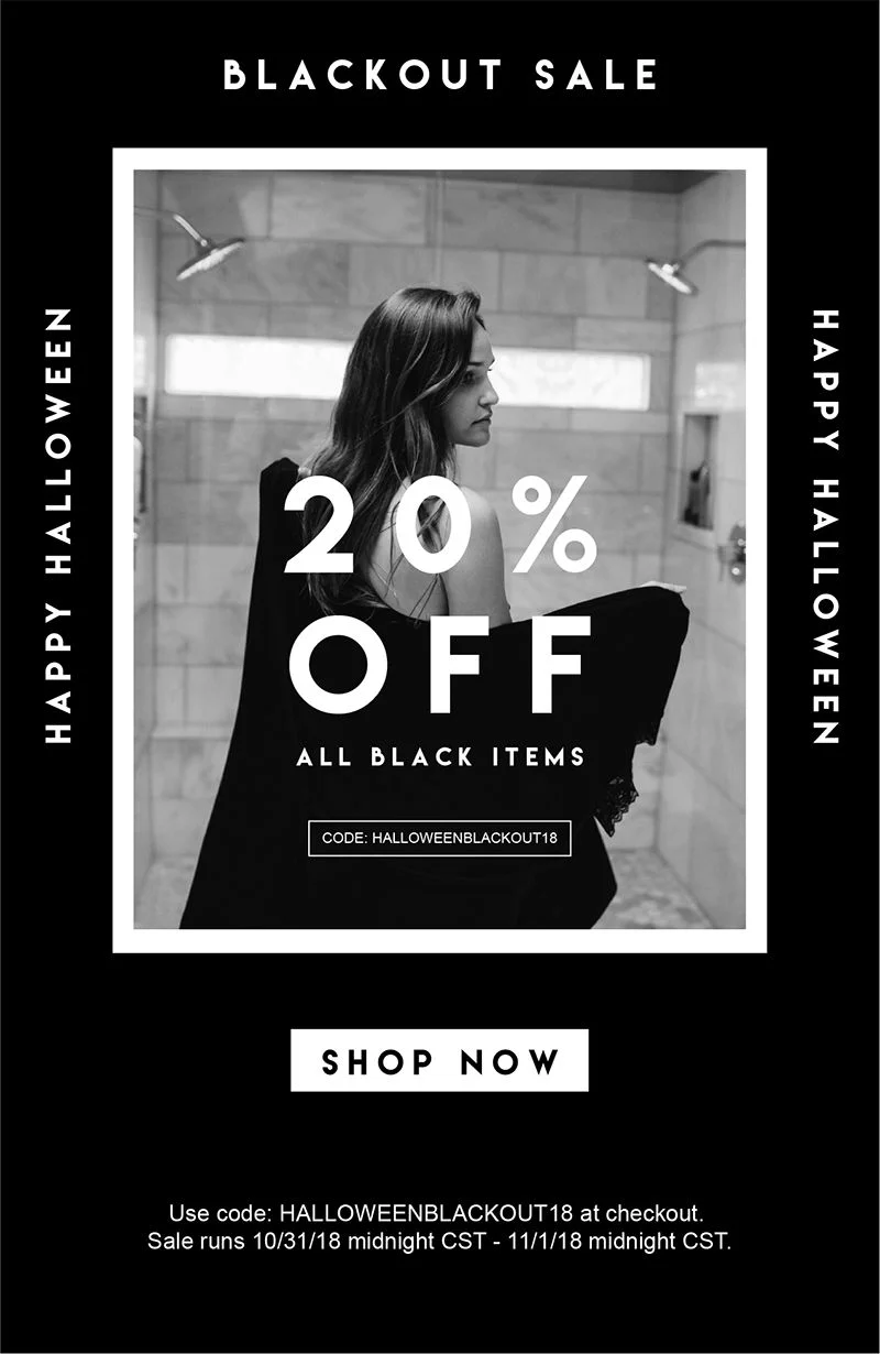
14. Use Halloween as a BFCM Warm-Up
Your Halloween sale should be a BFCM warm-up. It can be the testing pad for all of your crazy ideas you might want to implement for your BFCM sale. 😉
How to adapt this UX idea for BFCM:
Use your Halloween sale to get VIP sign-ups or early-access lists – frame the sale as the opening act: “This is just the start. Things are going to get bigger.”
Start building your BFCM email/SMS list with messaging like: “Looking for solid deals? Sign up now for 24-hour early access.”
Here’s a great example of how a pre-Black Friday sale on Halloween can look like – note how the discount is on black colored products:
⚠️ Do tread with caution – if you tell people that bigger discounts are coming for BFCM, they might not convert immediately. What you can do is pair with never-to-return perks (like exclusive Halloween merch or perks) that won’t be available during Black Friday.
15. Handle Post-Purchase Regret
Generally speaking, post-purchase regret is one of the biggest reasons some brands don't do well during the BFCM season.
Shoppers often second-guess if they got the best deal, and that’s exactly when your RTO (Return to Origin) gets a spike.
How to implement this UX idea for BFCM:
Give customers confidence that they’re getting the best deal, on product pages: “Lowest price in 30 months” or “You got it for $139 — smarter than paying full price”
Extend the reassurance in confirmation emails; say something like, “This item sold out in under 12 hours last year — and you just grabbed it.”
Pro Tip: Always affirm that shoppers made the right choice: “This is our best offer of the year — guaranteed.” – it’s a sure-shot measure against doubts like “what if I waited?” or “Was this the best decision?”
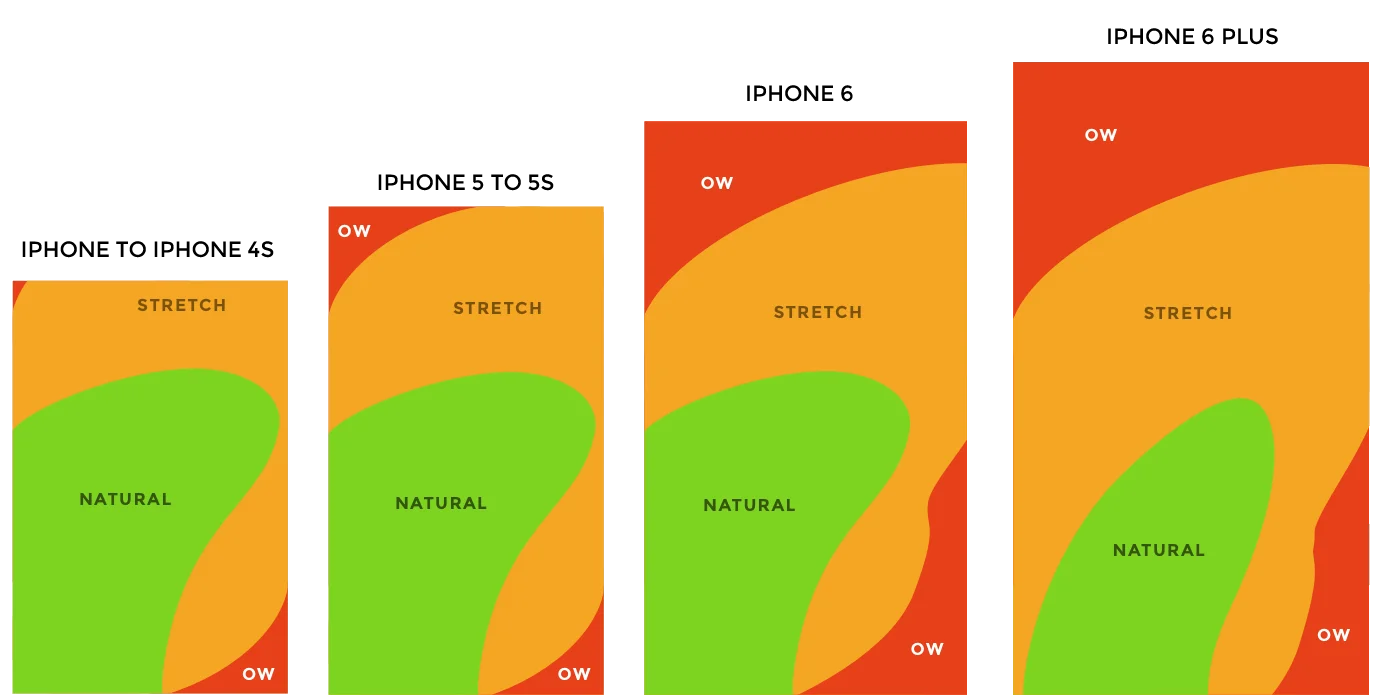
16. Design for Thumb Reach
Imagine this: if people hold their phones in one hand, only a small area of the screen is truly easy to reach; anything in the top corners requires extra effort.
Plus, most of your traffic is on mobile. So, it only makes sense to treat your store’s mobile user experience like an app and design for the thumb.
How to adapt this UX idea for BFCM:
Keep primary CTAs centered and within the easy-reach thumb zone
Place search and checkout at the bottom of the screen
Test on real phones for both right and left-hand usage patterns
17. More Swipes Over Dropdowns
On mobile, scrolls can feel tiring, but swipes? Completely natural. Touchscreens are built for gestures, so why not lean into them?
How to use this UX idea during BFCM:
Use swipe-based filters (price ranges, colors, sizes) instead of expandable menus (that hide behind icons)
Add scratch-card style pop-ups for discounts or surprise offers
Let shoppers swipe through deals, not click through menus after menus
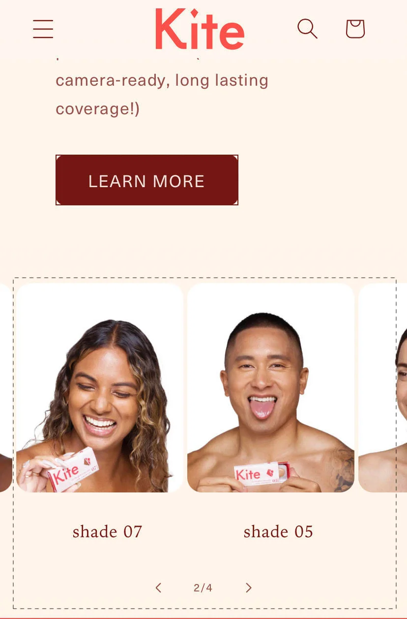
Replace dropdowns with swipeable carousels for categories and product variants – check this example from Kite, showing swipeable product variants:
Pro Tip: Measure scroll depth and time-to-complete-checkout on mobile; then strip every non-essential field.
18. Harness Micro Interactions
Most eCommerce stores feel dead to use. Taps don't register any sort of changes in button shadows. Neither are there color changes on anything when a shopper swipes.
And if a store's just a tad bit slow? Shoppers think the site's frozen (you know what can happen next). This is exactly why this UX change is super important during BFCM.
How to implement this UX tactic during BFCM:
Give shoppers instant feedback through ripples, animations on button presses, or subtle shadow shifts on Add-to-Cart and CTAs so it’s clear their action registered
Add CTA transitions as well as loader screens (checkmarks, micro spinners) while the checkout occurs (or moving between pages) to avoid “is this screen stuck?” moments
Use progressive reveal animations on product pages — think image fades, slides, or benefit highlights that naturally guide the eye down the page
Pro Tip: Don’t overhaul everything at once. A/B test one micro interaction at a time (like ripple vs no ripple on Add-to-Cart). Measure against the add-to-cart rate, time-on-page, and checkout completion rate.
19. Build a Speed Layer for Mobile Checkout
BFCM shoppers, if annoyed, will leave faster than they landed on your store. You just want to make sure you can get to them to close as quickly as possible – here’s how you do it:
How to adapt this UX idea for BFCM:
Audit checkout on at least three phones (iPhone, Samsung, OnePlus) to catch real issues
Strip optional fields and reduce scroll depth wherever possible
Break checkout into shorter, faster-loading steps if needed, like a one-click checkout
Enable one-click checkout if your platform supports it
Pro Tip: Make autofill seamless on mobile, like numerical keyboards for zip codes and phone fields, auto capitalization for names, etc.
20. Post-Purchase Anxiety… But on Mobile
Order cancellations spike during BFCM because customers second-guess their decisions. This is exactly why the last step of BFCM UX improvements ends on the thank you page.
How to implement this UX idea for BFCM:
Show an unboxing simulator on the thank-you page — maybe, autoplay a short video in the checkout screen or thank you page saying, "Hey, this is what happens when your package arrives. You take out the box, you unpack it, gift wrap, and then you get your product box."
Show a pre-unboxing survey after your shipping confirmation: “Where will you use this first?” and suggest complementary items based on the answer – for example, if you sell household products and they say living room, then you can show other products depending on what they chose
Make logical cross-sells on the thank you page, like if someone makes a tablecloth purchase, offer logical add-ons like table mats
Drop in mystery perks or run countdown unlocks after a purchase during BFCM with a reminder button: “Come back in 1h 29m to reveal a special gift”
Pro Tip: Follow up via push/SMS to get shoppers back who signed up for your BFCM post-purchase deals.
How to roll out these UX changes before BFCM?
Audit & prioritize: pick 3–5 ideas that fit your category, margins, and engineer your product display strategy.
Test early: use Halloween or another pre-BFCM event to get a trial run of your BFCM mechanics (daily deals, VIP early access, and chat staffing).
Measure & defend margin: track AOV, conversion, returns, and RTO separately (the goal is to adapt your discount strategy in real time).
Coordinate channels: map email/SMS/chat scripts and timing for each day of the BFCM weekend.
Mobile first: test on real devices and validate autofill, keyboard behaviors, and optimize for one-handed usage.
Rollback plan: if a flash pricing logic fails, you should be able to revert prices quickly.
Subscribe for more articles like this!
Thank you - we'll see you in your inbox soon!
Oops! Something went wrong while submitting the form.
Read by 5000+ ecommerce store owners
Subscribe for more articles like this!
Thank you - we'll see you in your inbox soon!
Oops! Something went wrong while submitting the form.


![[Webinar] Get Your Site Ready For BFCM: 20 UX Changes To Make Today](https://cdn.prod.website-files.com/605826c62e8de87de744596e/68da7277c9b4c5d3afddd7c0_black-friday-ux-changes-blog-cover.webp)


.svg)

.svg)

.svg)
.svg)
