Conversion Optimization
Why is Your Add to Cart Conversion Rate Low?
February 12, 2026

Insights in this post come from our CRO team's decade of experience working with eCommerce brands. Edited by our in-house content team.


Insights in this post come from our CRO team's decade of experience working with eCommerce brands. Edited by our in-house content team.
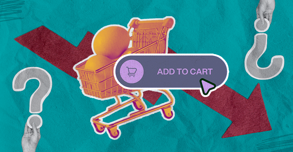
In our years of conducting eCommerce site audits, we’ve noticed a peculiar phenomenon: founders obsess over traffic as if it were oxygen, yet they ignore the "Add to Cart" (ATC) conversion rate, the actual heartbeat of the business.
If your traffic is surging but your ATC rate is stuck below the global average of 4.3% (Dynamic Yield, 2025), you aren't running a store; you’re managing an expensive museum.
Shoppers are wandering through your lanes and then vanishing without so much as a backward glance.
Why? Because most Product Detail Pages lack a human touch.
To fix the gap, we must move beyond technical checklists and address the psychological friction that turns a "maybe" into a "no."
Let’s diagnose why your visitors are window-shopping instead of buying.
This post covers:
Are You Filling an Information Gap or a Confidence Gap?
Is Your Frictionless UX Actually Making It Too Easy to Leave?
Are You Selling a Price or a Value Narrative?
Is Your Return Policy Hidden in the Fine Print?
Have You Decoupled Purchase Intent from Immediate Action?
When an eCommerce site isn't converting, the traditional reflex is to bury the customer under a mountain of data.
We assume that if we just tell them the thread count, the exact Pantone shade, and the torque of the mounting screws, they will succumb to the logic of the purchase.
But humans are rarely logical creatures.
We’re a bundle of nerves looking for a reason to say "no."
In our audits, we find that a low Add-to-Cart (ATC) rate is seldom due to a lack of specs; it’s due to a poverty of confidence.
The shopper isn't asking "What are the dimensions?" as much as they’re asking "Will I look like an idiot if I buy this?"
According to a 2025 Gartner study, 64% of B2C customers feel "overwhelmed" by the amount of information provided, leading to decision paralysis.
To fix this, you must move from "listing features" to "killing anxieties."
If you’re selling a high-end blender, don't just list the RPM; show a video of it pulverizing an iPhone (or at least some particularly stubborn kale).
Point to note: you aren't just supposed to give them data; you need to give them the emotional permission to stop worrying and start wanting.
We have spent the last decade worshipping at the altar of "Frictionless Design."
The goal, we’re told, is to make the path from landing page to checkout as slippery as a buttered slide.
But here’s the problem: if a journey is too effortless, the brain never actually engages. It stays in "skimming mode.”
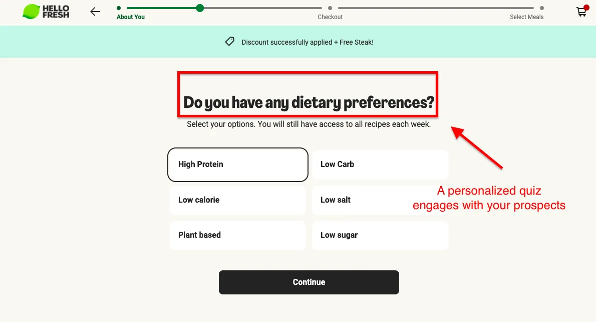
When we audit an eCommerce store, we often recommend "strategic friction."
This sounds counterintuitive, I know.
But by introducing micro-commitments, you force the user to invest a bit of themselves into the process.
Take a look at these examples:
Nielsen Norman Group (2025) research indicates that cognitive investment is a prerequisite for ownership. If the user hasn't "worked" for the product, they haven't bonded with it.
Sometimes, you need to slow them down to speed them up. What do you think?
Wish to improve your add to cart conversion rate? Learn more: How to Increase Add-to-Cart Rate: 20 Brilliant Ideas
When ATC rates tank, the panic button is almost always labeled "Discount."
Founders assume the price is a wall that shoppers can’t climb.
However, price is rarely an absolute barrier; it is a relative one.
A $100 t-shirt is expensive in a vacuum, but it’s a steal if it lasts for a decade and makes you look like a movie star.
The issue is that most PDPs (Product Detail Pages) present price as a cold, hard finality.
To improve conversions, you must wrap that number in a narrative.
Most founders treat a $400 price tag as a hurdle.
I treat it as a math problem. If you’re selling a premium espresso machine, stop talking about pump pressure and start talking about avoiding the $6 latte.
Data from PYMNTS Intelligence (2025) show that 60% of consumers now prioritize durable value over disposable convenience.
This way, you aren't asking them to spend; you’re helping them save.
The biggest killer of the Add-to-Cart click is the quiet suspicion that the customer is being "fleeced."
You can kill this anxiety by pulling back the curtain on your margins.
Research from Harvard Business School (2024) suggests that "operational transparency," which shows the actual cost of production, increases willingness to pay by up to 20%.
When shoppers see the "why" behind the "what," the price becomes a non-issue.
The idea is to give them a justification, not just a receipt.
Learn more about effective eCommerce pricing strategies: eCommerce Pricing Strategy: 13 Standout Brand Examples
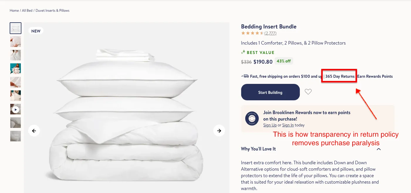
It’s one of the more baffling aspects of the human psyche that we’re far more likely to jump off a ledge if we can see a trampoline at the bottom.
In eCommerce, that trampoline is your return policy.
Many marketers treat returns like a shameful family secret, hiding the policy in 8-point font in the footer.
They worry that mentioning returns will "plant the seed" of failure in the customer's mind.
In reality, the seed is already there; it's loss aversion.
Statista (2025) reports that 71% of shoppers will abandon a cart if the return policy is unclear or overly restrictive.
In our audits, we advocate for pulling that safety net right up under the Add-to-Cart button.
A simple "Free 30-Day Returns, No Questions Asked" tag acts as a psychological green signal.
Do you see how you can make the exit easy by making the entrance inevitable?
We tend to view the eCommerce journey as a frantic race: the user lands, looks, buys, or "fails."
But the modern shopper’s journey looks less like a sprint and more like a distracted bumblebee wandering through a garden.
They might be on a crowded train, or in a boring meeting, or lying in bed with one eye closed.
They have intent, but they don't have the environment for a full checkout.
If your only metric for success is the ATC click, you are ignoring the 95% of people who are "browsing with intent."
By providing these soft conversions, you acknowledge the reality of human behavior.
You are building a relationship through multiple touchpoints rather than trying to force a first-date marriage.
Add To Cart conversion optimization is about a relentless commitment to clarity over clutter. Our advice: Don't try to fix everything by Monday.
Pick one friction point, run a clinical test, and watch how small shifts in narrative yield outsized gains in revenue. So, it's time to stop guessing, start measuring, and get out of your customers' way. Book a free audit with one of our experts today!
Does your analytics show that a lot of shoppers abandon after adding products to their carts? You'll find some answers here: Why Are People Adding To Cart But Not Buying?
Subscribe for more articles like this!


Read by 5000+ ecommerce store owners
.svg)

.svg)

.svg)
.svg)
2026 Convertcart, All Rights Reserved
33/1, Castle Street, Ashok Nagar, Bengaluru, India
