Before diving into advanced strategies, make sure your product page covers these essentials:
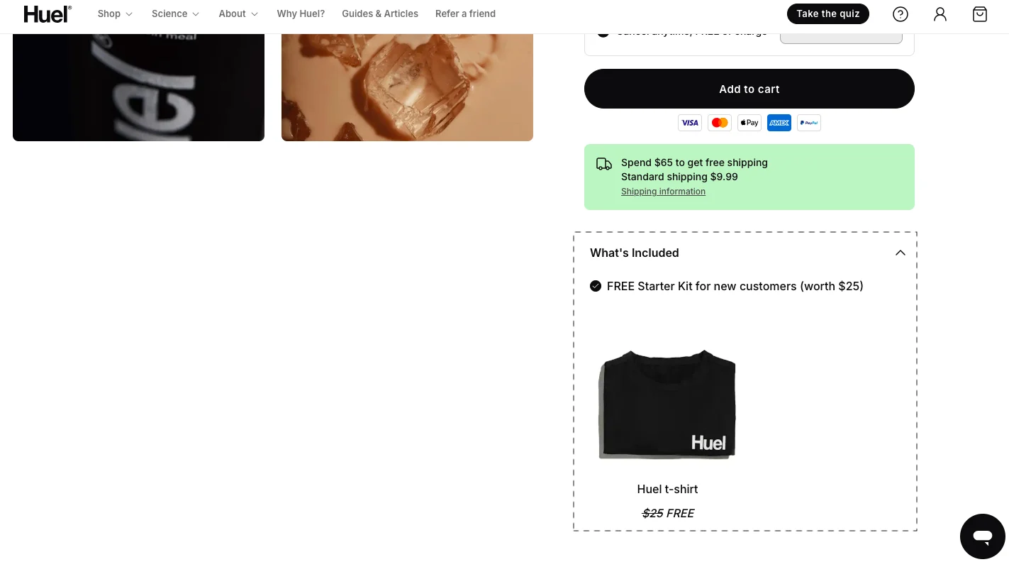
Clear “Add to Cart” button visible above the fold
CTA stands out with strong contrast and size
Pricing is easy to understand (no hidden costs)
Shipping costs and delivery timelines are shown early
Product images are high-quality and zoomable
Reviews or ratings are visible near the CTA
Variant selection is simple and intuitive
Page loads quickly (especially on mobile)
Mobile layout is thumb-friendly (easy to tap CTA)
The return/refund policy is easy to find
Your add-to-cart rate is the metric that tells you how well your product pages are doing their actual job, building enough desire, trust, and clarity that a shopper decides to take the next step.
Get this right, and everything downstream, checkout completion, revenue per session, return on ad spend, tends to follow.
This guide covers the full picture: where to look when your add-to-care is low, where yours should sit, what to fix first, and 20 tactics that actually move the number.
Even if your product pages look “fine,” add-to-cart rates usually drop because of:
Weak product clarity (users don’t understand the value)
Lack of trust (reviews, guarantees missing)
Too many choices (decision fatigue)
Traffic mismatch (wrong audience landing on the page)
Mobile friction (CTA hard to find or tap)
Looking for industry data? If you want to see how your current metrics compare to the 2026 global averages, see our eCommerce Add-to-Cart Benchmark Report.
What Is Add-to-Cart Rate?
Add-to-cart rate is the percentage of product page sessions where a shopper adds a product to their cart.
Formula: Add-to-Cart Rate = (Sessions with add-to-cart ÷ Total product page sessions) × 100
It tells you how well your product pages convert shoppers' interest into intent.
What to Fix First: A Prioritization Framework
Not all improvements are equal. Some changes can increase the add-to-cart rate within days. Others take weeks of testing with minimal payoff. Here's how to decide where to put your energy.
The Impact vs. Effort Prioritization Matrix
Quadrant
What to Do
Examples
Expected Outcome
High Impact, Low Effort
Start here — these deliver the fastest gains [cite: 263]
Make CTA more prominent [cite: 263]
Add trust signals near CTA [cite: 263]
Show shipping costs upfront [cite: 263]
Add urgency (“Only 3 left”) [cite: 263]
Improve CTA copy [cite: 263]
Immediate lift in add-to-cart and conversion rates (often within days) [cite: 263]
High Impact, High Effort
Work on these next after quick wins [cite: 263]
Redesign product page layout [cite: 263]
Improve imagery (lifestyle + zoom) [cite: 263]
Add product videos [cite: 263]
Simplify variant selection [cite: 263]
Optimize mobile UX end-to-end [cite: 263]
Step-change improvements in conversion rate and engagement [cite: 263]
Low Impact, Low Effort
Test opportunistically, but don’t prioritize [cite: 263]
Minor copy tweaks [cite: 263]
Small visual changes [cite: 263]
Micro UI adjustments [cite: 263]
Incremental gains, rarely transformative on their own [cite: 263]
Low Impact, High Effort
Avoid or deprioritize [cite: 263]
Complex animations [cite: 263]
Over-engineered personalization [cite: 263]
Features not tied to buying intent [cite: 263]
Low ROI, slows down meaningful progress [cite: 263]
High Impact, Low Effort — Start Here
These typically deliver the fastest gains:
Make the CTA button more prominent (size, color contrast)
Add trust signals near the CTA (reviews, guarantees, badges)
Improve CTA copy ("Add to Cart" → "Get Yours Today")
These changes often improve the add-to-cart rate within days.
High Impact, High Effort — Next Phase
Redesign product page layout
Improve product imagery (lifestyle shots + zoom)
Add video demonstrations
Simplify variant selection UX
Optimize mobile experience end-to-end
These require testing but can create step-change improvements.
Low Impact, Low Effort
Minor copy tweaks
Small visual adjustments
Micro UI changes
Worth testing — but don't expect big wins alone.
Low Impact, High Effort — Avoid for Now
Complex animations
Over-engineered personalization
Features that don't directly affect buying intent
These often consume time without improving conversions.
Pro tip: Most stores don't have a traffic problem. They have a prioritization problem.
How to Increase Add-to-Cart Rate: 20 Strategies
HIGH IMPACT, LOW EFFORT— Start Here
These require testing but can create step-change improvements.
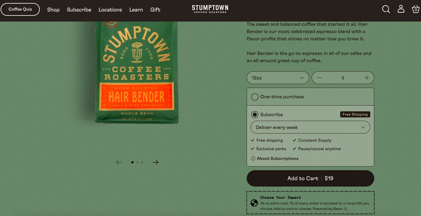
1. Build Better Context Around Your Primary CTA
The button itself is only part of the conversion equation. What surrounds it matters just as much. Based on audits of hundreds of product pages, add-to-cart rates consistently improve when you provide shoppers with the right contextual reassurance at the moment of decision.
A few microcopy patterns that work:
For in-stock products: "In stock — ready to ship today"
For made-to-order items: "Usually ships in 2–3 business days"
Social proof in numbers: "4,380+ customers love this product"
Subscription nudge: "We recommend the subscription — mix and match across three flavors"
The principle is simple: reduce the questions a shopper has to answer in their own head before clicking. The fewer unresolved doubts at the point of the CTA, the higher the conversion.
Case Study
We were working with a skincare brand last year.
(We’ll not be able to name them because of the nature of our arrangement with them.)
So.. they were facing a peculiar problem:
They had tested CTA colours for 6 weeks with almost no meaningful impact.
When we analysed session recordings and customer behaviour deeply, the issue wasn’t the button.
The issue was hesitation around product suitability.
The winning variation wasn’t a “better-looking CTA.”
It was adding a micro reassurance layer near the CTA explaining: “Recommended for sensitive, acne-prone skin.”
That single insight outperformed every visual experiment they had run before it.
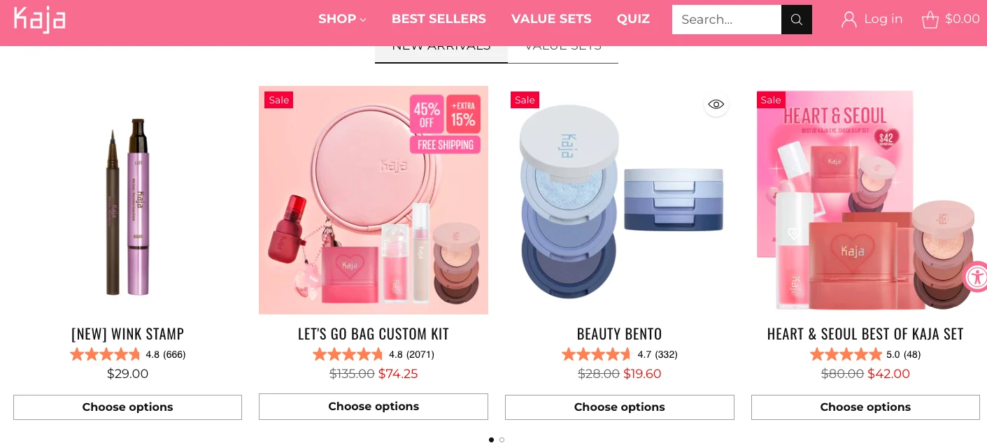
2. Reduce Decision Fatigue Through Sharper Labels
52% of online shoppers compare products across multiple stores before buying. That comparison phase is where you can win or lose them, and product labels are a surprisingly powerful lever.
The key distinction: decisive labels outperform descriptive ones. "Best for everyday use" is more useful than "Bestseller." "Perfect for oily skin" outperforms "Customer Favorite." Labels that help shoppers self-select remove cognitive effort from the decision, and less effort means more adds to cart.
Limited-time and milestone-event labels also perform consistently well ("Father's Day pick," "Limited run 48 hours only"), provided they're genuine.
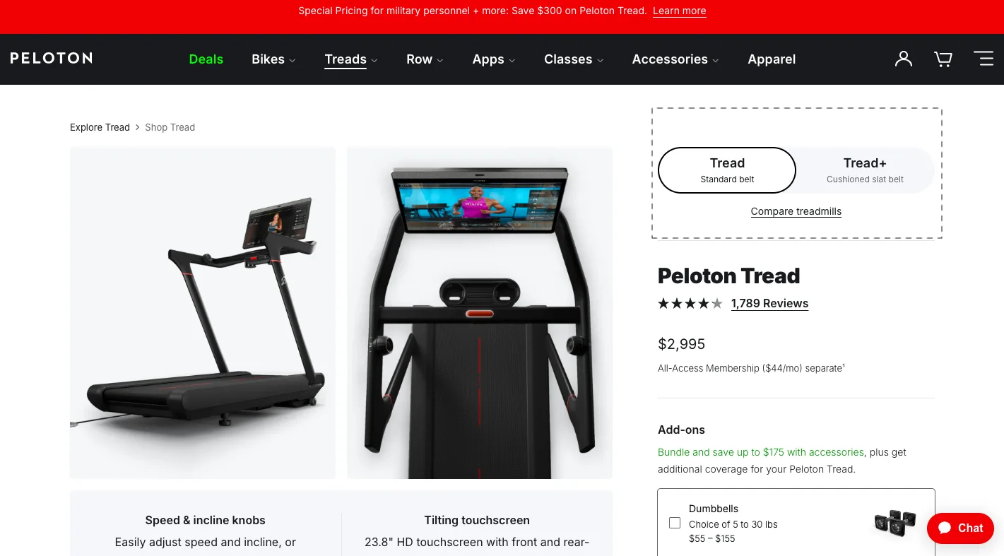
3. Make Your Above-the-Fold Region Do More Work
Everything visible before the first scroll is prime conversion real estate, and most product pages waste a surprising amount of it. To make yours pull its weight:
(i) Notification bar
Feature your most relevant current offer in a bar that's large enough to read comfortably on mobile. Rotate it dynamically by segment or traffic source.
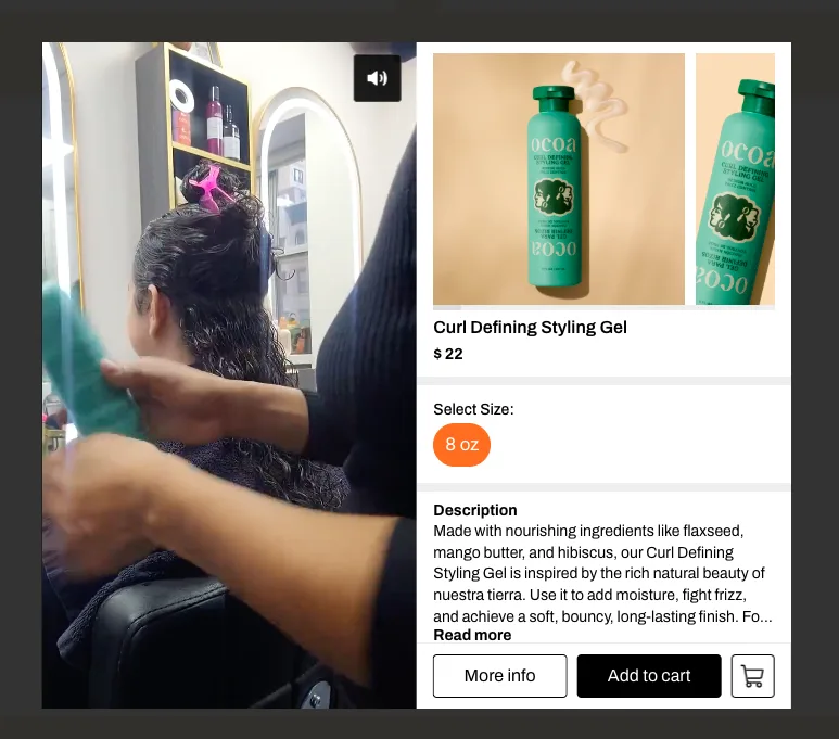
(ii) Product photography: Show enough detail above the fold that a shopper can assess key features, fabric, scale, and color accuracy without scrolling.
(iii) Quantified savings: Don't just show a crossed-out price. Tell shoppers what it means: cost per use, savings per month, value vs. buying separately.
4. Distribute CTAs Throughout the Product Page
The traditional product page assumes shoppers convert at the top, when they see the price and the button, and decide. In practice, many shoppers need to read reviews, check specs, understand ingredients or sizing, and then come back to the CTA when they're ready.
Placing your CTA at logical "moments of confidence" throughout the page, after the review section, after the key benefits breakdown, and after the FAQ captures those later-converting shoppers. Three placements per page is a reasonable ceiling; more than that starts to feel aggressive.
Check heatmaps and session recordings to identify where shoppers actually pause before converting. The CTA should be there.
5. Incentivize First-Time Buyers the Right Way
First-time buyer discounts are everywhere, which means they've lost most of their power as differentiators. The incentives that work better are those that feel personalized to how the shopper arrived.
A few approaches that outperform generic discount codes:
Channel-matched messaging:"Just found us on Instagram? Add any two items, and we'll include a free gift." The specificity makes it feel intentional rather than automated.
Educational content as a free add-on: For first-time buyers who are still exploring, bundling a starter guide or product tutorial with a starter pack bridges the gap between interest and purchase.
Risk reversal:"Free returns on your first order" or "30-day money-back guarantee" removes the main psychological blocker for first-time buyers, the fear of being wrong.
HIGH IMPACT, HIGH EFFORT — Next Phase
These require testing but can create step-change improvements.
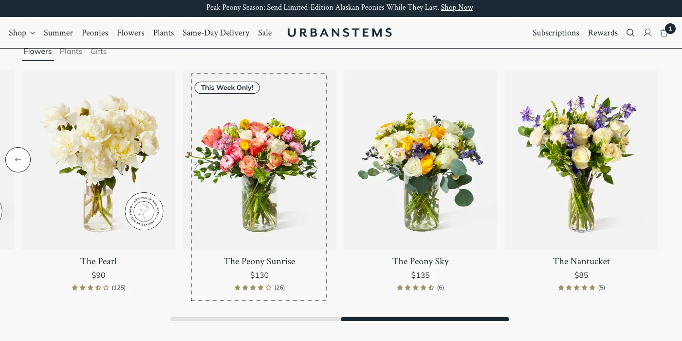
6. A/B Test Your Product Image Gallery
The image gallery is often the first thing a shopper engages with and one of the last things stores bother to test. There are several variables worth running through A/B tests:
(i) Hero image order
Studio shot vs. lifestyle shot as the lead image produces meaningfully different results depending on the category. Beauty and home decor often favor lifestyle leads; functional products tend to do better with clear product shots first.
(ii) Scroll direction
Vertical scrolling often outperforms horizontal carousels on mobile because it aligns with the natural thumb motion. Worth testing, especially if mobile is your dominant traffic source.
(iii) Number of displayed images
More isn't always better. Track how far shoppers actually scroll through your gallery. The drop-off point tells you how many images you actually need.
(iv) UGC vs. branded content
In niches like beauty, fashion, and home decor, galleries that mix in customer photos alongside polished branded content tend to outperform all-branded galleries. Real people using the product build a kind of trust that studio shots can't.
(v) Interactive elements
Try-on tools, 360-degree views, and zoom functionality all increase time on page and add-to-cart rate, provided they load quickly and don't interrupt the purchase flow.
7. Consider Staged CTAs
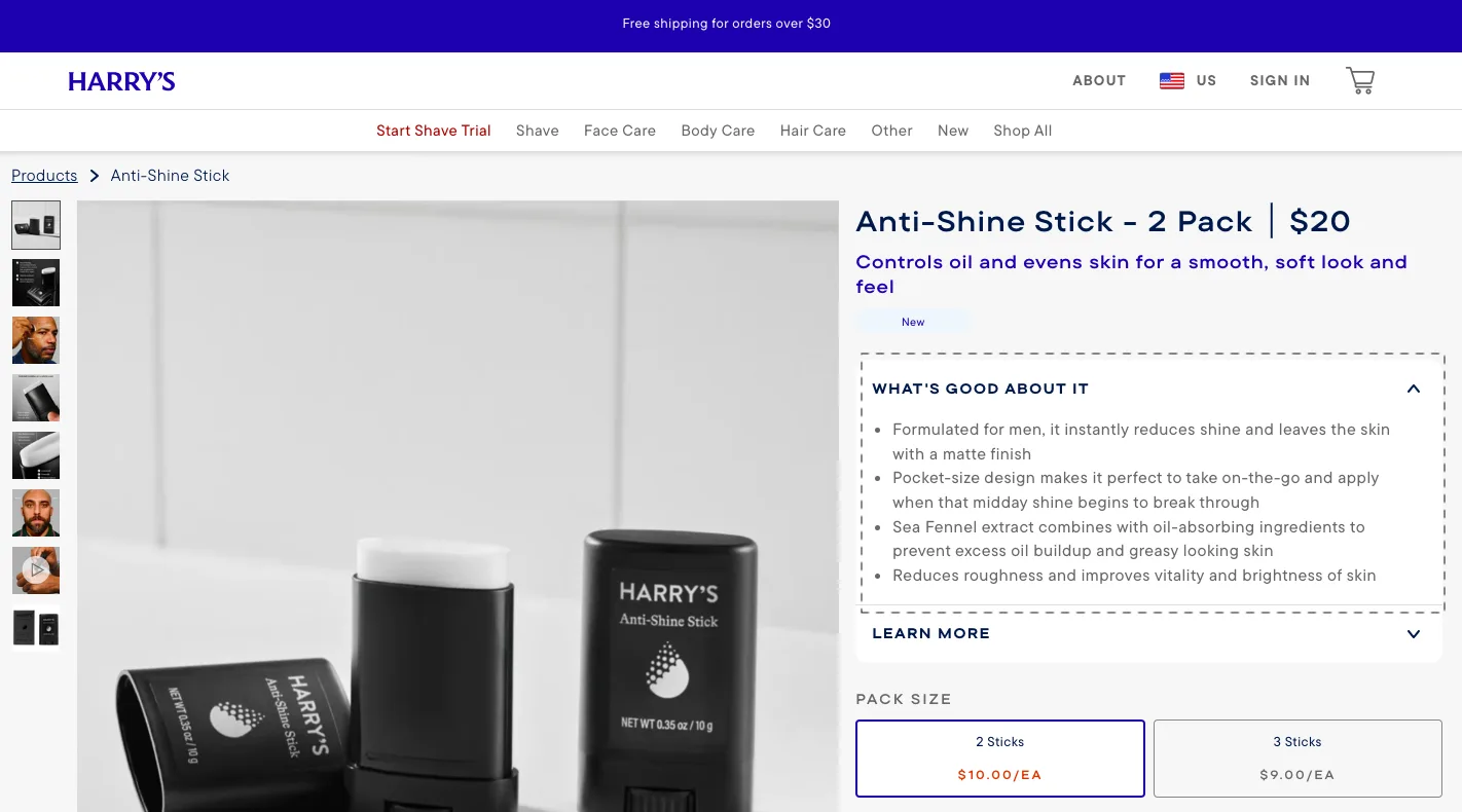
A direct "Add to Cart" button is great for simple, single-SKU products. For anything with variant sizes, color, materials, or configuration, it creates a frustrating experience: shoppers click the CTA, get an error ("Please select a size"), and often don't come back.
Staged CTAs solve this by guiding shoppers through variant selection before the final add-to-cart action. A "Choose Options" button that opens a lightweight modal where they select a variant and then add to cart removes that error state entirely and tends to increase engagement on mobile, where screen space is already limited.
This approach works especially well when:
The product is priced above the category average
The product requires more explanation before purchase
A significant portion of your traffic comes from social or AI search
8. Combine Cart and Checkout Flow Where Possible
Every additional step between "Add to Cart" and payment is a potential exit. The standard flow: add to cart → mini-cart → cart page → checkout steps is four decision points where a shopper can change their mind.
Combining cart and checkout into a single accelerated flow removes most of those exit points. It works particularly well for:
Single-SKU purchases with no variants
Stores with a high proportion of impulse buyers
Mobile-heavy traffic, where the friction of multiple steps is most acute
The risk is alienating multi-item shoppers who want to review their cart before committing. A/B test this carefully and apply it selectively based on purchase patterns.
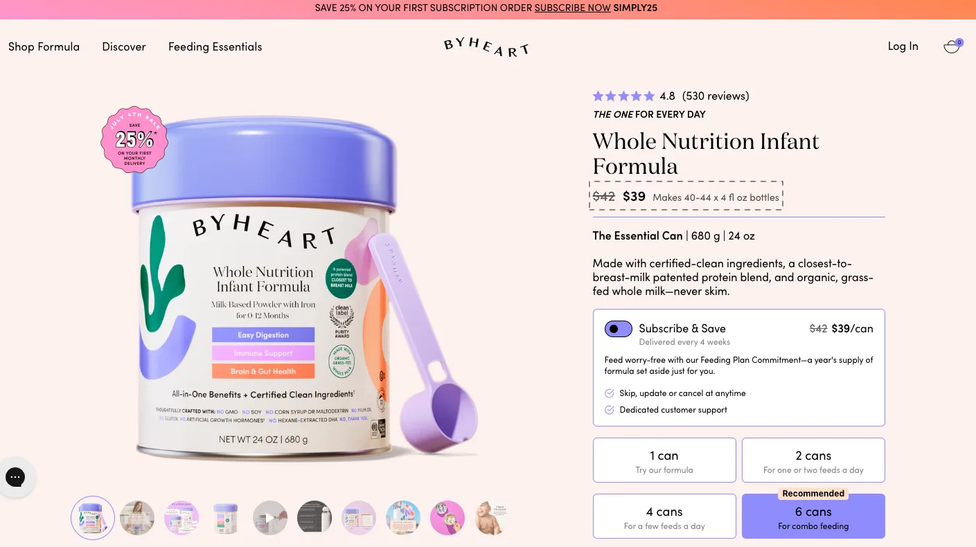
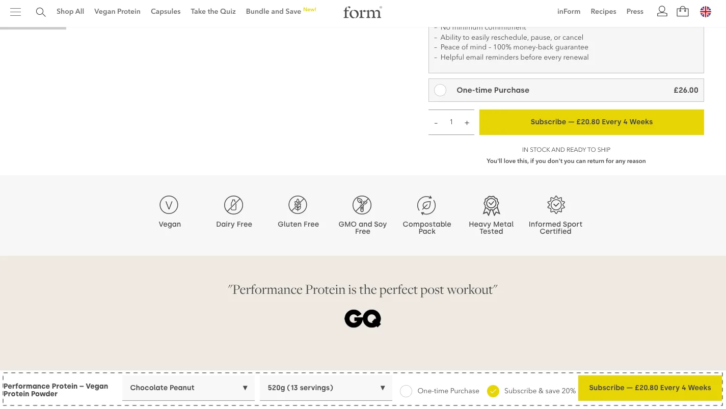
9. Make Your Sticky Add-to-Cart Work Harder
A sticky add-to-cart bar that does nothing but hold the button is a missed opportunity. The better version functions as a mini product configurator, allowing shoppers to switch variants, adjust quantities, or toggle between one-time purchase and subscription, all without scrolling back to the top.
This matters most for longer product pages (supplements, technical products, fashion with detailed size guides) where scrolling back to the CTA creates meaningful friction. A sticky bar that lets shoppers act on intent wherever they are on the page removes that friction entirely.
10. Feature Shoppable Videos
Video is now table stakes on product pages. But most video implementations treat it as a passive asset, something shoppers watch rather than act on.
Shoppable videos change that by embedding a CTA directly into or alongside the video player. The formats that convert best are short (under 90 seconds), feature someone using the product in context rather than talking about it, and open a quick modal with a single add-to-cart action rather than sending shoppers elsewhere.
UGC-style videos shot by customers or creators rather than branded production teams tend to outperform polished brand videos for conversion purposes, even if they look less expensive.
11. Rewrite Product Descriptions to Smash Objections
Most product descriptions describe the product. The most effective ones describe the shopper's problem first and then position the product as the solution.
That shift in framing changes how the description reads. Instead of "lightweight at 1.2kg," try "light enough to forget it's in your bag until you actually need it." Instead of leading with ingredients, lead with the outcome and let the ingredients validate the claim.
A practical structure: open with the problem or desire, validate it, introduce the product as the answer, handle the top 2–3 objections inline, close with confidence-building language (reviews, guarantees, social proof). Product descriptions structured this way consistently outperform feature-list formats on add-to-cart rate.
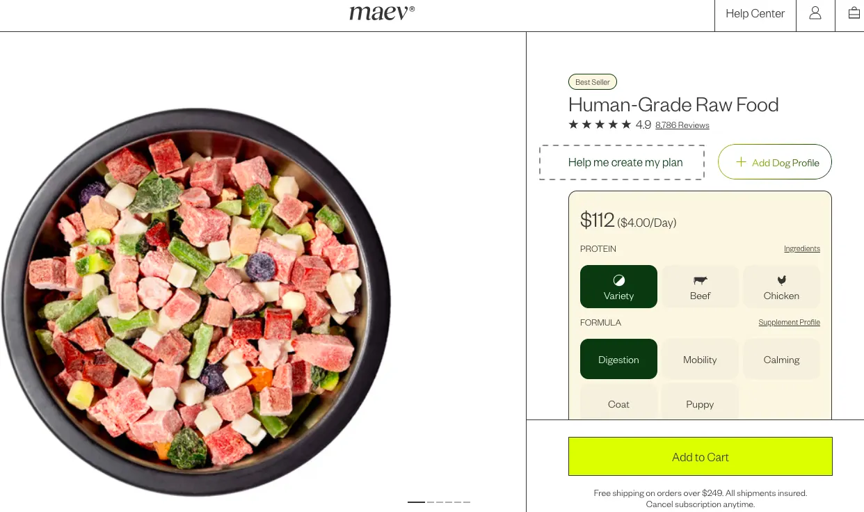
12. Use Customization and Personalization to Build Investment
There's a well-documented psychological principle at work here: people assign more value to things they've had a hand in creating. A shopper who's answered a quiz to find their ideal product, or built their own bundle, feels a sense of ownership before they've even paid.
"Build a bundle" prompts, product-match quizzes, and personalization flows that result in a customized cart rather than a generic product page consistently produce higher add-to-cart rates, particularly for first-time visitors who haven't yet committed to a specific product.
The key is keeping the customization fast and focused. A 10-question quiz kills momentum. A 3-question flow that leads somewhere specific earns the shopper's trust.
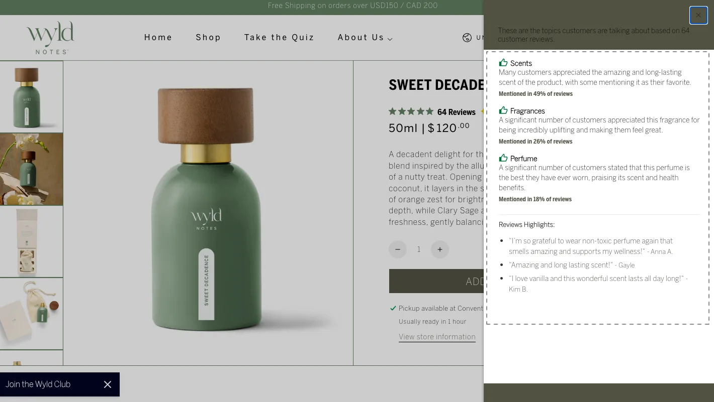
13. Set Up an AI Reviews Summary
Long review sections are valuable but rarely read in full. An AI-generated reviews summary, a 2–3 sentence distillation of what customers most consistently praise (and occasionally criticize), gives high-intent shoppers the confidence they need in seconds rather than minutes.
This tactic works especially well for products with large review volumes, where the signal is buried in the noise, and for categories where peer validation is a key part of the purchase decision (beauty, supplements, home goods). Place the summary close to the CTA, not buried at the bottom of the page, so it lands at the moment it's most useful.
LOW IMPACT, LOW EFFORT— Worth Testing
These are easy to implement but won’t move the needle alone.
14. Make It Easy to Add to Cart from the Primary Menu
If you're promoting bestsellers, seasonal collections, or hero bundles, consider surfacing add-to-cart functionality directly within your primary navigation.
For products with variants, the cleanest implementation is a "Quick Shop" hover state that opens a modal with variant selection and a single CTA. This keeps the nav uncluttered while dramatically shortening the path to cart for high-intent shoppers who already know what they want.
This works particularly well if your navigation features curated recommendations rather than category dropdowns, think "Staff Picks" or "Best for First-Timers" rather than generic category trees.
15. Make Wishlisting More Interactive
A wishlist click is a micro-conversion, a signal of genuine interest that most stores leave to go cold. In 2026, the best stores are making wishlists work harder.
Two tactics that consistently lift add-to-cart rates:
(i) Email-based wishlist nudges
For subscribed shoppers, send a targeted email when wishlist items go on sale. For non-subscribed shoppers, trigger a microcopy alert over the wishlist icon, "Some items on your wishlist are on sale," when they return.
(ii) Intent-capture at the moment of wishlisting
The second a shopper wishes for an item, show them a short prompt: Still thinking about it? Waiting for a better price? Confused about sizing? Gifting it later? This surfaces hesitation so you can address it, rather than letting it quietly kill the sale.
16. Show Exit-Intent Popups with Smarter Triggers
A generic discount pop-up is the 2019 approach. Shoppers have learned to close them on reflex, and they convert poorly.
What works better is matching the pop-up to the specific behavior you're observing. A few scenarios worth setting up:
Indecision on the product page (detected via scroll depth + time on page): Offer a 1-click bundle add-on rather than a percentage off
Live chat activity around shipping concerns: Resolve that concern directly — "Hate long waits? This item ships within 24 hours" with a direct CTA
Multiple visits across sessions without a purchase: A "Save for Later" nudge, "Keep these in your cart while you decide," often outperforms a discount because it doesn't train shoppers to wait for one
17. Surface Upgrades Strategically
Upgrades like a Pro version or a larger size are often introduced in ways that complicate the decision rather than simplify it. The goal should be to show the upgrade as a natural, low-friction choice rather than an interruption.
Patterns that work well:
A toggle in the first fold that lets shoppers switch between versions without leaving the page
Social proof-driven upgrade prompts: "127 customers chose the Pro version this week" in microcopy beside the upgrade option, with the CTA kept smaller than the primary product CTA
1-click upgrade as a separate option inside the cart, rather than on the product page
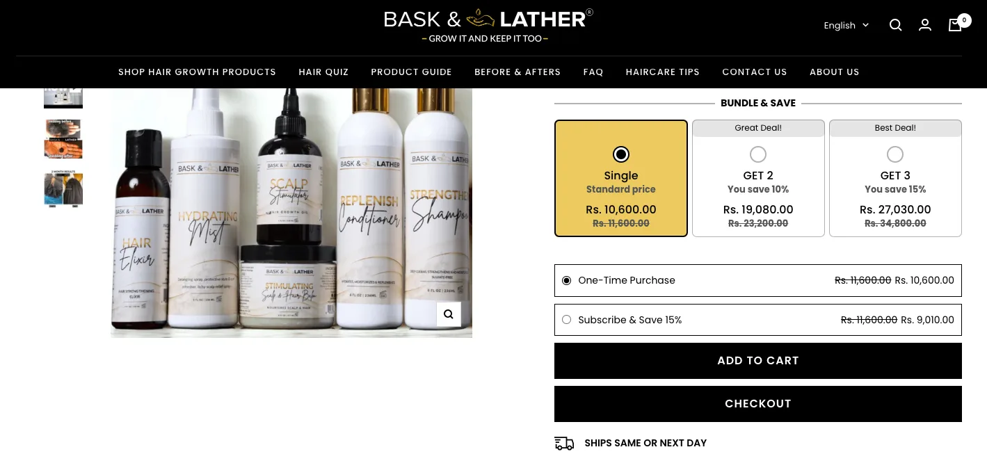
18. Offer Pre-Set Quantity Options as Selectable Tiles
The default quantity selector (a dropdown or +/- stepper) treats all shoppers the same. Pre-set quantity tiles showing a 1-pack, 4-pack, and 8-pack as distinct, selectable options with per-unit pricing, prime shoppers to consider higher quantities in a way that the default selector never does.
Label the tiers to reduce decision effort: "Try it," "Most popular," "Best value" guides shoppers without pressure. Highlighting the value difference between tiers (cost per unit, savings vs. buying singles) makes the higher quantities feel like obvious choices rather than upsells.
LOW IMPACT, HIGH EFFORT— Avoid for Now (or Deprioritize)
These often consume time without proportional returns unless very well executed.
19. Get Bundle Placements Right
Bundles are one of the more powerful tools for increasing add-to-cart rate, but placement determines whether they help or hurt. Drop them in the wrong spot, and they feel pushy; surface them at the right moment, and they feel like a genuine upgrade.
High-leverage bundle placements:
(i) Category page banners
Feature bestselling bundles with clear savings highlighted — "Worth $89, yours for $64"
(ii) Out-of-stock product pages
When a single item isn't available, a relevant bundle gives shoppers somewhere to go rather than bouncing
(iii) Homepage hero
A/B test a "Quick Shop" CTA on your hero banner that opens a modal with bundle sections and individual add-to-cart buttons
The name matters too. A bundle called something memorable and specific tied to an outcome rather than a category, outperforms a generic "Value Pack" every time.
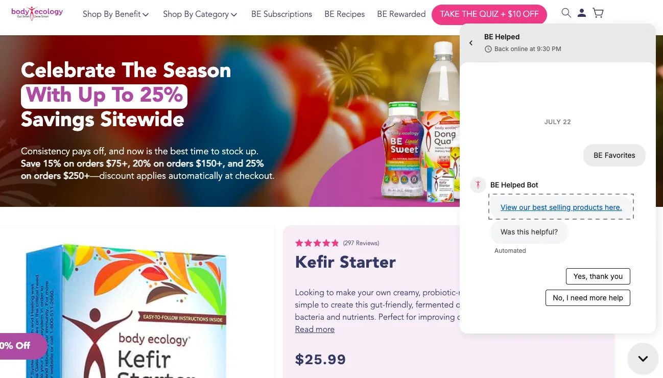
20. Recommend Products Through Live Chat
Shoppers typically turn to live chat when they're uncertain about shipping times, sizing, compatibility, or returns. That moment of uncertainty is also a moment of high engagement, and high-engagement shoppers convert at higher rates when given the right nudge.
Train your live chat (or configure your AI chat agent) to surface relevant recommendations in the right scenarios:
First-time visitors still browsing: guide them toward bestsellers or "most loved" picks
Shoppers asking about value: introduce bundle options
Shoppers whose preferred product is out of stock: offer alternative recommendations immediately, rather than letting them bounce
The best implementations surface these recommendations as a natural part of the conversation, not as an obvious upsell, but as genuinely helpful guidance.
How to Apply This in Practice
Before making any change, ask three questions:
Does this reduce friction or increase motivation?
Will users notice this change immediately?
Can this impact a large percentage of visitors?
If the answer is yes to all three, prioritize it.
Full Add-to-Cart Optimization Checklist
Checkpoint
Why It Matters
CTA
Add-to-cart button visible above the fold
Users shouldn’t have to search for the primary action.
Button stands out (contrast, size, spacing)
Weak CTAs get ignored, even with strong intent.
Sticky CTA on mobile
Keeps action accessible without scrolling friction.
Pricing
Price is clearly visible and easy to understand
Confusion kills momentum.
Discounts/savings highlighted
Reinforces perceived value.
No surprise costs later
Prevents drop-offs due to sticker shock.
Shipping
Shipping cost shown early
One of the top reasons users hesitate.
Delivery timeline is clearly stated
Reduces uncertainty and builds trust.
Product Info
High-quality images with zoom
Users rely on visuals to evaluate products.
Images show product in real-life context
Helps users imagine ownership.
Key benefits visible near the CTA
Reinforces why the product matters.
Social Proof
Reviews are visible near the CTA
Builds immediate trust.
Ratings displayed prominently
Quick validation for new users.
Reviews feel authentic (not generic)
Fake or vague reviews reduce credibility.
UX
Variant selection is simple and intuitive
Complexity leads to abandonment.
Default selections pre-filled where possible
Reduces decision friction.
No unnecessary steps before add-to-cart
Keeps flow fast and effortless.
Mobile
Buttons are thumb-friendly
Prevents misclicks and frustration.
No intrusive popups blocking CTA
Interruptions kill intent.
Page loads quickly (<3s ideal)
Speed directly impacts conversions.
Trust
Return/refund policy easy to find
Reduces perceived risk.
Clear guarantees (money-back, warranty)
Encourages commitment.
Persuasion
Genuine urgency (low stock, time-bound)
Encourages faster decisions.
Bundles or upsells are relevant
Increases value without hurting focus.
Next Steps
Add-to-cart rate is one of those metrics that rewards attention disproportionately. A 2–3 percentage point improvement, which is entirely achievable with the right changes, can translate into a meaningful revenue lift without spending an extra dollar on acquisition.
The place to start isn't the most sophisticated tactic on this list. It's the quick checklist near the top of this page. If you're missing trust signals, your CTA is buried, or your mobile experience is clunky, fix those first. Then use the prioritization framework to decide what comes next.
If you'd like a second set of eyes on your product pages, identifying exactly where your add-to-cart rate is leaking and what to fix, our team offers free conversion audits for eCommerce stores. We've done this across 500+ stores. We know where to look.


.avif)
.svg)

.svg)

.svg)
.svg)
