Every year eCommerce brands lose $18 billion in sales due to cart abandonment.
And this is just the beginning of your problems. Declining customer lifetime value, rocketing acquisition costs, and snowballing ad retargeting costs are the problems that follow.
So, what’s the solution?
Enter cart abandonment pop-ups.
What Is a Cart Abandonment Pop-Up?
Cart abandonment popups appear when customers are leaving behind items in the shopping cart without completing the purchase.
The objective is to convince customers to complete transactions before leaving the site.
While cart abandonment pop-ups aren’t hard to create, knowing what works can help eCommerce brands such as yours avoid costly mistakes.
19 Cart Abandonment Pop-up Examples (eCommerce)
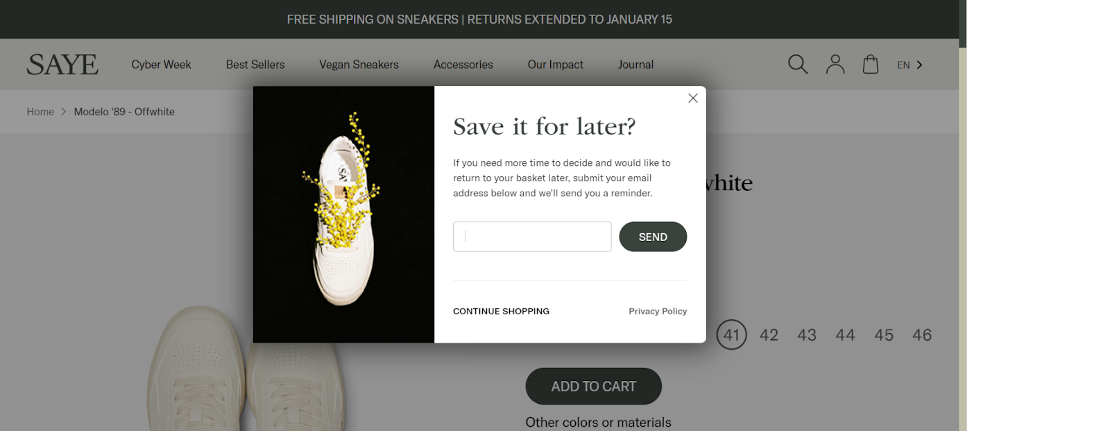
1. SAYE (Be accommodative)
Humans respond well to courteous and accommodative behavior. Something SAYE uses in its Save for Later cart abandonment popup.
We love how they pop the question right when we abandon our cart. It triggers a mental reflex compelling the brain to think of nothing but the question.
What makes it great
Text-to-image ratio: With a black-and-white color scheme, there’s an emphasis on the text without sidelining the image. Using the 80:20 rule can help you design abandoned cart pop-ups that convert well.
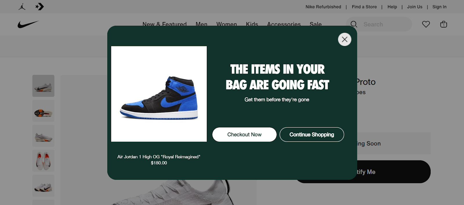
2. Nike (Sprinkle some urgency)
Urgency compels users to act thanks to its partner in crime, FOMO. Nike writes an attention-grabbing copy creating a subconscious urge to act.
While most brands would leave it to chance, the microcopy persuades us to act; capitalizing on the fear of regret.
What makes it great
Uppercase letters: Using uppercase letters in the copy is your way of saying ‘Hey, here’s something important, please read it first’.
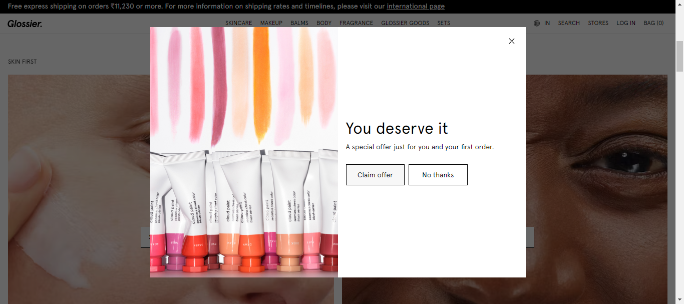
3. Glossier (Evoke a personal connection)
Glossier creates a personal connection by identifying visitors as protagonists. With an incentive, the brand nudges first-time cart abandoners to take action.
What makes it great
Minimalist design: You don’t always need a fancy cart pop-up design, a simple design with an emotional trigger can guarantee higher conversions.
4. Everlast (Remind ‘em once again)
While conventional cart abandonment pop-ups are great, pairing them up with a Pick upwhere you left off pop-up can help you re-engage returning visitors. A simple tip to create consistency in customer journey experience.
Everlast shows you how it’s done, a best practice that can help fuel your retargeting campaigns.
What makes it great
Smooth UX: With 3 products, it is easier to choose. Your customers are highly likely to remember the first and last products in a list—the ideal spots for bestsellers.
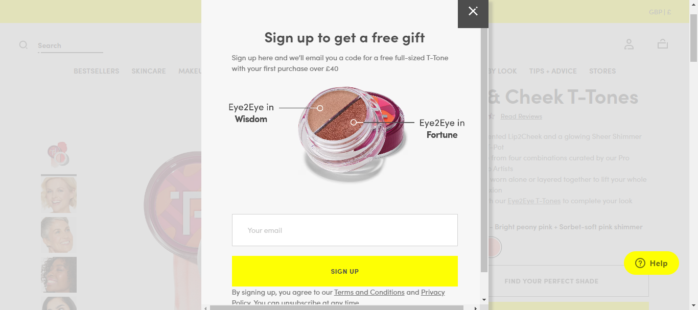
5. Trinny London (Bring in captivating visuals)
Selling a product relies on quality visuals. Trinny London ropes in appealing visuals that pique your interest.
The key element is the annotation—the nouns Wisdom and Fortune make it memorable.
What makes it great
CTA: The color of your CTA button strongly influences conversions. In the above example, yellow signifies positivity and optimism.
Customers may not be sure of what to buy. 38% of customer journeys begin on an eCommerce website. Your site visitors will still be in the consideration stage.
While they may add items to their cart, the intent to purchase might still not be there yet. In such a case, a ‘Save for Later’ abandoned cart popup can help you persuade customers.
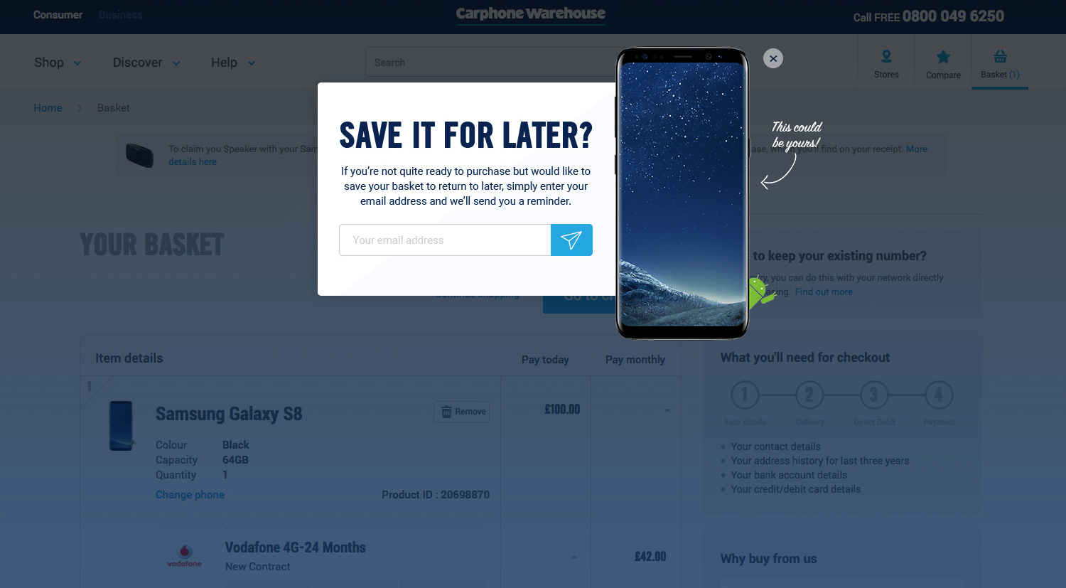
Carphone Warehouse uses a Save for Later abandoned cart popup to persuade customers to resume their purchases.
It offers to send reminders in exchange for emails. An example of reciprocity marketing.
Humans are wired to return a favor when extended. Think of the time when your neighborhood grocery store cashier reserved a few items for you when you were short of cash.
The explicit cue This could be yours guides captivates customers by presenting the sensory information to customers.
What makes it great
Funnel re-engagement: By sending 'Save for later' reminders, your site visitors can be brought back inside the conversion funnel. This way you can nurture customers based on where they’re in the customer journey. Ultimately, email marketing has a commendable ROI, where for every $1 spent, there’s an ROI of $40.
‘FREE’is a magical word that gets customers to break free from rational reasoning. This holds the key to reducing cart abandonment rates on your eCommerce site.
Terra Origin shows this in practice, offering a free gift on the purchase of any product.
Here’s the context—International Women’s Day
The free gift persuades customers to purchase an item because of the higher perceived value. Why? The average price of Terra Origin products ranges from $15-20. This psychologically influences customers to leverage the opportunity because there’s no additional cost involved.
Dan Ariely, a behavioral economics professor, in his book Predictably Irrational states that people change behavior patterns when they see something free. While it's an indicator of price, it taps the innate desire of humans to get something for free without shelling money for it.
This abandoned cart popup example stands out because it combines the power of free with urgency. A potent combination that is proven to increase conversions.
What makes it great
Strikethrough Pricing: The strikethrough pricing makes the reduction of the price more dominant. It is a reference for customers to know the savings offered to persuade them to buy.
8. Colorescience (Offer early access offers)
Early bird offers and Early access have an E in common. Surprisingly, that’s not limited to the alphabet but the principle of exclusivity. With that, comes the bragging rights :)
Colorescience uses the early access principle in its abandoned cart popups. A compelling incentive to complete their purchase.
With sitewide discounts plus a free gift on purchases over $150, customers have irresistible incentives. This influences them to act on impulse and give it a try.
Did you know? 29% of customers will buy a product they have no interest in, if offered a discount. This is because the degree of perceived risk reduces when there is a price reduction.
Sitewide discounts encourage new customers to shed their apprehensions as it builds trust and elicits reciprocity.
Invariably, it helps you sell your slow-moving inventory without hurting your profit margins as the cost is recovered by AOV.
What makes it great
Copy: The copy uses the AIDA framework to get customers to convert.
Attention – Exclusive Early Access for Lasting Beauty Rewards Members
Interest – 25% OFF SITEWIDE No minimums. No product exclusions.
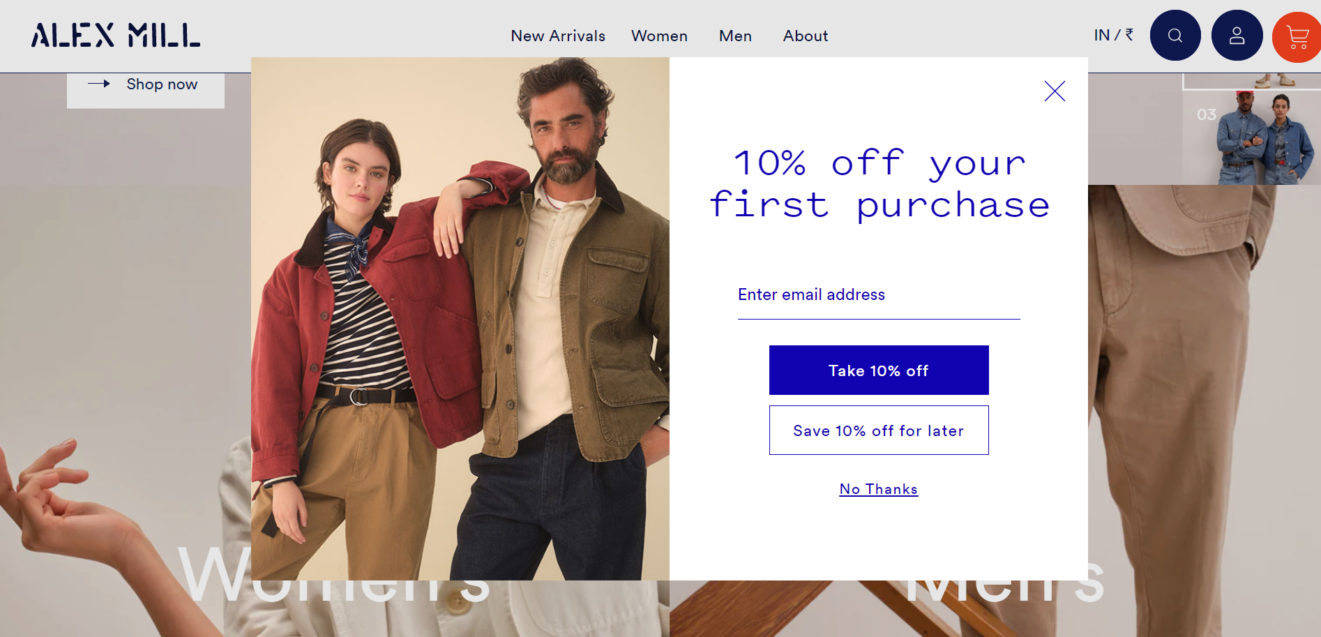
9. Alex Mill (Encourage first-time customers with a percentage off discount)
Percentage discounts are alluring. Believe it or not, 74% of customers prefer discounts with a percentage off savings.
Alex Mill understands this all too well, as evident from its shopping cart abandonment popup.
As per the Rule of 100 coined by Jonah Berger, it was observed that a % off discount works great for products under $100. Let’s suppose, a 10% off on a product worth $60 is the same as $6 off, the former is more appealing than the latter.
This is due to the rudimentary principle of Framing, where people perceive a percentage discount as huge when in reality it’s nothing big. This perception is largely influenced by a cognitive bias—a big percentage of a small number is less whereas a small percentage of a bigger number can be huge.
Another element that Alex Mill gets right is the visual hierarchy. It makes the messaging clear, uses whitespace, and uses a blue color font to communicate the benefit. This enables cognitive ease—the fluency and the ability of the brain to process information responsible for readability.
Finally, it offers customers a chance to save the offer for later, which invokes reciprocity. People will come back and avail the offer.
What makes it great
Images: The images act as visual cues communicating that the offer applies to both men’s and women’s apparel. This removes the ambiguity of any sort. Model images are to eCommerce what mannequins are to physical stores. 78% of customers want images that bring products to life.
The measure of one’s reputation and worth is measured by their possessions. People want to command respect which is the reason luxury goods are most sought after.
GILT offers a 70% discount in its shopping cart abandonment popup.
This popup will trigger conversions because it offers a chance for customers to live an exclusive lifestyle at a 70% discount. Now, one might argue that luxury products that sell for discounts are perceived negatively by customers.
However, Gen Z are one of the demographic groups that have a keen interest in luxury products. While this demographic doesn't have a high income, these form 24% of the luxury customer base.
This age group craves self-esteem, prioritizes social validation, and displays their social and personal beliefs on the internet.
This abandonment cart popup is effective because it relays the benefits like new sales deals daily and free signup.
What makes it great
White space: White space helps in easy comprehension while improving legibility. It guides the user from one element to another enhancing visual capacity.
Customers need more incentives, more rewarding experiences, and ultimately more savings.
Here’s a textbook shopping cart abandonment example from SAXX offering dual incentives—10% off for email signups and 15% off on agreeing to receive texts.
According to Google, 90% of customers are willing to share their email addresses for incentives like discounts and free samples. Furthermore, 65% of customers don’t mind sharing their personal information, albeit for a great customer experience.
The stats paint one true picture—Customers sign up for these incentives because the perceived benefits are twice as powerful as a single discount. The privacy policy takes customers into confidence that their data is safe. It outlines how the data is collected, stored, used, and shared.
What makes it great
Red font: The discount marked in red incites a sense of urgency for customers to act. It visually captivates users by reinforcing the offer making it more apparent.
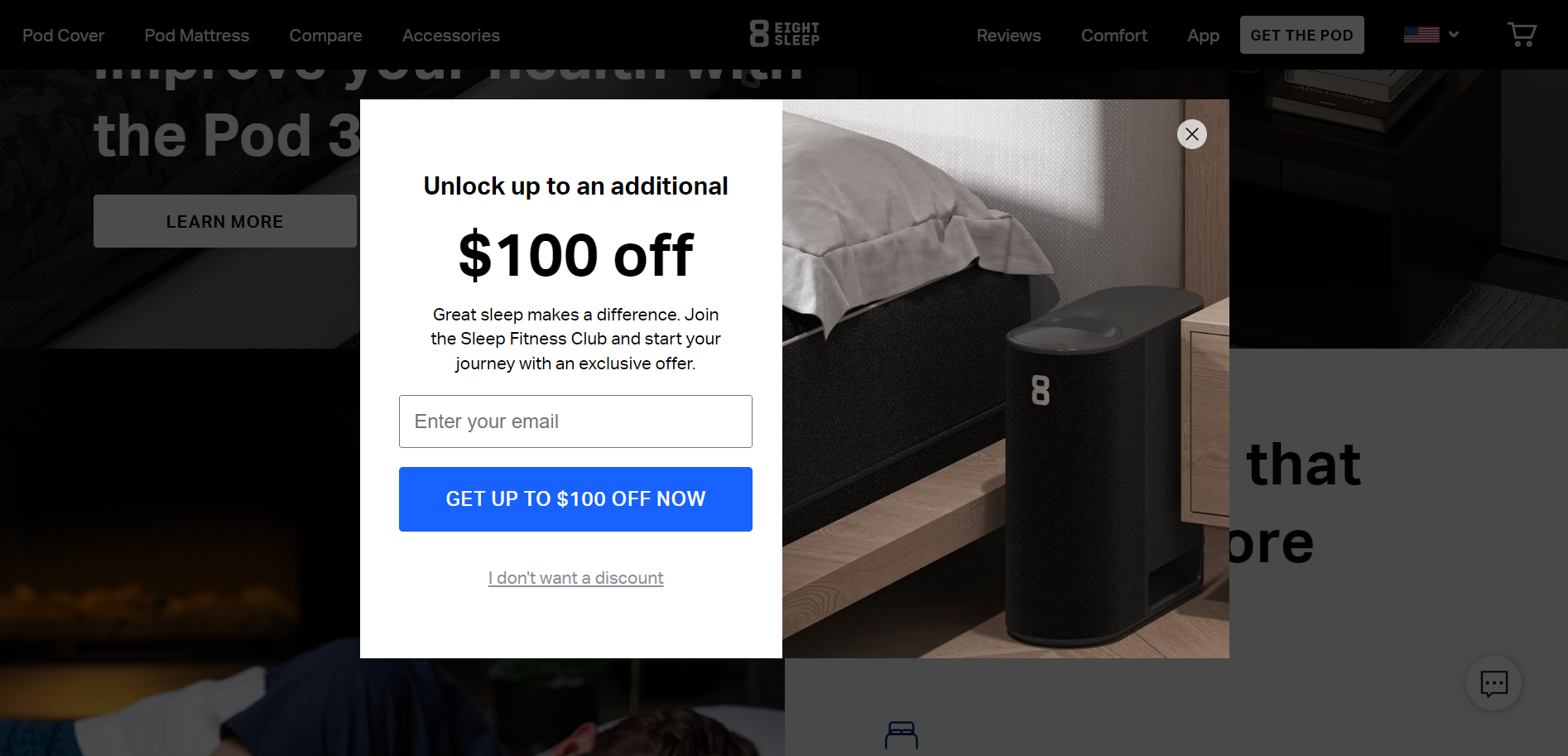
12. Eight Sleep (Provide exclusive experience as an incentive)
Customers want more than discounts. They want personalized experiences and rewards in exchange for loyalty.
Eight Sleep offers $100 off in exchange for email options with an exclusive offer— Sleep Fitness Club.
As a cart abandonment popup, this serves as an inspiration to highlight intangible benefits. While the tangible product is a mattress, Eight sleep is presenting a good night’s sleep as an intangible benefit. The copy Great sleep makes a difference draws the attention of customers evoking a subconscious trigger to take advantage of the offer.
The $100 discount increases the perceived value of the product as the average price is over $1000. This makes it more apparent since a $off discount works well for items over $100.
With 35.2% of US adults sleeping for less than 7 hours, sleep deprivation has become a cause of concern. The Sleep Fitness Club offers a solution to this problem.
What makes it great
Hero Text: The text $100 off appears bigger than the rest of the elements helping customers understand the image. This hero text expresses a distinct, tangible offer whilst enabling readability.
13. Pulp & Press (Woo customers with a sweepstake)
Humans like to try their luck especially when there’s a reward. Pulp & Press offers a sweepstake contest in its Shopify abandoned cart popup where one lucky winner can win up to $5000 in cash.
Sweepstake contests can help you create awareness and build the much needed promotion for your brand. This evokes reciprocity marketing since customers don’t necessarily have to buy to participate in the contest.
Fun fact, 34% of customers are acquired through contests such as sweepstakes. Props for the terms and conditions in enabling transparency.
While customer acquisition is a given, sweepstakes help you collect first-party data. This helps you enhance your organic/paid campaigns and personalization efforts.
What makes it great
Pronouns: The use of second person pronouns such as You and Your increases customer involvement bringing about the self-referencing effect.
14. Blume (Build trust with sitewide discounts + free returns)
As with all iconic duos in history who created a niche for themselves, sitewide discounts and free returns are the most popular duo in eCommerce to establish trust.
Blume offers a 20% sitewide discount plus free returns in its Shopify cart abandonment popup.
This cart abandonment popup works because of the anchoring bias—the human tendency to rely on the first piece of information presented to us. It makes customers take it as the final say instead of evaluating it critically. The use of capital letters for 20% OFF SITEWIDE influences customers’ perception of the brand as competent.
And free returns inspire confidence in customers by reducing the feeling of loss aversion with 79% of customers confirming the same.
What makes it great
Color: The blue color for the text and CTA invokes preattentive processing, the body’s processing of sensory information that takes place before the conscious mind starts paying attention. This makes the information easy to comprehend.
15. High Sierra (Persuade with limited-time offers)
Limited-time offers hook customers like no other. According to NRF, 90% of customers bought items that they hadn't planned to buy originally because of the increase in perceived value.
High Sierra offers 20% off for 24 hours in its shopping cart abandonment popup.
The potent effect of urgency and scarcity triggers impulsive buying in customers. With the offer valid for 24 hours, there is real urgency that is more persuasive.
The copy DON’T LEAVE reinforces the message and holds the customer’s attention. The exclamation mark after 20% OFF emphasizes how good the offer is.
What makes it great
Power Verbs: The word Unlock is a power verb that piques the interest of the user to take action.
Flash sales have been here for quite a while. They help you get brand visibility, increase sales during slump season, and sell excess inventory at low rates.
Learn how to create an abandoned shopping cart popup using this example from Great Jones.
Flash sales like these increase the transactional rates by 35%. Not only do they help increase new customer acquisition but also lead to customer loyalty.
Pricing is the key factor influencing flash sale purchases. 65% of customers look for price comparisons prompting 51% of the purchase decisions.
What makes it great
Image: The image of muffins activates the area of the brain responsible for gustatory experiences. Gustatory refers to the sense of taste and eating. This drives customers to take action.
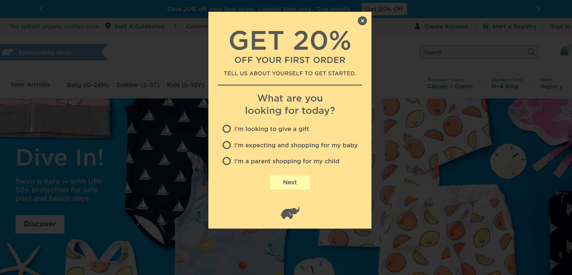
If you think surveys and pop-ups aren’t a good idea, think again. Here’s a cart abandonment popup example from Monica+Andy that gives contextual data.
Contextual data provides a broader understanding of the customers and helps analyze customer behavior patterns. This provides the foundation for personalization, product recommendations, and product discovery.
Conducting product discovery surveys create a favorable brand perception in the minds of customers. It helps customers match their intent to the products they like marking the start of a great user experience on the site.
What makes it great
Question: The open-ended question What are you looking for today? is a rational trigger. It kindles the neocortex(new brain) instrumental for sensory perception, generation of motor commands, spatial reasoning, and conscious thoughts in humans and language.
18. Burga (Build buzz with a mystery discount)
Humans are inherently curious beings. It’s all but impossible to stay away from events that pique our innate drive to know more.
Burga uses a mystery sale in its abandoned cart abandonment popup.
Mystery sales are effective as it activates the dopamine in the brain to know more about the mystery. While this provides an incentive for customers to click and know more about the sale.
During a mystery sale, the customer only gets to see the discount when they move to the checkout page.
It invokes reciprocity in action as customers are given a discount after a certain step. But, be sure to offer real value.
What makes it great
Copy: The ellipses(those three dots you see) build suspense and psychologically build enthusiasm nudging users to click.
19. Ashley & Co. (Crank it up with a gift card contest)
Customers who abandon their carts can be converted with gift cards as a last resort. Ashley & Co. captivates customers with its Shopify abandoned cart popup with a chance to get a $500 e-gift card.
Before we talk about gift cards, the success of this popup is high because it requires a minimal effort that has the possibility of a successful outcome. Gift cards serve as an incentive for customers to spend more as they serve as a substitute for cash. This allows them to spend more.
Interestingly, 45% of customers spend more than the value of the gift card when they redeem. Gift cards offer convenience—allowing customers to buy things of their choice.
During the holiday season, gift cards make a handy gifting option for last-minute shoppers.
What makes it great
Two-column layout: A two-column layout divides the area into equal proportions making enough space for content and images. This makes it clutter free and ensures readability.
Best Practices For High-Converting Cart Abandonment Pop-Ups
1. State social proof by the numbers
Social proof isn’t reserved for your product pages or below-the-fold content. They can be a part of your abandoned cart popup.
To make it more compelling, mention the number of customers that have benefitted from your product. Your website might already have the content.
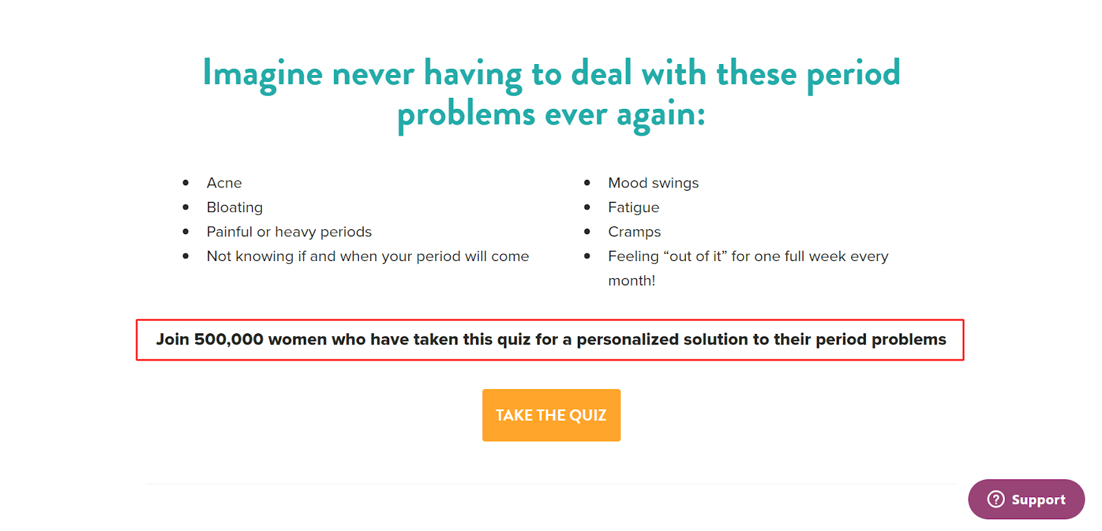
For instance, Flo Living uses collective social proof on its website to persuade customers to take the quiz.
Collective social proof invokes the Bandwagon Effect—the human tendency to adopt beliefs, attitudes, and behaviors because others are doing it. In eCommerce, when a large number of customers have bought a product, it seems highly desirable for your site visitors.
Think of the time when you wanted to buy a laptop, but changed your mind when your peers decided to buy a laptop with a touch screen. This is solely due to the inherent conditioning of humans to practice conformity.
Before we go, here are a couple of pointers when using collective social proof:
Use odd numbers to create trust and even numbers for symmetry
Choose a number that is memorable such as the one ending with 0
Use prepositions such as over, plus, and counting to strongly express continuity
2. Make the number the hero of the pop-up
When the customer has made their mind to leave, your cart abandonment popup should convince them otherwise.
All of this in 5 seconds!
Sounds impossible? Not really!
The number in your abandoned cart popup should be the hero. The larger the font, the easier it is for customers to process the information.
The above cart abandonment popup example brings forth the principle of preattentive processing. It refers to the subconscious processing of the information available in the environment. All of this is possible in just 200-500 milliseconds for the brain to register in spatial memory.
With these tips, your hero text will be ready in no time:
Use bright colors for the hero text to reduce cognitive strain
Ensure the hero text and the CTA are the same color to enable visual hierarchy
Use ellipses in your hero copy to reinforce the suspense and curiosity to know more
3. Leverage the power of visual cues
Visual cues direct the user's attention to the areas of importance. Can you do without them in your abandoned cart popups?
Let’s face it. Texts with images are more compelling than text-only cart abandonment popups. A pinch of visual cues can nudge customers to buy thanks to sensation transference.
Sensation transference refers to the subconscious assessment people make about a product solely based on visual cues. Here’s an example of a cart abandonment popup from Ritual using a visual cue.
The image gives an accurate description of the product bundle. It bridges the gap between the actual product and the online representation of it. The use of the hands is a suggestive cue conveying connection. It signifies human touch directing the users toward the CTA.
Implement these pro tips to leverage visual cues in your shopping cart abandonment pop-ups:
Use directional cues like arrows and pointers in your CTA as an attention hook
Use emojis to communicate emotions and messaging better
Feel free to use the return policy or terms and conditions to enable heuristics and address objections
Price skimming, the lesser known twin of strikethrough pricing can dissuade customers from abandoning their carts as it offers a sense of brand exclusivity.
Customers are prone to buy when a high priced or premium product is priced less for a limited time. It helps in profit maximization and generating buzz among customers.
Here’s how using price skimming in your cart abandonment popup can become a conversion driver—Early Adopters. This customer type will be ready to pay a higher price for a high-priced product because of its perceived value. As this group of customers will flaunt their product, price-sensitive customers will capitalize on the opportunity to buy at a discounted price.
Simple tips to pull price skimming strategy work for you:
Use a countdown timer to enable urgency and scarcity. Works great for premium products.
Include stock alerts to intensify scarcity.
5. Communicate urgency with countdown timers
Countdown timers are an all-time strategy to increase sales by the minute. Timing your pop-ups can increase AOV by converting the exit intent to purchase intent. Interestingly, the conversion rate for timer pop-ups stands at 10%.
Countdown timers create a situation where there’s a virtual contest between customers with no geographical limitations. It increases adrenaline by the minute.
It increases FOMO and strengthens the offer without being pushy.
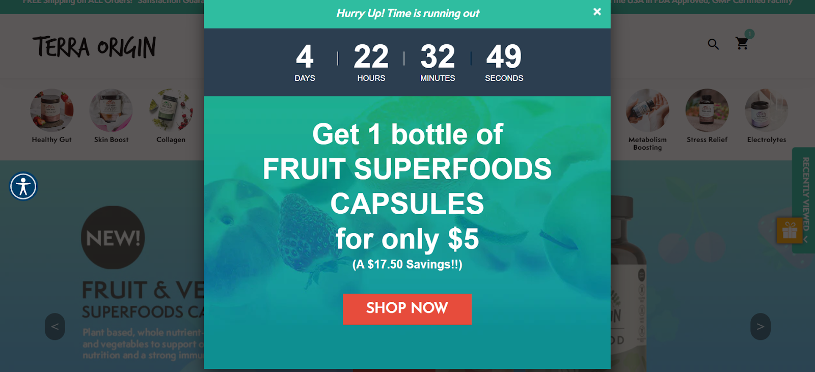
Terra Origin uses a countdown timer popup to turn exit intent to purchase intent.
The central copy lays down the offer and increases the perceived value with the use of an adverb only and the savings. The pop-up makes use of the 60-30-10 rule where the dominant color occupies 60%(aqua blue), the secondary color constitutes 30%(white), while the accent color at 10% (navy blue) maintains the balance, enriching the exit intent.
To make your timer popups optimized for conversions:
Mention the savings using the strikethrough pricing
Use CTAs that stress urgency such as Grab Now that influence users to take action
Mention the number of customers viewing the item to create an impulse purchase
Wrapping up
Cart abandonment popups should reduce dependency on your cart recovery emails. It should convince customers at the exit-intent stage that they are losing out on irresistible offers. The above tips and examples can help you turnaround your cart abandonment rates in less time.


.avif)
.svg)

.svg)

.svg)
.svg)
