92.6% of customers opine that visuals and imagery are the numero uno factor influencing purchase decisions.
And, this builds lasting first impressions.
Enter, Visual cues, the unsung hero leading conversions through a rich UX experience.
Visual cues are perceptual signals that influence where users look. In an eCommerce website, it includes symbols, techniques, nudges, colors, etc
In today’s blog post, let's learn how visual cues on eCommerce websites can help better conversion rates in 22 ways.
Visual Cues on product pages
1. Supplement product descriptions with images
Colors and images have an enduring effect on customers.
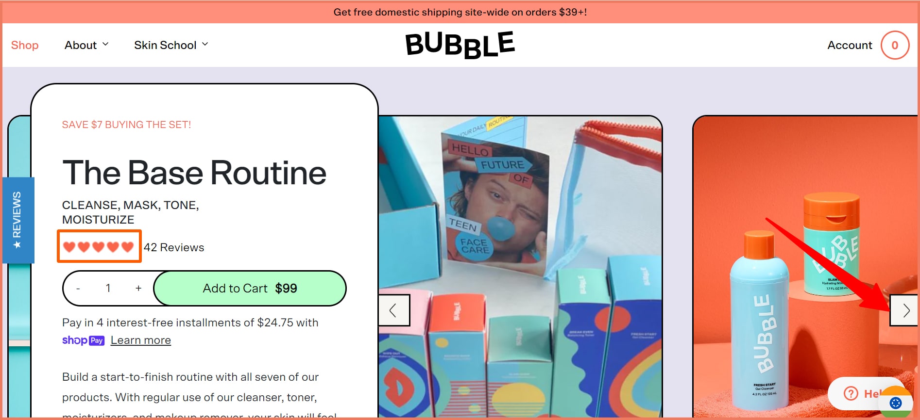
Bubble uses rich illustrations, emojis, and arrows as directional cues on its product pages.
Pro Tip
Emojis: A heart emoji is highly recognizable. It grabs instant attention. 71% of Gen Z are ready to buy products using emojis in advertising.
Product Images: Product images increase the buyer’s attention, customer’s trust, and conversion rates. 75% of customers rely on product images to make a purchase decision.
Arrows: Arrows are explicit cues. They direct the user’s attention to the direction.
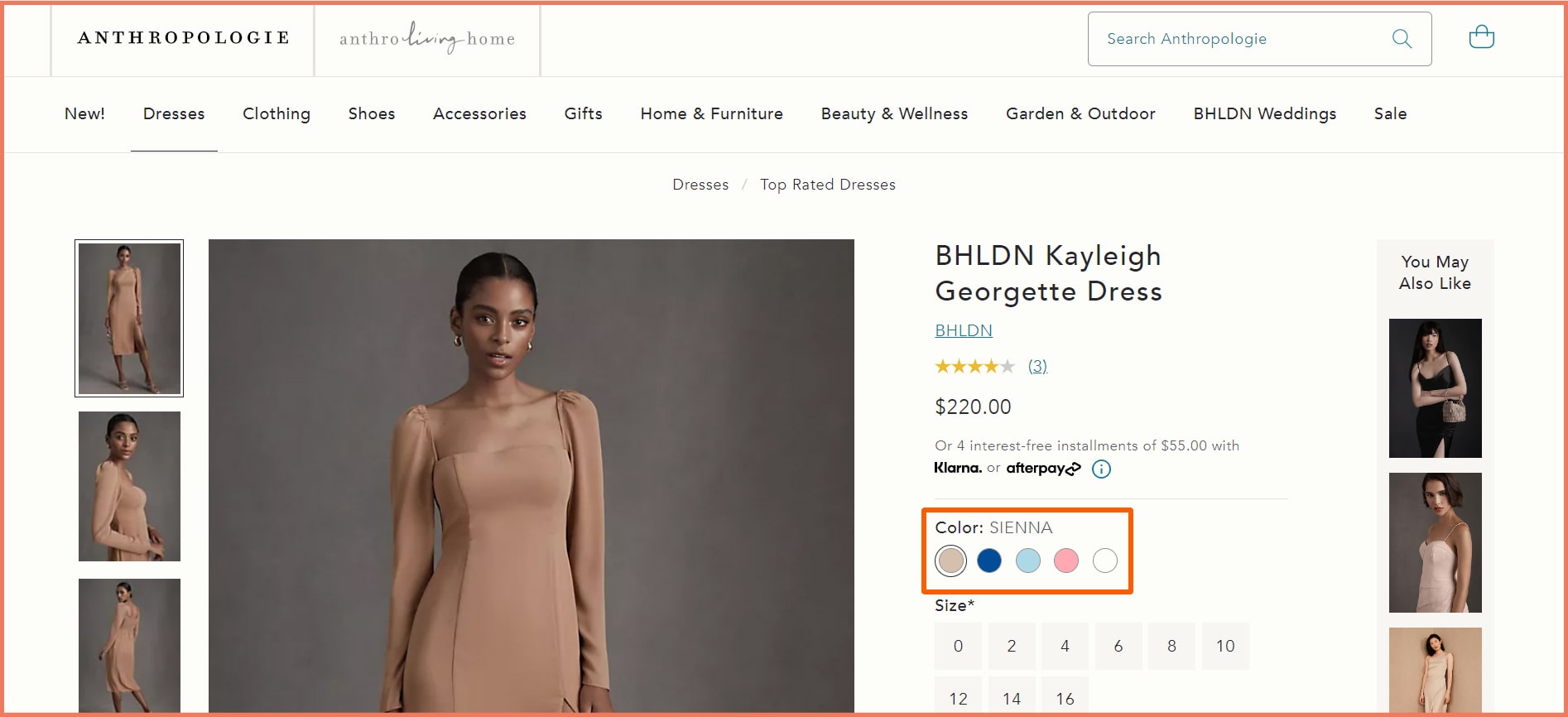
2. Arouse interest with colors (Use Product variation swatches)
Product variation swatches convey that you have the product in different colors which is a key factor in purchase decisions.
Anthropologie uses a color swatch variation on its product page.
Pro Tip
Color Psychology: About 85% of customers are influenced by color psychology. Colors evoke different emotions which may persuade customers to buy.
Shapes matter: A circle is easier for the brain to process as opposed to squares and hard lines. This is a thumbs-up from a UX perspective.
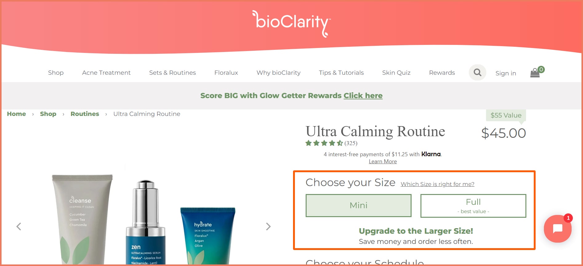
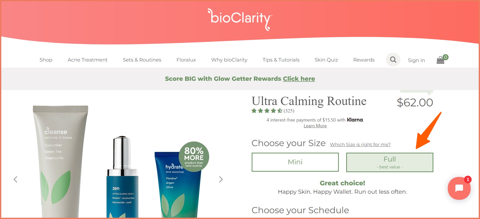
3. Separate CTAs for product size
Size can only be better shown in the form of images.
With the Size buttons, customers can assess their requirements and then make a decision.
The full-size pack has 80% more which is an upsell nudge.
Pro Tip
CTA Button: The ideal size of a CTA button is 42-72 pixels. This makes accessibility and cognition easier
Border color: When using white color in your CTA, a color border can help stand out help in terms of UI and UX
Alternatively here is a design cue for sizing used by Lush.
With the change of size model icon, there can’t be another way to communicate sizing.
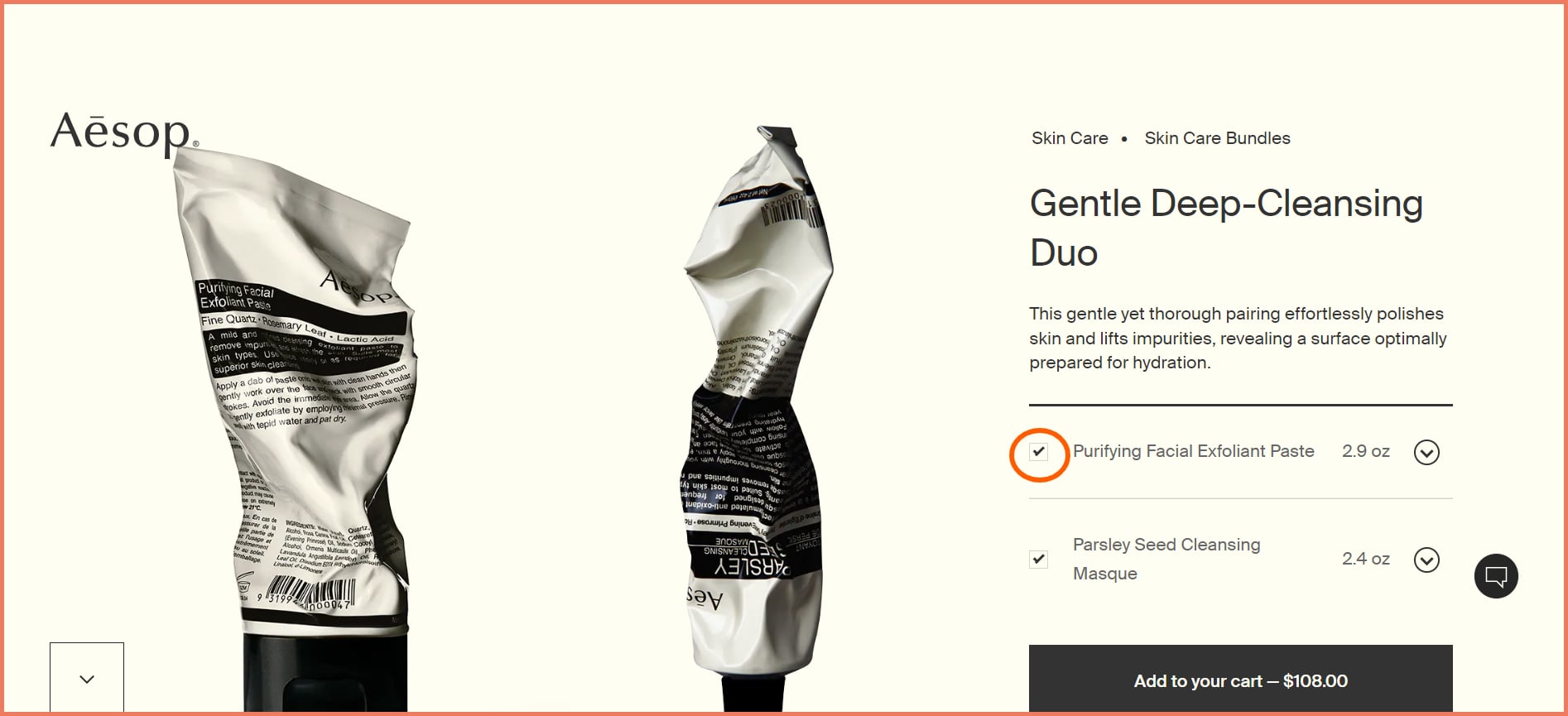
4. Interactive Gallery: An option to Add/Remove items
Product bundles can increase your AOV but having the option to opt out is seldom there.
Aesop has the option to add/remove the items in a bundle where the item removed disappears.
Pro Tip
Peculiar images: Product images that aren’t picture-perfect create a subconscious trigger making it memorable. Customers aren’t likely to forget you after the interaction.
Checkboxes: Checkboxes allow customers to select what they want. This is a plus when it comes to UX design. No one likes pushy brands.
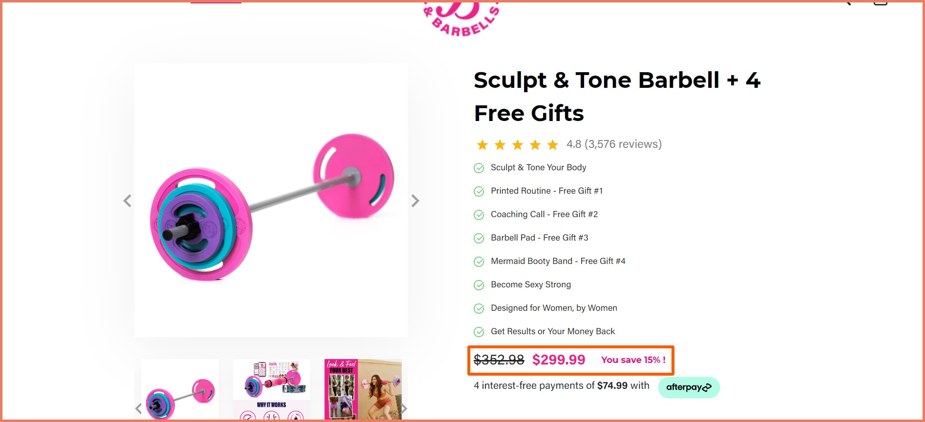
5. Pair strikethrough pricing with a different color
Strikethrough pricing increases the perceived value of the product. This is explained by the anchoring effect. Customers need a base point as a reference for assessing an offer.
Strikethrough prices make the advantage of pricing highly apparent to the customer.
Pro Tip
Colored font: Using a colored font evokes a subconscious trigger. Pink is the brand color that can help in brand identity.
Savings: Make the math easy for customers or your customers will abandon their carts.
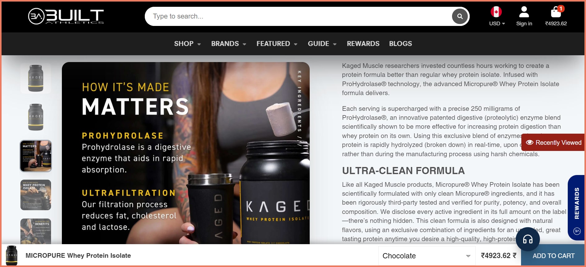
6. Use descriptive text to make product images ‘engaging’
Descriptive text helps communicate the product features, benefits, and other information better. It helps customers gain knowledge about the product which helps them pique their curiosity in the product.
Built Athletics is used in descriptive texts in product images.
Pro Tip
Educate and engage: Just educating users about the product can compel enough to them
Transparency: Shady and unethical practices are becoming prevalent in some industries. By coming clean on the manufacturing process and ingredients, trust is built.
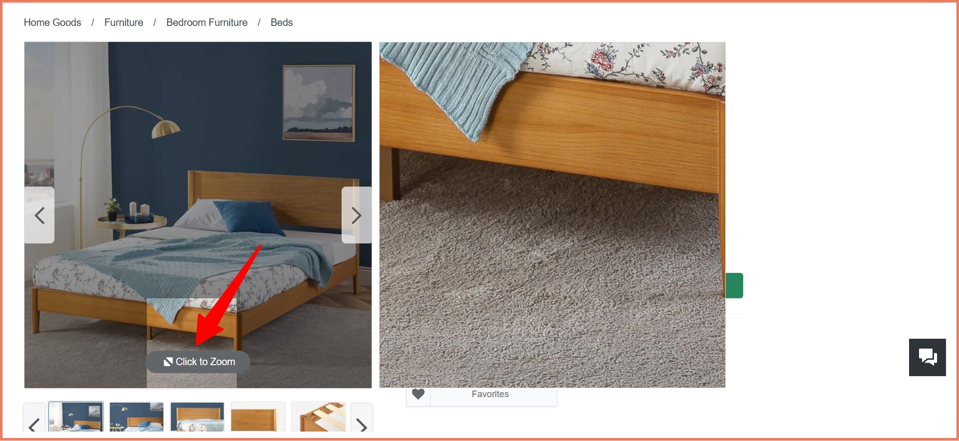
7. Highlight Zoom for a magnified view
A zoom option for product images is a major UX prerequisite.
Pro Tip
Images sell: Product images that bring products to life are crucial when it comes to purchase decisions. 75% of customers rely on product images to make a purchase decision.
Reduce returns: 22% of eCommerce returns were because of products that looked different from the one that was ordered.
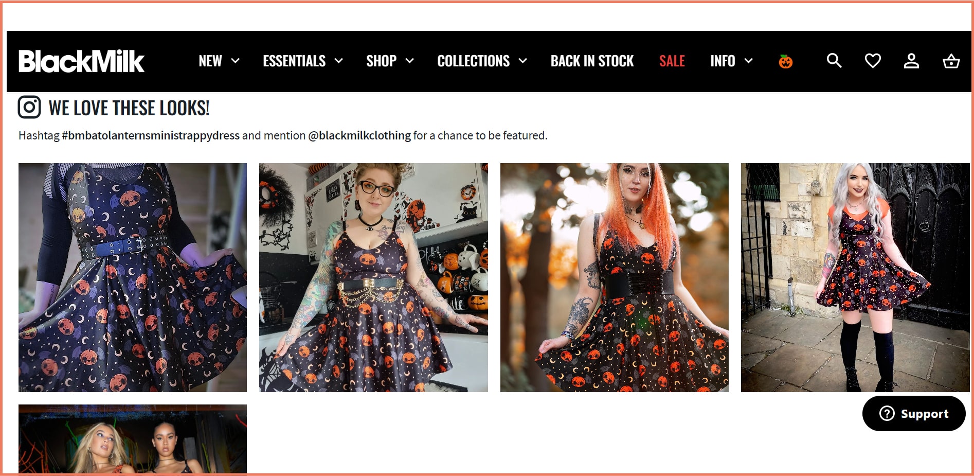
8. Sell through visuals: Use images, videos, GIFs
Using rich media formats such as social media images, how-to videos, and 3D images can increase the perceived benefit of the product.
Black Milk Clothing features social media images on its product pages.
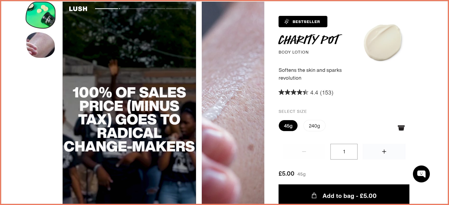
Lush includes story-type visuals that hold the user’s attention for long enough.
Pro Tip
Visuals sell: 90% of the information transmitted to the brain is visual. Rich media formats can persuade customers to buy. Using 3D images can increase the conversion rate by 40%.
Social proof: Featuring UGC on social media is the strongest social proof. 92% of customers trust non-paid reviews instead of paid advertising.
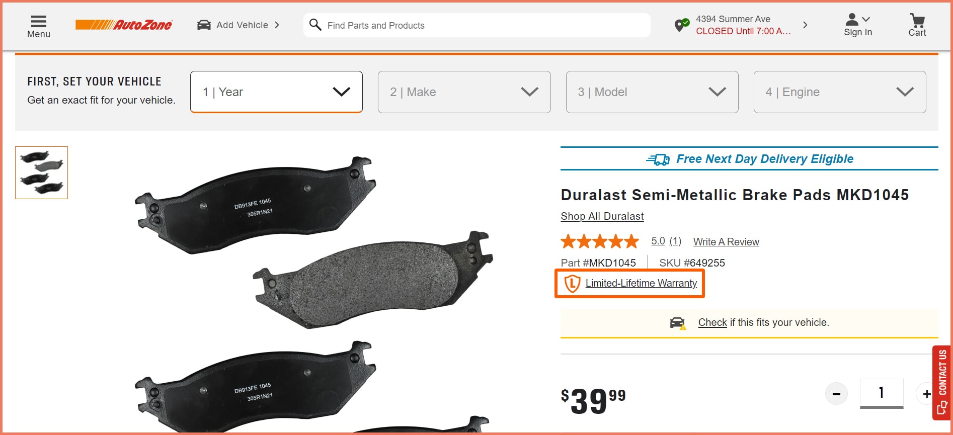
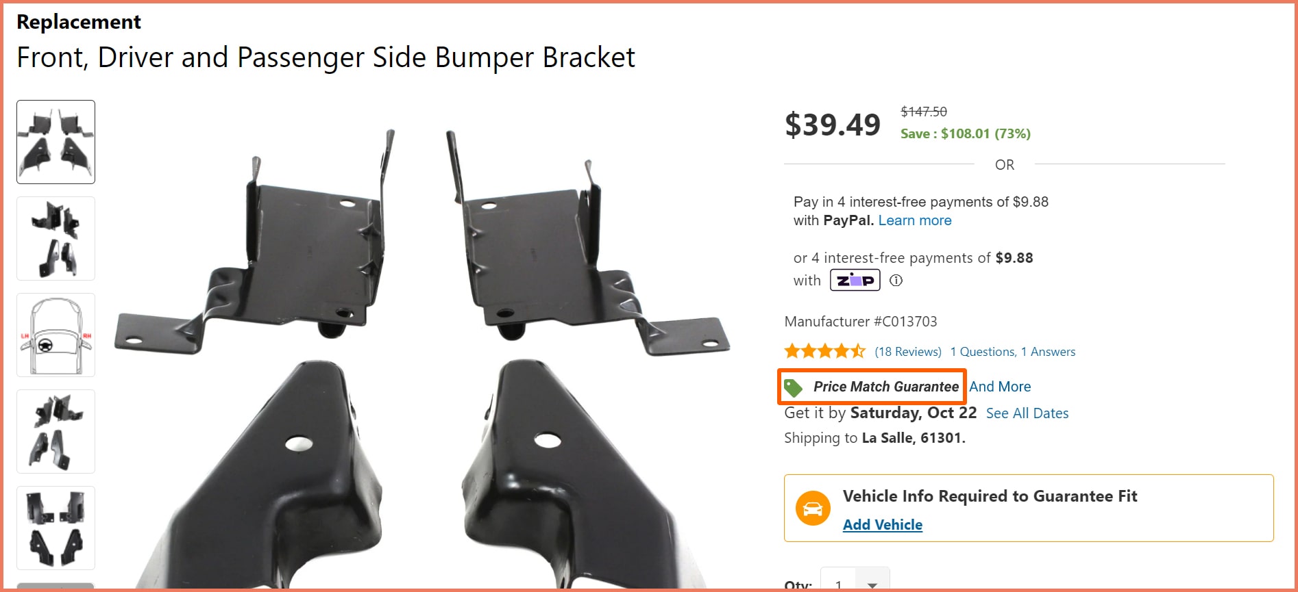
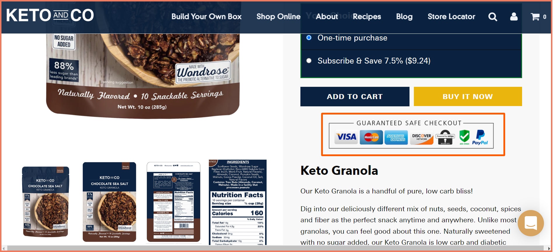
9. Demonstrate promise with emblems
Emblems convey trust signals and assurance.
AutoZone assures a limited lifetime warranty for its brake pads.
CarParts has a price match guarantee ensuring the best price.
Keta and Co assure customers that their financial details are safe and secure.
Pro Tip
Warranty badges: Warranty badges convince customers about a product’s durability. It addresses the risk aversion associated with the product.
Price-match guarantee: A price-match guarantee promises the customer a refund of the difference if they find a lower price post-purchase.
Payment secure badges: Payment secure badges guarantee the customer that their card details are safe and secure.
Visual Cues for Shopping experience
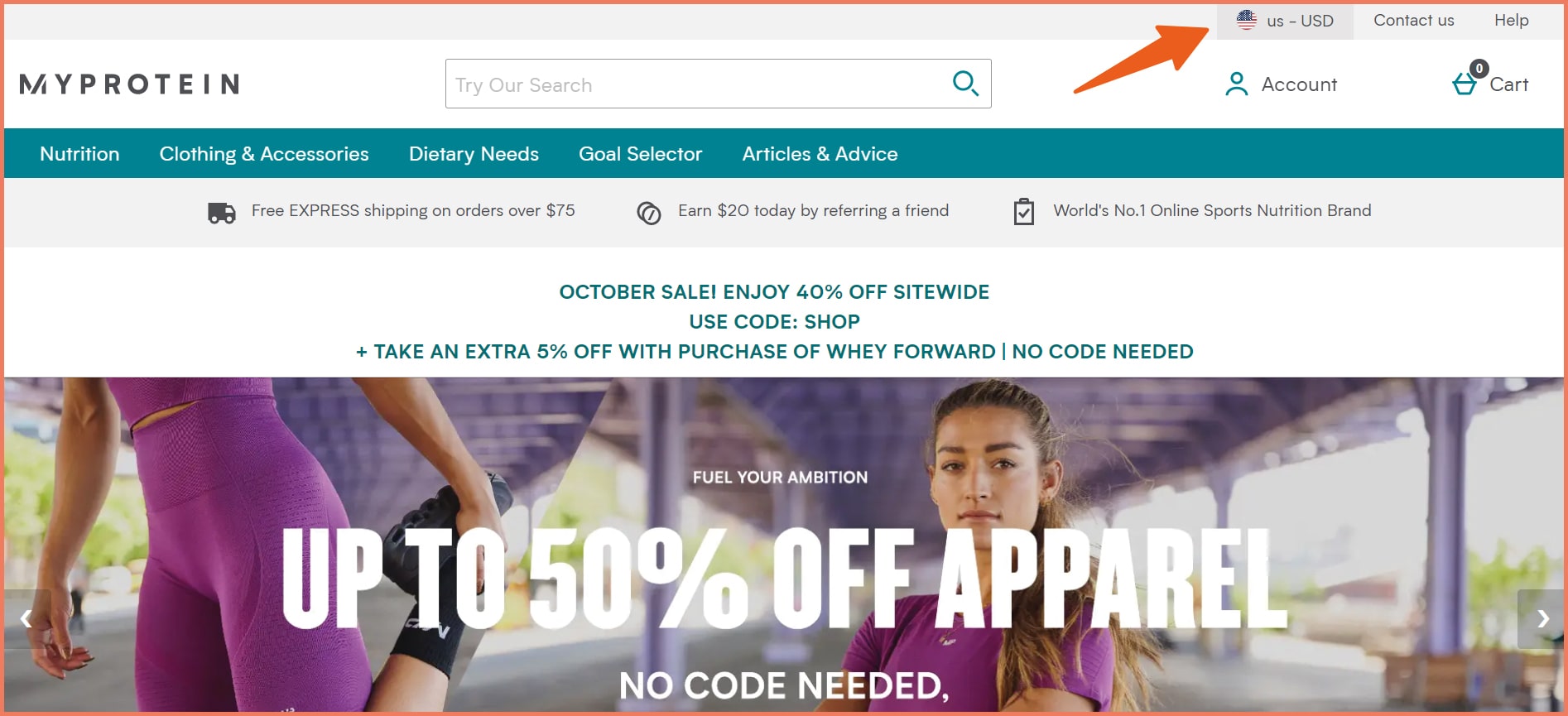
1. Make international shipping option prominent
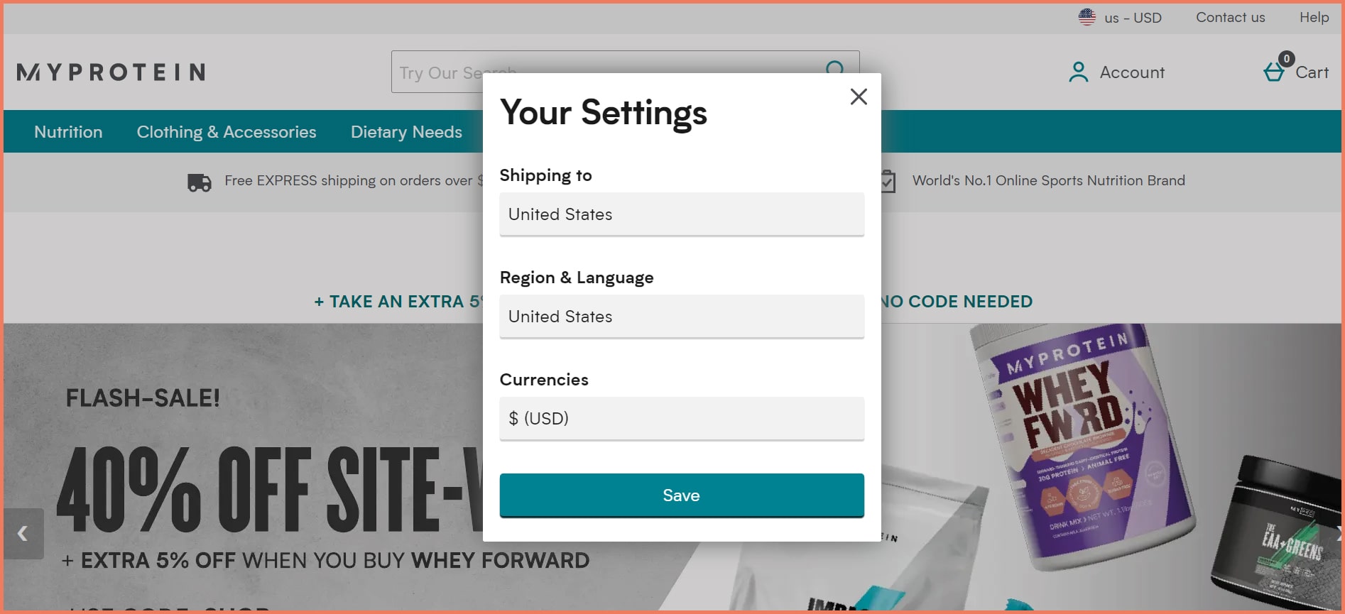
MyProtein uses a visual cue on its website for international shipping, region & language, and currency.
On clicking it, a popup window opens like the one below appears.
Pro Tip
High visibility: By including the international shipping option in the top right corner, users will be able to see it. High visibility on the website leads to higher conversions. This is a plus point for a great UX.
International customer acquisition: Providing international shipping serves as an opportunity to acquire foreign customers. 40% of customers make international purchases due to better availability while 22% were keen to purchase but international shipping wasn’t available.
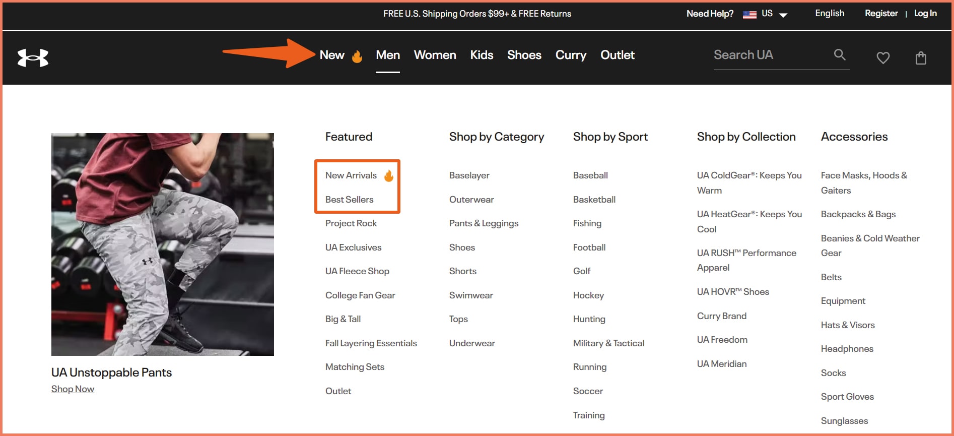
2. Feature New Arrivals with an emoji (make it pop)
Bestsellers and new arrivals indicate popularity. It enables social cognition that if other people are buying it must be good.
UnderArmour uses a flame emoji for New Arrivals and places the Best Sellers right below it.
The flame acts as a visual cue for cool, awesome, and exciting. Using emojis as a visual cue is a plus since it covers all demographics.
Pro Tip
Cognitive ease: With the black and white font/background combination, visitors can easily read the letters. This enables cognitive ease — the ability of the brain to easily process information.
Positioning: Since the New Arrivals and Best Sellers are included in the first column, users are highly likely to click
Site search is a critical component of the shopping experience. With site search responsible for producing 1.8x of the conversions, it’s time you used visual cues in your product images and autocomplete.
Warby Parker uses product images as visual cues in its site search.
This works well as customers are exposed to different options. Remember, not every site visitor knows what they want, this can help them find products that cater to their needs.
Another great hack is to use product images plus autocomplete suggestions in your site search.
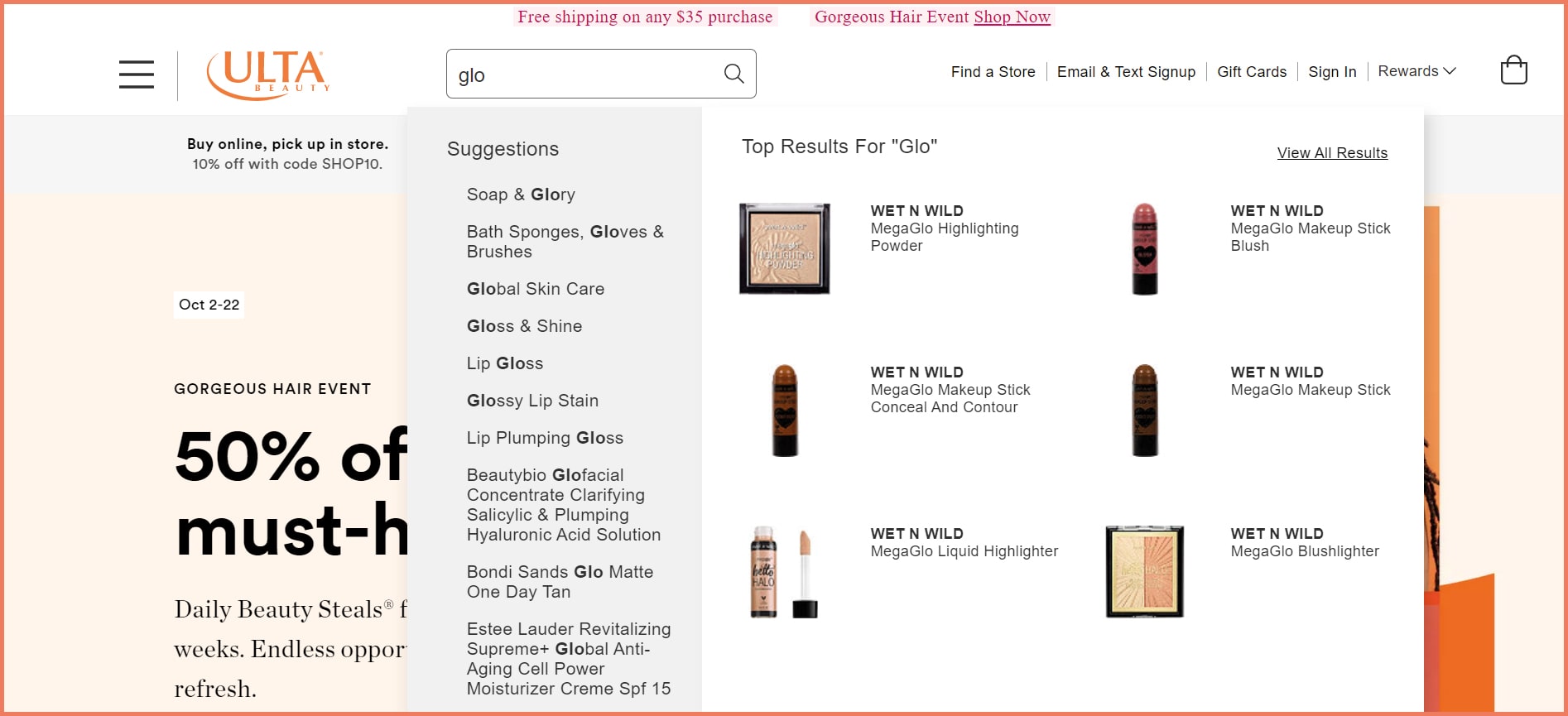
While the importance of site search is severely underestimated, 45% of revenue came from 15% of the users who used site search.
Ulta Beauty uses autocomplete suggestions plus product images in its site search.
Pro Tip
Product discovery: Providing product images and autocomplete suggestions enable product discovery. It provides a better shopping experience and customized searches. Interestingly, 50% of customers opined that images helped them decide what to buy.
Better user experience: Since images play a decisive role in purchase decisions, 78% of customers want images that bring products to life. With clear images and the option to view all results, this is a fine search experience.
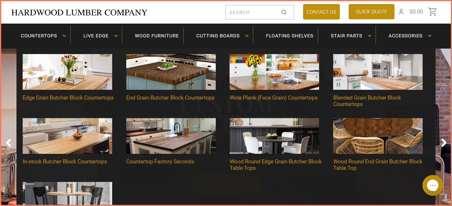
4. Add anchor images to product categories
‘A picture is worth a thousand words’ is not just an adage but an eternal truth. In eCommerce, when users are still not sure of what to purchase, an image can make better decisions.
Hardwood Lumber Company has added images to its product category dropdown.
This helps in educating customers about the range of products when you are in an industry where customers aren’t knowledgeable.
Appealing images depict a product in an aesthetically pleasing manner. All the images above look like a paradise. This is the whole point of including product category images in the dropdown.
Pro Tip
Reduces decision paralysis: Images that clearly show the differentiation, help customers in decision-making. The name and the images make decision-making easier as it enables cognitive ease.
Minimizes the exit rates: When users aren’t able to find products within the first seconds, they exit. With the product category dropdown, users can explore products increasing the on-page time. This is an opportunity for potential conversion.
Quick view and images on hover provide convenience to users without having to go to the product page.
This also is thumbs up for great usability when done well since they are navigational cues
Bonobos shows a rear image of the product on hover on its product page.
This is a visual cue for a product display. It shows the rear view of the product which can help users see the fit and look closely.
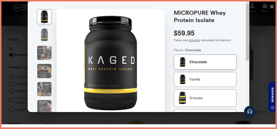
Built Athletics has a Quick View appearing on the hover on its product page. It allows users to view the product without having to go to the product page.
The preview opens a new window where users can look at the product without having to go to the product page.
Pro Tip
A quick view option is a better alternative to Quick buy since it does not come across pushy
Providing to link to product information makes a case for a pleasant customer experience
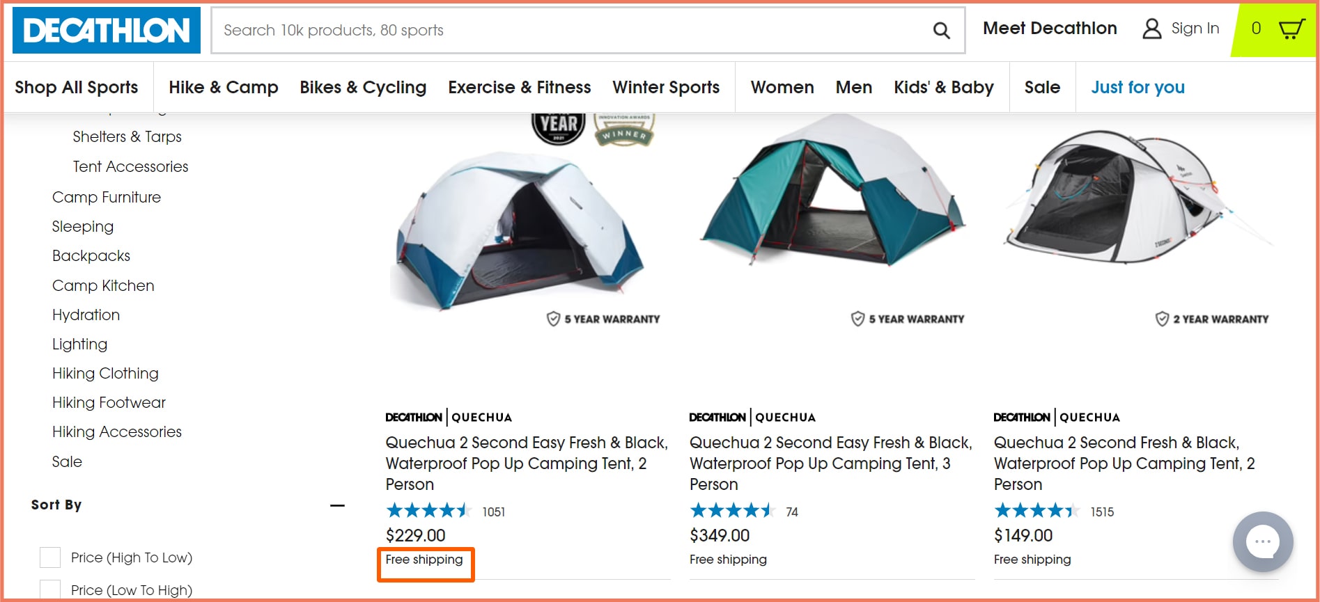
6. Write free shipping in BOLD
Free shipping is an incentive for buying decisions. 90% of customers will buy more often if offered free shipping.
Decathlon uses free shipping as a visual cue to attract customers.
Pro Tip
Reciprocity: Free shipping conveys reciprocity. As per this principle, customers are more likely to return a favor when offered one.
Last-minute shopping: Express shipping has a higher influence on purchase decisions. 33% of last-minute shoppers choose to buy products based on how soon they can get them.
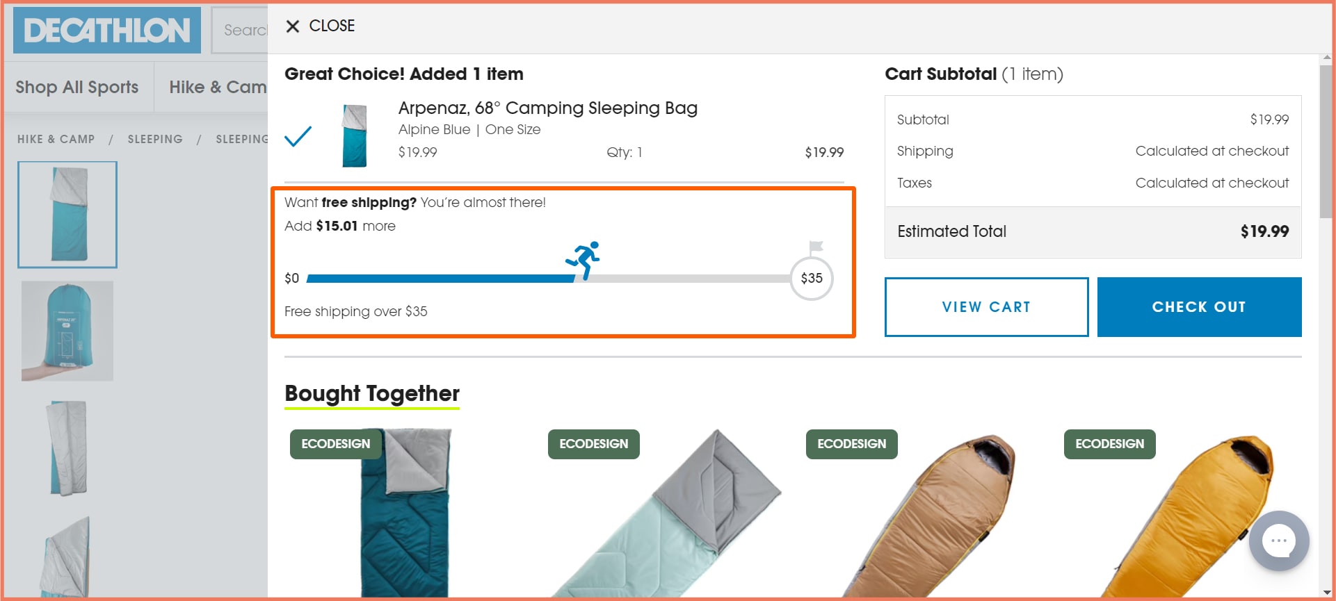
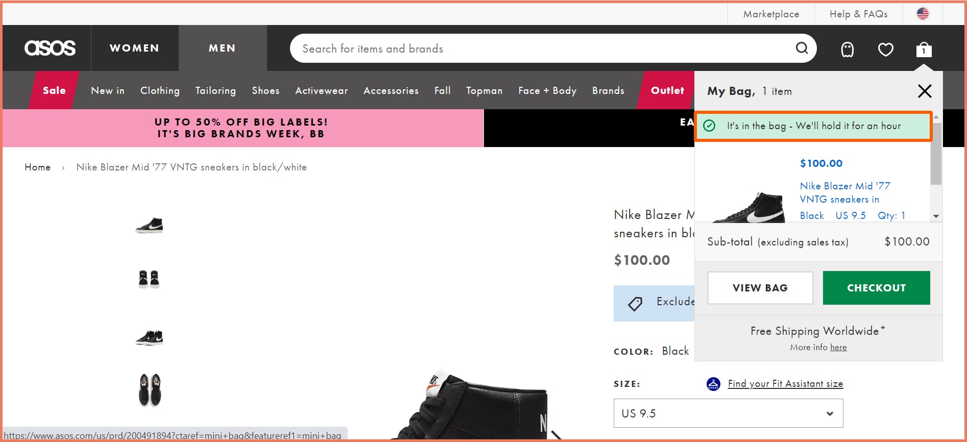
A progress bar indicates how far the customer has come in terms of progress. It reduces cart abandonment rates by conveying how close they are to making the payment.
Pro Tip
Center positioning: Keeping the progress bar in the center ensures high visibility making it a UX plus point. A 4-point progress bar is good enough as any more will cause friction.
2. Build excitement with a free shipping progress bar
A free shipping progress bar acts as a nudge to purchase an extra item to qualify for free shipping.
Pro Tip
Free shipping: Free shipping cart abandonment rates and motivates customers to return for a second purchase.
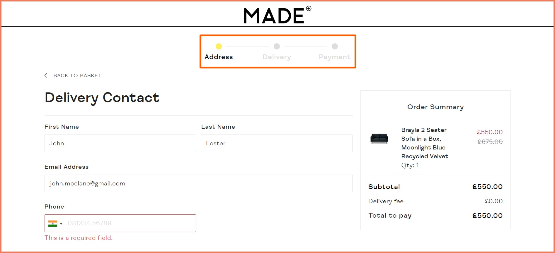
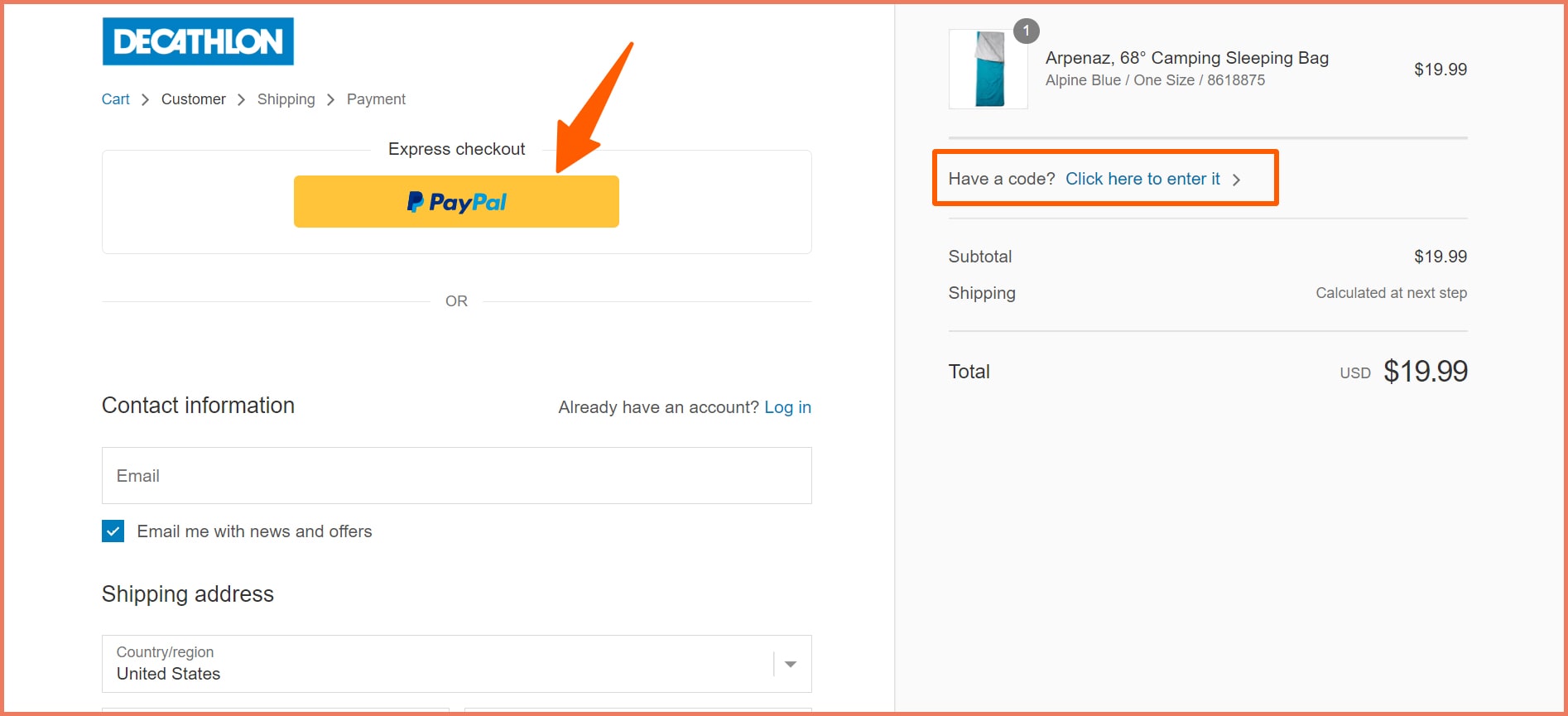
3. Make checkout easy with convenience buttons
Offer convenience by providing express checkout and promo code options to reduce checkouts.
Pro Tip
Higher conversion rates: Offering Paypal on express checkout results in 88.7% more conversions as compared to other payment methods.
Promo codes equal happiness: Promo codes can increase oxytocin levels with 83% of customers reporting a change in purchase behavior
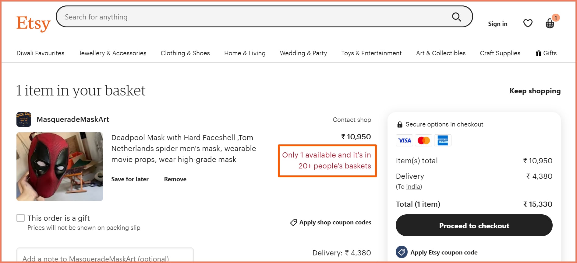
4. Drive quick conversions with low stock alert
An alert message or a countdown timer initiates urgency to drive FOMO.
A low stock alert and the number interested in buying it can compel users to make the payment.
Pro Tip
Reinforce urgency: A low stock alert reduces cart abandonment messages by showing the demand for the product as social proof. Using an express checkout can help with faster payments.
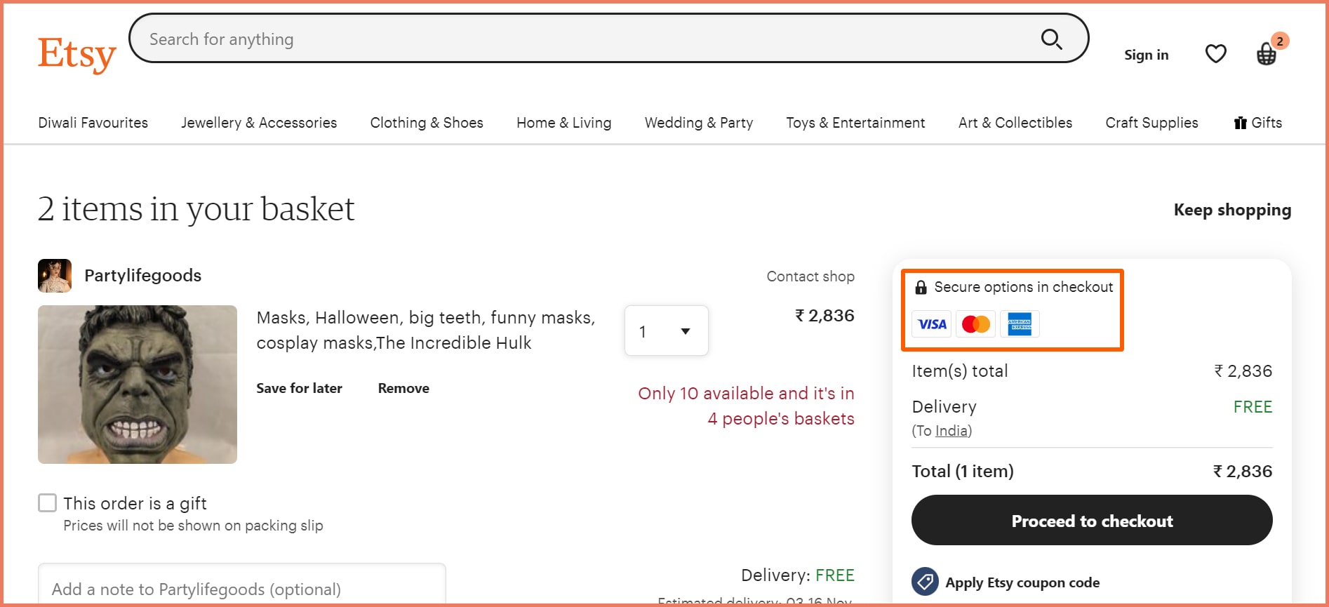
5. Make checkout safe with VISA payment badges
Checkout pages need trust badges to assure customers that their financial data is safe.
21% of customers are scared of credit-card theft. A payment trust badge can induce confidence in customers.
Pro Tip
SSL checkout: A fully secure SSL trust badge reduces cart abandonment rates, traffic bounces, and increases sales.
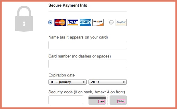
6. Show CVV numbers illustration for first time shoppers
A CVV number is useful for non-card transactions. It prevents frauds from committing identity theft protecting merchants and customers alike.
Pro Tip
Express checkout options: Customers may hesitate to provide the CVV number, in that case, Paypal and Apple Pay can help.
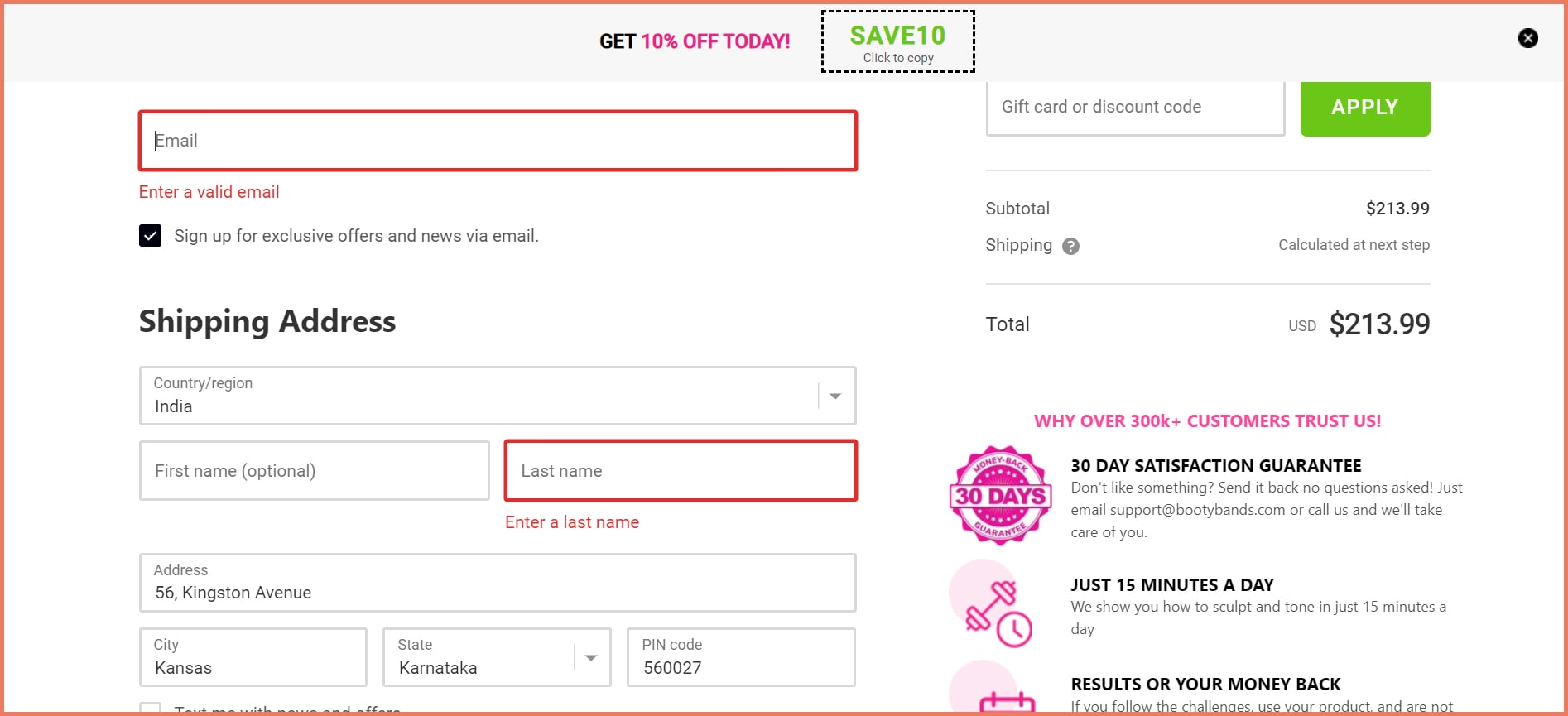
7. Create red error cues for feedback
Error cues are visual cues to help customers know where they went wrong.
Pro Tip
Provide examples: Error messages serve as effective visual cues for example, format of an email or prohibiting the use of special characters in names
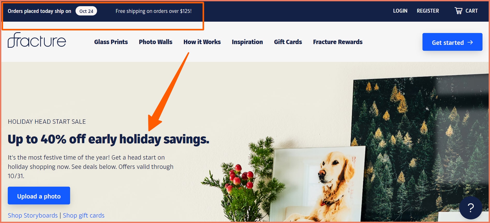
1. Know the Above the fold and below the fold proportions
The standard dimension for above-the-fold content is 800x600 pixels. The objective must be to include persuasion nudges such as free shipping, easy returns, promo codes, and discount offers on the header.
Here are 3 things that your above-the-fold content should contain-
a) Free shipping
Fracture includes free shipping and order dates on its above-the-fold headers.
90% of customers will purchase regularly if offered free shipping. The above fold content mentions the 40% discount on holiday shopping.
This is a great incentive as discounts are still a great motivation for customers to buy especially during the holiday season.
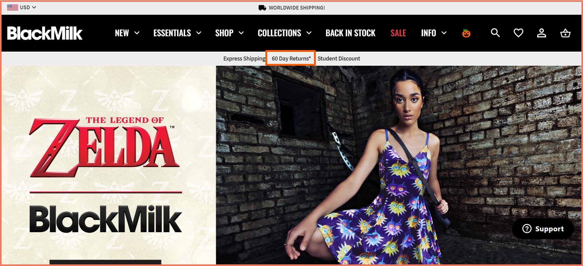
b) Easy returns
67% of customers check the returns page before making a purchase.
Including your return policy on your above-the-fold assures the customers of experimenting and BlackMilk Clothing does exactly that.
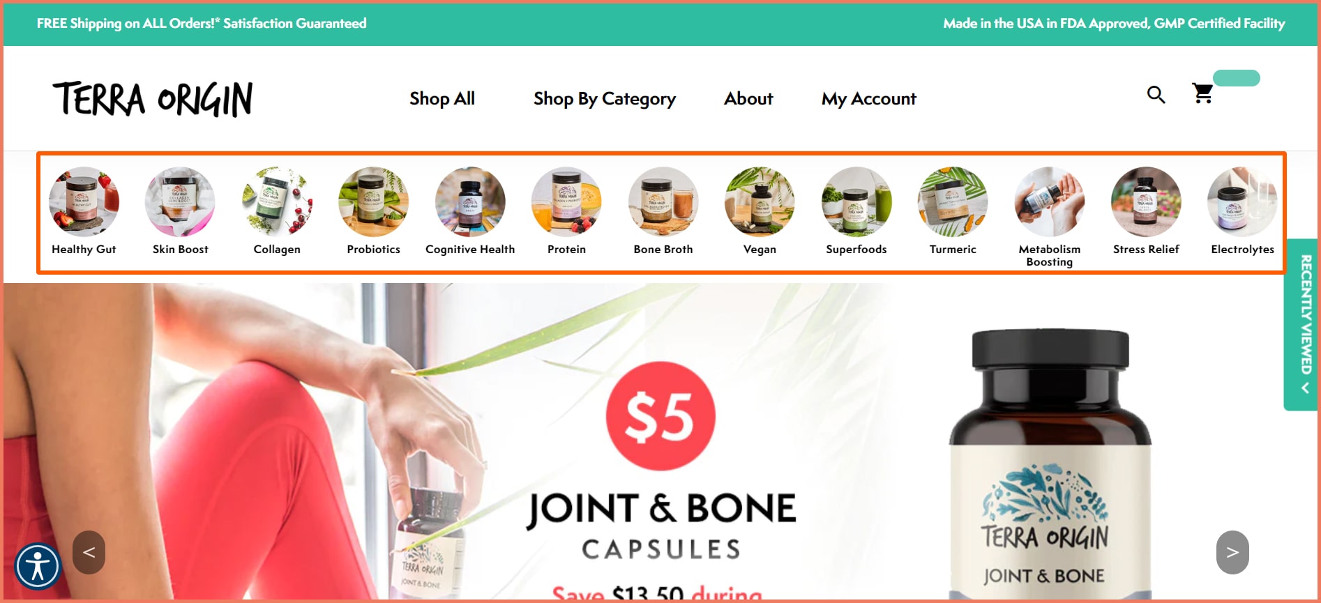
c) Product Categories
Featuring product categories is a visual cue to show customers your product offerings. It leads to product discovery.
The above fold is a great real estate for product categories as it enables high recall, high visibility, and recognition.
Terra Origin displays its product categories above the fold.
Customers may always not want what they want. Product categories allow them to explore and find what they want.
Remember, above the fold must communicate your value proposition. Customers must be convinced before they scroll above the fold.
2. Image Positioning: Which side is better?
Which side should you place the image on, left or right?
This is a question that has long baffled eCommerce marketers. Here’s the answer.
The human brain is divided into the right and left hemispheres. Images are processed by the right side of the brain while numbers and text are processed by the left side.
Sensory information absorbed by the left hemisphere is transferred to the right and vice versa. This is the reason images on the right are quickly processed by the left. Text and numbers are quickly processed by the right than on the left.
This is primarily the reason why pages contain images on the left while the product descriptions are on the right.
3. Place product descriptions in an inverted triangle
Writing the product description in an inverted triangle ensures that the most important information is presented followed by the background information.
This is a storytelling approach in content marketing and journalism. The goal of this approach is to convey the critical information first while the less important information is included in the end.
Starting with the benefits and pain points in product descriptions can increase the conversions.
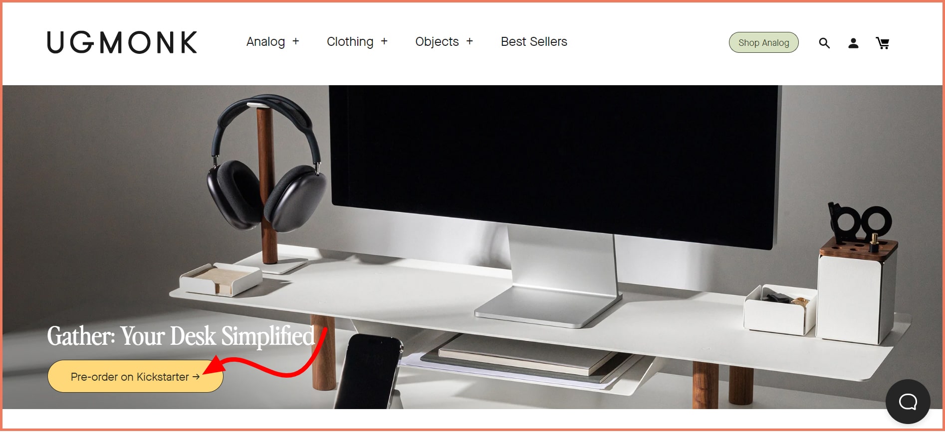
4. Use arrows in CTA and Back to Top
Arrows are directional cues communicating to viewers to click toward a particular object.
While arrows are explicit cues, they are visual aids in helping users to important elements on a website, ad, or landing page.
The arrow in the above image is a pointer toward the desk. Since it's at the end, you’d likely miss it.
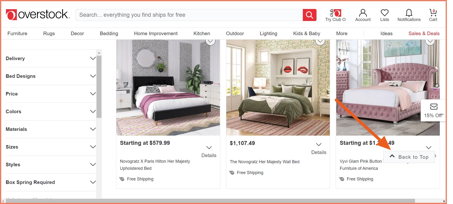
When you have various products to display, a Back to Top button is an effective directional cue.
When users get stuck and want to go to the top, this is a navigational cue that helps.
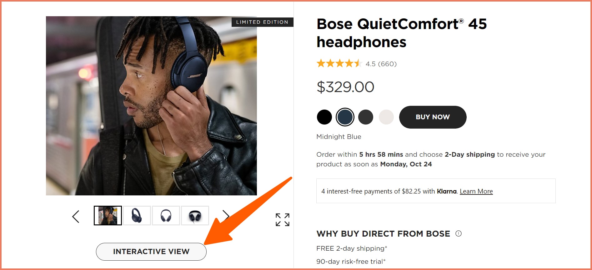
5. Use HD product images and 3D or 360-degree view
Using HD product images creates a positive impression in the minds of the customers.
Aesthetics sell and this is a weighing factor when it comes to purchase decisions.
Using 3D technology in your product pages increases conversion rates by 40%.
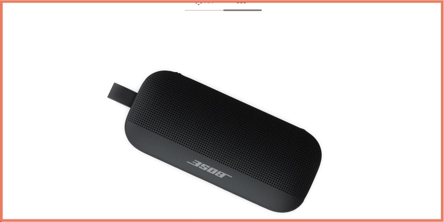
BOSE offers an interactive view on its product pages.
It provides AR and 360-degree view to get an immersive experience.
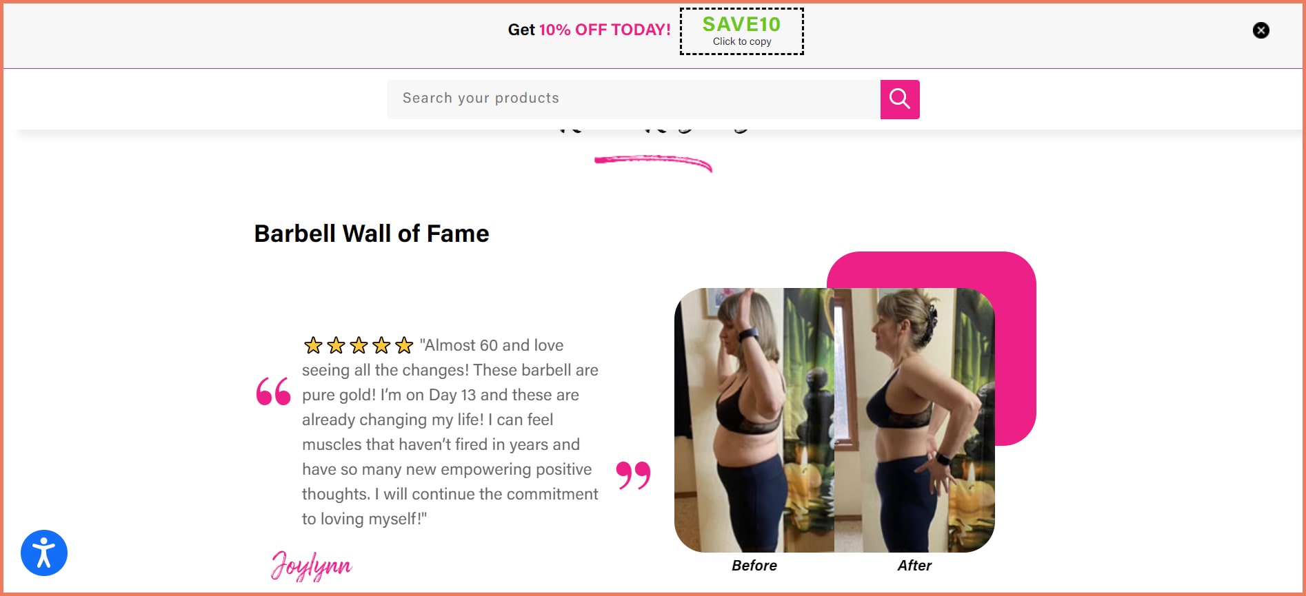
6. Use Before/After images and product in-use images
Before and After images convey the effectiveness of the product. It highlights the pain point that the product solves.
Here is a Before/After image from Booty Bands.
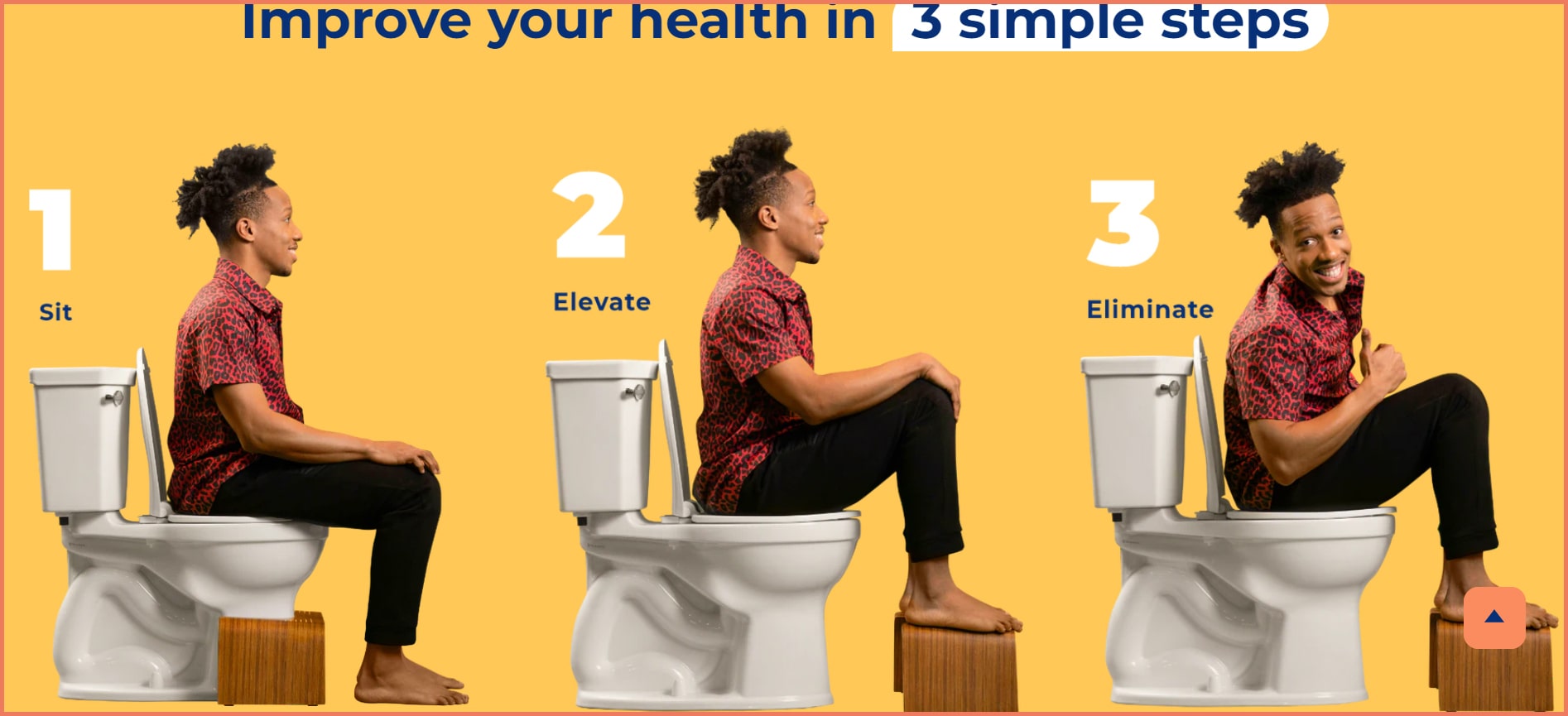
Product-in-use images demonstrate the working of a product. A step-by-step process can address customer objections about its usability.
SquattyPotty uses a 3-step guide image on its website. It shows the product in use in a simply brilliant manner.
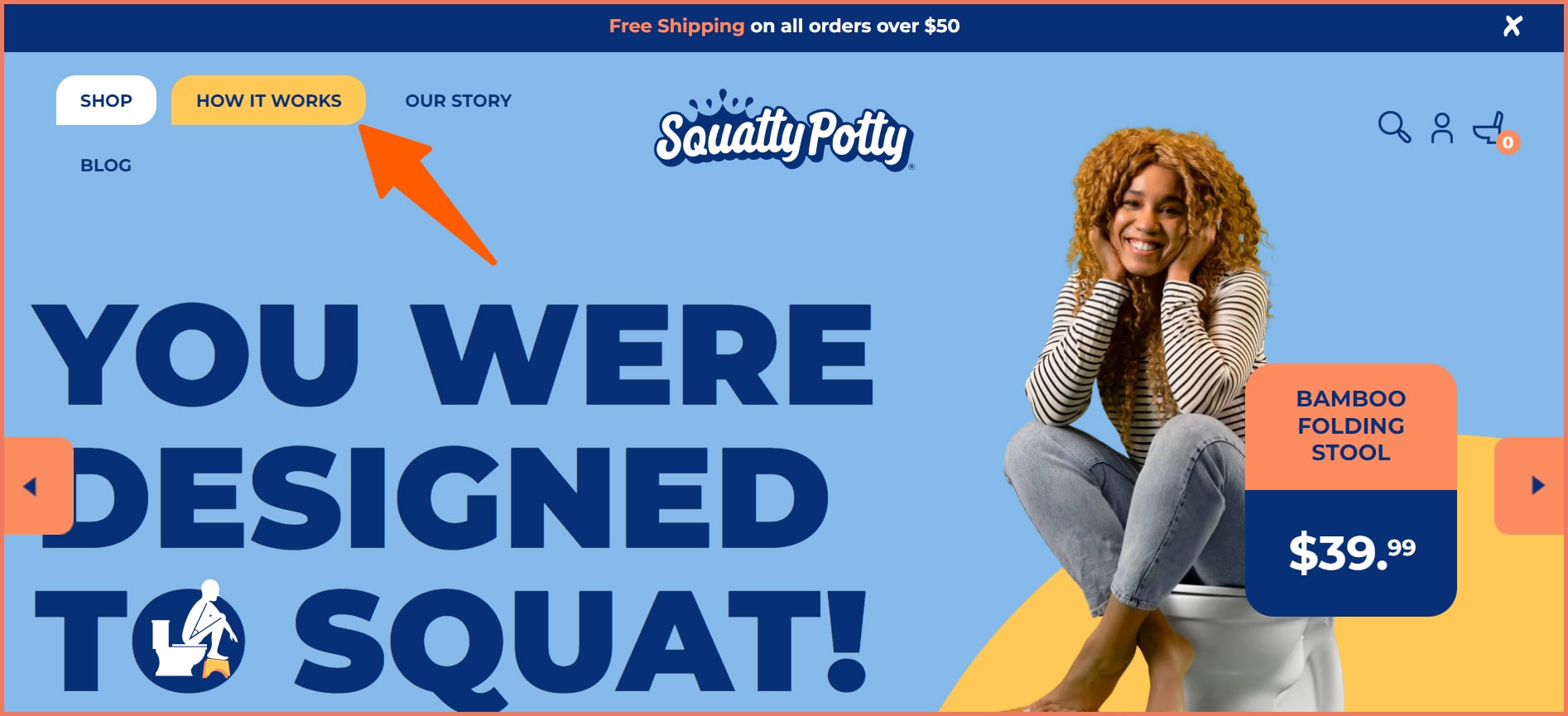
7. Use color contrast as a design cue
Color contrast is a visual cue for design done well and a navigational cue that makes UX pleasant.
A link changing its color on hover is a visual clue for the customers that they are headed in the right direction.
Squatty Potty uses it well on its website.
Color blink on category links on the website serves as a navigational cue. NewAir uses the stone brewing category on its website.
This serves as a prompt for users to explore the product category.
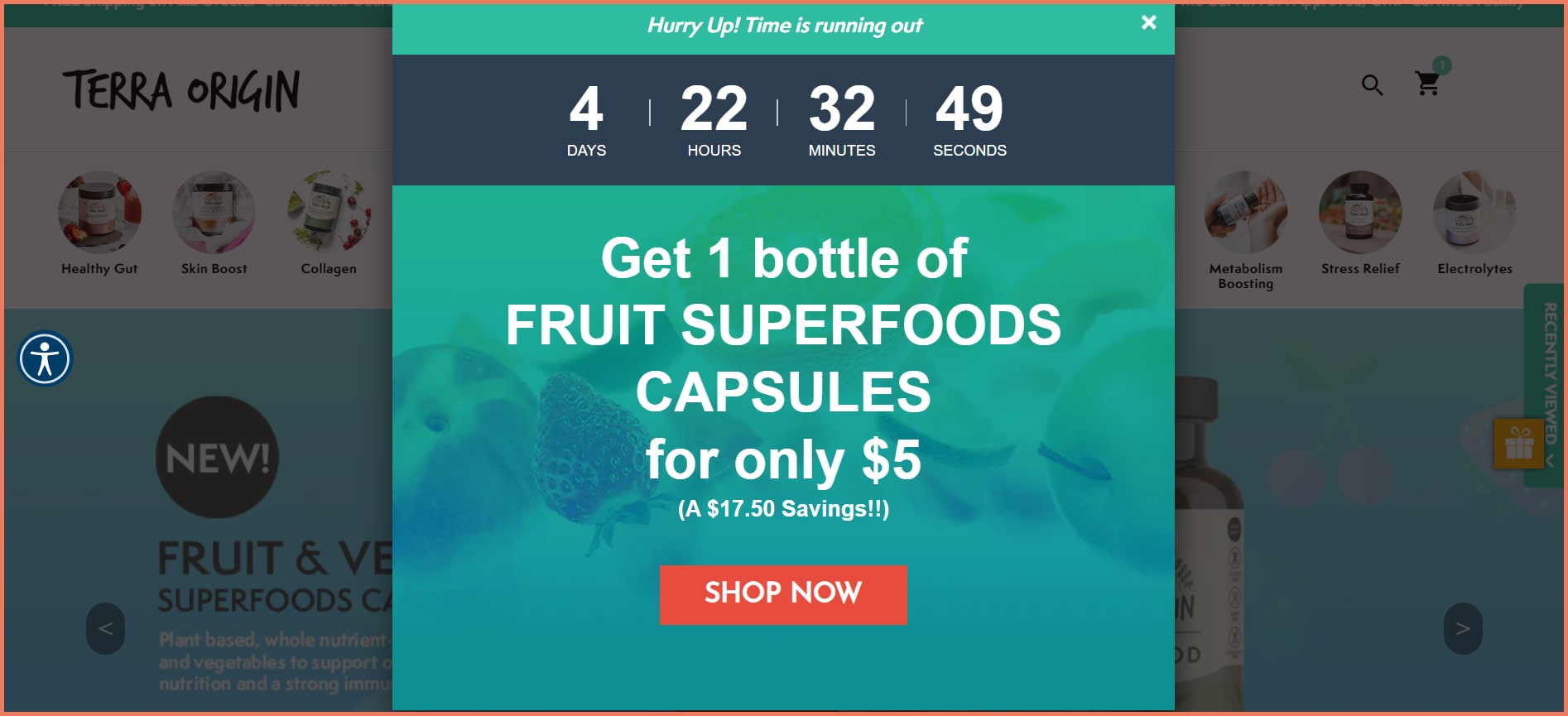
8. Use Pop-ups to nurture site visitors
Pop-ups are visual cues that convince users to explore products and not leave just as yet. With a conversion rate of 11.09%, popups are a potent tool in your marketing tool kit.
Here is a popup from Terra Origin selling an offer to goading site visitors to take an action. The countdown timer evokes urgency which is effective in increasing conversions.
Psychology behind visual cues
Visual Cues have a larger influence on consumer behavior due to sensation transference.
“Plain English, please”
Sensation transference refers to the unconscious assessment people make about a product solely based on visual cues.
This also applies to directional cues, navigational cues, and design cues.
Colors seemed to have a profound influence on conversions. Using color in your branding can increase brand recognition by 80% in customers.
For instance, yellow is symbolic of optimism and youth. It effectively grabs the attention of window shoppers. It evokes hospitality and purity.
Orange comes as a color indicating confidence and assertion. It’s a useful color for CTAs, Buy, or subscribe buttons.
Colors not only influence emotions but also are instrumental in attracting certain kinds of shoppers. Impulse shoppers are drawn to dark red-orange. Black and royal blue work as well.
Budget-sensitive customers relate better with navy blue conveying a sense of security and green for calmness.
Ultimately, 42% of customers form their opinion purely based on store design alone while 52% don’t return because of the unappealing overall aesthetics.
Visual Cues 101
1. What are visual cues?
Visual Cues are elements on the website that subtly draws the user’s attention to the important areas of the website.
Visual cues include directional cues, navigational cues, and design cues.
2. Which visual cues work better than others?
While each visual cue has its own benefits, some visual cues when used poorly don’t deliver results.
The objective is to drive attention without making it obvious.
For instance, a man looking away from the desired elements such as form or CTA is a bad visual cue.
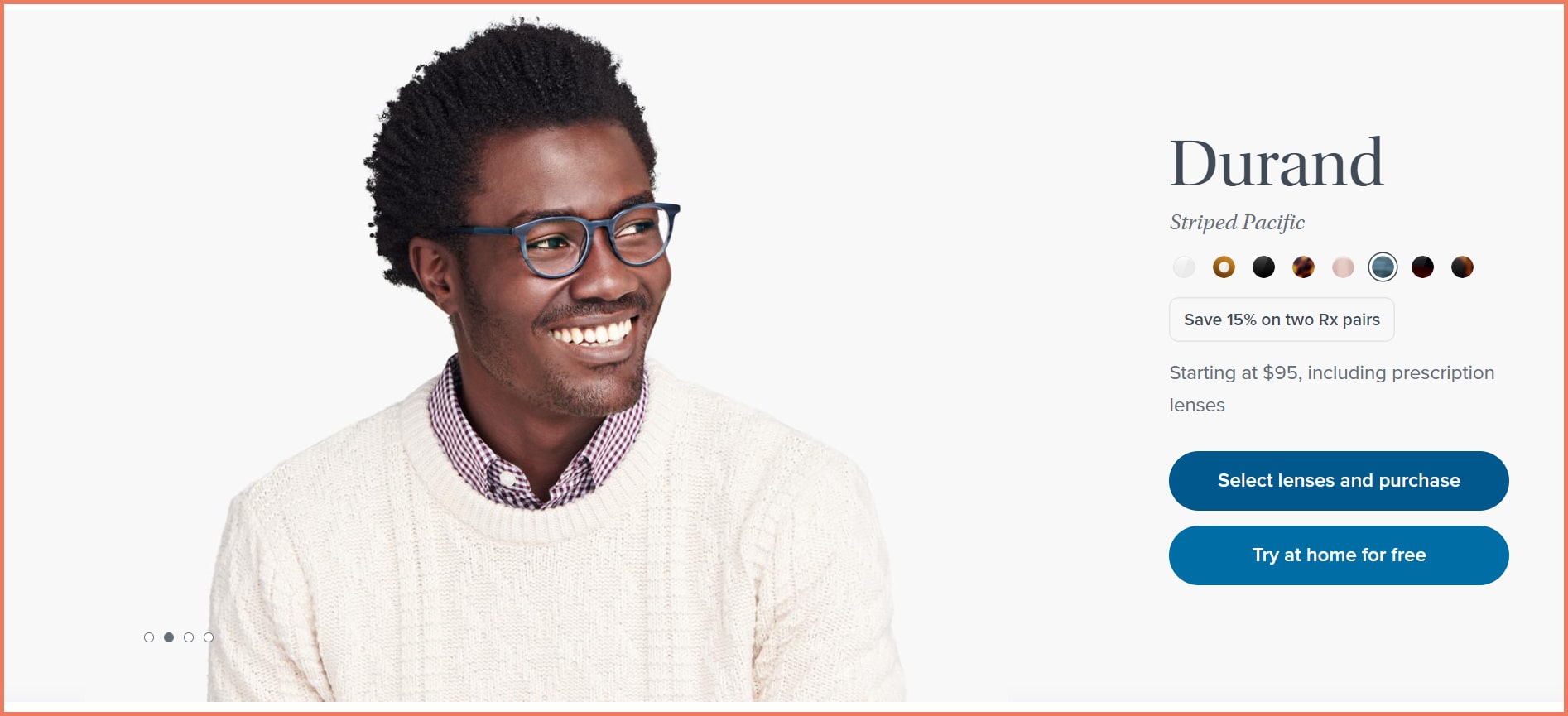
The best visual cue showing a human is an image on Warby Parker’s product page.
This is a visual cue that is subtle and does the job well of directing customers to the left.
Arrows work well but the type, color, and positioning are crucial to their effectiveness. But it falls flat if pointing towards a boring CTA.
Wrapping up, the right visual cue can be determined by running a heat map test on your website. Next, conduct an A/B test of two variations of the visual cues and make a decision based on the results.
Mobile vs Desktop
The shopping behavior on mobile and desktop are poles apart. Unlike desktop, mobile doesn’t need extensive visual cues.
The reason is because of four gestures that include vertical scrolling as people have learned vertical scrolling from desktop. Users will scroll through out of habit.
Second, with the advent of social media and dating apps, users will swipe left or right. The use of arrows for carousels is not needed as the navigation dots.
Screen tapping becomes second nature to mobile users. But a gentle visual cue can help make the user complete the action.
When it comes to visual cues for your mobile and desktop site, a UX approach backed by psychology is necessary for success.
3. What are examples of visual cues?
A person not directly looking toward a particular direction is a suggestive cue. Here is an example from Bonobos where the person is not looking directly towards the side but subtly drives the users to look towards the text.
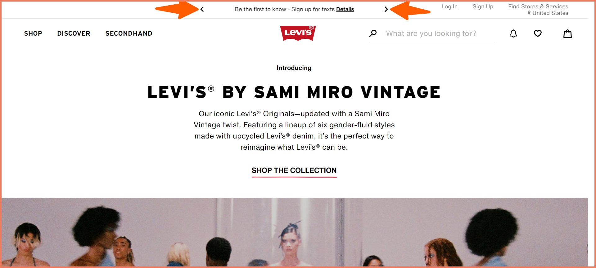
Arrows and pointers are explicit cues pointing toward a direction.
Here’s an example of Levi’s using pointers on its above-the-fold.
3. What are visual cues in marketing?
Visual cues are design elements on websites, landing pages, or ads that guide users to take the desired action. These are designed to provide a smooth user experience.
In the larger scheme of things, the goal of visual cues is to attract, engage, and convert website visitors into customers.
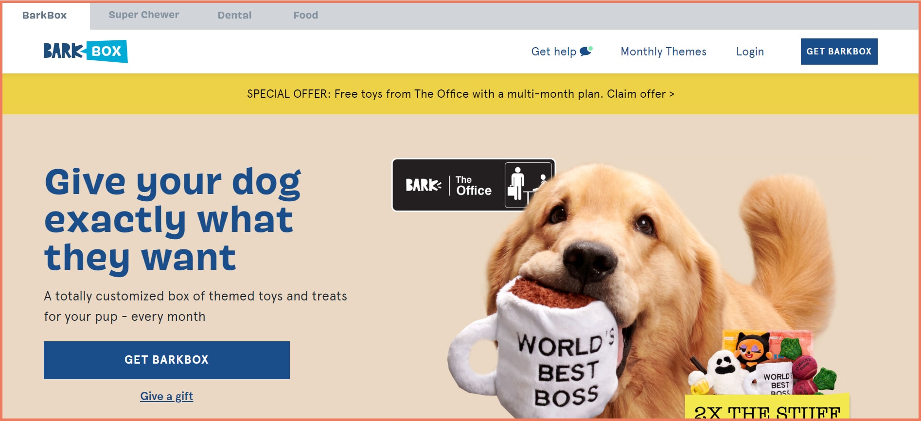
Here is the BarkBox website where the visual clue includes the key messaging, the CTAs, the cute doggo, and the special offer in the header. Notice how some are in different colors. These are visual cues in marketing.
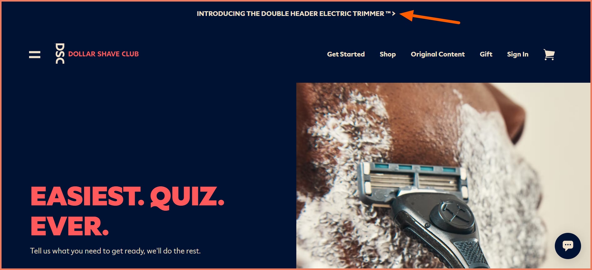
4. What is an example of a directional cue?
A directional cue is a visual hint guiding the users toward it. Here is an example of a directional cue on a website.
See the pointer at the end of Introducing the double header electric trimmer?
That’s a directional cue.
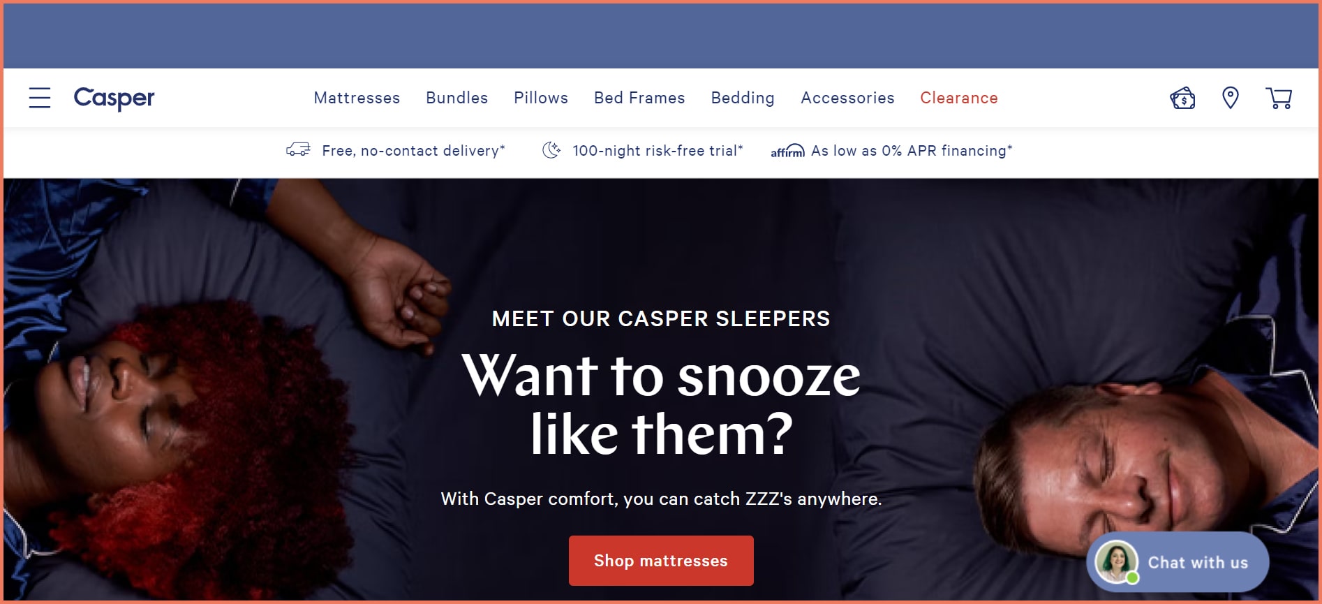
5. What is an example of using a cue to attract consumers?
Casper Mattresses use a suggestive cue to attract customers. Observe how it draws attention to their sleepers and then asks users if they want to sleep peacefully like them.
This is an example of a suggestive cue where it subtly points toward the message.
This is a genius of a visual cue in attracting customers.
6. What is the purpose of brand cues?
Brand cues or commonly known as consumer cues refer to a collection of visual, written, and verbal messages that influence buying decisions.
The purpose of brand cues is to assimilate all the customer touch points and embed your brand in the memory of customers. This develops a strong preference ultimately leading to brand loyalty.
7. What is a design cue?
Design cues are elements that make the customer journey memorable by ensuring that they have the best experience before buying a product.
Subscribe for more articles like this!
Thank you - we'll see you in your inbox soon!
Oops! Something went wrong while submitting the form.
Read by 5000+ ecommerce store owners
Subscribe for more articles like this!
Thank you - we'll see you in your inbox soon!
Oops! Something went wrong while submitting the form.


-1-min.jpeg)


.svg)

.svg)

.svg)
.svg)
