When it comes to writing product descriptions for mobile, most elements might seem intuitive.
But not all of them are important to the customer.
Research shows that 87% of consumers are unlikely to make a repeat purchase if they don’t see accurate product descriptions.
In this article, we’ll explore 27 best practices you need to keep in mind when writing highly persuasive product description copies and ways to get higher conversions with storytelling.
Copy
1. Address a specific problem and its solution
Before you write product descriptions for mobile, you need to present the information in a condensed form.
The information must be easy to skim—the customers must get the product overview.
Next, the solution must be presented concisely.
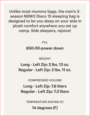
REI does just that by communicating the benefit of the product compared to its competitors in a subtle way.
It’s addressing a super specific problem and sells the experience—good sleep while camping.
When writing mobile product descriptions ensure you:
Write how the product can make their lives easy. Mobile shoppers are goal specific. For instance, if camping equipment is fire resistant, that’s the first information you need to present.
Write the most important piece of information first. Mobile users have shorter attention spans, are highly distracted, and want to find information quickly.
Use the bite, snack, and meal method. The bite must grab the user’s interest, the snack must tell what pain point it can address, and the meal can include features and specifications.
2. Pay attention to detailing
The devil lies in the details.
According to Gartner, 53% of US online customers will abandon their online purchase if they can’t find an answer to a quick question.
And the numbers might be more on mobile devices.
Making attention to detail the need of the hour.
GAP narrows it down to details about the fit, length, and model measurements.
This evokes heuristics—methods and approaches that help customers make decisions and solve problems quickly.
Plus, the information is presented in bullets which helps customers quickly scan and understand the key features of the product.
When writing product descriptions for mobile phones ensure:
You keep your bullet points symmetrical, with either one or two lines for all bullet points for mobile shoppers to understand
You use a font size of 11px or higher to provide a pleasant reading experience for customers
You provide good spacing to promote readability as a lack of spacing leads to cognitive strain. Meaning, the brain is trying to process information by reading in a small and poorly visible font or with terrible line spacing.
Avoid detailed explanations in bullet points. Focus on clarity.
DON’T LET HIDDEN ISSUES COST YOU SALES
Your store might look fine, but silent leaks could be draining your revenue daily.
We specialize in finding what most teams miss on their own sites.
Receive a detailed breakdown and actionable steps to improve conversions.
The product description is just as important for mobile shoppers as product images.
Write product descriptions that help visualize the products using mental images to demonstrate what’s written in the text.
This influences customers to make a purchase decision.
Overstock uses visualizations to help customers better relate to the product and its utility.
This increases the perceived value of the product and its specifications.
Here’re a few tips to help you write product descriptions that drive visualization:
Use power verbs to convey a sense of ownership to your customers. For instance, Give your guests an extra seating option—Give is a power verb
Use descriptive words to highlight the product’s benefits. In the product description example above, sturdy is a descriptive wordfor describing the strength of the metal frame
Focus on writing your mobile product description by picking one emotion. Here’s a list—Caring, novelty, exclusivity, reassurance, pain, and urgency.
4. Rule out loss-aversion with product utility
The best product description examples have one thing in common—they answer customer objections and reduce loss aversion bias.
They explain the product in context and benefits backed by features.
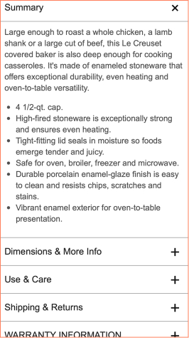
Williams Sonoma reduces the perceived risk of the product by mentioning the benefits of the product in two lines.
This is easy for mobile shoppers to read and make decisions. The specifications in bullet point makes it easy to scan on mobile screens giving a mobile-first experience.
When writing product descriptions for mobile:
Use the cause-and-effect principle to write product descriptions. For example, High fired stoneware is exceptionally strong and ensures even heating
Use the Problem-Agitate-Solution framework. Mention the relevant problem, its repercussions, and the solution you’re offering
Write for brevity. Keep your mobile product descriptions under 300 words.
Open the conversation by mentioning the USP of your product. Give users what they want.
5. Don’t shy from using contractions
Your average mobile shopper has multiple brands competing for their attention.
In a competitive eCommerce environment, a mobile phone description written using contractions makes it less difficult.
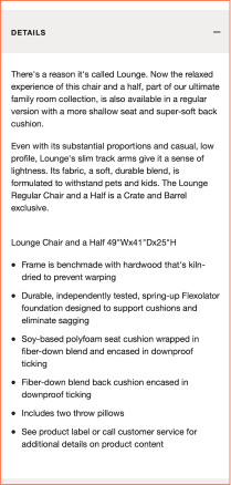
Crate & Barrel uses contractions in its mobile product description that makes complex information conversational.
It helps the readers understand what’s being communicated.
This along with the white space communicates the message effectively, guides the eyes, and improves visual capacity.
Here’s a list of tips to elevate your mobile product description writing:
It’s perfectly fine to break grammar rules as long as your audience resonates with
Use sentence fragments to keep it conversational
Make use of commas to write meaningful and crisp sentences
Information Architecture
6. Avoid keyword stuffing in titles
To get discovered and improve SEO, many online stores stuff keywords into the product titles on web pages.
Take the example of Grove Collaborative (image above).
If they depend too much on keywords, it’ll lead to titles like, ‘Laundry Detergent Sheets, Pre-measured, Recyclable & Plastic-free, 32 Loads, 100% Natural Fragrance’, which is neither conversion-oriented nor reader-friendly.
Visitors looking to purchase laundry detergent sheets want to know ‘how many’ (quantity) are they getting for ‘how much’ (price).
See how Grove Collaborative gets to the point.
Their product title simply states – Laundry Detergent Sheets (32 Loads)
Easier to scan and understand, right?
When it comes to mobile SEO, opt for titles with less than 8 words to get discovered and generate higher conversions.
7. Choose features highlights over other formats
A better way to structure content than traditional bullet points and paragraph format is to use feature highlights.
This section has to be optimized differently for desktop and mobile. Here’s how you can do it:
Use feature highlights for only one or two features that are the USP of the product. The rest can be shown in bullet point format.
Use fewer resources and replace feature images with icons. These still work better than the bullet point format.
To keep site loading times low, use feature highlights only for important or complex products. This way the resource-heavy pages can be justified.
Stores can also consider using more scalable graphics to illustrate features that are consistent across multiple products.
8. Use product photos to demonstrate features
Product photos in an ecommerce setting need to do more than display the product—they need to show information about various features of the product.
Optimizing product photos require a few additional steps when you do it for mobile. This includes:
Using adaptive images which detect the phone screen size and resize images accordingly to deliver the best size.
Using alternate images for product photos that don’t work well when sized down or get cropped in small displays.
9. Avoid full-page interstitials
Google believes that pop-ups and interstitials interfere with the user experience on mobile.
The ranking can fall if the following are detected on the mobile page:
If the pop-up covers the main content or product images as soon as the user lands on the page.
If the user has to dismiss the pop-up before accessing the main content.
Triggered pop-ups and prompt-based pop-ups can still be used. For example, having the size guide as a pop-up that gets triggered when the user clicks on an icon works well for a mobile page.
See above a good example from Zumiez. It has a bottom-aligned bar that takes up little space and has a prominent exit button.
Content sections
Displaying the right content which satisfies the customer’s information needs is crucial to conversions.
Customers rely heavily on product information. Here’s how to make sure your mobile product page is optimized for it:
10. Remove or merge structural aspects to maintain uniformity
While most of the information units remain uniform for desktop and mobile pages, the display of several functionalities gets affected. See how ASOS store blend functions with the navigation bar in the image above.
Elements such as categories, filters, or sorting functions are either merged or blended into the navigation bar menu.
Stores can choose to either implement or forego this strategy based on their page design.
11. Organically integrate variants for a seamless experience
Store owners should prioritize certain product variants and give them greater visibility on a mobile product page.
These could be bestsellers or the ones with the most discount.
Deep linking automatically sets product pages to load the bestselling/discounted variants.
It also enables the chosen variant thumbnail in the product cart instead of the default variant thumbnail.
For example, if the product image is a shirt of green color and the customer chooses the blue color, the cart will show the blue color shirt and not green.
Harry’s (in the image above) is a good example of how to show customized variants through thumbnails.
12. Make the CTAs accessible
Yes, of course, you might think, aren’t all CTAs accessible?
However, for mobile certain customizations can help you drive more conversions:
The ‘add to cart’ button must be placed above the fold and as close to the product images as possible. If it’s above the fold, customers don’t have to scroll to hit purchase, and similarly, if it’s near the photos, customers won’t miss out on it.
According to Apple, CTAs for mobile need to be 44 x 44 pixels, while Microsoft states 34 x 26 pixels as ideal. Ensure that your primary CTA buttons are at full width, which means they should cover up an entire row.
Apply sticky CTAs so that they are easily accessible even as visitors scroll down the product page.
13. Use vertically collapsed sections for FAQs & returns
Horizontal tabs do not work well for mobile pages.
Research has shown that27% of users often overlook the content in the hidden tabs.
So, the sections such as FAQs and returns information should be in a vertical collapsed section format.
In research, only 8% of customers overlooked this format.
Don’t crowd the page and position FAQs on the product page below the fold.
Choose the most common 3-4 FAQs and don’t overwhelm customers with all the information.
FAQs and other information-dense sections can also be further split into categories.
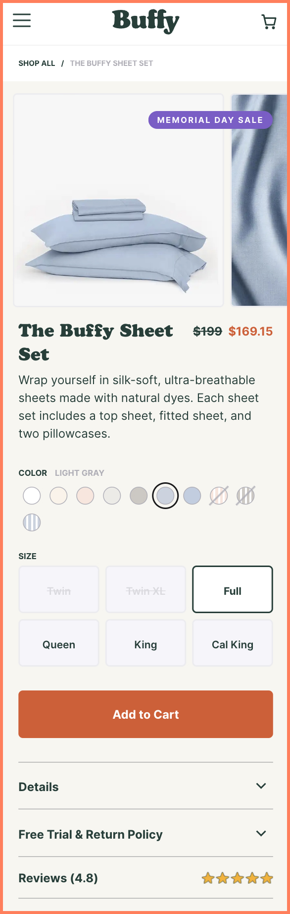
See how Buffy has designed the FAQs section on the product page.
Map the mind of your potential and existing customers to browse through Quora to find what people are searching for about a product category.
Customers can have questions that aren’t covered in the FAQs. At the same time, providing space for this in a mobile Q&A section can be tricky.
The simplest solution to this is to use a single button which creates a small pop-up form.
The form can have open text space for customer questions and have minimal fields with their email and name.
Language and SEO
The previous sections discussed what should be included in a mobile product page content.
This section deals with how it should be worded from a mobile SEO point of view.
Ensure the copy is empathetic, and take care of cultural and social norms.
15. Using localization in mobile SEO
Desktop SEO focuses on the general population with no geographic focus.
Google focuses mobile SEO on local results. Since it knows where the user is searching from, it displays results that are locally relevant and close by.
For customers, mobile-first indexing means where they search from and the results they see.
Data has shown that mobile searches using the phrase “near me” occurred three more times in the past few years, which means a lot of users search for local businesses.
To rank higher in mobile searches, stores can:
Optimize SEO with phrases like, “near me”, “open now”, and “where I can buy”.
Cater to local results by adding local keywords like, “flower shop in New York” etc.
Research customer behavior and include keywords for voice searches too.
16. Shorter title tags & informative meta descriptions
For mobile SEO, titles and meta descriptions have to be shorter and more persuasive.
This is because mobile Search Engine Results Page (SERPs) don’t display as much text or results as desktop SERPs.
Look at similar products but don’t copy the descriptions word-to-word (search engines and eCommerce stores might take it as spam
Don’t use generic phrases like "excellent quality" and "better than everyone."
Stores can optimize title tags and meta descriptions by:
Beginning the title with a keyword. This tells the audience the listing is relevant to their search query.
Keeping the title tag descriptive and educational.
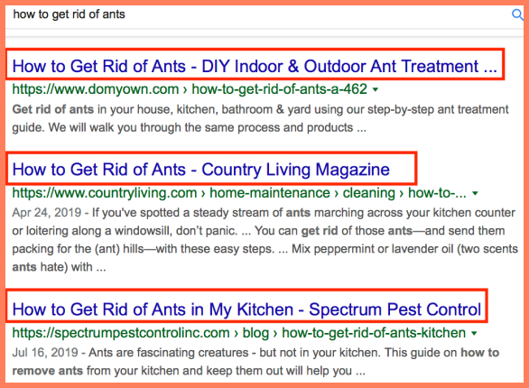
Ensuring the meta description is short and expands the information in the title.
The example above demonstrates the importance of an optimized title and meta description. Notice how the meta description creates curiosity in the second result.
17. Targeting O/S specific keywords
Google takes into account the customer’s mobile operating system to display the most relevant search results.
This means store owners must experiment with keywords to see which combination works best according to the mobile devices of their customers.
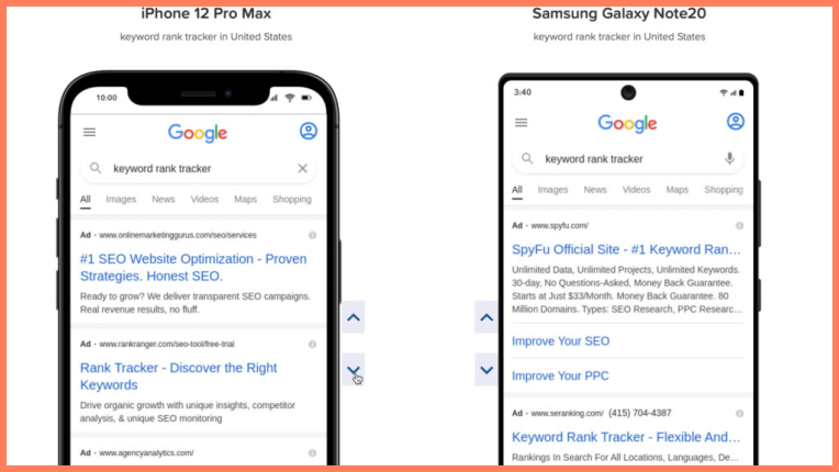
Google also uses different variations of SERPs layouts depending on the model of the mobile devices your customers use.
The screenshot above shows the same search result on an iPhone and Samsung Galaxy Note but they’re displayed differently.
Store owners can use tools like the MobileMoxie SERPerator that displays SERPs according to different mobile devices.
UX
A good shopping experience for mobile and desktop stores differs significantly.
For mobile users, here are some of the factors that lead to an overall good shopping experience.
18. Include autocomplete & auto-prediction functionalitie
No mobile shopper wants to go through the trouble of typing out long search queries on mobile phones.
They expect an autocomplete system that is accurate and anticipates the product they are searching for.
Due to the keyboard size on mobile screens being small, typos and spelling mistakes are expected.
Mobile page searches have to factor this in while displaying product suggestions to customers. Correcting the typo in the customer’s entry also builds trust and authenticity.
19. Skip animated carousels
While carousels have been a popular feature of desktop sites, they are not a good idea to incorporate into mobile pages.
The primary challenges of carousels on mobile screens are:
Customers find sequential access to information annoying and time-consuming.
A customer might not even realize a specific piece of content is a part of the carousel. Since there is a delay, they can scroll past it before the image changes.
Controlling a carousel with a swipe gesture leads to swipe ambiguity on iOS. If customers swipe right from the left edge of the screen, they will go back to the previous page. Close to the lower edge swipe will change applications.
Eliminating the swipe gesture leaves customers at the mercy of tiny dots and arrows they must accurately hit to control the carousel.
20. Replace hypertext with bars, tabs, & buttons
Hypertext is a major component of desktop sites but shouldn’t be used on mobile phones.
That’s because clicking hyperlinks on mobile screens can be a major challenge for a customer.
They can tap on a link by mistake or land on an undesired page and then have to navigate back to the site.
It’s advisable to display all links in the form of bars, buttons, and tabs for convenience and reader-friendliness.
21. Include mobile-specific gestures
The mobile shopping experience is enhanced by micro-interactions which makes the navigation and the browsing experience more intuitive. These include:
Action-based effects such as pull-down to refresh, swipe, pinch, grab to zoom gestures and swiping right to left to go back.
Integrating smartphone features into mobile pages including call and text message functions.
When horizontal content sections are used for mobile pages, they must be accompanied by visual hints that show these sections can be scrolled. The best way to do this is to have some content peek out.
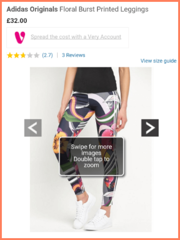
See the above example by Very to see how they use a swipe to change photos and double tap for zoom.
We also love the way Book of the Month displays recommendations on the product page. As you can see, when scrolling, the recommendations stick to the bottom of the page.
22. Use a vertical format based on the 5-second scan test
The 5-second scan test helps to identify where users see within the first 5 seconds of landing on a page.
Eye-tracking software has shown us that customers usually read in an F pattern starting from top to bottom and right to left, as shown in the images below:
This tells store owners that the most effective format of displaying content is in the vertical format.
Research has shown that 90% use vertical navigation content format out of the mobile sites analyzed.
YOUR STORE IS LOSING SALES RIGHT NOW
Your store might look fine, but silent leaks could be draining your revenue daily.
We specialize in finding what most teams miss on their own sites.
Receive a detailed breakdown and actionable steps to improve conversions.
Trust and credibility are also two of the most important factors when it comes to converting new customers. Here’s how to maintain that on mobile product pages:
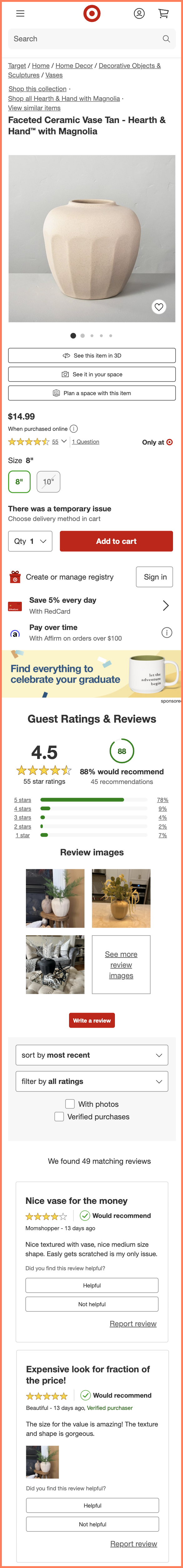
23. Add tiered reviews
It’s best to compile an overall average rating on mobile because of the shortage of space.
This rating must be displayed above the fold and near the product photos. This way customers can see the ratings without scrolling down.
Stores should also hyperlink the overall rating to the detailed reviews and rating section below.
A pro tip here is to use a drop-down menu that offers a detailed and quick breakdown of the ratings for the customer.
Here is a great example from Target. It shows tier-wise ratings and a quick link to see all the reviews.
24. Customize the review section
Similar to the rating summary, stores need to present a review summary or showcase their best reviews separately.
This must be placed at the top of the reviews section to save the customer the time and effort of scrolling and reading through all the reviews.
This review summary should contain:
Most unique/ helpful reviews.
Overall product recommendation
Breakdown of the star ratings
Photos uploaded by customers next to their reviews
Furthermore, customize the review section that lets visitors filter and search reviews, and find exactly what they require,
25. Integrate your awards into product photos
On desktop sites, stores can have a separate section for awards and certificates.
However, on mobile sites:
Integrate awards into product images or mention them near the CTA button. This way a customer won’t overlook them.
Add press coverage and industry badges to the respective product pages.
Each time a product wins an award or is certified, they add a ribbon to it. They also have a separate product section with all their award-winning products.
Visuals
On a desktop product page, it can be assumed that customers will read the text that accompanies images. On mobile, these large chunks of text become intimidating for customers.
That’s why product images for mobiles need to be self-sufficient and should not depend on the accompanying text for context.
26. Customize images
Convey emotions through images. For example, a customer is searching for a selfie stick before they go on a vacation.
Product images can show people using the selfie stick in a vacation scenario and easily capturing precious moments.
Add images that show all the benefits of the product. For example, the selfie stick product can also be used as a tripod stand.
Images can show people using it as a tripod stand and how it looks.
Try adding 3D images or 360° images to offer a real-life view of the product.
27. Optimizing videos for mobile
According to research, pages with a product video are 85% more likely to convert on average.
But videos on mobile product pages need to be treated differently than their desktop versions:
If the store is self-hosting the video, they must ensure the orientation and size change appropriately when customers rotate their phones.
It’s best to use videos that are under 4 minutes to ensure quick loading times and zero lag.
Stores should use an MP4 format for videos.
Buttons to control the playback should be large and easy to click.
Stores should use only one CTA per video.
Wrap Up
So if you’re only optimizing for the web and not focusing on mobile, you now know why the product content and page design on mobile have to be treated differently to enable better conversions.
Stores need to remember that product content needs to be mobile-first and not only mobile-friendly. A mobile-first approach to product content affects every aspect of the page, including the information hierarchy and the visual structure that determines the fate of the store.
The benefits of this approach include:
Higher conversions due to an enhanced mobile purchase experience
Cross-device responsiveness
Better SEO with mobile-first indexing
Optimizing content for efficiency and brevity
Effective mobile product content is one of the most underrated ways to give back to customers. When stores embrace this philosophy, customers will return faster and also bring their friends and family along.
Writing product descriptions for your mobile needs a different approach. Here’s a list of pointers:
Get straight to the benefit. Explain how the product solves the customer’s problems
Use storytelling in your product descriptions. Tell customers everything a product can do using visualization
Use bullet points to make scanning easier
Include keywords that are high on search intent
Add high-quality product visuals with carousels for mobile responsiveness
Add customer reviews and testimonials with the average rating to demonstrate credibility
Use power verbs, descriptive words, and emotions that work for your audience
2. What is the product description with an example?
A product description(mobile) is a marketing copy intended to explain the benefits of a product to the customer. It includes features, specifications, FAQs and more.
Ultimately, your product description is a salesman in disguise that drives sales.
3. What is the best product description?
For a product description to be the best, it needs to have the following elements:
Know the target audience—pain points, concerns, motivations to buy, etc.
Write in language that a fifth grader can understand
Hook the customer’s attention with the problem, agitator, and the solution
Sensory words that help individuals visualize and connect with you
Power words, descriptors, and emotions that pique the customer’s interest
Use product images as an accessory and not rely on it
Assure customers with trust words such as FDA certified, price match guarantee, etc
82% of mobile shoppers consider product descriptions to be highly influential when deciding to make a purchase. Your product description is as good as your conversion rates.
Subscribe for more articles like this!
Thank you - we'll see you in your inbox soon!
Oops! Something went wrong while submitting the form.
Read by 5000+ ecommerce store owners
Subscribe for more articles like this!
Thank you - we'll see you in your inbox soon!
Oops! Something went wrong while submitting the form.


.svg)

.svg)

.svg)
.svg)
