Despite the growing popularity of mobile commerce, the average mobile product page converts at around 1%-2%. Sad, but true.
Most mobile product pages aren't bad exactly; they're just unconsidered. Built for desktop, shrunk for mobile, and left to fend for themselves. Nobody audited them. Nobody asked the hard questions.
That's what this checklist is for: a genuine, room-by-room inspection of the things that quietly cost you conversions every single day.
Quick Score: How Healthy Is Your Mobile Product Page?
Before you begin, keep a tally. For every checkpoint that gets an honest yes, give yourself 1 point. Every NO scores zero.
At the end, add it up:
13–16 → Strong, but leaks likely: Your page is in better shape than most. But even one or two nos in the wrong places, a buried CTA, missing trust signals, or a broken back navigation can drain conversions at scale. Find them and fix them.
8–12 → Significant conversion friction: Your mobile experience has real problems that are costing you sales every day. The good news: most of these are fixable within weeks, not months.
Under 8 → You're losing serious revenue on mobile: Your page is working against your customers at multiple points in the journey. Prioritise the checkpoints you failed and start immediately.
One note on honesty: the scoring only works if you test your own page as a first-time customer would on a real phone, not in a desktop browser or a simulator.
The Patterns We See Again and Again
After auditing hundreds of mobile product pages, one thing quickly becomes clear: the best mobile PDPs don’t minimize friction.
They shift the moment of psychological commitment earlier — before the Add to Cart button is tapped.
Here are the three most common failure patterns worth knowing before you start the checklist, because once you see them, you'll spot them everywhere.
Pattern 1: The Desktop Squeeze: The page was designed for desktop and compressed for mobile. The result is a page that technically works but feels effortful: small tap targets, horizontal scrolling, images that take four seconds to load, and a CTA buried below content nobody reads.
Pattern 2: The Information Avalanche: Everything is on the page. The store has confused thoroughness with helpfulness. On mobile, where attention is scarce and screens are small, more information creates friction.
The customer who can't quickly find what they need to make a decision will instead decide to leave.
Pattern 3: The Invisible Leak This is the most expensive pattern, because it's the hardest to see. The page looks fine. Metrics look acceptable. But conversions are quietly underperforming because of a handful of small, fixable issues: a shipping cost revealed too late, a CTA that disappears on scroll, and reviews hidden behind a tab. No single issue is catastrophic. Together, they're significant.
If any of these sound familiar, the checklist below will tell you exactly where to look.
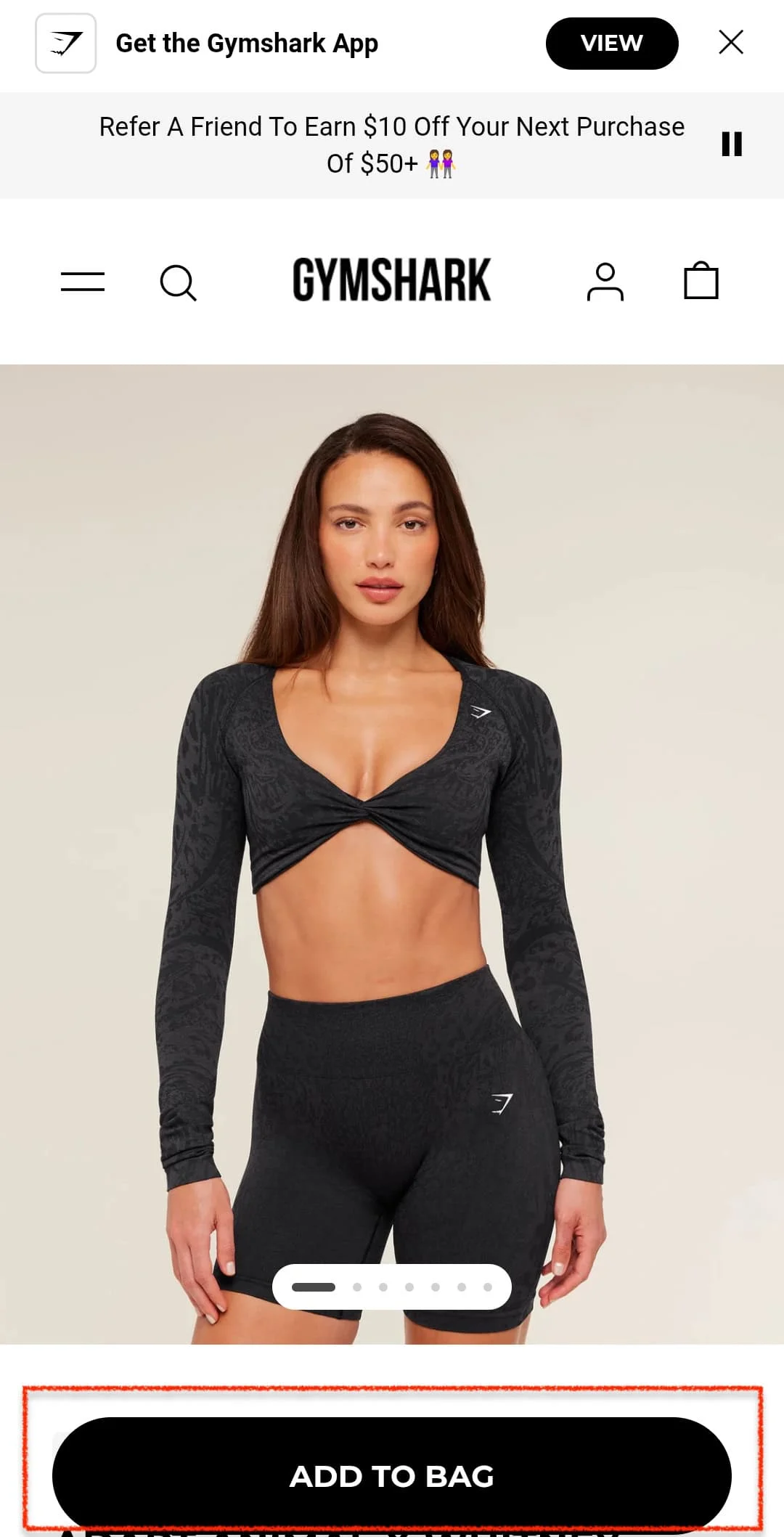
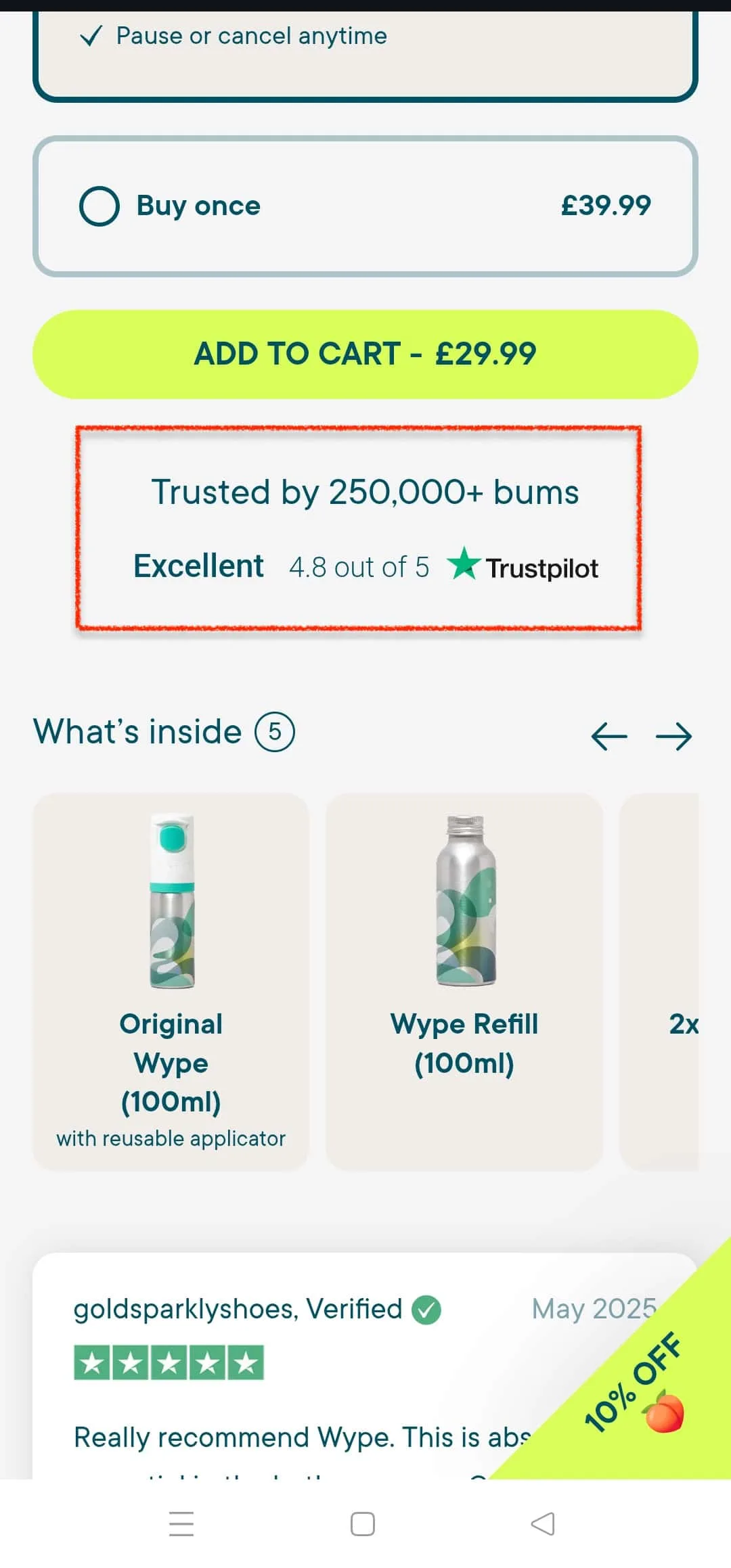
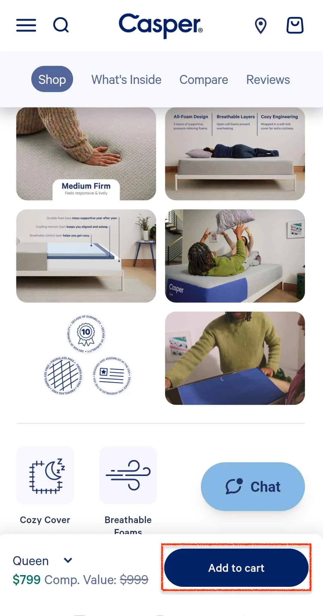
1. Is Your Add to Cart Button Visible Without Scrolling?
A remarkable number of mobile product pages bury their Add to Cart button below the image gallery, below the description, below a block of specs that most visitors will never read.
The customer has made their decision and then has to go looking for the means to act on it. If even a fraction of your highest-intent visitors can’t find the button fast enough, that’s not a UX problem. That’s direct, measurable revenue loss.
The yes/no test: Open your product page on your phone. Without scrolling a single pixel, can you see the Add to Cart button?
Yes: Move on.
No: Move the button above the fold, or introduce a sticky Add to Cart bar that follows the customer as they scroll. Also, check that the button is at least 44x44 pixels, Apple’s minimum recommended tap target size.
2. Does Your Hero Image Load in Under 3 Seconds on Mobile?
Studies show that the probability of a mobile visitor bouncing increases by 32% as load time goes from 1 to 3 seconds. By five seconds, that number climbs to 90%.
The hero image, almost always the heaviest asset on a product page, is usually the culprit. The cruel irony is that the stores most likely to have slow-loading images are the ones that invested most in beautiful photography.
A one-second delay in mobile load time can reduce conversions by up to 20%. For a store doing $50k a month, that’s $10,000 quietly leaving through a door you didn’t know was open.
The yes/no test: Run your product page through Google PageSpeed Insights. Does your hero image load in under 3 seconds on mobile?
Yes: Move on.
No: Compress your images, convert to WebP format, and implement lazy loading immediately.
3. Do Your Product Images Support Pinch-to-Zoom?
40% of eCommerce stores don’t support pinch or tap gestures for product images. This is extraordinary. Mobile shoppers cannot touch, smell, or try on a product; the image is the closest they have to a physical examination.
Denying them the ability to zoom is like a shop assistant snatching the product away just as a customer leans in for a closer look.
Zoom matters most where detail drives decisions: jewellery, fabric, electronics, footwear, skincare. In these categories, a customer who can’t inspect closely is a customer who talks themselves out of the purchase.
The yes/no test: Open your product page on your phone and try to pinch-zoom on the hero image. Does it work?
Yes: Move on.
No: Enable pinch-to-zoom and ensure your images are high enough resolution to hold up under magnification.
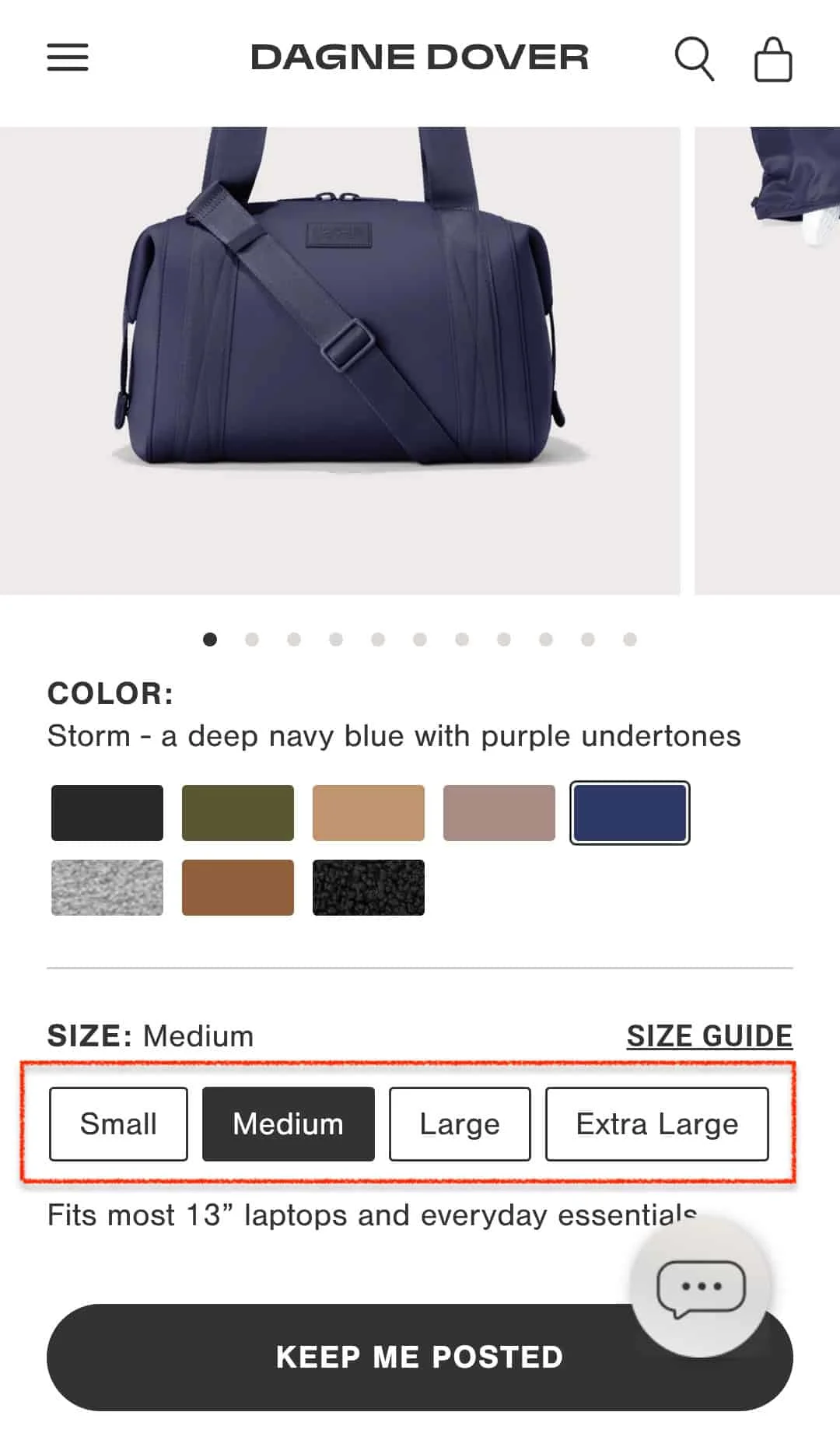
4. Are Your Size/Variant Options Easy to Select With a Thumb?
Small, tightly packed buttons for colour or size. Dropdown menus that open in the wrong direction. Swatches so tiny they’re effectively decorative.
The thumb is not a precision instrument; the average thumb pad covers roughly 44–57 pixels, which is exactly why Apple set 44x44 pixels as the minimum tap target size.
Most variant selectors on mobile fall well short of this, resulting in a quiet but consistent source of drop-offs at the exact moment a customer is trying to commit.
The yes/no test: Try selecting a size or variant on your product page using only your thumb. Can you do it in one tap, without hitting the wrong option?
Yes: Move on.
No: Increase tap target sizes, add spacing between options, and replace dropdowns with visible button selectors.
5. Do You Show Shipping Costs Before the Checkout Page?
Unexpected extra costs are the single biggest reason for cart abandonment, with 49% of shoppers who leave without buying citing them.
The most reliable trigger is a shipping fee that appears only at the final step of checkout: after the customer has committed, chosen their variant, tapped through three screens, and entered their details.
At which point, a significant number leave.
And a meaningful proportion never come back. Baymard estimates that fixing unexpected costs alone could recover $260 billion in abandoned orders globally. The shipping line on your product page isn’t a detail. It’s a revenue decision.
The yes/no test: Go through your own checkout as a first-time customer. Is the shipping cost visible on the product page, before clicking Add to Cart?
Yes: Move on.
No: Add a shipping cost indicator on the product page, near the price. If you offer free shipping above a threshold, make that threshold visible and prominent.
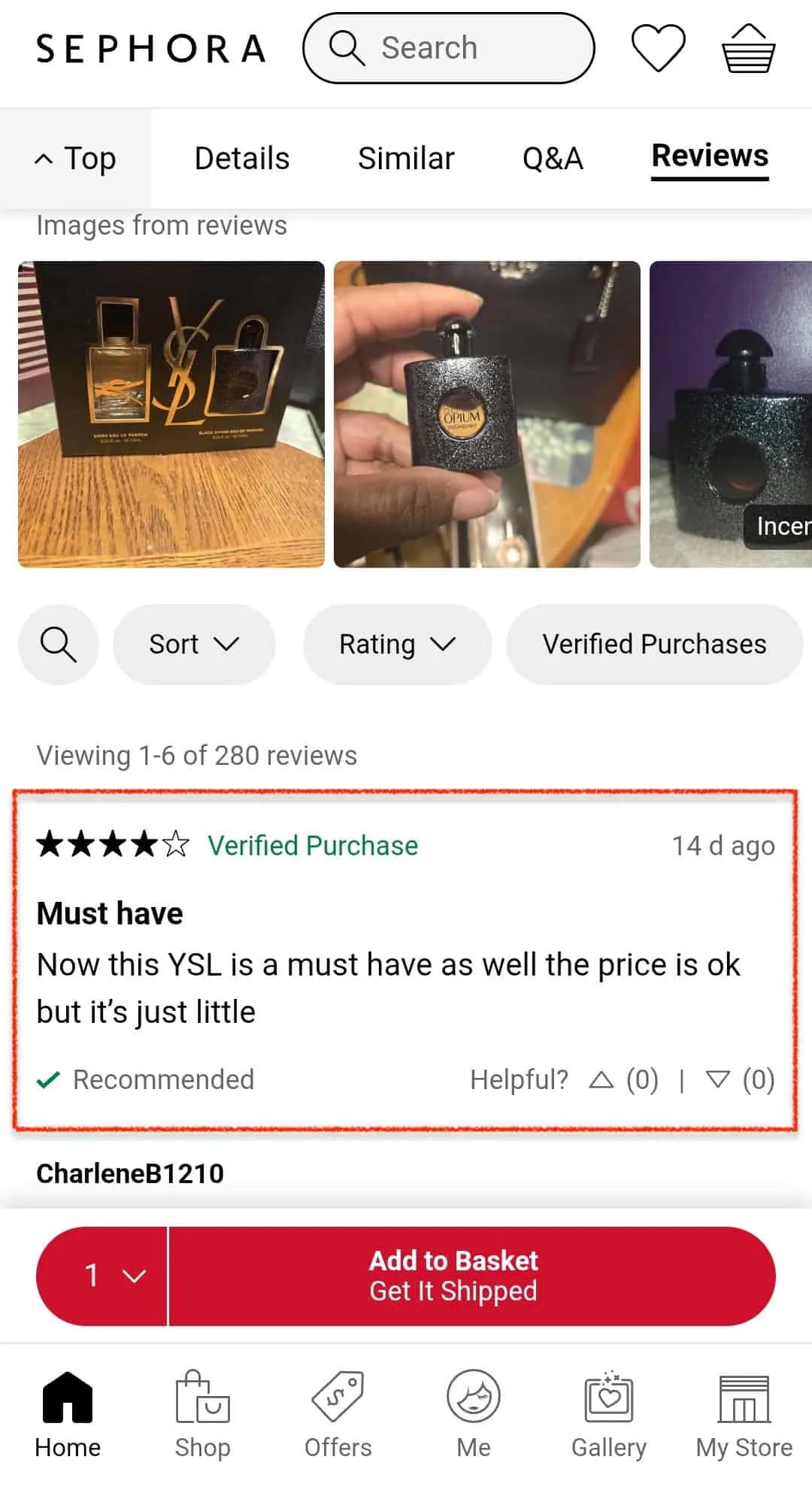
6. Are Customer Reviews Visible Without Leaving the Product Page?
On mobile, the decision to buy or leave is made in seconds. Social proof isn’t a nice-to-have; it’s structural.
Many product pages bury reviews behind a tab, link out to a separate page, or show a star rating with no content beneath it. A number out of five tells a shopper very little. The review itself, specific, human, occasionally eccentric, is what builds trust.
The yes/no test: Can you read at least one full customer review on your product page without tapping away to another page or tab?
Yes: Move on.
No: Surface two or three full reviews directly on the page, below product details. A filterable review section is better still.
7. Do You Display Trust Signals Near the CTA?
Right at the point of commitment, a small but perfectly formed doubt arrives: is this store legitimate? What happens if it doesn’t fit? Can I return it?
Trust signals: return policies, secure payment icons, money-back guarantees, and delivery windows exist to answer this doubt at the exact moment it arises. Placed anywhere other than near the CTA, they’re significantly less effective.
The yes/no test: Within two thumb-lengths of your Add to Cart button, is there at least one visible trust signal?
Yes: Move on.
No: Add a short, scannable row of trust icons directly above or below your CTA. Returns policy, payment security, and delivery estimate are the three that move the needle most.
8. Do You Show Stock Availability on the Product Page?
“Only 3 left” is not a manipulation tactic when it’s true. It’s useful information that helps a customer decide.
Stores that don’t show stock availability are leaving this motivation on the table and also failing the customer, since nobody enjoys adding something to the cart only to discover at checkout that it’s out of stock.
The yes/no test: Can a shopper see current stock availability or a low-stock warning on your product page without adding to the cart?
Yes: Move on.
No: Add a stock indicator near the CTA. If inventory is low, say so plainly. If out of stock, offer an email notification rather than a dead end.
9. Can Customers Get Back to Their Previous Search Without Losing Their Filters?
A customer searches “women’s running shoes under $100,” applies filters, taps into a product page, hits back, and finds themselves on the category root.
All filters gone. All progress erased. This happens because many stores don’t preserve the filter state on navigation. From a technical standpoint, it’s a straightforward fix. From a conversion standpoint, it’s anything but small: frustrated shoppers don’t reapply filters. They leave.
The yes/no test: Apply two or three filters on your mobile store, tap into a product page, then hit back. Are your filters still intact?
Yes: Move on.
No: Prioritise this as a development fix. In the meantime, ensure breadcrumbs show the customer where they came from.
10. Does Your Page Work Without Horizontal Scrolling?
Horizontal scrolling leaves no obvious trace in your analytics, just a bounce, indistinguishable from any other. It happens most when desktop elements like wide tables, comparison charts, or large images are carried over to mobile without reformatting.
The page technically works. But it requires an interaction so at odds with normal mobile behaviour that most people simply won’t bother.
The yes/no test: Scroll through your product page entirely on a phone. Does any element require horizontal scrolling to view in full?
Yes: Stack tables vertically, replace wide charts with bullet points, and constrain all images to screen width.
No: Move on.
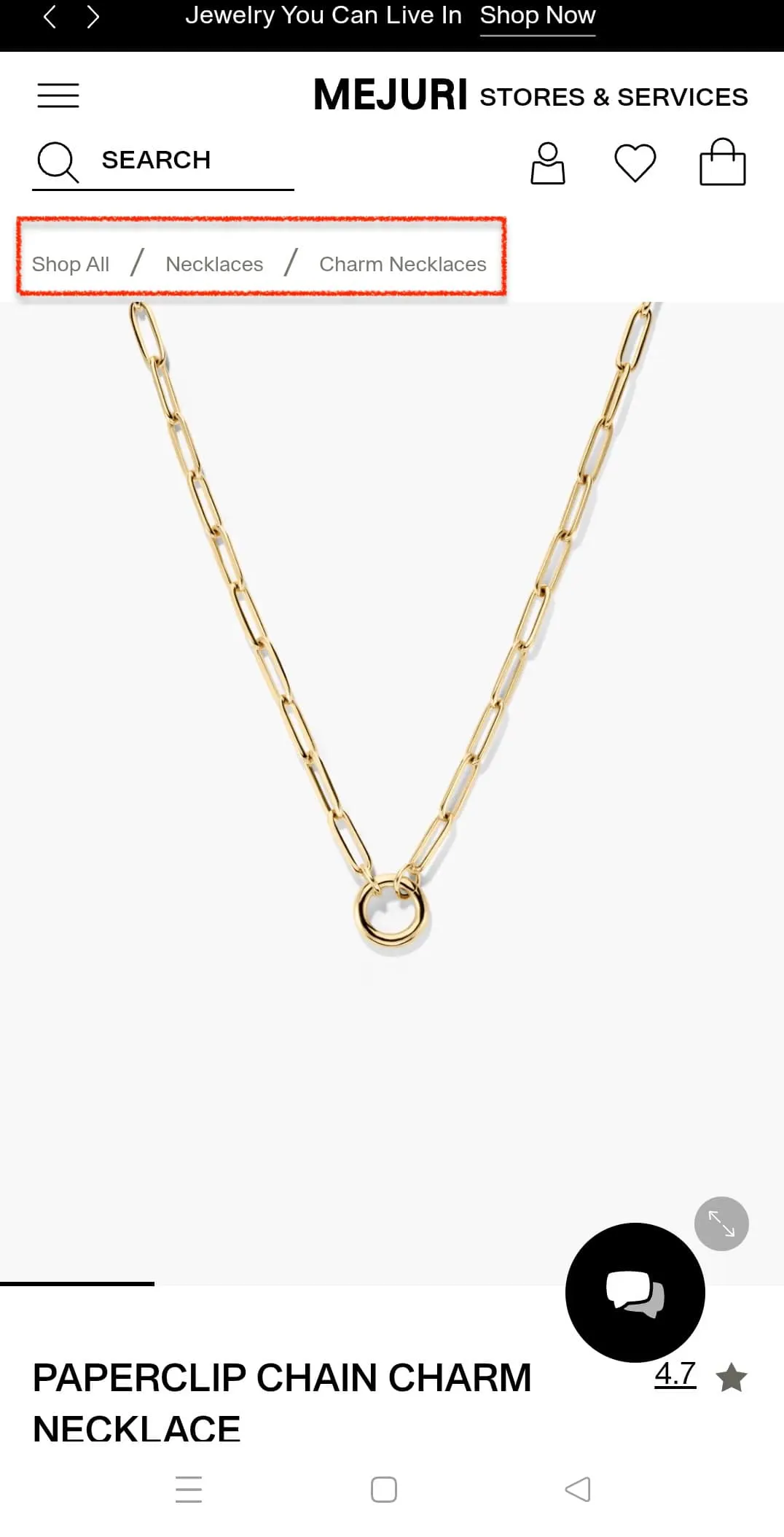
11. Are Your Breadcrumbs Visible and Tappable on Mobile?
Breadcrumbs are features nobody notices when they work, and everybody feels when they don’t. On a desktop, they sit unobtrusively doing their job. On mobile, cramped conditions mean they’re frequently invisible, untappable, or wrapped across two lines, more confusing than helpful.
The customer who can’t figure out where they are in your store is, in all likelihood, about to leave it.
The yes/no test: Are the breadcrumbs visible at the top of your product page, and can you tap each one cleanly without hitting the wrong element?
Yes: Move on.
No: Simplify to a maximum of three levels, increase tap target size, and ensure each crumb is clearly separated.
12. Do You Have a Sticky CTA That Follows the Customer as They Scroll?
A customer scrolling through images, reading descriptions, and checking reviews is in an active state of consideration. At any point, they might tip from considering to deciding. At that exact moment, the CTA should be present, requiring a single tap.
Without a sticky CTA, the customer who decides halfway down must scroll back up to act. Some will. Many won’t. Stores that implement a sticky CTA typically see a 10–15% lift in Add to Cart rates from the same traffic, the same product, the same page.
The yes/no test: Scroll to the very bottom of your mobile product page. Is there a visible, tappable Add to Cart button without scrolling back up?
Yes: Move on.
No: Implement a sticky CTA bar fixed at the bottom of the screen. Keep it slim and ensure it doesn’t obscure critical content.
13. Are Upsell and Cross-Sell Recommendations Shown Without Disrupting the Purchase Flow?
There’s a fine line between a helpful suggestion and an unwanted interruption. On mobile, where the purchase flow is already fragile, that line is finer still.
The most common mistake is placing recommendations in the middle of the page, breaking the natural flow toward the CTA. The customer loses their place, gets distracted, and the moment of purchase intent evaporates.
The yes/no test: Do your upsell or cross-sell recommendations appear below the CTA rather than between the product details and the Add to Cart button?
Yes: Move on.
No: Move recommendations below the fold, after the CTA. They should feel like a natural extension of the page, not a tollbooth on the way to checkout.
14. Do You Use Urgency or Social Proof Nudges Near the CTA?
“12 people viewing this right now.” “Only 4 left in stock.” “47 sold in the last 24 hours.” These work because they answer the unspoken question every hesitant shopper is asking: Is this worth it, and will I regret not acting now? One nudge, placed near the CTA, grounded in real data, is enough. Manufactured urgency that customers can see through does more damage than no urgency at all.
The yes/no test: Is there at least one urgency or social proof nudge visible near your CTA without scrolling?
Yes: Move on.
No: Add one low stock warning, live viewer count, recent sales notification, or a bestseller tag. Keep it real.
15. Does Your Product Title Match What Customers Actually Type Into Google?
Most eCommerce teams name products the way a cataloguer might, precisely, internally consistent, and almost entirely useless to a stranger with a problem to solve. “HB-44X Lumbar Support Module” is a fine name for a warehouse shelf.
It’s a poor answer to what someone types at 10 pm when their back hurts: “cushion for lower back pain office chair.”
Mobile shoppers are overwhelmingly search-first. They don’t browse, they hunt. If your title doesn’t echo the words in their head, your page simply doesn’t exist to them.
And that’s not an SEO problem. That’s lost revenue.
The yes/no test: Open Google and type what your customer searches for. Does your product title contain those exact words — not synonyms, not internal terminology, but those words?
Yes: Move on.
No: Check your site search logs, Google’s autocomplete, and the “people also ask” results for your category. The language is freely available. Use it.
16. Is Your Checkout Reachable in 2 Taps or Fewer From the Product Page?
Every additional step between a buying decision and its completion is an opportunity for a customer to change their mind.
On mobile, where interruptions are the permanent condition, this is amplified. Two taps, Add to Cart, Proceed to Checkout, is the standard.
Three is acceptable. Four or more is a problem dressed up as a checkout process.
The yes/no test: Starting from your product page, count how many taps are required to reach the payment screen. Is it two or fewer?
Yes: Move on.
No: Audit your checkout for unnecessary steps. Consider a Buy Now button that bypasses the cart entirely for customers ready to commit immediately.
Your Mobile Product Page Is Either Working or It Isn't. Now You Know Which
If you've reached the end of this checklist with more No's than Yes's, you're not in bad company.
Most eCommerce stores have between four and eight of these issues running quietly in the background on pages that are otherwise well-stocked, well-designed, and well-intentioned.
But here's the thing: this checklist only shows you what's visible on the surface.
The deeper issues, the ones that don't show up in a manual walkthrough but show up very clearly in your conversion rate, typically require a trained eye and a full audit to find.
That's exactly what we do.
If you found even 3–4 issues here, your mobile experience is already leaking revenue. We'll go through your entire store: product pages, cart, checkout, and come back with a prioritised list of exactly what to fix and in what order. No generics. No guesswork. Just a clear diagnosis specific to your store.


.svg)

.svg)

.svg)
.svg)
