Landing Page Conversion Rate Optimization: 11 Proven Ideas


There’s something peculiarly humbling about a landing page. You pour your heart and soul into creating one, but it’s always hard to meet your conversion goals.
Some pages succeed with the economy of a master craftsman; others suffer, nobly but hopelessly, like a tent in a windstorm.
If you’re a founder or marketer who wants more conversions and less guesswork, read on.
We’ll start by asking the right questions, then show you how to test the answers until they stop being wrong.
If you want your landing page to convert more visitors, start with the basics: a fast, clean, and focused page.
Make your headline instantly tell people what they’ll get. Keep your design simple and remove anything that competes with your main call to action.
Use clear, benefit-driven copy that sounds like a human, not a marketing robot.
Next, build trust fast. Add reviews, real photos, guarantees, and anything that reduces hesitation.
Make your offer feel valuable and time-worthy, whether that’s a discount, a free trial, or a helpful download.
Then comes the engine of great landing page performance: A/B testing. Try new headlines, new CTA buttons, different layouts, and even different hero images.
Keep what wins, ditch what doesn’t.
Make the user journey effortless. Shorten forms, reduce steps, and make sure the mobile version works beautifully.
Every extra field or friction point drops your conversion rate.
In short: great landing page CRO is clarity + trust + simplicity + testing. Focus on these, and your conversions will fly high.
This post covers:
Design for How People Buy (Not How You Want to Sell)
The “Scrolling Story Arc”: Landing Pages Should Have Narrative Tension
Design a Landing Page That Deposits Attention, But Doesn’t Drain It
Because Slow Pages Kill Good Intentions
Make Every Pixel Pay: Design Pages That Delight
Show, Don’t Just Tell: Turn Browsers into Buyers with Demo Videos
From Words to Wallets: Master the CTA
Let Your Success Stories Do the Talking
Less is More: Simplify Lead Forms to Boost Conversions
Treat A/B Testing as Your Conversion Control Tower
Turn Your Offer Into a No-Brainer Moment
A 10% conversion rate is often seen as “good,” but the truth is that what counts as good depends heavily on your industry and the purpose of your landing page.
For instance, a good conversion rate for a low-priced eCommerce product would be much higher when you compare it with a B2B enterprise SaaS subscription.
The “right” conversion rate depends on your product, your audience, and what you’re asking people to do.
A newsletter signup page might hit 30%, while a high-ticket (say $12000) product page may sit closer to 3–5%.
Here’s a quick overview of the median conversion rates in different industries from a study conducted by Unbounce.

As you can see in this chart, the median conversion rate in the media and entertainment industry is 12.3%, while it’s only 3.8% in SaaS and 4.2% in eCommerce.
Creating a high-converting landing page is about following simple principles of conversion optimization.
You need to visualize your landing page as a short, focused conversation.
You welcome the visitor, explain the value clearly, show them why they can trust you, and make it incredibly easy for them to say “yes.”
In the next few steps, we’ll walk through exactly how to structure your page, what to highlight, what to remove, and how to make every element work together so your landing pages work as revenue-generating machines for your business.
Most landing pages read like an enthusiastic salesperson who barges in with a pitch before you’ve even hung up your coat.
They’re built around internal priorities, the features the team is proud of, the messaging marketing wants to push, the CTA the CEO swears will “drive conversions.”
But here’s the uncomfortable truth: people don’t buy in that order.
They follow their own quiet, instinctive buying journey, scanning for reassurance, checking for risk, looking for social proof, and deciding whether the value is clear enough to trust.
When your landing page mirrors your sales process instead of their decision-making process, the whole experience feels slightly off.
Flip that script, design for the real user journey, and your landing page conversion rate climbs with almost suspicious ease.
Map your landing page to the real buying journey: Most visitors don’t arrive ready to act. They browse, compare, doubt, and reassess.
Align your layout with how shoppers naturally move from curiosity → clarity → trust → action. Here’s how the process looks:
If you do this well, your landing page stops feeling like a sales pitch, and your customers start feeling like they’re having a conversation with a consultant who’s guiding them through their buying journey.
👉 Lead with what buyers want to know first, not what you want to say: Users scan for benefits, proof, risk reduction, and price clues long before they care about features.
Organize your content around their mental checklist, not your internal messaging priorities. Let’s learn this with the help of an example.
A meal-kit startup opens its page with:
“We’re an award-winning logistics company revolutionizing vertically integrated food supply chains.”
That’s the kind of sentence that makes readers slowly back away from their laptops. It answers zero buyer questions and feels like it escaped from a corporate annual report.
The same company could instead begin with:
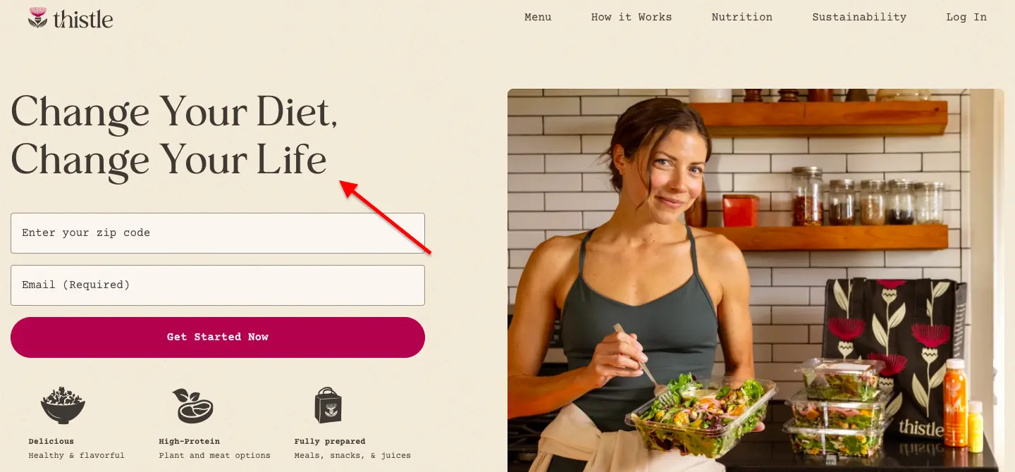
“Delicious, done-for-you meals in under 15 minutes. Fresh ingredients, step-by-step recipes, and zero prep panic.”
Followed by:
4M meals delivered. 98% of customers stay for month two. Cancel anytime.
Now the visitor instantly sees benefits, proof, and reduced risk, all the things they instinctively scan for, before they even wonder how the service works.
👉 Reduce decision friction with clear, confidence-building cues: Social proof, transparent pricing, simple layout, and predictable interactions help visitors feel in control.
👉 Use empathy, not persuasion, to guide the page flow: When your landing page mirrors the shopper’s mindset, questions, motivations, anxieties, and excitement, the experience feels intuitive.
And intuitive pages convert better because they respect how humans actually decide.

Most landing pages are linear, boring, and forgettable, just a block of copy, a hero image, and a lonely CTA.
But humans respond to stories. A high-converting landing page isn’t just a page; it’s a micro-narrative.
It hooks attention, builds curiosity, escalates tension, proves value, and delivers a payoff for your CTA.
Think of every scroll as a page turn in a story people actually want to finish.
Treat your landing page like a narrative, and suddenly, conversion rates stop being a mystery and start feeling inevitable.
Hook immediately with a compelling premise.
Your headline and hero section should grab attention and promise a benefit, just like the first sentence of a great story. If visitors aren’t intrigued in the first few seconds, they won’t scroll.
Here are some steps to infuse a story arc in your landing pages:
👉 Build tension through curiosity and conflict: Highlight the problem, friction, or pain your audience faces.
Use subheads, visuals, or short anecdotes to make them care, and prime them for your solution.
👉 Deliver proof and reassurance before the payoff: Testimonials, case studies, stats, and guarantees act like plot twists that resolve doubt.
This is where your page earns credibility and trust while maintaining narrative momentum.
👉 Reward the scroll with a clear, satisfying CTA: The payoff should feel earned.
After guiding users through tension, proof, and benefit, your CTA becomes the natural conclusion, the “aha” moment, where conversion feels like the obvious next step.

Visitors arrive with a limited attention budget. Every scroll, click, or form field is a small withdrawal. Most landing pages spend recklessly. Too many choices. Too much text. Too many distractions. The result?
Fatigued visitors who leave without converting.
The best landing pages act like smart bankers. They drain attention. They guide users carefully.
They conserve mental energy. Every section, every visual, every word earns its place.
When a landing page respects attention, visitors feel understood. They stay engaged.
They gain confidence. And conversion stops being a question; it becomes almost inevitable.
Here’s how you can create high-converting landing pages that do not drain a user’s attention:
👉 Simplify the visual hierarchy: Clutter is an attention tax. Use whitespace, clear headings, and a single primary CTA to focus users on what truly matters.
👉 Limit cognitive load: Remove unnecessary options, long forms, or excessive choices. The fewer decisions a user has to make, the more likely they are to act.
👉 Guide scrolling with purpose: Break content into digestible sections that naturally lead visitors down the page.
Use visuals, subheads, and cues to pique curiosity without fatigue.
👉 Reward attention with value at every step: Every section should give something worthwhile, proof, clarity, benefit, or reassurance.
Visitors feel their attention is earned and are more likely to convert.
Further Reading: How To Use Visual Commerce To Improve Conversions
If your landing page takes too long to load, your visitors won’t stick around to see your offer. On the other hand, fast-loading pages feel effortless.
Speed matters because people browse with short attention spans, busy thumbs, and often patchy mobile data.
A landing page that appears instantly sets the tone: this brand is reliable, smooth, and worth my time.
Here’s how you can make your landing pages load like lightning:
👉 Trim heavy images: Large images are the biggest culprits of slowdown. Compress them, resize them, and use modern formats like WebP.
Your visitors won’t notice the difference in quality, but they will notice the faster load time.
👉 Remove the extras you don’t need: Extra scripts, widgets, plugins, and fancy add-ons might seem helpful, but they pile up.
Keep only what adds real value to the page. Simpler pages load faster and convert better.
👉 Use lazy loading for visuals: If your page has multiple images or videos, don’t load them all at once.
Load only what visitors see at first, let the rest appear as they scroll.
👉 Pick a fast, reliable hosting setup: Your landing page is only as fast as the server hosting it.
Using a reliable CDN (Content Delivery Network) ensures your page loads quickly, no matter where your visitors are located.
👉 Test your page speed regularly: Use tools like PageSpeed Insights or GTmetrix to spot hidden issues.
Sometimes, a tiny fix, a script moved, an image swapped, can shave off a full second.
The faster your landing page loads, the more people stay, explore, and convert. That’s why it’s one of the simplest wins in landing page conversion rate optimization.
Further Reading: How to Speed Up Shopify Website - 17 Practical Ideas
A landing page should feel good the moment someone lands on it. Not overwhelming, not cluttered, just clean and easy on the eyes.
When a page looks beautiful and organized, people instinctively trust the brand behind it.
The goal isn’t to create a work of art.
It’s to make the page so visually clear and appealing that visitors instantly understand what you’re offering and feel comfortable taking the next step.
Here’s how to make your landing pages visually delightful:
👉 Use plenty of breathing room: Don’t cram everything together. White space helps your message stand out and makes your page feel easy to read.
A spacious layout keeps visitors from feeling rushed or overwhelmed. Here’s a good example from Udacity:

👉 Choose colors with purpose: Pick a color palette that fits your brand and supports the mood you want to create. Use brighter colors for buttons and key actions so your call to action naturally stands out without shouting.
👉 Keep your visuals crisp and relevant: Use high-quality product images, lifestyle photos, or illustrations that help people “get it” instantly. If your visuals don’t add clarity or trust, they don’t need to be there.
👉 Make the text scannable: Most people don’t read, at least not at first. So, it’s ideal to break your message into short paragraphs, bold subheads, and simple bullets so visitors can scan the copy more quickly.
👉 Maintain a clear visual hierarchy: Decide what you want people to notice first, second, and third, and design the page to guide their eyes in that order.
Big headlines, clear sections, and a strong CTA help visitors move naturally toward the action.
👉 Keep the design focused on one goal: Beautiful design doesn’t distract; it directs. Every element, from fonts to icons, should support the main action you want visitors to take.
When your landing page feels comfortable, it piques curiosity and is most likely to drive conversions for your business.
A demo video gives customers instant clarity. Instead of guessing how your product works or what makes it valuable, they can watch it come to life in just a few seconds.
This kind of visual explanation builds confidence and removes the uncertainty that holds people back from taking action.
Here’s how to make demo videos work harder for your landing page:
👉 Keep it crisp and purposeful: Focus on the core idea: what the product does and why it matters. A short, tight video keeps attention without overwhelming your audience.
👉 Show the product in everyday use: Let customers see the product in a real setting.
Simple, natural demonstrations help them understand how it fits into their lives.
👉 Highlight the key benefit: Every product has a moment where its value becomes obvious.
Make sure that moment is clear and easy to spot in the video.
👉 Place the video where it can’t be missed: Position it near the top of the page so people can watch it right away without scrolling.
👉 Add captions for silent viewing: Many people watch videos with sound off. Captions help them follow along without missing anything important.
👉 Keep the production clean but straightforward: You don’t need elaborate effects.
Good lighting, steady footage, and a simple narrative are more than enough to make the product feel real and trustworthy.
A thoughtful demo video can turn curiosity into understanding and understanding into action when customers can clearly see how your product works; they’re far more comfortable moving forward.
Here’s a good example from the University of Texas:

Their site is cited among higher-ed examples that use an “ambient hero video” on the homepage showing campus buildings, student life, and landmarks to give visitors an immediate sense of what it’s like to be part of the community.
Your call to action is one of the most important parts of your landing page. It’s the point where customers decide whether they’re ready to move forward.
To help them take that step, your CTA needs to be easy to spot, easy to understand, and worth clicking.
Here’s how to make your CTAs more effective:
👉 Use clear, direct wording: Choose phrases that tell customers exactly what will happen: “Get Started,” “Download Now,” “Start My Trial.”
Straightforward language removes guesswork.
👉 Make the button visually distinct: A CTA should stand out from the rest of the page. Use a contrasting color and enough space around it so customers can locate it instantly.

👉 Use time-friendly cues when appropriate: If the offer is time-sensitive, a small prompt like “Ends Today” or “Limited Offer” can help customers decide without delay. Keep it honest and simple.
Further Reading: The Most Powerful CTA Phrases in eCommerce
Customers want to feel certain they’re making the right choice, and nothing builds that confidence faster than seeing real experiences from real people.
Social proof turns your landing page from a “maybe” into a “this works for others like me.” When visitors see evidence that your product delivers on its promises, their decision becomes much easier.
To make social proof truly effective, it needs to be visible, genuine, and relevant to the action you want customers to take.
Here’s how to elevate social proof on your landing pages:
👉 Highlight customer reviews that speak to real outcomes: Instead of generic praise, feature reviews that clearly explain how your product solved a problem or improved someone’s day-to-day life.
These specific, relatable details help customers picture the same results for themselves.
👉 Use visual proof wherever possible: Photos, short customer clips, star ratings, and screenshots create instant credibility.
People trust what they can see, and visual testimonials feel more grounded than text alone.
👉 Place proof near decision points: Add reviews or testimonials close to your CTA, pricing section, or form.
Customers often pause at these moments, and reassurance right there can tip the balance in your favor.
👉 Showcase recognizable logos or trust badges: If you’ve been featured in publications, partnered with known brands, or have certifications, display them clearly.
These familiar symbols reinforce reliability and lower perceived risk.
👉 Bring in numbers when they strengthen the story: Statements like “Over 20,000 customers trust us” or “Rated 4.8/5 based on 3,200 reviews” instantly communicate scale and consistency.
Use them only when the data is genuine and up to date.
👉 Keep everything authentic: Avoid over-polished or too-perfect reviews. Natural language, balanced wording, and honest opinions feel far more credible.
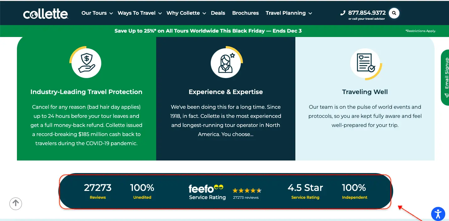
Here’s an excellent example from Collette, a popular travel experience platform.
They’ve used a section of their landing page to highlight their experience and their expertise in a visually appealing way:

Social proof is more than a landing page accessory; it’s a trust builder. When customers see that others have taken the same step and benefited, the path forward feels much safer.

The more effort your form demands, the more customers hesitate. A simple, well-designed form removes that burden. The key is to ask only for what you truly need and present it in a way that feels straightforward and respectful of the customer’s time.
Here’s how to create lead forms that convert more effectively:
👉 Limit the number of fields: Every additional field adds mental effort. Start with the essentials, name and email are often enough.
If you need more details, collect them gradually later in the customer journey.
👉 Use a clean, single-column layout: A tidy vertical structure is easier to follow and encourages customers to move from step to step.
Multi-column forms often look confusing and slow people down.
👉 Offer autofill whenever possible: Customers appreciate anything that saves typing.
Autofill for names, emails, and addresses reduces errors and speeds up the entire process.
👉 Label fields clearly: Avoid vague prompts. Instead of “Details,” use “Work Email.”
Instead of “Phone,” say “Phone Number (optional).” Good labeling removes uncertainty and encourages smoother completion.
👉 Make optional fields truly optional: If a field isn’t required, label it clearly or remove it entirely.
People often abandon forms when they feel forced to share more information than necessary.
👉 Add a small piece of reassurance: A simple note like “We’ll never share your information” or “Unsubscribe anytime” builds trust and reduces anxiety around privacy.
Use a progress indicator for longer forms: If your form genuinely needs multiple steps, show customers how far along they are.
Small progress markers make the process feel manageable.
👉 Test different versions regularly: Form optimization is practical and measurable.
Try shorter versions, altered field orders, or different layouts to see what leads to better completion rates.
A simplified lead form shows customers that you value their time and want the process to be as smooth as possible.
When the path to signing up feels light and straightforward, many more people are likely to complete it.
A/B testing is where guesswork goes to die. The best-performing landing pages run on controlled experiments that show you, with absolute clarity, what actually works.
When you test headlines, layouts, CTAs, or even something as small as button spacing, you gain real behavioral insights that no “rule of thumb” can give you.
A/B testing turns your landing page into a living, evolving system. Each experiment, whether it wins or flops, sharpens your understanding of your audience.
Small lifts compound, and over time, those incremental gains turn into dramatic conversion improvements.
The key is discipline: test one element at a time, let the data run its course, and resist the urge to crown a winner too early.
Customer behavior shifts, attention spans shorten, trends fade, and ongoing testing keeps you aligned with what works right now, not last season.
Approach testing with curiosity and rigor, and your landing page will never stop improving. It becomes a feedback machine, one that tells you exactly how to convert more of the people already showing up.
Here are some key strategies for running A/B tests for improved landing page conversions:
👉 Test one variable at a time: Changing multiple elements at once muddies the results. Isolate a single variable so you know exactly what caused the lift (or drop).
👉 Run tests long enough to gather real data: Don’t declare winners overnight.
Give your tests enough traffic and time to reach statistical confidence; rushing leads to misleading conclusions.
👉 Prioritize tests with the highest potential impact: Start with elements that influence decisions most: headlines, CTAs, hero copy, and layout order.
Small changes in these areas can create outsized gains.
👉 Let behavior, not personal preference, determine the winner: The goal isn’t to validate your favorite idea; it’s to uncover what resonates with real users.
Trust the data even when it surprises you.
Further Reading: 134 A/B Testing Ideas For BigCommerce Stores

Most landing pages treat offers like afterthoughts, small bonuses tucked between blocks of copy. But the brands that convert hardest understand a simple truth: your offer is the moment everything clicks.
A powerful offer doesn’t shout; it sharpens desire. It takes whatever a visitor is already considering and makes the decision feel unmistakably smart.
Whether it’s a value-packed bundle, a limited-time upgrade, or a perk that removes friction entirely, irresistible offers shift the customer’s mindset from “Should I?” to “Why wouldn’t I?”
When you present the right incentive at the right moment, conversions stop being a hope and start becoming a pattern.
Make the value unmistakably clear.
Don’t assume customers will connect the dots; spell out exactly why the offer elevates the experience or saves them meaningful time, money, or effort.
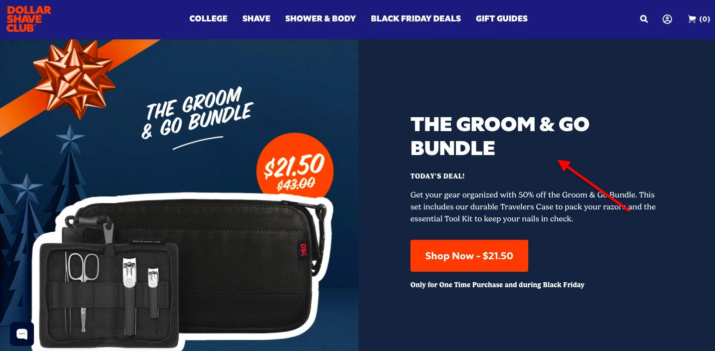
👉 Anchor the offer against something bigger: Compare it to the regular price, the full bundle, or the cost of not acting.
Anchoring gives the promotion context and instantly strengthens perceived value.
👉 Add a friction-removing perk: A small upgrade, free shipping, a bonus add-on, a faster checkout path, can tip hesitant visitors into buyers by removing the last psychological hurdle.
👉 Time limit with intention, not pressure: Use natural time cues (“Weekend Special,” “Season Kickoff,” “New Launch Offer”) to create momentum without feeling manipulative.
The goal is urgency, not anxiety.
Landing page optimization is the deliberate, almost scientific act of tuning a page’s design, layout, copy, and user experience so that more visitors do the thing you desperately want them to do.
It’s where artful persuasion meets data-backed iteration, all in service of boosting conversions and smoothing every bump in the user journey.
It’s a more focused branch of the wider conversion rate optimization (CRO) universe.
While CRO looks at your entire conversion funnel, landing page optimization zooms in on a single, high-stakes moment: the page where user intent collides with your value proposition.
The goal? Increase landing page performance by making every element, your headline, hero section, social proof, CTA placement, and even the form fields, more targeted and more irresistible.
A truly optimized landing page gives visitors exactly what they came for: clear messaging, fast load times, intuitive design, and just enough persuasive nudge to make clicking the CTA feel like the natural next step.
Let’s take a brief stroll into the world of numbers, the friendliest kind, I promise.
To understand how well your landing page is doing its job, you need to know your conversion rate, which is simply the percentage of visitors who completed your desired action.
Here’s the no-nonsense formula:
Conversion Rate = (Total Conversions ÷ Total Visitors) × 100
If you had 1,000 people visit your newsletter signup page, and 50 of them raised their hands and subscribed, the math goes like this:
50 ÷ 1,000 = 0.05 → 5% conversion rate
No spreadsheets, no PhD required, just basic arithmetic and a willingness to face the truth your analytics are trying to tell you.
A high-converting landing page needs five things: A clear value proposition that people can understand in under five seconds.
A single, visible call-to-action (no competing paths or distractions).
Benefits written in plain language, not corporate fluff. Social proof, like reviews, star ratings, customer stories, or trust badges.
A clean, focused design that guides the eye naturally toward the CTA.
A/B testing takes the guesswork out of landing page optimization. Instead of relying on hunches, you can see exactly which version of your headline, layout, or CTA leads to a higher conversion rate.
Sometimes the changes that seem tiny, like switching “Buy Now” to “Get Started,” can lead to surprisingly big lifts.
Over time, this iterative testing helps you build a landing page that’s shaped by real user behavior, not assumptions.
The best-performing pages on the internet didn’t get that way overnight; they got there by testing, testing, and testing some more.
98% of visitors who visit an eCommerce site drop off without buying anything.
Even when you feature the best eCommerce promotions.
Why: user experience issues that cause friction for visitors.
And this is the problem Convertcart solves.
We've helped 500+ eCommerce stores (in the US) improve user experience and 2X their conversions.
How we can help you:
Our conversion experts can audit your site - identify UX issues, and suggest changes to improve conversions.