In many high-intent industries, the biggest barrier to a sale isn't a lack of interest, but rather the friction of "infinite browsing" and the tendency to delay decisions. This is where a well-placed prompt changes the game. In fact, urgency nudges have been shown to make users book faster, with reservations increasing by 20% in certain industries.
In this guide, we're not just going to throw examples at you. We're going to show you the patterns behind the examples, what psychology makes them tick, what most brands get wrong, and how to apply them to your store today.
The idea comes from behavioral economists Richard Thaler and Cass Sunstein, who argued that you can steer people toward better decisions simply by changing how choices are presented without restricting any options or changing prices.
In eCommerce, that translates to something surprisingly practical: design your store so the best choice for the shopper is also the easiest one to make.
The classic example is the decoy effect. Present two products, one at $49, one at $40, and most shoppers will hesitate.
Add a third at $25 that's clearly inferior, and suddenly the $40 option looks reasonable, even smart. Nobody changed the products. Nobody changed the prices. You just changed the frame.
But here's what most guides won't tell you: nudging only works when the underlying page works. Layer urgency onto a confusing product page and you'll get confused, urgent visitors who still don't buy. The nudge is the finishing touch, not the foundation.
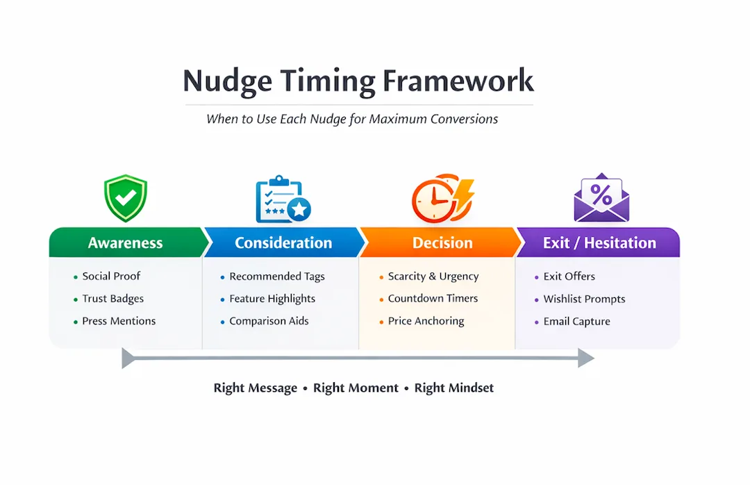
The Nudge Timing Framework (When to Use Each Nudge for Maximum Conversions)
Most brands don’t fail because they use the wrong nudges. They fail because they use the right nudges at the wrong time. Nudging isn’t about stacking tactics; it’s about matching the nudge to user intent.
The 6 Nudge Patterns That Actually Drive Conversions
We've grouped 29 examples below into six core patterns. Each pattern has a psychological principle behind it, a set of real-world examples, and crucially, a section on where most stores go wrong. Read those parts carefully. They'll save you more conversions than the examples themselves.
Pattern 1: Trust Acceleration Nudges
Why it works: Shoppers don't distrust your product; they distrust themselves for not knowing enough about it. Trust nudges remove that hesitation. They don't add persuasion; they subtract doubt.
What most brands get wrong: They dump every trust signal onto the product page at once. Five badge icons, a star rating, a review count, and a Trustpilot widget all fighting for attention. The result? None of them land. Pick your strongest signal and give it space to breathe.
How to apply it: Place your single most compelling trust signal, a review count, a "X% of buyers recommend this" stat, or a recognizable third-party badge directly beneath your product name. Not in the footer. Not buried below the fold. Right there, where the eye goes first.
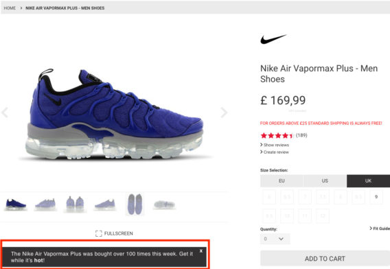
1. Nike's Notification Nudge
Nike displays a notification right under the product image gallery, showing how popular a product is in real time. This product page nudge hints at buying while the item is still trending.
What is a Notification Nudge?
A notification nudge is a message that helps shoppers discover other people's interest in the same product, a price drop, or a limited-time upgrade.
Where do Notification Nudges work best?
Especially effective for trend-driven products — clothing, beauty, gadgets. Use them on the homepage (to highlight how many products were sold that week) and on product pages.
How to implement Notification Nudge?
Make notifications dismissible
Add social proof or statistics to make them persuasive
Position them so they don't disrupt other page elements
Place them near the primary CTA, that's where they convert best
Convertcart Pro Tip: Notification nudges work especially well in a mobile conversion strategy. Pair them with an easily identifiable icon, like a human eye.
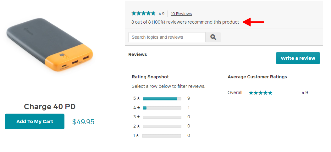
2. Biolite Energy’s Review Nudge
Biolite knows shoppers hesitate before a purchase. So alongside the standard star rating, they show how many customers actively recommend the product. That's a nudge, not just a rating.
What is a Review Nudge?
Review nudges build social proof. Their purpose is to trigger a potential customer to think: "So this brand is trustworthy and has products other people are happy with."
Where do Review Nudges work best?
Specifically for high-ticket items or products that require research cutting-edge skincare, health supplements, and customizable fitness equipment. Use them on homepage recommendations, the first fold of product pages, and above or below the order summary on the cart page.
How to implement Review Nudge?
Show customer name, profession, and location for authenticity
Pull a snippet from a real review alongside the rating and customer photo
Dedicate a product page section to "what the community says" across parameters like size, fit, comfort, and quality
Use a third-party review snapshot in the homepage header
Convertcart Pro Tip: Include a UGC review nudge in your image gallery for higher engagement and greater purchase confidence.
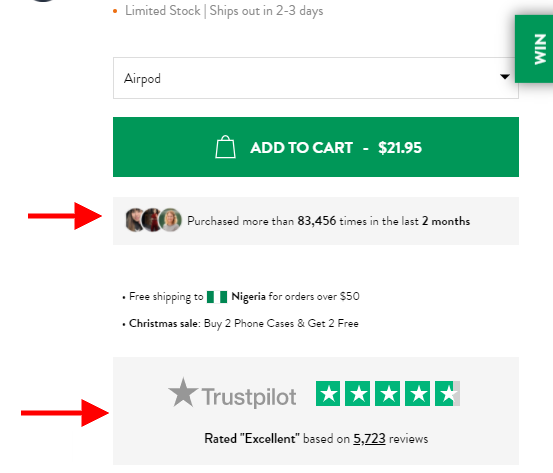
3. Burga's Social Proof Nudge
On their product page, Burga pairs customer reviews with the Trustpilot badge; the trust symbol does the heavy lifting of reinforcing reliability without adding clutter.
What is a Social Proof Nudge?
A social proof nudge creates assurance across various stages of the conversion funnel from the moment visitors land, right through to the moment they're about to add to cart.
Where do Social Proof Nudges work best?
Homepage, product pages, and order confirmation page.
How to implement Social Proof Nudge
Use the hero header for third-party social proof (like nutrition brand Huel does)
Show real customer photos alongside reviews — name, age, and a highlighted phrase
Place a review snapshot right under the product name
Convertcart Pro Tip: Back your social proof nudge with numbers: how many products sold, how many customers served, or how many rated you "excellent."
nerdwax
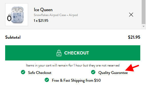
4. Burga's Reassurance Nudge
Right alongside their upsell, Burga offers three clear reassurance checks. This nudge doesn't shout at shoppers; it quietly removes every reason not to complete the checkout.
What is a Reassurance Nudge?
With cart abandonment sitting at over 70%, shoppers need convincing. Reassurance nudges address the specific fears that stop people at the final step.
Where do Reassurance Nudges work best?
Product page onwards — mini cart, order confirmation, and checkout page.
How to implement Reassurance Nudge?
Talk about a money-back guarantee right under the primary CTA on the product page
Feature popular payment logos under the primary CTA in the mini cart
Offer a popular payment method as a secondary CTA with "More payment options" microcopy
Convertcart Pro Tip: Don't restrict reassurance to the product page. Popular payment logos in the footer and third-party certifications sitewide build ambient trust, making every nudge work harder.
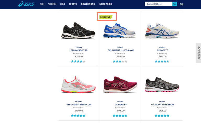
5. ASICS' Badge Nudge
Product badges nudge customers without adding cognitive load. For ASICS, badges aren't decoration; they're one of the most fundamental parts of the product's user experience.
Pattern 2: Loss Aversion & Urgency Nudges
Why it works: Decades of behavioral research confirm it humans feel losses about twice as intensely as equivalent gains. "Only 3 left" hits harder than "Buy now and save." That's not manipulation; it's math.
What most brands get wrong: Fake urgency. Countdown timers that reset. "Low stock" labels on products that are always in stock. Shoppers notice. And once they do, every other nudge on your site loses credibility, too.
How to apply it: Only deploy scarcity and urgency when they're real. If stock genuinely runs low, say so precisely, "4 left" beats "almost gone." If your sale genuinely ends, show a timer. Earn the nudge.
How do the best online stores use psychological triggers to speed up the purchase decision? Explore these optimized ways to implement a countdown timer eCommerce layout that actually lifts revenue.
6. Amazon's Urgency Nudge
Amazon figured out urgency a long time ago. Notice how they attach "free shipping" to a slower option and then frame "fastest shipping" as a limited-time condition. They don't just create urgency, they make it feel like a service.
What is an Urgency Nudge?
Urgency nudges fight a shopper's natural tendency to look elsewhere, research more, and delay. Done right, they make acting now feel smarter than waiting.
Where do Urgency Nudges work best?
Sitewide, but don't be too in-your-face about it. Use notification bars, exit-intent pop-ups, category-page banners, and product-page labels.
Urgency nudges drive conversions well across necessities food, pet care, skincare, and healthcare.
Caveat: Think twice before applying urgency to luxury products. It can work for exclusive drops via pre-order or early access, but generally, urgency and luxury don't mix.
How to implement Urgency Nudge?
Show a dynamic current price: "Get it at $X for the next [countdown timer]"
Be precise with stock: "Last 5 left" beats "Running low!"
Make it available only for free order pickup and clearly mark shipping as "out of stock"
Attach a free gift, but make it limited time
Convertcart Pro Tip: Relatable labels lift conversions. Try "Last Chance" on recommendations, or "Ends in XX minutes" on the notification bar when you auto-apply checkout discount codes.
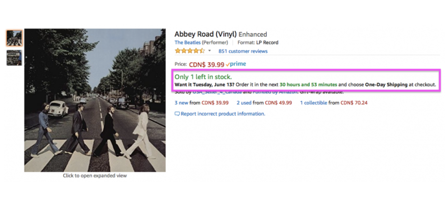
7. Amazon's Scarcity Nudge
Amazon's at it again; this time using scarcity to speed up decision-making. When someone sees "Only X left in stock," the psychology of FOMO kicks in almost involuntarily.
What is a Scarcity Nudge?
A low-stock nudge speeds up decision-making at the point of purchase by creating FOMO before hesitation can take hold.
Where do Scarcity Nudges work best?
Category pages and product pages. Apply scarcity labels on product recommendations sitewide. Works especially well for apparel, health & beauty, and nutritional supplements.
How to implement Scarcity Nudge
Feature a pre-order CTA for a bestseller that's running out
Use live activity updates: "[Name] just bought this!"
Run a flash sale with a massive price dip and limit it to a few hours
Convertcart Pro Tip: Test a grayed-out "Sold Out" CTA on the homepage hero product; it often prompts shoppers to explore the rest of the site.
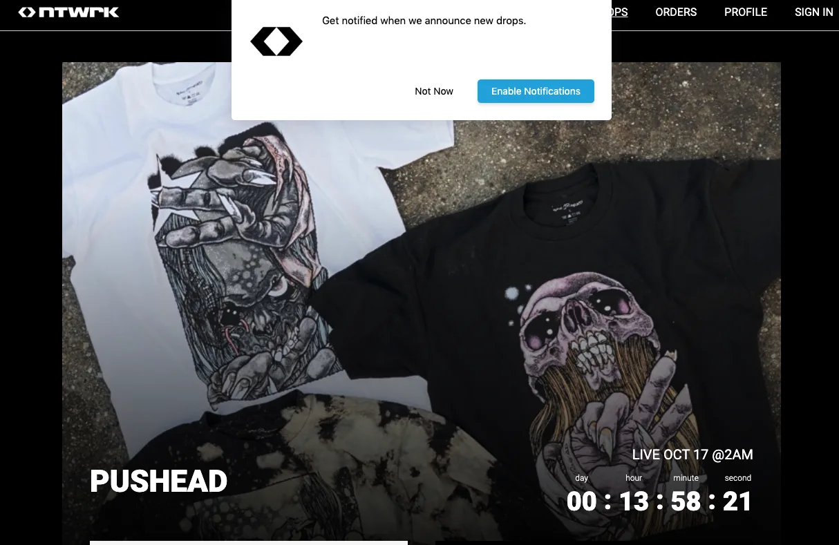
8. Ntwrk's Drop Nudge
While running a sale, Ntwrk uses a smart notification nudge to inform customers about upcoming deals and encourage them to sign up. The exclusivity of a "drop" does the heavy lifting.
What is a Drop Nudge?
Drop nudges tap into the limited-time nature of specific product collections, amplifying the sense of exclusivity a shopper associates with them.
Where do Drop Nudges work best?
As push notification nudges or slide-ins with an email or text sign-up hook.
How to implement Drop Nudge?
Reserve a dedicated nav category: "New Drops" or "Limited Collection"
Offer an "available only on app" nudge to make the drop a mystery
Do a partial hero header reveal and let the copy do the rest
Convertcart Pro Tip: Send a nudge email to subscribers with an email-only discount. It makes the drop feel even more exclusive.
Pattern 3: Decision Simplification Nudges
Why it works: The paradox of choice is real. Too many options or too much information delivered poorly pushes shoppers into paralysis. Simplification nudges make the right path feel obvious.
What most brands get wrong: They add nudges on top of complexity instead of reducing the complexity first. A "Recommended" badge doesn't help when there are 47 variants and no clear way to choose between them.
How to apply it: Before adding a nudge, ask: Have I removed every unnecessary decision from this page? Then use directional cues, arrows, contrast, white space, and a model's gaze to guide the eye where it needs to go.
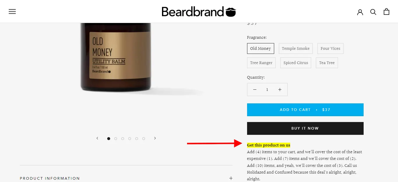
9. Beardbrand's Highlight Nudge
Most sites would just scream "Free!" Beardbrand does something smarter: they use a highlight nudge that forces shoppers to engage with the argument for buying more. It's not a shout, it's a well-placed elbow.
What is a Highlight Nudge?
A highlight nudge calls out one attribute through design, copy, or both to stop a potential shopper from scrolling past.
Where do Highlight Nudges work best?
Homepage, category pages, product detail pages, and select instances of cart and checkout pages. Also works well on notification bars and as microcopy above or below the primary CTA.
How to implement Highlight Nudge?
Feature a member-only special price in a contrasting color
Use icons like ⏰ or 🎁 on notification bar offers
Tag sale variants differently on product pages: "sale," "clearance," or "almost gone!"
Convertcart Pro Tip: On mobile, keep highlight nudges expandable unless they're already short enough to scan at a glance.
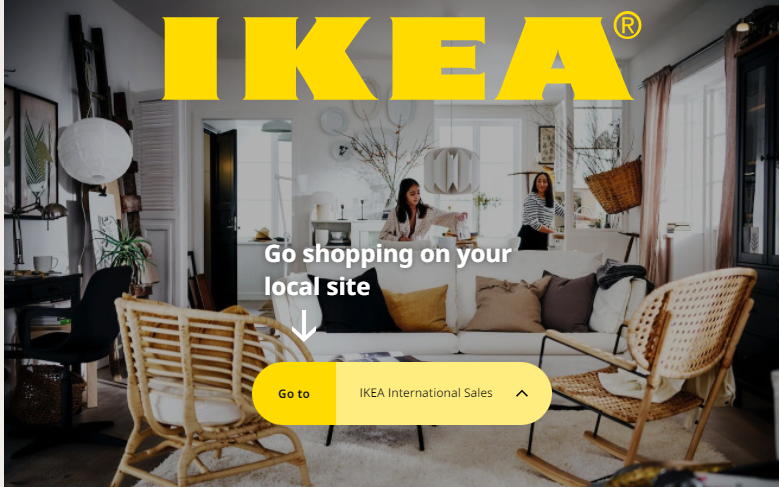
10. IKEA's Directional Nudge
IKEA uses a subtle directional arrow to help visitors identify key functions on the homepage. It doesn't demand attention; it earns it by making navigation feel intuitive.
What is a Directional Nudge?
Directional nudges guide shoppers toward decisive actions by creating confidence, bringing CTAs to prominence, or highlighting specific pages.
Where do Directional Nudges work best?
Homepage, product pages, and paid traffic landing pages.
How to implement Directional Nudge
Use imagery where the model looks at the headline
Add arrows on CTAs to increase click probability
Highlight left/right arrows on mobile recommendation carousels
Convertcart Pro Tip: Beyond explicit arrows, apply implicit directional cues: white space, color contrast, and the framing of recommendations all guide the eye without anyone noticing.
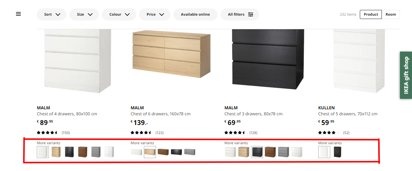
11. IKEA's Variant Nudge
IKEA nudges customers to explore a variant that might better suit their interior style, showcasing stock depth while reducing choice friction.
What is a Variant Nudge?
A variant nudge shows shoppers how many subtypes of a product exist by color, flavor, or specification without overwhelming them.
Where do Variant Nudges work best?
Stores with large catalogs: apparel, F&B, tools, perfume. Category pages and product pages.
How to implement Variant Nudge
Separate variants by "new launches," "on sale," or "limited drop" on product pages
Offer additional info when a variant is clicked — through microcopy or callout boxes
Convertcart Pro Tip: Slash out-of-stock variants sitewide. Nothing kills momentum faster than clicking a color and hitting a dead end.
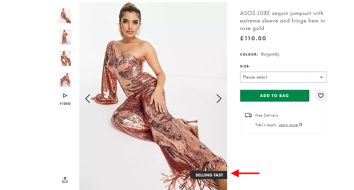
12. ASOS' In-Picture Nudge
ASOS subtly signals high demand directly on the product image. It's a nudge that works without interrupting the shopping experience. You notice it, absorb it, and move on.
What is an In-Picture Nudge?
An in-picture nudge draws instant attention to why a shopper needs to act fast or act surely, placed directly on the product image.
Where do In-Picture Nudges work best?
It's a myth that these only work for scarcity. The best brands use them to create confidence or exclusivity, too.
How to implement In-Picture Nudge?
Feature a "Shop the Look" nudge to drive cross-sells
Use "Just Dropped" for repeat customers
Apply a members-only price nudge to drive loyalty program sign-ups
Convertcart Pro Tip: Keep in-picture copy under six words. Any more and it stops being a nudge and starts being a distraction.
Pattern 4: Value & Anchoring Nudges
Why it works: People don't evaluate price in a vacuum; they compare. Show a higher reference price, and the current price feels like a bargain. Show a bundle and the per-unit math suddenly looks very attractive.
What most brands get wrong: Anchoring without context. A crossed-out price means nothing if shoppers don't believe the original was real. BNPL info buried in the footer doesn't help the shopper hesitate on the product page.
How to apply it: Place your anchor where the decision happens on the product page, above the fold, near the CTA. For BNPL, show the per-installment amount right next to the total price. Make the math effortless.
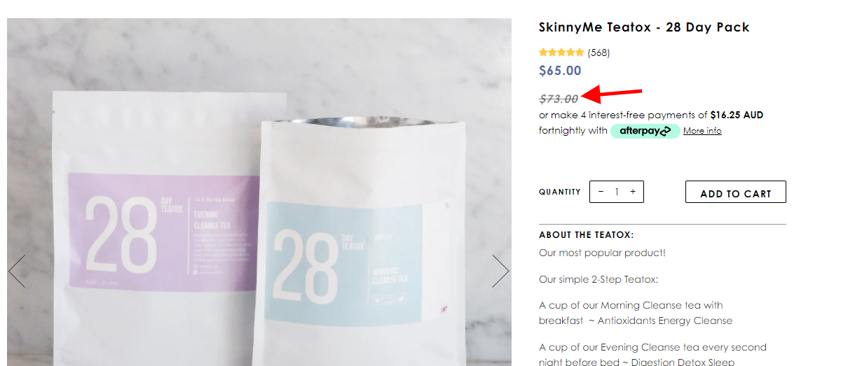
13. SkinnyMe's Price Anchoring Nudge
SkinnyMe shows the before-and-after prices side by side. The displayed drop convinces shoppers not by telling them the product is good, but by making the deal feel undeniable.
What is a Price Anchoring Nudge?
A price anchoring nudge creates a reference point against which shoppers make their purchase decision. The original price becomes the anchor that makes the discounted price irresistible.
Where do Price Anchoring Nudges work best?
On specific products during clearance sales or discounts. Also effective on pricing pages, catalog pages, and digital ads.
How to implement Price Anchoring Nudge
Show the lower price alongside the original and highlight the % savings
Break the price down to cost-per-serving or per-unit (great for nutrition and pet care)
Feature tiered pricing on the hero header and in transactional emails
Convertcart Pro Tip: Combine the decoy effect with price anchoring on the homepage and product page recommendations for maximum impact.
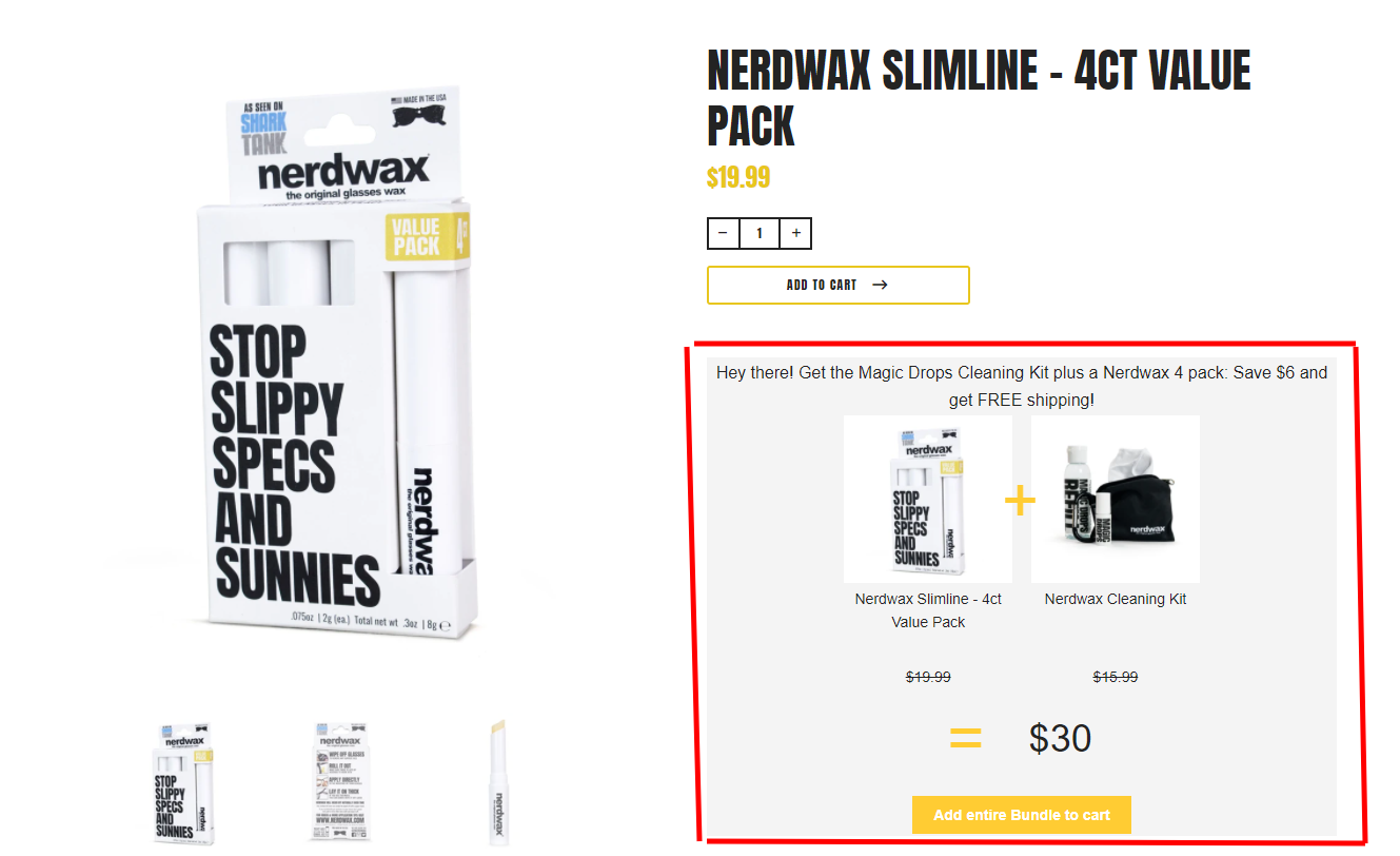
14. Nerdwax's Upsell Nudge
Nerdwax uses nudge theory to upsell a high-value bundle on their product pages. They detail what the pack contains, how much shoppers save, and include free shipping and three reasons to upgrade, all in one nudge.
What is an Upsell Nudge?
Upsell nudges recommend relevant products, increasing average order value. Done right, they feel like a win for both sides: the shopper gets more for less, the store improves margins.
Where do Upsell Nudges work best?
Product image labels across the homepage, category pages, and product pages. Also effective within the mini cart and cart page.
Caveat: Upsell nudges only convert when you personalize recommendations.
How to implement Upsell Nudge?
Let shoppers choose their "free" product on multi-buy deals
Make the nudge conditional: "online only" or "member only"
Build a subscription tier: X% off for 3 months, Y% for 6, Z% for a year
Convertcart Pro Tip: Start upsell nudges on popular products first, then expand to other categories as you gather data.
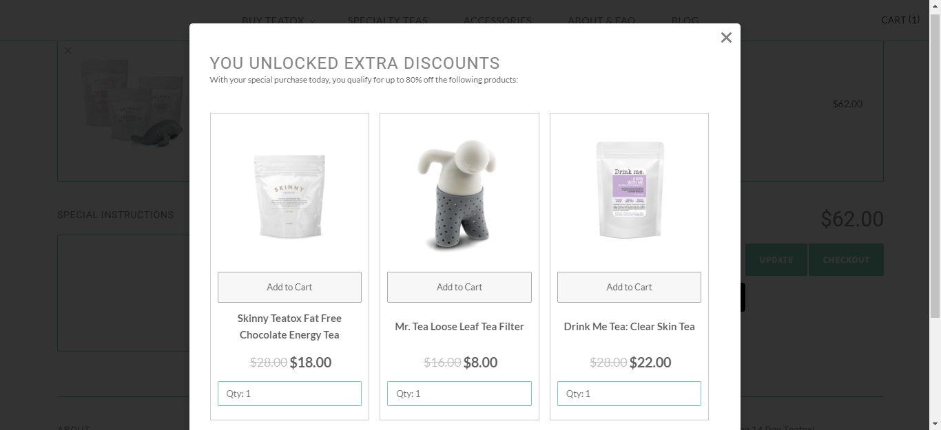
15. Skinnyteatox's Upsell Pop-up Nudge
Skinnyteatox gamifies the upsell. They launch a pop-up that makes shoppers feel they've unlocked a discount by choosing certain products, which turns a transaction into an achievement.
What is an Upsell Pop-up Nudge?
It gives shoppers extra reasons to add more to their cart, such as discounts, a free upgrade, or a free gift when they add X more products.
Where do Upsell Pop-up Nudges work best?
Product pages, mini cart, and order confirmation page. Avoid it at checkout; it creates a distraction at exactly the wrong moment.
How to implement Upsell Pop-up Nudge
Offer quantity options for the same product
Position upsells as "last-minute add-ons" within the mini cart
Convertcart Pro Tip: Make quantity editing and add-to-cart one-click within the pop-up. Any friction here kills the conversion.
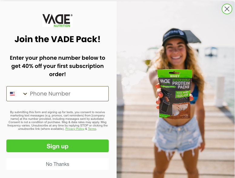
16. Vade Nutrition's Discount Nudge
Vade uses a discount as the prime mover for email opt-ins — but, crucially, the discount activates only on the first subscription order. That single condition turns a generic offer into something that earns commitment.
What is a Discount Nudge?
A discount nudge uses the promise of a price drop to drive micro-conversions or full conversions. Universal appeal makes it one of the most flexible nudges in the toolkit.
Where do Discount Nudges work best?
Notification bars, hero headers, exit-intent popups, product labels, and discount nudges work across the entire site. They shine on the homepage, product pages, and dedicated sale pages.
How to implement Discount Nudge?
Frame it around "early access," "exclusive," or "sitewide"
Use price anchoring to show old vs. new price — plus the % savings
Feature it on the hero header for sitewide or annual sales
Leverage seasonal events: Black Friday, Christmas, etc.
Convertcart Pro Tip: Balance one-time discount nudges with year-round nudges, such as bundling discounts and a dedicated flash sales section.
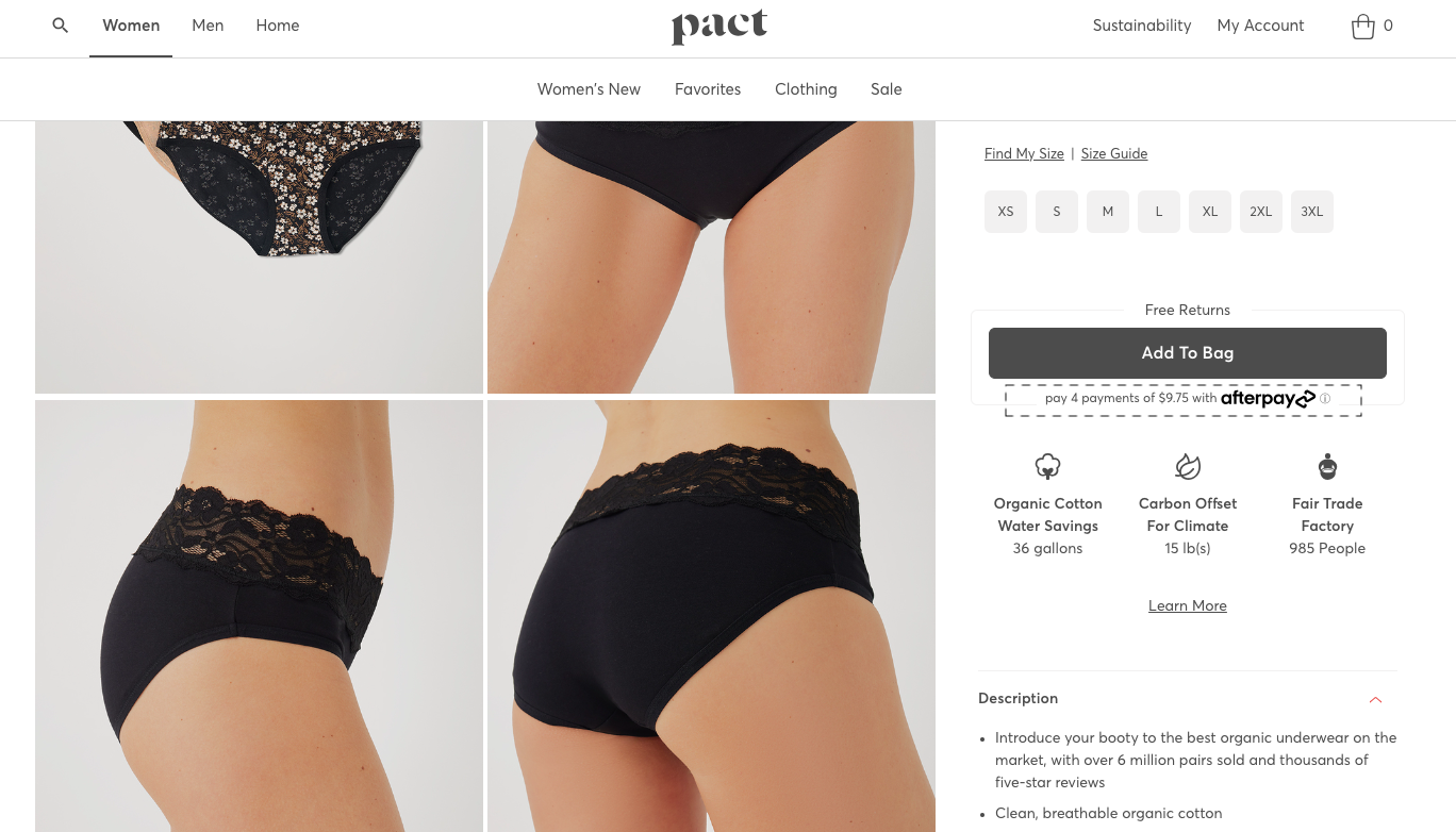
17. Pact's BNPL Nudge
BNPL is forecast to drive tens of billions in online spending annually, and Pact brings it front and center on their product page, making high-ticket items feel accessible before the shopper even has to ask.
What is a BNPL Nudge?
A Buy Now Pay Later nudge de-risks a purchase for a potential shopper. It works particularly well for high-value items where the total price creates hesitation.
Where do BNPL Nudges work best?
The product page, but its effectiveness depends on shoppers knowing the option exists across the site.
How to implement BNPL Nudge
Use the notification bar to draw attention to split payments, especially when you highlight a popular BNPL provider
Pair BNPL info with payment-related trust symbols in the footer
Convertcart Pro Tip: Feature BNPL info above your benefit callouts on the product page. It creates a faster impression, and faster impressions convert.
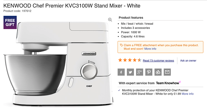
18. Kenwood's Freebie Nudge
Kenwood positions a "free gift" label right beside the product image. It's a simple move that shifts the shopper's mental calculation from "do I want this?" to "what do I get with this?"
What is a Freebie Nudge?
A freebie nudge changes customer perception by attaching a free gift or consultation to a purchase — appealing particularly to first-time visitors and long-time browsers who haven't yet converted.
Where do Freebie Nudges work best?
Homepage hero header, product page microcopy above the description, and category page banners. Best suited for higher-value products where margins support it.
How to implement Freebie Nudge?
Offer a "free mystery gift" pop-up on purchases above $X
Add an in-cart progress bar showing how close shoppers are to qualifying
Use the notification bar to display a crisp, interest-piquing call-out
Convertcart Pro Tip: Pair freebie nudges with subscriptions for maximum appeal and keep them away from individual low-margin products.
Pattern 5: Social & Community Nudges
Why it works: Humans take cues from each other constantly. "14,000 happy customers" is more persuasive than any headline your copywriter produces — because it isn't you saying it.
What most brands get wrong: Generic community signals. "Join our community!" with no specifics. Reviews with no names, no photos, no humanity. These nudges work because they feel real — the moment they feel staged, they backfire.
How to apply it: Get specific. Not "thousands of customers love this" but "4,312 customers rated this 4.8 stars." Show faces. Show names. Show where people are from. Specificity is credibility.
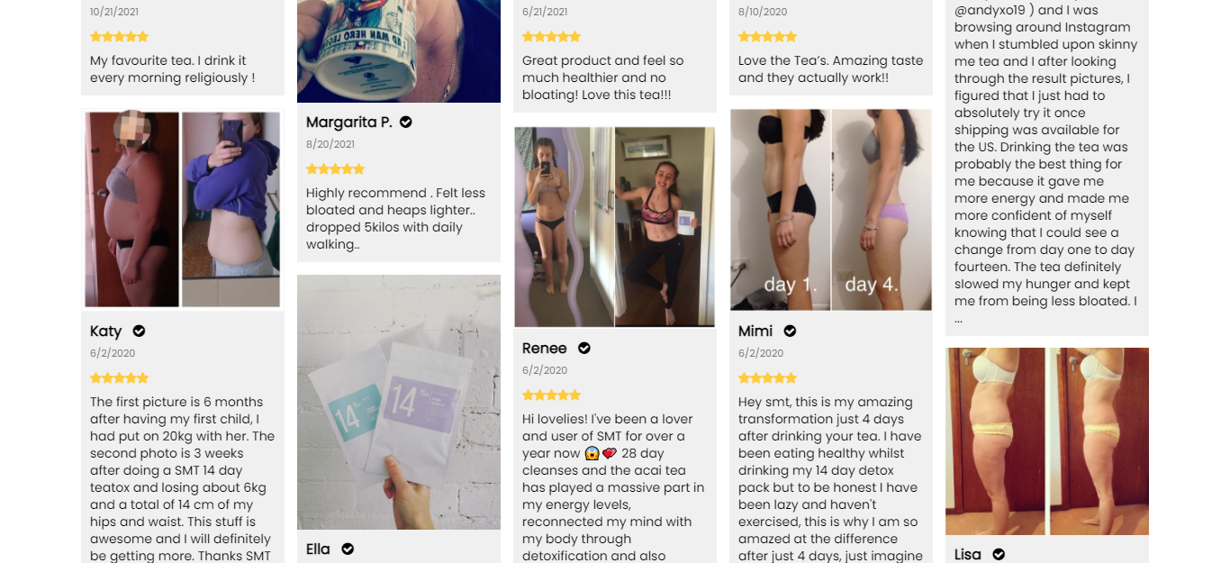
19. SkinnyMe's Community Nudge
SkinnyMe takes the review section further than most; they include before/after imagery to make the social proof visceral rather than abstract. For a product that requires real convincing, this does the job.
What is a Community Marketing Nudge?
Community nudges empower potential customers by sharing the experiences of people who already buy from the brand, building trust and improving conversions simultaneously.
Where do Community Nudges work best?
All high-intent pages, but especially the homepage and product pages. Particularly effective for new-age products, sustainable brands, and limited-edition drops.
How to implement Community Marketing Nudge
Feature a social wall on the homepage with "shop the look" CTAs on every tile
Show your loyalty member count: "[X number] and counting"
Build a dedicated "Reviews" page (like Warby Parker) and link to it from every product page
Convertcart Pro Tip: Rename your "Resources" section to "Community," then fill it with guides, ambassador sign-ups, and guest posts from existing shoppers.
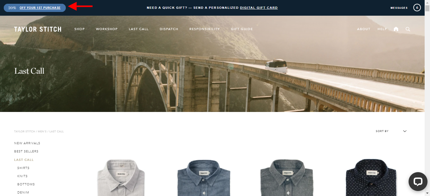
20. Taylor Stitch's Notification Nudge
Taylor Stitch gives first-time customers a 20% discount via a sticky notification bar. It's impossible to miss, easy to act on, and it rewards new visitors for showing up.
Where do Notification Nudges work best?
Notification bars, naturally but some brands also use the space above or below the bar to call out deals, categories, or free shipping thresholds.
How to implement Notification Nudge
Highlight a single message on your notification bar (if you feature more, keep it to three max, and limit links to two)
Feature a slide-in notification that expands into a pop-up when clicked
Convertcart Pro Tip: Make your notification bar sticky so that when shoppers scroll away, your offer scrolls with them.
21. Patagonia's Cause Marketing Nudge
As a brand built around environmental activism, Patagonia's nudges are never pushy; they're an extension of identity. The nudge works because it aligns brand values with shopper values.
What is a Cause Marketing Nudge?
It connects eCommerce businesses with customers on a philanthropic level, strengthening the brand-buyer connection beyond the transactional.
Where do Cause Marketing Nudges work best?
Homepage, product pages, and about us pages. Ideal for apparel, nutrition, pet products, and jewelry.
How to implement Cause Marketing Nudge
✔ Use the hero header to draw attention to categories tied to the cause ✔ Tie membership rewards to positive impact with video content (like TOMS) ✔ Create an "impact report" and carry it across the home, product, and about pages
Convertcart Pro Tip: Identify one singular message and run it consistently across your site and social channels. Recall builds authority.
22. Taylor Stitch's Loyalty Nudge
Taylor Stitch makes its loyalty program feel like a benefit shoppers would be silly to skip. The nudge doesn't just mention rewards; it makes non-members feel they're leaving money on the table.
What is a Loyalty Nudge?
Loyalty nudges move both new visitors and existing shoppers toward membership by clearly showing what they'd gain from buying more throughout the year.
Where do Loyalty Nudges work best?
Sitewide, applied differently across homepage, category pages, and product pages.
How to implement Loyalty Nudge
Mention members-only pricing across recommendations and category listings
Use the notification bar to highlight a limited-time membership perk
Dedicate a homepage section to your community and link to the loyalty program
Convertcart Pro Tip: Channel your exit-intent popup into loyalty by nudging users to join the program, then follow up with retargeting, sales alerts, and personalized recommendations.
Pattern 6: Engagement & Retention Nudges
Why it works: Not every visitor is ready to buy today. Engagement nudges capture the ones who aren't and keep the door open for when they are. Progress nudges gamify completion. Exit-intent nudges rescue abandoners. Wishlists turn browsers into retargetable leads.
What most brands get wrong: Treating every nudge as a conversion attempt. A pop-up that screams "WAIT! 10% OFF!" at every visitor, including the ones who just checked out, erodes trust and looks desperate.
How to apply it: Match the nudge to the intent signal. Someone browsing for four minutes without adding to the cart? Show a wishlist prompt. Someone on the checkout page moving toward the back button? That's when the discount offer makes sense.
23. Under Armour's Wishlist Nudge
UA nudges customers to use the wishlist feature through a dismissible banner a low-pressure move that creates a retargeting hook without feeling like a conversion play.
[IMAGE: Under Armour wishlist nudge]
What is a Wishlist Nudge?
Wishlist nudges drive micro-conversions even when macro-conversions don't, and they supercharge email and retargeting strategies.
Where do Wishlist Nudges work best?
Category pages, product pages, mini cart, and order confirmation pages.
How to implement Wishlist Nudge
Feature a recognizable wishlist icon in the primary navigation (H&M uses ♡)
Trigger a wishlisting popup on exit intent
Add a "Share your wishlist" microcopy nudge on product pages, especially effective during the peak holiday season
Convertcart Pro Tip: Audit all out-of-stock products and change their category page CTAs to "Notify Me." Capture the intent even when the inventory isn't there.
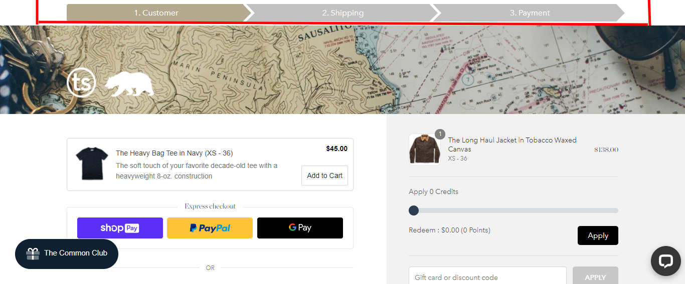
24. Taylor Stitch's Progress Nudge
Taylor Stitch gamifies the checkout process by showing shoppers exactly where they are and how close they are to the finish line. Predictability reduces anxiety, and reduced anxiety drives completions.
What is a Progress Nudge?
Progress nudges gamify engagement around multi-step actions that might otherwise feel complicated, boring, or expensive.
Where do Progress Nudges work best?
Multi-step forms, checkout flows, and threshold qualifications.
How to implement Progress Nudge?
Use it in quiz funnels to show how many questions remain
Add it to the mini cart to show proximity to free shipping, gifts, or gift wrapping
Use it to walk shoppers through bundle-building or subscription setup
Convertcart Pro Tip: Place progress nudges above the fold. Most visitors drop off after the first few scrolls give them a reason to keep going before they decide not to.
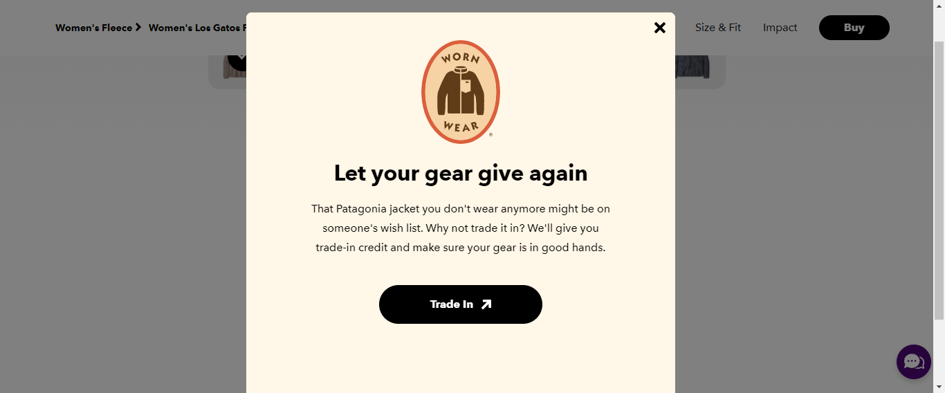
25. Patagonia's Overlay Nudge
Patagonia uses a trade-in credit overlay offering value in exchange for old clothing. It's an overlay nudge that does double duty: it acquires leads and reinforces brand values in a single pop.
What is an Overlay Nudge?
An overlay nudge dims the background and draws attention to an offer or downloadable resource, making it impossible to ignore without being dismissible.
Where do Overlay Nudges work best?
High-intent pages, with messaging tailored to where the shopper is and what they're doing.
How to implement Overlay Nudge
Use it to improve micro-conversions: email or text sign-ups
Highlight free seasonal shipping on a certain spend threshold
Feature a short post-purchase survey
Convertcart Pro Tip: Study shopping behavior to find the perfect trigger timing. And always make the cancel button obvious, a trap that can't be escaped erodes trust fast.
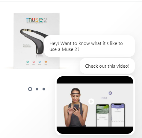
26. Choosemuse's Engagement Nudge
Choosemuse uses a chatbot to nudge visitors to watch a product video, reducing the research friction that typically kills conversions for specification-rich products.
What is an Engagement Nudge?
Engagement nudges deepen a potential customer's interaction with the brand during a single session rather than waiting for them to explore on their own.
Where do Engagement Nudges work best?
Homepage and category pages, though the right format depends on product type. A video demo suits spec-heavy products; a quiz suits those with multiple variants.
How to implement Engagement Nudge?
Add a "Take the Quiz" prompt on the homepage for personalized recommendations
Rewrite your chat widget to feel human: "Feeling lost? Talk to us!" beats a faceless widget
Add a "Read all reviews" microcopy nudge next to homepage product recommendations
Use "Quick View" as a secondary CTA on category pages
Convertcart Pro Tip: Match engagement nudges to the page's purpose. A product demo works on the product page; a "how to get a free consultation" video fits the homepage.
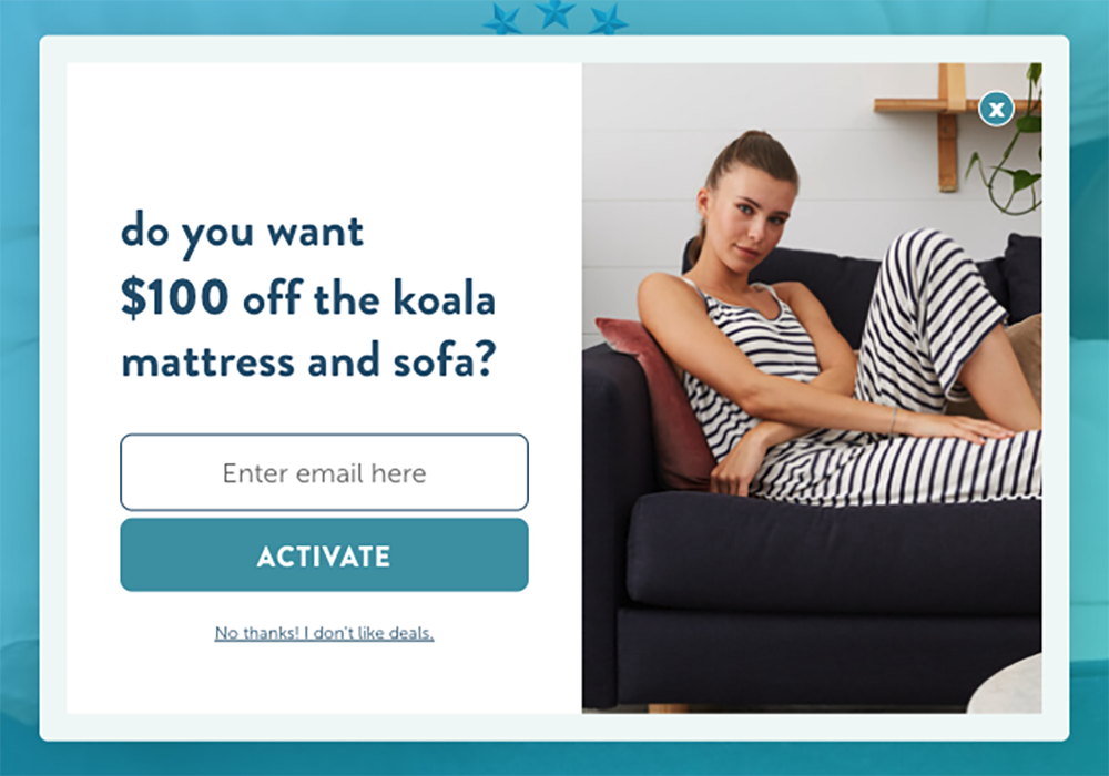
27. Koala's Exit-Intent Overlay
To reduce the number of exiting visitors, Koala deploys a creative exit-intent pop-up that cross-sells and collects leads. One nudge, two jobs.
What is an Exit-Intent Nudge?
Exit-intent nudges stop visitors from leaving abruptly by making a compelling offer that pushes them toward a purchase or at least a micro-conversion.
Where do Exit-Intent Nudges work best?
Homepage, product page, and order confirmation page.
How to implement Exit Intent Nudge
Offer a gated resource on the homepage: recipes, styling tips, tutorial videos, in exchange for email sign-ups
Show a limited-time cart abandonment discount on the product page
Reference a cause you support on the order confirmation page and state clearly how much of the proceeds go toward it
Convertcart Pro Tip: Align exit-intent messaging tightly with where the shopper is on the site. The closer it matches their intent, the higher the conversion rate.
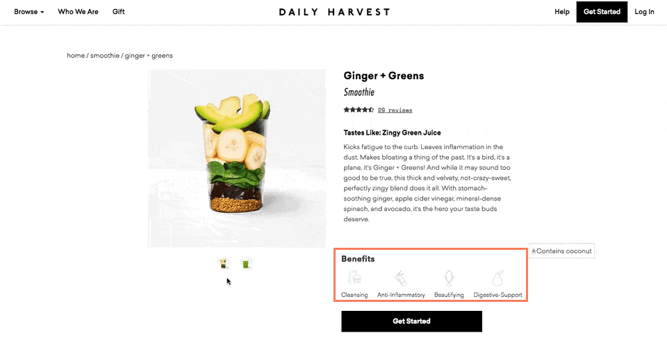
28. Daily Harvest's Benefit Nudge
Daily Harvest labels products with their benefits directly on the product card, capturing attention from fast-scrollers before they have a chance to move on.
What is a Benefit Nudge?
A benefit nudge highlights exactly how the product will improve the shopper's life, making the "why buy" case without requiring a click.
Where do Benefit Nudges work best?
Product pages, but there's no reason to stop there. Apply them as image labels or design highlights across recommendation carousels, too.
How to implement Benefit Nudge
Label the hero image in the product page gallery
Highlight the single biggest benefit as a callout on every recommendation
Use a ticker band across high-intent pages, but limit it to three benefits maximum
Convertcart Pro Tip: Pair benefit nudges with press mentions to generate interest and confidence at a single glance.
Why Most Nudge Marketing Fails
It's worth pausing here, because there's a version of everything above that doesn't work at all.
Most e-commerce stores treat nudges as a checklist. Add urgency ✓. Add social proof ✓. Add a discount pop-up. Done.
The result is a page that feels like a street market where everyone's shouting at you simultaneously. Cognitive load goes up. Trust goes down. Conversions flatline.
Here's the honest truth from our audits: nudges don't fix broken pages. If your product description is confusing, your images are weak, or your checkout has seven unnecessary steps, no amount of "Only 2 left!" labels will save you.
The stores that get nudge marketing right treat it as a system, not a checklist:
They start with intent. What is this visitor trying to decide? What's making them hesitate? The nudge answers that question, not a generic one.
They sequence nudges. Trust signals come before urgency. Social proof before price anchoring. Engagement before exit intent. There's an order that mirrors how real purchase decisions unfold.
They test ruthlessly. A nudge that lifts conversions for a beauty brand might tank them for a B2B tool store. There are principles, but no universal playbook.
See What's Holding Your Nudges Back
The examples in this post work. But whether your implementation of them works depends entirely on your page, your audience, and your product category.
We've audited 500+ eCommerce stores across the US, and the same mistakes keep showing up: urgency without trust, social proof without specificity, and nudges layered onto pages that were never built to convert.
If you'd like a set of expert eyes on your product page, we'll tell you exactly what we'd fix and why.
A nudge strategy is a way of using psychology to guide customer behavior without restricting choices or changing prices. Three things make it effective:
First, you need to understand what motivates your customers. Second, you need to create an environment that makes the desired behavior easy. And third, you need to deliver a compelling and trustworthy message.
Your nudge strategy will also depend on your broader goal: are you trying to increase sales, drive sign-ups, or improve sharing behavior? The nudge follows the objective.
What is nudge marketing?
Nudge marketing uses behavioral psychology to influence customer decisions by changing the context in which choices are presented. It doesn't force a behavior; it makes a particular behavior feel like the natural, obvious choice.
A business might place items in strategic locations, offer discounts, or use social proof to make the desired behavior more attractive. All of it falls under the umbrella of nudge marketing.
What are the benefits of nudge marketing?
It reaches and engages consumers effectively without interrupting them
It influences behavior by working with how people naturally make decisions
It's relatively inexpensive and easy to implement
It works across online and offline channels
It boosts sales and encourages desired actions
It builds brand awareness and shifts customer perception over time
What are the most common nudge marketing techniques?
Social Proof — People follow the crowd. When shoppers see others buying something, they're more likely to buy it themselves.
Loss Aversion — People fear losses more than they value gains. "Only 3 left" motivates action more effectively than "buy now and save."
Anchoring — People evaluate decisions from a reference point. The price they see first shapes how they evaluate every subsequent price.
When should you use nudge marketing?
The simple answer: when a shopper is one step away from a micro-conversion or a macro one.
Nudges work because they tip shoppers toward action at the critical moment. But placement matters enormously, too many nudges, and you look desperate. Too few, or in the wrong places, and you lose conversion opportunities.
Use nudges surgically. And earn them by fixing the page first.
Subscribe for more articles like this!
Thank you - we'll see you in your inbox soon!
Oops! Something went wrong while submitting the form.
Read by 5000+ ecommerce store owners
Subscribe for more articles like this!
Thank you - we'll see you in your inbox soon!
Oops! Something went wrong while submitting the form.


.svg)

.svg)

.svg)
.svg)
