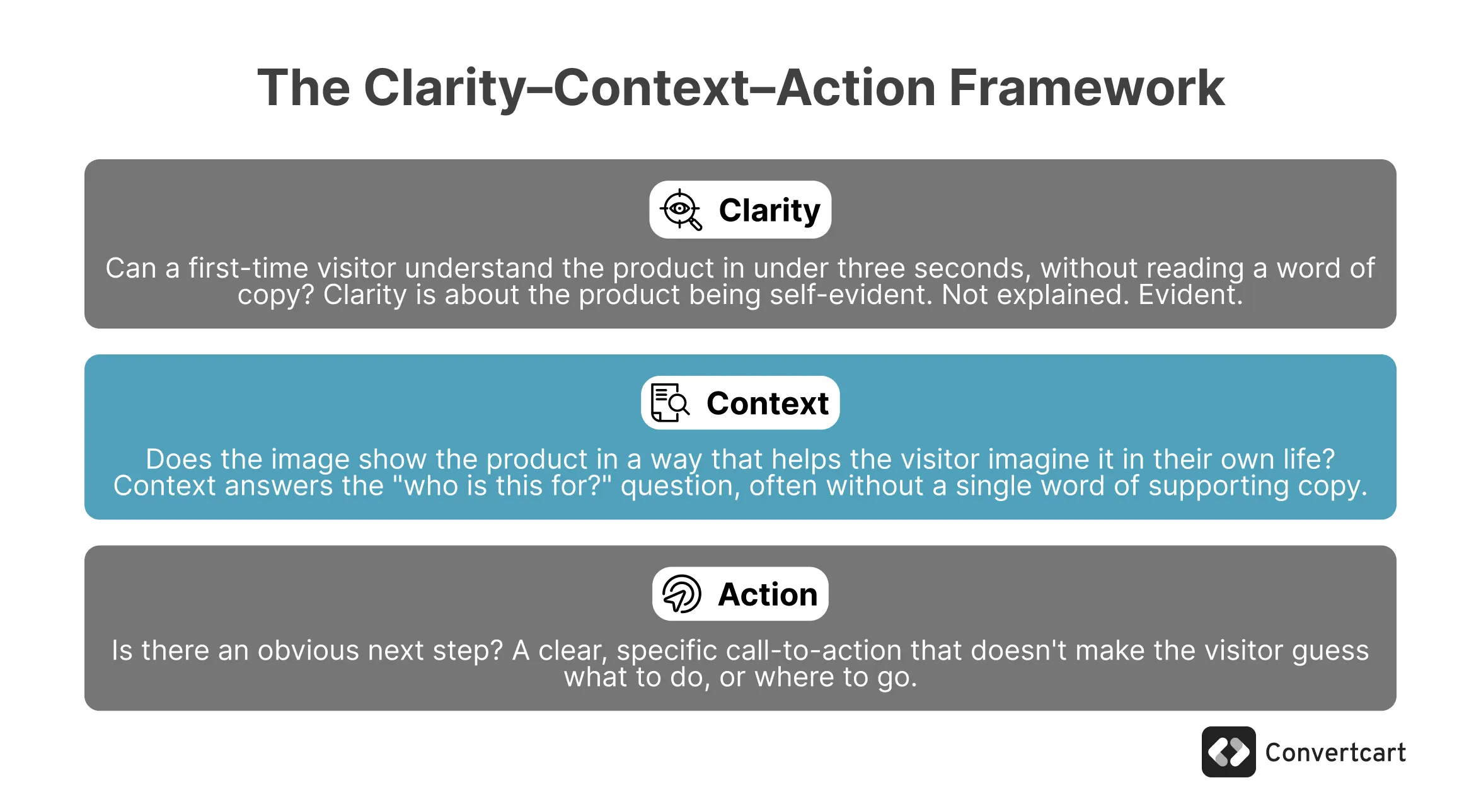
Before we get to examples, here's a quick checklist you can use on any hero, including your own:
Can I understand the product in 3 seconds without reading anything?
Does the image show me how this fits into my life?
Is the value proposition visible without effort?
Is there a clear, specific CTA, not just a button that says "Shop Now"?
Is the product instantly clear, without reading a word of copy?
Does the image add meaning, or is it just filling space?
Can a visitor understand the value proposition without effort?
Is there a clear, specific CTA, not just a button that says "Shop Now"?
If you answered "no" to any of these, you've found your problem.
Let’s face it: most eCommerce stores spend more time picking a hero image than they spend thinking about what that image is supposed to do.
The problem is rarely aesthetics. It's clarity.
A visitor lands on your homepage and, in roughly three seconds, makes a decision: is this for me?
If your hero section can't answer that question before they reach for the scroll button, no amount of soft lighting or tasteful typography can save you.
In this guide, you'll find a simple framework for evaluating any hero section, patterns that high-performing stores follow, the mistakes that kill conversions, and real examples to show what's working and what isn't.
Product discovery – barriers that prevent shoppers from finding items
Category/collection pages – improvements that drive deeper product exploration
Product page – what to optimize to convert 2–3x more buyers
Cart – ways to ease hesitation and speed up purchase decisions
“The report was deep and super insightful. Can’t believe it’s free.”
Logan Christopher CEO, Empire Herbs
The Anatomy of a High-Converting Hero Image: Patterns From 500+ Audits
We've worked with eCommerce stores for more than a decade now, and during the process, we've found 4 types of Hero images that prevented bounces and got decent engagement.
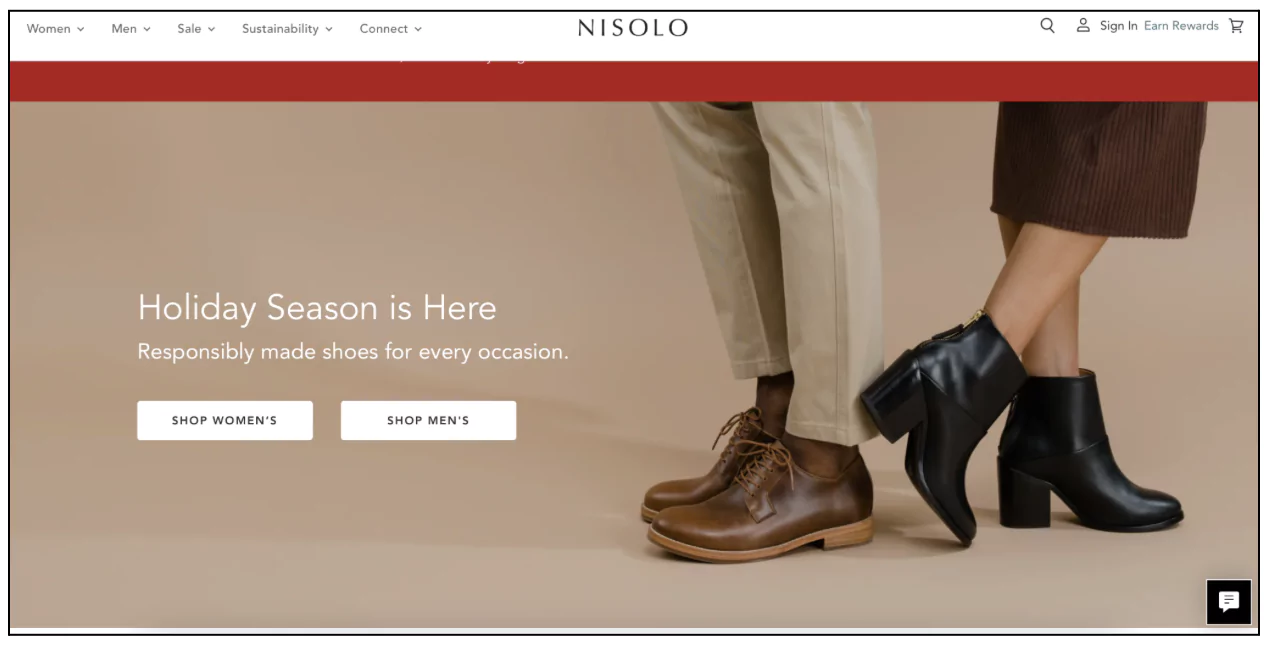
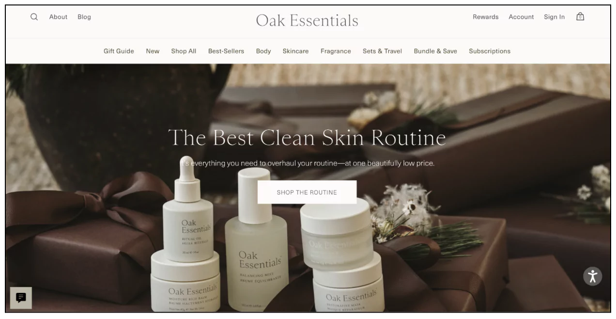
Pattern 1: Product-First Hero Images
When the product is visually self-explanatory, the smartest thing you can do is get out of its way and show it directly.
Product-first heroes are strong on Clarity almost by definition; the product is the message.
The risk is Context: without a human, a lifestyle cue, or a benefit headline, the visitor sees what you're selling but not necessarily why they should care.
Fashion — Feature-Driven Approach
Stores that tie hero images to specific moments, such as a seasonal drop, a fashion week, or a cultural event, are doing something clever: they're borrowing urgency from the calendar rather than manufacturing it.
The product gets to look confident because the occasion gives it a reason to exist right now.
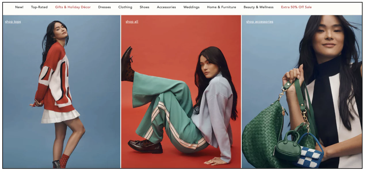
Fashion — Versatility Storytelling
Showing multiple styling options in a single hero image is a smart play for fashion brands with a higher average order value.
The message is implicit: you can wear this more than one way, which means it's worth more than you think. A "Complete the Look" CTA turns this from inspiration into conversion.
Electronics — Spec-Led Hero image
Electronics customers are a practical lot. They want to know what the thing does before they want to know how beautiful it is.
Close-up, high-resolution product shots paired with a benefit-driven headline, "10-Hour Battery Life," "Crystal Clear 4K Display," speak directly to the decision already forming in the visitor's mind.
Pattern 2: Lifestyle / Context-Driven Hero Images
When the product needs explanation, or when the emotional appeal of owning it is more powerful than the product itself, context carries the weight.
These heroes say less about the product and more about what life looks like when you have it.
Home and Furniture — Room Settings
A sofa photographed against a white wall tells you very little.
The same sofa in a warmly lit living room, with a throw pillow and a coffee table that somehow makes you feel like a calmer, better-organized person who tells a story.
Furniture brands that show complete room settings are outsourcing the work of imagination to their photography, which is exactly the right call.
Beauty — Before/After and Results-Led Hero Images
Beauty is perhaps the most context-dependent category in eCommerce.
Customers aren't buying a serum; they're buying the version of themselves that uses the serum.
Close-up imagery showing product results, paired with clinical credibility ("98% Saw Results in 7 Days"), does the job for both Context and Motivation.
Food & Beverage — Sensory Hero Images
High-definition close-ups of food steam rising from a dish, a glossy glaze on a donut, the crispy edge of a pizza crust do something purely physical to the viewer. They create appetite.
Evocative copy like "Taste Freshness in Every Bite" reinforces what the image has already accomplished. Meal pairing suggestions in the hero ("Perfect Pairings for Your Summer BBQ") extend this into a genuine lifestyle context.
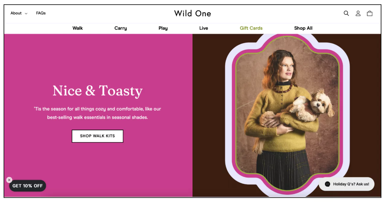
Pet — Bonding and Emotion
Pet parents are not purchasing a chew toy.
They are investing in their dog's happiness, which is a slightly different transaction.
Hero images that show the emotional bond between owner and pet, a dog excitedly waiting for a walk, a cat in a genuinely comfortable bed, make the product feel like a means to something that already matters deeply.
This is Context doing its heaviest lifting.
Pattern 3: Minimalist / Text-Led Hero Images
When messaging is the differentiator, when the brand has something genuinely distinct to say, simplicity drives clarity.
These heroes resist the temptation to show everything, and the restraint is the point.
Fashion — Sustainable and Ethical Brands
Eco-conscious fashion brands often use cleaner, quieter hero images as a visual signal of their values.
The product doesn't need to dominate the frame because the message does.
A subtle "Sustainable" tag, a brief note about ethical production, and a product that feels considered rather than manufactured, this combination builds trust before a single product page is visited.
Jewelry — Luxury Through Restraint
Fine jewelry photographed on dark velvet, or against a neutral background with controlled lighting, communicates premium positioning without a word of copy.
The aesthetic choice is the value proposition. "Elegance Redefined" isn't a tagline; it's a confirmation of what the image has already established.
When the goal is immediate action, a sale, a limited-time promotion, or a product launch, messaging and CTA dominate.
These heroes sacrifice a degree of aesthetic refinement for commercial directness, which is entirely the right trade-off when the context calls for it.
Electronics — Deal-Led Hero Images
"Save $300" displayed alongside a high-resolution product image, with an "Exclusive Online Offer" badge and a deadline, this is conversion arithmetic.
There's no ambiguity about what's being offered or what to do about it.
Electronics retailers who run time-sensitive promotions through their hero sections often see measurable lifts because the message and the action are perfectly aligned.
Beauty — Bundle and Limited-Edition Offers
Highlighting a time-sensitive bundle ("20% Off Bestselling Skincare Kits") in the hero section is a direct conversion play.
The limitation creates urgency; the bundle creates perceived value.
The CTA has a specific job to do, and it does it.
⚠️
Why are potential customers dropping off so early?
Why visitors don’t trust your store within 3 seconds
Why shoppers can’t find what they’re ready to buy
What’s stopping 2-3x more shoppers from clicking “Add to Cart”
Where buyers hesitate right before purchase
Why high-intent shoppers still drop off
“The report was deep and super insightful. Can’t believe it’s free.”
Logan Christopher CEO, Empire Herbs
Common Hero Image Mistakes
A brief tour of the ways perfectly good stores sabotage their own front doors.
Prioritizing aesthetics over clarity. The most common mistake, by a significant margin.
The image is beautiful, the photography is professional, and a visitor has no idea what's being sold. Beauty is never a substitute for comprehension.
No clear value proposition: The visitor understands what you're selling, but not why they should care. This is the Motivation gap, and it's almost always fixable with a single benefit-led headline.
Weak or missing CTA: "Shop Now" is a direction, not an invitation. "Find Your Perfect Fit," "Build Your Bundle," "Shop the New Collection" give the visitor a specific reason to click rather than a generic permission to do so.
Generic stock visuals: A smiling person holding a product they've clearly never used, photographed in a studio in 2019 against a background that suggests neither time nor place. Visitors clock this immediately, undermining every trust signal you've worked to build elsewhere.
Overloaded messaging. Three promotions, two headlines, a badge, a countdown timer, and four CTAs.
The visitor, confronted with all of this, chooses none of it. Hero sections reward restraint.
How to Choose the Right Hero Image for Your Store
This is less complicated than it sounds.
If your product is visually self-explanatory, a piece of clothing, a piece of furniture, a consumer electronic, lean into Product-First. Show it large, show it clearly, and get out of the way.
If your product needs explanation or if the emotional appeal of owning it is more powerful than the object itself, use a Lifestyle or Context-Driven approach. Show the life, not just the thing.
If your brand or messaging is the differentiator, if what you stand for matters as much as what you sell, a Minimalist or Text-Led hero gives that message room to breathe.
If your goal is immediate conversion, a promotion, a limited-time offer, or a product launch, Offer-Driven is the right pattern. Don't apologize for being direct.
Most stores will find themselves somewhere between two of these patterns, which is fine. The framework doesn't require purity. It requires honesty about what you're trying to accomplish and whether your current hero is actually doing that job.
Double Your Homepage Conversions
A high-performing hero image doesn't just look good. It removes doubt. The visitor shouldn't have to work to understand your store — that work is yours to do, and the hero section is where you do it.


.svg)

.svg)

.svg)
.svg)
