The consumer electronics category is a difficult space to be in, mainly because the top choice for nearly half the US population is Amazon.
When the loyalty towards the top player is this high, it becomes increasingly important for electronics and gadgets eCommerce stores to optimize for a great user experience to rope in customers.
How to increase sales in your electronics eCommerce store
1. Showcase ‘New Launches’ in the first fold
Most of your shoppers who land on the homepage - have short attention spans - you need to give them something to stick around.
✅ Make sure the new launches are displayed in the first fold
✅ Create a carousel to cover all the latest tech and the bestsellers during that week/month
✅ Advertise deals alongside new launches but refrain from making it too flashy (We don’t want offers to appear like spammy ads!)
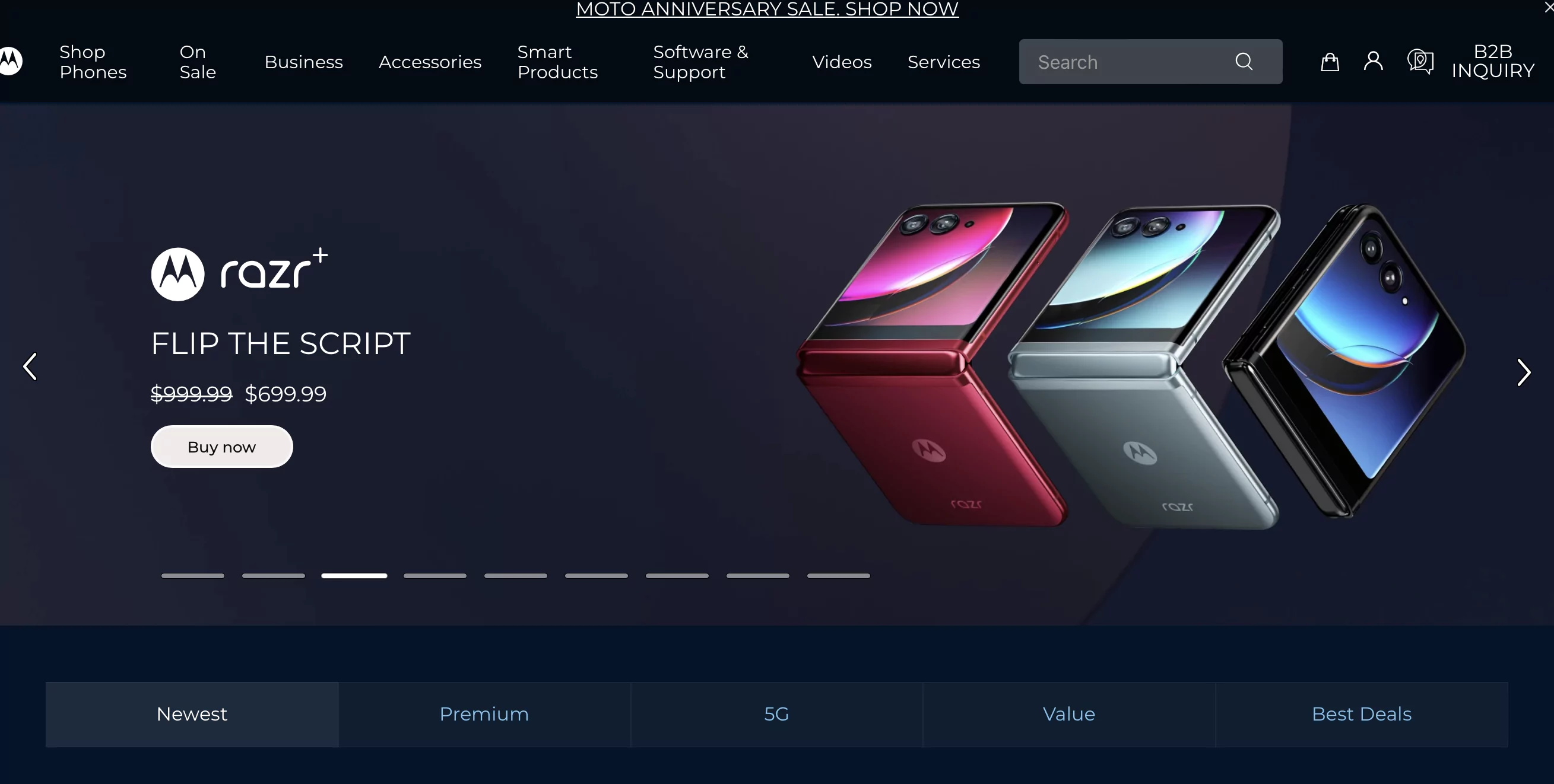
A great example is Motorola. The website is aesthetically pleasing, shows the popular and latest models and presents the shoppers with deals and offers in their very first fold.
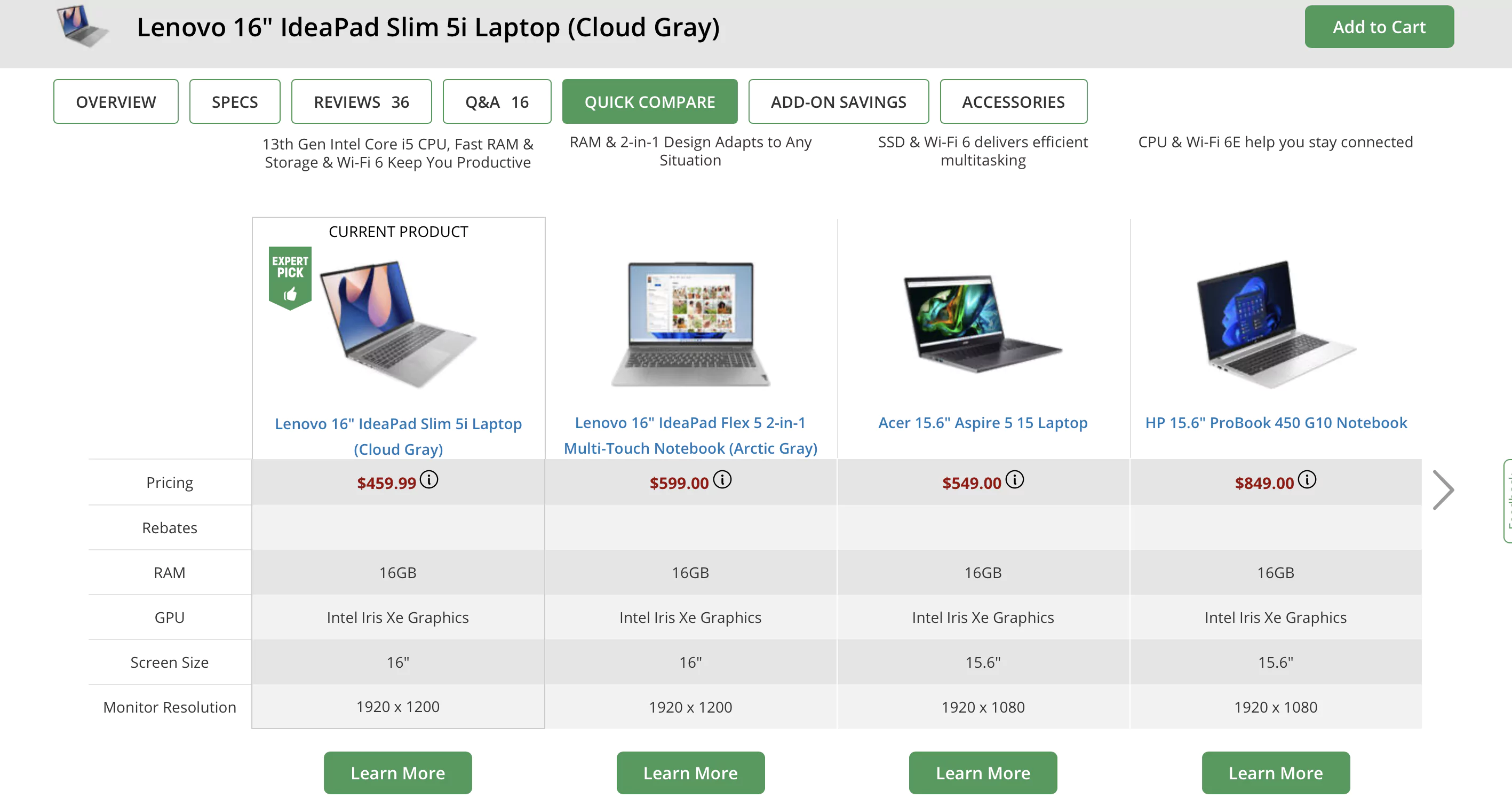
2. Give shoppers an *easy* way to compare products
Your job is to make shopping easy for your website visitors. If they want to compare products, you don't want them looking around - you want them to do it easily.
A great comparison page should include:
✅ Features, specifications and prices of different models in a tabular format
✅ Sticky header which has the model names
✅ De-prioritize features that don’t majorly differ and highlight those that do
✅ Group attributes under headings to make the comparison more intuitive
For example: For laptop comparisons, headings could be - battery, display, etc. and the specifications can fall under these attributes.
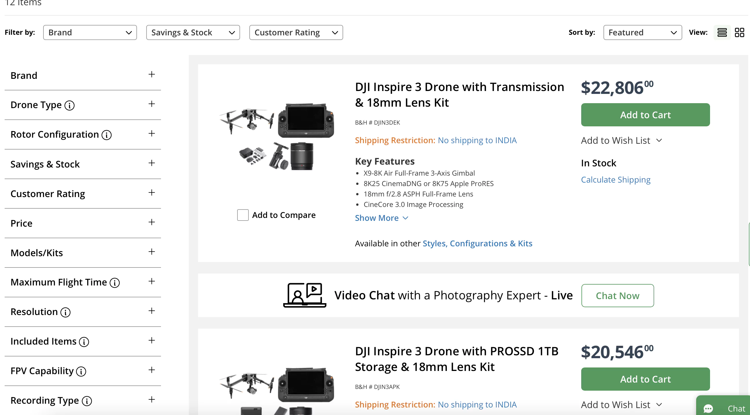
Let’s take B&H for example. They provide a very simple comparison of the featured models - covering the major points of differences.
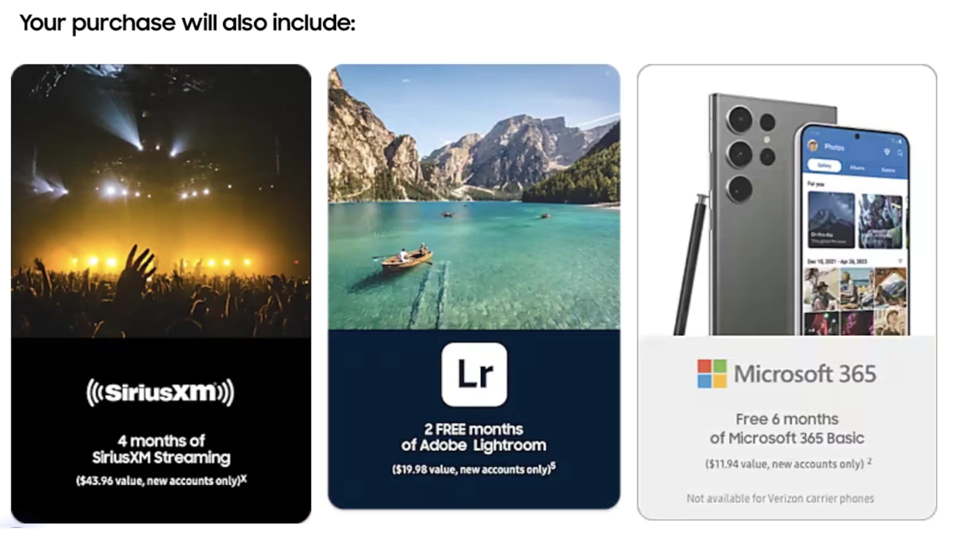
3. Highlight ‘everything’ that the purchase includes
You want people to look forward to the purchase - show them everything that comes with the product. Unless it's an iPhone, it still won't come with an adapter :)
The extras may include:
✅ Chargers or cables
✅ Accessories
✅ Any third-party subscriptions
✅ Software or apps
✅ Any other promotional items
And these must find space on the product pages of your online gadget store.
A remarkable example is Samsung. On every product page, they highlight the add-ons the buyer will get along with the purchase.
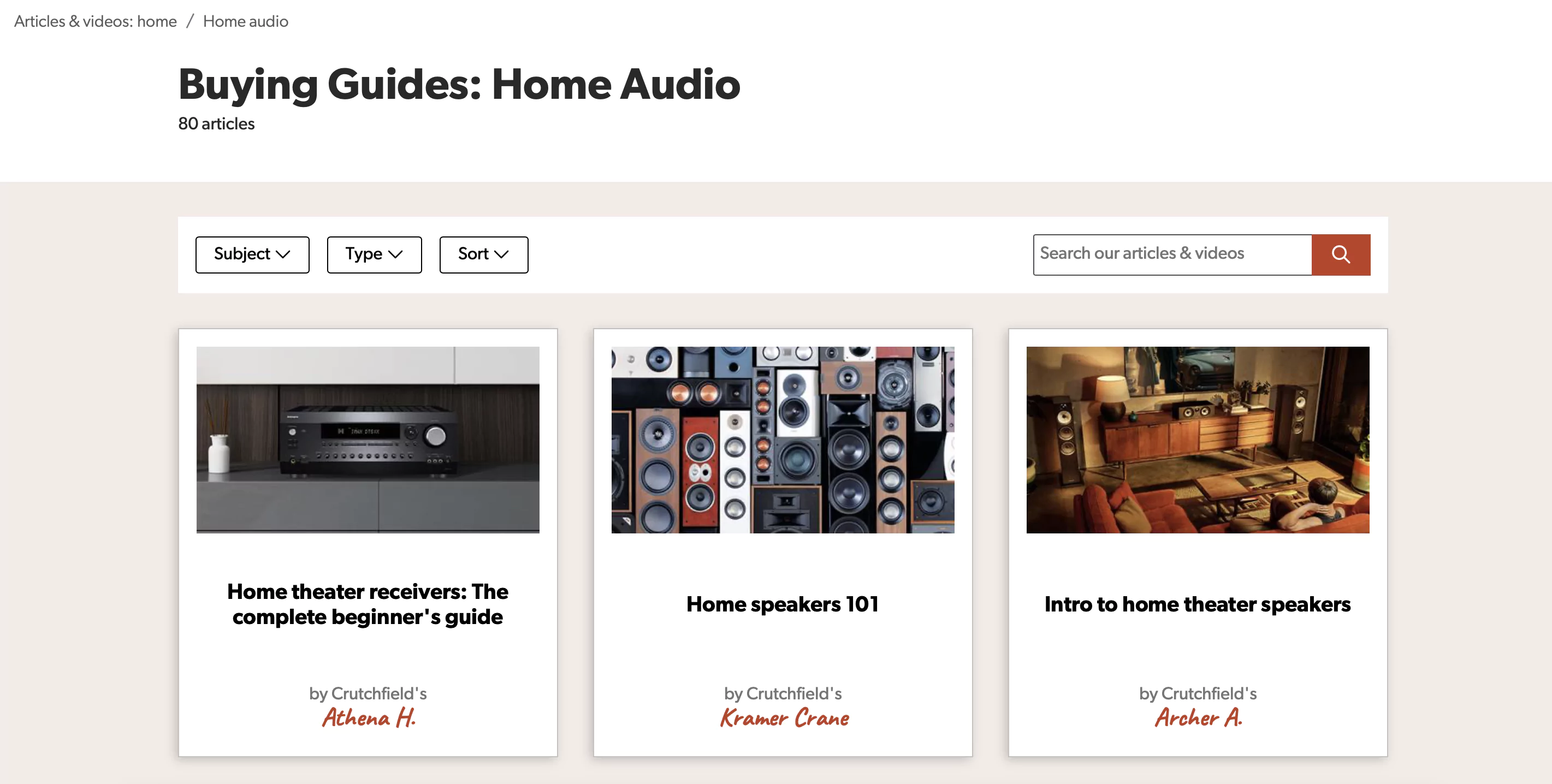
4. Invest in content marketing
Oftentimes your shoppers don’t know what they don’t know OR what they should look for while selecting a product.
This is when you can become their North Star - guiding them to the right product.
How?
Make a list of all the frequently asked topics and create either text-based or video-based content.
Some of the topics that you can cover in your shopping guides are:
✅ Tables for product comparisons
✅ Guides for product exchange guides
✅ Calculators for savings on purchases guide
✅ Videos for switching from different brands to your brand/products
Crutchfield has created a bunch of content to help its shoppers make an informed purchase decision.
5. Showcase complimentary services
Brands become bigger and stronger when customers know the value they get out of them - could be tangible, intangible or both.
As online gadget store owners you obviously focus on the product but in that process, you may miss out on promoting the services.
These services may include:
✅ Free installation
✅ Warranty and guarantee
✅ Post-sales maintenance
Highlight them by:
✅ Adding this information in the first fold of your product pages
✅ Formatting it differently or putting it in a box
✅ Ensuring that the word ‘free’ is prominent
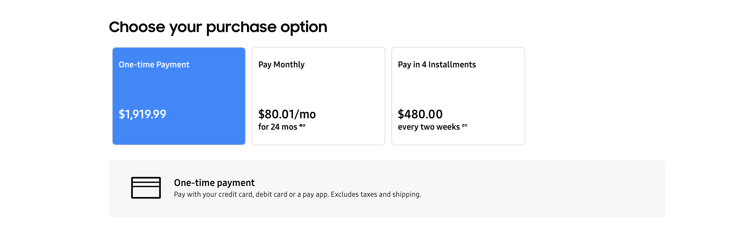
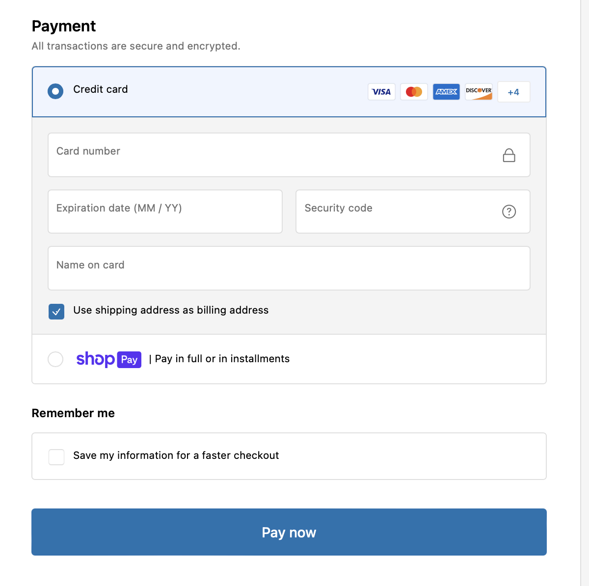
6. Pay extra attention to payment options
Electronics are no candy purchases that can be bought by pulling out a dollar from the pocket.
These are heavy investments - and you must become a partner for your shoppers in their payment planning journey.
A few ways to do this are:
✅ Provide multiple EMI along with one-time payment options
✅ Offer multiple payment methods - cards, net banking etc.
This also needs to be implemented on your electronics eCommerce website in a way your shoppers can easily understand and make use of.
For this, optimize your payment options by:
✅ Using radio buttons to present shoppers with choices, which look like this:
(Options with round buttons for selection)
✅ Avoiding the use of drop downs for payment method selection
✅ Setting the most popular payment method as default - typically credit cards for US users
✅ Updating the copy of the CTA button as per the payment method selected to avoid confusion
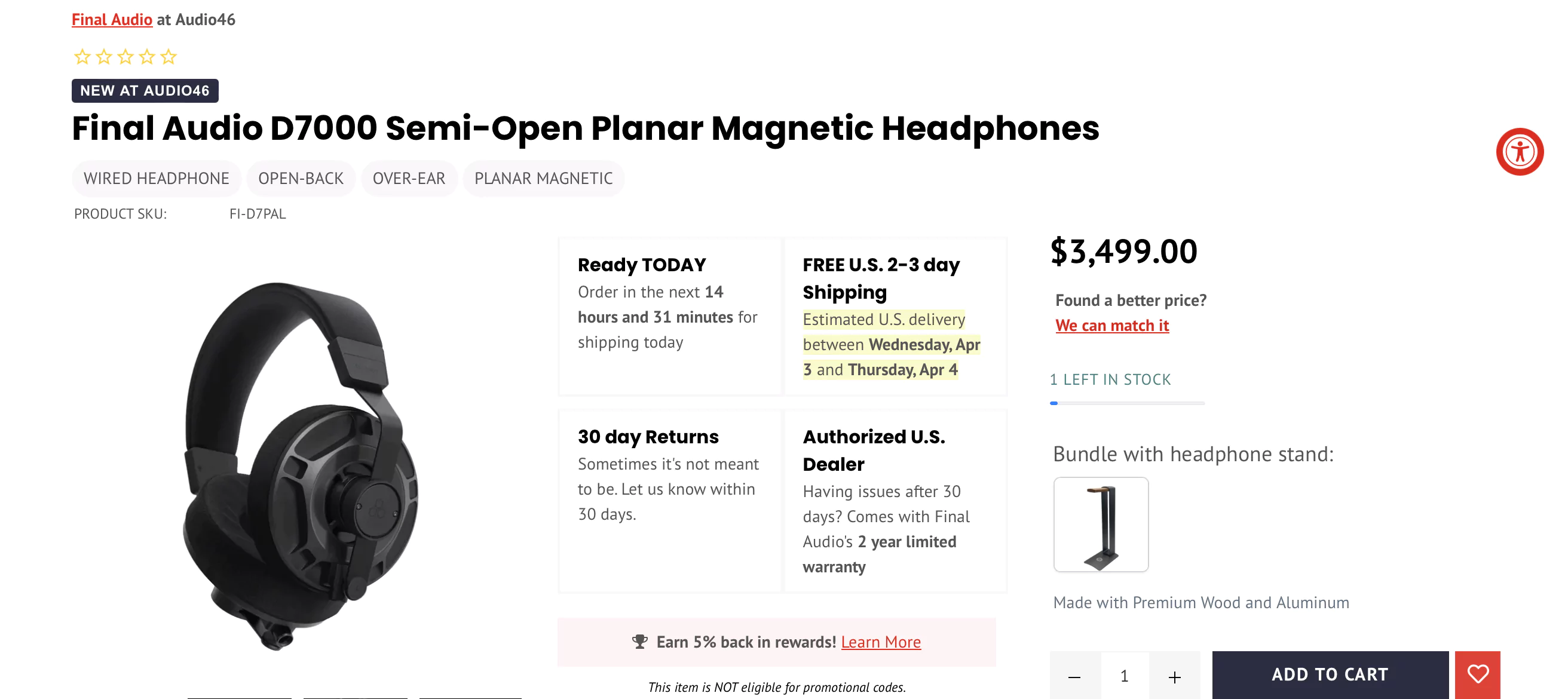
7. Crystal clear shipping information
Once you have the money to get those cool headphones, you want them now B-)
Shoppers love it when they know that their electronic products will be delivered to them when they want - and the way they want.
For this:
✅ Mention delivery date as opposed to shipping time. Shipping time may or may not include processing time, leading to ambiguity
✅ Mention the day and date of delivery, thereby reducing guesswork for users
Audio46 has designed its product pages in a way that they cover all the essential shipping information - further highlighting what’s important to its shoppers.
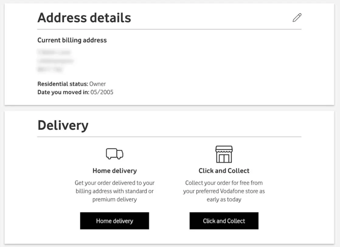
✅ Give the option to choose the fulfillment method on the product page itself - home delivery or store pickup.
✅ Additionally, provide the option to change the fulfillment method during the checkout process
Pro tip: Talk about ‘free’ shipping explicitly on the product page (even if you have banners stating the same - they often get missed)
8. Recommend products strategically
One of the top-notch means for your shoppers to discover your categories and products is through recommendations, which also fetch sales, of course.
(Which means getting recommendations right is really important!)
There are two kinds of product recommendations that you can add to your electronics eCommerce website-
✅ Alternate products
✅ Supplementary products
While the first helps with product discovery and findability, the second one enhances product catalog navigation and awareness.
A good strategy would be to recommend both.
Let’s see how to do that effectively.
Tips to get the alternate product suggestions right:
✅ The alternate suggestions should be very similar to the product (Let your site auto-generate this)
✅ List the alternate products on the right-hand side - ideally vertically
Musician’s Friend shows the alternate products right under the main product.
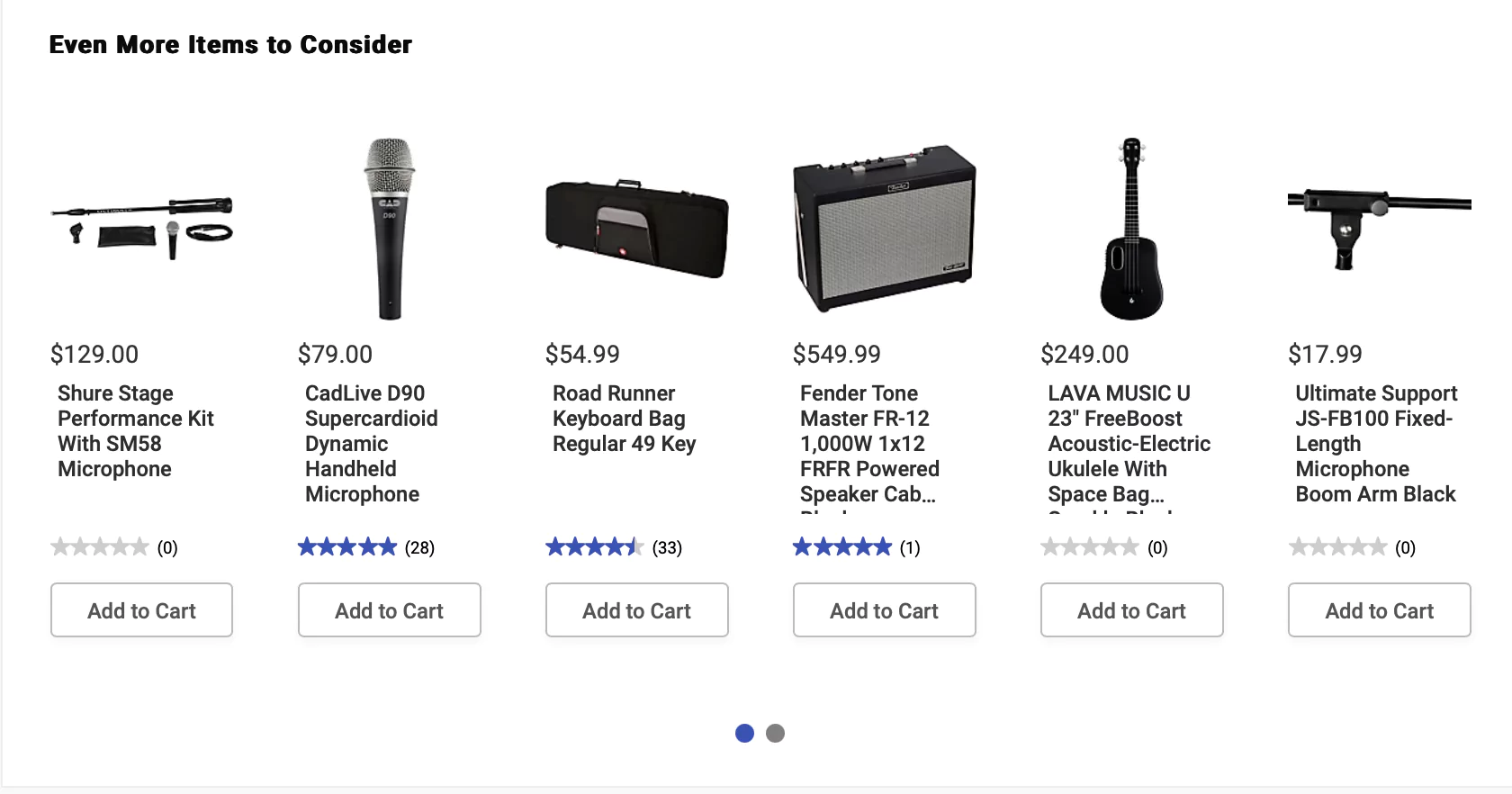
Tips to get the supplementary product suggestions right:
✅ Recommend all the products that ‘complete the package’.
For example: getting a case and memory card to go along with that compact camera they just added
✅ List the supplementary products on the product page as well as below the cart contents on the cart page
✅ Avoid using labels such as ‘Recommended’ unless product compatibility can be guaranteed. (You can say something like - Others also bought)
✅ Maximize the user’s product catalog awareness by suggesting products from a diverse set of categories.
✅ Enhance navigation by linking to the categories of the suggested products.
Musician’s Friend suggests supplementary products after all the information about the main product is covered.
9. Put a timer on deals and offers
Build FOMO, and get users to act fast.
Add exciting and time-bound offers to your electronics eCommerce website - and let your customers know that leaving your website without buying will mean missing the party.
For this install timers on deals.
To increase sales through deals:
✅ Add the deals and the timer on the homepage as well as the product pages
✅ Highlight only one prominent deal on the homepage - leave the product-specific offers for the product page
✅ Don’t miss out on adding the ‘seconds’ section along with day, hour and minutes
✅ Consider using exit intent pop-ups showing a countdown timer on offers
A great example is Samsung. They have all the essential elements in the very first fold - the offer, timer, a clear CTA, and their product images.
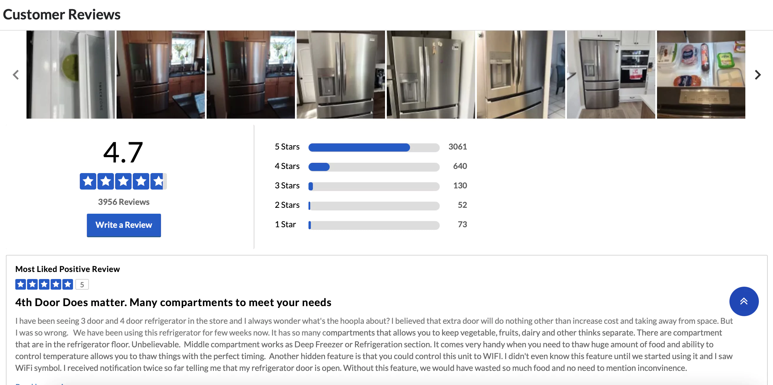
10. Reviews - more visual - more authentic
Users will naturally trust you more when they know that other shoppers out there have bought products from you that work perfectly well.
For this, have your customers submit reviews with pictures of the products on your electronics eCommerce store.
To make sure that these visual reviews are doing their job:
✅ Display user-submitted images alongside their reviews
✅ In addition to this, display all user-generated pictures in a gallery right on top of the reviews
A great inspiration is Sears. They display all the images and reviews on the product page after the product details and recommended products.
11. A good exit intent can always do wonders
Comparison across websites before making a purchase is a common scenario when it comes to electronics eCommerce space.
To hold back your website visitors make an offer they can’t refuse.
Create an exit-intent pop-up that gives crisp yet full information about the offer.
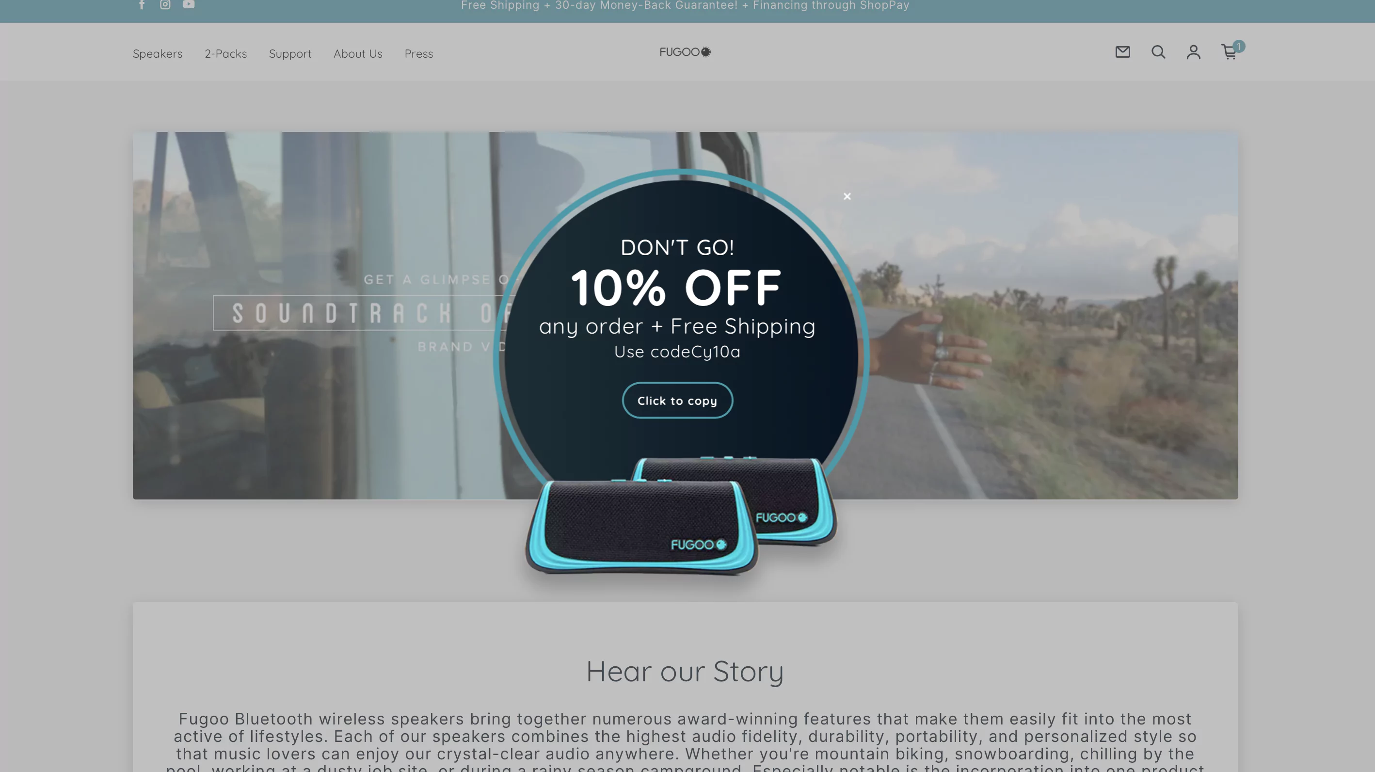
Fugoo has created a very enticing exit intent pop-up. What they do is:
✅ They explicitly ask the visitors to stay back
✅ They have highlighted the offer and made it unmissable
✅ They have also added a secondary offer - an extra gift
✅ There is a CTA to copy the offer - encouraging visitors to use the coupon code
✅ There are product images - making staying back even more lucrative
✅ The design is simple and easy to consume
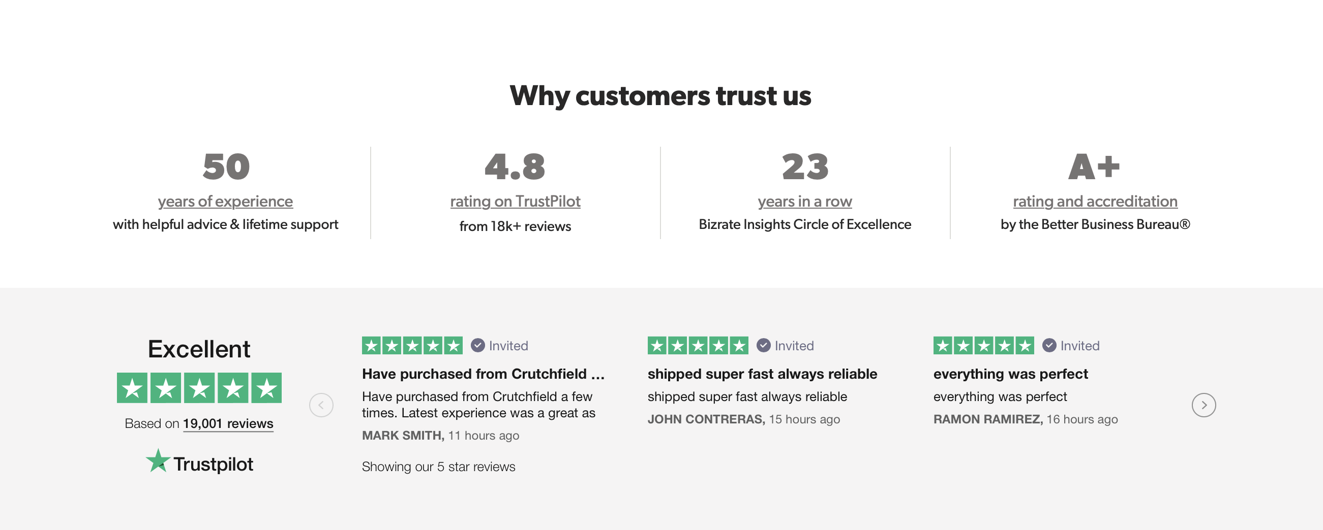
12. Provide assurance symbols
Trust symbols have always been crucial, but with the increase in internet fraud and cyber crimes, they are more important than ever
As assurance symbols, consider adding the following:
✅ Ratings and reviews by customers
✅ Awards and accreditations
✅ Trustpilot of other review platform badges
✅ Secure shopping guarantee badge
✅ Money back guarantee badge
✅ Social Proof (e.g., Number of Customers Served) etc.
Where do these trust badges appear?
✅ Homepage
✅ Product pages
✅ Site footer
✅ Checkout page
Crutchfield has created a fold that has a number of assurance symbols grouped together. Shoppers, in a single glance, can confirm that this is an online store they can trust.
13. Help shoppers shortlist products
Your shoppers may view a product, like it, and not do anything about it before jumping to the next one to check that out.
You can really ease their lives by collating the universe of products that their eyes have viewed and presenting it to them so that they can shortlist what they ultimately want.
Make sure to:
✅ Add the ‘Recently Viewed’ button on the navigation bar
✅ Add it next to the ‘Saved’ or ‘Wishlist’ option
✅ Provide sufficient information on the page for shopprs to compare products - the name of the model, price, 2-3 basic specifications


.svg)

.svg)

.svg)
.svg)
