Conversion Optimization
eCommerce Product Detail Page: 20 Do's and Don'ts
January 16, 2024

Insights in this post come from our CRO team's decade of experience working with eCommerce brands. Edited by our in-house content team.


Insights in this post come from our CRO team's decade of experience working with eCommerce brands. Edited by our in-house content team.

Many eCommerce businesses let go of optimization efforts thinking their products will speak for themselves—and that never happens because one of the first contact points (the product detail page) ends up disappointing potential customers.
Now it’s easy to say pick the right images or write a brilliant product description, and you’re sorted.
Except that you’re not—working with 500+ businesses over the last five years, we’ve realized brands overlook more than they’d want to.
So here’s a list of ideas that’ll help you make your eCommerce PDP shine—and a list of mistakes you mustn’t repeat if you want those conversions rolling in faster and longer.
Once the typical shopper lands up on a product detail page, the typical questions they want answers to are:
- Will this fit me?
- What is it made of?
- How will it help my life?
- Will I be able to save any money buying this?
- Is there an upgrade/modification available?
If you’re able to answer the above in your PDP marketing efforts, your job is already half done—Brilliant Earth offers a great example to leverage product info before shoppers reach the primary CTA:
Since eCommerce PDPs have been around for a while, shoppers are used to pop-ups proclaiming X% off upon email sign up—thus, they don’t even bat an eye to close them and move on.
One way to hook them while narrow down their options for your back-end email preference center is to ask them what kind of content they’d like to engage with—this is how eCommerce skincare brand Topicals enhances their PDP eCommerce pop-ups:

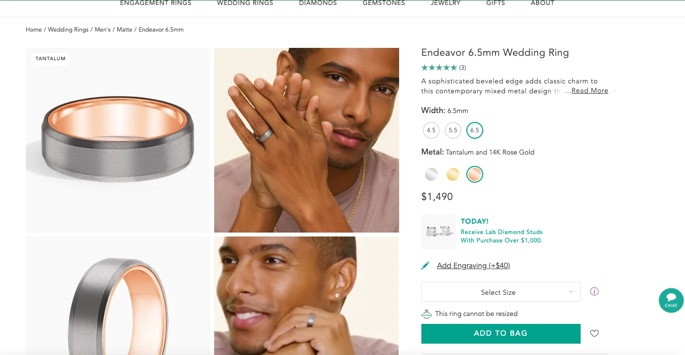
While product recommendations are great (54% of businesses report them to be the key driver behind AOV going up,) they’re usually secondary within a shopper’s attention.
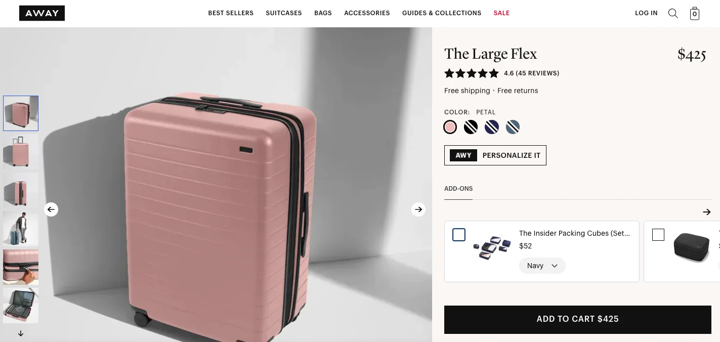
What we’ve seen work in PDPs in eCommerce is to feature lesser priced add-ons—that too right above the primary CTA so that the shopper doesn’t have to spend additional time looking around.
Here’s an example from eCommerce travel brand Away.
Observe how the brand features the checkbox option, which when used, the total price on the primary CTA changes.
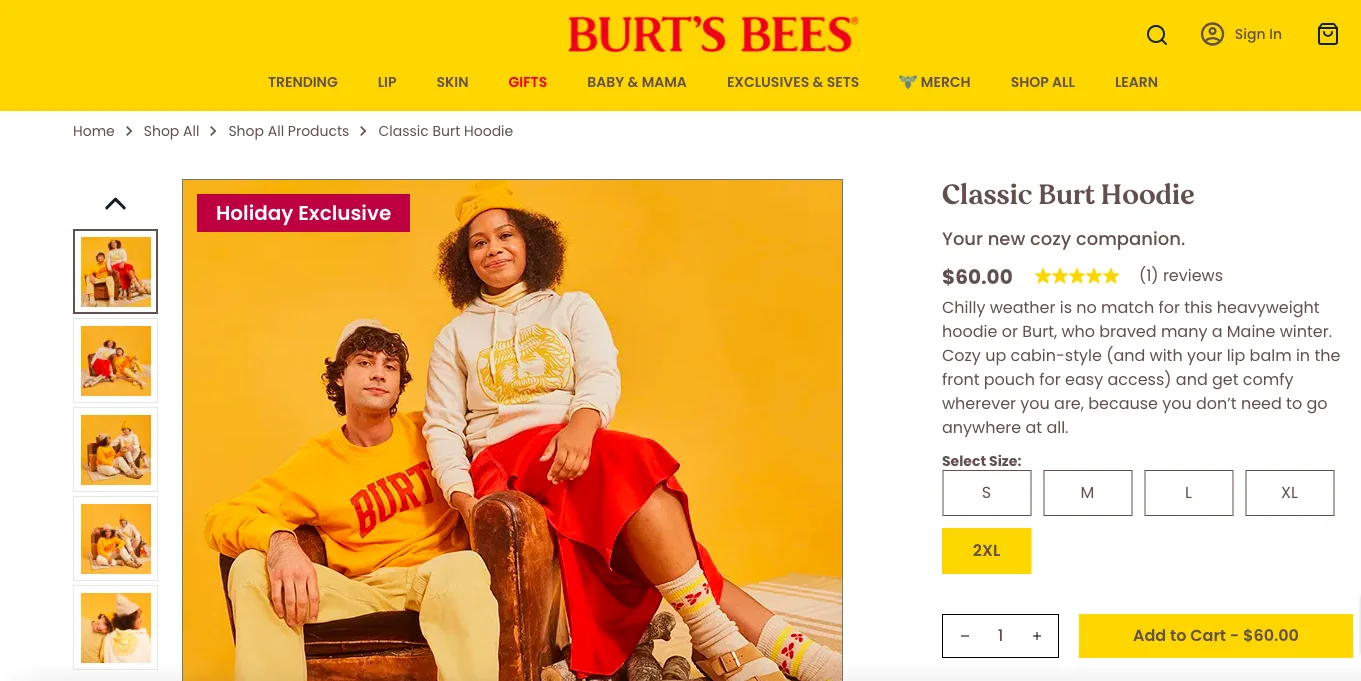
Almost a decade back, MIT researchers found that the human brain processes images as fast as 13 milliseconds.
So, if you can label your images to drive exclusivity, flash deals or even seasonal discounts, shoppers are likely to be inspired to buy more through your eCommerce PDP.
This is the principle Burt’s Bees follows as part of their product detail page best practices:
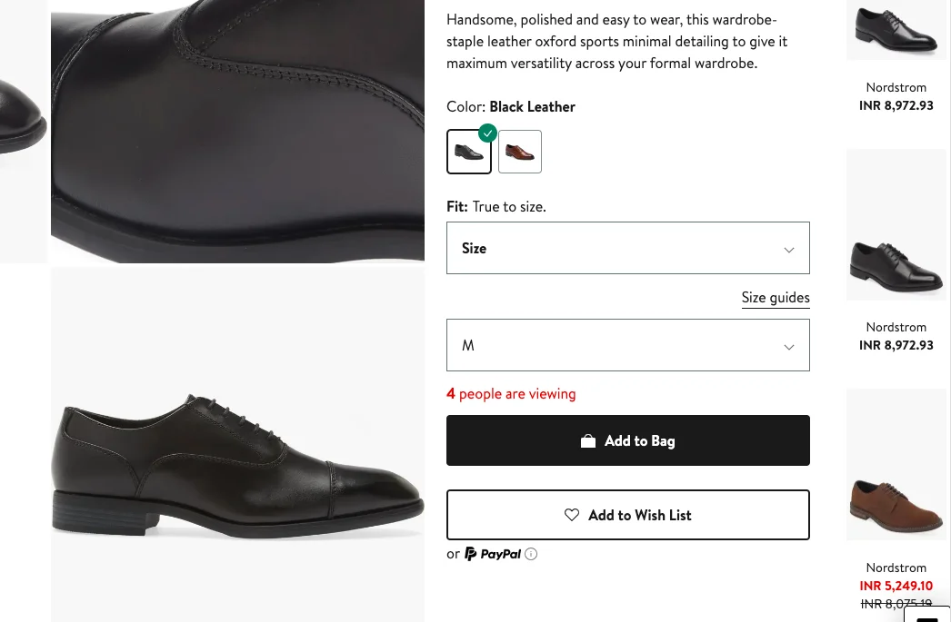
A/B testing experiments tell us that simply using FOMO isn’t enough—where a brand uses it on their PDP marketing is equally important.
What we’ve seen work best is when FOMO is created around the primary CTA—be it the number of views the product is receiving at the moment or its current stock levels.
Here’s a cue to use from eCommerce brand Nordstrom that features FOMO elements in contrasting colors:
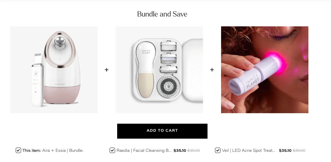
Many brands we’ve worked with come with the problem that despite curating some great bundles, they don’t help increase AOV.
We figured it’s because shoppers don’t experience a sense of choice while considering these bundles for a purchase.
Best way out? Make each part of the bundle editable through radio buttons in your PDP optimization—just like Vanity Planet does:
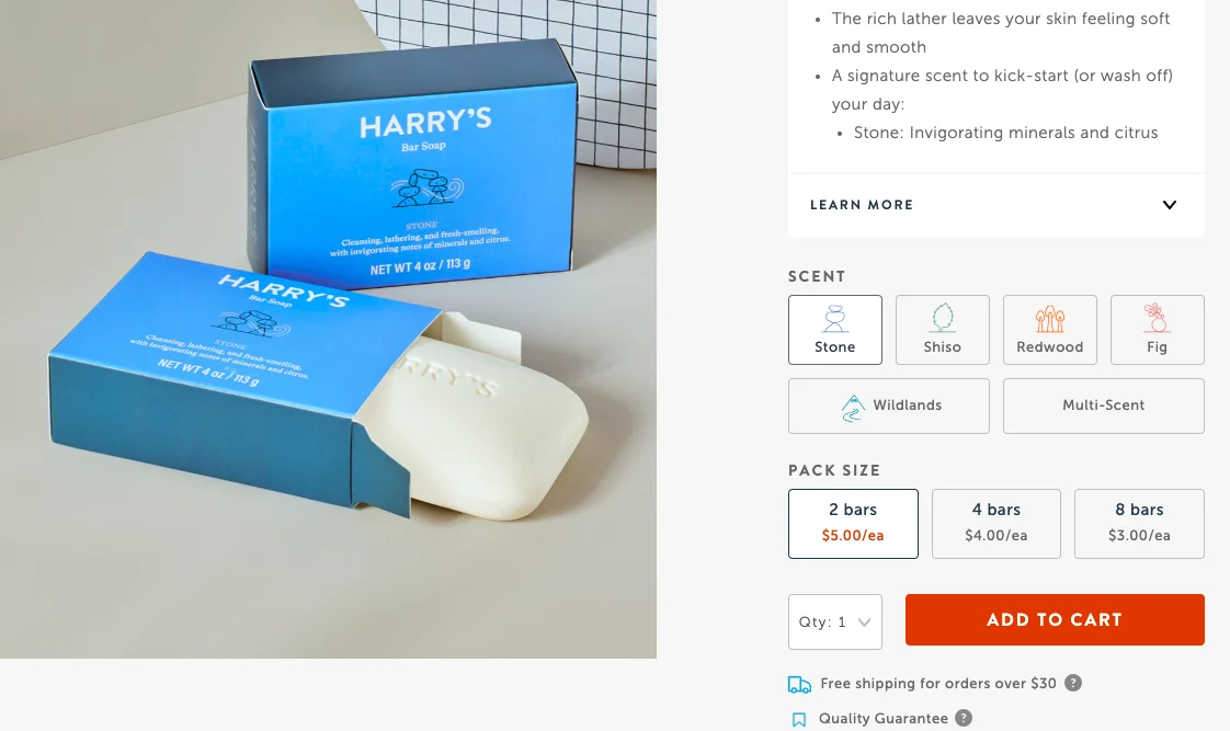
Beyond product discount markers, successful eCommerce product detail pages have one thing in common: clearly quantity discount markers.
When shoppers see they can save more by buying more, the natural tendency becomes to add more to cart or add a larger pack size—see how Harry’s leverages this CRO feature:
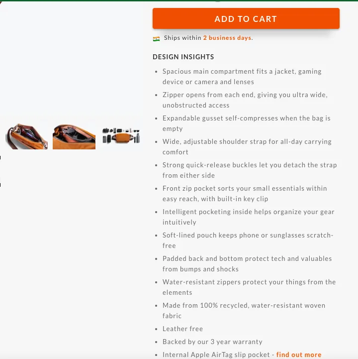
Recent research says 87% of shoppers count on product page content to make a purchase.
And this is why, if you manufacture or stock products that are more detailed or complex, you can’t hide information on them under a simple “description” section.
Bring out the techniques or craftsmanship in your PDP optimization to do full justice to a higher price you ask or the claims you make.
eCommerce brand Bellroy features a section called “Design Insights” on their product detail pages to drive both features & benefits:
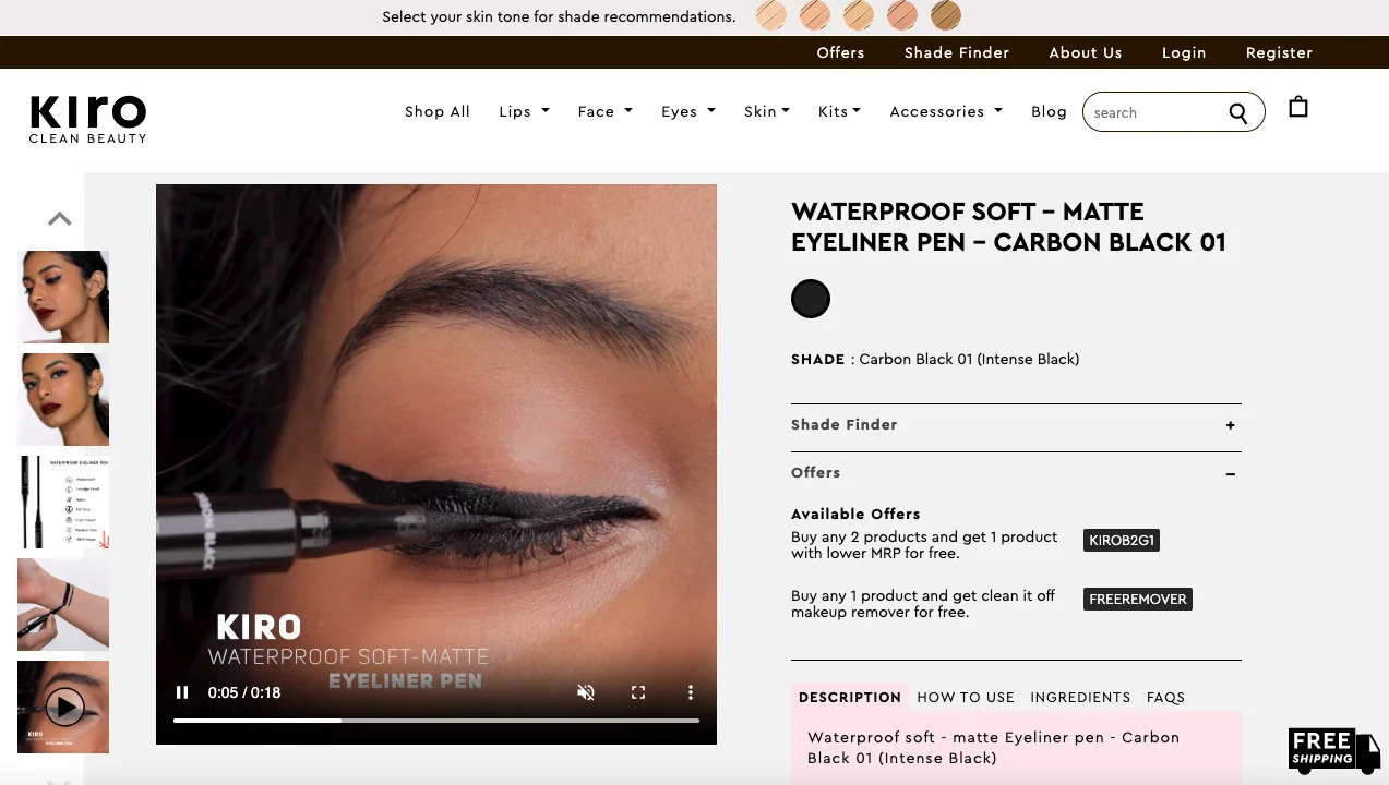
Given that human beings (so obviously shoppers too) can process visuals 60, 000 times faster than text, it’s a given that your product detail pages will do better with video (research says sites that feature video convert at 4.8% whereas sites that don’t, at only 2.9%.)
But like we were speaking of FOMO earlier, the success of video too counts on where you place it—our suggestion: don’t keep it multiple scrolls down in your page, instead feature it within your gallery.
This is what Kiro Beauty does too in their PDP eCommerce—in this case, the video is also quite snackable at just 18 seconds long:
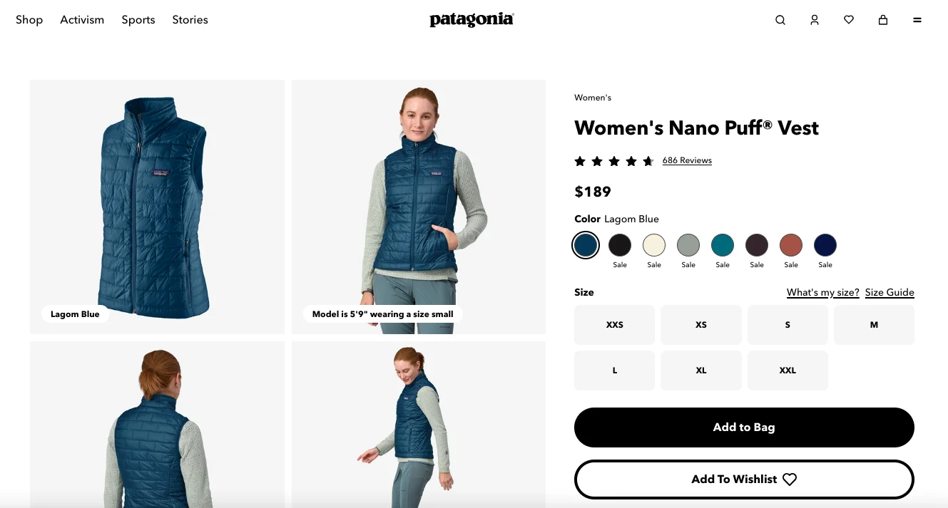
Many eCommerce businesses tend to forget that before macro conversions come micro-conversions—and optimizing those on the product detail page is absolutely crucial.
One major way to do this is to feature a prominent wishlisting option—just like outdoor brand Patagonia does in their PDP eCommerce:
Now that we’ve covered some of the most critical product detail page best practices, let’s also take a look at some mistakes that are often overlooked:
Or as worse would be including keywords that hardly have any search volume.
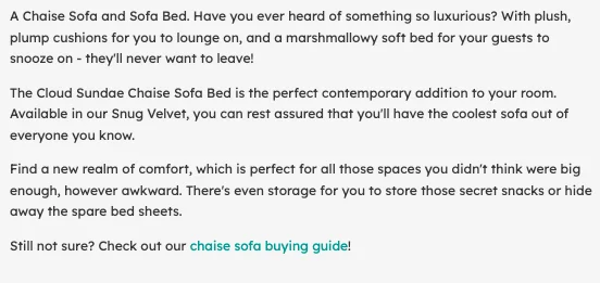
On the other hand, when you align your keyword strategy with search intent, you’re in a position to optimize your content for those who’re the most likely to buy.
A good eCommerce brand to take cues from? Snug, the sofa company, it is then—check out how well-optimized the content below is in their eCommerce PDP:
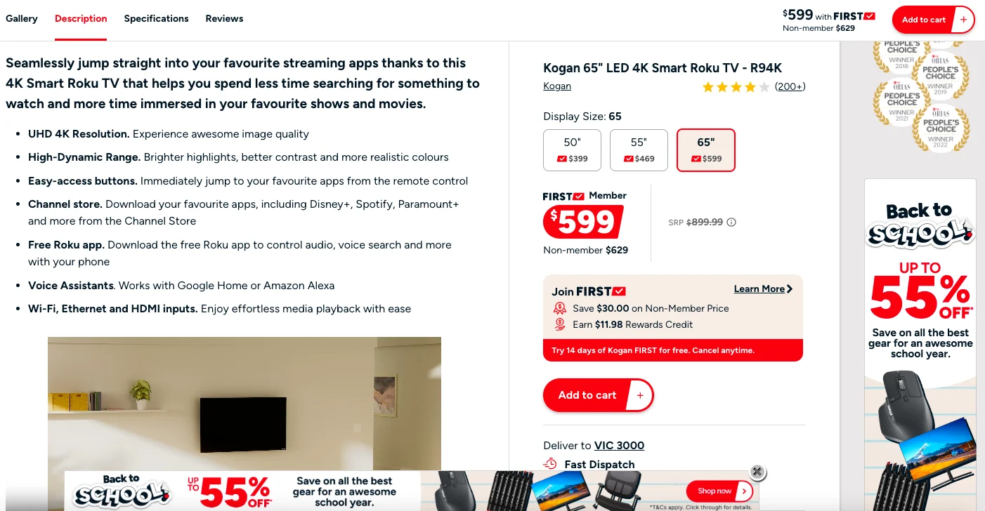
This one is a killer mistake in PDP marketing, whether your primary audience shops on desktop or mobile (and especially, if they shop on mobile.)
If shoppers can’t focus on takeaways as soon as they land, it’s unlikely they’ll want to buy—when some people we know landed on the Kogan website, that’s exactly what happened—this huge Australian eCommerce brand has too many moving parts on their product detail pages, creating continuous distraction & overwhelm:
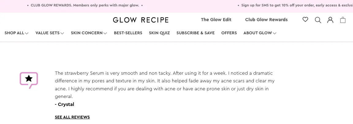
Now that it’s known that the average online shopper would like to see at least 112 reviews before settling on a purchase, most eCommerce businesses think showcasing reviews as social proof is enough on their product detail pages.
Except that there’s always the possibility that a potential shopper may not scroll all the way down to the reviews section—without enough confidence built earlier on in the page, this can lead to them bouncing off.
Check out how skincare brand Glow Recipe decides to take care of this challenge by featuring a review snippet and featuring microcopy that links to all the reviews.
On an eCommerce product detail page, shoppers want to know if the product will add value to their lives.
This information becomes clear when you clearly spell out benefits in your description—don’t just hide them away, call them out in bullets or ticks so that a shopper exactly knows what’s in it for them.
Take a look at this description—the benefits aren’t visible at all (you don’t wanna do this):
And, now see what mattress brand Casper does to highlight benefits:
If you sell products for nutrition, beauty or problem areas like sleep issues, comparison charts become a big conversion opportunity for you.
For science-backed products, not offering a comparative analysis with products that exist and are out in the market, is a big mistake.
Want your shoppers to trust you and convert as a result? Take a leaf out of Seed Nutrition and the way they offer comparative analysis in their PDP eCommerce:
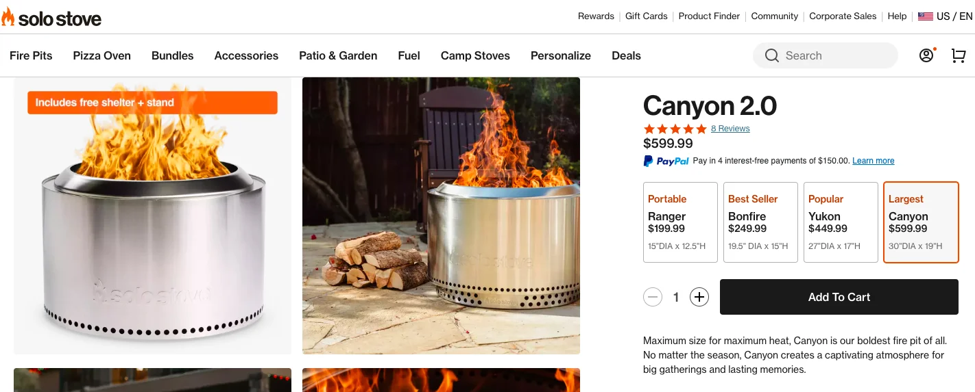
Most eCommerce businesses are now used to showcasing color variants distinctly through radio buttons.
But in our audits, we’ve noticed how not clarifying product variants in the first few scrolls can take a toll on conversions—when these products are kept for later view to highlight the main product on the detail page, shoppers may walk away thinking they don’t have a choice.
eCommerce brand Solo Stove sets up a good example for other brands to follow:
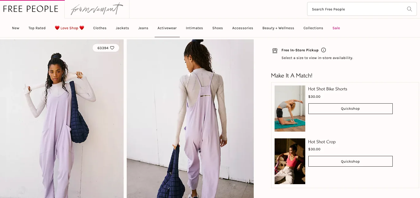
You might have a great product detail page but if you’re featuring unoptimized recommendations from across your site, you’d have to give up on those conversions.
What we’ve seen in our free audits is that it’s not enough for businesses to only label the recommendation sections appropriately—even the best labels can’t help the problem of irrelevant recommendations.
eCommerce fashion & apparel brand Free People offers an amazing cue to how you could do it—note that they call out specific recommendations to go with the product despite having a separate section towards the end of the page:
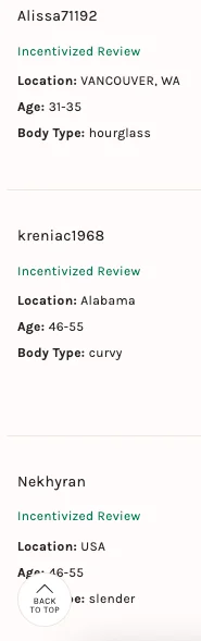
It’s 2024 and eCommerce reviews have gone way past “such a cool product” written by SM2520.
Now shoppers want in-depth reviews by verified buyers, and ideally covering aspects that matter: size, age, body type etc.
In fact there are brands that make review transparency a part of their bigger package—they even highlight incentivized reviews on their product detail pages:
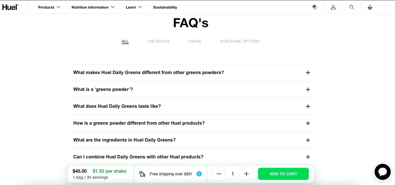
Apart from the nature of a product and its benefits, shoppers consider a purchase through the lens of support, delivery and returns.
Hence, if these aspects don’t find space in the first few scrolls, conversions can turn tricky.
Our suggestion for your eCommerce PDP?
- Use limited microcopy above the fold and link it to your separate FAQ & policy pages
- Offer a comprehensive FAQ section that covers multiple areas that would be of interest to the typical shopper
Here’s how eCommerce nutrition brand Huel gets this right:
Recommended reading: 17 Proven Ways To Perfect eCommerce FAQs
The eCommerce shopper is now used to product detail pages raving about discounts.
So, if yours aren’t showing some value through savings, converting could become a problem.
But then again, if a competitor is featuring a $10 off and the price is coming to $100 and yours is somehow at $30, then this could make shoppers doubt your products.
Unless you optimize your eCommerce product detail pages around the following elements, there’s no promise conversions will happen:
Name your products based on the kind of keywords and phrases customers are searching for—so if a common search is “nourishing cold cream,” make sure your product name contains these words in some relatable combination.
When eCommerce brands are able to optimize their product descriptions for high-intent users, they typically see higher conversions. Just ensure you bring in enough info about post-purchase care, returns and exchanges, apart from the benefits and features.
In our CRO audits, we’ve repeatedly seen how recommendations that don’t ring a bell with target customers, go overlooked. For your product detail pages to convert, you need your recommendations to “click” as valuable for your potential customers.
Since shoppers need to feel they’re in control, crucial information on a product detail page includes return policies, whether and how free shipping would be possible as well as the typical questions shoppers have before & after a purchase.
Every great product detail page we’ve created, tested or drawn inspiration from has featured an image gallery that answers at least some of the questions around quality, use and the context a shopper has. Plus, a limited number (not more than 5) of quality visuals helps.
It’s easy to think product detail pages are about macro conversions alone. But to get shoppers to believe in the brand and product, sometimes micro-conversions are the first step. Find out ways to optimize your wishlisting options & CTAs, email sign ups and navigation so that it becomes easy for shoppers to move to other parts of your storefront.
7 Unconventional Product Page Metrics for eCommerce (& Insights)
How to Cross-sell on Product Pages—Without Being Pushy (+ Examples)
40 High-converting Health/Beauty "Product Page" Examples
98% of visitors who visit an eCommerce site—drop off without buying anything.
And product detail pages are often the reason, being unoptimized and unhelpful.
User experience issues invariably cause friction for visitors.
And this is the problem Convertcart solves.
We've helped 500+ eCommerce stores (in the US) improve user experience—and 2X their conversions.
How we can help you:
Our conversion experts can audit your site—identify UX issues, and suggest changes to improve conversions.
Subscribe for more articles like this!


Read by 5000+ ecommerce store owners
.svg)

.svg)

.svg)
.svg)
2026 Convertcart, All Rights Reserved
33/1, Castle Street, Ashok Nagar, Bengaluru, India
