Conversion Optimization
23 Key Elements Every Product Description Page Must Have (eCommerce)
November 2, 2023


We could talk about all the obvious elements that even the best product description pages come with—but we’ve decided to pull out what we’ve found inspiring and having an impact on real-time conversions for real-time clients.
So here we go!
Evoke the right emotions and shoppers will respond.
If you’re a new or more exclusive brand, the first emotion you may need to create is “safety”—it’s safety that generates trust.
Frida, an eCommerce brand that caters to the needs of babies and new parents, ensure to do this with all of their product names—here’s an example:

By now, you must have seen a lot of price anchoring examples across eCommerce stores—where the original price is struck-through and the reduced price is mentioned alongside it.
This isn’t the only way—you could also write:
- Original value: X, Now only: Y
- (Price) - get a free sample
- Spend $X and get $Y rewards
- X% off when you buy more than 2
Alternatively, you can do what Allbirds does—they clearly mention that shipping is included in the price they’re charging on the product description page:

Apart from great pricing, positioning the payment as “easy” or “desirable” can have an instant effect on conversions.
This is why many brands now highlight BNPL options, and give info on the number of instalments too.
But there there are other ways to do this by mentioning:
- Redeem saved points through membership account
- Sign up for our *email exclusive* offer
- Log in to pay and save 10% instantly
- Earn X credit by paying with Y
- Get $X e-gift card when you pay with Y
Elvie, which creates products for breastfeeding mothers, features the most popular payment methods on their product description page (something that most brands reserve for checkout):

It’s quite common to see eCommerce brands put out “subscribe & save X%” on their product description pages.
To make it even more compelling:
- Ensure you apply price anchoring (like Chewy does—so that when they mention a further slash on the “autoship” option, shoppers are sold)

- Mention points they earn upon a repeat subscription (like Skin Authority does by mentioning “200 insider points upon every 3rd subscription purchase)
- Reduce the price for shorter subscription cycles (for example, if for 60 day intervals you charge $110, for 30 day intervals bring it down to $90)
eCommerce has come a long way—now it’s not enough to just have color or type variants in swatches.
The swatches themselves have to deliver value.
One way to get this right is to label the swatch thumbnails either with a “-X%” or “Price fall” or “Price drop”—this can instantly target those who’d buy the product on the description page only if they got a better deal.
Similarly, if you feature size variants for the same color, separate cues need to be there for each one—this can especially be beneficial for home decor and furniture businesses.
Here’s a look at how Snug offers visual cues for size variants of the same color:

This is an especially great conversion driver for fashion brands that have switched over to cross-border eCommerce.
Ensure that you feature size parallels for every region you cater to apart from your homeground location—see how Everlane gets it right:

To make it even more accessible, consider breaking down the size guide into separate sections that can help shoppers “find your length”, “find your fit” etc. like men’s fashion brand Bonobos does:

Like “ingredients”, “how to use” etc. and make them collapsible—you can either do this in a vertical format or a horizontal one.
Here’s an example from Wayfair:

This is how Golde does it and it can be highly effective for conversions.

And feature the rest in a “read more” format—this improves the chances of shoppers knowing their primary takeaway from the product description page instantly.
The other way to do it is to highlight the summary of what the product is about and highlight it amply—just the way Flower Beauty does it:

Or even the highlights of a single product in bullets—here’s what Lush Cosmetics does:

While it’s great that 99.9% are known to read customer reviews before deciding on a purchase, sometimes product description pages need more.
Apart from bringing in labels like “top rated” or “high rated” and linking to the reviews section in the first fold, you need to bring in social proof that’s backed by authority—Golde gives us a cue on how to do this without appearing pushy:

No matter which category you’re catering to in eCommerce, complex or high-value products need that extra visual push to drive conversions.
This is true for layered clothing, powder supplement mixes with multiple ingredients and even jewelry that has several functional parts.
One way to do this is to introduce one image in the gallery that clearly states either the parts of the product or the benefits a shopper can hope to experience by using it—here’s an example from Kylie Cosmetics:

Many eCommerce brands make the mistake of making “standalone” suggestions that are either complementary to the main product or are similar in nature—and conversions in such cases are a near hit-and-miss.
instead:
- Introduce brand authority and bring in a section labeled “we’d recommend”, “complete the experience” etc.
- Feature a “bundle & save” section as this can be a win-win for both you and the shopper—but make sure the bundle features products that pair excellently together
eCommerce brand Vanity Planet shows us how to nudge shoppers without making it seem forced:

It’s easy to think that only the most mature customers will come across an FAQ section and read it.
Wrong.
Even slightly interested customers are likely to convert with an in-depth FAQ section—keeping it detailed while covering relevant areas like mattress brand Casper does is the way to go about it:

Most eCommerce brands are now up to speed in making their review section feature filters along the lines of “rating,” “most recent” and “most positive”.
But there are several others aspects you’d want shoppers to be able to filter in the reviews section:
- Images & videos
- Skin type
- Size
- Shade
- Age
- Profession
The more segmented the reviews a shopper sees, the more likely they’re to feel convinced.
Snack brand Chomps does a phenomenal job at bringing in a number of relevant areas for filtering:

Especially when shoppers are on the lookout for comparing several products, what they’d like is a “general” sense of how people like a specific product.
That’s where a review snapshot can come in really handy—here’s an example from Wayfair

Patagonia takes it a step further:

Almost everyone puts this vital form of information right under the CTA or sometimes even after the microcopy on shipping & returns.
But what we’ve seen work well is when you call free shipping out in the first fold and make the shopper aware of this vital condition—this feature influences their shopping journey from thereon.
Here’s a visual example yet again from snack brand Chomps:

More prominent information on product description pages always end up taking the cake—but when you reserve microcopy for the most important bits of info, it can boost conversions instantly.
Here are a few ways we’ve seen work:
- Highlight info on memberships and make sure to color code it differently—here’s how MeUndies does it, and the best thing is that the expanded info doesn’t take the shopper away from the page:

- Highlight warranties or guarantees
- Feature a “fair pricing” clause if you have one and link to any necessary policies
- Display the returns window and link to your returns policy
- Back-in-stock alert messages
Building confidence in a shopper is tricky.
Sadly, too many brands miss out on leveraging the “wishlist” icon to drive buyer confidence.
And a brand like Sephora shows how this can in fact help:

This is beneficial to convert shoppers specifically for high-value items like expensive gadgets and designer wear.
UK brand Very, for example, features insurance options when you head to buy gadgets like the iPhone 14 from them:

Similarly, if you’re recommended an add-on for a bundle deal, make sure you justify with a description why you’re suggesting it—children’s play brand Lovevery aces this:

It’s common to see brands reserving sticky menus for their “add to cart” prompts or even their rewards & membership info.
However, we’ve seen shoppers take note when you reserve your sticky meny for some great offers—while they may be anticipating it in the cart page, you’re simply making it more obvious.
Here’s how Banana Republic does it:


There are several ways to get this right, whether you’re targeting new shoppers or old-timers:
- Feature a FREE product guide when targeting new customers or throw in a few bestseller samples
- Remind shoppers to log in to their account and shop to win a special discount on the box or a complementary item
Huel, for example, uses this section to remind shoppers that they should add their free t-shirt in the cart page and choose their size:

If you’re an eCommerce brand that doesn’t have a huge in-house customer support team, then it makes for you to optimize your live chat feature for quicker conversions.
Here’s what you can do:
- Keep the typical *top* complaints at the top—like Dollar Shave Club does:

- Feature a linked <customer service help> section—it can then guide the shopper through a series of steps like choosing help for a specific area, then choosing a medium to communicate etc.
- Optimize “search” so that they can access blog articles through the live chat feature itself
16 Elements all High-Performing Product Pages have in common (Updated for 2023)
Product page UX: 22 data-backed secrets for high conversions
45 eCommerce Product Page Optimization Hacks (+ Examples)
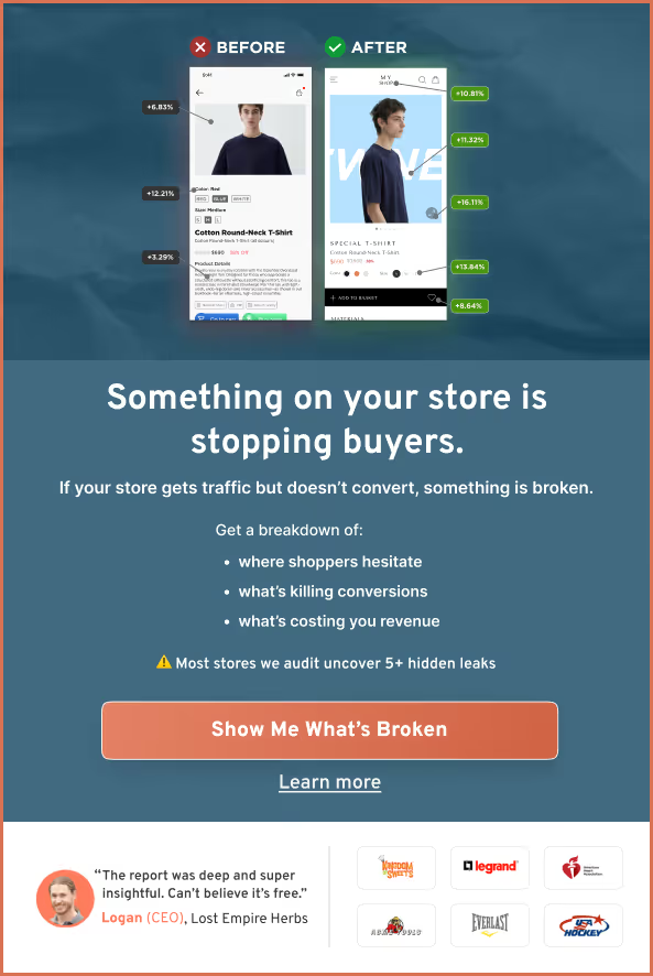
98% of visitors who visit an eCommerce site—drop off without buying anything.
Why: user experience issues that cause friction for visitors.
And this is the problem ConvertCart solves.
We've helped 500+ eCommerce stores (in the US) improve user experience—and 2X their conversions.
How we can help you:
Our conversion experts can audit your site—identify UX issues, and suggest changes to improve conversions.
Subscribe for more articles like this!


Read by 5000+ ecommerce store owners
.svg)

.svg)

.svg)
.svg)
2026 Convertcart, All Rights Reserved
33/1, Castle Street, Ashok Nagar, Bengaluru, India