The pandemic saw families invest in living spaces as they continue to spend more time inside. On average, Americans spent nearly 10% more on home improvement projects in 2020 than in 2019.
Current data forecasts growth of $8.08 bn from 2020 to 2024 for the US home furniture market. Online furniture retailers and home décor stores can expect a market size of more than $54.23 bn by 2024. At this point, the online furniture store and home décor store sales will account for at least 12% of all eCommerce.
It’s exciting time to be an eCommerce home furnishing store owner. Yet, there are several factors why online furniture retailers might fail to capitalize on this trend and leave a lot of money on the table.
Research has shown that online furniture retailers who do not adopt digital transformation features will be unable to deliver a memorable purchase experience. A few of these digital features include product customization, HD Zoom, 360-degree views, etc. Such stores will eventually lose out in such a highly competitive market.
A good starting point to analyze your store’s performance is to conduct a thorough analysis of your audience and their behavior. Here are a few key questions to consider:
What are the primary channels that drive customers?
Which sections/ pages/ categories perform better? Why?
What features do customers use?
What are the most common complaints you get?
Contemporary online retailing is no longer just about selling and discounts, it's about show and tell. Customers today want all the details so that they can compare products and make informed choices.
This is especially true in the case of large-ticket and infrequent purchases that an online furnishing store and home décor stores usually offer.
Without further ado, let’s look at 20 common reasons why online furniture store and home furnishing store owners are seeing middling returns despite a new-found market size for it:
1. Lack of product recommendations
Most home décor stores and furniture retailers have huge product catalogs with multiple SKUs. It can be challenging for customers to browse or process such large chunks of information.
Even if customers do manage to narrow down on a product, having too many variations and choices can lead to postponement of the purchase altogether. According to Cylindo's report, 42% of customers surveyed abandoned a planned purchase because there were too many choices.
What a home furnishing store can do instead is reduce the problem of choice. They can conduct an inventory analysis and reduce the number of products. Step one is to slowly phase out the slow-moving products. Step two is to remove the variants: colors and sizes that are unpopular.
The other option is to offer a virtual equivalent of the store salesman. The report further shows that 91% of customers are more likely to purchase when stores recognize, remember, and recommend relevant products and offers. Furniture store owners can improve sales by offering their customers customized product recommendations based on their past purchase behavior.
Here are the most successful product recommendation algorithms to use:
You might also like: Tailored product offerings based on past data.
Visitors who viewed this product also viewed: A great chance to upsell and cross-sell other products based on collective purchase behavior. This is a great addition to the cart checkout process and can help increase the average order value.
Recently viewed: Shows those products that customers have checked out before but failed to purchase. Works great as a reminder.
Products from the same collection: Bestselling products from the same category that the customer is currently viewing.
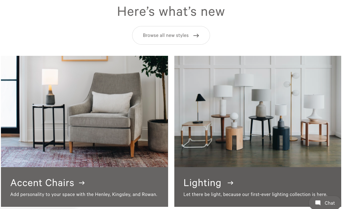
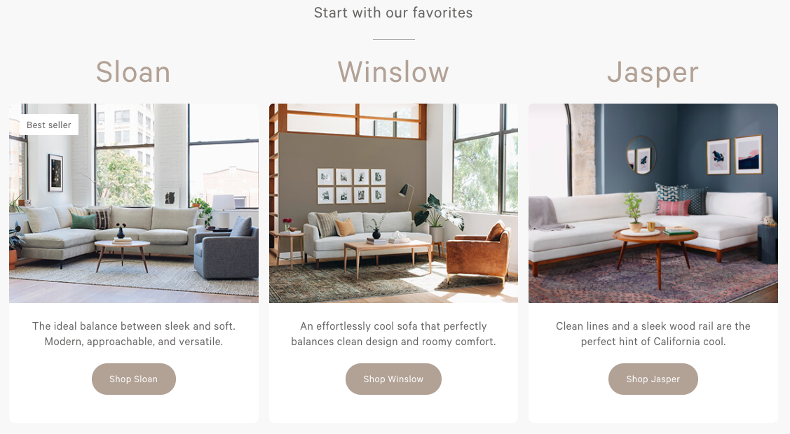
Here’s a great example of product recommendations from Interior Define. Right on their homepage, they have a ‘what’s new’ section that divides new products as per category, and below they have a favorites section as well.
2. A complex catalog
In the past, all you needed to start an online home furnishing store or home décor store was a product catalog. It would only display product information and the customers would place orders over call, fax, or email.
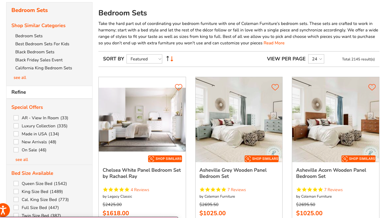
What online furniture retailers now need to do is implement a product classification and categorization process with sorting and filtering options. This helps customers narrow down choices and immediately find what they are looking for. The site experience must ensure that each category has unique filters that are specific to the product type.
Having an easy filtering and sorting process vastly improves the time it takes for an eCommerce furnishing store to move the customer to the next stage of the purchase funnel.
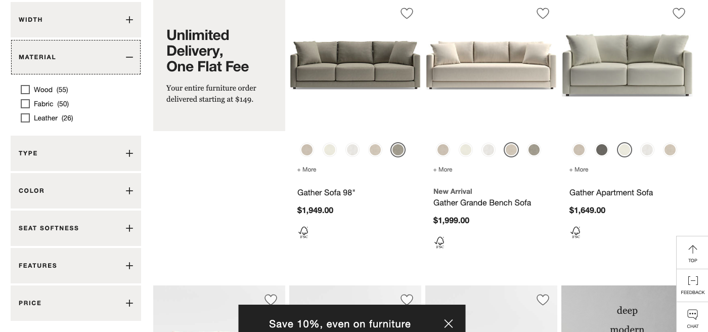
Crate & Barrel has one of the best-designed navigation sections. Look at the filtering sections on the left including Width, Material, Type, Color, Seat Softness, Features, and Price.
On the right, we see the price, color options, and variants without even getting into the product details page. All the options have thumbnails to view the product.
3. A non-optimized checkout process
Checkout is the most crucial stage in the online purchase process. 2 out of the top 4 reasons for cart abandonment are linked to the checkout process:
24% of shoppers leave without purchasing because the site doesn't offer guest checkout.
18% of shoppers leave because the checkout process was too long/complicated.
This means that almost half of all cart abandonment happens because of a lousy checkout process. Optimizing it is one of the crucial things online furniture retailers must focus on.
They can experiment with single-stage or multi-stage checkout processes depending on what works better. Filling in the delivery details are huge turnoffs for customers. Offering guest checkout options and reducing the number of form fields can help to improve the customer experience. Enabling autosuggestions for form details can help salvage purchases.
eCommerce furniture store owners can also include functions like using location tools to show estimates of shipping time and costs. Another great hack is to include an image of the exact product the customer has ordered.
It is also imperative to incentivize users to provide their email ids. Which can then be used to launch abandoned cart email series.
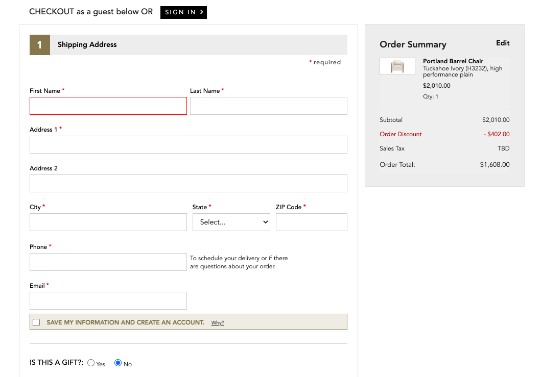
An example of simplicity is the checkout page of Ethan Allen.
At the top, they have an option to sign in or checkout as a guest. On the right, we can see the exact product along with a breakup of costs. Right below they have an option to save the information by creating an account which is a subtle way of getting people to register.
4. Subpar browsing experience
Displaying complete product information is crucial to increasing conversions. According to NN Group's insights, 20% of purchase failures are due to missing or unclear product information.
When it comes to a home furnishing store or furniture store site, the most important product information are: dimensions, delivery, return policies, and materials. If any of these are missing, it can derail the purchase as well as lead to a blacklisting of the online store itself.
Another key information metric is “in-stock products”. Imagine as a customer you’ve spent half an hour shortlisting a table only to find out that product is currently not available. This is a disappointing shopping experience and will count against the store.
Even something as simple as displaying information consistently is helpful. Shopping for high ticket items often involves product comparison. At this point displaying information in a comparable format helps customers choose faster.
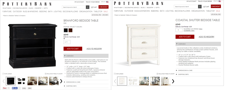
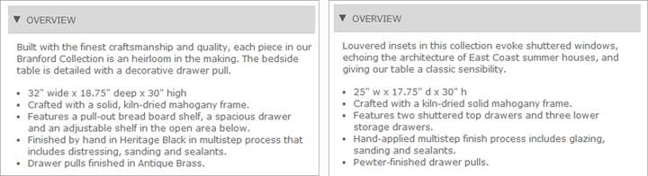
Take this example from Pottery Barn. Both tables begin with descriptions, overviews, and bulleted lists of features. They end with dimensions, finish information, and hardware details. It makes it a lot easier for customers to compare products side by side.
5. Sluggish mobile site
Customers are now used to searching, comparing, and buying on their phones. In today’s times creating a dedicated mobile site for your online furniture store or furnishing store is a no-brainer. In fact, most new companies build the mobile site first and then extend it to other devices.
Creating a mobile-optimized site involves pairing down the information to display and creating a navigational system that takes into account thumb scrolling and finger pinch zoom.
It is also important to add other mobile-first features including voice search, using phone locations to track deliveries, displaying nearest stores, chat options with interior design experts, and social media share buttons. Visual editors and AR are also great features that can be included. These help the customer visualize the products in their own home.
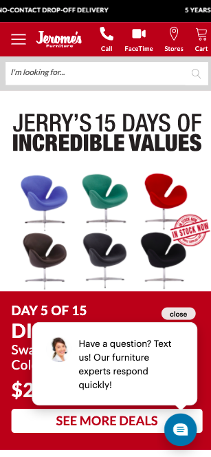
Here’s an example of a mobile site by Jerome’s. They have a Facetime option right at the top and a chat with experts option right at the bottom. This is a great way to use mobile features to make it easier for customers to connect with the store.
6. Generic product copy
Writing product descriptions and website copy is so much more than providing the right information. It is about convincing customers why they need the product and more importantly why they need to buy it from you.
Here is a hack that can help you write convincing copy.
Create a persona of your ideal customer or use data to build a profile of your most profitable customer type. Now use your website copy to create a conversation with that specific customer. Use humor, wit, relatable anecdotes to resonate with them.
For each product instead of just presenting the facts, present a story instead. Tell your readers the inspiration behind the design and the journey of the wood used in the piece. Inspire them to imagine the product in their home—how would it change their life? Show them how that home décor piece or furnishing might be a conversation starter or something that brings people together.
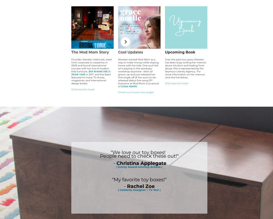
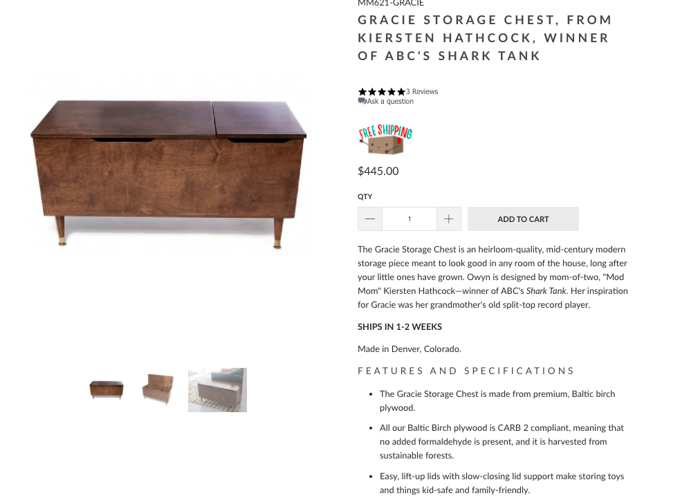
Here’s a great example of a copy that stands out from Mod Mom Furniture. Right on the home page, founder Kiersten Hathcock, talks about her story behind starting the brand, being featured on Shark Tank, and releasing her book. Her site also has product reviews from popular Hollywood celebrities right below.
When it comes to the product, notice the language she uses, “heirloom-quality, mid-century modern storage piece”, she lists her inspiration as her grandmother’s old record player.
When it comes to the wood she mentions, it is made from Baltic birch plywood, harvested sustainably, and is CARB 2 compliant. All of these phrases make the product sound premium and safe, and portray her business as being environmentally responsible.
There are many factors that affect customer conversions. One of the most overlooked among them is the call-to-action button.
When Impact made a single change to the copy of their CTA button they were able to increase conversions by a whopping 78.5% within only a month.
Sometimes the smallest changes can make the biggest difference.
Here’s what home décor store sites and online furniture retailers should incorporate while designing CTA buttons:
Contrasting colors work best for CTA buttons. Dark color buttons against a light background or vice versa. This helps them grab attention and stand out.
Images that preface the CTA are also key. They must resonate with the customer and be attractive enough for them to click on the CTA button.
Reduce the clutter around it. Research has shown reducing the clutter around the CTA button can increase conversions by as much as a massive 232%.
Surrounding the CTA button with empty, negative space can help make it more effective.
Most CTA buttons include copy that is made up of verbs. This is a subtle nudge to the customer to take action after they read it. The copy must also be minimal, clear, easy to understand, and memorable.
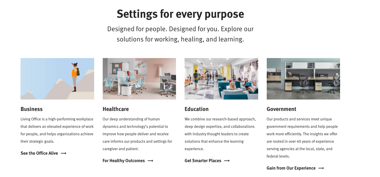
Here’s a great example of multiple CTA buttons used by Herman Miller to classify their product segments.
Each CTA is personalized to the category and the copy embodies the products. It is minimal and yet evocative. There is a curiosity that is created within the customer to know more about them.
8. Outdated navigation
What an eCommerce home furnishing store designer often fails to recognize is that shopping is a visual experience.
Shopping search doesn’t work like usual online searches because the majority of the customers don’t know the exact keywords to the product they are looking for.
There is a term coined for the specific type of frustration that a customer feels when they’re unable to find the product they want online. It’s called “Shopstration.”
The answer to this is visual search navigation (VSN). It has been redefining the online shopping search experience by changing the way stores catalog their inventory online. It imitates the way customers think about shopping in physical spaces and returns fewer irrelevant results.
VSN allows customers to search by specific attributes and narrows down products displayed in real-time. Example: If a customer is looking for a wooden table, it begins to narrow down results depending on the kind of wood, the design, the setting, functionality, etc. It mimics the choice-by-elimination process customers usually use in physical stores.
VSN also helps eliminate complex menus and options by creating an intuitive and decluttered shopping experience. It uses deep tagging, enables on-the-fly filtering, and uses AI to connect customers to the product they’re looking for.
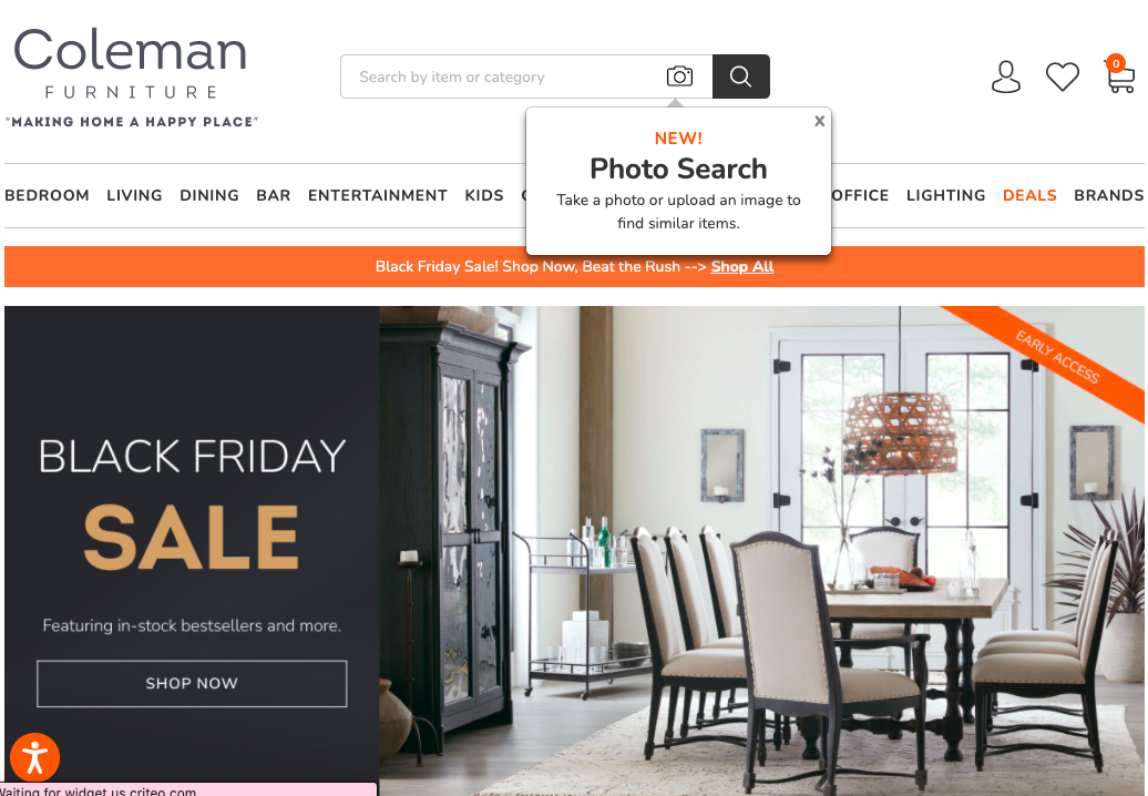
Coleman lets customers choose their purchase journey. Goal-oriented customers can use smart text and even photo search options, while inspiration-seeking customers can shop using collections and photo recommendations.
In addition to this, they combine real-time customer behavior to recommend the most relevant products for each customer.
Today, customers have a host of options to compare the prices of homogeneous products before purchase. They have sites devoted to price comparisons, reviews, and expert opinions before making a purchase. All of this has led to an increased customer resistance towards high prices.
A buyer demands to know why the cost is high and is also able to verify whether it is justifiably so. They can check reviews of product quality, raw material prices, and even compare shipping costs.
It is therefore imperative for online furniture store owners & online furniture retailers to maintain complete cost transparency. A failure to do so and customers will migrate to competition.
It is mandatory now to present shipping costs upfront. That is why most companies use a shipping cost calculator to present actual costs depending on locations. Brands also need to maintain a complete breakdown of costs should the customer desire to view it.
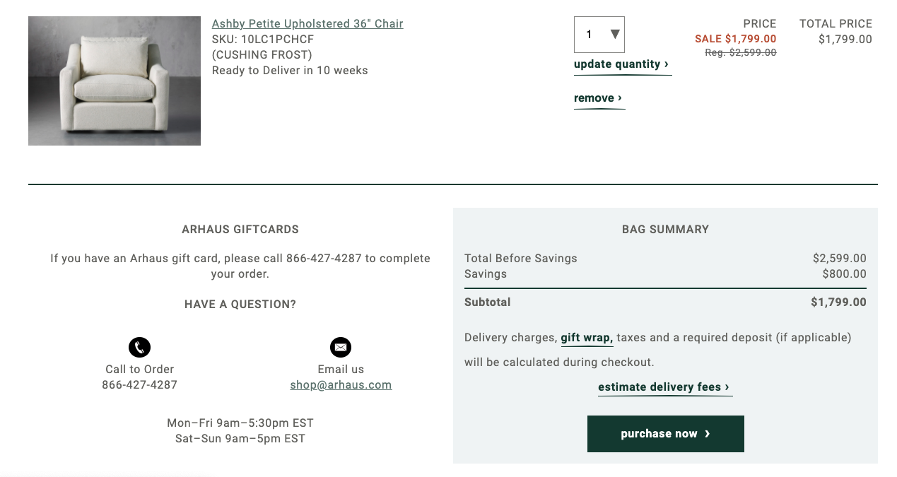
A good example here is the premium furniture portal Arhaus.
Observe how they have a shipping cost estimator. They show you product price, discount, and deposit altogether before the checkout page. They also have a dedicated helpline number for customers to call to complete their orders.
10. Low customer trust
When it comes to shopping online, trust is a major factor in the decision process. Research has shown that several factors contribute to creating trust amongst online shoppers.
As an online furnishing store or home décor store here’s what you need to keep in mind:
The most important trust-building factor is creating easy modes of contact between store employees and online visitors. More than 50% of online shoppers said that online stores that make it easy for customers to contact people are more trustworthy.
The second most important factor is being open and honest about negative events and news. Customers feel that stores that own up to their mistakes and fix them are far more trustworthy than the rest. As a furnishing store business, it's important to respond to negative reviews and feedback instead of simply burying or ignoring it.
Other trust-building factors include letting customers control how their data is used and educating them about the products offered. These two are relatively easier to implement and control.
Apart from these, it is of paramount importance for the store to maintain and ensure maximum product quality and accurate representations of product information. Having a flexible and easy returns policy also helps build trust and customer loyalty.
Here’s a great example of how to inspire customer trust by Interior Define. They clearly mention their returns policy upfront and also highlight the product dimensions.
But most importantly for customers who are still indecisive, they offer free swatches. This allows customers to test the fabric and color before making a purchase.
11. No live chat support
Customers are always looking to reach out to stores. They want to discuss return policies, shipping times, and product details.
Sometimes customers want to call just to be reassured. They need to know that if something goes wrong there is someone they can reach out to.
It is essential for online furniture retailers and furniture store brands to maintain open and clear lines of communication for customers at all times. When it comes to responding to customers, time is of the essence. It’s crucial that queries are responded to as quickly as possible. Delays in responding lead to lower trust perceptions.
Integrating live chat/ live messenger into the store website is a great way to respond instantly to customers. It allows for quick query solving and helps improve purchase rates.
It is also a great tool to build customer relations, loyalty, and can be used to upsell or cross-sell products.
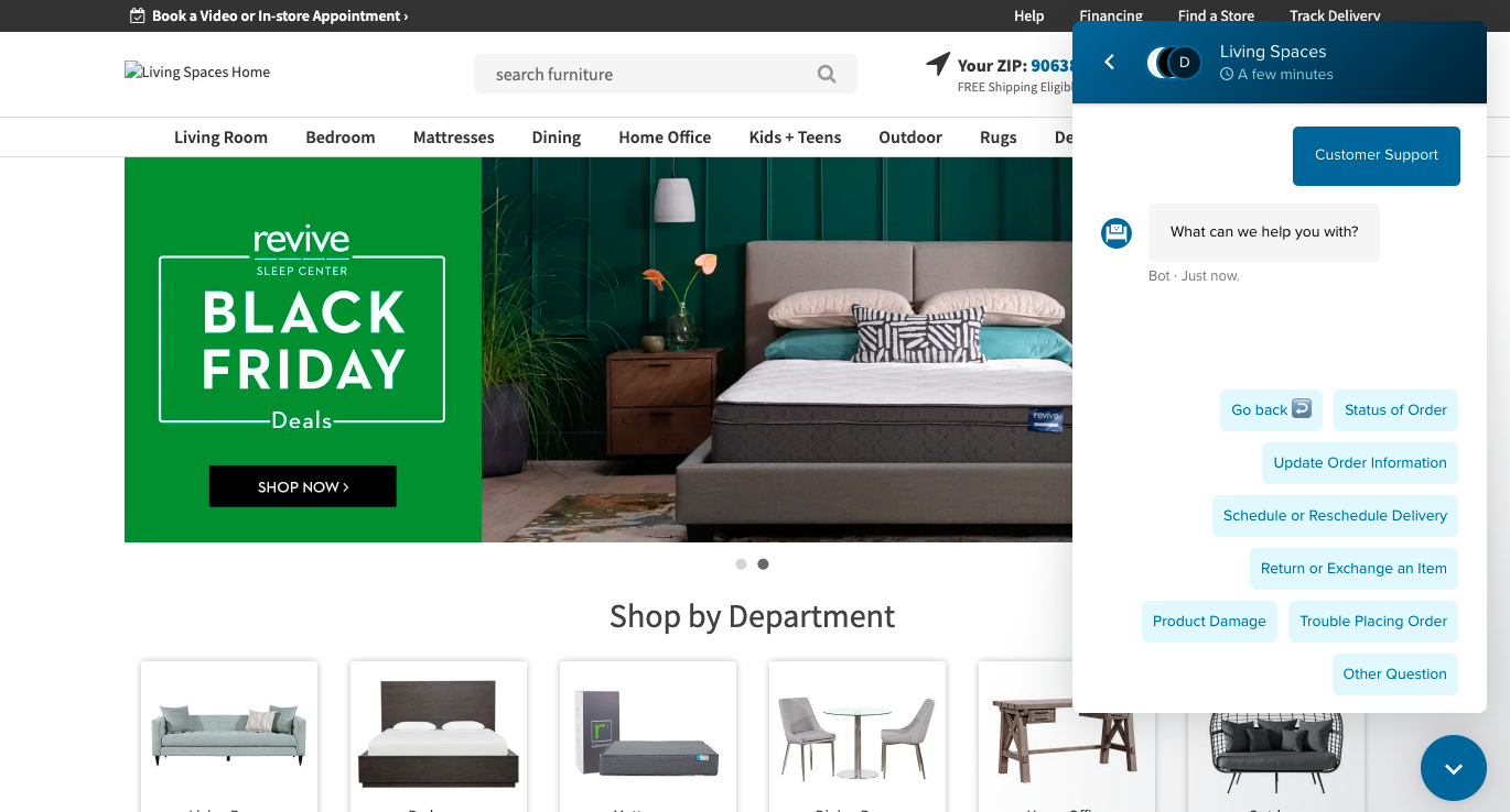
Here’s a great example of live chat from the home furnishing store Living Spaces. They have a chat option on the home page itself with pre-set options that the customer can easily choose from. They also provide video appointments and consultations.
12. Absence of social proof
When it comes to creating credibility online, nothing matters as much as reviews and ratings. They are key influencers of major purchase decisions.
Cylindo's report finds out that 42% of US internet users see reviews from other customers as the most important feature that increases the likelihood of purchase. Similarly, 95% of shoppers read online reviews before making a purchase.
When it comes to big-ticket purchase destinations like a furnishing store, or an online home décor store, product reviews become even more important. For high-value items, online ratings and reviews are the most common sources potential customers check.
A brand’s social proof i.e. product reviews, ratings, and customer testimonials are akin to traditional word-of-mouth. They need to be given a prominent place on the store’s website.
Customers should also be able to sort reviews based on topics, including quality, dimensions, color, etc. so that they can get all the information they need.
Online furniture store brands should also incentivize their current customers to write reviews. Post-purchase surveys are a great tool to generate new reviews and thus additional sales.
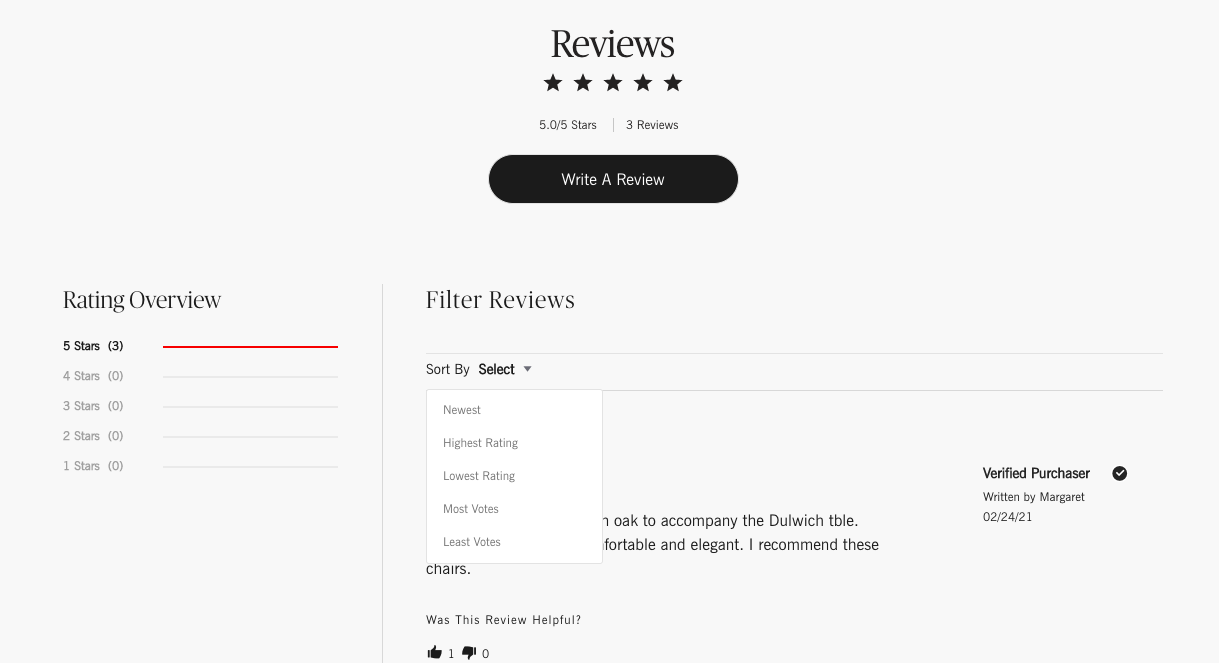
Design Within Reach has a comprehensive ratings and reviews system. They feature a ratings summary right at the top.
They allow customers to sort reviews by: newest, highest rating, lowest rating, most votes, and least votes.
They also allow potential visitors to rate reviews themselves based on how helpful they were. For further transparency, they also mention that the review is by a verified purchaser.
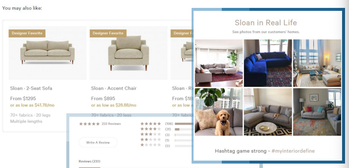
13. In-context imagery missing
Shopping for home décor or furnishings is a highly visual activity. More often than not customers have difficulty articulating what they want or need unless they see it in the right setting.
They might not know the difference between a divan or a settee but when they see them they know immediately which one they want.
eCommerce furniture store and furnishing store owners need to create a shopping experience that feels intuitive and inspires homeowners through images.
These products require context. In-context imagery helps define how a product would look in a home. This helps the customer visualize how it would look in their home.
Rather than create studio locations that look artificial, stores can use photos taken by existing customers of their products and use that to guide new customers. This is a great way of showcasing previous purchases and also doubles up as social proof.
Interior Define does a great job of implementing this strategy. They encourage customers to post images of their purchases on social media using a pre-defined hashtag. They then feature those photos as user-generated content on their product pages.
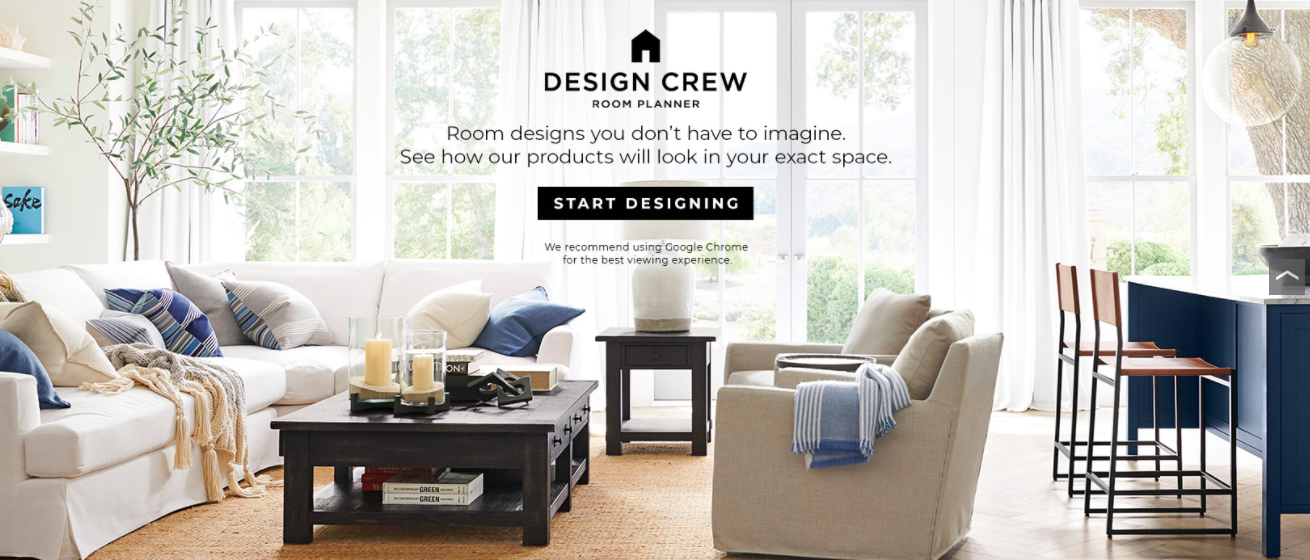
Over time technology has revolutionized the online shopping experience. Stores can no longer stand out based on 360° views and HD Zoom. These are now standard features.
To keep the shoppers engaged, home furnishing store brands and eCommerce furniture retailers need to invest in Augmented Reality (AR) and Virtual Reality (VR). This allows customers to virtually try out the furniture before purchase.
Since most of the shopping is done through smartphones, AR allows shoppers to insert and integrate products into their homes and immediately see how the furniture would look.
Research has shown that customers that engage with AR are 8 times more likely to convert than others. AR and VR are slowly becoming an inevitable part of the online shopping experience.
Pottery Barn 3D Room View uses AR to allow customers to virtually visualize spaces both empty and currently furnished stocked with their products. It allows users to virtually add, remove, move items around the room, and change details.
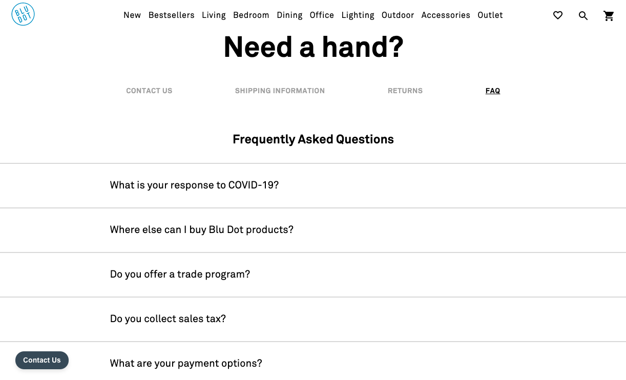
15. Hidden FAQs
A strong and comprehensive FAQ page accomplishes a lot when it comes to building customer trust. It helps a home furnishing store and online furniture retailers demonstrate their expertise, experience, and shows customers how the business is run.
FAQ sections can help potential users become more familiar with the brand thereby making them more comfortable with purchasing from the store.
They can help overcome purchase objections, provide room to elaborate on the company’s journey, and showcase what makes their products stand apart from the rest.
It is also a great place to put in information that doesn’t fit in the ‘About Us’ or the homepage sections. Store owners can also display their certifications and product quality highlights here.
Here’s a great example of a comprehensive FAQs page from Blu Dot. They have the Contact Us, Shipping and Returns sections, right next to the FAQs. This classifies the information and makes it easier for customers to refer directly to the section they need.
They also have a separate section for COVID-19 response as customers would want to know the measures being taken.
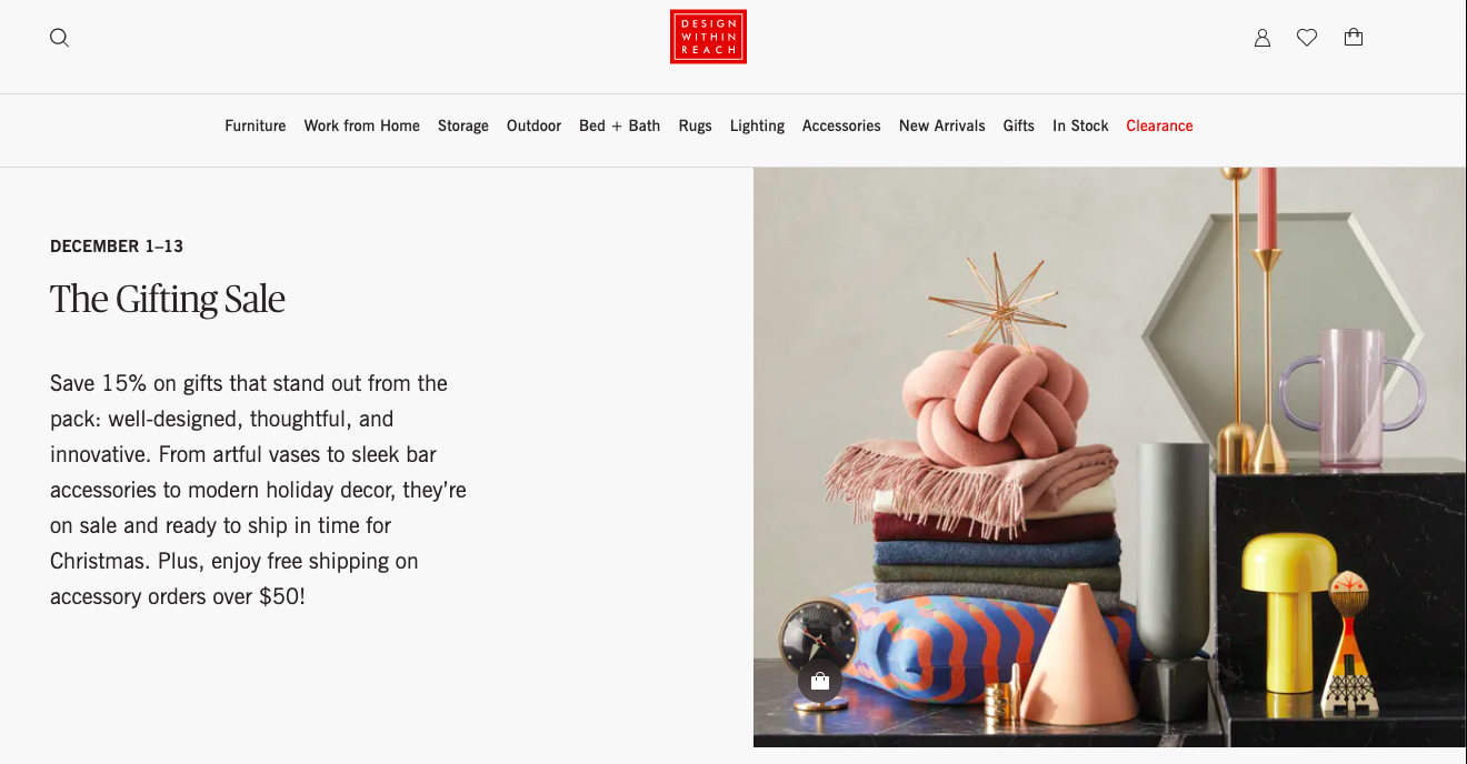
16. Insufficient motivation
Purchase incentives have become a perpetual feature of eCommerce. Due to the heavy competition online, stores are continuously running deals and/or discounts throughout the year.
For home furnishing store and furniture store portals, it is now imperative to at least match competition when it comes to incentivizing purchases. Apart from the traditional discounts and offers routes, brands can also incentivize purchase using scarcity and urgency triggers.
Both of these leverage the fear of missing out (FOMO) to break down customer procrastination and push purchases. Research has shown that product pages with a countdown timer perform 9% better than those without.
There are several ways in which these incentives can be combined including flash sales, limited-time free shipping, page countdown timers, and limited stock.
Urgency and scarcity can also be enhanced through website copy and design. Using colors like red conveys a sense of emergency and trigger action.
Here’s an example of the holiday sale from Design Within Reach. It is a limited period sale on specific items that are in demand during the gifting season. It offers a fixed discount on price and an additional incentive of free shipping above $50.
17. Ignoring cart abandonment
Most seasoned eCommerce marketers know that cart abandonment is a huge problem. There is a major gap between getting the customer to the checkout page and getting them to hit purchase.
For online furniture retailers and home décor store websites, it is extremely important to keep experimenting and optimizing the checkout phase.
While it is important to gather customer information, forcing them to open an account for purchase is the wrong way to do it. It is much better to have a guest checkout option and incentivize customers to provide their data earlier on.
According to data, checkout design improvements alone can lead to a 35.26% increase in conversion rates. These are usually related to page layout, simplification of forms, improving micro-copy, and using default values.
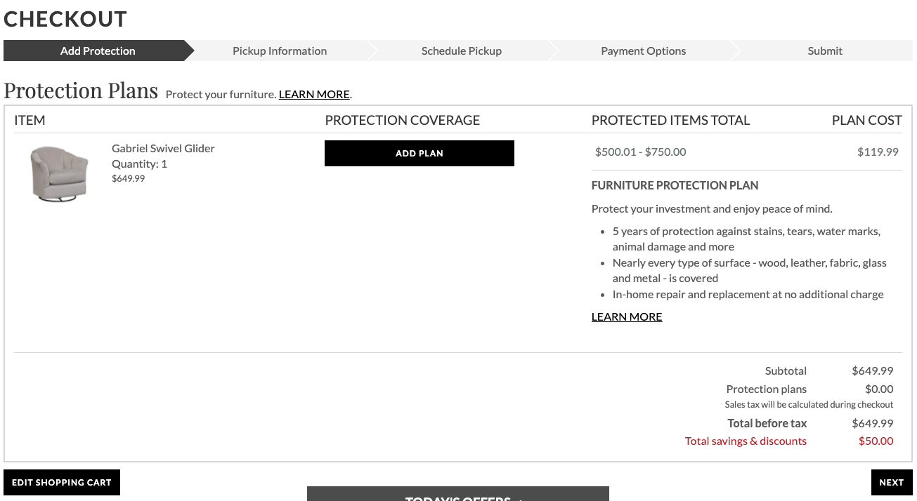
Haverty’s has a great multi-step checkout process with an intuitive and easy-to-grasp UX/ UI.
They have an optional protection plan and separate sections for pick-up locations and payment. They also include an edit shopping cart button at the bottom and a photo of the product.
18. Too many form fields
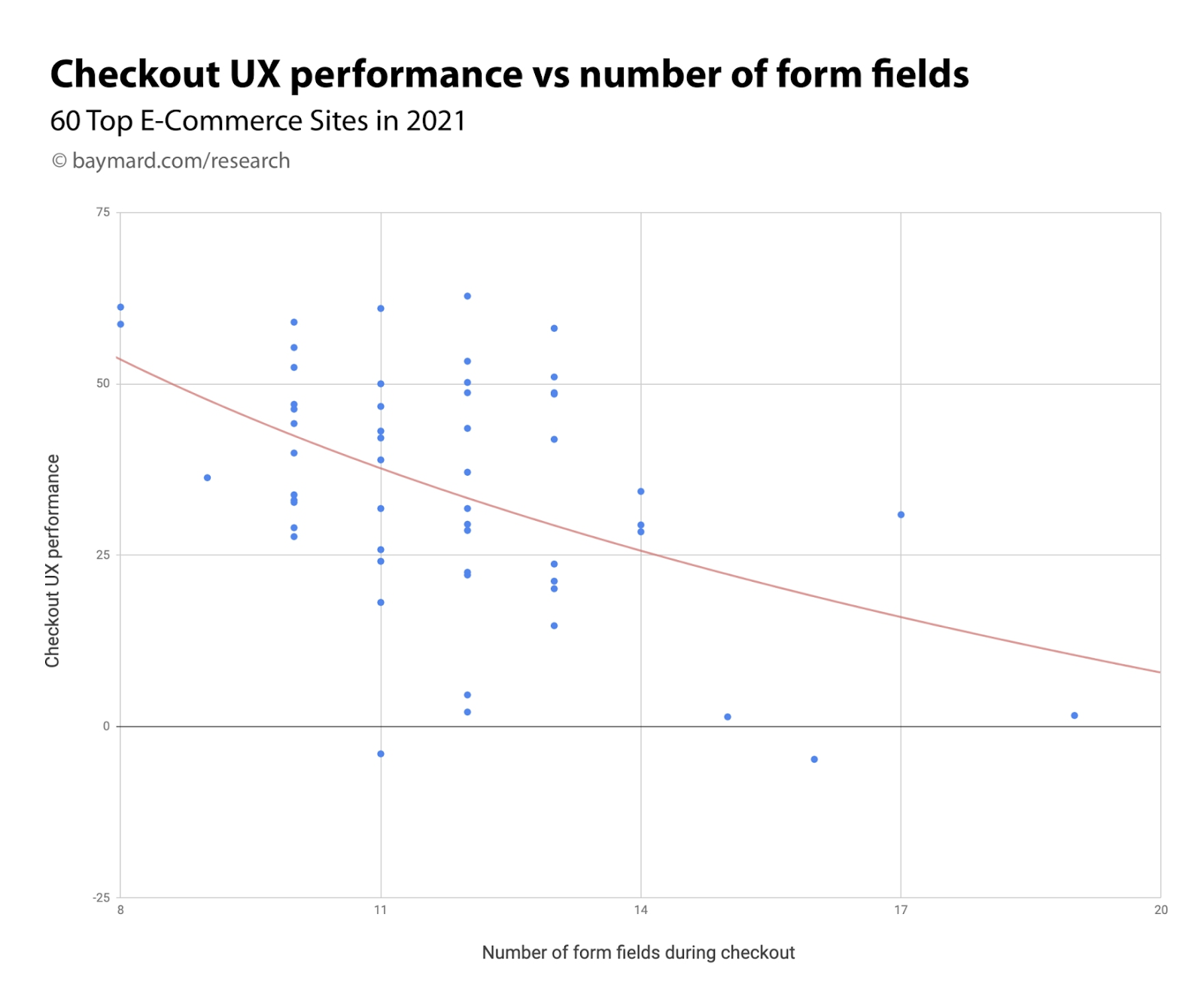
One of the primary reasons why checkout processes are long is due to lengthy forms. On average a checkout process has 11.8 form fields but this can be reduced to 8 form fields in total.
Here’s a graph that shows the inverse correlation between the number of form fields and the checkout UX performance.
There are several hacks furnishing store owners and furniture retailers can use to reduce form fields:
Use a single name field instead of two.
Secondary address line, company, and coupon code fields can be removed.
Having a coupon code field forces customers to pause and instead search for a coupon code. It actually derails the purchase process.
Using Zip/ Postal code auto detection instead of manual input.
Setting billing address = shipping address to default instead of displaying two separate form fields.
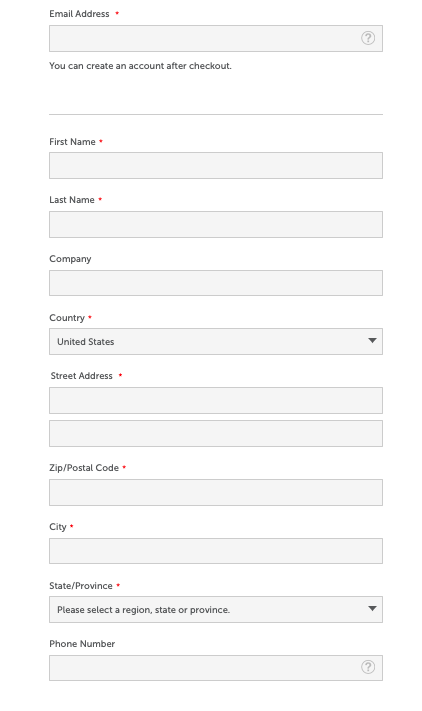
Here are the checkout form fields at LoveSac. Notice how they offer an option to create an account after checkout. They use dropdown menus for country and state making it easier and time-efficient for customers.
19. Inadequate personalization
Customers respond positively to brands and products that cater to their personalities. For home furnishing store sites and home décor sites, financial success relies heavily on identifying the customer’s personal taste and using it to engage with them.
As per Deloitte's research, customers love personalization and are ready to pay a premium for it. Survey data shows that 48% of customers were willing to wait longer for a personalized product.
Online eCommerce has witnessed a huge shift from mass production to mass personalization. Those businesses that haven’t made this shift risk losing customer loyalty to competition.
Introducing elements of co-creation with customers gives them convenience and control over the final product. It co-opts the entire process of purchase leading to massive improvements in traffic and conversion rates.
There are several levels at which a brand can personalize the browsing and purchase experience:
Geographical personalization: This customizes website content based on the consumer’s geographical location. Users from specific countries are directed to the store sites of those countries. Businesses can also use geolocation to map consumer movements. This data can be used to push location-specific messages and offers.
Account customization:One of the most common forms of personalization is when customers personalize content by registering an account. Whenever they sign in, the store chooses to add or subtract sections based on a particular customer’s needs. Customization can also be in the form of rearrangement of content including quick links to what they regularly access.
Deloitte's research further shows that 1 in every 5 customers do not mind sharing personal data with businesses if that data is used to offer them personalized products or services. This makes personalization the ideal leverage point for requesting customers to part with personal data.
Here’s a great example of personalization by Room and Board. They offer free virtual design services by design experts that help you shop for your spaces.
This includes guided shopping, color and material options, home décor ideas, furniture pieces, and floor planning. It’s a one-stop complete customization solution.
20. Limited payment options
Today online shopping is majorly affected by the huge network of rewards or rewards points. Customers have specific cards for specific products or industries that help them earn cashbacks or rewards points in bulk.
Add to this the wallet ecosystem and it becomes evident why customers today are spoilt for choice when it comes to making payments.
As a furniture store or home décor store owner, it is crucial to have as much variety as possible when it comes to offering payment methods and brands.
When a store offers multiple payment methods it establishes credibility and portrays itself as a progressive brand to the customer.
Apart from multiple payment methods, it is also important to offer financing options. Most online retailers offer EMI-based payments at little or no interest rates.
For online furniture retailers, most of the purchases are high ticket items. Offering easy financing can help sweeten the deal for customers.
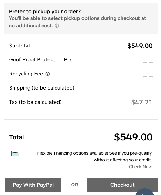
Here’s a great example of payment options and financing from Bob’s Discount Furniture. They upfront classify PayPal and other payment options. Below that they mention the flexible financing options the customer can opt for by sharing their credit scores.
Post implementing these conversion hacks, furnishing store owners and online furniture retailers should:
Take a good look at their store’s desktop and mobile site versions. They should go through the entire user journey from browsing, to selection, and checkout.
Identify and fix any small errors whether they might be in copy or design.
Ensure there are no broken links, and that all the photos and graphics look professional and load quickly.
These might seem like small issues but they can hurt a brand’s credibility and customer trust quotient.
To sum up, here’s a brief recap of what we covered. Home furnishing store owners and furniture retailers need to:
a) Reduce the problem of choice
Offer smart, customized product recommendations and cut down on inventory variants.
Offer free design services and expert guidance for custom shopping.
Implement a smart classification system that enables customers to filter and sort through products.
b) Invest in creating an engaging browsing experience
Create personalized shopping experiences and product customizations options for customers.
Display information in consistent structures to enable easy comparisons.
Shopping is a visual experience, navigation is key. Implement visual search navigation and allow customers to choose from goal-oriented or inspiration-based purchase journeys.
Experiment with copy and CTAs to find what works best for your customers and then implement accordingly.
Use in-context imagery, VR, and AR to help potential customers visualize products in their living spaces.
c) Optimize the checkout process
Reduce form fields and use auto-suggestions for text.
Enable guest checkout options and incentivize customers to share details instead of demanding them.
Actively identify and work on reasons for cart abandonment including simplifying page layout and removing unnecessary steps.
Include multiple payment mediums and easy finance options for customers.
Use urgency and scarcity marketing tactics including countdown timers and limited period incentives to help avoid purchase procrastination.
d) Adopt a mobile-first attitude
Smartphone optimization for site design and layout.
Introduce smartphone features including voice search, video chat, and AR.
e) Double down on trust-building mechanisms
Provide complete information regarding products and policies.
Include live chat support, honest reviews, and ratings.
Integrate social media testimonials and customer photos to show social proof.
Be transparent and upfront about pricing and other associated costs.
Have a comprehensive FAQs section that helps overcome purchase objections and clears customer doubts.
High-value eCommerce segments including furniture store and home décor websites work primarily on convenience, brand perception, and trust as drivers of conversion. These are the pillars of sustainable business growth and must be strengthened from time to time.
The conversion hacks we’ve covered here will help make your brand’s customers feel more valued and protected thereby ensuring repeat sales.
Subscribe for more articles like this!
Thank you - we'll see you in your inbox soon!
Oops! Something went wrong while submitting the form.
Read by 5000+ ecommerce store owners
Subscribe for more articles like this!
Thank you - we'll see you in your inbox soon!
Oops! Something went wrong while submitting the form.


.svg)

.svg)

.svg)
.svg)
