When someone lands on a home decor store, they’re not just shopping. They’re picturing that armchair by the window and wondering if the rug works with the existing floor. And then, more often than not, they leave without buying anything.
In our decade of auditing home decor stores, we have found that this hesitation almost always comes from one of three places: practical doubts around price, delivery, and returns; functional doubts about fit, materials, and comparisons; and aesthetic doubts.
The stores that convert well answer all three.
Find Why Shoppers Are Dropping Off Your Home Decor Store
Across hundreds of store audits, we have found that every friction point killing your conversion rate maps to one of three layers of shopper concern. Address all three, and you give shoppers nowhere left to hesitate.
Layer
What shoppers are asking
Where you lose them
Practical
Can I afford this?
Will it arrive on time?
What if I need to return it?
Surprise shipping costs at checkout, unclear return policies, no flexible payment options.
Functional
Will it fit my space?
What are the real dimensions?
Is the material durable?
Vague product descriptions, no size guides, no sample ordering.
Aesthetic
Will it look right in my home?
Does it match what I already have?
Flat product photography, no lifestyle context, no AR or room planning tools.
Most stores over-invest in fixing the practical layer because those problems are easy to see and easy to fix. The aesthetic layer is where the real conversion opportunity lives in home decor, and it is the one most stores underinvest in. Knowing which layer your store is leaking from the most is the fastest way to know where to begin.
Where to Start: Diagnosing Your Home Decor Store's Conversion Rate
Thirty-four strategies are a lot to absorb, so before diving in, it helps to know which layer your store is leaking from the most. Here is a quick diagnostic based on what we see most often in our audits.
If your add-to-cart rate is low (below 8%), your Aesthetic Layer needs work. Shoppers are not finding enough confidence in the product to move forward. Start with strategies 1–5 and 12–15.
If your cart abandonment rate is very high (above 85%), your Practical Layer is creating friction. Unexpected shipping costs and limited payment options are the most common culprits. Start with strategies 25–29.
If your return rate is high (above 6%): Your Functional Layer is underperforming. People are buying things that do not match their expectations. Start with strategies 6, 10, and 11.
If your traffic is good but conversion is consistently below 1.5%: Both your Aesthetic and Practical layers likely need attention. Shoppers are either not finding what they want or not trusting your store enough to commit. Work through all three layers systematically.
Now that you have an idea of where you need to start, let’s dive into the strategies.
Aesthetic Layer: Help Shoppers Imagine the Life
Ideally, your shoppers need to feel the product in their space before they will commit to buying it. Every strategy in this layer closes the gap between what someone sees on a screen and what they can picture on their wall, floor, or shelf.
1. Let Shoppers Search With a Photo, Not Just Words
Shoppers looking for a specific item they saw on Pinterest or in a friend's home often cannot describe it precisely in words. They know the vibe. They know the colour palette and the rough style. They just cannot translate any of that into a search query that returns what they are actually after.
Visual search solves this by letting people upload an image and find similar products automatically.
The technology analyses colour, style, pattern, and material. Even if there is no exact match in your catalogue, it surfaces the closest alternatives and related items that share the same aesthetic. Here is how to make visual search work for your store:
Let shoppers search by photo: Add an image upload option to your search bar. This is especially valuable for mobile users, who can photograph something they see in real life and search directly from the image.
Use AI to match style, not just product: The goal is not to find an identical lamp, it is to find a lamp that fits the same visual world. Configure your search to match on aesthetic properties like warmth, minimalism, or texture, not just product attributes.
Drop visual search results into styled rooms: When someone searches with an image of a Japandi living room, show them a curated room that matches that style rather than a flat grid of individual products. Lead with the mood, then surface the items.
Add "Shop the Look" to every result: Each styled room or lifestyle scene should have clickable tags on every visible product so shoppers can move directly from discovery to purchase.
2. Give Them A Search Bar They Understand
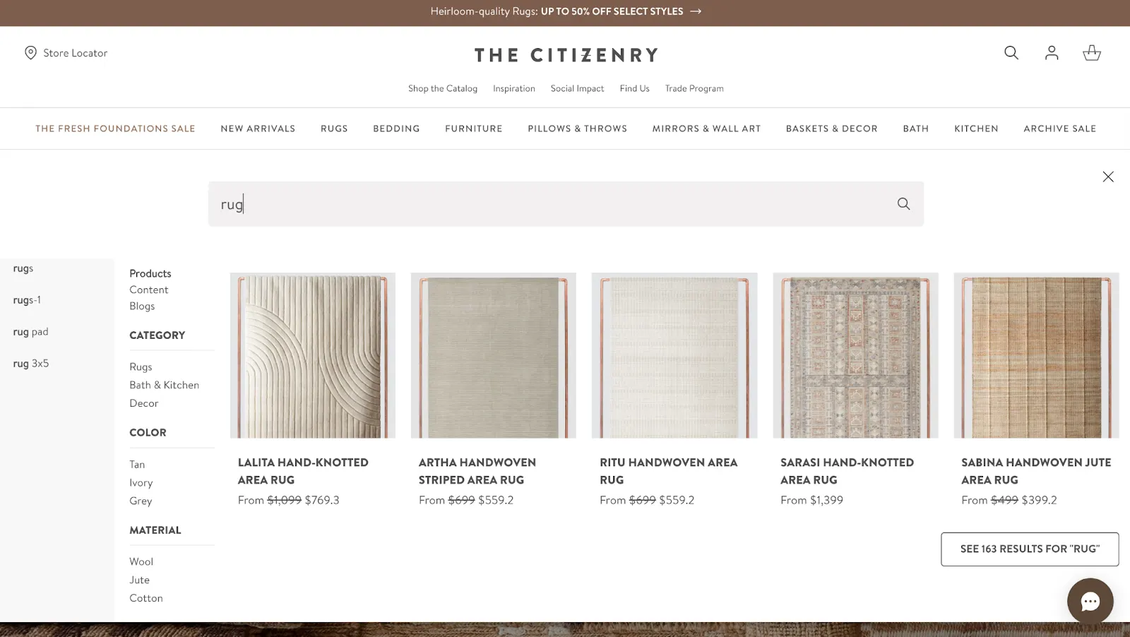
A bad search experience sends people away faster than almost any other friction point. Someone types "sofe" instead of "sofa" and gets zero results. Someone searches "neutral living room rug" and gets a random selection of rugs with no styling context.
Someone searches for a discontinued item and hits a dead end. Smart search means anticipating these situations and building your way out of them.
Add typo tolerance and context awareness: Your search should understand that "sofe" means sofa, that "minimlist" means minimalist, and that "grey" and "grey" are the same colour. These are small fixes with significant impact.
Surface styles and categories, not just products: As people type, show real-time suggestions that include style categories ("Boho Living Room", "Coastal Bedroom") alongside individual products. This helps shoppers who are still defining what they want.
Prioritise in-stock, highly-rated items: People should never fall in love with a search result only to discover it is sold out. Filter sold-out items out of top positions or clearly flag their availability.
Build a useful zero-results page: The dreaded "0 results found" message is a conversion killer. Replace it with smart alternatives: similar styles, trending items, or an invitation to take a style quiz (more on that in Section 4).
Include image previews in search dropdowns: Visual information processes faster than text. Showing a small product image alongside each search suggestion helps shoppers confirm they are on the right track before they even click.
3. Stop Organising by Product Type. Start Organising by Room and Style
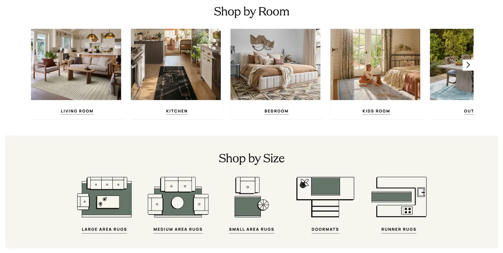
Most home decor stores organise products the way warehouses think: by product type. Rugs in one place, cushions in another, lamps somewhere else. But shoppers think about their homes by room, and they think about aesthetics by style. Your navigation should reflect that.
Organise by room first: Living room, bedroom, kitchen, dining room, entryway, home office — these are the categories that match how people approach decorating. They are not buying a rug in the abstract; they are buying a rug for their bedroom.
Add style categories alongside room categories: Boho, minimalist, modern farmhouse, Japandi, coastal, and industrial, let people shop by aesthetic. This is particularly valuable for new visitors who are still developing their sense of what they want.
Add preview images to every category: Even experienced shoppers may not know what "Japandi" means. Small lifestyle photographs next to each style name let people navigate by feeling rather than vocabulary.
Add bonus filters that solve real problems: "Ships in 2 days", "Best for small spaces, "Pet-friendly", and "In-stock only" are filters that answer the practical questions your shoppers are quietly asking. Make them prominent, and let people apply multiple filters at once.
⚠️
Why isn’t your home decor store converting better?
Product discovery – barriers that prevent shoppers from finding items
Category/collection pages – improvements that drive deeper product exploration
Product page – what to optimize to convert 2–3x more buyers
Cart – ways to ease hesitation and speed up purchase decisions
“The report was deep and super insightful. Can’t believe it’s free.”
Logan Christopher CEO, Empire Herbs
4. Make Your Product Filters Intuitive
When someone arrives on a category page with 400 rugs and no way to narrow things down, they leave. Filters are the mechanism that keeps high-intent shoppers engaged long enough to find something they love.
Put filters where people look for them: A sidebar on desktop or a top filter bar on mobile. Position them where shoppers can see them without scrolling.
Surface your most-used filters prominently: If your analytics show that "pet-friendly" and "in-stock" are the filters people use most, move them to the top. Do not bury the most relevant options at the bottom of a long list.
Allow multiple filters simultaneously: Someone looking for a "modern, neutral, small-space-friendly" sofa should be able to apply all three filters at once. Forcing them to choose between "modern" and "neutral" is a false constraint that loses sales.
5. Show the Life, Not Just the Product
A product photograph on a white background answers one question: what does this item look like? A lifestyle photograph answers the question that actually drives purchase decisions: What will this look like in my home? The research on this is consistent.
People respond to context. Show them an armchair in a room with warm lighting, a throw blanket, a small side table, a bookshelf in the background, and they do not just see the armchair. They see a life. That emotional connection is what converts browsers into buyers.
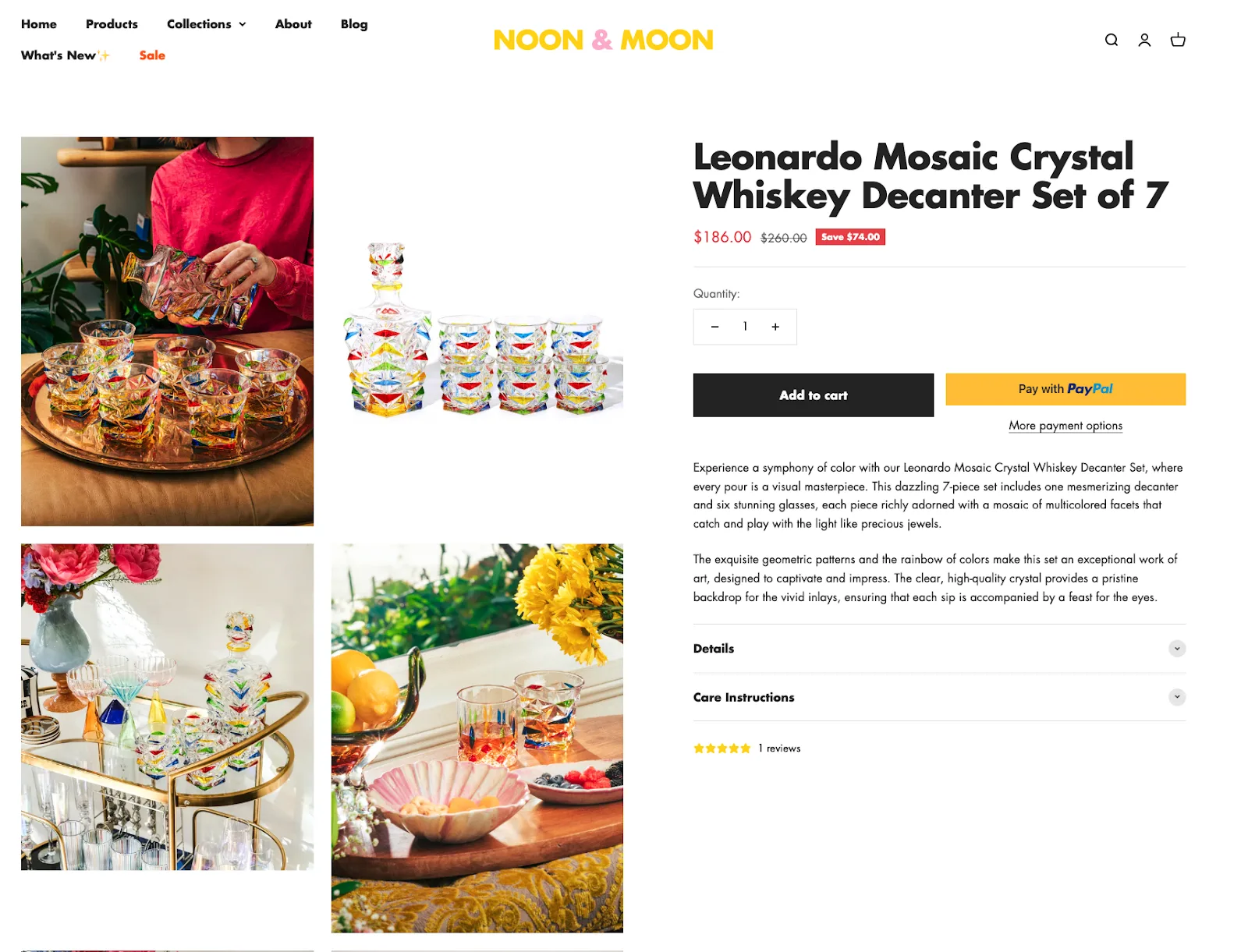
Replace some white-background shots with styled lifestyle images: You do not need to eliminate product shots entirely. The goal is to give people both, so they can toggle between the precise product view and the contextual lifestyle view.
Show the same product in multiple aesthetics: If your armchair works in a minimalist space and also in a maximalist boho room, show both. This expands the shopper's sense of possibility and increases the range of people who see themselves owning it.
Use seasonal and occasion-based setups: A dining table photographed for a cosy winter gathering lands differently than the same table photographed for a summer garden party. Rotate your lifestyle imagery with the seasons, and you give returning visitors a reason to reconsider products they have seen before.
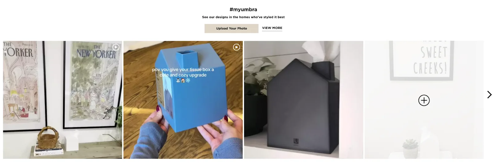
Feature real customer spaces: Customer photos from Instagram or dedicated UGC campaigns sit alongside your professional photography and do something the professional shots cannot: they prove that real people in real homes with real furniture actually made it work.
Invest in texture close-ups: Add high-resolution zoom and close-up shots showing the weave of a fabric, the grain of wood, the nap of velvet. These tactile details reduce the uncertainty that prevents people from committing to a purchase. No one wants to guess what "soft cotton blend" actually feels like.
Functional Layer: Answer Every Practical Question
Once a shopper finds something they like the look of, a different set of questions takes over. Will it fit? What is it actually made of? How does it compare to the similar option? These are the questions that product pages either answer or fail to answer, and failure here sends people to a competitor to find out.
6. Write Product Descriptions Knowing That Shoppers Cannot Touch the Product
The goal of a product description is not to tell people how elegant your armchair is. They can see that in the photographs. The goal is to answer every practical question standing between them and the purchase.
Get specific about sizing: "This rug works well in rooms of 12 by 12 feet or larger" is useful. "Large" is not. Include dimensions for every item and, where relevant, add recommendations about what sizes of rooms the product suits.
Add compatibility guidance: "Pairs well with walnut wood tones", "Works best in low-traffic areas", "Suitable for outdoor use". These small, practical notes prevent the returns that happen when something does not work as expected.
Use scannable icons for practical properties: Machine washable. Pet-friendly. Scratch-resistant finish. Assembly required (fifteen minutes, no tools). Outdoor safe. These details matter enormously to certain shoppers and can sit neatly in a visual icon row rather than being buried in a paragraph.
Describe materials in plain, sensory language: "Soft, linen-like texture with a matte finish" is worth ten mentions of "polyester blend". Help people feel the product through your description.
Be upfront about drawbacks: If an item is heavy, mention it. If assembly is complex, say so. If the colour looks slightly different in person than on screen, acknowledge it. Transparency builds the kind of trust that reduces returns and increases repeat purchases.
7. Help Shoppers Build the Whole Room, Not Just Buy One Piece
People rarely furnish a room one piece at a time. They are building a world, and they want help doing it. This is an opportunity for you to make their job easier while increasing your average order value.
Create curated room bundles: "Modern Living Room", "Coastal Bedroom", "Japandi Home Office" — present collections of products that work together and let people buy the whole look in a few clicks.
Make bundles customisable: The person who loves your sofa but already has a coffee table should be able to swap that item out. Curated suggestions with flexible options feel helpful rather than prescriptive.
Offer a discount for buying together: Ten percent off when someone buys the sofa, rug, and coffee table as a set gives them a financial reason to buy more and a practical reason to feel good about it.
Trigger "Complete the Look" suggestions from the cart: When someone adds a chair, show them the rug that pairs with it. When they add a lamp, surface the side table that completes the scene. This suggestion feels like service rather than upselling when the pairing is genuinely good.
8. Use Videos to Let Your Shoppers Discover Every Angle of Your Product
A video answers questions that neither photographs nor descriptions can address. How does this drawer close? How does the light fall on this fabric in a real room? How does this sofa actually feel to sit on, based on how the people in the video are using it?
Add short lifestyle clips showing the product in use: Someone curling up on a sofa, someone setting a dining table for dinner, curtains catching a breeze. These thirty-second clips make people feel something. Static images make them think. Feeling and thinking together is what converts.
Use explainer clips for complex products: Showing how quickly a bookshelf assembles, or demonstrating that a velvet chair does not visibly mark when you run your hand across it, removes specific anxieties that text cannot address.
Place videos near the "Add to Cart" button: Put them in the image carousel or directly below the product information. The video should be available at the moment someone is making their decision, not buried at the bottom of the page.
9. Sell the Story Behind the Product, Not Just the Product Itself
Home decor is not just about aesthetics. It is about provenance. People want to know who made their handwoven throw, where the reclaimed wood came from, and why that ceramic lamp has the particular finish it does. Answering these questions makes people feel like they are buying something meaningful rather than something generic.
Feature rotating spotlights on collections: "The Coastal Wood Collection, designed in Goa, inspired by the Konkan coast." Include sketches, material sourcing notes, and quotes from the designers. People who buy this feel like they are buying a story as much as a product.
Add artisan bio cards to relevant product pages: "Handmade by Priya, Jaipur block printing technique passed down through four generations." A photograph and a one-liner turn a product into a person, and that shift changes how people feel about owning it.
Use social media for unscripted moments: Unloading a new shipment of tiles, a table getting its final polish, a craftsperson inspecting a new rattan design. These unpolished, real-time glimpses are highly shareable and build a depth of brand trust that no amount of polished advertising achieves.
10. Reduce The Risk Between Browsing and Buying With Samples
Home decor shoppers face a fundamental problem: they cannot touch anything. For products where texture, colour accuracy, and material quality are genuinely important, such as rugs, upholstery, curtains, wallpaper, and tiles, this uncertainty is a major barrier to purchase.Sample ordering removes that barrier almost entirely.
Offer fabric swatches, wallpaper cuttings, and tile samples: Let people hold the material, compare it against their existing furniture in their own lighting, and confirm the colour match before committing.
Keep sample ordering low-friction and affordable: A bundle of five swatches for a nominal fee, with free shipping, is low enough cost not to deter people but high enough to filter for genuine intent. Offer to credit the sample cost against the final purchase.
Add a clear sample CTA below "Add to Cart": Something like "Not completely sure? Order a fabric swatch first" tells shoppers there is a lower-stakes step available. This paradoxically increases full-purchase conversions because it reduces the sense of risk.
Follow up after samples arrive: A short email a few days after the samples ship, "How did the swatches look in your space? Here's how others styled this fabric," keeps the purchase journey warm and gives shoppers who liked the sample a gentle nudge to complete the purchase.
11. Side-by-Side Comparisons That End Decision Paralysis
When someone is deciding between two similar dining tables or three variations of the same sofa, the decision is easier if they can see both options side by side. A comparison table does not just save time; it actively reduces the anxiety of making the wrong choice.
Focus on the features that matter most for each product category: For sofas: dimensions, fabric type, number of seats, care instructions, and lead time. For rugs: dimensions, material, pile height, and suitable rooms. Do not overwhelm with irrelevant specifications.
Add star ratings and review snippets to each column: Seeing that the mid-range option has 4.8 stars while the premium option has 4.3 can be the deciding factor.
Let people customise what they compare: Drop-down selectors that let shoppers build their own comparison rather than showing a pre-set comparison give people a sense of agency that increases engagement.
12. Make Your Products Lifelike With 3D Product Viewers
A standard photograph shows one angle, one lighting condition, and one styling choice. A 3D product viewer lets shoppers rotate the item, zoom in on details, and explore it from every angle. This is particularly valuable for items where form matters, a chair whose silhouette you need to see from the side, a lamp whose base proportion matters, or a sofa whose arms you need to inspect.
Let people rotate and zoom freely: The more control shoppers have over how they view a product, the more confident they become in their understanding of it. Confidence converts.
Combine 3D viewers with lifestyle photography: The two serve different needs. Lifestyle photography answers "does this feel right?" and the 3D viewer answers "does this look exactly right?" Both questions need answering before someone buys.
Use 3D viewers particularly for products with customisation options: If someone is choosing between four fabric colours and three leg finishes for a sofa, being able to see their exact configuration in 3D before purchasing removes the single biggest source of hesitation.
13. Let Shoppers Place Your Products in Their Actual Space With Augmented Reality
Augmented reality lets shoppers place a virtual version of your product in their actual room, using their phone camera. They hold the phone up, point it at the corner where the bookshelf might go, and see the bookshelf sitting there in accurate proportion to the real space.
The impact on conversion rates is significant. IKEA reported a meaningful reduction in returns after deploying its AR tool, because people could confirm fit and scale before ordering. Several major US retailers have seen add-to-cart rates increase by double digits after implementing AR on product pages.
Deploy AR particularly for large items: Sofas, wardrobes, dining tables, rugs, and beds are the products where scale uncertainty is greatest. A rug that looks beautiful in a photograph might be completely wrong for a particular room. AR removes that uncertainty.
Place the AR button prominently on the product page: "See this in your room" needs to be as visible as "Add to Cart." If shoppers do not notice that the AR option exists, they will not use it.
Ensure the AR experience works on standard mobile browsers: WebAR has improved substantially. People should not need to download an app to access the visualisation tool.
14. Help Shoppers Design the Whole Room Before Buying Anything
For shoppers who are furnishing multiple pieces of a room at once, a 3D room planner offers something AR cannot: the ability to see how all the pieces work together. Users input their room dimensions, place furniture items, and see the full room take shape before committing to anything.
This tool is most valuable for furniture-heavy categories: Bedroom sets, home office setups, and living room arrangements. These are purchase decisions that involve multiple items and spatial planning that is genuinely complex.
Offer room planning as a free service: Brands that position their room planner as a complimentary design tool rather than a product feature see higher engagement and stronger loyalty.
Use the room planner as a lead capture mechanism: Someone who spends twenty minutes building a room in your planner is a highly qualified prospect. Offer to save their room design via email, and you have both a lead and a rich data set about their preferences.
15. Let Shoppers Build Their Exact Product Before They Buy It
Many home decor products are inherently customisable. Sofas come in different sizes, fabrics, and leg colours. Shelving units come in different widths and heights.
Bedframes come in different headboard styles. When a retailer sells these products with only photographs of a single configuration, they lose the customers who want a different one.
Build a product configurator for items with multiple options: Show the item updating in real-time as shoppers change colour, size, or material. Seeing the exact product they are about to buy removes the anxiety that comes from imagining it.
Keep configuration options clear and scannable: Colour swatches rather than colour names. Fabric samples rather than fabric descriptions. The more visual and tactile the configuration interface, the higher the completion rate.
Show real-time pricing as options change: If adding an arm extension to a modular sofa costs $200 more, show that update immediately. Surprises at checkout cause abandonment.
16. Replace the Generic Chatbot With a Virtual Interior Designer
A generic chatbot that answers questions about shipping and returns is useful. A design advisor who helps people choose what to buy is transformational. The difference is not just about the sophistication of the technology; it is about the mindset behind the feature.
Position chat as a style assistant, not a support tool: "Need help styling your space? Tell me about your room, and I'll suggest pieces that work together" is a different opening than "How can I help you today?"
Make the chat proactive: When someone spends several minutes on a furniture category page, surface a gentle prompt: "You've been looking at living room furniture, would you like some help putting a look together?" Not intrusive, just available.
Use AI to power real-time pairing suggestions: Someone asking about a sectional sofa should get suggestions for coffee tables, rugs, and lighting that work with it. The Design Advisor's value is in making the whole room work, not just selling a single item.
Keep the tone warm and non-robotic: The experience should feel like chatting with a design-savvy friend who happens to know your entire product catalogue. Stiff, formal language kills the effect.
17. Offer a Quiz to Personalize the Entire Shopping Journey
A style quiz does two things simultaneously. It helps shoppers clarify what they want, something many of them genuinely have not figured out yet, and it gives you data to personalise their entire shopping experience afterwards. The quiz should feel like a game, not a form. Short, visual, and fun.
Keep it to four to six questions: Ask about vibes ("Which of these rooms feels most like home to you?"), colour preferences, and functional priorities ("Which matters most: practicality, aesthetics, or both?"). Use images wherever possible.
Give shoppers a style identity at the end: "You're a Warm Minimalist" or "You're a Boho Maximalist" is satisfying in a way that a list of product recommendations is not. The identity primes people to see the subsequent recommendations as personally curated.
Make the quiz lead directly to a curated shop: "Shop Your Style" should take people to a filtered collection that matches their results. You have just saved them the entire navigation and filtering process.
Use quiz results in follow-up emails: "We found some new pieces for your Japandi collection" is an email that almost anyone opens. Generic promotional emails are not.
18. Offer a Seasonal Collection That Sells a Mood, Not Just a Discount
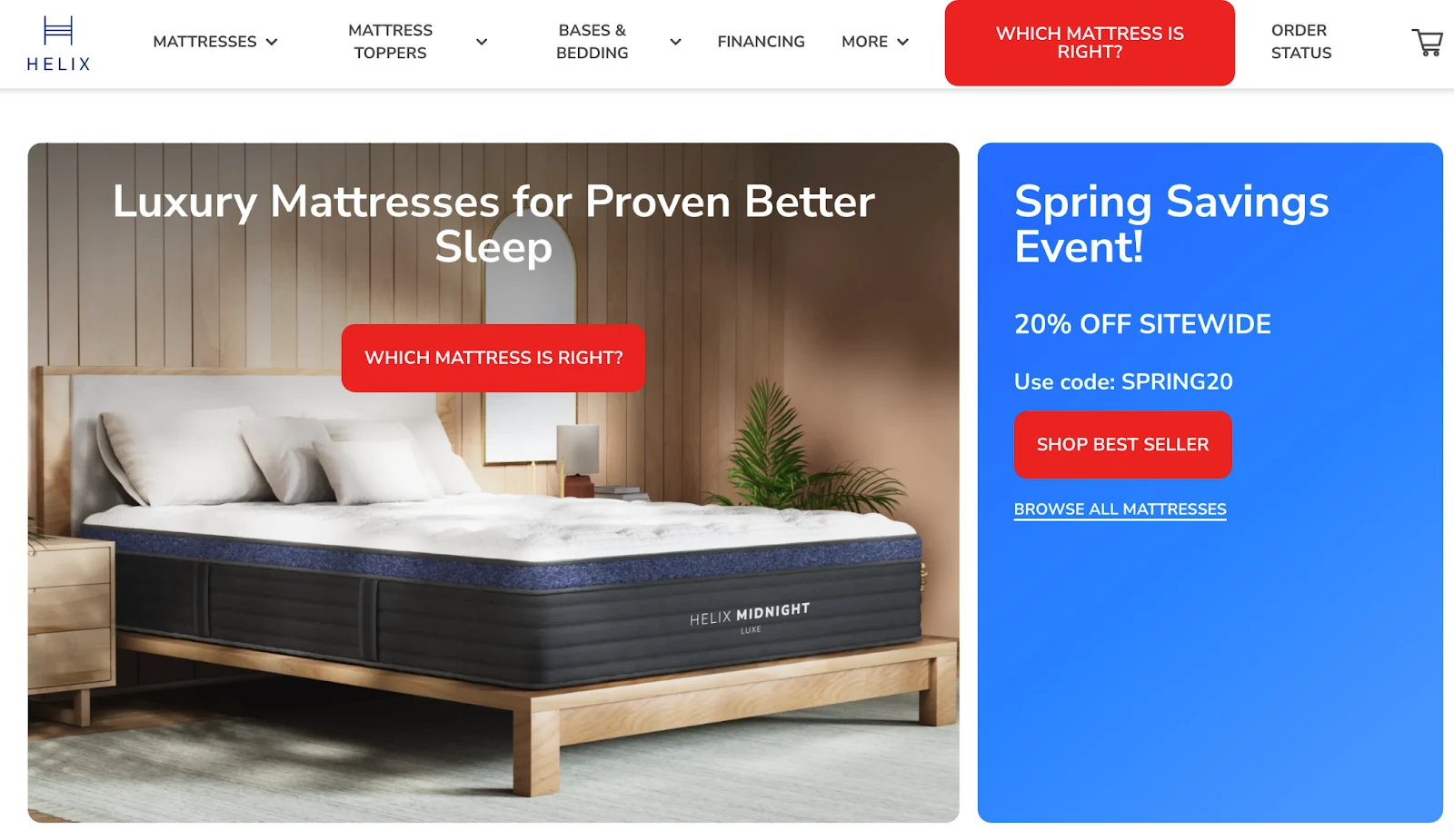
Seasonal campaigns work best when they go beyond slapping a snowflake on your homepage. The goal is to give shoppers a specific aesthetic destination, a particular kind of home they can imagine creating, and then make it easy to build it from your product range.
Name your seasonal collections evocatively: "Warm Minimalism" for winter, "Monsoon Refresh" for the Indian rainy season, "Fall Hygge" for October — these names do more work than "Winter Sale." They create a mood that makes people want to inhabit the space.
Bundle seasonal decor with everyday items: A "Fall Living Room Upgrade" kit combining a chunky throw, an amber-hued lamp, and a wooden tray sells the vision of autumn comfort rather than three separate products.
Use time limits genuinely and sparingly: "Shop the Holiday Warmth collection before December 25th to receive it in time" is useful information. Fake countdown timers on products that are always available undermine trust.
19. Use Wishlists to Stay in the Consideration Set Long After the First Visit
Not everyone is ready to buy today. Some shoppers are six months away from moving into a new home. Some are waiting for their next paycheck. Some are simply not quite sure yet. Wishlists let you stay in their consideration set through all of that.
Prompt returning shoppers with their saved items: "You left these in your wishlist — still interested?" is a warm, low-pressure re-engagement that works far better than a generic promotional email.
Send price drop notifications for wishlisted items: This feels like a service rather than a marketing message, because it is. Someone who saved a sofa at $1,200 and receives an email when it drops to $999 experiences that notification as genuinely helpful.
Include related items in price drop emails: "The rug you saved is now 20% off — and here are three cushion covers that pair beautifully with it" turns a transactional notification into a styling suggestion.
20. Create an Engaging Experience By Showing How Your Products Are Made
The story behind a product does significant work at the point of purchase. Someone who knows that their handwoven rug was made by an artisan in Rajasthan using techniques that have been in her family for three generations is buying something different from someone who knows nothing about where their rug came from.
They are buying a story and a connection, and they are far more likely to feel satisfied with the purchase.
Add brief production stories to relevant product pages: This does not need to be long, two or three sentences about the making process, or the maker can shift how a product feels.
Use video for compelling craft stories: A sixty-second video of a potter throwing the bowl you are about to buy converts better than any amount of descriptive text.
Practical Layer: Remove Every Reason Not to Buy
By the time a shopper reaches this layer, they like the product, and they understand it. What stops them now is financial risk, delivery uncertainty, and the anxiety of spending serious money without being completely sure. Every strategy here removes a specific version of that risk.
21. Build a Simple, Generous Return Policy
Buying home decor online is a leap of faith. The piece might arrive and look slightly different from the photograph. The colour might clash with the existing furniture in a way that was impossible to predict from a screen.
The proportions might be off in ways that only become apparent when the thing is sitting in the actual room. A generous, clearly stated return policy does not just reduce anxiety after purchase, it reduces the anxiety that prevents purchase in the first place.
State your return policy in plain language and put it where people can find it: Not buried in the footer. On the product page, near the "Add to Cart" button.
Offer a meaningful time window: Thirty days is standard. Sixty or ninety days for larger items gives people the confidence to commit before they are completely certain.
Process refunds quickly: Three to five business days after receiving the return. Slow refunds are one of the most reliable sources of negative reviews in eCommerce.
No restocking fees: Ever. They feel punitive, and they generate the kind of complaint that ends up on social media.
Why visitors don’t trust your store within 3 seconds
Why shoppers can’t find what they’re ready to buy
What’s stopping 2-3x more shoppers from clicking “Add to Cart”
Where buyers hesitate right before purchase
Why high-intent shoppers still drop off
“The report was deep and super insightful. Can’t believe it’s free.”
Logan Christopher CEO, Empire Herbs
22. Use Visual Tags as Nudges to Surface Key Product Qualities
Small visual tags on product listings, "Best Seller", "Limited Stock", "New Arrival", "Staff Pick" do quite significant work. They reduce the paralysis that comes from browsing a large catalogue by signalling that someone, somewhere, has made a judgment call that narrows the field.
Keep tags honest and current: A "Limited Stock" tag on a product with 200 units in the warehouse destroys trust faster than no tag at all. Only use urgency signals when the urgency is real.
Personalise tags for returning customers: A "Welcome Back" tag or a "Based on your recent browse" label for returning shoppers makes them feel recognised rather than anonymous.
Use tags sparingly: One or two tags per product is effective. Five tags on every product means no tag means anything.
23. Turn Customer Photos Into Your Most Persuasive Sales Tool
User-generated content works because it is evidence. Professional photography shows what a product looks like in ideal conditions. UGC shows what it looks like in someone's actual home, with their actual furniture, in their actual lighting. That specificity is enormously persuasive.
Create a branded hashtag and actively curate it: A hashtag like #MyCozyCorner or #StyledWithYourStoreName gives customers a mechanism for sharing and gives you a stream of content to draw from.
Embed shoppable UGC feeds on product pages: When a shopper sees six different real homes featuring the sofa they are considering, all slightly different rugs, different lighting, different room sizes, and can tap through to buy the items they see, the friction between social inspiration and purchase drops dramatically.
Make UGC submission easy and rewarding: "Share a photo of your new piece and receive 10% off your next order" is a low-cost acquisition mechanism that also generates high-quality social proof.
Reduce the gap between social discovery and purchase: Someone who sees your lamp in a TikTok room transformation should be able to go from that video to your product page in two taps. Tools that enable Instagram Shopping and TikTok Shop integrations exist specifically to close this gap.
24. Add Sustainability Signals for Eco-Conscious Buyers
A growing share of home decor shoppers actively look for sustainable options. Highlighting eco-friendly materials and ethical manufacturing is not just a values statement; it is a conversion lever for a significant and growing customer segment.
Add a "Sustainable Materials" callout to relevant product pages: Bamboo, reclaimed wood, organic cotton, recycled fibres. Name the material and explain briefly why it matters.
Display third-party certifications prominently: Fair Trade, FSC-certified wood, OEKO-TEX fabric certification. These mean something to environmentally conscious buyers, and they mean more coming from a third party than from you.
Mention packaging: If your packaging is recyclable or biodegradable, say so on the product page. For many shoppers, this detail tips a near-purchase into a definite one.
25. Make Checkout as Simple as Possible
Keep the checkout to a single page wherever possible: Multiple checkout screens multiply the opportunities for people to reconsider or abandon. Each additional screen costs you a percentage of your remaining shoppers. This matters even more on mobile — mobile checkout optimisation deserves its own attention.
Offer guest checkout: Forcing people to create an account before purchasing is one of the most reliable drivers of checkout abandonment. You can invite account creation after the purchase.
Show a progress indicator if you use multiple steps: People tolerate longer processes when they can see how far along they are. Uncertainty about how many more screens remain triggers abandonment.
26. Offer Multiple Payment Options That Make Big Purchases Feel Manageable
Home decor purchases are expensive. A $1,200 sofa represents real money for most households, and asking people to pay it all at once when they are already uncertain about their purchase is asking a lot.
Offer Buy Now Pay Later prominently: Affirm, Klarna, and Shop Pay Installments have become standard expectations for higher-value purchases. Showing the monthly payment figure ("From $112/month") alongside the total price makes large purchases feel more manageable and meaningfully increases conversion rates.
Display all payment methods visibly: Visa, Mastercard, PayPal, Apple Pay, Google Pay — show them at or near the product page, not just at checkout. This signals security and choice before someone even reaches the payment step.
Offer interest-free periods during key promotional seasons: "0% interest for six months" during the holiday season gives shoppers a concrete financial reason to buy now rather than wait.
27. Be Completely Transparent About Shipping
The number-one cause of checkout abandonment across all of eCommerce is unexpected shipping costs. In home decor, where items are often heavy and bulky, this problem is particularly acute.
Show shipping costs on the product page, not just at checkout: By the time someone reaches checkout, they have invested time and emotional energy in their decision. A shipping cost surprise at that point feels like a betrayal.
Give specific delivery windows: "Estimated delivery: June 28 to July 3" is useful. "Ships in 2–4 weeks" is not. People are often buying for a specific occasion — a housewarming, a renovation — and they need to know whether the item will arrive in time.
Offer free shipping with a minimum order threshold: "Free shipping on orders over $75" both removes the friction of shipping costs and nudges people to add a little more to their cart to qualify.
28. Turn a Sold-Out Product Page Into a Lead Capture Opportunity
When a popular product sells out, most retailers simply show "Out of Stock" and hope the customer checks back. A back-in-stock notification system converts that moment of disappointment into a captured lead.
Make the sign-up simple: An email address field with a "Notify me when available" button is all you need. Do not add friction here.
Create mild urgency when the product returns: "Only 12 units available" alongside the restock notification motivates quick action from people who have already been waiting.
Offer a small incentive for signing up: A modest discount on the restocked item or free shipping gives people an additional reason to complete the purchase rather than simply noting that the item is back.
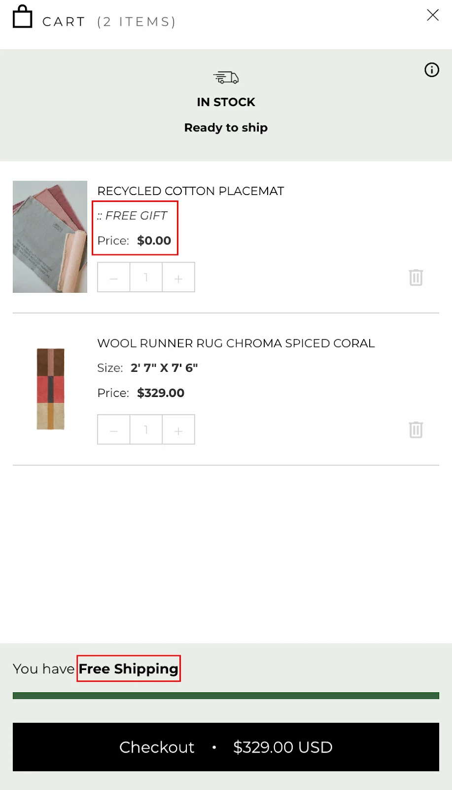
29. Add Free Gifts and Extras to Sweeten the Deal
A small free gift at the point of purchase does something psychologically interesting it shifts the frame from "am I paying too much?" to "I'm getting something extra." The size of the gift is almost irrelevant. What matters is the feeling of reciprocity.
Match the gift to the purchase: A free rug pad with a rug purchase. A set of decorative pillow covers with a sofa purchase. Free gift wrapping during the holiday season. These pairings feel thoughtful rather than arbitrary.
Add a threshold-based gift for larger orders: "Spend $100 and add a set of scented candles for just $10" gives people a specific goal and a reason to round up their cart.
Use seasonal freebies to add relevance: A free festive throw-in in December, a mini potted plant in spring, these small seasonal touches create the feeling that your brand pays attention to what time of year it is.
30. Use Decoy Pricing to Guide Shoppers Toward Your Best Option
Decoy pricing works by introducing a third option that makes your preferred option look like a better value. It is one of the most effective psychological triggers in eCommerce — and one of the most underused in home decor.
Suppose you sell two mirror sets: one for $80 and a premium version for $180. If you introduce a third option — a slightly smaller premium set for $170 — you create a reference point that makes the $180 set feel like exceptional value for just $10 more.
Use "Best Value" or "Most Popular" tags to direct attention: The tag does not need to be elaborate; a small coloured label achieves the effect.
Keep it to two or three options maximum: More than three choices trigger the paradox of choice. The decoy only works when the comparison is clear.
Use the same principle in bundling: A throw for $40, a throw-and-cushion set for $75, and a premium throw set for $150 most people gravitate toward the middle option, which they perceive as the smart choice.
31. Build Creative Pricing Displays That Reduce Hesitation
Use price anchoring on product pages: Showing a premium item alongside your best-seller makes the mid-range option feel like the reasonable choice. This is standard retail practice, but it works particularly well online, where shoppers are making price judgments without a physical reference.
Use subtle "Compare at" labels: Showing the original price alongside a reduced price signals value without requiring a loud "SALE" banner. Particularly effective for products that have been genuinely reduced.
Deploy visual urgency signals carefully and honestly: "Only 3 left" when there are genuinely only 3 left creates urgency. The same message when there are 300 in the warehouse destroys trust. Use these signals when they are true.
32. Build a Pinterest Presence And Turn Pins Into Long-Term Traffic
Pinterest is not exactly a social network. It is more of a search engine for aesthetic aspiration, a place where people collect images of the homes they want to have, the rooms they want to create, and the furniture they want to own. If your products appear in those collections, you are present at the moment of desire, which is the best possible moment to be present.
Add a "Pin It" button to every product image and lifestyle shot: Shoppers who pin are planners. They are building a picture of what they want, and they will come back when they are ready to buy. Your products living on their boards is the best kind of long-term marketing.
Ensure your pin metadata includes product name, brand, and price: When a pin gets re-saved hundreds of times, it should still lead back to you.
Build your own boards organised by room, style, and season: "Cozy Corners", "Japandi Homes", "Diwali Tablescapes". These boards give people reasons to follow you and explore beyond the individual products they have already seen.
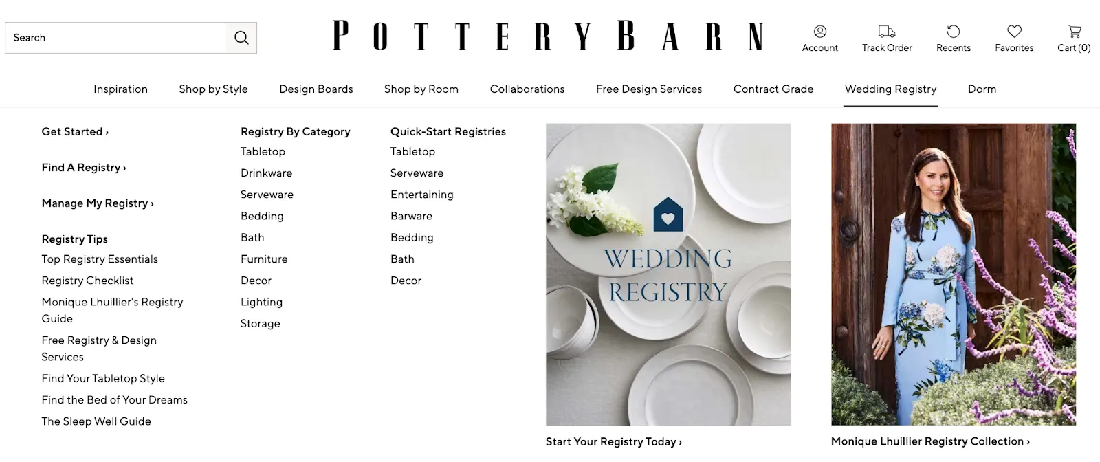
33. Launch a Gift Registry And Turn Your Customers Into A Sales Channel
Weddings, housewarmings, anniversaries, and new home celebrations are moments when people want to spend money on home decor and want someone to tell them what to buy. A gift registry turns your current customers into advocates and introduces new customers who arrive with a clear purchase intent: to buy something from a specific list.
Make the registry easy to set up: A clean interface, preset style categories, and an easy sharing mechanism (a link or a QR code) remove the friction that keeps people from creating one.
Offer a post-event discount: Items that were not purchased from the registry by the time the event passes represent revenue you have otherwise lost. A "Thank you for celebrating with us, here's 15% off anything remaining on your list" email captures some of that value.
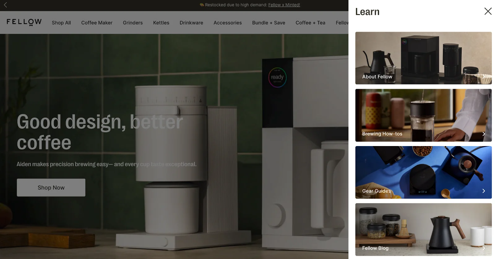
34. Educate Them With Helpful Product Guides That Boost SEO
Home decor shoppers search for advice constantly. "What rug size goes under a queen bed?" "How do I mix wood tones?" "What is the difference between modern and contemporary style?" If your store answers these questions well, you benefit twice: you build trust with the person reading, and you rank for the searches that bring in high-intent traffic.
Write guides that are genuinely useful, not just SEO-optimised: "How to Style a Small Living Room Without Making It Feel Cluttered" is more useful than "Small Living Room Tips." The specific, practical title attracts the specific, practical reader.
Use keywords the way real people search: People do not search for "polished chrome dual-lamp side table." They search for "small bedside lamp ideas" or "budget-friendly entryway furniture." Write in the language of the searcher, not the language of the product catalogue.
Link from guides to relevant products: Each guide should include "Shop the Look" callouts that connect the styling advice to purchasable items. Your content should be both a guide and a shopping tool.
Add an FAQ section to each guide: Will this fabric hold up to pets?" "Is this table easy to assemble?" "How do I clean velvet upholstery?" These questions are what people actually search for, and answering them in a FAQ section increases your chances of appearing in Google's "People Also Ask" result
Update guides seasonally: A "Fall Living Room Refresh" guide published each autumn, updated with new products and current trends, gives you fresh content and a reason to email your list every year.
Frequently Asked Questions
What Is a Good Conversion Rate for a Home Decor eCommerce Store?
Between 1.7% and 1.9% for organic traffic is the category average. Above 2% is solid; above 3% is exceptional. Paid channels perform better, Google Ads converts at around 2.73%, and Facebook and Instagram Ads at around 3.77% because those visitors tend to arrive with stronger purchase intent.
Other benchmarks to track: add-to-cart rate around 10.2%, cart abandonment between 83.7% and 88.6%, average order value approximately $124, and return rate around 4.6%.
Why Are Home Decor Conversion Rates Lower Than Other eCommerce Categories?
Four friction points drive this. The sales cycle is long — shoppers typically visit three or four times before buying, comparing styles and checking measurements across multiple sessions. The average order value is high, which makes people more careful.
The visualisation gap is significant because photographs cannot answer "will this actually fit my room?" And shipping costs frequently surprise people at checkout, which is one of the most reliable drivers of abandonment in this category.
What Is the Average Home Decor Cart Abandonment Rate?
Between 83.7% and 88.6%, among the highest of any eCommerce category. The main culprits are unexpected shipping costs at checkout, uncertainty about how a product will look in a buyer's actual space, and the long consideration cycle that comes with big-ticket purchases.
Transparent shipping, AR visualisation, and flexible payment options tend to have the most direct impact on bringing this figure down.
How Does AR Technology Affect Home Decor Conversion Rates?
AR tools that let shoppers place virtual products in their actual rooms consistently lift conversion rates and reduce returns. The visualisation problem is the single biggest barrier to purchase in this category, and AR addresses it directly.
Buyers can confirm scale, proportion, and colour match before committing, which removes the uncertainty that causes both abandonment and post-purchase regret.
Subscribe for more articles like this!
Thank you - we'll see you in your inbox soon!
Oops! Something went wrong while submitting the form.
Read by 5000+ ecommerce store owners
Subscribe for more articles like this!
Thank you - we'll see you in your inbox soon!
Oops! Something went wrong while submitting the form.










.avif)
.svg)


.svg)

.svg)
.svg)
