Most eCommerce shoppers engage because they are visually enthralled — one way or another.
And that means how you use images on your store and what you use them for can make or break the way conversions happen.
In our free audit sessions, across niches including beauty, travel, fashion, electronics, real estate and much more, we’ve noticed how much is lost when images don’t do their job.
So, we sat and curated the top 9 visual shopping elements that if an eCommerce site optimizes, conversions can soar!
1. Create a visual-first mobile interface (especially if your TG is younger)
Here’s a fact: almost 80% of Gen-Z shoppers prefer doing their online shopping over mobile.
If numbers are to be believed, there’s been a spike in this number by almost 46% since 2021.
A visual-first mobile interface, then, is the first step you can take towards optimizing eCommerce visual search.
👉 Fix contextual attributes to visual data: for example, fetch not just a specific product type but also visual themes and style descriptors like “rustic” and “streetwear”.
👉 Offer an instant feedback loop: help shoppers refine results by featuring enhancement prompts like “Want better results? Crop to focus on the bag.”
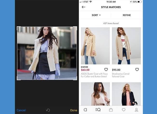
Fashion brand ASOS leverages a visual-first mobile approach with the “style match” tool on their app. This enables shoppers to upload screenshots and get instant product visual matches as well as “Shop the Look” nudges.
Why this works
Shoppers are constantly screenshotting or saving looks they love from Instagram, Pinterest, TikTok, etc. ASOS leans into this habit and closes the gap between seeing and buying.
UX Pro Tip
Leverage smart in-app prompts like “👀 Just took a screenshot? Tap here to find it with Style Match” — this improves engagement and buying because the app begins to visually nudge shoppers to the next step. Thankfully, on IOS and Android, apps can detect when shoppers add new screenshots to their camera roll.
2. Show product page recommendations of the visually closest products
In our CRO experience, product recommendations get many eCommerce brands super anxious.
More than the visual search angle, the conversation then becomes about how to upgrade, upsell and cross-sell.
But we’ve noticed, sticking to recommending only the visually closest products can have an instant bearing on conversions — and that’s because this piggybacks on the existing mindset of the shopper.
👉 Show added diversity while offering a similar frame of visual reference: for example, if a shopper is checking on a tan suede boot product page, show them “a vegan alternative” recommendation with an appropriate visual cue.
👉 Add smart toggles that help refine the search: bring in radio buttons that can be selected /deselected and with each prompt, the visual suggestions change — prompts like “Show in Different Colors” and “Similar but Cheaper” can make for more intuitive browsing.
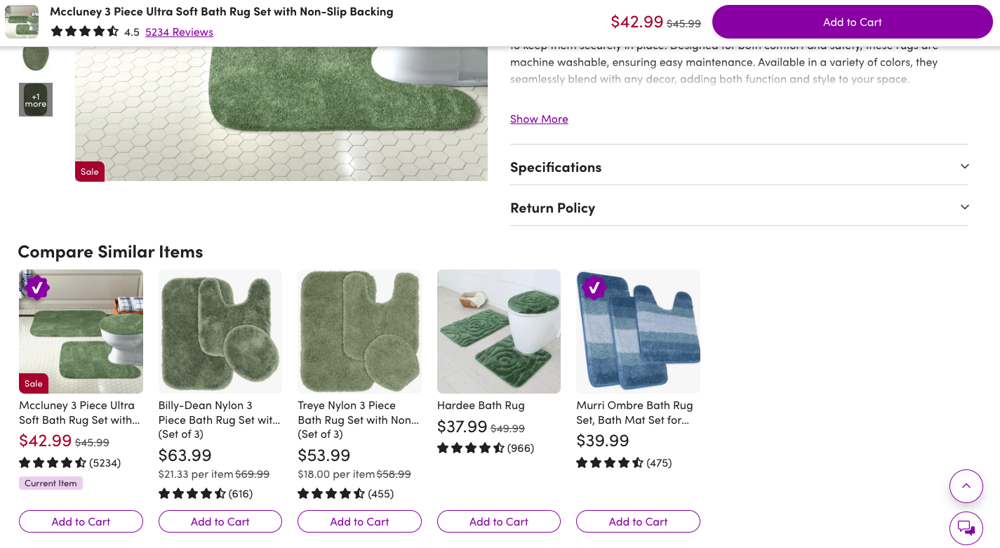
The first recommendation section Wayfair shows is one on visually similar items, and to take it a notch further, they allow comparisons as well:
Why this works
Even when shoppers are confident about the brand and its products, looking through dissimilar recommendations can create decision fatigue.
This visual shopping tactic resolves this common problem.
UX Pro Tip
Prioritize in-stock items, better-reviewed products, or items with better margins within the visually similar set.
3. Show default image-led product suggestions within search
Consider this not just an excellent visual search tactic but also a consummate UX hack that combines visual discovery with guided navigation.
The way this works is the suggestions appear as soon as the shopper clicks on the site search bar. You need to, however, ensure that the suggestions are highly relevant — it’s best when they’re on the lines of “Bestsellers” or “Trending Now” as this especially helps channel the journey for first-time visitors.
👉 Feature a “Quick Add” button to each visual suggestion: this helps shoppers move directly move to the cart stage, especially if they’re on an impulse buying streak.
👉 Reserve a couple of visual tiles for guides & blogs: this becomes even more relevant when these educational suggestions have something to do with the products / categories mentioned in this section.
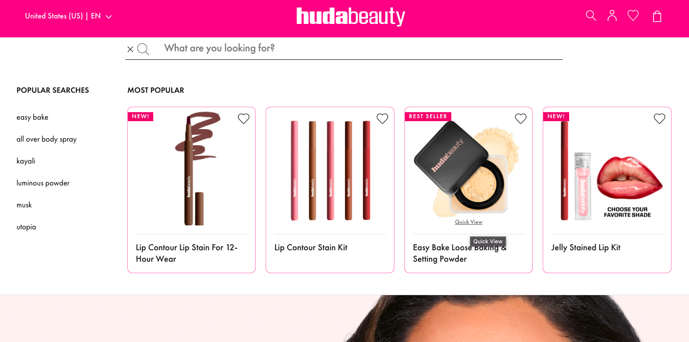
Huda Beauty creates a combination of popular search terms and visual product results under “most popular”, where each recommendation reveals “Quick View” upon hover:
Why this works
This is a prominent visual spotlighting opportunity for both higher-margin SKUs as well as low awareness products.
UX Pro Tip
Pull out default suggestions for this section based on actual shopper behavior signals — prioritize signals like cart contents, latest browsing history and location to optimize.
4. Drive buying through AR-led visual contexts
The fact that shoppers are almost always surrounded by inspiring objects can often be the crux of great conversion stories.
But first of all, it can be the perfect condition for eCommerce visual search to do its job better.
The idea is to have an in-store capability that lets shoppers overlay interesting items in their living or working contexts.
👉 Ensure top-notch camera-based recognition: this helps shoppers across contexts use a feature like this.
👉 Feature results from a vast catalog: the more number of categories and SKUs you are able to cover, the more result variations shoppers can access — this is especially helpful when you’re trying target multiple profitable customer segments.
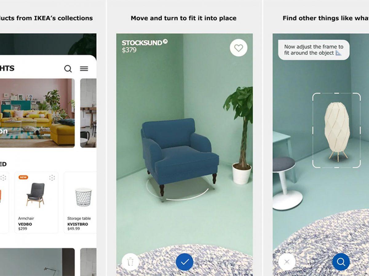
Ikea leverages this visual search method with their Ikea Place app, under which almost 3200 products are included to be fetched as results when shoppers type relevant queries:
Why this works
Integration of AR into visual search is a surer way of getting people to engage more while showing them more personalized results — and in combination, these promise higher conversions.
UX Pro Tip
Smart framing nudges like “Move closer to the fabric” or “Try a different angle" can enhance a feature like this.
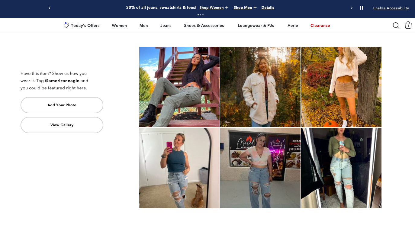
5. Let shoppers upload UGC images directly to your site
It’s no mystery that businesses across eCommerce niches have, time and again, found that Gen-Z and Millennial shoppers are obsessed with UGC.
And a big part of that reason is that UGC works as an authenticity signal for them to consider purchases more seriously.
So linking UGC with visual search capabilities can in fact be a major conversion driver in 2025.
👉 Make it easy to tap products separately: map multiple parts of the image into separate shoppable zones — and to address higher buying intent, feature a CTA like “Shop the Full Look”.
👉 Let them directly pull images from their socials: whether they want to source these from Instagram, Pinterest or Tiktok, use APIs or clipboard/paste detection.
eCommerce brand American Eagle uses this approach and optimizes their product pages for higher engagement. And when a shopper clicks on “View Gallery”, they can see the entire collection of UGC photos that can then direct them to other products and categories:
Why this works
Being able to upload one’s own UGC is a highly personal act that most shoppers love — when they notice other shoppers have done the same, the trigger to engage and further explore deepens even more.
UX Pro Tip
Appropriate a clear #hashtag for this section if you do plan to use this visual search strategy — it’s also a great way to optimize SEO across marketing channels.
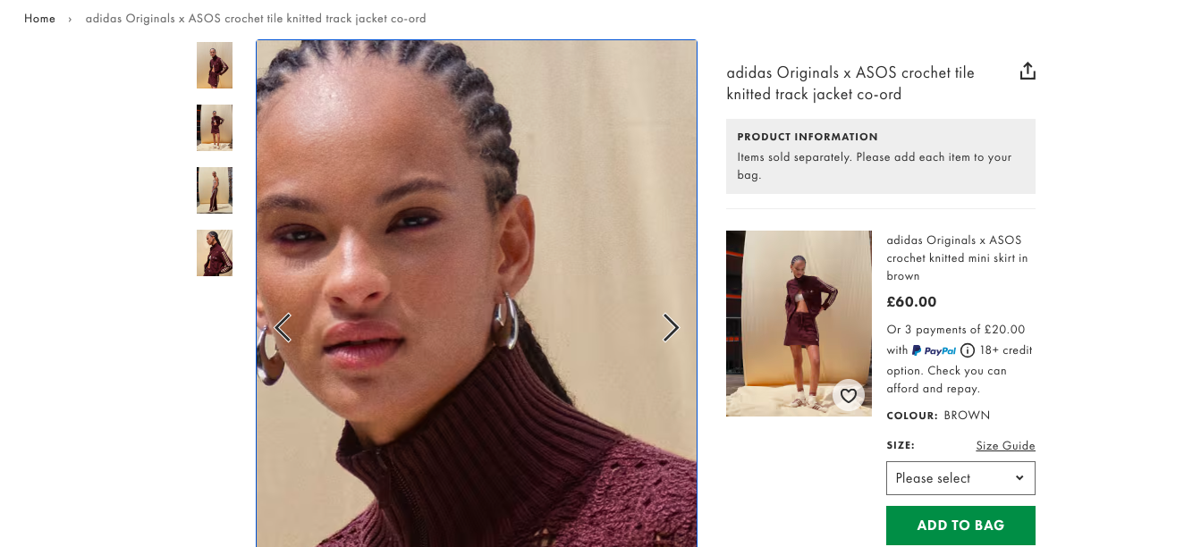
6. Make the zoom functionality super intuitive
If you’re like, wait, it's 2025 and these guys are still talking about the zoom functionality in eCommerce visual search, then you’re not alone.
The zoom feature has gone through all kinds of modifications over the years, but even then is considered a top feature by almost 80% of shoppers — especially across visually complex niches like fashion and home decor.
👉 Show zoomed-in hotspots: highlight key zones of the image that matter most to a shopper who’s assessing for quality, texture, design, cut etc..
👉 Introduce gesture-responsive deep zoom: let shoppers tilt their phone to pan across the zoomed area.
ASOS features an intuitive zoom function that makes visual search worthwhile not just on desktop but also on mobile — their functionality combines drag-and-drop & pinch-and-zoom effortlessly.
Additionally, shoppers can go three layers deep with the brand’s zoom functionality.
Why this works
Zoom, in the absence of touch and feel, is THE way for shoppers to build instant as well as long-term trust with an eCommerce brand.
UX Pro Tip
Always reset zoom between variants. You don’t wanna give shoppers awkward transitions when switching shades, colors, or prints
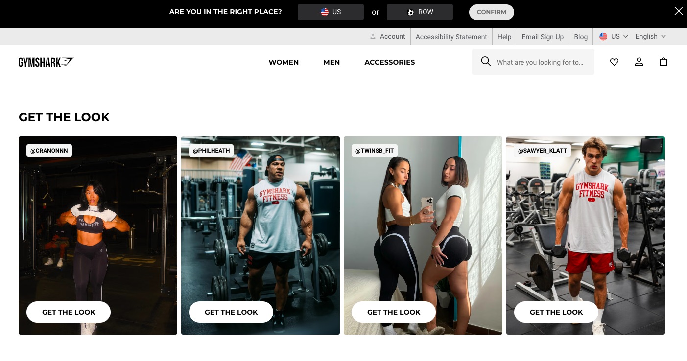
7. Integrate popular social searches into your homepage
So here’s the thing: UGC shown through social walls on eCommerce sites builds trust 33% more than influencer visuals and professionally-shot content.
And that explains why integrating social searches into your eCommerce homepage has got to be one of the key visual search strategies for 2025.
👉 Let shoppers toggle between themes: for example, as an apparel brand, you can try themes like “Leg day looks,” “Winter wear,” “Monochrome edits” for more engagement and personalization.
👉 Make it clear that the UGC is shoppable: a clear, persistent CTA is ideal so that you don’t waste an opportunity just because a shopper didn’t stop to hover. 🤷
Gymshark really plays up this visual search strategy on their homepage by showing the social wall just as the first fold ends.
Why this works
A trustworthy social wall plug on the homepage can feel more human and connected for most shoppers, especially those who’re engaging with the brand for the very first time!
UX Pro Tip
Use visual AI to let shoppers filter UGC by:
Body type
Skin tone
Occasion
Product color
Room type (for home decor)
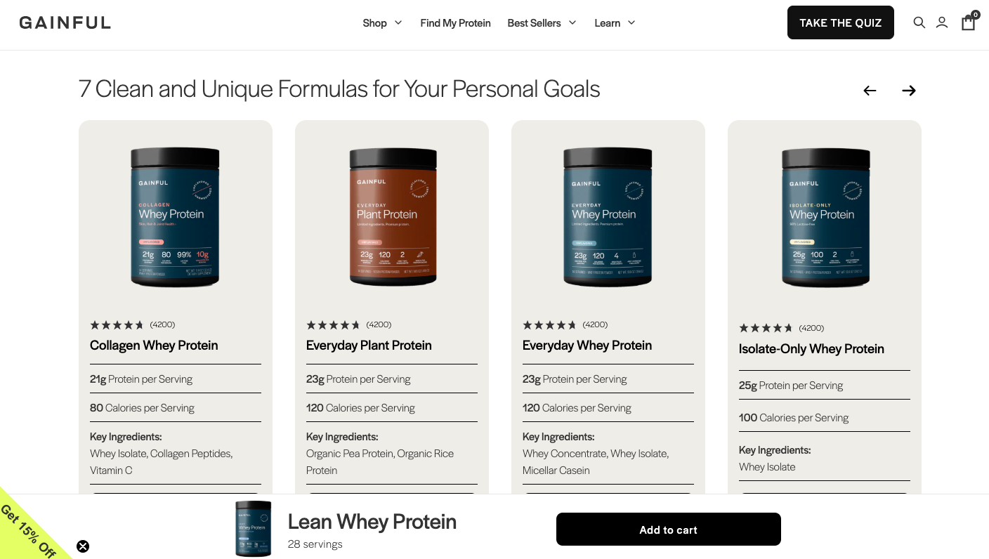
8. Track session behavior to update visual feed
In 2025, the shopper’s current mood and in-session site behavior are two powerful aspects, which when combined can change the way visual search works.
Be it scroll patterns, hover time, clicks, zoom-ins, or image uploads, the shopper is constantly offering you data on what’s keeping them ticking.
👉 Actively use other patterns beyond clicking to update visual feed: find out what they’re hovering on or stopping to zoom — beyond clicks, these patterns reveal their subconscious preferences.
👉 Build next steps on the immediate previous step: for example, if the shopper clicks on a terracotta vase, shift the next 3 image-led suggestions towards organic pottery tones & rounder shapes.
Wellness brand Gainful adapts to this visual search process seamlessly by surfacing recommendations that are visually (and characteristically) in line with the category the shopper is actively browsing:
Why this works
Adapting without asking, learning without nagging — is where most shoppers would rather be, no matter where on the customer journey map they are.
UX Pro Tip
Offer clear filters to refine feed manually — “More highly rated,”“Only for women over 50” etc. are examples of such filters.
While personalization is key in eCommerce visual strategies, it’s never complete without you knowing the shopper’s location and which products are in demand there.
And this is why location-based filtering as a first step to all other visual search strategies can be a conversion boon.
👉 Have a multi-pronged approach of capturing shopper location: this needs to include GPS positioning for mobile users, IP-based geolocation for desktop users, manual location input as fallback and sore location preferences in user account profiles.
👉 Use various filtering systems in the back-end to create relevancy: this includes showing only products that can be shipped to their location, displaying location-specific currency & pricing and highlighting items available for pickup nearby.
Why this works
This is a highly underrated yet critical visual search approach because it takes into account how shoppers behave geolocationally and not just at a strictly personal level.
UX Pro Tip
Always cache location-based results to reduce server load.
Visual Search Questions eCommerce Businesses Ask
What are the main purposes of eCommerce visual search?
Letting shoppers “search by image” is not the only function of eCommerce visual search. If done correctly, it serves several other high-intent purposes including:
🔥 Improving product discovery: Given that shoppers hardly know product names and find inspiration through a post they saw on social media or a retargeting ad, visual search can be key to them finding the exact product or close matches.
🔥 Creating more space for impulse buying: More shoppers than ever are now working with the mindset of “I want this look right away” or “Show me different but similar” — making impulse buying easy only if as a business, you’re able to return searches that are highly specific and close enough to the shopper’s preferences.
🔥 Reducing returns through visual accuracy: If shoppers can see how an item looks on someone or visually compare multiple similar items, they're less likely to order the wrong thing.
🔥 Enhancing product tagging & search relevancy: With the help of AI, you can auto-generate product tags at scale and also cluster products that have visual similarities.
Which visual commerce trends are eCommerce brands benefitting from the most?
We’re including this question here just because we’ve been asked this over and over.
The truth is visual eCommerce is exploding, but that’s not to say that every trend will shape how your shoppers will interact with your store and buy from it — the 5 trends we think will move the conversion needle for you are:
👏 Visual lookbooks: whether they have seasonal significance or not, these lookbooks can be a great way for shoppers to imagine a host of products together — leading to higher aspiration, even if they're not going into the individual product pages.
👏 Shoppable videos: consider archiving them like you would a blog, especially if your store does live sessions so that new visitors can still convert when they view these.
👏 Social feeds: well-designed feeds work as social proof, product pages and video / photo content all at once, improving the chances of shoppers finding what they love through visual search.
👏 AI powered visual recommendations: be it bestsellers or of products that are really close to what the shopper prefers, this tactic is going to be evergreen as far as visual commerce goes, for a long time to come.
👏 Product try-ons: can be especially effective for mobile shoppers who’re comparing first before they get to desktop to buy.
Create brilliant visual shopping experiences with breakthrough UX
98% of visitors who visit an eCommerce site—drop off without buying anything.
Why: user experience issues that cause friction for visitors — even when the store boasts of visual shopping experiences.
And this is the problem Convertcart solves.
We've helped 500+ eCommerce stores (in the US) improve user experience—and 2X their conversions.
How we can help you:
Our conversion experts can audit your site—identify UX issues, and suggest changes to improve conversions.
Subscribe for more articles like this!
Thank you - we'll see you in your inbox soon!
Oops! Something went wrong while submitting the form.
Read by 5000+ ecommerce store owners
Subscribe for more articles like this!
Thank you - we'll see you in your inbox soon!
Oops! Something went wrong while submitting the form.


.jpg)


.svg)

.svg)

.svg)
.svg)
