Conversion Optimization
Low Form Conversions? Making Any of These 9 Mistakes?
April 12, 2024

Insights in this post come from our CRO team's decade of experience working with eCommerce brands. Edited by our in-house content team.


Insights in this post come from our CRO team's decade of experience working with eCommerce brands. Edited by our in-house content team.

First things first: most customers hate filling out forms.
Only 45% of people who visit a form convert successfully.
The reason: they expect some value waiting for them on the other end.
Jump to:
Why are form field conversions important for eCommerce stores?
The debate: How many fields should a form have?
9 reasons for low form field conversions (and what to do instead)
For eCommerce businesses, forms are an important micro-conversion i.e. a smaller action that leads to a bigger action. i.e. a macro-conversion.
For example, a form that subscribes users to your newsletter. It’s a small step that offers you access to send your customers emails.
In one of your emails, you may send them an offer or a deal that can lead them to purchase—a bigger action.
So, online forms are essential for specific customer actions and conversions on your eCommerce store.
Form conversions offer opportunities to gather visitor information and quality leads that can further convert into actual customers.
Here are some of the common outcomes of form optimization:
Form optimization is essential both from a CRO and a UX standpoint.
Ultimately, it impacts your form completions and form conversion rates.
This is a question most eCommerce businesses have.
And this is also one space where most form optimization efforts fall flat.
One of the most common optimization advice you’ll hear is 'reduce form fields'.
Does it work?
Our verdict: it depends.
It all boils down to your business goals and where the shopper is in the buyer's journey.
You’ll have to be intentional about what you expect from customers as well as the value you’re offering for their time.
Are you looking for a large number of leads or are you more interested in quality?
For example, if you’re struggling to get leads from your sales funnel, you may want to focus on forms with short fields.
This may land you a higher quantity of leads to refine.
However, if your prospective customers are already in your sales funnel, forms with longer fields will be more effective in segmenting them basis their needs.
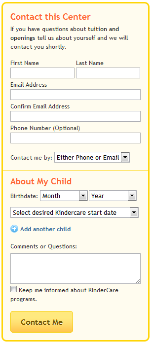
Kindercare experimented by adding an extra field—comments or questions—in their form.
It didn’t increase or decrease the conversions, however, it improved the quality of leads.
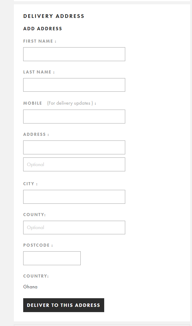
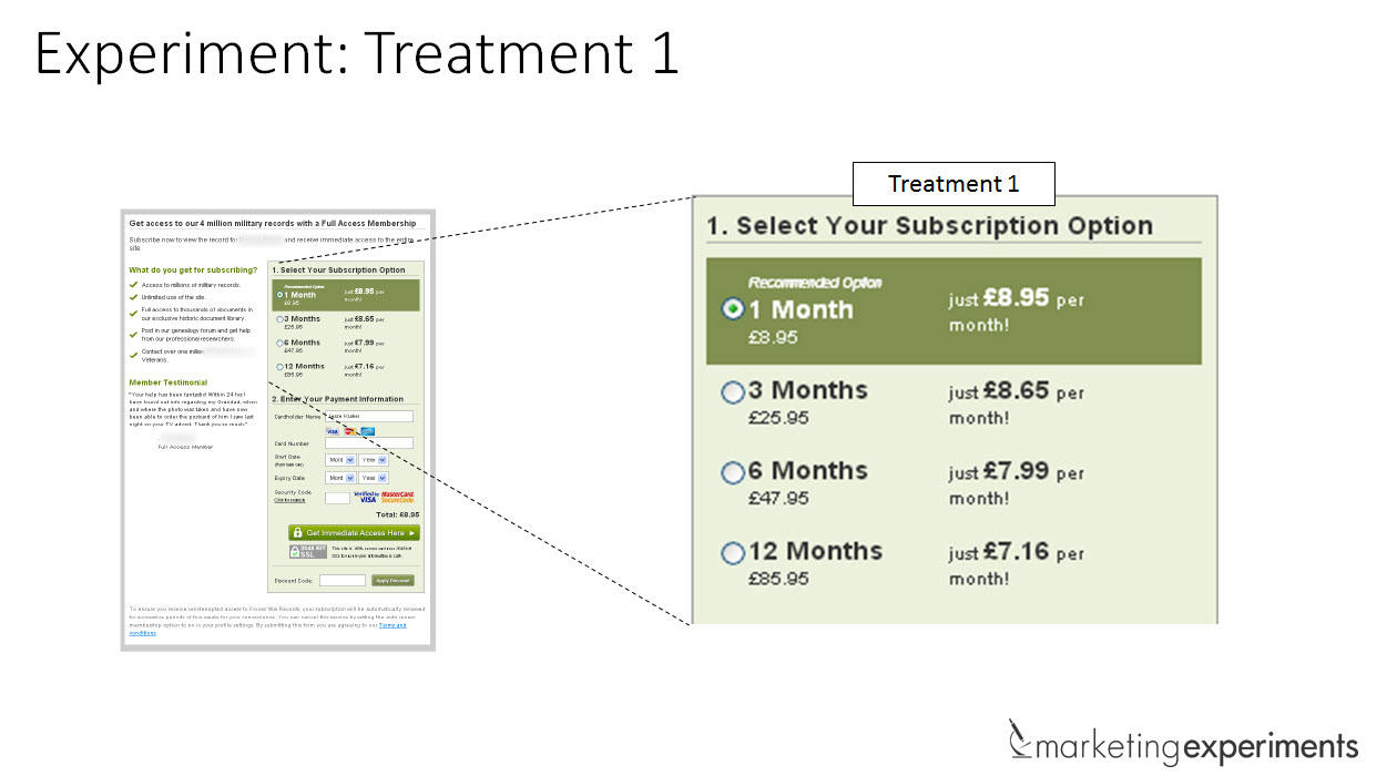
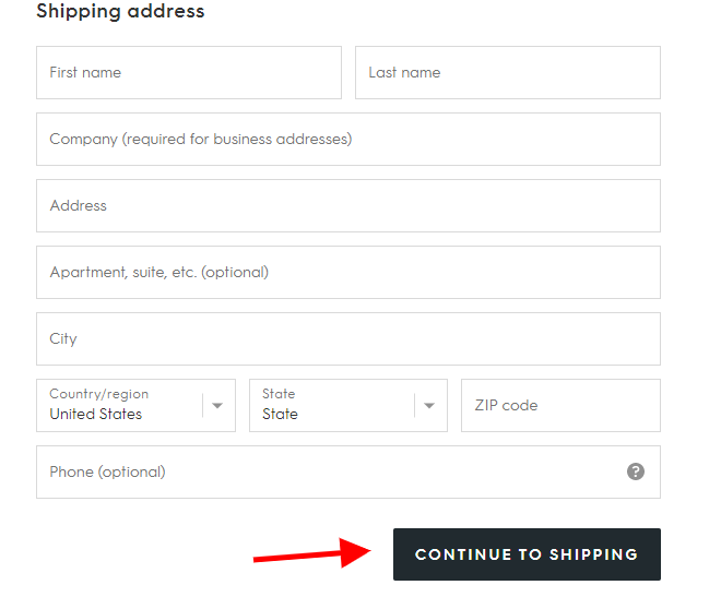
Here’s an example from ASOS for form optimization inspiration.
See how it limits questions relevant to customer’s delivery on their delivery form below
You may already have a form optimization strategy in place. It’s easy to think that it works just fine on your eCommerce store.
However, the difference between a high-converting form and a low-converting one lies in the tiniest of details.
It could be something as simple as removing 1 field in the form.
Here are 9 mistakes in your form field elements and design that’s stopping conversions:
How easy is it to fill out your form?
The amount of effort your customers have to put into filling your form determines whether or not they’ll go ahead and complete it.
81% of customers abandon a minimum of one form.
You can prevent them from abandoning by solving the problems they face.
Unnecessary typing is one.
It can make form filling stressful especially on mobile because one wrong tap leads to data inconsistencies.
So, when customers have to answer duplicate questions or type every single letter, it can get frustrating.
In this case, consider using auto-complete or auto-fill from their saved browser cookies.
With this, you’re reducing the number of times they have to type out on a field.
That’s like doing the hard work for your prospects.
Moreover, customers complete your forms 30% faster when they use auto-fill.
Another culprit is asking sensitive or difficult questions first.
This can make a customer hesitant or skeptical about the intentions of your store.
So, start with the easy questions first. It can be starting may be with their name, email address, or interests.
Then you can lead up to more sensitive information such as an address, phone number, or credit card details in payment forms.
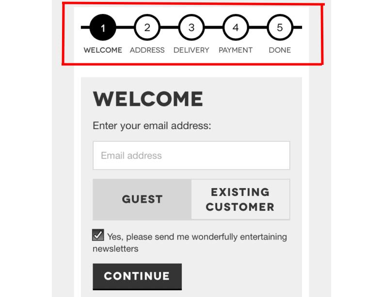
Longer form fields can create a higher perceived effort to fill the form. This can make the customer feel overwhelmed, ultimately leading to form abandonment.
This is where multi-step forms can help.
They break down the form questions and filling steps into several pages.
That way it’s easy to digest and doesn’t seem like a lot of work.
Breaking down the questions into two parts makes the form look shorter and easier to fill.
Unsurprisingly, it sees a 214% increase in conversions.
Is your first instinct to design forms for desktop first and then for mobile? You maybe losing out on a lot of customers in that case.
Around 12.7% of your conversions come from mobile. So it’s important to prioritize mobile optimization for your forms.
One of the best ways to optimize for mobile is replacing form fields with HTML mobile input types.
For example, is your customer about to enter a date on your form?
Use an HTML date selector for this field.
This way, your customers can easily scroll to their preferred year, day or month.
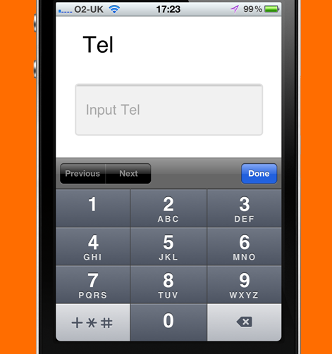
Another example is using the telephone HTML input field.
Have you ever tried to input a phone number and your smartphone automatically displays a numerical keyboard? This is one optimization you shouldn’t miss.
It helps reduce the stress of always switching to a numerical keyboard.
Font types are also a crucial area to optimize.
Always ensure that your mobile font size is above 16px.
Not only does it make it easier to read, but customers won’t have to zoom in while filling out a form. That’s one less pinching action on their end.
Another common trouble is popups. Using forms in popups makes for a bad UX.
Popups generally appear oversized making it difficult for customers to read the text. Using a separate form tool for mobile is a much better option.
Also read: eCommerce UX: 20 Common Mistakes (The Unnoticeable Ones)
Are you leaving your forms to default themes or customization? Have you tested how aligned your form fields are?
Form design and placement play a crucial role in creating a good user experience.
People are wired to read from left to right. So as a rule of thumb, keep the questions on the left and the form fields on the right.
It’ll significantly reduce the friction caused by stressful eye movement. Top alignments are also great because they are close to the fields and serve the same purpose.
When placing a form on your eCommerce store, consider placing it above the fold of your page.
Above the fold content still matters.
Placing your forms there can increase your chances of conversions.
You can also experiment with a vertical or horizontal form layout.
They A/B tested both horizontal and vertical visual hierarchies and found that the former led to 52% higher conversions.
This depends from site to site, you’ll have to check what works for you.
Form placements play an important role when it comes to mobile.
Since devices such as smartphones and tablets have smaller screen space, hence a single-column form design makes more sense.
Moreover, up and down eye movements are natural for people. Multi-column forms force the customers to look left and right which makes processing the information longer.
You should avoid something like this in your forms to reduce cognitive load.
Putting some thought into the layout can help avoid form abandonment.
Eye-tracking studies have found that if the size of input fields doesn’t match the title, it leaves viewers confused. Baymard Institute’s study also points towards that.
The input field size suggests what sort of an answer the customer should provide. So aligning it with the question can help avoid confusion.
Similarly, you should also design form elements intuitively with the customer in mind. For example, using dropdown menus for questions that have only 2-3 options is redundant. Using radio buttons instead can make more sense.
This case study proves the point.
Upon A/B testing dropdown and radio button options for a form field, the results showed that radio buttons led to a 15% rise in conversions. This is because it created lesser friction.
To improve your form engagement, you can also experiment with visual form elements.
Since the human brain processes visual cues 600,000 times faster than text, it’s sure to catch the eye of customers.
Visual questions are a great example.
Instead of drop-down options, you can use clickable image answers—it can make the form more interactive.
Most of your customers would want to get done with the form with minimum effort. Your task is to make their work easier.
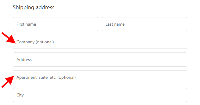
So, don’t make all the fields required in that case.
When optimizing your eCommerce HTML forms, you may have made all form fields required with a red asterisk or you may have chosen not to distinguish these fields as a way to get prospects to fill all fields.
This can be a turn-off for your eCommerce store visitors because it’ll feel like you’re asking for a lot.
And truthfully sometimes, not all questions are a need-to-know.
Here, you can mark the fields which are not so important as optional. However, limit it to a maximum of one or two fields—as Nielsen Norman Group’s research suggests.
Also, ensure you distinguish between optional and required fields. Let the psychology of voluntary disclosure take its course.
Ditch the conventional red asterisk and consider highlighting in the text which fields are optional instead.
With the red asterisk, you’re calling attention to only the important fields.
A study has shown that labeling optional fields encourages visitors to read and fill through the entire form as opposed to skipping and filling only the asterisked fields.
See how Unconditional highlights its optional fields below
Your Captcha box may be keeping the spambots away but it’s also keeping your conversions at bay.
A Stanford University experiment finds out that can reduce your form submissions by 30%.
Besides the lack of trust it communicates to your visitors, captcha boxes also tend to cause friction in the user experience. It’s evident—people don’t like to prove that they are human.

So now, you’re probably wondering how you’re going to deal with the spambots.
Luckily today, there are advanced solutions designed to deal with this. You can consider using plugins like Akismet if you have a WordPress store.
For other web platforms, you can create a honeypot blocker.
A honeypot blocker creates an invisible field that is visible only to bots thereby blocking them from creating spam submissions.
Your store visitors are converting through your forms and the spambots are blocked. That’s a win-win!
People don’t care much for filling forms. So, they generally won’t go out of their way to provide the details you need.
Using social proof is a way to nudge your eCommerce visitors to complete a form.
With these positive signals, your visitors become a little more relaxed and ready to convert.
Depending on what function the form plays, you can add relevant trust signals to it.
Here are some social proof ideas you can use:
Adding a privacy policy to your emails is also a necessity.
With the recent GDPR and CAN-SPAM regulations, privacy is an important issue. Customers too prioritize their security and privacy over anything else.
You should also be careful about the words you choose for your privacy policy.
For example, this case study found out how the word spam negatively affected customers and reduced conversions.
Removing the word spam and altering the text improved the signups by 19.47%.
One red flag on web forms is the phone number field.
Visitors are usually wary when it comes to giving out this sensitive information.
So if you must absolutely request a phone number, ensure you make it an optional field.
A study has shown that switching a phone number form field from mandatory to option decreased form abandonment from 39% to 4%.
30% of people will complete a form if there’s something in it for them.
The question is why should they fill your form? During form optimization, you want to be clear on whether your value proposition is relevant to your visitors.
For example during email signups, do your visitors really want to be in your email database?
If yes, what value are you offering in return? Consider offering live chat, support, freebies, a discount, and other items your customers might be interested in.
See how Bailly offers a discount coupon on their sign-up form.

Sometimes filling a form can feel like a quiz or an exam with the amount of brainwork required to get it right.
This feeling can be described as a cognitive load.
A great way to reduce cognitive load is by aligning input types based on questions.
For example, if a question asks for your location, a drop-down option will be the best suited for that.
Here’s another example: if acceptable passwords are case sensitive and you don’t clearly state this, you’re going to frustrate your visitors when creating an account. It’s just a bad user experience.
As a start, use in-line validation to help your visitors understand the acceptable criteria earlier on.
This way they avoid waiting until they hit the submit button before figuring out that there’s an issue with their submission.
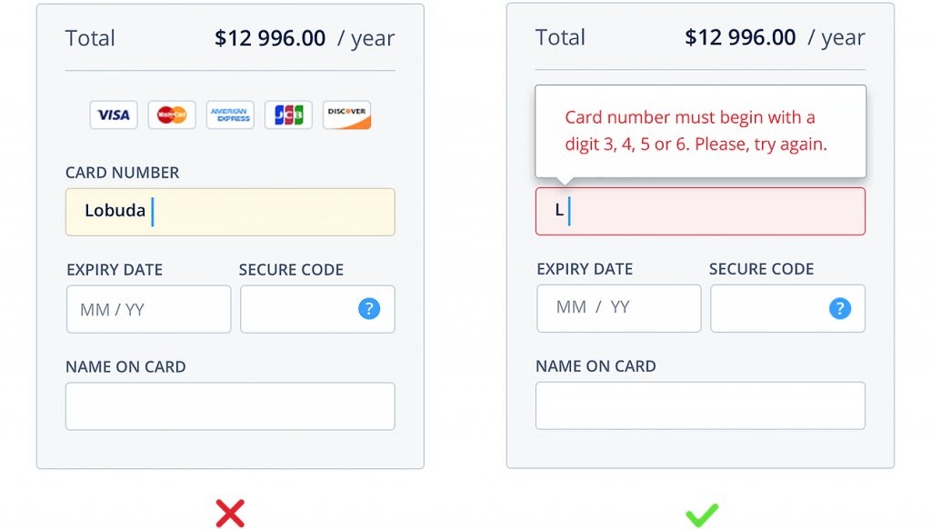
As this case study shows, real-time in-line validation leads to a 22% increase in success rates and a 42% reduction in completion times.
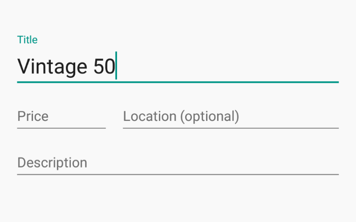
A major optimization mistake is using placeholders. While they are great for helping your visitors understand expected answers, they usually disappear once you click on a field.
This can be counterproductive because your visitors can forget what the prompt was.
Moreover, a field that already has text will make them ignore and not fill it—as per eye-tracking research data.
If you must use placeholder texts, ensure they are floating.
This way once a visitor clicks on a field, the help text automatically goes above the field and they can still use it. Here’s an example of what a floating placeholder looks like.
In general, use as many helpful texts as possible.
Show error messages and let your visitors understand what each field represents by explaining form fields with text.
So the visitor has finally filled your form. What happens next?
Without a clear call-to-action (CTA), your visitors won’t be able to understand what value they’re receiving.
Using generic submit buttons is no longer compelling enough.
When visitors click on your CTA, they want to know what happens next.
Studies have shown that more descriptive CTAs increase conversion rates on your eCommerce store by 30%.
So consider defining the next course of action with more descriptive CTA’s.
You may want to use this in payment and checkout forms especially due to the sensitive information that a visitor is asked to enter.
It helps build trust and enables them to complete a form faster.
See how the example below uses a personalized CTA as opposed to a regular submit button.
This case study shows how changing the CTA copy from something on the generic side such as try for free to something personalized such as adding a pain point improved conversions by 24%.
When creating your CTA button, do keep an eye out for design.
Using contrasting colors for your CTA buttons can improve conversions.
Not showing where your visitors are in the step of filling your forms can be quite frustrating especially when you have multi-page forms.
One of the best form optimization practice you might be skipping out on is adding a progress bar.
These indicators let your store visitors know where they are and how many steps they have left. This assures them about the end goal and how much effort and time it’ll take to fill the form.
Research shows that 90% of customers prefer web forms with progress bars.
Sometimes, you may be caught up so much in the form optimization process that you forget that your visitor isn’t just one person.
They are different people with different backgrounds and interests. So this diversity should reflect in your form as well.
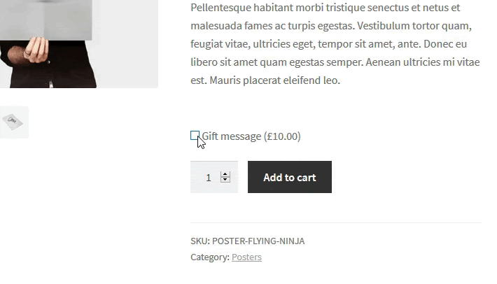
Instead of adding a long-form that asks for every single detail, you could add conditional logic to help with further tailoring the form as per their specific interests.
Here’s an example below. you’d see that not everyone would need to fill out a gift message.
So it first asks if you want to give this item as a gift. If yes, you get a prompt for a message. Else, the next step would be to add directly to the cart.
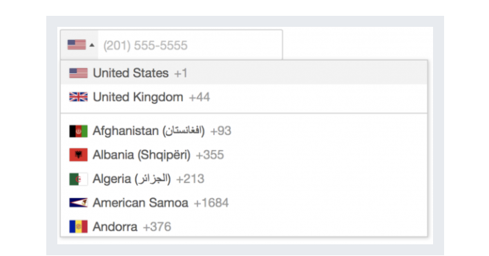
Another form optimization mistake is that you probably don’t use enough smart defaults to ensure better personalization.
It could be something as simple as an auto-detect location.
That way, your customers don’t have to endlessly scroll or manually enter their country.
This can also be applied to other similar fields. Like the phone number field.
Like in this example below:
Finally, try to make the content of your forms conversational and engaging.
Natural language forms work best as your visitors know that there’s a human touch behind the whole automated process.
Here’s an example we love:
Don't forget to read: 27 Founders/Store Owners Share eCommerce CRO Best Practices
Building easy-to-complete forms are an important step in your conversion rate optimization (CRO) strategy.
Successful form submissions improve conversions a lot.
To ensure that you’re recording good form conversion rates, you have to keep on testing and analyzing your form data.
Some metrics you can monitor are:
When designing for mobile, prioritize simplicity and readability.
Use larger input fields and buttons for ease of use on smaller screens.
Minimize scrolling and use responsive design to ensure forms adapt well to various screen sizes.
Allow for flexibility in address formats and provide dropdowns for selecting countries to adapt to international customers.
Use address verification tools to standardize addresses and ensure accurate delivery.
Group related fields together logically (e.g., personal information, shipping details, payment information).
Use clear labels and placeholders within the fields to guide users. Avoid using jargon or ambiguous terms.
98% of visitors who visit an eCommerce site—drop off without buying anything.
Reason: User experience issues that cause friction for visitors.
And Convertcart solves exactly that.
We help eCommerce brands optimize their websites to boost their conversions.
We've helped 500+ eCommerce stores (in the US) improve user experience—and 2X their conversion rate.
How do we do this?
Our conversion experts audit your site—identify UX issues, and suggest changes to turn more of your visitors into customers.
Subscribe for more articles like this!


Read by 5000+ ecommerce store owners
.svg)

.svg)

.svg)
.svg)
2026 Convertcart, All Rights Reserved
33/1, Castle Street, Ashok Nagar, Bengaluru, India
