Conversion Optimization
eCommerce Above The Fold Optimization - 15 Proven Conversion Boosters
July 20, 2023


.jpg)
Above the fold is ideal to gain your visitor’s attention and engage them.
If they are intrigued, then they'll explore more on your store.
In this blog post, we'll cover:
Before the arrival of “digital”
The concept of a fold began with journalism, where the way a newspaper was folded and stacked offered visibility only to the top fold.
Soon the most exciting news was making it to this part through compelling headlines and eye-catching imagery.

The first fold at the beginning of digital
This translated to the digital world. On a website, above the fold means any content that’s viewable without scrolling.
So websites would try to cram up all their information within the designated 600 pixels of space.
Like this website below has done — something that’s quite frankly unthinkable as far as eCommerce UX goes:

Their excuse: what if scrolled right past and prime real estate didn’t do its job?!
How above the fold has changed after 1994
Website usability has changed a lot since 1994. The most remarkable change has been the habit of scrolling. Today, scrolling has become second nature to online users.
And thanks to a plethora of devices with different screen sizes and resolutions, it’s a bit dicey to decide exactly where the page fold lies.
This has led to many propounding that the fold is dead or the fold is a myth.
Here’s what they base their case on:

This data matches with the Nielsen Norman Group’s research.
Their 2010 research had revealed the viewing time for above-the-fold content to be 80%. Their recent 2018 research revealed that the same had dropped to 57%.
A Google study seems to corroborate the above claims. It found that it takes just about 50 milliseconds for the average human eye to form an aesthetic judgment about a website. A lot of which practically depends on above the fold optimization in an eCommerce store.
In more recent research by the Baymard Institute, this number seems to hover around >54%, especially for mobile audiences who’re leaning into faster experiences.
Another interesting research was carried out by MECLABS. They discovered that placing the call to action (CTA) below the fold boosted conversions by 20%.
These conclusions are NOT wrong.
For what they really point at is how businesses need to be smarter than ever to make the first fold work for conversions.
When it comes to A/B testing the first fold, many eCommerce stores get into testing CTAs and hero images even before they’ve resolved shopper uncertainty.
In 2026, this will be key to the first fold success of your store’s homepage. Before getting into CTA size & color or image & video choices, ask:
This will help you bring up A/B testing options that juggle with the primary messaging.
For example, you might consider bringing in one variant that hinges on price justification:
“Non-toxic formulas for plants starting at $49 — FREE GIFT when you buy for $75”
And another one that leans in more on outcome focus & long-term benefits:

Test between identity-specific messaging and outcome-specific messaging - while the first answers “Is this for me?” (something like “Built for___”), the latter answers “will this actually work?” (on the lines of “shows results in ___ days”).
Test in a way that you can contrast value by independent appeal & comparison - this is strategic when you’re trying to see how the positioning of specific product messaging works. While the first can lead with “The best in___”, the latter can work especially when an upgrade is involved “Outperforms ___ by___”.
Further Reading: 153 A/B Testing Ideas for eCommerce (Homepage, PDP, Cart, Checkout)
In 2026, as an eCommerce business owner, you ought to say, “Move over, hero header.”
And the reason is both simple and complex. The hero section doesn’t need to be a single message anymore.
Because it needs to be way more.
It needs to be where they’re able to sort their mind out about what they want and how they want it.
So, segmenting this section for decision states becomes a major way to pull in conversions.
Make decisions especially easier for new customers - this ensures they’re not scrambling around for product discovery. Even seconds of delay can prove challenging to someone who doesn’t know much about a brand.
Something that Truly Beauty keeps track of and positions strategically, becoming one of our favorite above the fold website examples (with deceptive simplicity):

Include multiple elements in the hero strip in a non-intrusive way - this can be tricky, especially from the first fold design optimization lens. But the key is to create a visual hierarchy that lets you include crucial elements like:
Further Reading: 12 Critical eCommerce Segmentation Mistakes (+ Ways to Fix Them)
Above the fold web design across eCommerce stores misleads founders into believing that multiple CTAs work in the first fold.
Through our free audits, we’ve found that this is varying across the year as well as niches.
The idea, however, is for shoppers to engage actively in sorting as soon as they land on the homepage.
Alongside, for you to funnel the intent that shoppers are reflecting through their choices.
This is something that one of our favorite pet brands Catalyst gets right — while keeping it simple with a single CTA:
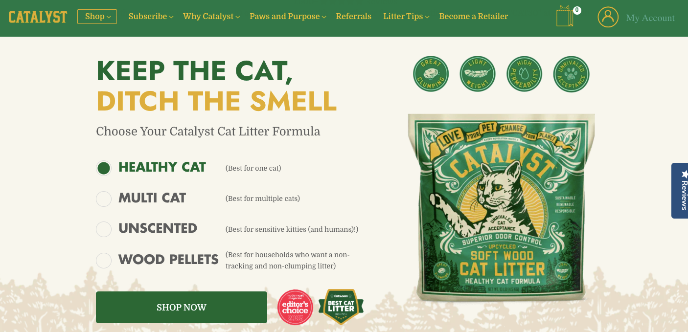
Set up two compelling actions as choices against “I’m in the mood for” - two options that we’ve seen to work really well are “limited drop” and “low stock”. Here the idea is to target through urgency but funnel it enough to see who’s being led by exclusivity and who by scarcity.
Let people sort between two CTAs - though a little different from the ways to sort we mentioned earlier, this can still be helpful to target multiple intents without making above the fold design chaotic. Some of the best secondary CTA choices happen to be “take the quiz” and “see all our reviews”.
Further Reading: 20 Proven Ideas to Improve eCommerce Filtering For a Better Shopping Experience
When it comes to above the fold content, it’s important to reserve the space only for vital, high-priority information.
8 seconds is all you get to woo them with your web page. Make it count.
The best above the fold website examples offer us cues on what's most critical:
Chipotle’s above the fold design is one of them:

Lead with the value proposition - and support it with the strongest social proof you have.
Be wary of creating false bottoms - the illusion is that the visitor is at the bottom of the page, even though there’s more information beyond.
To be considered for the Google featured snippet, your above the fold optimization needs to make the content:
This snippet is usually drawn from the best-performing pages: those that Google sees in a positive light for regularly sharing high-quality content.
To do this, you should format your above the fold content well using bullet points, short copy, descriptive images, and CTAs that drive response.
Consider A/B testing a combination of elements - tweak one element at a time instead of changing too many.
Create precise schema markup for first fold content - for example, if you prominently display "Free shipping over $50" or "30-day returns" in your hero section, mark these up as FAQ schema.
You must prioritize speed and optimize images for an ideal experience.
Use large and heavy images with caution.
While they’ll attract the visitor’s attention, they may also affect your page load speed.
Remember: To preload the Largest Contentful Paint (LCP) image so that your first fold hero header image appears much faster than all other images when the page loads.
Keep an array of image optimization tools handy - use ImageOptim (to optimize images), PictureFill (for polyfill support), HTMLImageElement.Sizes (for feature detection), etc..
Look at customizing the widths and size values of images used - the PictureFill WP plugin comes in handy for this.
For starters, make the padding for above-the-fold content customized for smaller screens.
Notice how the above the fold example from SkinnyTies is all optimized for the device screen it’s hosted on?

While a 22 px font size may work for desktop, you may need to resize it to 18 px for mobile.
The same goes for navigation bars. Check how they appear on smaller screens.
Make the options tap-friendly.
We love how Amazon optimizes its above the fold eCommerce design to fit various devices and screen sizes:

Look into developing your website along a fluid grid - this will help it adapt to the dimensions of the screen it’s being hosted on and modify the corresponding elements.
Use tappable, accordion sections for above-the-fold on mobile - this can especially be helpful for pages where you naturally need to feature a lot of content.
Further Reading: eCommerce Mobile UX: 27 Ways to Get More Conversions
Fun fact: 90% of those who read your headline also read your CTA.
Coming back to this research, there are two types of goals you can assign for your CTA. One is reach maximization and the other is exposure time maximization.
If you want more people’s attention, placing your CTA above the fold makes the most sense. If you want visibility for a longer time, place it below the fold.

Placing it somewhere in between (600–1000 pixels) may offer the best of both worlds—higher reach and greater engagement.
We love how The Mountain builds into the CTA here, with the copy before supporting it in this wonderful above-the-fold optimization example:

Align the CTA color to your overall brand visual tone - according to studies, orange, blue, red, and green work best for CTA buttons.
Use a tool like CRO360 - to test out different CTAs in terms of color, text and placement.
Further Reading: CTA Button Examples (+ 50 Call to Action Phrases)
Start with a goal. This will depend upon your sales funnel and in which stage of the funnel your customers are.
If they’re in the awareness stage, your heading should focus on problem identification.
If they’re in the purchase stage, your heading should focus on problem-solving.
We love what Away does here to introduce their AirPods Cleaning Kit:

Ask questions or use numbers in your copy- this nudges shoppers to think and engage faster & for longer!
Incorporate a trust bar right beneath the header - color code it differently and feature your biggest brand differentiators here like “extended returns” or “free shipping on all orders”.
Further Reading: 10 scientific hacks to overcome customer objections in eCommerce
To optimize your above-the-fold navigation:
Maintain a menu of up to 2 layers (unless you feature a massive catalog).
Highlight only up to 3 revenue-driving categories (if you plan to use the hero section for this).
Use visuals in your primary menu only if you have a very visual store (like fashion, makeup etc.)
We love how NewBalance has developed its navigation to account for an intuitive menu as well as provide navigable sections across the homepage.

Implement quick-action categories such as ‘Whats Hot’ and ‘Whats New’ - to streamline navigation for customers who’d like to get a brand perspective.
Make your parent categories stand out in bold text - without this distinction, shoppers don’t have a sense of visual hierarchy.
Further Reading: eCommerce Navigation Best Practices For 2025
Both for SEO and UX, your page load time should be minimum.
0 - 4 seconds, to be specific—in fact, eCommerce sites loading within 1 second bring in 2.5 to 5 times more conversions than those loading in 5 to 10 seconds!
Google shows a preference for those websites that load quickly and are not too heavy on the interface.
Quicker page load times also benefit CPC and other performance marketing campaigns.
In short, keep your speed in check like the best above the fold examples do.
Here’s what happens when you don’t:

Ensure your Largest Contentful Paint (LCP) loads within 2.5 seconds - after all it takes 50 milliseconds for visitors to form an impression of your content.
Use Google Page Insights to remove CSS or JavaScript scripts - as a next step, remove all unnecessary JavaScript from your header and optimize the CSS.
Focus on creating a singular yet distinct experience that doesn’t leave customers overwhelmed.
Wondering what can be so distracting when it comes to above the fold eCommerce design?
Autoplay carousel with multiple offers.
Pop-ups that show the minute a visitor lands up.
Multiple CTAs that don’t help the shopper move along in their journey.
They all have ONE THING in common: they create hesitation around what the first fold is supposed to mean.
Weigh rich content against the time it takes to load - carousels, videos, and AI elements should only be included if they do not take too much time.
Avoid all autoplay elements - and establish manual controls like clear arrows and pause buttons (for videos).
Also read: eCommerce Website Optimization: 28 Improvements To Boost Conversions
Mentioning product categories that are specific and not broad help users in finding what they’re looking for.

The Body Shop mentions specific product categories on their above the fold header.
When you click further it refines the product category further, making it an ideal first fold optimization example:
-min.jpeg)
Identify categories that do the best in terms of homepage conversions - and not just categories across the site based on overall sales volume.
Look into your data to see what high-intent buyers are searching for - this should give you a clue on which categories are most likely to clock conversions.
38% of customer journeys start on the retailer’s homepage.
Including a returns policy has several benefits—improves conversion rates, increases repeat customers, and improves profitability.
BlackMilkClothing includes its return policy above the fold.
Thanks to high visibility, it addresses the customers’ objections, if any, and influences purchase decisions.
In fact, 67% of customers visit the returns page before making a purchase.
.png)
Highlight the return window above the fold header to make things clear - 62.58% of customers expect eCommerce brands to allow up to 30 days to return.
Include a know more link - so customers can learn about the terms and conditions, making way for super effective above the fold optimization.
Further Reading: 14 Brilliant Examples of eCommerce Return Policy (+ Proven Tips)
Incorporating visual cues in your above the fold design invokes heuristics—mental shortcuts that enable decision making and solving problems quickly.
Dollar Shave Club has a visual cue (the gaze actually pointing towards the button) in its above the fold to subtly drive users to the CTA.

Use explicit cues - consider using arrows, pointers, and human imagery to guide the users within the attention span of 6-8 seconds.
Position your visual cues well - put them on the left and text to the right to enable cognitive ease.

- Simple, direct copy that points out the customer pain and offers a ready solution
- Clean, soothing brand colors and an uncluttered UX keep the focus on the copy
Further Reading: 40 High-Converting Health/Beauty "Product Page" Examples

- High-quality visuals that create a visual experience, increasing the chances of conversions
- A sticky chat button with most asked questions to choose from, reducing interaction cost from the get-go

- No-fuss, easy-to-understand value prop for all segments against an uncluttered layout
- A quiz that offers room for engagement and keeps the shopping experience fun
Further Reading: Our Favorite Hero Image Examples in eCommerce (+ Conversion Secrets)

- Intuitive UX with simple navigation and uncluttered positioning of elements
- Easily viewable discount offer placement on the top encourages customer action

- Eye-catching visuals that clearly depict the hero products
- The loyalty program widget aims at acquiring long term customers

- An autoplay GIF video that draws in the senses, followed by a connected powerful headline
- Assuring microcopy targeting returning customers, who’re known to make purchases more quickly
-min.jpeg)
- A bold summer sale callout (though we believe this would’ve been better with a flash sale treatment)
- Creating a separate navigation category of “New In” prevents unnecessary scrolling for discovery

- A relatable story featuring Whitney Simmons, an American fitness influencer who battled depression and made a turnaround with fitness
- The copy Embrace your evolution in her latest collection is nudge marketing at its best

- The ‘Consult a doctor for free’ is a value addition for a skincare brand
- Well-aligned secondary and tertiary CTAs like Take a wellness assessment and Choose concern ace customer segmentation

- Today: first 3 months free + free WW cookbook creates a sense of urgency
- How it works, Pricing, Recipes, Healthy Living and Find a Workshop effectively increase dwell time and reduce risk aversion
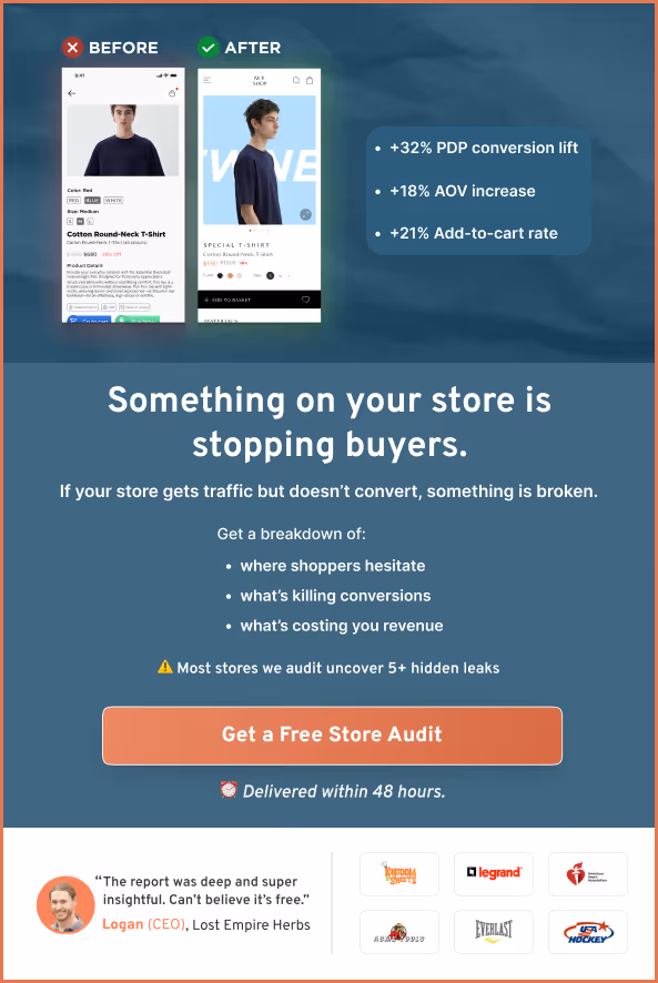
98% of visitors who visit an eCommerce site—drop off without buying anything.
Why: user experience issues that cause friction for visitors.
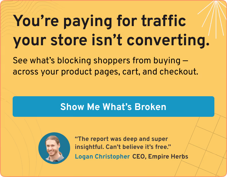
And this is the problem Convertcart solves.
We've helped 500+ eCommerce stores (in the US) improve user experience—and 2X their conversions.
How we can help you:
Our conversion experts can audit your site—identify UX issues, and suggest changes to improve conversions.
Subscribe for more articles like this!

Read by 5000+ ecommerce store owners
.svg)

.svg)

.svg)
.svg)
2026 Convertcart, All Rights Reserved
33/1, Castle Street, Ashok Nagar, Bengaluru, India