…because, well, without the right image optimization techniques, carousels would make no sense.
What is an image carousel?
There are various names used for image carousels such as web sliders and sliding banners. These are usually placed above the fold.
Based on their movement, image carousels can be static or auto-rotating.
Static carousel display comes with indications for navigation, for example, arrows on the left and right.
Auto-rotating carousel images move on their own, without manual intervention by the visitor.
Consistent challenges around image carousels
Most tests done by CRO experts prove that eCommerce image carousels are tricky.
Eric Runyon carried out a study to discover how image carousels performed on the Notre Dame website.
His study revealed that only 1% of visitors clicked on web sliders, be it static or rotating.
Out of this, almost 84% of them clicked on the first carousel banner slider.
The rest 16% was divided among the other 4 sliders (roughly 4% each in that case).
Nielsen Norman Group’s research also revealed something similar.
They carried out a usability test where they asked a user to spot a special deal on washing machines on the Siemens homepage.
The result: the user failed to spot the offer in spite of the offer being placed in a prominent position i.e. the first slider in the image carousel.
There are several other experiments that have been carried out to test the effectiveness of rotating banners.
Every single one of them points to the following challenges users face while navigating eCommerce image carousels:
a) Image carousels are too fast
Psychologically, the eye is receptive to movements.
Thus rapid movements can distract the eye from registering messages.
So, auto-moving sliders increase the chance of the message getting missed.
Even if a user is interested in the information on one slide, it changes so fast that they may end up failing to register the information.
The auto-rotating sliders can also pose a challenge for people with disabilities.
This hampers carousel usability to a great extent.
b) They’re too many options
As the research points out, most often it’s the first image slider that gets the most clicks and views.
Using multiple sliders on your eCommerce websites can also lead to decision paralysis for users. T
oo many competing messages can compel the user to be overwhelmed and choose nothing in the end.
c) Image carousels can be confusing
It’s easy for users to miss them since they look like ads—this is known as banner blindness.
Moreover, automated sliders can also shock users since they’re not aware of when the sliders will switch.
Carousel navigation can also get difficult when there are no specific arrows pointing towards a movement. This makes users feel a lack of control and ends up in poor carousel interaction.
However, they may be placed in different locations in different slides. This can severely impact the image carousel conversion rate.
d) Image carousels are bad for site speed
If you have about 4–5 high-quality image sliders, it may get difficult for users to load the page.
Even a 1-second delay in page speed can lead to a 7% decrease in conversions. Hence large-sized eCommerce carousels are bad news for conversions.
e) Image carousels are not very responsive
Image carousels that are created for desktop work poorly on mobile devices since they’re not customized for vertical viewing.
This is again an example of a faulty carousel UX design since users will have to pinch and zoom to view the sliders. Or for the worst part, ignore them altogether.
11 friendly reminders for eCommerce image carousels
Now that you’re aware of the problems associated with using image carousels, let’s look at some reminders of how to use them better—if you feel you just have to use them.
1. When to use carousel sliders (and when not to)
You can refer to this checklist if you’re unsure about when to use carousel images on your eCommerce site, and when to give them a miss.
When to use carousel sliders:
When there’s a design need. A carousel display makes sense if the existing web design format is in alignment. For example, if you’re already following a format that resembles a timeline, a presentation, or a slideshow, you can go for a slider.
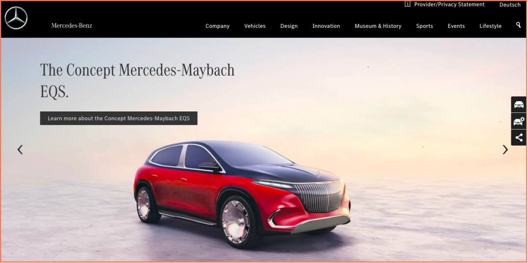
When it saves time and effort. If you’re using carousel images to save visitors time to explore the whole website, then you’re on the right track. Here’s an example of how Mercedes Benz uses their rotating banner—it comes with ample manual control and features precise product information. The side buttons—featuring the configurator, the product page, and a share button—enhances the banner experience a little more than usual.
When it helps users compare products. If the carousel banner enables viewing a range quickly where products are showcased in a way comparison becomes easy, then that’s great. Showcasing specifications, technicalities and other product information is a good enough reason.
When the layout is mostly visual. Adding rotating images to your website can be an advantage when there’s not much text and users can simply focus on the visual element. Check out this carousel example from Reebok. It has ample manual control apart from being largely visual with minimal text.
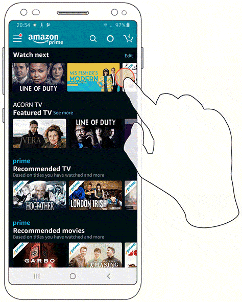
When it helps in cross-selling. Want to suggest complementary products to customers to increase their average order value? This is how Amazon uses carousel banners to offer relevant product recommendations.
When not to use carousel sliders:
When it’s central to the homepage. It’s often not a good idea to make an image carousel the hero of your homepage. Users find accessibility and readability a challenge. Image carousels can cause brand confusion on top of that.
When you’re featuring an article. Too many sites that rely on the click-bait approach have articles lined up in the form of a carousel. And you don’t want to be known for something like that.
When you’re making your business your priority. And when you’re less interested in what your users will experience in the process. Meeting just your business needs through an image carousel is a bad idea.
When you’re creating a repository of all your products. There are other ways to do this. An endless rotating banner where all your products are dumped could lead to a negative carousel interaction you wouldn’t want to be known for.
2. Don’t autoplay image sliders
Automated image sliders may not be as full-proof as you thought them to be.
Science has proven that the human eye involuntarily reacts to any form of movement—this results in distraction.
Interestingly, the US Army funded a research that tried to analyze the extent to which motion distracted people from focusing on a task.
The end result: people miss the original message. Suppose a visitor lands on your website and pauses on the carousel display.
Just when they’re trying to focus on the offer or the promotion, the carousel slider moves.
Hence their attention focuses more on the movement than on the message.
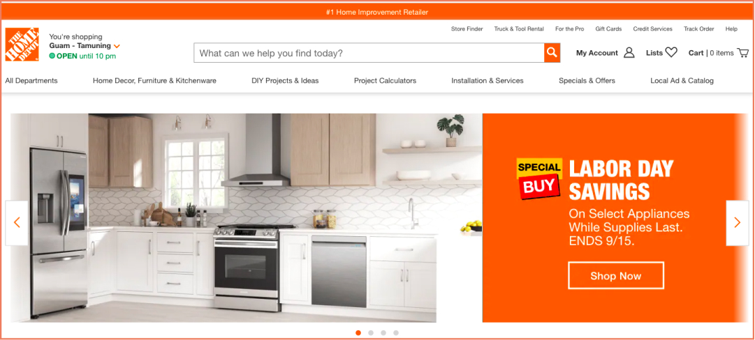
In the following example, Home Depot eliminates this problem by offering complete manual control to users with the arrows and the small dots.
3.Offer them slider control instead
Now you know how frustrating autoplay sliders can be.
Offering them manual control is the ideal antidote for the annoyance that auto-moving sliders can cause.
Here are a few ways to offer carousel slider control to users:
Use right and left-pointing arrows indicating the direction in which the sliders move. These may be placed either on the sides or below the carousel display.
Create dot navigation that visitors can use to choose which slide they want to view. They can be hollow by default and be filled to indicate the current slide. Dot navigation also helps in indicating the number of slides present.
Want to choose something even more creative while still offering control to users?
Check out this carousel UX design example from Harvard's Graduate School of Design.
Offering control back to your customers bodes well for your business.
When users have higher control, they can take more time to absorb information and take decisive action.
4. Touch-friendly sliders are a thing now
When it comes to mobile image carousels, responsive design is a must.
This is essential because you’re trying to put the user at the center of the browsing experience.
Here are a few points to remember when going for a responsive mobile carousel design:
Make manual control the focus once the user is already scrolling through the carousel.
Introduce new items in batches one row after another so that the user has to click less.
Make the process of browsing intuitive for the user—showing the number of rows on the carousel and where the user is currently, helps.
When talking about mobile carousels, it’s impossible to miss the file formats.
If you want to achieve shorter loading times and faster selling, .SVG files is the way to go.
There are a bunch of reasons what makes .SVG files a preferred format for mobile carousel design.
For one, the file sizes are small which makes them automatically easy to load.
.SVG files are also interactive making it easy for developers to introduce complex animation.
Finally, the vector nature of .SVG files ensures they are not resolution dependent, making them ideal from standard monitors to swanky smartphones.
With progressive web apps slowly gaining popularity, using .SVG files for mobile image carousels can be ideal.
6. Avoid banner blindness with visual clarity
Even if you’re choosing to go with an image carousel, make sure you make visual clarity the top priority.
Remember that the human eye can focus on only a few elements.
Hence toning down visual clutter can help visitors focus on the action more.
Keep your content ultra-specific and your UX design less flashy.
Making it more interactive also has proven to increase engagement.
Finally, keep an eye on the size.
Ensure that the product images, fonts, and widgets are smaller in size, otherwise, they may take up too much space and look cluttered.
Here are a few tips to keep in mind:
Strike a balance between visual and text
Make sure the text is stating what it really means
Limit the number of features per slide
Stick to one message per slide
Ensure your bigger brand idea gets built across the carousel
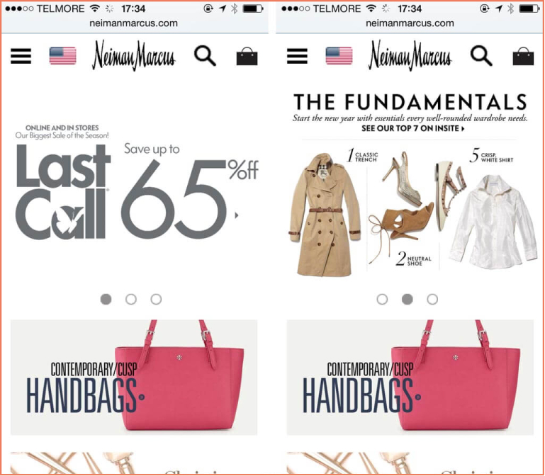
Check out how Neiman Marcus cuts down its desktop elements on mobile for a better responsive experience.
7. Use 5 or fewer slides
When you limit the number of slides on your rotating banner, it ensures chances of higher engagement from users.
The reason is simple: beyond 5 slides, people will begin to lose the narrative that you’re trying to create through the slider.
If the slides can repeat all over again after a point, then that’s the best-case scenario.
Take a look at how Ralph Lauren does it—combining video and image in a carousel with just 3 elements playing back to back and then repeating.
The bars at the bottom of the carousel indicate the user’s progress and the pause button on the left allows the user to stop at any time.
8. Consider carousel slider SEO
Carousel sliders are also important areas that Google crawls. Ignore this and you may lose out on coveted search positions.
2 aspects of image carousel SEO that you should consider are H1 tags and readability.
Considering the H1 tags are the most visible title on a page, it’s important that your rotating banners carry distinct tags.
Google reads these tags and then decides page rankings.
This means if your H1 tag is duplicated across a single slide, the search engine won’t know which to pick for efficacy.
And then there’s readability. The point is to keep the text crisp so that it’s understandable and actionable.
Anything more could be potentially annoying for the user. Using clear CTAs that indicate the next steps without confusion is a good idea.
Here’s an example from Williams-Sonoma. See how the font size is way above normal that makes it difficult to read?
Moreover, the proportion of the text to the banner is skewed. The font size is also bigger than the CTA which doesn’t help.
All in all, there’s too much happening in the banner for the visitor to register any information.
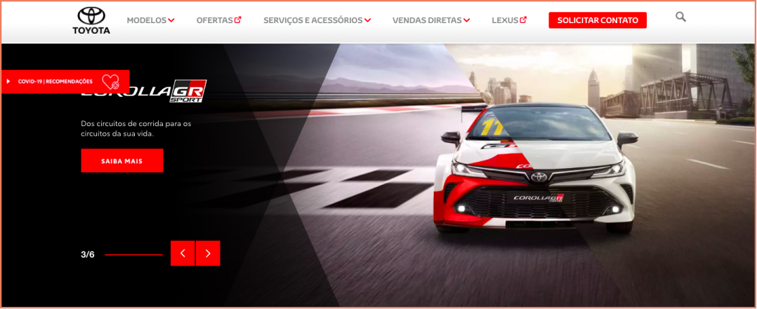
9. Show a progress bar
Introducing a progress bar into your carousel design can turn out to be lucrative.
It makes sure the user is not left hanging or wondering what is coming up next.
A progress bar offers more control to the user, provided it’s displayed in an intuitive way.
For example, you should avoid displaying how many items are there in total (as in displaying 1-5 of 20). Instead, you can simply display the number of rows and which of them the visitor is on (as in 1 of 10).
Check out the Toyota Brazil homepage example. Apart from distinct scroll buttons, the website also features a numbered system for easier recognition.
10. Some more points for mobile image carousels
It’s important to remember carousels don’t behave on mobile sites the way they do on desktop sites.
This will need you to make space for certain factors that work differently in mobile factor, and these include:
Choose gestural control over pagination control, leaving out start/end and next buttons.
Employ the partially visible feature so that users know something is coming up next, whether your carousel is vertical or horizontal.
Use special care to decide what should feature around the carousel so that users find navigation easy.
Make sure labels are easily readable, especially when they feature beneath thumbnail images.
See how ToysRUs clearly labels navigation instructions below the carousel?
11. Use large scroll buttons
Even if you’ve designed a rotating banner with all the right elements, without large-enough scroll buttons it might not fly.
A simple yet distinctive scroll feature can easily indicate to users that there’s more they can discover if they keep going.
You can use them to various ends like tell a story or lead them to a CTA.
Just as Ikea does it.
It maintains a certain continuity with its distinct scroll buttons that match the slide design.
If not carousel images, then what? Here are 7 unique alternatives
Well, now that it’s proven that image carousels can have a bad effect on user experience, let’s look at their alternatives:
1. Using content smartly
There’s a number of other ways to bring sharp focus to what you’re trying to sell.
One of them is to use your content to speak directly to your target audience.
This especially works if you’re catering to multiple personas. It not only offers a clear messaging but also leads to customer satisfaction.
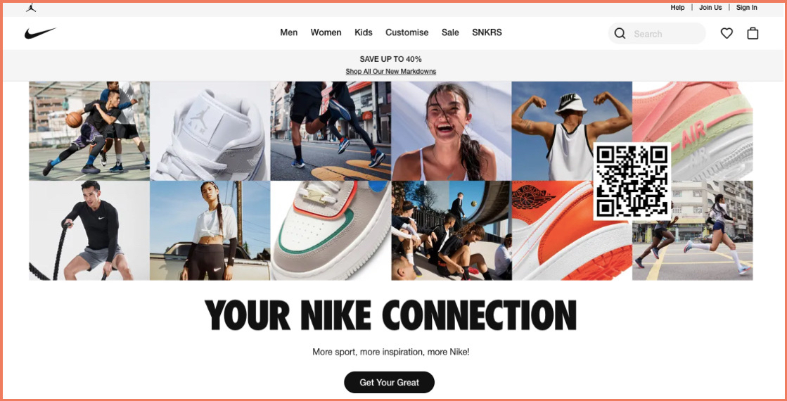
Here’s how Nike does it. They use the primary section of their website to build social proof.
2. Use the space to communicate your value proposition
When you do away with carousel banners, you also do away with the need to cram all your information above the fold.
Check out the Lighthouse Brewing Co.’s homepage and you’ll realize how they best utilize space to communicate their USP and entice visitors to read ahead.
Why should the hero of the homepage only be an image carousel?
What if you used the space effectively to bring your brand’s or a specific product’s value proposition a little more alive?
Check out what Frank Body does to know what we’re talking about.
The product benefit is highlighted in simple and clear language with a compelling CTA.
3. Build content blocks that lead to separate segmented homepages
Considering image carousels don’t really do justice to elaborate textual content, content blocks are an option.
When clicked, these could lead to separate homepages for different segments of your audience. (Looking to know more on how you can convert through your homepage? Read this.)
A great example of this is when your customers hail from different countries. You can use the content blocks to lead them to their local sites.
A great way to attract as well as track website traffic!
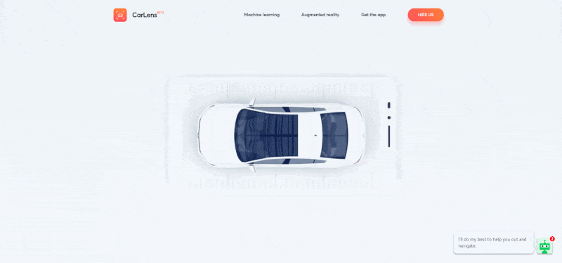
4. Experiment with video
Want to add some interactivity and motion to your site? You can experiment with video and GIFs in that case.
They not only grab your visitor’s attention but also add more perspective to your product offerings.
This is how CarLens uses its space to communicate product features with video animation.
5. Promote your offers
Have some recent offers you’re running? Then your homepage is the best place to showcase them.
You can promote your year-long discount or the latest offers here.
You can also keep updating the section to include special seasonal offers such as holiday season discounts or Black Friday deals.
Make sure it doesn’t clash and multiple offers don’t end up confusing the visitor.
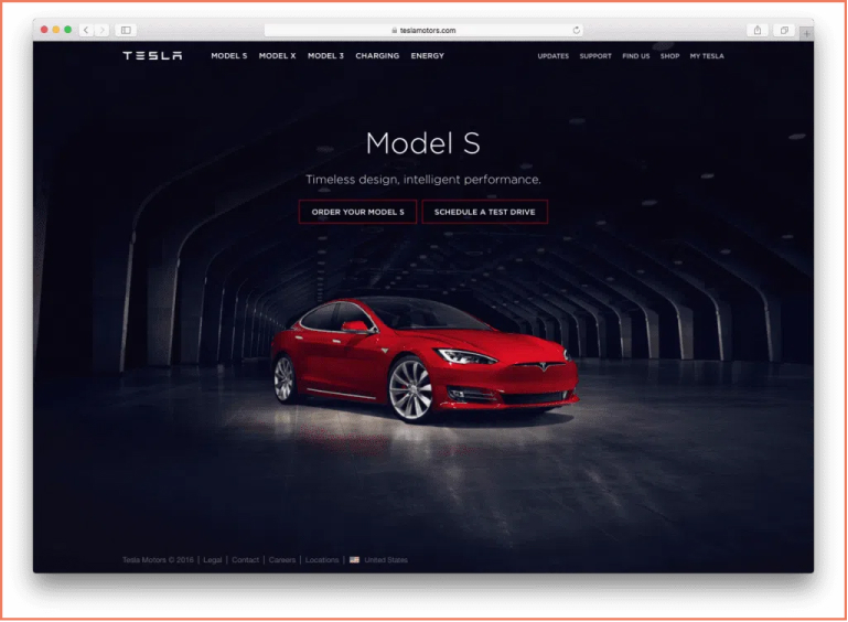
6. Showcase your products
Want to showcase your top-selling products? That’s a great option for this section.
Instead of waiting for your visitors to discover them through navigation, why not feature them right where they see it first?
Check out Tesla Motors keeps its homepage section focused to promote its latest car model.
7. Add some personalization
Personalizing your visitor’s experience will always lead to positive conversions.
There are several ways you can add personalization to your homepage section instead of image carousels.
For example, you can add a hero image that features your latest collection. Like H&M does.
You can also add some personalization with site search.
Replacing carousel banners with a search option is a great way to personalize the visitor’s shopping experience right from the start.
BONUS READ:
11 ready reminders on image optimization (+ instant takeaways)
eCommerce image optimization refers to any action you carry out on improving the user experience and SEO of your store pictures.
It could have to do with:
Adding descriptions
Improving the quality of images
Reducing file size
Or even using the right file type
And it is integral for any eCommerce business to understand this aspect, whether they intend to use image carousels or other methods.
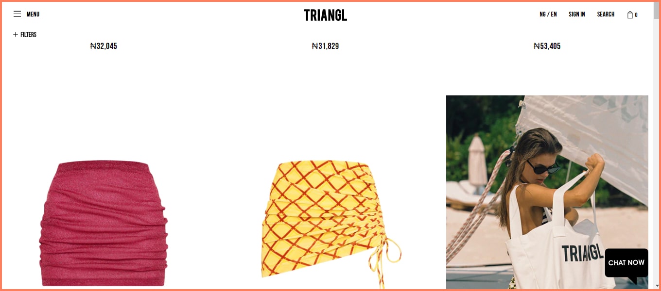
1. Customers need contextual images
The importance of high-quality product pictures can’t be undermined.
However, beyond image quality, providing context is very helpful to your customers.
For example, if you’re selling a bag, a picture of a model wearing or using that bag helps your customers see themselves with that product.
See how Triangl achieves this whenever you hover on an image listed on their category page.
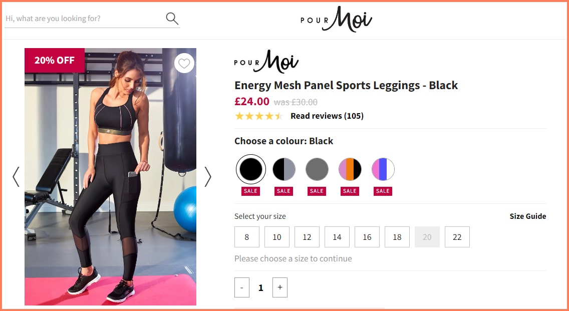
In our example below, Pourmoi does an excellent job of selling these leggings by showing them in use.
Rather than describing the pockets this product has, they show you a practical use case of this feature - how you can keep your phones in during a workout.
Key Takeaways
Always show your products in use, especially in situations/events they were designed for
Merge solo shots and context shots on your product page for a more varied view
Introduce user-generated images to show off real-life customers who wear or use your product
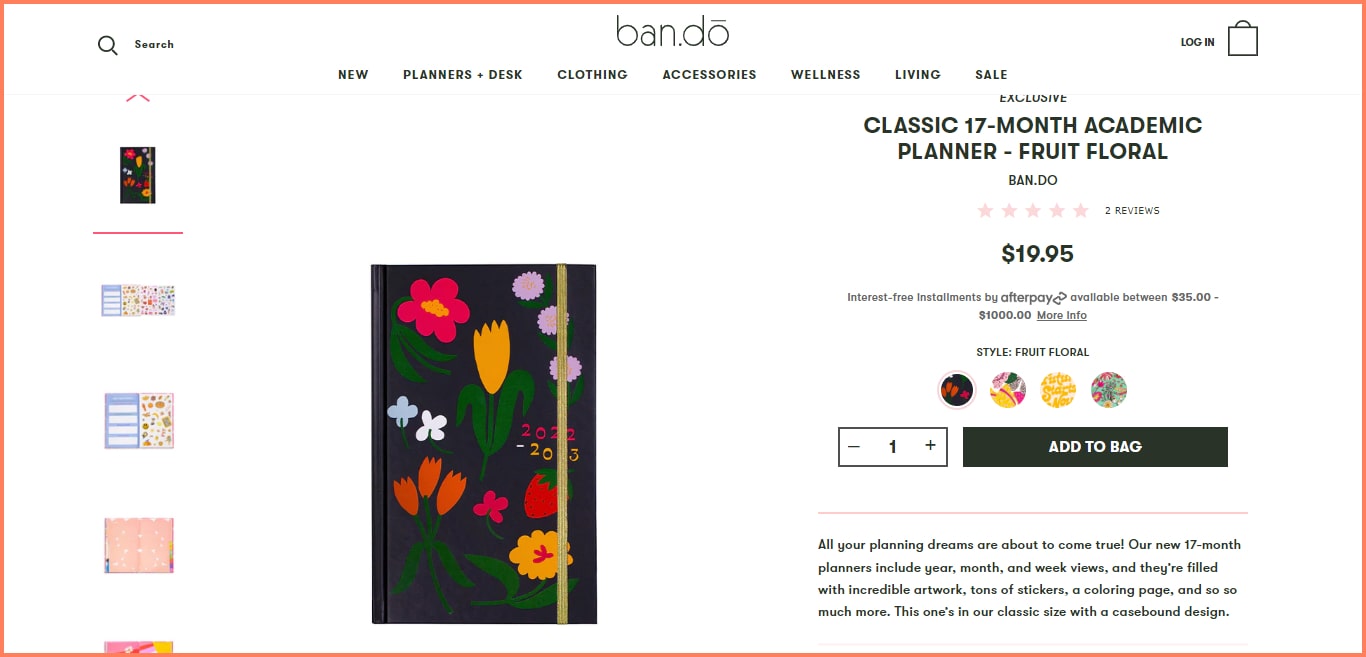
2. Thumbnail images DO NEED optimization
Thumbnails are a great way to show your customers that there are multiple pictures across the site.
In fact, an excellent tactic to improve product page SEO and conversions is by optimizing thumbnails.
The first thing to do is to ensure that these thumbnails are showing several variations at a glance.
Your customers can then see different aspects of that product by clicking on them.
Bando automatically shows the bigger image once you hover on a thumbnail.
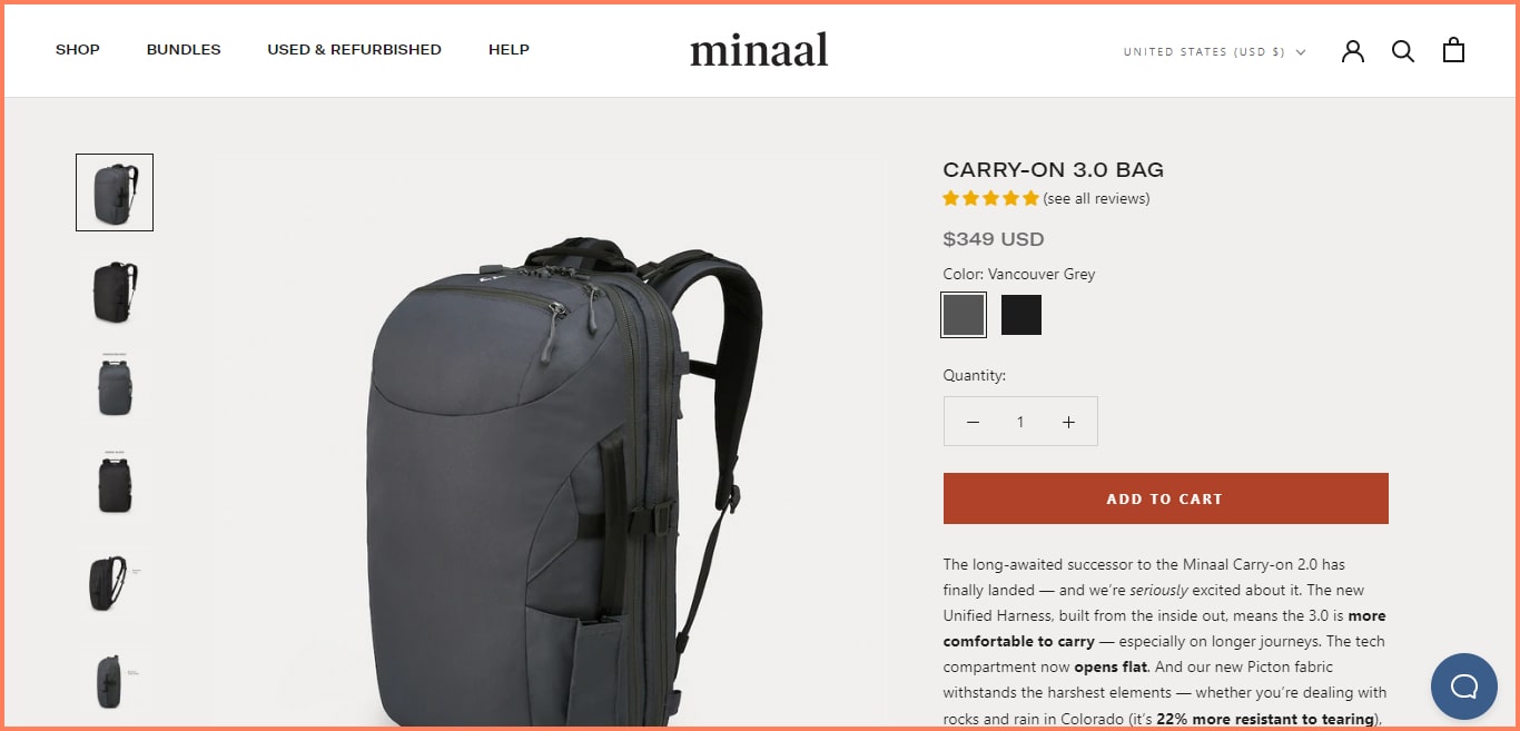
Next, you want to place them in a strategic location that is visible yet not distracting from the main image. See how Minaal does it in our example below.
You also want to give them different alt attribute text from the bigger versions. You don’t want a case where there are duplicate texts.
If possible, we recommend skipping alt text on thumbnails altogether.
Why? So that they don’t steal attention away from the actual product images.
Finally, ensure that your thumbnail file sizes are super small so that they do not affect your page speed over time.
Key Takeaways
Let your thumbnails show different angles or variations in one glance
Ensure you use small thumbnail files to avoid long load times
Limit alternative texts to main images so your thumbnails don’t rank on search engines
3. Augmented Reality can bring out the best
Many store owners have the misconception that AR is just one of those trends.
And although it’s partly true, AR significantly helps users improve their shopping experience.
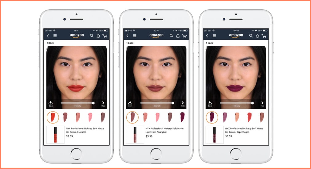
For example, in Amazon’s partnership with L’Oreal, customers can find the right lipstick shade on the app with AR.
Users have the option to either scan a picture of their face or use a model’s visual with their exact skin tone to match.
With AR, a customer can see what a piece of clothing or accessory would look like on them.
So once they point a camera to whatever they are purchasing an item for, they can see a digital overlay of the product and decide whether it fits or not.
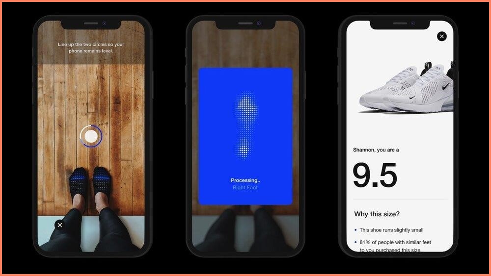
See how Nike recommends a shoe size for its customers in its mobile app.
You can integrate AR into your store with popular AR studios like Spark and Shopify AR.
To successfully create your product AR, you’d also need a 3D visual of the product and specific measurements.
Key Takeaways
Integrate your store with AR via Shopify AR or Spark
Offer realistic AR-generated models to test with - not all customers want to scan their home or body
Suggest recommendations to help customers make a more informed decision
4. Images need to be optimized for mobile experience
The images you use for your desktop version cannot be simply tweaked for mobile.
Many store owners tend to focus on just resizing one image for several screen variations but mobile image optimization goes way beyond that.
Your user experience has to reflect the mobile experience.
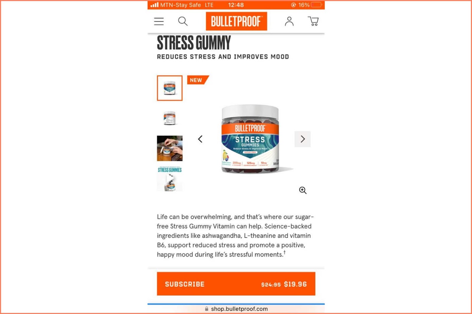
For example, see how BulletProof hasoptimized their mobile experience in such a way that the image doesn’t take up the entire page and there’s enough room for other elements.
For a heightened mobile experience, you’d typically need to see if users can scroll without getting stuck on an endless image loop.
Ask the following:
Can they pinch and zoom?
Are the thumbnails easy to tap?
And have you allowed easy swiping?
The answers to these questions will help you push your mobile experience forward.
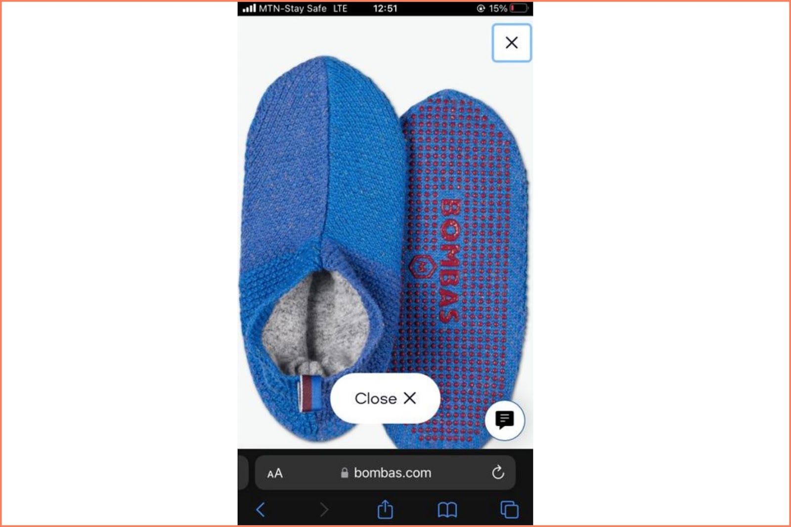
See how Bombas offers a clear pinch and zoom for customers who’d want to view product specifics.
Key Takeaways
Resize image resolutions for a more responsive mobile view
Ensure that your elements are properly placed and that there’s room for thumbs
Enable pinch and zoom for mobile so users can see the details of your product images
5. 3D images add depth to the shopping experience
3D images come to the rescue when customers want to see a product image in a 360-degree view.
95% of customers prefer an interactive 3D representation instead of video playback.
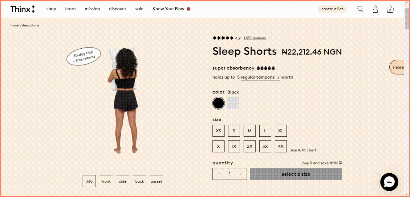
In our example below, Thinx offers a 3D and 360-degree view of models wearing the product so you can picture it from all angles.
You might also prefer to render all close-up shots to get the perfect 3D image for your store.
These types of shots are typically:
On a white background
¾ image view
Hero shot, front, back, and side view
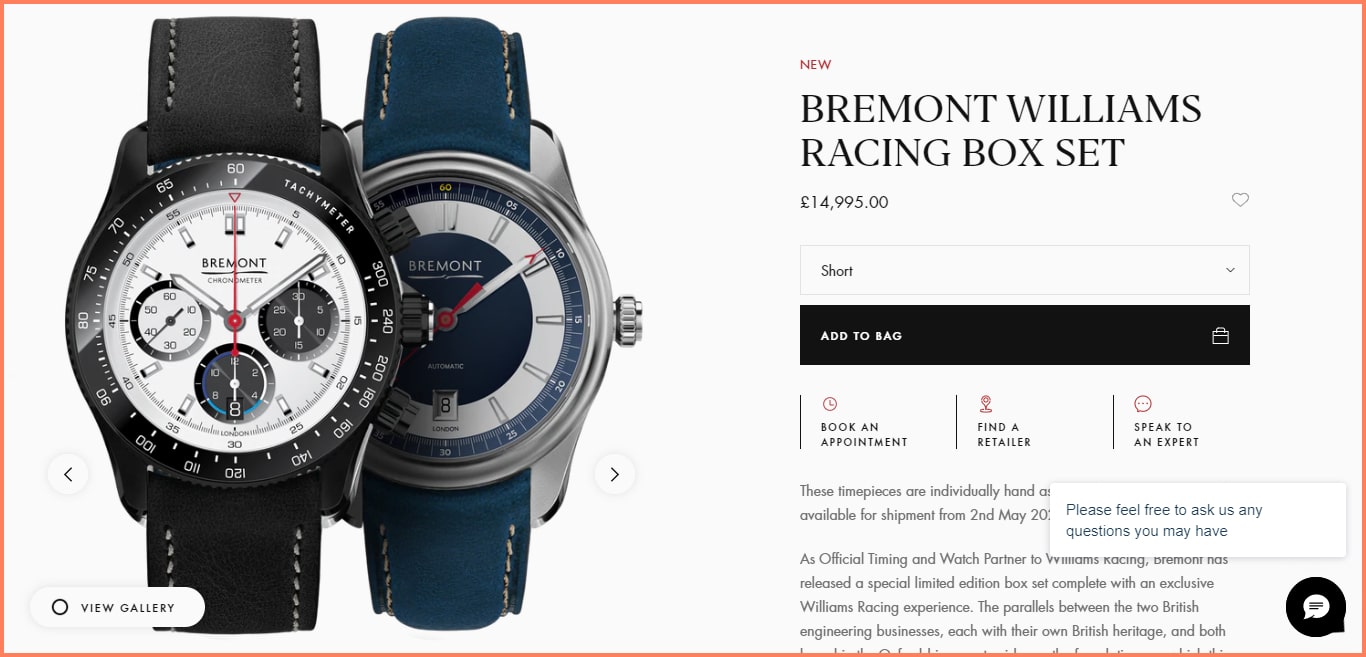
See how Bremont already attracts its audience with this close-up, almost 3D-like image
These types of pictures may not be exactly functional for low-ticket items like a T-shirt but are perfect for high-value products like a sofa or furniture that need a little more push.
Key Takeaways
Replace video playbacks of your products by sharing 3D images
Contact a 3D rendering service to generate 3D product images
Take up-close shots in a white background to help with the rendering
6. Varied product images help draw attention
As we discussed above, customers love to see a lot of pictures.
Sharing varied product images helps to provide a richer user experience.
For one, they can see all angles of your product and become better aware before they decide on a purchase.
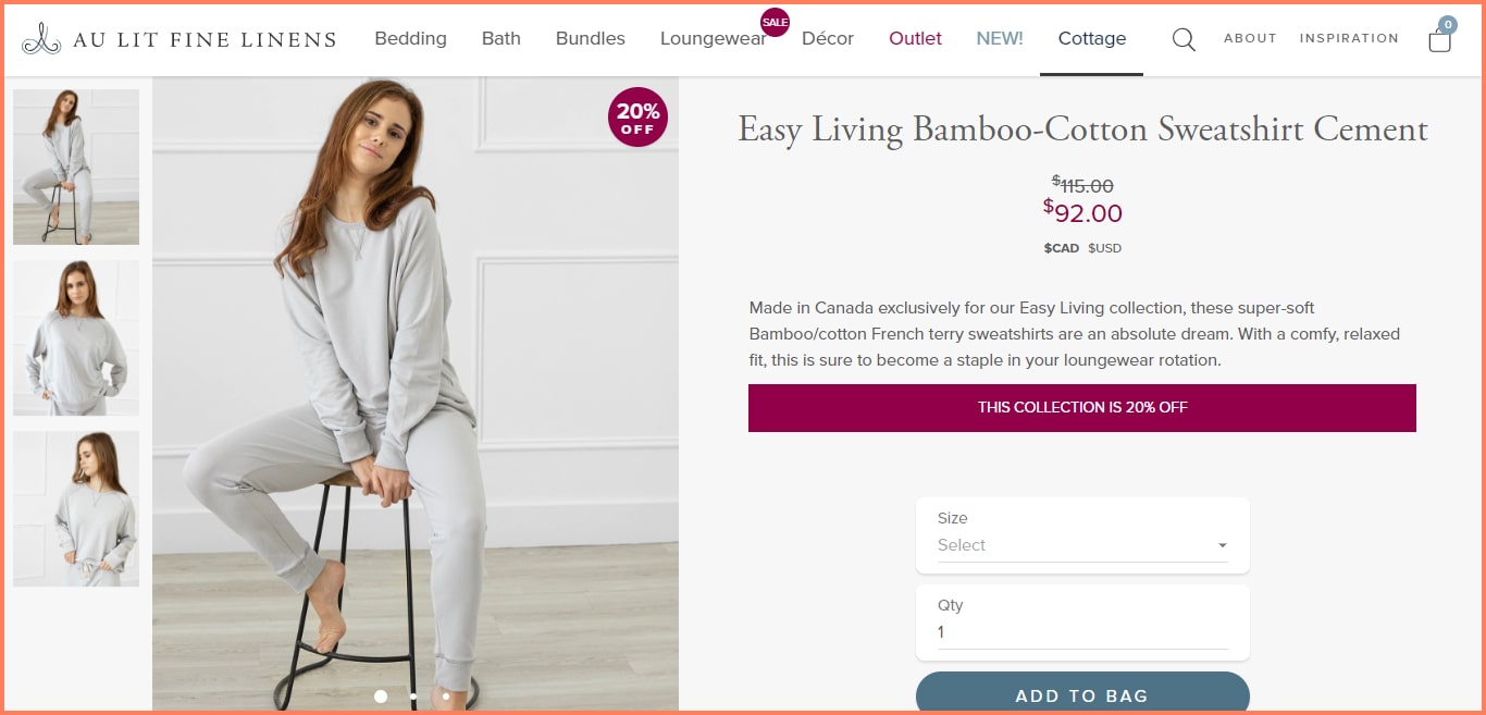
For example, Au Lit Fine Linens shows (in one glance) different images available. As you see there are only three.
And that’s because too many images can cause shoppers to jump off.
When curating your images, ensure you have several types which would surely include:
One standalone product image
A close-up shot of the product
The product in context either by a model or a customer
A side view of this image
Images that depict all the color & style variations available
See how NCLA does it in this example below;
Key Takeaways
Share multiple images to show off different angles of your product
Ensure that these images are between 3-5 so they don’t cause shopping fatigue and endless scrolls
Make room for the different variations you have i.e colors or patterns
7. Swipeable (rather than tappable) images ease UX
The amount of physical and cognitive effort it takes to tap an image is lesser than swiping across a carousel.
However, your customers have a higher chance of seeing your entire range of product images while swiping than manually tapping on each thumbnail.
So, incorporate a carousel-style. You’d also want to let your users know that this section is a carousel. This means adding directional cues to nudge them into swiping.
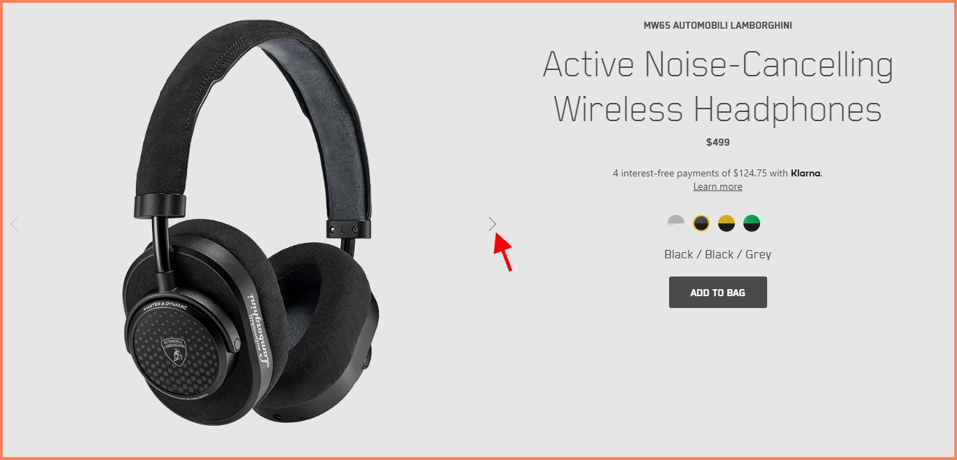
For example, Master Dynamic uses directional cues to show users that they can swipe left to see more images.
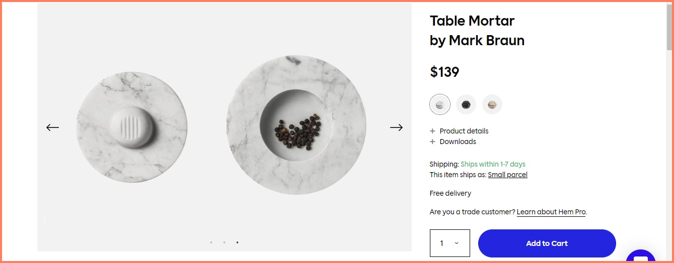
We also recommend using breadcrumbs to show how many images are left during the swipe. This way customers know how long more they have to swipe.
Hem adds this along with its directional arrows. You can see the three dots below the product image.
Key Takeaways
Use a carousel-style to showcase multiple images so it's easy to swipe through
Add directional arrows so your customers know where to swipe and when to stop
Add breadcrumbs to show how many images/swipes are left
8. Consistency in look and feel across products helps
Low-quality images leave a terrible impression on your store.
This is why in addition to using high-quality images, you need to have a consistent look and feel that convey the spirit of your brand.
Visual inconsistencies can cause uncertainty. This can make your customers skeptical about whether or not to get the product.
Start by ensuring that your product images show the exact variant and sizes available. This experience should be the same for both web and mobile versions of your store.
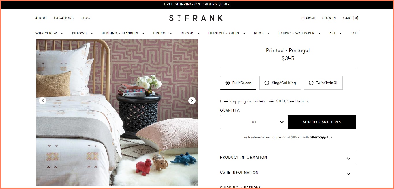
For example, see how St. Frank conveys a homely feel across their product images as a handcrafted product brand.
A great way to provide consistency is by ditching stock images.
Instead, you should optimize your images for trust in the following ways:
By consistently using the same models
By having a brand aesthetic for stand-alone images
By using customer-generated images of using the product
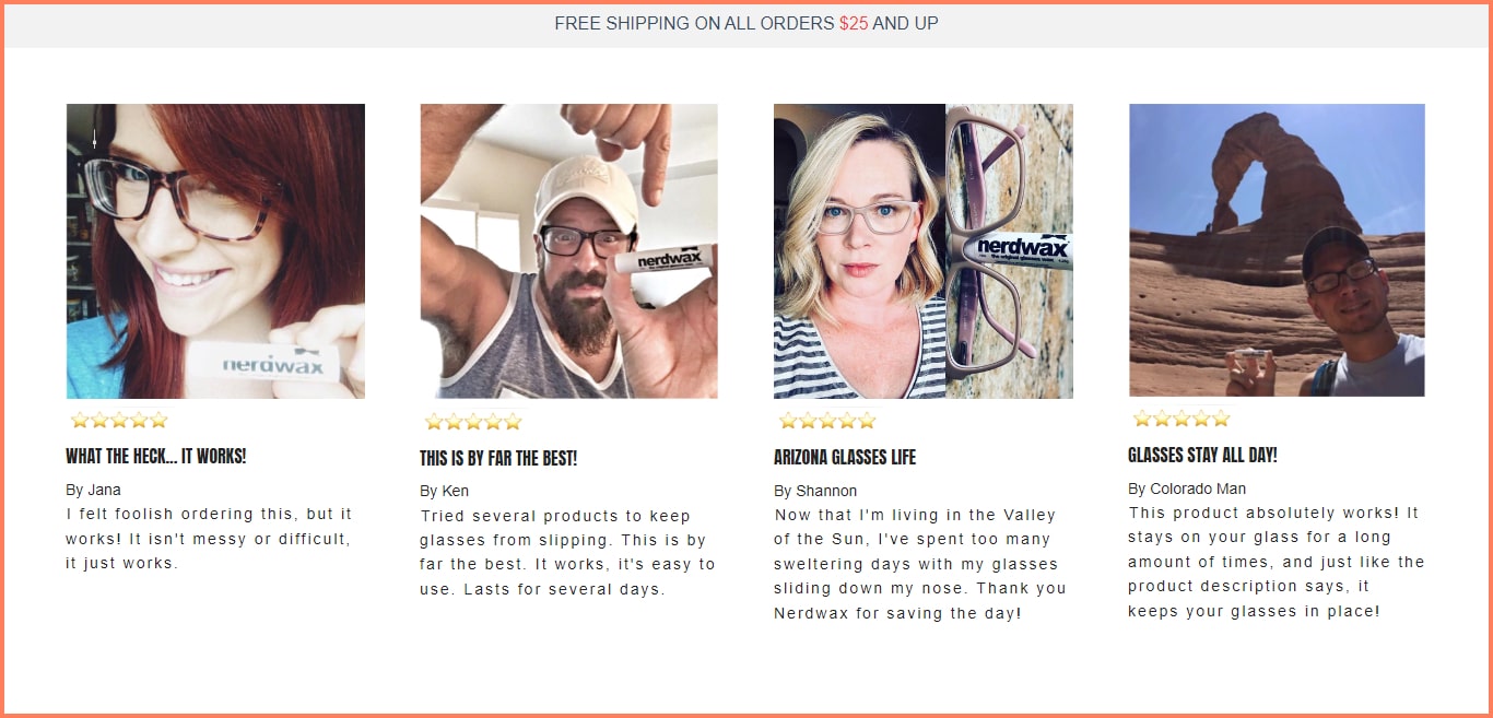
In our example, see how Nerdwax shows off its community with user-generated images.
Key Takeaways
Ditch the stock images and use purposefully shot pictures instead
Use images that immediately show your brand personality and story (we recommend using the same photographer or brief)
Let your product images show the exact variant you have in store to prevent high returns
9. Lifestyle photography helps in creating emotional connect
Product photography is popular because it gives the customer sufficient information about the product.
Lifestyle photography further helps by appealing to user emotions.
To build the true value of your products, you need both product and lifestyle photography.
That way, you can evoke emotions in your customers and sell an aspiration through your product.
When shooting for lifestyle photography, focus on the details of what you’re selling; from the models to the environment.
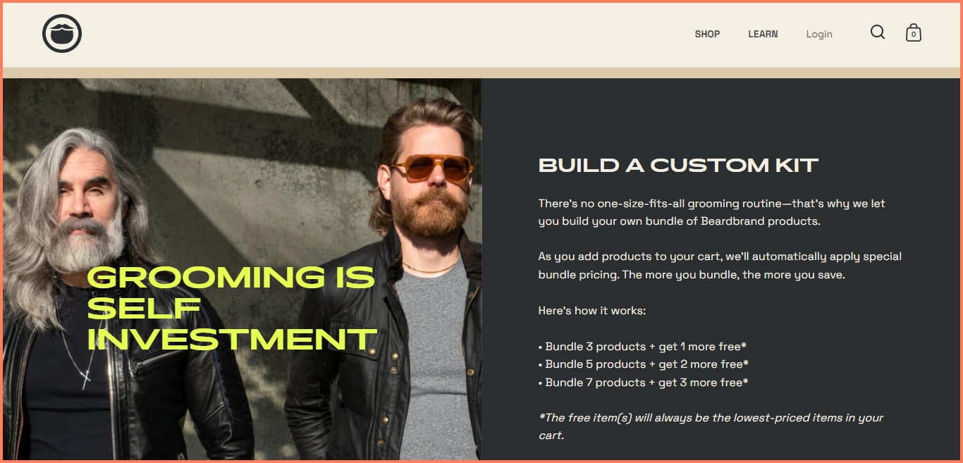
In our example, Beardbrand sells the lifestyle of being cool - no matter whether the customer is young or old.
Biko also does an excellent job of complementing the product description by providing a calm and slow lifestyle through the depicted images.
Aside from excellent lighting, the flowers and details of this image make it a good lifestyle image to emulate.
You can also see from the thumbnails that this image is accompanied by standalone product images.
Key takeaways
Pair lifestyle photography with product photography for optimal results
Tell a story through your pictures to evoke emotions like admiration, happiness or excitement
Focus on the details of your environment and the model to sell better
10. Align your product images with your brand essence
While selling your brand through product descriptions is a great way to start, pictures are a more effective method to explore.And since humans are visual beings, the essence of a brand can be processed more easily through images.
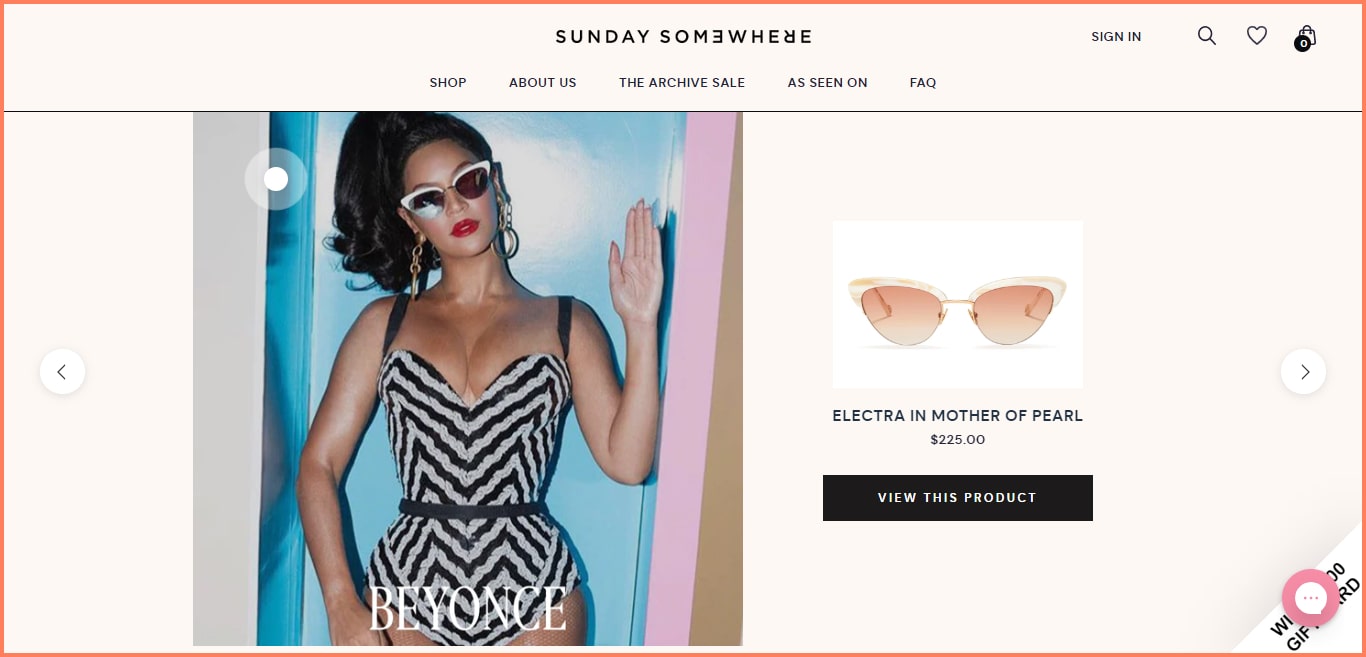
SundaySomewhere, for example, doesn’t even spend much time explaining the product.
By showing the famous Beyonce as a model, they’ve already explained that they sell luxury.
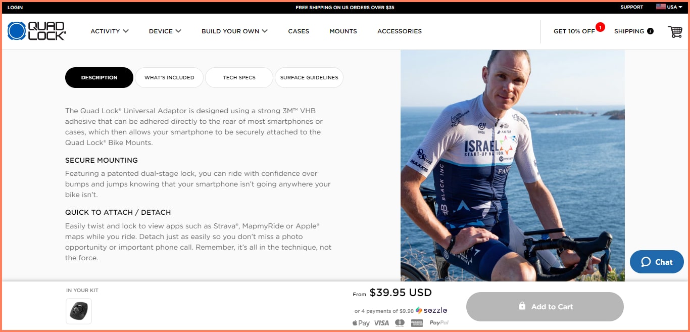
In another example, Quadlock complements its product description by showing British cyclist Chris Froome securely mounting a bike.
So apart from positioning themselves as a fitness brand, the photo helps build trust.
Key Takeaways
Communicate your brand through your product images
Use models that reinforce your brand stance; e.g athletes for a fitness brand or a celebrity for a luxury brand
Complement these images with solid copywriting to drive home the story
11. Align your images with your product description
The good news is that visual elements complement listed features & benefits.
If your customers are able to skim through a bulk of text and see a corresponding image, it brings them a step closer to your product.
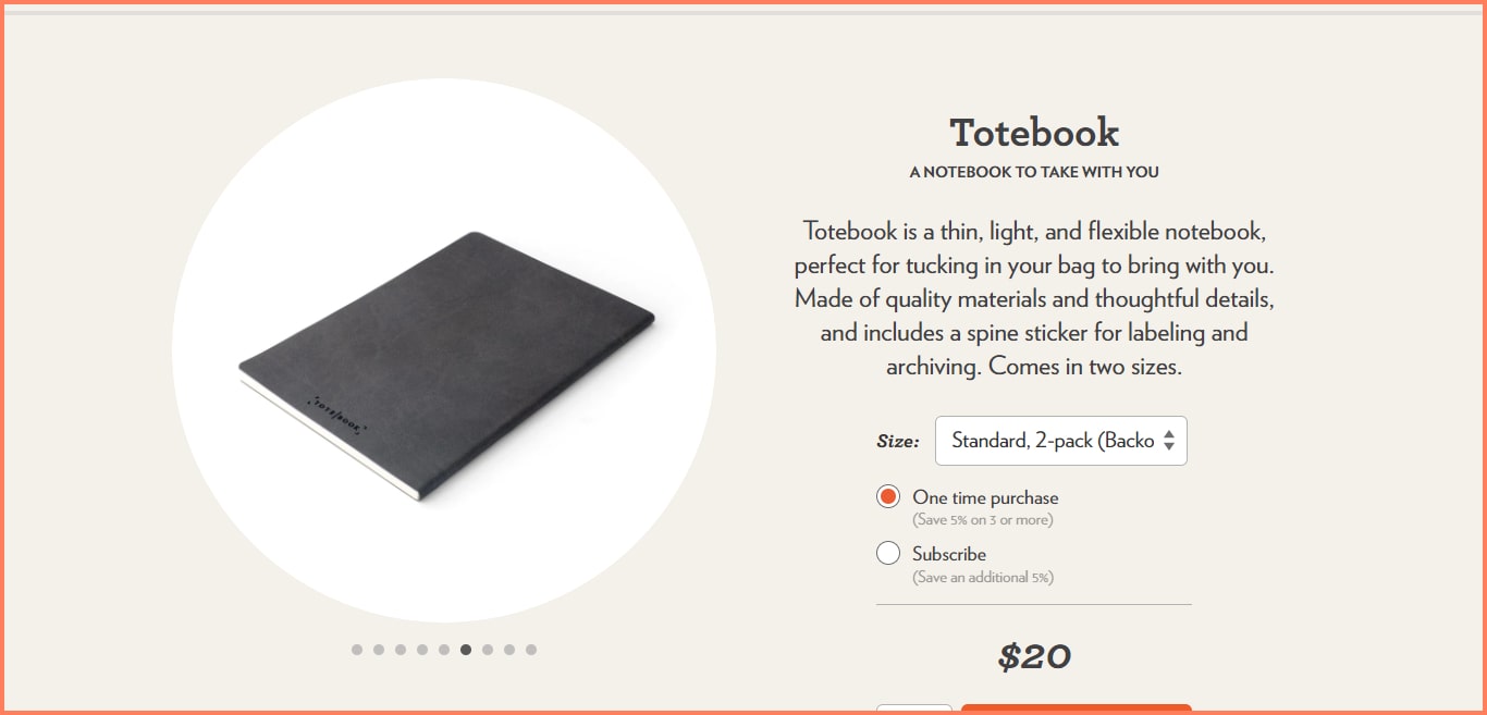
In our example, Studioneat sells the Totebook as a slim and light product. The image corroborates that reference by showing off the product’s slimness.
You can also create a deeper reference by showing close-up images of the features you’re referencing.
Key Takeaways
Complement product descriptions with images that reinforce said features
Always use close-up shots to depict the details you’re trying to communicate
Image Carousels: Still a good idea in 2022?
As we’ve seen, image carousels are a big deal.
They can show products from different perspectives, highlight special offers, and even drive sales based on segmentation.
Automatic rotation can make the user lose interest and not interact with the carousel.
Banner blindness is real: information in the header often gets ignored.
Users with low literacy or international origins may read too slowly to grasp the content.
We love how Depesh Mandalia put this in an interview with eConsultancy:
“One focused banner message will drive higher CTRs than a few unfocused banners. Serving 100% of your visitors is near-on impossible without knowing something about them yet there seems a self-persuasion with content managers that more choice is good = more clicks = more sales. It doesn’t work that way.”
Summing it up,
Image carousels CAN be ineffective at actually converting visitors into paying customers.
Your visitors are on your site to shop, not to watch a rotating carousel of images. The carousel is likely to take their attention away from your products and your calls to action, leading to fewer sales.
If you have a carousel of images on your site, it's also important to ensure that they're accessible to everyone, including those with disabilities.
This can be a challenge, as carousels are often not designed with accessibility in mind.
Image carousels CAN be bad for SEO.
Google's algorithms do not give weight to images in carousels, so they will not help your website rank higher in search results.
Additionally, image carousels can slow down your website.
If your website is loading slowly, users are likely to leave before they even see your carousel.


.svg)

.svg)

.svg)
.svg)
