A product listing page (PLP), also called a category page or, on Shopify, a collection page, displays multiple products from a single category or collection. It sits between your homepage and your individual product detail pages (PDPs).
Most eCommerce teams focus heavily on product pages and checkout, but a large percentage of conversion loss actually happens earlier, on the product listing page. If users don’t find the right product quickly, they never reach the point of purchase.
The framework below breaks down the key elements of a high-converting product listing page and how each one directly impacts your ability to turn browsing into buying.
The Convertcart PLP Conversion Framework
Factor
Description
Impact on Conversion Rate
Supporting Data / Insight
Quick Win
1. Filter & Faceted Navigation UX
How easily users can narrow down products using filters (size, price, category, etc.)
Poor filtering leads to overwhelm, resulting in higher drop-offs before product clicks
~30–50% of users rely on filters on large catalogs; poor filtering increases exit rates significantly
Add sticky filters, multi-select options, and show result counts in real time
2. Sort-by Defaults
The default product ordering (e.g., popularity, price, newest)
Wrong default sorting can hide best-selling products, which lowers engagement
“Best-selling” or “recommended” sorting often outperforms “newest” for conversion
Default to “Best Sellers” or “Recommended” instead of “New Arrivals”
3. Product Card Design
The information shown on each product tile (image, price, reviews, badges)
Weak product cards reduce click-through to PDP, creating a bottleneck at the discovery stage
Adding ratings, reviews, and badges can increase CTR by 20–40%
Add social proof (ratings), quick-view, and urgency badges directly on cards
4. Infinite Scroll vs Pagination
How users browse through multiple pages of products
Infinite scroll increases browsing but can reduce focus; pagination improves intentional navigation
Infinite scroll boosts engagement but can hurt conversion if users lose orientation
Use hybrid: infinite scroll + “load more” + visible page position indicators
5. Above-the-Fold Product Count
Number of products visible without scrolling
Too few leads to low exploration, while too many results in cognitive overload
Showing 4–8 products above the fold tends to balance clarity and choice
Optimize grid to show 4–6 clear products on first view (especially mobile)
6. Mobile PLP Experience
How product listings behave on mobile devices
Mobile friction leads to high drop-off before PDP visit
Mobile often drives over 60% of traffic but sees lower conversion due to UX gaps
Use large tappable cards, sticky filters, and fast-loading images
7. PLP Personalization
Showing products based on user behavior (history, preferences)
Increases relevance, leading to higher product clicks and conversion likelihood
Personalized product recommendations can lift conversion rates by 10–30%
Show “Recommended for you” or reorder grid based on browsing behavior
What Makes a Good eCommerce Product Listing Page? (Weak vs. Strong)
A useful mental model: imagine two stores on the same street, selling identical products. One is chaotic, dim, and impossible to navigate. The other is organized, well-lit, and staffed by someone who actually knows where things are. The following table is the digital equivalent of that comparison.
Element
Weak PLP
Strong PLP
Filters
Generic (size, color only)
Specific and instant-updating (fit, material, occasion, rating)
Product images
Single static image
Multiple angles + hover secondary image
Social proof
None visible
Star ratings + review count on every card
Copy
Jargon-heavy, dense
Plain language, benefit-led
Pricing
Small, buried font
Bold, with crossed-out original price on sale items
Product Listing Page Checklist: Must-Have Elements
Building a product listing page is a bit like setting the table for a particularly large and fussy dinner party. If you forget the forks or heaven forbid, the napkins the whole evening feels slightly askew. Use this checklist before you launch any new PLP or update an existing one.
Keyword-optimized H1: Contains the primary category keyword. Clear, not clever.
Intro paragraph: 100–150 words, plain language, includes category keyword naturally.
Breadcrumbs: Visible, accurate, and clickable at the top of the page.
Intelligent filter sidebar: Specific filters, instant updates, sticky on scroll.
High-resolution product images: Consistent lighting and backgrounds. Secondary image on hover.
Star ratings on cards: Visible below the product name, with a review count, and clickable.
Clear pricing: Bold, with the original price crossed out on sale items.
Quick View button: Styled distinctly from Add to Cart.
Scarcity/social badges: 'Bestseller,' 'Low Stock,' purchase counts — used sparingly.
Mobile-optimized grid: 2 columns on mobile, thumb-friendly CTAs, sticky filters.
Pagination: Clear numbered pages, or 'Load More' with paginated URLs.
Internal links: To related PLPs, subcategories, and featured PDPs.
Dynamic content: Location-based, history-based, or membership-based, where possible.
10 eCommerce Product Listing Page Examples (And What Makes Them Work)
What follows is not simply a gallery of pretty pages. Each example is here because it demonstrates a principle, something you can lift and apply to your own store. The structure, for each one: what they do, why it works, when to use it, and the key takeaway.
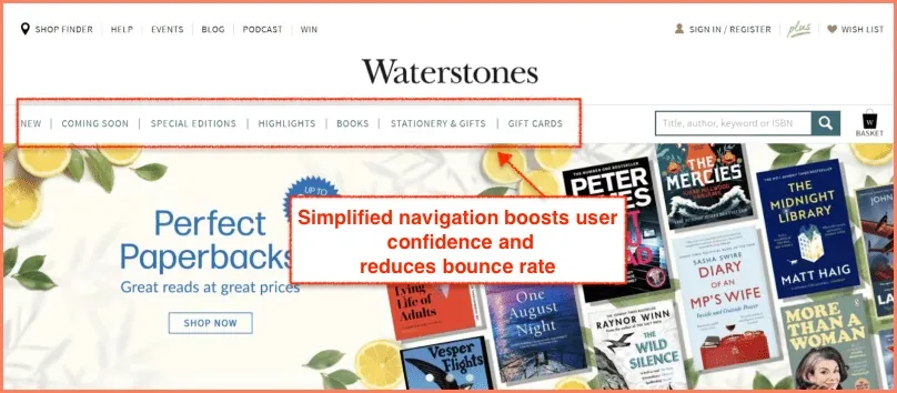
1. Waterstones — Make Navigation a Walk in the Park
What they do: Waterstones places product categories prominently in the main navigation, offers an intuitive search bar, and provides filtering by genre, format, price, and rating, all of which are accessible without leaving the listing view.
Why it works: Shopping for books is inherently exploratory. A shopper often doesn't know exactly what they want, just roughly the territory. Waterstones' navigation lets them roam without getting lost. Baymard Institute research confirms that visible category navigation significantly reduces bounce rates on category pages.
When to use it: Any store with a broad or deep catalog. If your products span more than four or five categories, structured navigation is not optional.
Key takeaway: Navigation is not just about getting shoppers to the right page; it is about making them feel confident that they can find what they're looking for. Confidence keeps them on site.
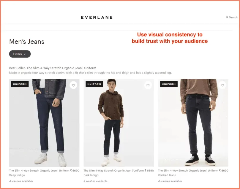
2. Everlane — Get the Product Display Right
What they do: Everlane uses a clean, consistent grid with carefully chosen background palettes. Every image changes on hover to show the product from a different angle or in a different context — but the transition feels seamless, not jarring.
Why it works: Visual consistency is trust-building in disguise. When everything on the page looks like it belongs together, shoppers spend less mental energy on the aesthetics and more on the products. The hover variation adds information without adding noise.
When to use it: Fashion, home goods, beauty — any category where the look of the product is the primary purchase driver.
Key takeaway: Everlane's grid is proof that restraint is a design principle. Three products per row, consistent lighting, purposeful hover. Nothing more than what's needed.
How do the best online retailers structure their product listing grids to maximize clicks and sales? Explore these real-world eCommerce category pages to borrow their UX tactics.
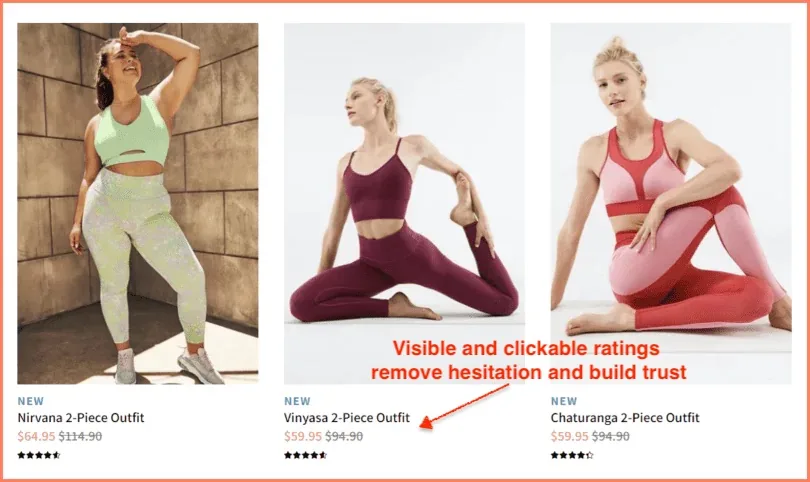
3. Fabletics — Leverage Social Proof Through High Ratings
What they do: Fabletics displays star ratings directly below each product name on the listing page, alongside the review count. Both are clickable, taking the shopper straight to the reviews on the PDP.
Why it works: Social proof short-circuits the rational deliberation process that makes shopping feel effortful. A 4.8-star rating from 3,400 reviews doesn't just signal quality, it signals that 3,400 people have already done the hard work of evaluating this product, so you don't have to. It is, psychologically speaking, a gift.
When to use it: Always. There is no category where social proof doesn't help. Even B2B stores benefit from it.
Key takeaway: Make ratings visible, clickable, and contextualized with a review count. A lone five-star rating from two people is not reassuring. Four-point-seven from two thousand is.
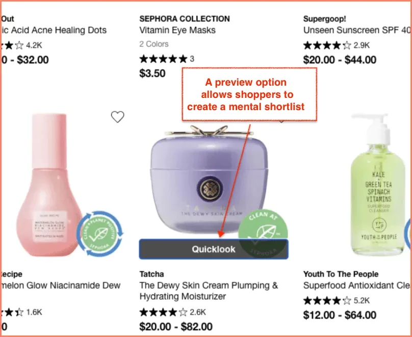
4. Sephora — Let Shoppers Take a Quick Look
What they do: Sephora's listing page features a 'Quick Look' button that appears on hover. Clicking it opens a detailed product overlay with imagery, shade options, a short description, and an 'Add to Bag' button without navigating away from the PLP.
Why it works: The Quick View button serves shoppers in the gathering phase, helping them build a mental shortlist before committing to any one product. It reduces friction for the exploratory shopper without penalizing the decisive one. It also keeps the shopper in the browsing context, which means fewer exit points.
When to use it: Especially powerful for beauty, fashion, and any category with high SKU counts where shoppers often evaluate 5–10 products before deciding.
Key takeaway: The Quick View button is not a shortcut; it is a different path for a different kind of shopper. Style it distinctly from your primary CTA to avoid confusion about what each button does.
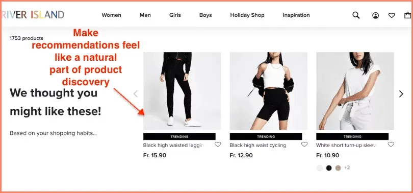
5. River Island — Use Product Recommendations and Use Them Well
What they do: River Island surfaces product recommendations on the PLP based on a shopper's browsing history. These aren't generic 'You might also like' suggestions; they're contextually placed within the grid itself, as if the page knows who you are.
Why it works: Relevance is the enemy of bounce. When a shopper sees products that match their demonstrated taste, they stay longer, click more, and buy more. River Island's approach to PLP personalization is one of the more elegant implementations in fashion retail.
When to use it: Any store with sufficient session data to personalize. Even basic personalization (showing recently viewed products first) outperforms a fully static grid.
Key takeaway: Recommendations on a PLP work best when they feel like a natural part of the discovery experience, not a tacked-on 'also seen' sidebar. Integrate them into the grid. Label them clearly.
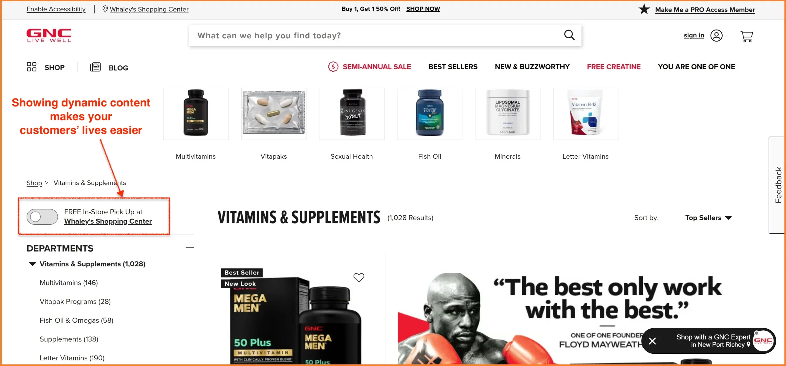
6. GNC — Show Dynamic Content
What they do: GNC uses geolocation to show shoppers real-time information on their listing pages, specifically, whether a product is available for free in-store pickup nearby. This changes dynamically based on the shopper's location, without requiring any action from them.
Why it works: Dynamic content resolves objections before the shopper has even consciously formulated them. 'Will this arrive in time?' and 'Can I pick this up today?' are two of the most common reasons people abandon a product consideration. GNC answers both, preemptively, on the listing page itself.
When to use it: Any multi-channel retailer with physical locations. Also useful for showing shipping date estimates, stock levels by region, and personalized offers.
Key takeaway: Dynamic content is personalization's practical cousin. It doesn't need to be sophisticated, just relevant. Telling someone in Dallas that they can pick up an item in Plano today is enormously useful.
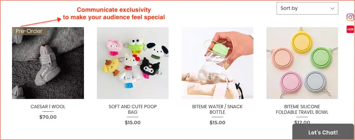
7. Cutie Pawty — Prioritize Exclusivity and Scarcity
What they do: Cutie Pawty uses product badges to communicate both pre-order status and scarcity ('Only 3 left') directly on their listing page images. The badges are small, clearly designed, and strategically placed prominently without being garish.
Why it works: Scarcity and exclusivity trigger a well-documented psychological response: loss aversion. The prospect of missing out on something is, for most people, more motivating than the prospect of gaining something. This is not manipulation; it is honest communication of real inventory conditions, presented in a way that helps shoppers make faster decisions.
When to use it: Limited-edition drops, low-stock situations, pre-order products. Don't manufacture false scarcity — shoppers can smell inauthenticity, and it damages trust faster than almost anything else.
Key takeaway: Keep badge use restrained. One or two badges per row maximum. Too many 'Low Stock' labels and the urgency loses its potency — it becomes wallpaper.
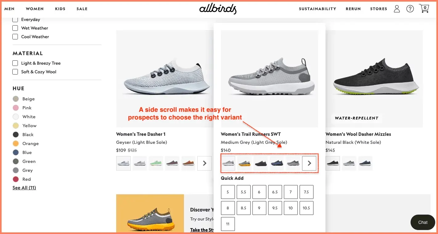
8. Allbirds — Introduce Side Scroll for Product Variants
What they do: Allbirds shows color variants via a horizontal scroll beneath each product card on the listing page. The shopper can swipe through available colors without clicking into the PDP, and the product image updates in real time to reflect the selected variant.
Why it works: Color is one of the most common reasons shoppers visit a PDP only to bounce back to the listing page. ('I like this shoe, but not in white. Let me go back.') Allbirds collapses that back-and-forth into a single, fluid interaction on the PLP. It respects the shopper's time, which is in shorter supply than most marketers appreciate.
When to use it: Fashion, footwear, homeware any category where color or finish is a meaningful purchase variable.
Key takeaway: Every click you eliminate from the path to purchase is a potential conversion you save. Variant selection on the PLP removes at least one.
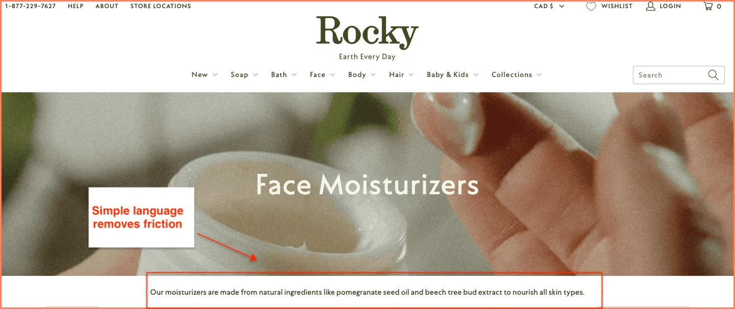
9. Rocky Mountain Soap — Make Product Copy Easy to Understand
What they do: Rocky Mountain Soap writes its listing-page copy in plain, direct language. No 'artisanal formulation with bio-active botanical compounds.' Just: what it is, what it does, why you'd want it.
Why it works: Jargon is a form of friction. Every technical term a shopper has to decode is a moment where they could decide that all this effort isn't really worth it. Accessible copy removes that friction entirely. It also signals something important: a brand that speaks clearly usually has nothing to hide.
When to use it: Everywhere. But particularly important in wellness, supplements, personal care, and B2B categories, where the temptation to use industry language is strongest.
Key takeaway: Read your product names and descriptions aloud. If you'd feel slightly embarrassed saying them to a sensible person in a normal conversation, rewrite them.
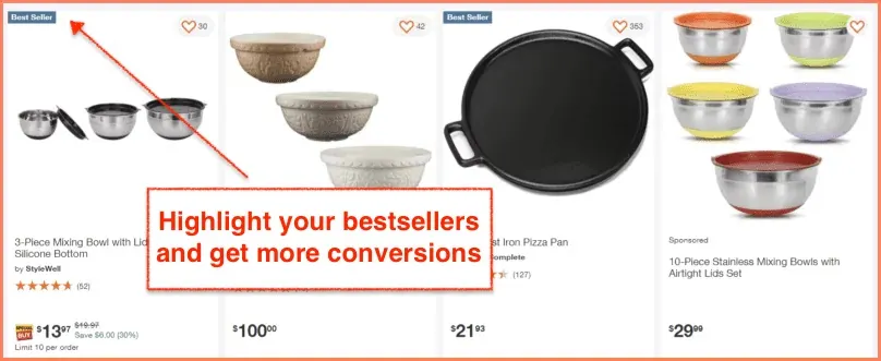
10. Home Depot — Reserve the Top Row for Bestsellers
What they do: Home Depot places its bestselling products in the top rows of every category listing page. The products carry a 'Bestseller' label, often accompanied by the number of purchases in the past week or month.
Why it works: For top-of-funnel visitors, shoppers who are browsing rather than searching for something specific, bestsellers are an enormously helpful signal. They answer the question, 'Where do I even start?' by providing social validation from the crowd. The specific purchase count ('847 bought this week') adds quantitative weight to that validation.
When to use it: Especially effective for high-SKU categories (tools, electronics, home improvement) where the options can feel overwhelming to a new visitor.
Key takeaway: Bestsellers don't just sell products. They orient the confused shopper, reduce decision fatigue, and build category authority. Put them at the top, label them clearly, and let the data do the persuading.
How to Optimize Your eCommerce Product Listing Page for SEO
Here is something that surprises many eCommerce teams: a PLP is not just a UX problem. It is also a significant SEO opportunity and one that most sites squander with remarkable consistency.
The keyword 'ecommerce product listing page' and all its variants are searched by real people making real purchasing decisions. Ranking for category-level keywords often drives more revenue than ranking for individual product terms, because the intent is broader and the audience is larger.
Here is how to optimize your PLPs for search without making them feel like they were written by someone who has never spoken to a human being:
Use the Category Keyword in Your H1
Your H1 should contain the primary category keyword. 'Women's Running Shoes' is better than 'Shop Our Collection.' It tells both Google and the shopper exactly what this page is about. Do not be clever here. Be clear.
Write a Short Intro Paragraph
The biggest SEO miss on most PLPs is the absence of any text. A short intro paragraph (100–150 words) at the top of the category, written in plain English, helps Google index the page and provides the shopper with context. It doesn't need to be literary. It just needs to be there.
Something like: 'Our women's running shoes are designed for everything from treadmill sessions to half-marathon training. Filter by support type, cushioning level, or terrain to find your match.'
Handle Faceted Navigation Carefully
Faceted navigation (filters that create new URLs) is one of the most common sources of duplicate content on eCommerce sites. Every combination of filters, Size: 10, Color: Blue, Brand: Nike, can generate a new URL, most of which you don't want Google to index.
The standard approach is to use canonical tags to point filter-generated URLs back to the main category URL. Use robots.txt or noindex tags for combinations that don't represent meaningful, distinct pages. And use hreflang correctly if you operate in multiple regions.
Choose Pagination Over Infinite Scroll for SEO
Infinite scroll is popular for UX reasons — it keeps shoppers browsing without interruption. But it creates significant crawling problems for Google, which may not reliably render content loaded via JavaScript.
Pagination (Page 1, Page 2, Page 3) gives Google clear URLs to crawl and index. If you want the best of both worlds, use a 'Load More' button approach with paginated URLs in the background. This serves shoppers well on mobile while remaining indexable.
Build Internal Links to PDPs
Every product card on your PLP is an internal link to a PDP. That's good. But you can do more: add contextual text links within your intro paragraph to key subcategories or featured products. Link your PLP to related PLPs (e.g., 'Women's Running Shoes' links to 'Running Socks' and 'Running Jackets').
This creates a topic cluster that Google can navigate and evaluate. PLP → PDP → Cart → Checkout, connected by logical internal linking, is exactly the kind of site architecture that Google rewards.
Key Metrics to Track on Your Product Listing Page
What gets measured gets improved. The following metrics, taken together, give you a complete picture of how your PLP is performing and where to focus your optimization efforts.
Metric
What it measures
What a problem looks like
Buy-to-detail rate
% of PLP visitors who click through to a PDP and purchase
Low rate = products aren't compelling or findable on the PLP
CTR to PDP
% of PLP visitors who click through to any PDP
Low CTR = grid, copy, or imagery isn't enticing enough
Add-to-cart rate
% of PLP visitors who add any product to the cart
Low rate = trust signals or CTAs are weak
Bounce rate
% of visitors who leave after viewing only the PLP
High bounce = navigation, load time, or relevance issues
Low rate = filters aren't visible, useful, or trusted
A note on benchmarks: buy-to-detail rates vary considerably by category. Fashion typically sees rates of 1–3%. Electronics can be lower. Don't chase a universal benchmark; establish your baseline and improve against that.
FAQ
How many products should be on a product listing page?
Most eCommerce stores perform best with 24–48 products per page.
Research from Baymard Institute consistently points to this range as the sweet spot: enough variety to feel substantial, not so many that shoppers hit decision paralysis and leave.
The right number also depends on your category: a niche store with 20 SKUs doesn't need pagination, while a department-style catalog with thousands of products needs thoughtful page depth plus strong filtering so shoppers never feel like they're wading through everything at once.
As a rule, prioritize making the right products easy to find over simply showing more of them.
Should I use infinite scroll or pagination on a product listing page?
For mobile UX, infinite scroll reduces friction and keeps shoppers browsing naturally. But for SEO, pagination wins, it gives Google discrete, crawlable URLs for each page of products, which infinite scroll (driven by JavaScript) often doesn't.
The best compromise for most stores is a "Load More" button: it replicates the seamless feel of infinite scroll while keeping paginated URLs accessible to search engines in the background.
If SEO traffic is a meaningful part of your acquisition mix, and for most eCommerce stores, it should default to pagination, or the Load More hybrid is the safer long-term choice.
What is a good product listing page conversion rate?
PLP conversion rates vary significantly by category, traffic source, and how you define "conversion."
If you're measuring add-to-cart rate directly from the PLP, 3–5% is a reasonable benchmark for many retail categories.
Click-through rate from PLP to PDP typically runs between 20–40% for well-optimized pages. Fashion and beauty tend to sit at the lower end of purchase conversion due to high browsing intent; categories like electronics or tools, where shoppers arrive with more specific intent, often convert higher.
Rather than chasing an industry average, establish your own baseline and focus on moving it by even a 0.5% improvement in add-to-cart rate compounds meaningfully at scale.
How do I improve my PLP conversion rate?
Start with the four highest-leverage fixes: add star ratings and review counts to every product card (social proof reduces hesitation), make filters specific and instant-updating (generic filters get ignored), ensure your product images show a secondary angle on hover (it increases PDP click-through), and place your best-performing or bestselling products in the top rows (they orient new visitors and reduce decision fatigue).
Beyond those, test a Quick View option so exploratory shoppers can evaluate products without losing their place in the grid.
For returning visitors, even basic personalization surfacing recently viewed items measurably outperforms a fully static page. Fix the fundamentals first; then layer in the more sophisticated stuff.
What should a product listing page include?
A high-converting PLP needs: a keyword-optimized H1 and a short intro paragraph (for SEO and context), breadcrumb navigation, a product grid with consistent high-resolution imagery and hover variants, visible star ratings and review counts on every card, clear pricing with sale prices crossed out, an "Add to Cart" button and a distinct "Quick View" option, specific and instantly-updating filters with sort options (Bestsellers, Price, Rating, Newest), scarcity or social badges used sparingly, and a mobile-optimized layout with thumb-friendly CTAs.
Internal links to related categories and subcategories round out the SEO side. Think of the PLP as a curated sales floor, not a warehouse. Every element should help shoppers find the right product faster.
How do I optimize filters for conversion?
The most common filter mistake is being too generic. Size and Color are a starting point, not a strategy. Effective filters reflect how your customers actually think about your products for apparel, that might mean Fit, Occasion, or Material; for supplements, Goal or Ingredient.
Filters must update results instantly without a full page reload: a loading spinner after every filter click is a conversion killer.
Make the filter panel sticky on scroll so it's always accessible, and on mobile, use a collapsible drawer rather than burying filters at the top. Finally, track filter usage rate in your analytics. If fewer than 30–40% of visitors are using filters, they're either not visible enough or not relevant enough to your shoppers' decision-making process.
Ready to Turn Your PLP Into a Conversion Machine?
98% of visitors leave an eCommerce store without making a purchase. A well-optimized product listing page is one of the highest-leverage places to change that number.
Convertcart has helped 500+ eCommerce stores in the US improve their UX and double their conversions. Our conversion experts can audit your PLP, pinpoint exactly where shoppers lose interest, and suggest changes that move the needle.


.avif)
.svg)

.svg)

.svg)
.svg)
