Insights in this guide come from hundreds of mobile UX audits we've conducted for eCommerce brands.
One pattern appears repeatedly: stores rarely lose conversions where founders think they do. Most teams optimize checkout first, while the biggest leaks often happen much earlier, in performance, discovery, or product evaluation.
But, before we dive into finding where the problem exists, you need to know whether you actually have a problem:
Mobile Conversion Benchmarks: Are You Actually Underperforming?
Use this benchmark data as a starting point for investigation, not a diagnosis.
Average Mobile Conversion Rates
The average mobile eCommerce conversion rate typically falls between 1.5% and 2.5%, though performance varies significantly by industry.
Average Mobile Conversion Rates
Mobile conversion rate
General interpretation
Below 1%
Significant friction likely exists somewhere in the mobile journey — performance, discovery, usability, or checkout issues are probably compounding each other
1% – 3%
Typical range for most eCommerce stores — room to improve, but not a sign of a broken experience
Above 3%
Often indicates a highly optimized experience or a favorable product category — common in high-frequency purchases like beauty, personal care, and food
How your mobile rate compares to desktop tells a different, and often more useful story.
Mobile vs Desktop Conversion Rates
For most eCommerce brands, desktop conversion rates remain higher than mobile conversion rates. This gap exists for several reasons:
Smaller screens limit visible information
Mobile sessions are often interrupted
Typing and form completion require more effort
Product research may happen on mobile, while purchases happen later on desktop
A lower mobile conversion rate isn't necessarily a problem. The bigger concern is when the gap becomes unusually large.
Mobile vs Desktop Conversion Rates
Scenario
Signal
What it may indicate
Mobile slightly below desktop
Normal
Expected buying behavior — shoppers often research on mobile and complete purchases on desktop
Mobile significantly below desktop
Investigate
Likely friction in usability, discovery, performance, or checkout — the gap is large enough to warrant an audit
Mobile improving while desktop stays flat
On track
Mobile optimization efforts are working — continue testing and iterating
If your numbers are off, here's where to start looking.
What To Fix First: A Mobile Friction Prioritization Framework
Mobile Friction Framework
Problem you're seeing
Friction type
Priority
Fix this first if…
Mobile bounce rate above 50%, sessions under 60 seconds
Performance
1
Pages are slow, laggy, or failing Core Web Vitals
High traffic, but under 20% of visitors reach a product page
Discovery
2
Shoppers can't find products through nav, search, or filters
Strong product views, but under 5% add to cart
Usability
3
Mobile engagement lags significantly behind desktop
Healthy add-to-cart rate, but checkout completion under 50%
Checkout
4
Carts are created but purchases aren't completed
First purchases happening, but 90-day repeat rate under 20%
Retention
5
Acquisition works, but customers don't come back
Rule of thumb: Fix the earliest point of friction affecting the largest number of shoppers. A navigation issue impacts more visitors than a checkout issue, and a checkout issue impacts more visitors than a retention issue.
Mobile eCommerce Optimization Scorecard
Use this scorecard to get a quick read on where your mobile experience stands across each friction type.
Mobile eCommerce Optimization Scorecard
Area
Score (0–5)
What a low score usually indicates
Performance
—
Slow loading times, poor responsiveness, or unstable page experiences
Discovery
—
Shoppers struggle to find products through navigation, search, filters, or category browsing
Usability
—
Mobile shopping feels difficult due to poor navigation, tap targets, readability, or interaction design
Checkout
—
Purchase intent exists, but shoppers abandon during cart or checkout
Retention
—
Customers purchase once but rarely return or re-engage
Total
— / 25
Score each area above to see your result
Not sure what your score means? Here's how to read it.
How to Score Each Area
Use this scorecard to get a quick read on where your mobile experience stands across each friction type.
The earlier the friction occurs in the shopping journey, the more customers it impacts. For example, a discovery issue affects every visitor, while a checkout issue only affects shoppers who reach checkout.
MOST MOBILE CONVERSION PROBLEMS FALL INTO ONE OF THESE 5 CATEGORIES
- Performance Friction: The Impact of Speed on Mobile Conversions
- Discovery Friction: Why Shoppers Can't Find What They Want
- Usability Friction: Improving the Mobile Shopping Experience
- Checkout Friction: How to Improve Mobile Conversion Rates
- Retention Friction: Why Mobile Customers Don't Return
Let's dive in:
Performance Friction: The Impact of Speed on Mobile Conversions
Mobile shoppers expect speed. Unlike desktop users, they're often browsing while multitasking, switching between apps, or shopping in short bursts throughout the day. Every additional second spent waiting increases the likelihood of abandonment.
Performance friction occurs when shoppers are ready to engage, but the experience feels slow, unstable, or unresponsive.If your store has high bounce rates, short session durations, or a large gap between mobile and desktop conversion rates, performance may be contributing to the problem.
1. Slow Loading Pages Increase Early Abandonment
Before shoppers can browse products, use search, or add items to cart, they need pages to load. Slow-loading category pages, collection pages, and landing pages often cause visitors to leave before they interact with the store at all.
As part of your eCommerce mobile optimization audit, review:
Mobile page load times
Bounce rates on key landing pages
Performance across different mobile devices and network conditions
Speed of high-traffic category pages
The faster shoppers can access content, the more likely they are to continue exploring.
2. Heavy Images Create Unnecessary Friction
Product imagery plays a critical role in online shopping, but oversized image files can significantly slow the mobile experience. Common performance issues include:
A good mobile eCommerce optimization strategy balances visual quality with loading speed. Shoppers should be able to view products clearly without waiting for pages to fully render.
3. Poor Core Web Vitals Make the Experience Feel Unstable
Performance isn't only about how quickly a page loads. It's also about how quickly it becomes usable. Issues such as layout shifts, delayed interactions, and content that jumps while loading can create frustration even when pages appear fast.
When auditing mobile shopping experience optimization, pay attention to:
Largest Contentful Paint (LCP)
Interaction to Next Paint (INP)
Cumulative Layout Shift (CLS)
Strong Core Web Vitals help ensure shoppers can browse, search, and interact without interruptions.
Discovery Friction: Why Shoppers Can't Find What They Want
Before a shopper can buy, they need to find the right product. Yet many brands focus on optimizing checkout while overlooking the earlier stages of the mobile journey.
When navigation is confusing, search results are poor, or product discovery requires too many taps, shoppers leave before they ever reach a product page.
In many cases, low mobile eCommerce conversion rates aren't caused by checkout friction at all, they're caused by discovery friction.
Signs you may have a discovery problem:
High mobile traffic but low product page views
Visitors rely heavily on site search
Category pages have high exit rates
Mobile shoppers browse but rarely add products to cart
Mobile conversion rates lag significantly behind desktop
If these symptoms sound familiar, start by auditing the following areas.
1. Navigation Makes Shoppers Work Too Hard
Mobile shoppers don't browse the way desktop shoppers do. They are often distracted, using one hand, and trying to complete tasks quickly. Every additional tap, menu layer, or unclear category increases the likelihood that they'll abandon the session.
To improve mobile eCommerce optimization, review:
Whether your most important categories are visible immediately
Whether promotional links are crowding out transactional links
Whether shoppers can move between categories in a few taps
Whether navigation remains accessible as users scroll
The goal isn't to show more options. It's to help shoppers reach relevant products faster.
2. Search Is Doing Too Much Heavy Lifting
When shoppers can't navigate effectively, they often turn to search. A high percentage of search usage isn't always a success metric. It can indicate that visitors are struggling to discover products through browsing alone.
An effective mobile search experience should support:
Autocomplete suggestions
Typo tolerance
Related-product recommendations
Helpful zero-result pages
Mobile-friendly search interfaces
Voice search for shoppers who prefer speaking over typing
For large catalogs, search often becomes one of the biggest drivers of mobile conversion rate optimization, because it shortens the path between intent and purchase.
3. Filters and Category Structure Create Unnecessary Friction
Mobile shoppers have limited screen space and even less patience. When filters are hidden, irrelevant, or difficult to use, finding the right product becomes frustrating.
Audit whether:
Your most-used filters are surfaced prominently
Category structures match how shoppers actually browse
Applied filters remain visible
Sorting options are easy to access
Shoppers can narrow large product collections quickly
Strong filtering and category architecture don't just improve usability; they directly support mobile shopping experience optimization by reducing the effort required to find relevant products.
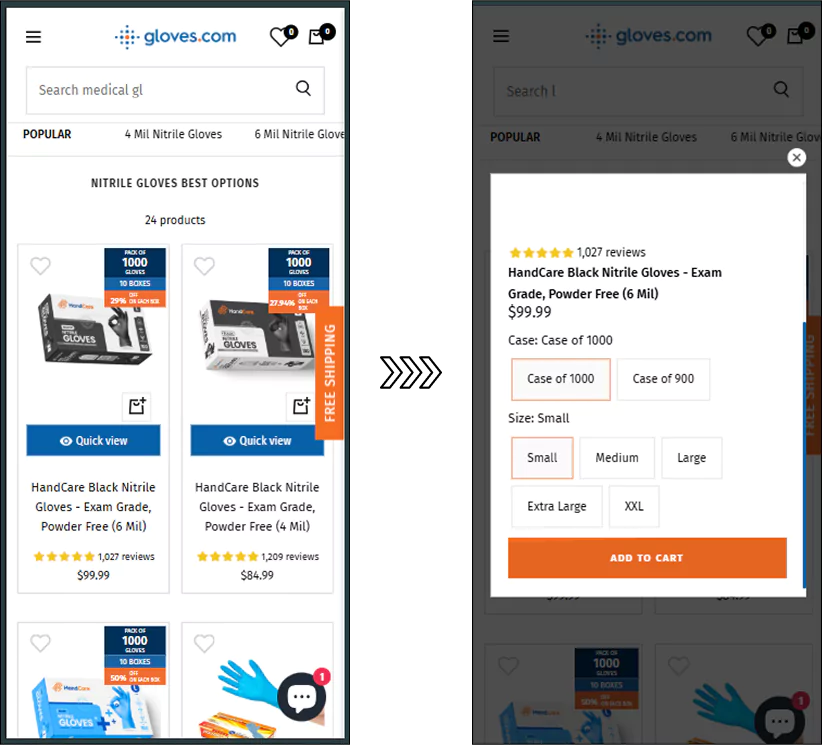
Convertcart Case Study - Reducing Friction with Mobile Quick View for Gloves.com
For mobile shoppers, product discovery doesn't end when they find a product. They still need enough information to decide whether it's worth exploring further.
One challenge my audit team observed was that shoppers had to leave the category page and load a separate product page every time they wanted to compare options.
This added friction to the browsing process and contributed to a category-page abandonment rate of 95.3%.
To reduce that friction, we introduced a mobile Quick View experience that allowed shoppers to view key product details, select variants, and add items to cart directly from the category page.
This experiment increased mobile conversion rates by 9.27% and +7% increase in category-page conversions.
Key takeaway: Sometimes the fastest path to improving mobile eCommerce conversion rates isn't helping shoppers find products faster; it's helping them evaluate products without disrupting their browsing journey.
Usability Friction: Improving the Mobile Shopping Experience
Mobile shoppers are often browsing with one hand, on smaller screens, and in shorter sessions than desktop users. As a result, usability issues that seem minor on desktop can become significant conversion barriers on mobile.
If your store attracts plenty of mobile visitors but mobile conversions consistently trail desktop performance, usability friction may be the underlying cause.
1. Critical Actions Fall Outside the Thumb Zone
Most mobile shoppers navigate using their thumbs.
When important actions such as menus, filters, search, or checkout buttons require excessive stretching or repositioning of the hand, interactions become slower and less intuitive.
Key conversion paths require minimal effort to complete
Improving thumb accessibility is one of the simplest ways to create a better mobile shopping experience without redesigning the entire site.
2. Interactive Elements Aren't Clearly Interactive
Mobile shoppers scan quickly. When links, buttons, filters, and expandable elements don't look interactive, users hesitate or miss them altogether. Common signs of this issue include:
Important actions receiving low engagement
High browsing activity with few progression clicks
Visitors repeatedly returning to category pages
To improve mobile eCommerce optimization, ensure that:
Buttons are visually distinct from the surrounding content
Links are easy to identify
Filters and expandable menus provide clear visual cues
Interactive elements remain consistent across the site
Shoppers shouldn't have to guess what can be tapped.
3. Error Messages Create More Confusion Than Clarity
Usability friction often appears during moments of intent. A shopper may be ready to continue, but unclear validation messages force them to stop and troubleshoot.
Instead of generic messages like:
"Invalid entry"
Provide specific guidance that tells users:
What went wrong
Which field needs attention
How to fix it
Clear validation reduces frustration and removes unnecessary barriers from the mobile journey, supporting both mobile conversion optimization and checkout completion.
Checkout Friction: How to Improve Mobile Conversion Rates
Many mobile shoppers don't abandon because they changed their mind. They abandon because completing the purchase feels harder than it should.
By the time a customer reaches checkout, product discovery and evaluation have already done their job. The remaining challenge is removing the friction that stands between purchase intent and payment.
If your store has healthy add-to-cart rates but weak checkout completion rates, audit these areas first.
1. Reduce Form Friction Wherever Possible
Typing on mobile remains one of the biggest conversion barriers.
Long forms, unnecessary fields, and repeated data entry increase the effort required to complete a purchase.
As part of your mobile conversion rate optimization audit:
Enable browser autofill
Remove non-essential fields
Use appropriate mobile keyboards for each field type
Clearly indicate required information
Minimize the number of steps needed to complete checkout
The fewer inputs shoppers need to provide, the easier it becomes to complete the purchase.
2. Make Checkout Errors Easy to Fix
Few experiences are more frustrating than submitting a checkout form and receiving a vague error message.
Messages such as:
"Invalid information"
force shoppers to guess what went wrong.
Instead:
Highlight the exact field causing the issue
Explain the problem clearly
Suggest how to correct it
Display errors immediately rather than after submission
Clear validation helps prevent unnecessary abandonment and supports better mobile conversion optimization throughout the checkout journey.
3. Let Shoppers Return Without Starting Over
Mobile shopping sessions are frequently interrupted. A shopper may receive a message, switch apps, answer a call, or simply leave and return later. When their cart disappears, purchase intent often disappears with it.
To reduce checkout friction:
Persist cart contents across sessions
Sync carts across devices where possible
Allow shoppers to save items for later
Make returning to checkout effortless
Persistent carts won't solve every abandonment issue, but they prevent shoppers from having to repeat work they've already completed.
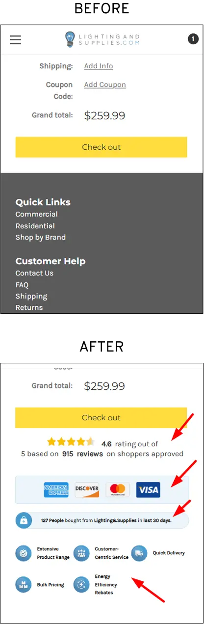
Convertcart Case Study: Increasing Trust Signals on Mobile Checkout with Lighting & Supplies
For many mobile shoppers, the decision to buy isn't determined by product information alone. It's determined by whether the store feels trustworthy enough to complete the purchase at checkout.
My CRO team noticed that mobile conversions were consistently underperforming despite strong purchase intent. The checkout experience contained few reassurance cues, giving shoppers little evidence that the site was credible, secure, or widely used by other customers.
To address this, we introduced several trust-building elements directly within the mobile checkout experience:
Customer review ratings and review volume
Secure payment and accepted-card icons
Recent purchase activity notifications
Service and delivery assurance badges
Additional trust and credibility messaging
This experiment alone increased conversions by +8.71%.
The test reinforced an important principle of mobile eCommerce optimization: shoppers don't always abandon because checkout is difficult.
Sometimes they abandon because they aren't fully convinced it's safe or worthwhile to proceed.
To address this, we introduced several trust-building elements directly within the mobile checkout experience:
Customer review ratings and review volume
Secure payment and accepted-card icons
Recent purchase activity notifications
Service and delivery assurance badges
Additional trust and credibility messaging
This experiment alone increased conversions by +8.71%. The test reinforced an important principle of mobile eCommerce optimization: shoppers don't always abandon because checkout is difficult. Sometimes they abandon because they aren't fully convinced it's safe or worthwhile to proceed.
Retention Friction: Why Mobile Customers Don't Return
A mobile conversion isn't always a customer acquisition problem. Sometimes shoppers complete their first purchase, but never return. When that happens, brands often respond by increasing acquisition spend instead of investigating why existing customers aren't coming back.
Retention friction occurs when the mobile experience makes it difficult for shoppers to continue their relationship with the brand after the first purchase.
If repeat purchase rates are stagnating despite healthy acquisition, audit these areas first.
1. Shoppers Have To Start Over Every Time They Return
Mobile shopping rarely happens in a single session. Customers browse during commutes, breaks, or while multitasking. When they return and discover their cart is empty, wishlist is gone, or browsing history has been lost, many won't repeat the effort.
Review whether shoppers can:
Access saved carts across sessions
Save products for later
Resume shopping without rebuilding their journey
Reducing this friction makes repeat purchases feel effortless.
2. The Post-Purchase Experience Ends Too Early
For many brands, communication drops off after the order confirmation email. Yet the period immediately after purchase often determines whether a customer returns.
Audit whether you're providing:
Useful shipping and delivery updates
Relevant product recommendations
Replenishment reminders wherever appropriate
Timely re-engagement campaigns
Retention improves when the customer relationship continues beyond the transaction.
3. Returning Customers Receive the Same Experience as First-Time Visitors
Retention friction often begins before the second purchase. Shoppers who don't develop confidence during their first interaction are less likely to return. Forcing them to navigate the same onboarding, product discovery, and browsing journey as new visitors creates unnecessary friction.
Look for opportunities to make returning easier through:
Account-based experiences
Personalized recommendations
Recently viewed products
Loyalty and rewards programs
Faster reordering paths
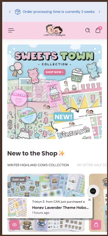
Case Study: Increasing Mobile Conversions with Real-Time Social Proof with Hubman & Chubgirl
First-time visitors often lack the confidence that repeat customers already have. Without prior experience with the brand, they rely on external signals to determine whether a store is trustworthy and whether products are genuinely popular.
To address this, we tested more prominent social proof across mobile and tablet experiences, including recent purchase notifications that highlighted real customer activity.
The goal was simple: make demand visible at key moments in the shopping journey. This experiment increased conversions sitewide by +2.94% and also significantly improved order completion rates across devices.
The test demonstrated that visible social proof can reduce perceived purchase risk, particularly for first-time visitors who have not yet developed trust in the brand.
Know that 98% of visitors who visit an eCommerce site drop off without buying anything? Why: user experience issues that cause friction for visitors. And this is the problem Convertcart solves. We've helped 500+ eCommerce stores (in the US) improve user experience—and 2X their conversions.
How can we help you:
Our conversion experts can audit your site—identify UX issues, and suggest changes to improve conversions.


.avif)
.svg)

.svg)

.svg)
.svg)
