Over the years, our CRO team has audited hundreds of eCommerce stores.
The same conversion leaks that barely hurt at 1,000–5,000 daily visitors become catastrophic at 50,000–100,000+ visitors.
At low traffic, a 2% overall conversion rate might mean 20–50 sales per day.
Scale to high traffic stores (e.g., 100,000 daily visitors), and the same 2% yields 2,000 sales.
But if CRO mistakes keep you at 2% instead of a realistic 3%–4% (achievable with fixes), you're leaving 1,000–2,000 potential orders on the table daily.
At a $100 AOV, that's $100,000–$200,000 in daily lost revenue (millions annually).
The CRO Mistakes We Keep Spotting On High-Traffic Stores
Let’s take a look at 8 conversion rate optimization mistakes that we've spotted while auditing high-traffic eCommerce stores.
I'll also show you the exact fixes that have delivered real lifts like +7% category conversions and 50%+ checkout gains:
1. Optimizing for Average Conversion Rate Instead of Segments
One of the most expensive CRO mistakes high-traffic eCommerce stores make is treating their conversion rate as a single number.
When we audit high-traffic stores (50,000+ monthly sessions), we almost always find the same thing: a "decent" blended conversion rate.
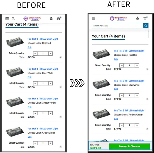
Our audit reports found that 63.99% of their mobile cart drop-offs were due to two factors:
vague CTAs ("Continue" buttons with no directional clarity) and
late-stage pricing surprises (shipping and taxes appearing only at final checkout).
We optimized the checkout CTA placement, and final pricing was displayed upfront (mobile & tablet cart page), which resulted in mobile cart drop-offs being reduced by 4%.
We also ran multiple A/B tests and found that making it sticky improved the overall experience.
2. Adding More “Best Practices” Instead of Removing Friction
Look at the home page below.
See how different promotions are competing for attention?
High-traffic eCommerce stores often fall into the trap of layering on more features.
Your store gets populated with urgency timers, trust badges, pop-ups, upsell widgets, live chat bubbles, email capture forms, related products carousels, and endless "best practice" elements.
The core principle: Conversion isn't about adding more; it's about subtracting distractions.
From one of our CRO audits, we saw that simplifying by removing non-essential elements reduced page clutter and lifted add-to-cart rates by 15-25% in similar cases, without adding any new features.
When in doubt, always apply the "less is more" test.
We love how this homepage looks, breaking the usual grid style with a ‘Start Here’ CTA. It offers relief to first-time visitors who might get easily overwhelmed:
When high-traffic online stores ask us how to prioritize, we have a simple ask.
"What is the single primary goal here?"
Once you have your answer, subtract everything else.
For instance, on your homepage, the single primary goal for most high-traffic eCommerce stores is "drive to products/add-to-cart," driving them deeper into the funnel toward purchase.
Everything that doesn't directly support that goal becomes potential noise (distracting sidebars, excessive navbar, pop-ups that fire too soon).
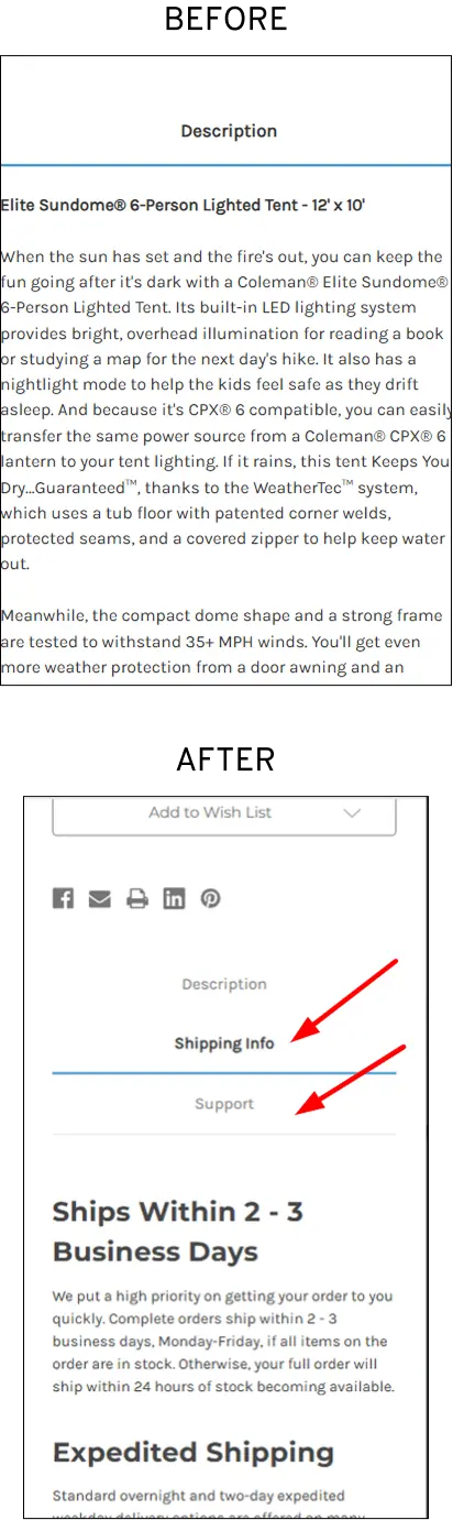
3. Treating Product Pages Like Catalogs, Not Decision Tools
We have noticed that high-traffic eCommerce stores often treat product detail pages (PDPs) as static catalogs, simple lists of specs, a few photos, generic descriptions, and a basic "Add to Cart" button.
This turns them into passive displays rather than active decision tools that guide, persuade, and remove doubts for buyers ready to purchase. This CRO mistake becomes more dangerous as your traffic grows.
Recently, we audited an eCommerce store Lighting & Supplies. The store saw heavy traffic but low conversions. For instance, user testing revealed that the PDPs had a large number of views but low add-to-cart rates.
Many shoppers were abandoning checkout due to uncertainty about returns, delivery timelines, and support availability.
We transformed product pages into a decision tool:
These experiments resulted in a 15.73% gain at the campaign level and a 4.01% gain at the website level, consequently improving revenue.
4. Running Safe A/B Tests That Don’t Move Revenue
As a high-traffic eCommerce store, you have massive segments to test, which means they can reach statistical significance quickly.
But this advantage often backfires.
A sports apparel brand with heavy traffic kept running safe micro-tests like button colors, minor CTA copy variations ("Shop Now" vs. "Buy Now"), and small icon tweaks.
These delivered sporadic 2-8% lifts in clicks or add-to-cart but flatlined site-wide revenue growth, as they didn't fix underlying issues like cluttered layouts and poor visual hierarchy.
We shifted from cluttered, multi-column layouts with inconsistent images to a clean, single-column structure with strong visual hierarchy, consolidated trust signals, and clear, thumb-friendly CTAs above the fold.
We also focused on mobile optimization by prioritizing fast-loading, scannable content for dominant mobile traffic.
All of this resulted in 2X purchase quantity increases, which meant 50%+ conversion lifts in peak conditions, translating to substantial annual revenue growth without extra ad spend.
Remember, test structural changes mobile-first (where friction hurts most), then roll out to desktop. Monitor revenue metrics (AOV, revenue per visitor) alongside CR
5. Ignoring Mobile-Specific Behavior
Despite mobile devices generating over 60% to 65% of global web traffic, a significant number of businesses still use a "desktop-first" approach, treating mobile optimization as an afterthought.
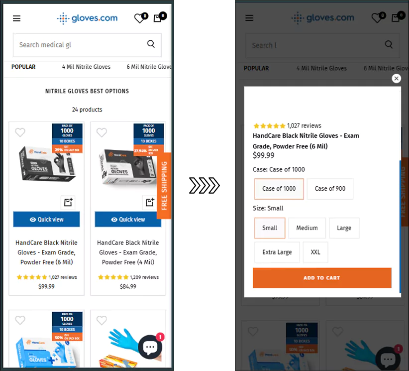
When we audited Gloves (caters to healthcare/industrial sectors), we noticed that their mobile category abandonment stood at a staggering 95.3%.
Our team found it odd how category pages were suffering even with intuitive filters.
We hypothesized that shoppers were bouncing off because there were too many clicks to PDPs.
Consequently, our team rolled out a Quick View feature, testing it specifically for mobile users.
When mobile shoppers tapped a product, a card opened with essential details, zoomable images, size selectors, and a prominent "Add to Cart" button, all optimized for thumb reach and fast interaction.
This experiment boosted conversions from the category page by 7%, a meaningful lift at high traffic, recovering revenue from browsers who previously abandoned without deeper engagement.
It also improved overall session depth and reduced bounce on mobile category pages.
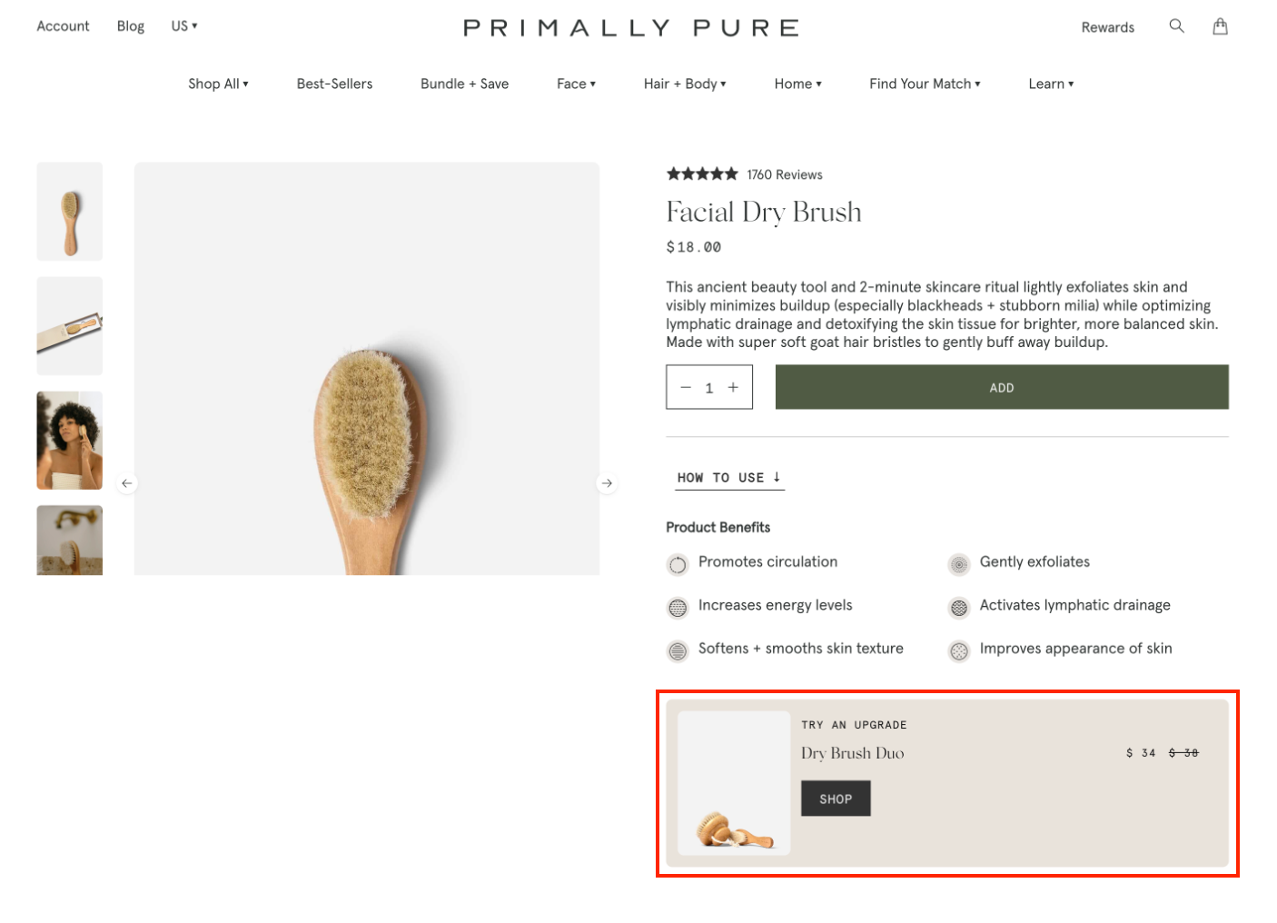
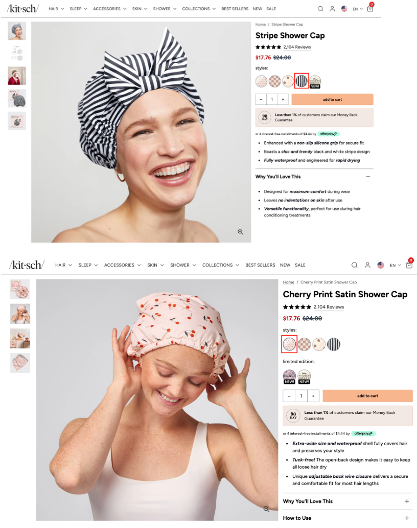
6. Creating Too Many Choices (Variant Overload)
When your eCommerce store scales, so do your product catalogs, offering extensive customization, dozens of colors, sizes, materials, bundles, or configurations per product to capture every possible preference.
While variety seems customer-friendly, it frequently triggers decision paralysis (also known as choice overload or the paradox of choice), where shoppers freeze, hesitate, or abandon rather than decide.
We like how Primally Pure offers a product variant as an “upgrade”:
Limit default visible variants to 4-6 most popular (e.g., bestsellers in core colors/sizes), with "See all options" expander for the rest.
Also, invest in product imagery to show how every product variant looks:
7. Not Addressing Last-Minute Buyer Anxiety
The surge of doubt right before purchase stems from uncertainty about shipping details, return policies, and overall trust/security.
Shoppers hesitate: "What if it arrives late? What if I need to return it? Is this site safe with my card?"
Studies show that the average cart abandonment hovers around 70% across industries, with many shoppers citing that delivery dates and returns policy are unsatisfactory or unclear.
These reasons peak at checkout when commitment is highest, and people have invested time adding items but bail on final doubts.
We have implemented multiple strategies that have reduced cart abandonment by 10%-20% through rigorous testing, including:
Adding a compact trust block above or beside the payment button with recognizable logos (PayPal, Stripe, Visa/Mastercard), with copy like "Secure Checkout, We Never Store Card Details."
Showing estimates in cart (e.g., "Standard: 3-5 days, Free over $X"), avoid surprises. You can link to full policies, but summarize key benefits.
Also, make sure to A/B test trust block placement (above fold vs. near CTA), copy ("Secure & Easy Returns" vs. detailed), or add progress bars for flow confidence.
8. Running CRO Without a System
Most high-traffic eCommerce stores we have worked with often treat CRO as a series of random experiments.
They test whatever idea pops up from a team member, a blog post, or a competitor's site, without any structured process, prioritization framework, roadmap, or learning loop.
This "ad-hoc" approach leads to scattered efforts, inconclusive results, wasted resources, and minimal compounding revenue growth.
Without a system, teams chase shiny objects (e.g., endless micro-tests) instead of high-impact fixes, burning engineering/dev time and tool budgets on low-ROI ideas.
Many tests fail or end inconclusively (~60%+ of A/B tests produce no clear winner) because there's no hypothesis validation, proper prioritization (e.g., ICE/PIE scoring), or research foundation, leading to frustration and CRO fatigue.
No documentation or shared learning means wins aren't scaled, lessons aren't applied, and the same mistakes repeat. Progress flatlines while traffic costs keep rising.
CRO isn't a one-time project or quarterly tactic.
Without an ongoing system (e.g., 90-day sprints, roadmap, centralized repo), it dies within months as teams move on to "the next big thing" like more ads.
When you do prioritize, focus first on checkout/PDP leaks (high-traffic, high-value steps) over low-impact homepage tweaks.
Create your central database, like a "CRO wiki" for hypotheses, test setups, results, screenshots, and key learnings.
Mandate post-test summaries, like “What worked/why? What to scale/avoid?”
Also, build team alignment like weekly reviews, clear KPIs (revenue per visitor, not just CR), and post-mortems for every test.
1. How do I know if my eCommerce store has a conversion problem vs a traffic problem?
If you're driving solid traffic, especially 50,000+ monthly sessions, but your revenue isn't growing at the same pace, chances are you don't have a traffic problem but a conversion problem.
The clearest sign is when visitors land on your site but fail to buy.
You see healthy session numbers and page views, yet add-to-cart rates stay low, cart abandonment remains high, and overall conversion rate hovers at or below the typical 2–3% benchmark.
In contrast, a true traffic problem shows up as consistently low visitor numbers across channels, poor organic visibility, or struggling ad impressions and click-through rates.
But once traffic starts flowing and people still aren't converting, the issue almost always lies in silent CRO mistakes that high-traffic eCommerce stores commonly make.
When you optimize for average conversion rates instead of segments, you end up adding more distractions instead of removing friction.
You start treating product pages like catalogs rather than decision tools, ignoring mobile-specific behavior, or running CRO without a proper system.
If your analytics show strong traffic paired with flat or declining sales, it's time to stop chasing more visitors and start diagnosing the costly CRO mistakes silently hurting your bottom line.
2. Should I optimize for overall conversion rate or specific customer segments?
You should optimize for specific customer segments, not just the overall (blended) conversion rate.
Optimizing only for the average conversion rate is one of the most expensive and common CRO mistakes that high-traffic eCommerce stores make.
For example, mobile users might have much higher cart drop-offs due to vague CTAs or surprise shipping costs, while desktop users struggle with cluttered layouts.
New visitors from paid ads may abandon because of trust issues, whereas returning customers convert at 2–3x higher rates.
Traffic from organic search might need stronger decision-making tools on product pages, while email traffic responds better to personalized offers.
When you chase only the overall conversion rate, you end up making generic changes that deliver flat or minimal lifts.
At 50,000+ monthly sessions, these “average” fixes miss the real leaks that scale into catastrophic revenue loss.
The smarter approach for high-traffic stores is to segment your data by device (mobile vs desktop), traffic source, user type (new vs returning), or even behavior, then fix the biggest friction points in each segment.
This is exactly why segment-focused CRO often uncovers quick wins, like reducing mobile cart drop-offs by improving CTA clarity and showing pricing upfront, that compound into significant revenue gains without acquiring more expensive traffic.
High-traffic stores that shift from “average optimization” to segment-specific fixes consistently see stronger, more reliable lifts because they’re solving the actual problems real buyers face, rather than papering over them with a misleading blended number.
3. What are the signs that my CRO efforts are failing or need a better system?
If you're running lots of tests but your overall revenue is still flat, that's the biggest red flag that your CRO efforts are failing or that you're running them without a proper system.
Other clear warning signs include:
You’re only seeing tiny lifts (2–8%) from cosmetic changes like button colors, minor CTA copy tweaks, or icon adjustments, with no meaningful impact on site-wide revenue or revenue per visitor.
Most of your A/B tests end up inconclusive or with no clear winner.
You feel CRO fatigue and the team is constantly testing “shiny objects” inspired by blog posts or competitors, but nothing compounds into consistent growth.
You’re spending engineering time and tool budget on low-impact ideas while high-traffic pages like product detail pages and checkout still leak revenue.
There’s no centralized documentation of what worked, why it worked, or what to avoid next time, so the same mistakes keep repeating.
You’re treating CRO as random experiments instead of a structured process with hypothesis validation, prioritization (like ICE/PIE scoring), a testing roadmap, and regular learning reviews.
Without a real CRO system, even massive traffic volumes deliver disappointing results because efforts remain scattered and focused on safe micro-tests instead of fixing the big silent killers, like variant overload, mobile friction, or last-minute buyer anxiety.
Here's why you need a CRO audit
98% of visitors who visit an eCommerce site drop off without buying anything.
Why: user experience issues that cause friction for visitors.
And this is the problem Convertcart solves.
We've helped 500+ eCommerce stores (in the US) improve user experience and 2X their conversions.
How we can help you:
Our conversion experts can audit your site, identify UX issues, and suggest changes to improve conversions.
Subscribe for more articles like this!
Thank you - we'll see you in your inbox soon!
Oops! Something went wrong while submitting the form.
Read by 5000+ ecommerce store owners
Subscribe for more articles like this!
Thank you - we'll see you in your inbox soon!
Oops! Something went wrong while submitting the form.


.avif)
.svg)

.svg)

.svg)
.svg)
