There is something inherently skittish about a visitor arriving via a paid ad.
Unlike a friend who wanders into your shop because they’ve heard you make the best coffee in the county, a paid clicker arrives with their arms crossed and a healthy dose of skepticism regarding your brand, your product, and most certainly your pricing.
They are, in a sense, waiting for you to prove them wrong.
If you’re wondering why you’re paying for a crowd that refuses to stay for the show, this guide is your roadmap. We’ve identified the specific "leaks" in your eCommerce landing page optimization that turn interested visitors into vanishing acts.
Thereafter we've made a list of 9 strategic ways to build immediate trust, fix your purchase journey, and finally get your paid traffic to stop hovering and start converting.
Why Your Paid Traffic is Not Converting (Checklist)
1. Does your landing page actually deliver on the promise of your ad, or are you accidentally leading your visitors into a high-stakes game of bait-and-switch? You dangled a "Free Beginner's Guide" in the ad, but the landing page immediately pivots to a high-pressure sales pitch for a premium subscription.
You expected them to scroll down to find the freebie, but your aggressive first-fold offer convinced them they’d been hoodwinked, sending them straight to the exit.
2. Is your website moving with the grace of a tectonic plate, or is it actually fast enough for a human with things to do? Your ad shouted "Instant Access," but the site delivered nothing but a blank white screen and a spinning loading icon.
You banked on the deal being good enough to keep them waiting, but the delay made your store feel broken, driving them back to the search results before your product even loaded.
3. Are you asking your visitors to do far too much, far too soon, like a host who demands a life story before offering a chair? The ad suggested a "Quick Signup," yet the page instantly demands a five-field form and two mandatory cookie banners.
You assumed they would gladly trade their data for the product, but the sheer friction of the first fold made them feel interrogated rather than welcomed.
4. Does the price on the page match the expectation set by the ad, or are you saving a nasty "sticker shock" for the very end? The creative highlighted a "Budget-Friendly Solution," but the page features the "Enterprise Gold" pricing tier as the very first thing they see.
You figured they would eventually scroll to find the entry-level price, but that immediate sticker shock disqualified your brand before they ever reached the affordable options.
5. Can a person actually buy the thing using only their thumb, or does your checkout require the dexterity of a concert pianist? Your mobile ad promised "One-Tap Ordering," yet the page displays a tiny desktop layout with microscopic, unclickable buttons.
You assumed they would pinch and zoom to navigate, but the clunky mobile experience was so frustrating that they abandoned the cart mid-commute.
6. Does your headline speak to a human benefit, or are you just reciting a list of cold, mechanical features? You highlighted "Advanced Cloud Integration" in the ad, but the landing page fails to explain how that actually makes a customer’s life easier.
You assumed they would translate the jargon themselves, but the lack of a benefit-driven "hook" left them cold and uninspired.
7. Are you hiding your "Buy" button in a thicket of decorative foliage? The ad promised a "Simple Purchase," yet the landing page buries the CTA below three paragraphs of company history and a large lifestyle photo.
You expected them to hunt for the button, but the visual clutter camouflaged the primary action so well that they simply gave up.
8. Is your "Social Proof" so vague that it sounds like you wrote it yourself? You touted "Thousands of Happy Customers," but the page only shows three anonymous quotes from "John D." and "Sarah M."
You assumed these generic blurbs would build trust, but the lack of specific, verified details made your store feel like a ghost town.
9. Does your "Free Shipping" offer wait until the final checkout screen to make an appearance? The ad lured them in with "No Extra Costs," but the landing page stays silent about shipping until the very last moment.
You figured they’d be committed by then, but the sudden appearance of a shipping fee felt like a betrayal, causing an immediate cart abandonment.
10. Are you forcing a "Create Account" wall before they’ve even seen the shipping costs? You promised an "Easy Checkout," but then blocked the path with a mandatory registration page.
You assumed they’d want to "join the family," but that early demand for a password felt like a barrier, not an invitation.
11. Does your mobile site require the eyes of a hawk to read the fine print? The ad looked great on a desktop, but the mobile landing page shrunk your text into microscopic "scrolls."
You assumed they would squint to read your value proposition, but the poor readability made the experience feel like work rather than shopping.
12. Are you using "Stock Photos" that look like they were taken in a parallel, much shinier universe? You promised an "Authentic Product," but the page features glossy, generic photos of people shaking hands in an office.
You assumed these images looked professional, but the lack of real product shots made the brand feel hollow and untrustworthy.
13. Does your "Search Bar" behave like a stubborn toddler who refuses to understand a typo? The ad drove them to search for a specific item, but your site returned "Zero Results" because they misspelled one letter.
You assumed they’d try again, but the lack of "suggested results" made them think you simply didn't have what they wanted.
14. Are your "Urgency" timers obviously fake and perpetually stuck at 14 minutes? You tried to "nudge" them with a countdown clock, but the timer resets every time they refresh the page.
You assumed this would create excitement, but the transparent trickery actually destroyed your credibility in seconds.
15. Is your "Privacy Policy" link more prominent than your "Place Order" button? You wanted to show you are "Trustworthy," but gave the legal links the same visual weight as the checkout action.
You assumed users appreciated the transparency, but the competing buttons created choice paralysis just when they were ready to pay.
16. Does your "Chat Bot" pop up and block the product description the moment they arrive? You promised "Instant Support," but the automated greeting covered the very information the customer was trying to read.
You assumed the "nudge" was helpful, but it felt more like an overeager shop assistant blocking the aisle.
17. Are you using "Auto-Play Video" that screams at people in quiet libraries? The ad was silent and sleek, but the landing page launched a loud video without warning. You assumed the motion would grab attention, but the sudden noise sent them scrambling for the 'Mute' button—or the 'Exit' tab.
18. Do your "Product Swatches" change the image, or do they just leave the customer guessing? You offered "Six Vibrant Colors," but clicking the "Blue" box still displayed the "Red" product photo.
You assumed they’d use their imagination, but the visual disconnect made them too nervous to commit to the purchase.
19. Is your "Return Policy" buried so deep it requires a shovel to find? The ad promised "Risk-Free Shopping," but the landing page offers no reassurance about what happens if the product doesn't fit.
You assumed they wouldn't worry about returns yet, but the lack of a clear "Money-Back Guarantee" kept their wallets firmly shut.
20. Does your "Add to Cart" button provide any feedback, or does it just sit there like a stone? They clicked "Buy," but nothing happened on the screen to confirm the action.
You assumed they’d check the tiny cart icon in the corner, but the lack of a "Success" animation made them think the site was broken.
21. Are your "Trust Badges" so low-resolution they look like they were "borrowed" from Google Images? You wanted to show you were "Norton Secured," but the blurry icon looked more like a security risk than a shield.
You assumed the logo was enough, but the poor quality suggested your site might not be as secure as you claim.
22. Do you ask for a "Phone Number" without explaining why you need it? Your checkout form demands a mobile number for a simple digital download.
You assumed they wouldn't mind, but the unexplained request felt like an invasion of privacy, stopping the transaction dead in its tracks.
23. Is your "Exit Intent Pop-up" appearing before they’ve even read the first sentence? You wanted to "capture the lead," but triggered the discount offer three seconds after they landed.
You assumed the "nudge" was timely, but it interrupted their flow before they even knew what you were selling.
24. Do your "Filters" actually work, or do they just refresh the page back to the start? They tried to sort by "Size: Large," but the site just reloaded the entire "Size: Small" inventory. You assumed they’d try a different filter, but the technical glitch made the eCommerce navigation feel like a broken maze.
25. Does your "Thank You" page leave them wondering if the order actually went through? They finally paid, but the screen just went white or showed a generic "Error" message.
You assumed the email confirmation would suffice, but that final moment of uncertainty ruined the entire purchase journey experience.
26. Are your "Comparison Tables" so wide that they require horizontal scrolling on a phone? You wanted to show "Why We are Better," but the table cut off halfway through the second column.
You assumed they would scroll sideways, but the clunky UI made your "Superior Design" look anything but.
27. Does your "Coupon Code" box sit there, tempting them to leave and search for a discount? You placed a giant "Enter Promo Code" box right at the top of the checkout.
You assumed it was helpful, but it actually "nudged" them to leave your site and hunt for coupons on coupon aggregators, where they were likely to find a competitor's ad instead.
28. Are you using "Jargon" that requires a PhD to decode? Your ad promised a "Sleep Solution," but the page talked about "proprietary open-cell viscoelastic polymers." You assumed technical details built authority, but the complex language just made their heads spin.
29. Does your "Hero Image" push the "Buy" button so far down that it disappears? You used a beautiful, full-screen lifestyle photo that took up the entire first fold.
You assumed the "vibe" would sell the product, but the lack of an immediate CTA meant they had to look for the page's purpose.
30. Are you still using "Sliders" that move faster than a human can read? You put your three best offers in a carousel, but the slide changed just as they started reading the second one.
You assumed the movement was "modern," but the constant shifting made the page feel unstable and frustrating to navigate.
9 Paid Traffic eCommerce Strategies for Repeat Conversions
Building a sustainable brand requires moving beyond the "one-hit wonder" sale and turning expensive first-time clicks into a predictable cycle of revenue.
These nine strategies focus on optimizing your eCommerce landing page and purchase journey to ensure your paid traffic doesn't just convert once, but remains a loyal, returning customer for years to come.
1. Align your ads with your landing pages
The typical bounce rate for landing pages is between 60-80% and that’s because 77% of these landing pages are homepages.
Put simply, each landing page should uniquely reflect what a paid ad states in the Google search results.
Here are a few things you’ll have to watch out for:
a. How well the meta description and meta tag capture the landing page’s content
b. How well the meta description captures the USP of your brand/ product & sets it apart
c. How well the landing page delivers on the overall experience for visitors to convert
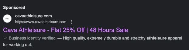
When we were looking for “athleisure on sale” to explore paid traffic eCommerce, we found (and felt excited about the deal):
But when we went into the landing page, all we found was the following with no iteration of the flash sale or the discount that may be automatically applied:
What we’d have liked to see:
- Flash sale info in the first fold
- Any discount code that may be applicable
- Any other ongoing offers in the 2nd or 3rd scroll to keep us on the site
Pro Tip: If your product ad is about a specific product, ensure the landing page is the product page—similarly, your discount ads need to be connected to pages where microcopy states the discount is auto-applied.
2. Make paid copy target high user intent
Across the internet, you’ll find advice like “write killer headlines” or “talk about your USP” to guide how copy under eCommerce PPC management should flow.
However, it’s not as simple and we’ve got three paid ad results from the same search term “best vegan lipstick in UK” to elaborate on:
For each, a different set of factors is working to convert—but look carefully and you’ll see the third result serves TG intent the best:
- It assures shoppers the brand’s products are “always vegan…”
- It talks more about the brand—and in effect is able to relay to users what they can expect on-site
- Microcopy drives confidence in the business’ authenticity as well as offers links that can be off assistance to people ready to buy
3. Offer “more” on the landing page than the ad
While alignment between paid ad and landing page is absolutely essential for paid traffic marketing success, enriching the latter with savings, quizzes or even urgency nudges could inspire more conversions.
When we went looking for “ best portable cooking stoves in the US,” the following popped up:
So we were definitely prepared for a lot of variety when we got to the category page that was serving as the paid ad landing page. What we didn’t expect was:
- Social proof labels to drive confidence
- Great price slashes on some of their bestsellers
In your eCommerce PPC strategy, you’re likely to forget on-site UX to enable paid traffic conversions.
But what the visitor is able to see and do to make sense of your brand, will decide if they’ll convert.
When we looked for “handcrafted fine rings in the US” and came across Misahara’s landing page, we saw how many UX aspects this eCommerce jewelry brand had gotten right:
- Easy filtering and sorting methods (especially if your landing page is also a category page)
- Limited navigation links in the main menu (Misahara centralizes their “about us” and “stories” pages to create customer trust
- Live chat that answers several questions a first-time customer may have
- A social wall for visitors who’d rather get into micro-conversions before converting
Other UX aspects that your eCommerce brand will need to convert paid traffic:
- Few distractions—this includes too many deals set up as categories
- Long-term benefits—highlighting membership rewards is a good way to go
- Review snapshot panel—even third-party review validation from names like TrustPilot works, having mentioned the total number of reviews your brand has received
If you say “skincare made from the most natural ingredients, sourced only locally and authentically,” you’re leaving it at the USP—but if you say something like “naturally good skincare tested to give you maximum nourishment through the seasons,” you’ve moved a few notches up to the UVP.
Highlighting the UVP in your eCommerce paid search begins with how your Google or Facebook ads read.
The next step is to optimize the copy the visitors first see when they arrive on your site.
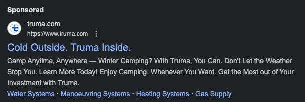
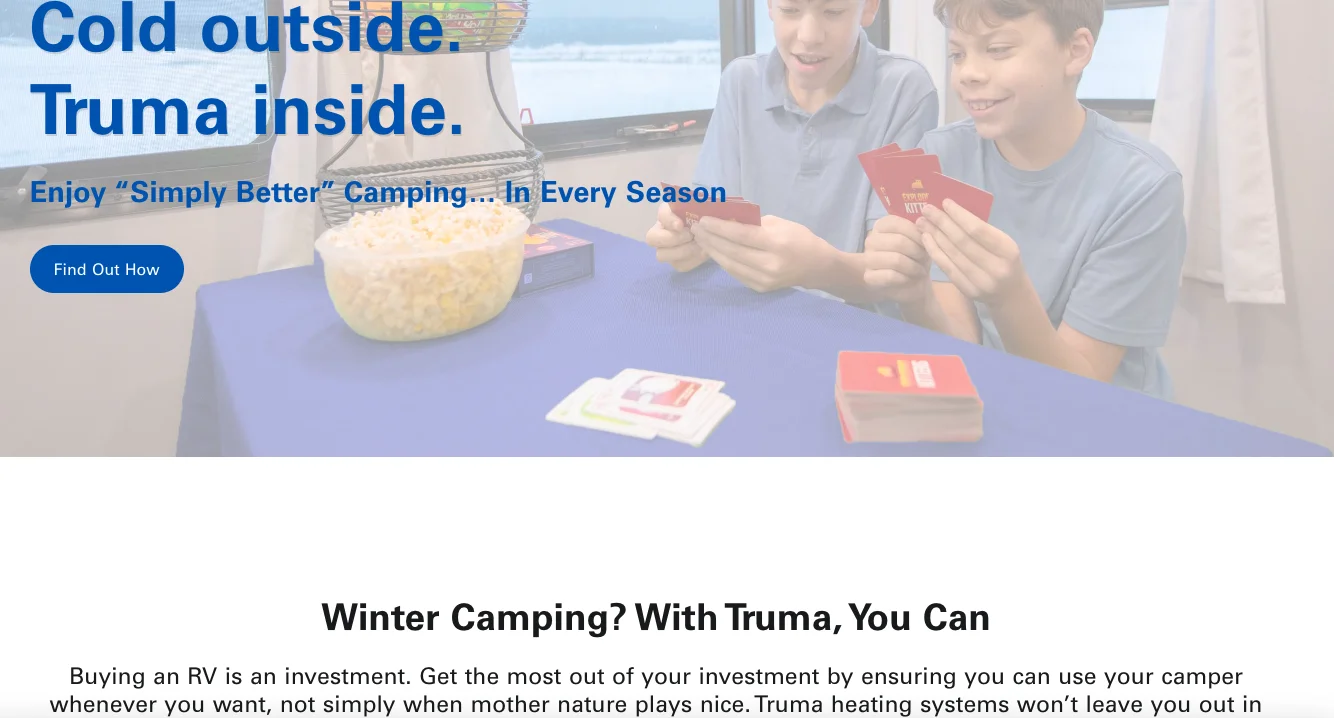
When we went looking for “outdoor gear for dry cold in US,” we found Truma’s paid search listing clearly elaborate the UVP:
What’s better, when we reached their site, it reiterated the UVP to create greater assurance for us to scroll and explore:
6. Get your retargeting strategy sorted
For your paid traffic marketing to work after visitors land up on your site, the ad they see should have been worthwhile.
If you’ve been running a retargeting campaign, showing the same ad to the same visitors multiple times, it’s time to stop.
According to research, if a paid eCommerce ad shows up more than 5 times, it becomes annoying and intrusive—more than 10 times, anger becomes the leading emotion.
Here are a few aspects to remember while setting your retargeting ads in place:
- Show a repeat of products not more than thrice
- If you’re retargeting them for cart abandonment, ensure you reach out with a limited time offer
- For top of the funnel visitors, keep your retargeting restricted to products similar to the ones they may have searched
- For more mature visitors, your retargeting ads can explore limited edition product drops and even exclusive bundling opportunities
7. Offer more reasons to engage & micro-convert
Sure there’s a kind of pressure to deliver on your paid search optimization efforts, but don’t be in a tearing hurry to convert such traffic.
This can mislead you to focus on offering only great deals on your website—instead pay attention to what you’re showing them to convert in smaller steps:
- How you help them sign up on your email list—the quality of pop-up content will matter a lot
- How you help them arrive at a great product or deal—show funnel quizzes that can narrow down their search
- How you help them discover all the different ways your brand & products can make a difference—a blog / resources section that builds awareness and deepens understanding can be great
- How you help them know how to leverage long-term benefits—a separate website section or page on loyalty programs could set them on the conversion path
8. Collab with influencers in your category
There’s a good reason why 72% of marketers used Instagram for influencer marketing in 2022—and seeing the results, 17% invested in this form of paid promotion in 2023.
A great example of this is how Caruselle created a partnership between influencers and Radha beauty products. After running traffic-optimized social ads, they were able to exceed their traffic and conversion goals by 15%.
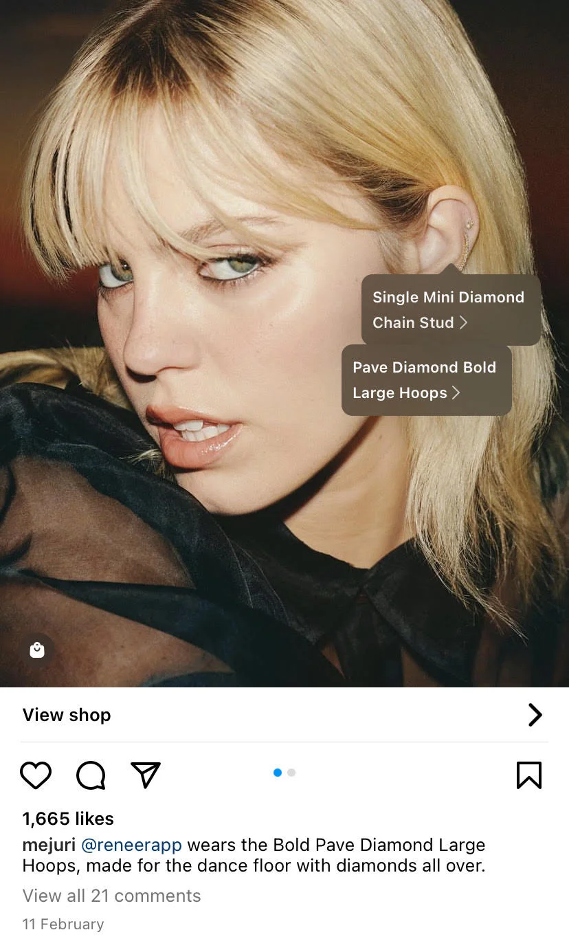
On the other hand, eCommerce brand Mejuri ensures they showcase both major and more micro influencers on Instagram, making their posts shoppable—here’s an example of the singer Reneé Rapp wearing Mejuri products as part of a paid collaboration:
Here are a few things to remember while trying to convert paid traffic through influencers:
- Create relevant #hashtags for wider reach—you can even use these in your social media ads and meta tags to improve recall
- Create a separate category page for this influencer on your site—showcase products across price points here
- Experiment with “account takeovers” to drive more of the said influencer’s traffic to your site
9. Make it super easy to move towards checkout
For your eCommerce PPC strategy to fly, it’s important that your paid visitors find least friction on their journey.
Create a checkout flow that features the following capabilities:
- Make it easy to add products across the site—feature “add to cart” buttons right from the homepage
- Show a product recommendations pop-up but also make sure there’s a CTA there for visitors to click
- Show a secondary CTA of a popular payment method on the product page, cart and checkout
- Promote trust badges where they’re easily visible—locking them away in the footer until checkout might be a bad idea
- Make forms super short and limited to name, email, phone number and shipping address


.avif)
.svg)

.svg)

.svg)
.svg)
