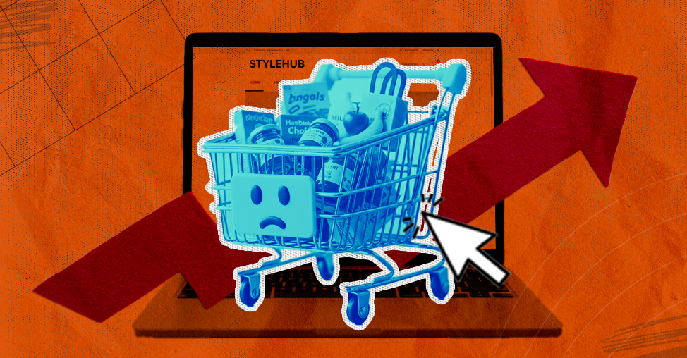
We audited 35 eCommerce websites last month, and here are their top reasons for cart abandonment:
23% of them were not showing shipping charges until checkout 16% of them tried to upsell something unrelated during checkout 11% of them promised a discount but asked for a discount coupon code at the next step
Carts are recovered only when discounts are offered
Shoppers don't see enough value without an incentive
Value proposition, trust signals, product differentiation
Once you've identified where friction is happening, here's why shoppers abandon carts in the first place.
PART 1
Reasons Why eCommerce Stores Have High Cart Abandonment Rates
1. You Are Too Aggressive and Annoying Shoppers
In our frantic quest to "optimize," we have convinced ourselves that a customer’s screen should resemble a chaotic game of Whac-A-Mole.
A customer lands on a homepage and is immediately hit by a pop-up offering a discount.
They close it, only to face a hovering chatbot. As they try to scroll, an exit-intent overlay appears, pressuring them to stay.
Intrusive tactics are among the top reasons for cart abandonment in eCommerce.
2. You Are Laying Too Much Emphasis on Process
To put it simply, the modern checkout process seems exhausting.
You begin with your name (fair enough), proceed to your address (logically sound), but soon find yourself deep in the weeds of "Address Line 2", a field that 71% of sites still fail to hide when empty, leading to no end of confusion for those of us living in houses with only one floor.
According to recent studies, the average US checkout flow still subjects the poor, weary traveler to 23.48 default form elements.
This is despite the fact that their research proves an "ideal" flow, one that doesn't cause a minor existential crisis, requires only about 12 to 14.
A consumer has spent twenty minutes carefully selecting a set of artisanal garden gnomes, only to reach the final "Confirm" button and discover that the shipping costs, which were hitherto a state secret, are roughly double the price of the product.
If you aren't being transparent about the "to-your-door" $$ from the very first click, you aren't being clever; you’re being an obstacle.
4. Your Mobile Experience Is Broken
We must now address the curious case of the mobile checkout, a place where many a merchant’s dreams go to die.
It is a remarkable feat of engineering to design a website that looks majestic on a twenty-seven-inch monitor but behaves like a petulant toddler when viewed on a smartphone.
The problem is rarely one of aesthetics; it’s one of physics.
We ask customers with human-sized thumbs to navigate "Buy Now" buttons the size of a grain of rice and fill out forms that require the precision of a diamond cutter.
What is a normal baseline for checkouts left unfinished in your specific niche? Explore these industry-specific cart abandonment rate statistics to benchmark your performance.
5. You Have a Prominent Empty Coupon Box
There’s a psychological trap many ecommerce stores unintentionally create: the large, prominent, and empty "Enter Discount Code" field placed right next to the subtotal.
According to recent data, around 8% of cart abandonment happens when shoppers hunt for discounts and fail to come back.
Making the coupon field too visible can also increase checkout hesitation.
6. Your Error Messages Are Invisible
We’ve all been there. You fill out your details, click “Complete Purchase,” and nothing happens. The page refreshes with no clear indication of what went wrong.
A silent error appears somewhere on the form, but it’s easy to miss, leaving customers confused and frustrated.
Poor error handling is one of the major reasons for cart abandonment in ecommerce.
When users encounter issues but receive no clear feedback on how to fix them, they abandon the process entirely.
7. You Don't Offer Enough Payment Options
It’s frustrating to guide customers through a long checkout process only to discover at the final step that their preferred payment method isn’t available.
According to recent studies, 10-13% of shoppers abandon their carts when their preferred payment method is missing.
8. You’re Not Showing Trust Signals
Many eCommerce stores fail to display clear trust signals at checkout, because they are busy trying to cross sell.
Customers question the safety of sharing payment details, making this one of the key reasons for cart abandonment.
Product discovery – barriers that prevent shoppers from finding items
Category/collection pages – improvements that drive deeper product exploration
Product page – what to optimize to convert 2–3x more buyers
Cart – ways to ease hesitation and speed up purchase decisions
“The report was deep and super insightful. Can’t believe it’s free.”
Logan Christopher CEO, Empire Herbs
PART TWO
The Smartest Things Stores are Doing to Reduce Cart Abandonment (Real-World Examples)
Hesitation vs Advanced Stores
WHAT CREATES HESITATION
WHAT ADVANCED STORES DO
Pressure-heavy urgency
Give shoppers controlled flexibility
Generic upsells
Use contextual recommendations
Vague trust badges
Place reassurance where doubt happens
Aggressive discounting
Increase perceived value intelligently
Reactive support
Resolve objections before exit
1. Letting Shoppers Set Their Own Deadline
Countdown timers had their moment.
In 2026, stores that reduce abandonment without pressure have flipped the script, giving shoppers control of the timeline rather than bulldozing it.
It turns out that when people feel ownership of a decision, they're far more likely to follow through.
For example, Anthropologie uses a low-pressure "save for later" prompt with a personal wishlist function rather than a ticking clock, giving shoppers ownership of when they return.
Key Lessons from Anthropologie
"Add to Wish List" placed directly beneath the primary CTA gives hesitating shoppers a pressure-free middle ground.
Offering both Klarna and Afterpay installments right beneath the Add to Basket button removes the price objection before it can form.
The 136 wishlist saves visible on the product image does quite a powerful work, it signals desirability without a single word of pushy copy, letting social proof speak for itself.
Caveat: Anthropologie can lean on "Add to Wish List" as a recovery tool because they have a large, loyal, return-visitor customer base who genuinely come back.
If your store is heavily dependent on first-time traffic from paid ads or social, a wish list alone won't recover the cart.
You'll need an active follow-up sequence, whether email or SMS, to turn that saved item into a completed purchase before the shopper forgets entirely.
Is your current email sequence failing to nudge shoppers past the finish line? See how to fix it with these tactical abandoned cart recovery email examples.
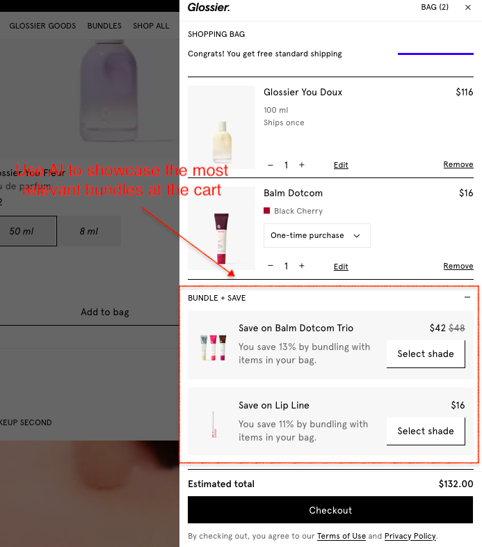
2. Using AI to Read What the Cart Is Actually Saying
A shopping cart isn't just a list of products; it's a live signal of intent.
The smartest stores are using AI to decode that signal in real time, surfacing bundles, complementary products, and offers that feel like curation rather than upselling.
The result is a cart experience that increases order value while keeping the shopper moving forward.
Glossier's AI surfaces "pairs well with" bundles at a reduced price, feel-good curation, not aggressive upselling.
One of the cleanest in-cart AI experiences in US eCommerce right now.
Key Lessons from Glossier
The "Bundle + Save" panel sits inside the cart drawer itself, not on the product page, not in a pop-up, which means it catches shoppers at peak intent, right when they're already committed enough to have added two products.
Showing the exact percentage saved ("You save 13% by bundling with items in your bag") makes the value proposition concrete and immediate.
The "Select shade" CTA within the bundle suggestion is a small but brilliant detail; it keeps the shopper in a decision-making mindset rather than a passive browsing one, which significantly increases the likelihood that the bundle will be added.
Caveat: Glossier's bundle suggestions work because they're directly connected to what's already in the cart.
The Balm Dotcom Trio appears because a Balm Dotcom is already in the bag.
If your AI or manual bundling logic isn't that precise, generic "you might also like" suggestions in the cart drawer will feel intrusive rather than helpful and may actually distract from completing the original purchase.
The moment a shopper adds an item to the cart, their brain shifts into loss-aversion mode.
The stores consistently outperforming here have figured out how to interrupt that pattern, tying the purchase to something bigger than the product itself.
Cause-led cart messaging doesn't just recover sales; It builds the kind of loyalty that brings people back without a discount.
Cotopaxi's "Gear for Good" mission is woven directly into the cart UI; a percentage of your purchase funds goes to poverty relief, visible before you pay.
It doesn't feel like marketing; it feels like teamwork towards a better world.
Key Lessons from Cotopaxi
The "Do Good" donation toggle sits at the bottom of the cart drawer, right above the checkout button, making it the last thing a shopper sees before committing, which is precisely when cause-led messaging has the most emotional pull.
Making the donation an opt-in toggle rather than an automatic addition puts the shopper in control, which paradoxically makes them more likely to engage with it feels like a choice, not a charge.
The copy "Donate today and help end extreme poverty in our lifetime" is specific enough to feel meaningful but broad enough to resonate across every customer segment.
Caveat: Notice that Cotopaxi is completely transparent about the donation mechanics: "this product does not qualify for discounts" and "donations are not tax deductible" are both called out clearly in the cart. That level of honesty is what makes the cause messaging feel trustworthy rather than exploitative.
If you're adding a donation toggle to your cart, get the small print right. US shoppers will notice if you don't, and the trust damage will far outweigh the conversion gain.
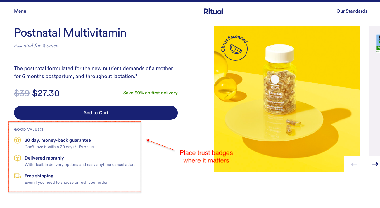
4. Putting Trust Signals Where the Doubt Actually Lives
Most brands front-load trust and then go quiet exactly where shoppers need it most: inside the cart.
In 2026, the stores with the lowest abandonment rates aren't relying on badges alone; they're providing the right reassurance at the precise moment a shopper is most likely to talk themselves out of buying.
For instance, Ritual does a good job at displaying the most relevant trust signals at the right moment in the customer’s journey.
Their product page displays a 30-day money-back guarantee badge, “delivered monthly”, and “free shipping”, all positioned right below the Add-to-Cart.
Key Lessons from Ritual
Placing three trust signals, money-back guarantee, flexible delivery, and free shipping in a single boxed panel directly beneath the Add to Cart button means a shopper can't click without seeing them first; the placement isn't accidental, it's deliberate friction removal.
"Don't love it within 30 days? It's on us" is doing something smarter than a standard guarantee. The conversational tone makes it feel like a brand promise rather than a legal disclaimer, which lands very differently with a hesitating first-time buyer.
The "even if you need to snooze or rush your order" copy beneath free shipping addresses a subscription-specific anxiety flexibility that most brands bury in the FAQ and never think to put next to the buy button.
Caveat: Ritual's trust panel works because every line is specific and actionable; there's no vague "customer satisfaction guaranteed" language anywhere.
If you're going to replicate this format, resist the temptation to pad it with generic badges. Three sharp, specific signals will always outperform six vague ones, and a cluttered trust panel can actually increase doubt rather than reduce it.
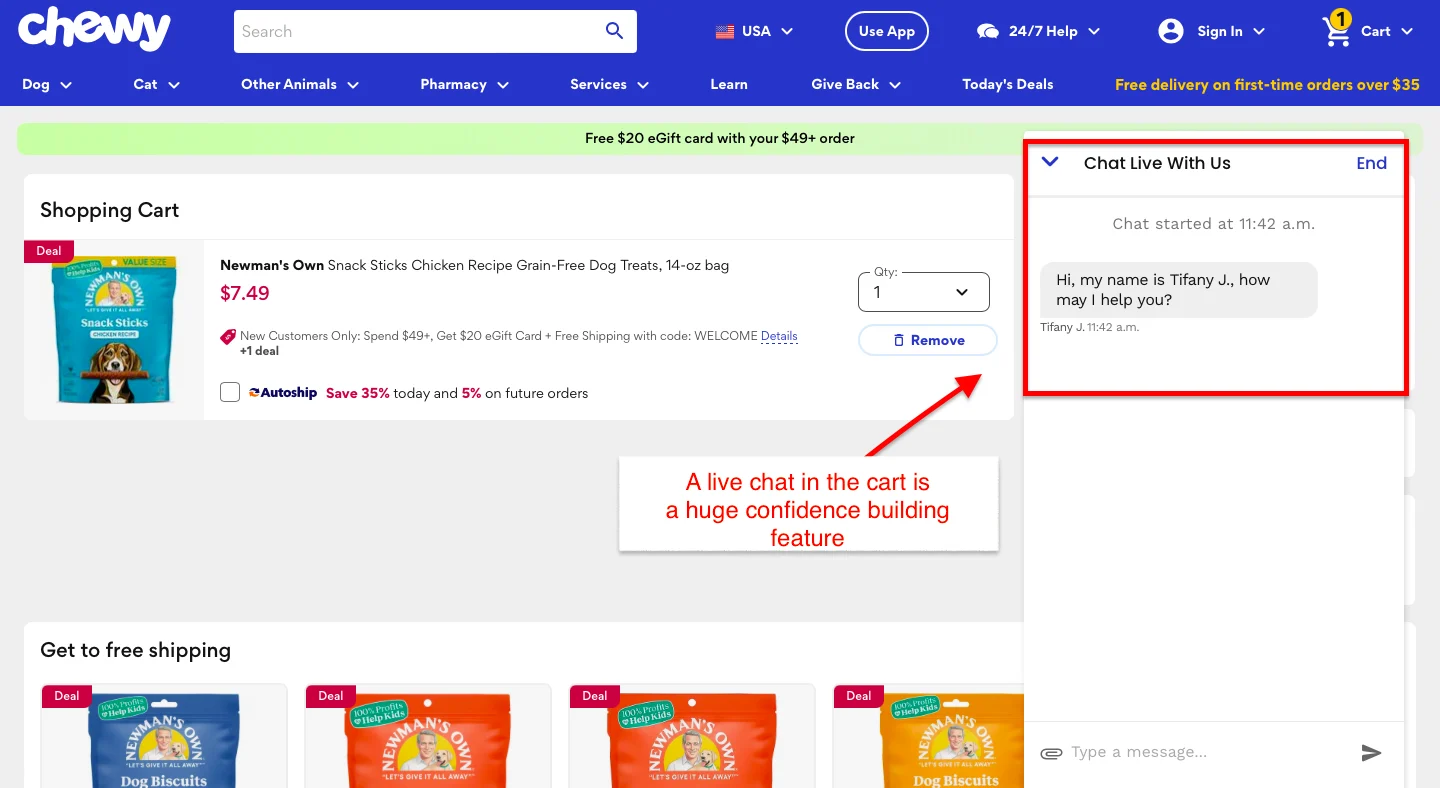
5. Triggering Live Chat In Cart
The smartest stores are using live chat as a precision conversion tool, not a support function, and the recovery rates reflect it.
Chewy's live chat is one of the most behavior-sophisticated in US eCommerce. Customers can easily find it on their cart page and connect with a human agent for any questions.
We think that’s an excellent strategy to alleviate any last-minute fears a customer might have.
Key Lessons from Chewy
Routing carts to a human agent rather than a bot makes a measurable difference in recovery rates for considered purchases.
Addressing specific objections, shipping timelines, return policies, and product compatibility directly in the chat message removes the need for the shopper to look for answers elsewhere.
Caveat: Live chat is only as good as the response behind it. If your team can't respond within 60–90 seconds during peak hours, a poorly timed chat trigger does more harm than good. Set realistic availability windows and make them visible to shoppers upfront.
6. Showing Social Proof That Proves Results, Not Just Popularity
Five-star ratings are table stakes.
US shoppers have learned to scroll past them. What's actually closing carts in 2026 is outcome-driven proof: specific results, real timelines, relatable customers.
For example, Tula displays real data showing how its skincare products worked for most of its customers.
What we liked about this messaging is that it’s prominently placed on their product display page and helps remove any doubts customers might have about the product's merit.
Key Lessons from Tula
Clinical proof with specific percentages ("97% saw clearer skin") outperforms star ratings at the cart stage; it's data, not opinion, and skeptical shoppers know the difference.
Grouping three distinct outcomes in one panel, clarity, hydration, and breakout prevention, addresses multiple objections in a single glance without cluttering the page.
Pairing hard proof with a discounted bundle price ($88 vs $126) on the same screen removes both emotional and rational barriers to purchase.
Caveat: Tula's clinical evidence is supported by a study of 31 subjects over 1 week, self-assessed. That footnote matters more than it looks.
If you're going to lead with percentages, make sure they're defensible. US shoppers and the FTC are paying closer attention to results-based claims than ever before.
Vague statistics without a source will do more damage than no statistics at all.
Why visitors don’t trust your store within 3 seconds
Why shoppers can’t find what they’re ready to buy
What’s stopping 2-3x more shoppers from clicking “Add to Cart”
Where buyers hesitate right before purchase
Why high-intent shoppers still drop off
“The report was deep and super insightful. Can’t believe it’s free.”
Logan Christopher CEO, Empire Herbs
7. Testing Micro-Incentives Before Giving Discounts Away
Discounting to recover cart abandonment is expensive and trains shoppers to wait.
The stores protecting margin in 2026 are testing smarter free-shipping thresholds, bonus samples, and early access, finding the smallest incentives that tip the decision without eroding what they've built.
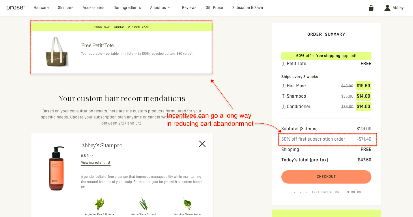
For instance, Prose uses a quiz to offer personalized product recommendations, then gives first-time customers a handsome discount and free shipping.
They also throw in a free tote bag! Cool, isn’t it?
Key Lessons from Prose
Stacking multiple incentives, a free physical gift, 60% off, and free shipping in a single cart view, creates an almost irresistible value moment without a single straight discount on the core product price
The free Petit Tote is called out in its own dedicated panel at the top of the cart, giving it the visual weight of a featured product rather than a throwaway freebie. Perceived value matters as much as actual value
"Love your first order, or it's on us", sitting quietly beneath the checkout CTA does the heavy lifting. It's a money-back guarantee that doesn't sound like one, which makes it feel more human and less transactional
Caveat: Prose can afford this incentive stack because their subscription model recovers the margin over time.
If you're not running a subscription business, layering a free gift, a 60% discount, and free shipping at the same time will hurt badly.
Start with one incentive, test its impact on conversion and margin, then layer from there.
Cart Friction Audit: 15 Questions Every eCommerce Store Should Ask
AUDIT QUESTION
WHAT IT HELPS YOU DIAGNOSE
The "Stranger Danger" Test: Can a customer buy without creating an account?
Whether account creation is creating unnecessary friction.
The Surprise Tax: Are shipping costs visible before checkout?
Whether hidden costs are causing last-minute abandonment.
The "Thumb" Factor: Can shoppers comfortably complete checkout on mobile?
Whether mobile usability is hurting conversion.
The Administrative Burden: Does your checkout have fewer than 14 form fields?
Whether checkout complexity is slowing customers down.
The Coupon Exit: Is the discount code field hidden until needed?
Whether you’re encouraging shoppers to leave and search for discounts.
The Trust Tally: Would a first-time visitor trust your site with their credit card details?
Whether lack of trust signals is reducing purchase confidence.
The Speed Trap: Do key checkout pages load quickly?
Whether performance issues are causing drop-offs.
The Payment Palette: Do you offer wallets, BNPL, and alternative payment methods?
Whether payment friction is preventing completion.
The "Oops" Feedback: Are form errors highlighted clearly and immediately?
Whether usability issues are creating frustration.
The Breadcrumb Trail: Is there a visible checkout progress indicator?
Whether shoppers know how close they are to completing the purchase.
The Ghost of Fees Past: Are all charges visible before the final payment step?
Whether surprise fees are hurting conversion.
The Return Policy Panic: Is your return policy easy to find and understand?
Whether perceived purchase risk is too high.
The Interruption Factor: Have you minimized pop-ups and distractions during checkout?
Whether interruptions are breaking buying momentum.
The Security Blanket: Are security badges, guarantees, and trust signals visible where decisions happen?
Whether shoppers feel safe completing the purchase.
The Final Hurdle: Have you personally completed a purchase on your store recently?
Whether internal teams are missing obvious friction points.
If you answer "No" or "Not Sure" to more than three of these questions, your cart abandonment problem may be larger than a single checkout issue.
How do the best online retailers structure their carts to maximize average order value? Explore these real-world cart page designs to steal their cross-sell and trust tactics.
2X Your eCommerce Revenue
Most stores treat cart abandonment like a leaky bucket; patch one hole, find three more.
The smartest ones we've worked with stopped chasing leaks and rebuilt the bucket from scratch. Better checkout flow, sharper trust signals, smarter recovery sequences, and suddenly the 70% that was walking out the door starts looking very different.
The fixes are rarely dramatic. But you have to know where to look first. That's exactly what our free audit does.
We'll go through your cart experience end to end, identifying friction points, missed nudges, and quick wins your competitors haven't found yet. Straightforward, specific, and genuinely useful, whether you work with us or not.


.avif)
.svg)

.svg)

.svg)
.svg)
