A limited-time offer is any promotion with a defined expiry, a countdown, a stock cap, or a closing deadline. Used well, it's one of the highest-leverage conversion tools in eCommerce. Most brands get it wrong not because the tactic is flawed, but because there's no real strategy behind the urgency. This guide fixes that.
The Convertcart Framework: What Type of Limited-Time Offer To Run (Based On Your Goal)
If your primary goal is...
And the shopper's state is...
The Right Category to Use
Strategic Logic
Clearing out Stock
Browsing for deals
Scarcity-Driven (Availability-Based)
Competition between shoppers drives immediate action on specific SKUs.
Closing a Hesitant Sale
About to abandon the site
Behavior-Triggered (Contextual)
Surgical intervention that addresses doubt at the exact moment of hesitation.
Driving a Revenue Peak
Highly engaged (Email/SMS)
Deadline-Driven (Time-Based)
A hard "clock" forces a binary yes/no decision for your most loyal audience.
Scaling New Acquisition
Entering a high-noise period
Event-Driven (Campaign-Based)
Leverages existing "ambient urgency" (e.g., Black Friday) to reduce acquisition costs.
1. Deadline-Driven
A specific end date or time is communicated clearly, and the offer disappears when the window closes. Simple mechanism; execution is everything.
2. Scarcity-Driven
Where time pressure comes from the clock, scarcity pressure comes from competition. Shoppers aren't just racing time; they're racing each other.
3. Behaviour Triggered
Urgency is deployed in response to a specific shopper action, such as an exit intent, a cart abandonment, or a prolonged product-page session.
4. Event-Driven
Seasonal events like Black Friday, summer clearance, and back-to-school generate ambient urgency that brands can ride rather than create.
And Some Really Cool Limited Time Offer Examples (With Breakdowns—Why They Work So Well)
Theory is one thing. Here's what it looks like when a brand actually gets it right and the mechanics behind why it worked, so you can steal it for your own store.
CATEGORY 1 — DEADLINE-DRIVEN URGENCY (TIME-BASED)
Brooklinen — Anniversary Sale
What they did: For their 5th anniversary, Brooklinen sent a time-bound email offering 20% off sitewide. The email led with emotionally charged copy, a single CTA, and a live countdown timer ticking toward the deadline.
Why it works: The countdown exploits loss aversion — shoppers feel the discount slipping away second by second. Anchoring it to a milestone (their anniversary) adds emotional legitimacy: the urgency feels earned, not manufactured. One CTA eliminates decision paralysis.
Pattern you can steal: Tie a deadline to a real brand moment so the urgency feels earned rather than invented.
Where to use this: Email and SMS campaigns. Works especially well when you have a genuine milestone to hang the offer on.
Expected impact: Countdown-timer emails consistently lift click-through rates by 10–15% vs. static-deadline equivalents.
How to replicate it:
Tie the offer to a real event — anniversary, milestone order count, founder birthday. The more specific, the more credible.
Keep copy brief and emotionally specific. Tell readers what they lose, not just what they gain.
Use a live countdown timer, not a static phrase like "ends soon." Seconds ticking down hit differently.
Lock the email to a single CTA. Competing actions dilute the urgency you've built.
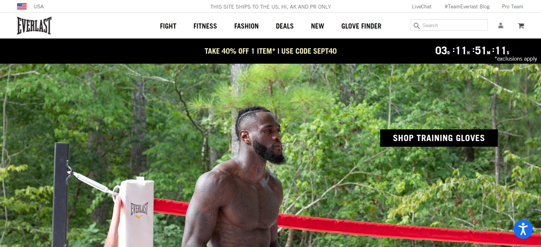
Everlast — Above-the-Fold Countdown Timer
What they did: Everlast places a countdown timer directly in the hero section of its homepage above the fold, impossible to miss within the first second of landing. The timer runs against a contrasting colour palette and sits alongside an unambiguous offer headline.
Why it works: Above-the-fold placement is one of the most effective spots in eCommerce: visitors spend 54% of their viewing time there. By putting the countdown exactly where eyes land first, Everlast ensures the urgency is seen before anything else — including the navigation, the product imagery, or competing calls to action. The colour contrast between the timer and background does the cognitive heavy lifting, making it impossible to gloss over.
Pattern you can steal: Put your countdown where eyes land first — above the fold — not buried below product copy where it's easily missed.
Where to use this: Homepage hero sections, sitewide sale announcements, and any campaign where the goal is instant awareness of the offer window.
Expected impact: Above-the-fold countdown timers can increase on-page conversion by 3–10% — the uplift is highest when the offer itself is strong.
How to replicate it:
Use a contrasting colour for the timer so it stands out from your brand palette — not competes with it.
Keep the offer headline short enough to read in under three seconds. If it needs explaining, it's too complex.
Pair the timer with a stock or purchase-count signal (e.g. "1,200 already claimed") to add scarcity alongside the deadline.
A/B test placement: hero section vs. sticky header bar — some audiences respond better to persistent visibility.
How do the best online stores use psychological triggers to speed up the purchase decision? Explore these optimized ways to implement a countdown timer eCommerce layout that actually lifts revenue.
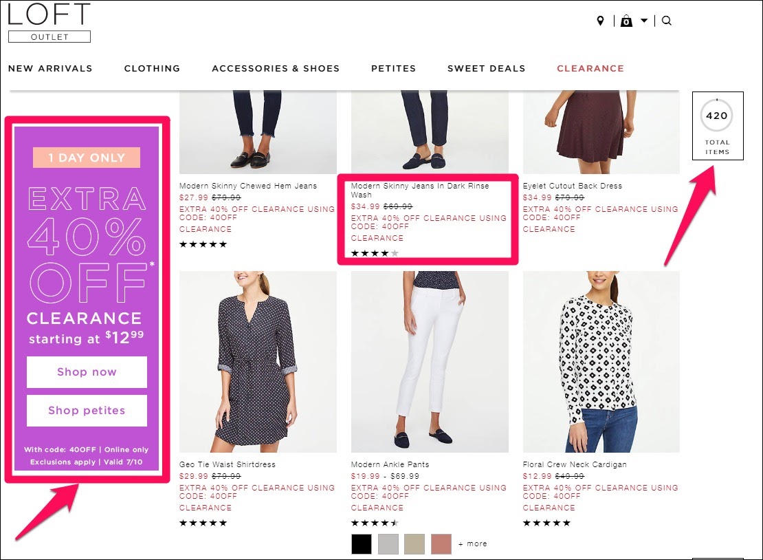
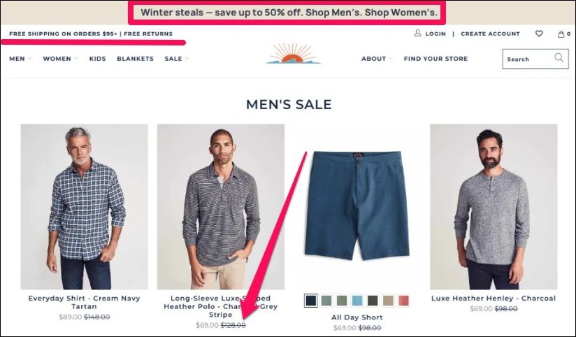
What they did: Loft ran a one-day clearance offering 40% off selected products, with prices starting from $12.99. A sidebar showed a live inventory indicator and customer ratings directly on each product.
Why it works: The stock indicator makes competition visible; seeing three units left in your size means someone else might grab them. The $12.99 entry price lowers the psychological barrier for fence-sitters. Customer ratings handle the final objection: shoppers know the thing they're racing for is actually worth having.
Pattern you can steal: Stack scarcity + social proof on the same page. The combination converts faster than either element alone.
Where to use this: Clearance pages, end-of-season sales, any situation with genuine inventory pressure.
Expected impact: Real-time stock indicators on clearance pages can lift conversion by 25–30% vs. static product listings.
How to replicate it:
Use a real inventory count; never fake it. Savvy shoppers notice, and the trust damage is permanent.
Set a narrow window: one day for clearance is ideal. Longer dilutes urgency.
Surface customer reviews directly on the offer page, removing any reason to navigate away to verify.
Price the entry point low enough that hesitation feels irrational.
JackRabbit — Flash Sale Landing Page
What they did: JackRabbit runs week-long flash sale campaigns on a dedicated red-themed landing page, offering 40% off selected products plus free shipping on orders above $75. The page makes category navigation effortless — shoppers can browse any department without leaving the sale environment.
Why it works: The red colour theme is doing specific psychological work here: red is consistently shown to create urgency and excitement, and in a sales context, it primes shoppers to act quickly. The dedicated landing page removes all navigation friction — there's no reason to leave, and no competing content to distract. The $75 free-shipping threshold is a quiet AOV lever that nudges shoppers to add one more item rather than pay for delivery.
Pattern you can steal: Build a dedicated, friction-free sale environment — a standalone page converts better than a banner dropped on an existing category page.
Where to use this: Week-long or multi-day flash sales where you want shoppers to browse broadly rather than buy a single targeted product.
Expected impact: Flash sales can boost repeat purchase rates by up to 385% on average — the dedicated page format ensures those browsers don't slip away mid-sale.
How to replicate it:
Use red or high-contrast accent colours for flash sale pages — the psychological association with urgency is well established.
Make cross-category browsing seamless: shoppers should be able to move between departments without leaving the sale hub.
Set a free-shipping threshold 10–15% above your current AOV to lift basket sizes without giving away margin.
Keep the campaign window tight — anything beyond 72 hours starts to lose urgency. A 24–48 hour window is optimal.
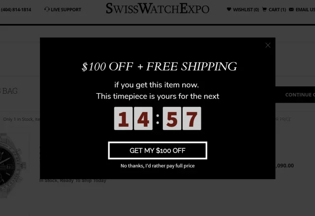
What they did: SwissWatchExpo deployed an exit-intent pop-up triggered the moment a shopper moves to leave. The pop-up offered a discount plus free shipping, paired with a countdown timer and a benefit-focused CTA — all in a minimalist design.
Why it works: This is urgency at the exact moment of maximum indecision. The exit motion signals hesitation, not disinterest. The pop-up intercepts that hesitation with a concrete reason to stay. A countdown timer on top of contextual relevance compounds the pressure. The minimalist design ensures the offer is the only thing to look at.
Pattern you can steal: Trigger urgency at the hesitation point, not the browsing point — one well-timed intervention beats three earlier interruptions.
Where to use this: Any high-consideration product page or cart where price is the likely hesitation factor.
Expected impact: Well-configured exit-intent popups recover 5–15% of abandoning visitors when the offer is genuinely relevant.
How to replicate it:
Trigger only on exit intent — not on load, not after 5 seconds.
Keep design ruthlessly simple: the offer, the timer, one CTA.
Personalise where possible — reference the category or product they were browsing.
On mobile, exit intent is a swipe or back navigation, not a cursor movement. Configure your trigger accordingly.
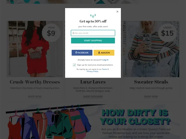
thredUP — First-Visit Discount Popup
What they did: thredUP offers first-time visitors up to 50% off their first order — but rather than displaying the discount code immediately, the brand asks shoppers to submit their email to receive it. The offer is made time-sensitive to drive immediate action.
Why it works: This is behaviour-triggered urgency at its most strategic. thredUP knows 92% of first-time visitors won't buy on their first visit, regardless of the offer, so rather than going for an immediate conversion, the brand uses the limited-time offer to capture the email address. The urgency pushes the email submission; the email enables the long-game nurture. It's two conversion goals achieved with one popup.
Pattern you can steal: Use a first-visit popup to capture email addresses, not just immediate sales — urgency drives the opt-in, and the email sequence handles the conversion.
Where to use this: First-visit homepage popups, especially for stores with longer consideration cycles or higher-priced products.
Expected impact: Retargeted visitors are 43% more likely to buy — capturing the email from a non-converting first visit is often worth more than the immediate sale.
How to replicate it:
Trigger the pop-up after 60 seconds or on exit intent — not on arrival. Give shoppers time to establish interest first.
Ask for an email to receive the code, not display it immediately — this grows your list and creates a second touchpoint.
Make the discount substantial enough to feel worth the email submission. 10% rarely clears that bar; 30–50% does.
Follow up non-converters with a nurture sequence. The email you captured is the beginning of the relationship, not the end of it.
Harley Davidson — Re-engagement Email
What they did: When shoppers missed a limited-time sale, Harley Davidson sent a re-engagement email with the message: "These deals have ended, but more deals are waiting for you." The email featured multiple product categories, uber-specific pricing (e.g., $139.95), free shipping, free returns, and a gift-with-purchase threshold.
Why it works: The copy does something clever: it acknowledges the missed offer rather than pretending it didn't happen. This honesty creates a reciprocity effect — by being straight with the shopper, the brand earns goodwill for the next offer. The specific pricing ($139.95 rather than $140) signals fairness and reduces the perception of artificial inflation. Multiple categories prevent choice paralysis by giving shoppers multiple entry points into the offer.
Pattern you can steal: Re-engage shoppers who missed your last offer by being honest about it — then immediately give them a reason to stay.
Where to use this: Post-sale re-engagement emails, lapsed customer win-back flows, or any moment when you need to bring back shoppers who dropped off.
Expected impact: Re-engagement emails that acknowledge a missed offer and present a clear next step can recover 10–15% of lapsed shoppers who would otherwise have churned.
How to replicate it:
Lead with honesty: acknowledge the missed offer before introducing the new one. It builds trust rather than eroding it.
Use specific pricing figures rather than rounded numbers — $139.95 reads as carefully calculated, not arbitrary.
Offer multiple product categories to give different shoppers different entry points, and avoid funnelling everyone to a single SKU.
Stack incentives: free shipping + free returns + gift-with-purchase together lower perceived risk from multiple angles simultaneously.
Seasonal events like Black Friday, summer clearance, and back-to-school generate ambient urgency that brands can ride rather than create. The risk is commoditisation: every brand runs a Black Friday sale. The ones that convert offer something distinct: a threshold incentive, a bundle, an exclusive, not just a market-matching discount.
Best for: sitewide campaigns, seasonal promotions, culturally anchored shopping moments.
Faherty Brand — Winter Seasonal Sale
What they did: Faherty ran a winter seasonal sale on a dedicated, holiday-themed landing page, offering up to 50% off with free shipping on orders above $95. Price displays showed the actual dollar savings alongside the percentage.
Why it works: Seasonal events do the urgency heavy lifting — shoppers already know the window is limited. The free shipping threshold at $95 is a subtle AOV lever: it nudges customers to add one more item rather than pay for delivery. Dollar-off figures feel more concrete than percentages alone, a textbook framing effect.
Pattern you can steal: Use seasonal ambient urgency as the foundation, then layer a threshold incentive to lift average order value.
Where to use this: Sitewide seasonal campaigns. The dedicated landing page signals intent; a banner on the homepage doesn't.
Expected impact: Free-shipping thresholds set 10–15% above current AOV typically increase basket size by 8–12% without margin erosion.
How to replicate it:
Build a dedicated landing page, not a homepage banner. A page signals commitment.
Theme the page to the season so it feels purposeful, not generic.
Show dollar savings and percentage together: both numbers work better than either alone.
Set a free-shipping threshold just above your current AOV.
Add a countdown timer. Faherty didn't do it; it's the one gap in an otherwise sharp execution.
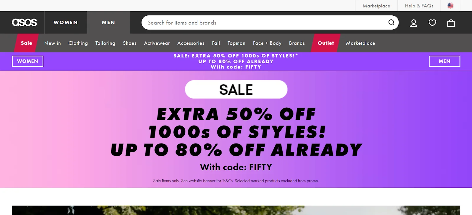
ASOS — Black Friday Landing Page
What they did: ASOS builds a dedicated Black Friday hub weeks in advance, teasing deals before they go live. On the day, the hub shows live countdown timers per deal category, a progress bar for overall sale inventory, and personalised product recommendations within the sale.
Why it works: ASOS turns Black Friday into an event rather than a discount. The advanced teasing builds anticipation — shoppers bookmark and return. Per-category timers create urgency across multiple product areas simultaneously. Personalisation inside the sale means the urgency feels relevant, not generic. The progress bar (showing how much of the sale inventory remains) is a sitewide scarcity signal that lifts basket urgency across every page.
Pattern you can steal: Build anticipation before the event and extend urgency across the sale through category-level timers and sitewide progress signals.
Where to use this: Any major campaign event — Black Friday, Cyber Monday, anniversary sales — where you want to drive multi-session engagement.
Expected impact: Advance teasing for Black Friday events increases day-of conversion by 15–25% vs. brands that launch without pre-event build-up.
How to replicate it:
Tease the sale 5–7 days before launch. Collect early sign-ups so you have a warm list to email on the day.
Use per-category countdowns rather than a single sitewide timer — shoppers in different departments feel the urgency personally.
Add a sitewide inventory progress bar to create ambient scarcity across all pages.
Surface personalised picks within the sale hub — urgency converts faster when the product is already relevant.
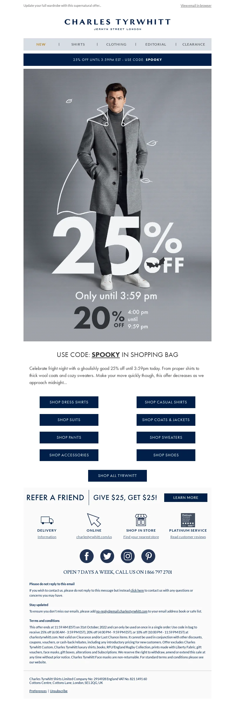
Charles Tyrwhitt — Dual Discount Email
What they did: Charles Tyrwhitt runs time-sensitive dual discount email campaigns where shoppers get 25% off until 3:59 PM — and 20% off thereafter. The gap between the two tiers is clearly communicated, with the deadline displayed prominently.
Why it works: This is loss aversion with a precision edge. It's not just "offer ends tonight" — it's "you will lose 5 percentage points of discount at exactly 3:59 PM." The specificity of both the time and the tier gap makes the cost of delay concrete and calculable. Shoppers don't just feel vague urgency; they can quantify exactly what procrastination will cost them. That specificity is what separates this from a standard countdown-timer email.
Pattern you can steal: Make the cost of delay quantifiable — a tiered discount with a specific cutoff time converts better than a single deadline because shoppers can calculate exactly what they lose by waiting.
Where to use this: Email campaigns targeting warm audiences who are already familiar with the brand and likely to be in the consideration phase.
Expected impact: Tiered-discount urgency emails with specific cutoff times typically outperform single-deadline equivalents by 15–20% on click-to-purchase rate.
How to replicate it:
Use two discount tiers with a clearly communicated cutoff — the gap between them is what creates urgency, not the discount itself.
Make the time precise: "3:59 PM" converts better than "this afternoon" because the loss feels immediate and real.
Apply contrasting colours to the two discount figures so the superior tier stands out visually at a glance.
Pair with a countdown timer so shoppers can see exactly how much time they have to claim the better rate.
The Anatomy of a High-Converting Limited-Time Offer
Strip back any offer that converts well, and you'll find the same six components, each doing a specific job. Miss one, and the whole structure weakens.
1. Value proposition (must be genuinely compelling)
Urgency amplifies desire — it cannot create it. The offer itself has to be worth acting on before the countdown kicks in. "10% off" rarely clears this bar. "40% off, today only, while stock lasts." might. Lead with value; let urgency push shoppers over the line.
2. Urgency mechanism (real or it's worthless)
A countdown timer, a stock indicator, or a fixed deadline, whichever you use, must be genuine. Fake scarcity is one of the most common conversion killers, not because shoppers can always prove it's fake, but because the suspicion alone is enough to stop them from acting.
3. Strategic placement (right moment, not every moment)
Urgency shown too early reads as pressure. Urgency shown after a shopper has decided to leave is wasted. The sweet spot is where decisions happen: the product page, the cart, the checkout, or in direct response to a specific behaviour like exit intent.
4. Action-driven CTA copy (fold the deadline into the button)
"Shop now" is a direction. "Claim 40% off ends midnight" is a reason. The best CTAs on limited-time offers fold the urgency into the button text itself, so the action and the deadline are inseparable.
5. Visual cues (impossible to miss at a glance)
Contrast, size, and motion all serve urgency. A countdown timer in a contrasting colour above the fold will be seen. The same timer buried in grey text below the fold won't. Design as if your shopper will spend four seconds on the page — because they might.
6. Trust elements (urgency raises stakes; proof lowers perceived risk)
Customer reviews, return policies, and transparent terms don't compete with urgency — they make it safe to act on. Strip them out, and you get pressure without reassurance, which sends people away rather than through the checkout.
Where to Place Limited-Time Offers for Maximum Impact
Product pages
Best for: reducing hesitation at the decision stage when desire is already established.
Avoid when: the shopper is still in early discovery urgency before desire feels like pressure, not a deal.
A product-page offer works because the shopper is already interested. Urgency here reduces hesitation rather than creating it from scratch. Stock indicators and time-limited pricing perform especially well in this placement.
Cart and checkout
Best for: recovering abandonment and increasing AOV at the highest-intent moment in the funnel.
Avoid when: the urgency contradicts something already promised (e.g., free shipping already in the cart).
Cart abandonment sits at roughly 70% across eCommerce. A well-placed offer at this stage, free shipping for the next hour, and a small discount for completing the order now can recover a meaningful slice of that loss without discounting sitewide.
Homepage
Best for: sitewide sales and seasonal campaigns where the offer is relevant to every visitor.
Avoid when: the offer is product-specific, homepage urgency for a single SKU is confusing, not compelling.
Homepage urgency captures early attention and signals that something is happening. Works best when the offer is broad enough to be relevant regardless of why the visitor arrived.
Email and SMS
Best for: time-bound offers to warm audiences who have already opted in and trust the sender.
Avoid when: the list is cold, or the offer is poorly matched to the segment, irrelevant urgency, or people.
Countdown timers in email, combined with a single clear CTA, consistently outperform static offers on the same products. The channel itself implies a degree of personal relevance that makes urgency land harder.
Avoid when: they fire on every page, on every visit, for every visitor intrusion earns forgiveness only when it's relevant.
The most intrusive format, which means trigger logic matters more here than anywhere else. Exit-intent timing, session-based triggers, and first-visit discounts all outperform generic timed pop-ups.
Mistakes That Kill Limited-Time Offer Conversions
Fake urgency
Countdown timers that reset. "Only 3 left" on infinite digital inventory. Offers that "end tonight" and reappear tomorrow. Each of these teaches shoppers that your urgency is theatre, and once that lesson is learned, no timer will move them again. Fake urgency is worse than no urgency.
Urgency overload
When everything is urgent, nothing is. A site where every product has a countdown timer and every banner shouts "limited time" creates noise that shoppers tune out entirely. Urgency requires contrast to work.
Poor timing
Urgency before desire is pressure. Urgency after someone has already decided to leave is too late. The placement and trigger logic behind a limited-time offer matters as much as the offer itself.
Weak offers dressed as urgent
A 5% discount is not interesting regardless of when it expires. Urgency is an amplifier, not a salvage strategy. If the underlying offer isn't compelling, no countdown timer will make it so.
5. Broken mobile experience
More than half of eCommerce traffic is mobile. Countdown timers that don't render properly, popups that are impossible to close on a small screen, and CTAs too small to tap actively destroy the urgency you're trying to create.
FAQs About Limited-Time Offers
Do countdown timers really increase conversions?
Yes, when used correctly. Studies consistently show countdown timers lift click-through rates by 10–15% in email and can improve on-page conversion by 3–10%. The caveat is credibility: a timer that resets or doesn't correspond to a real deadline trains shoppers to ignore it.
How long should a limited-time offer last?
It depends on the offer type. Flash sales perform best under 24 hours two to three hours is optimal for pure impulse purchases. Seasonal campaigns can run for days because the cultural window is already understood. For most ecommerce promotions, 24 to 72 hours is the sweet spot: long enough to reach your audience across time zones, short enough to maintain genuine urgency.
Can urgency hurt brand trust?
Fake urgency can and does. Real urgency, clearly communicated and followed through on, does not. Shoppers who see a deadline honoured (the offer genuinely disappeared) are more likely to act quickly next time. Those who see it extended learn to wait it out.
What's better: scarcity or urgency?
Neither is universally better. Scarcity tends to work better on product pages with genuine inventory pressure. Urgency tends to work better across catalogues and in email or SMS. The most powerful campaigns combine both but only when both restrictions are true.
What's a realistic conversion lift from a limited-time offer?
Depends heavily on the baseline, offer strength, and execution quality. Well-configured exit-intent offers typically recover 5–15% of abandoning visitors. Cart abandonment emails sent within an hour recover 5–10% of lost carts. Countdown-timer emails consistently outperform static equivalents by 10–20% on click-through rates.
Final Thoughts
There's a temptation, when conversion rates need moving, to reach for urgency as a shortcut. Slap a timer on it. Add "ends tonight." Watch the numbers twitch.
Sometimes it works. Mostly, it doesn't, or it works once and then stops working as shoppers learn the pattern.
The brands that use limited-time offers well treat urgency as a system, not a tactic. They choose the right mechanism for the right moment. They back it with a genuinely compelling offer. They place it where decisions are actually made. And they follow through on every deadline they set because trust, once broken by a fake countdown, is very difficult to rebuild.
Urgency that works doesn't feel like urgency. It feels like a good reason to act now. That's a very different thing, and it's exactly what the framework in this guide is built to produce.


.avif)
.svg)

.svg)

.svg)
.svg)
