Most product pages behave like a bored shop assistant, technically present, not especially helpful. And yet the difference between a page that converts at 2% and one that converts at 6% often comes down to a handful of deliberate decisions: where the CTA sits, how uncertainty is resolved, and whether the copy speaks to someone or just at them.
We've spent a good deal of time studying brands that are getting this right. A few clear patterns keep emerging. What follows is our attempt to document them honestly, not as an aesthetic exercise, but as a practical scoring exercise you can apply to your own store.
The Convertcart 25-Point Evaluation Framework That We Used To Build This List
Every product page you'll see below has been scored across five dimensions, each worth up to 5 points, for a possible total of 25.
Dimension 1: Information Hierarchy Clarity
The core value proposition is immediately visible. Product name, benefit, price, and CTA are clearly prioritised. No competing actions appear above the fold. Visual hierarchy guides the eye naturally toward the buying decision.
Dimension 2: Trust & Proof Density
Reviews and ratings sit near the point of decision, not buried at the bottom. Proof is specific UGC, results, testimonials, expert validation, not just star counts. Shipping, returns, and guarantees are clearly stated. Real human signals (faces, usage context) are present.
Dimension 3: Decision Friction Reduction
Variant selection (size, colour, configuration) is easy to understand and act on. FAQs, size guides, and key information are accessible without leaving the page. Cognitive load is minimal; smart defaults guide decisions. No unnecessary fields or confusion.
Dimension 4: Desire & Motivation Amplification
Benefits are clearly articulated, not just features. Emotional triggers (status, relief, transformation) are present and credible. Product imagery or video supports the narrative. Urgency and scarcity, when used, feel earned rather than manufactured.
Dimension 5: Conversion & Revenue Levers
The CTA is clear and persistent, especially on mobile. Bundles, upsells, or cross-sells are integrated naturally into the page structure. Free shipping thresholds or incentives are visible before checkout. Adding to the cart feels effortless.
How to interpret your score:
🚀 22–25 → Elite product page (a genuine conversion asset)
🔧 16–21 → Strong, but with fixable leaks
⚠️ Below 15 → Likely costing you revenue
Score Your Own Page
Use this table to evaluate any product page in your store. Be honest, the gaps are where the money is.
Dimension
What "Great" Looks Like
Max Score
Your Score
Information Hierarchy Clarity
Core value proposition visible above the fold; product name, price, and CTA clearly prioritised; no competing actions; visual hierarchy guides attention naturally
5
___
Trust & Proof Density
Reviews near decision points; specific proof (UGC, testimonials, expert validation); shipping, returns, and guarantees clearly stated; human signals present
5
___
Decision Friction Reduction
Variants easy to understand; size guides/FAQs accessible inline; minimal cognitive load; smart defaults guide choices; no unnecessary confusion
5
___
Desire & Motivation Amplification
Benefits clearly articulated (not just features); emotional triggers present; strong imagery/video supports narrative; urgency/scarcity used credibly
Deep-diving into 5 Product Pages — With Their Respective Scores
The following five brands were chosen because each one solves a different problem.
Spanx addresses anxiety.
BlendJet addresses attention.
Ritual addresses skepticism.
Dollar Shave Club addresses average order value.
Loop addresses the disbelief that a commodity product can be desirable.
Together, they cover the full territory of what a great product page needs to do.
1. Spanx: The Guided Selling Lever
Niche: Apparel / Shapewear | Score: 21/25 | Key lesson: A product page that acts as a consultant, not a catalogue
Dimension
Score
Verdict
Information Hierarchy Clarity
4/5
Clean above-the-fold presentation; product and CTA are easy to find
Trust & Proof Density
4/5
Reviews and policies are present, though not aggressively surfaced
Decision Friction Reduction
5/5
Context-sensitive sizing is best-in-class; it removes the single biggest barrier to purchase
Desire & Motivation Amplification
4/5
Benefit-led copy, though emotional triggers could be stronger
Conversion & Revenue Levers
4/5
Clear CTA; upsell integration is present but understated
What They Get Right
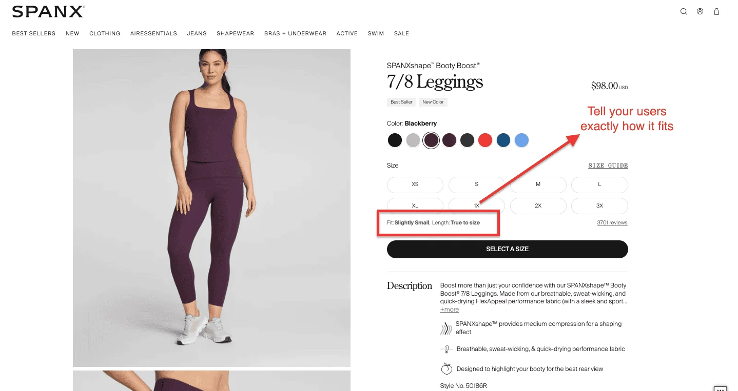
Buying shapewear online is, by any objective measure, a leap of faith. You cannot try it on. You are not entirely certain of your size in this particular product category. And the stakes of getting it wrong feel oddly high.
Spanx's product page understands this better than most brands do.
The standout feature is context-sensitive sizing. A shopper looking at leggings sees a different size guide than one looking at shorts, a small thing that eliminates a major source of anxiety. What Spanx has built is essentially a digital fitting room: not flashy, but deeply reassuring.
The page also adds social cues like "fits slightly small" directly in the variant selector — preempting hesitation before it forms. This is what we mean by acting as a consultant. The page anticipates the question and answers it before the shopper has to ask.
That reassurance is what converts.
Where They Could Improve
The emotional dimension of the page is underdeveloped. Spanx has a compelling brand story, confidence, transformation, and freedom of movement, but most of that energy is channelled into functionality rather than feeling. For a brand with less category recognition, this balance would be riskier.
Reviews are present but not prominently featured near the buying decision, which is a missed opportunity to reduce final-moment doubt.
What to Steal
Build category-specific size guides, not one-size-fits-all charts
Surface social proof ("fits slightly small," "runs true to size") directly in the variant selector
Answer the shopper's most anxious question, fit, size, compatibility, before they have to ask it
For any product with a fit dimension, the product page should eliminate that variable entirely
2. BlendJet: The Visual Information Density Lever
Niche: Consumer Electronics / Kitchen | Score: 22/25 | Key lesson: Making a complex product scannable in under 15 seconds
Dimension
Score
Verdict
Information Hierarchy Clarity
5/5
Instantly clear what the product is and why it matters
Trust & Proof Density
4/5
Reviews and social proof present; could be closer to the CTA
Decision Friction Reduction
4/5
Variant selection is clean; checkout flow is smooth
Desire & Motivation Amplification
4/5
Benefit-led copy is strong; lifestyle imagery does good work
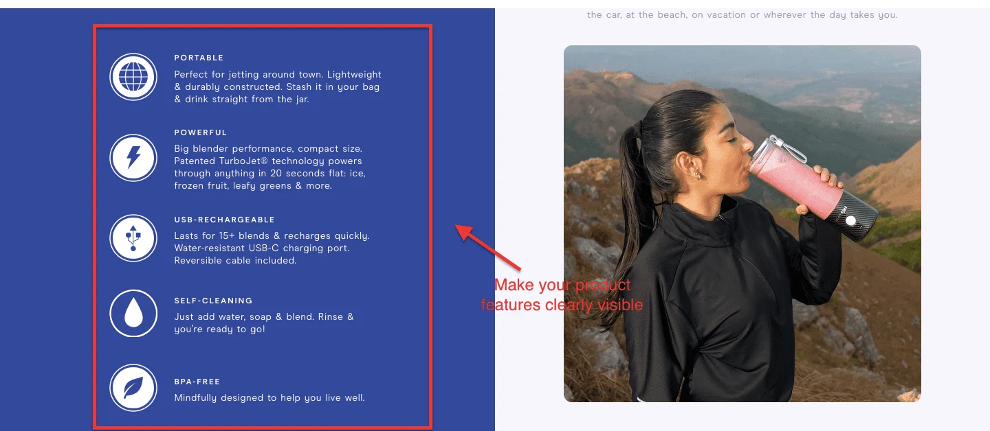
BlendJet sells a portable blender to busy, health-conscious people who have almost certainly seen forty portable blenders on Instagram and are not entirely sure which one won't break after three weeks.
The page solves this problem by putting the product's most important features front and centre in a format that is almost impossible to skim past: a bold feature block with an icon for each benefit and two lines of plain-English copy under every header. No spec sheets. No technical jargon. Just the answers to the questions the buyer is already carrying.
This is what Baymard Institute's research on feature presentation found: icons paired with short benefit-led copy significantly outperform text-only bullet lists, because shoppers feel they're casually scanning while actually absorbing information more deeply. BlendJet has operationalised this insight with unusual precision.
The "three-feature rule" is the instinct to lead with the three things that matter most, and making them impossible to miss is something almost any product page can apply.
Where They Could Improve
Trust signals could be positioned more aggressively near the CTA. Reviews and social proof are present on the page, but a shopper whose thumb hovers over "Add to Cart" would benefit from seeing a star rating and a review count right there, not a scroll away.
What to Steal
Design your feature block as a pre-emptive objection handler — each feature is the answer to a question your buyer is worried about
Use icons with short benefit-led copy, not spec-heavy bullet points
Identify the three things your buyer most needs to know and make them impossible to miss in the first scroll
Keep the copy scannable: if it takes longer than 15 seconds to grasp the product's value, you've lost the browser
3. Ritual: The Science & Trust Lever
Niche: Health & Wellness / Supplements | Score: 23/25 | Key lesson: In a market full of claims, showing your work is a competitive advantage
Dimension
Score
Verdict
Information Hierarchy Clarity
4/5
Clear hierarchy; the science doesn't obscure the product
Trust & Proof Density
5/5
Ingredient traceability, third-party testing, and clinical citations all present
Decision Friction Reduction
4/5
Subscription vs one-time purchase is clear; FAQs are accessible inline
Desire & Motivation Amplification
5/5
The "what changes in your body" narrative is emotionally compelling and scientifically grounded
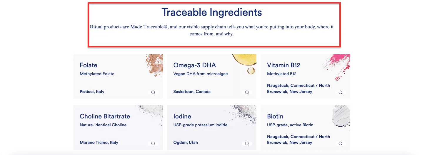
The supplement industry has a trust problem. Every brand has before-and-after photos. Everyone has five-star reviews. Anyone can claim their product is "clinically proven." Ritual's response to this environment is to make the evidence visible and specific.
Their product pages feature what they call ingredient traceability: for every ingredient in the formula, the page shows where it was sourced, why it was chosen, and what the research says about it. This isn't a PDF buried in a footer tab. It's integrated into the page itself, displayed in a clean UI that makes a health-conscious buyer feel they've done their due diligence even if they've spent only 90 seconds on the page.
That is the whole trick. Ritual has made transparency feel effortless for the reader while doing the hard work behind the scenes.
The page also handles the subscription decision with unusual clarity. The pricing comparison between a monthly subscription and a one-time purchase is presented without dark patterns, pre-ticked boxes, or confusing language. This builds trust at precisely the moment it's most needed.
Where They Could Improve
The above-the-fold experience could work harder. The brand's scientific credibility is its strongest conversion lever, but the hero section is relatively understated. Surfacing a single compelling clinical fact rather than waiting for the shopper to scroll could lift initial engagement.
What to Steal
Make your proof specific and traceable, not just present: "sourced from X, tested by Y" is more convincing than "third-party tested."
Integrate trust signals into the product description itself, not just in a reviews block
If you use subscription pricing, present the comparison honestly; dark patterns erode the trust you've spent the rest of the page building
In health and wellness, transparency is a conversion lever, not just an ethical choice
4. Dollar Shave Club: The Revenue Expansion Lever
Niche: Personal Care / Subscription | Score: 22/25 | Key lesson: Upselling that feels like helping, not selling
Dimension
Score
Verdict
Information Hierarchy Clarity
4/5
Product and value proposition are immediately clear
Trust & Proof Density
4/5
Reviews present; subscription terms are transparent
Decision Friction Reduction
4/5
Subscription configuration is clean; variant selection is simple
Desire & Motivation Amplification
5/5
"The starter set" framing makes the upsell feel like the obvious choice
Conversion & Revenue Levers
5/5
Cross-sells are built into the page structure; subscription pricing is prominent
What They Get Right
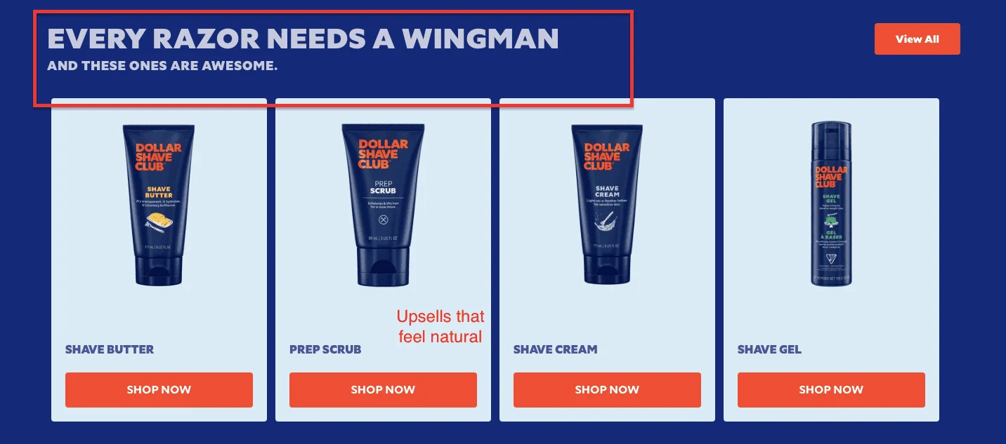
Dollar Shave Club has always understood that the razor is just the beginning.
Their product pages reflect this: shave butter, post-shave cream, and moisturiser are presented as logical next steps rather than pushy additions. The cross-sell is built into the page structure itself, not bolted on as a banner or a pop-up, which makes the AOV-boosting feel natural rather than transactional.
The framing is everything. Dollar Shave Club doesn't present these products as extras. They present them as a set, the complete shaving routine, which makes the single-item purchase feel incomplete by comparison. The shopper doesn't feel upsold; they feel equipped.
Subscription pricing is handled with similar intelligence. The monthly cost is front and centre, but the one-time purchase option is equally visible. This honesty, counterintuitively, is what makes the subscription feel trustworthy.
Where They Could Improve
Above-the-fold trust signals could be stronger. For a new visitor who hasn't encountered the brand before, there's a slight gap between the value proposition and the social proof that supports it. A review count or a trust badge closer to the CTA would close that gap.
What to Steal
Build cross-sells into the page structure as a natural progression, not as afterthoughts
Frame complementary products as a complete solution, not as extras
Present subscription and one-time pricing with equal clarity, the contrast does the persuasion work for you
Make the upsell feel like the page is helping the shopper not forget something important
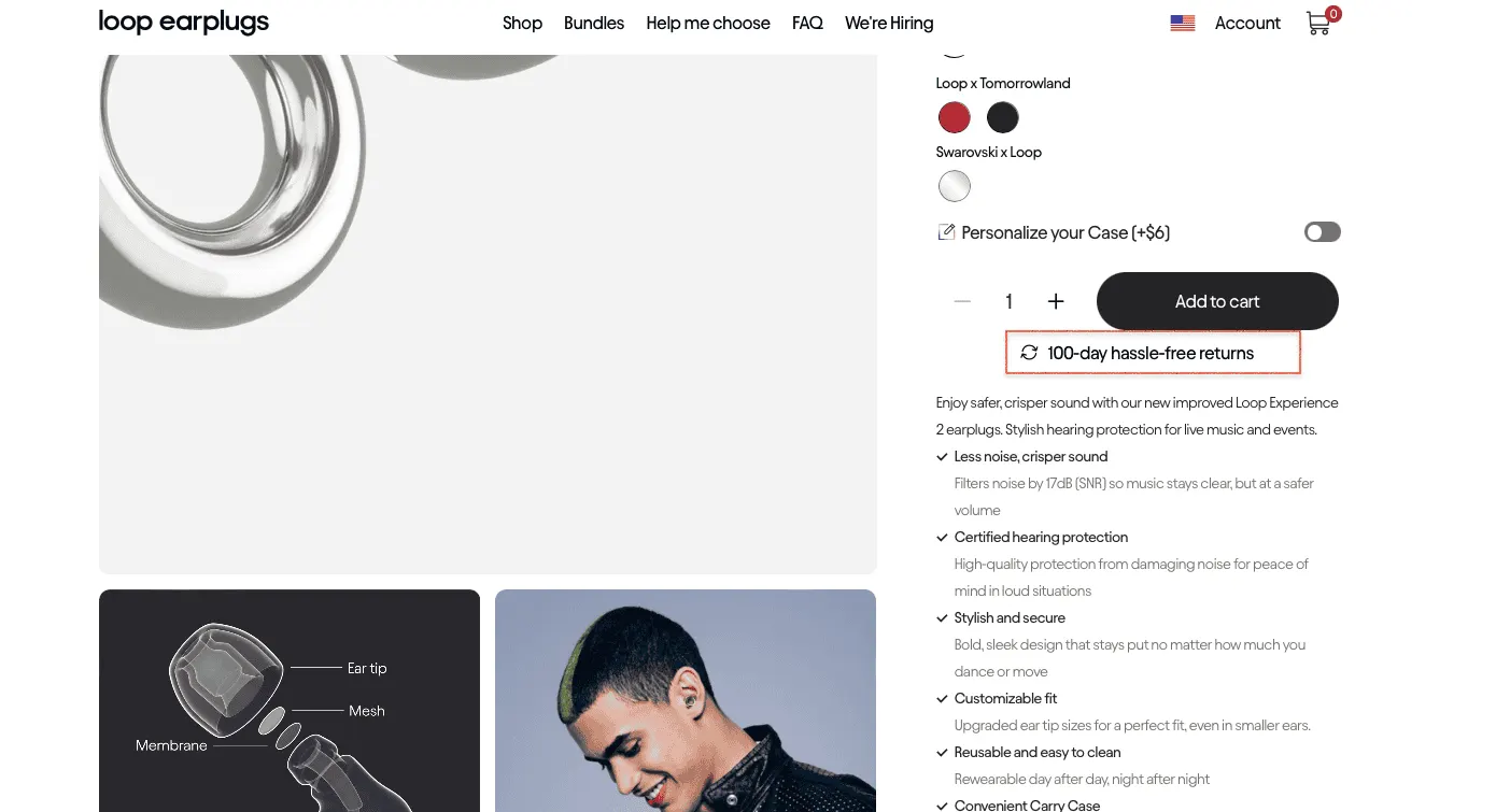
5. Loop Earplugs: The Brand Story & Experience Lever
Niche: Consumer Accessories / Lifestyle| Score: 23/25 | Key lesson: Selling an experience, not a specification
Dimension
Score
Verdict
Information Hierarchy Clarity
5/5
Immediately clear what the product is, who it's for, and why it matters
Trust & Proof Density
4/5
Reviews and use-case social proof present; certification badges visible
Decision Friction Reduction
4/5
Model comparison is clear; variant selection is clean
Desire & Motivation Amplification
5/5
Best-in-class lifestyle framing; the product is embedded in a compelling identity
Conversion & Revenue Levers
5/5
Persistent CTA, model comparison table, bundle integration
What They Get Right
Earplugs are, by any reasonable standard, a commodity. A small piece of foam (or silicone) that you put in your ear to reduce noise. The specs that distinguish one pair from another, attenuation ratings, frequency response curves, and noise reduction ratings, are not the kind of thing that makes people feel good about a purchase.
Loop has solved this problem by refusing to sell earplugs. They sell the experience of going to a concert safely, of being present at a loud dinner without a headache the next morning, of protecting your hearing without missing the moment.
Their product pages are built entirely around this insight. The lifestyle photography doesn't show earplugs in a clinical context; it shows people at concerts, festivals, and social gatherings, wearing Loop and clearly enjoying themselves. The copy doesn't lead with attenuation ratings; it leads with the situations the product enables.
This is what we mean by doubt reframing. The page doesn't ask the shopper to overcome their scepticism that earplugs are boring or medicinal. It replaces that frame entirely with a different one: these are an accessory, a piece of concert kit, a lifestyle choice.
The use of negative space is deliberate and effective. The page doesn't crowd the product with information; it lets the imagery and short benefit-led copy do the work. The shopper absorbs the identity of the product before they absorb the specifications, which is precisely the right order.
Where They Could Improve
The model comparison could be surfaced earlier in the page journey. Loop makes several variants (Experience, Switch, Quiet, Engage), and for a new visitor, knowing which model to consider is a meaningful decision. The comparison table exists, but it requires some scrolling to reach.
What to Steal
Sell the experience your product enables, not the product itself
Use lifestyle imagery to establish identity before presenting specifications
Negative space is a conversion tool. A less cluttered page creates a more considered purchase
If you sell a commodity or a "boring" product category, your job is to reframe what the product means, not to out-spec the competition
6–12: Quick Wins
Not every lesson needs a full autopsy. The seven brands below each do one thing exceptionally well — and that one thing is worth borrowing. No score tables, no lengthy breakdowns. Just the pattern, and what to do with it.
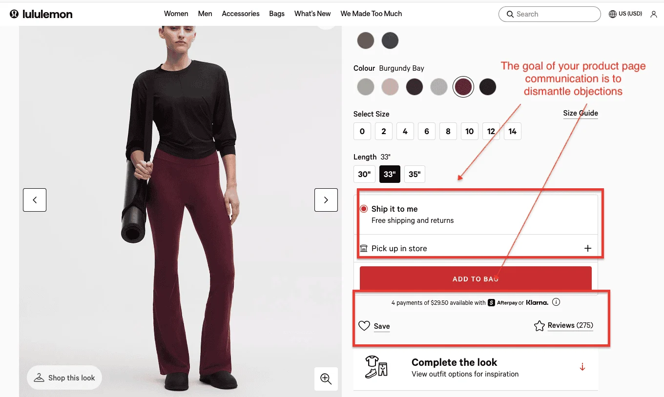
6. Lululemon — Remove the Objection Before It Forms
Niche: Apparel / Athletic Wear | Score: 20/25 | Key lesson: Dismantle objections before the shopper forms them
Lululemon sells premium athletic gear at prices that require justification. Their product page doesn't try to excite; it dismantles objections, one by one, until nothing stands between the shopper and the Add to Bag button. "Free Shipping + Free Returns" appears prominently on the product page itself, not buried at checkout. Afterpay and Klarna handle the buyers who flinch at $128 leggings.
Three hundred-plus reviews provide social proof at scale. Every element is doing the same job: reducing perceived risk.
What to steal: Audit your product page for the three most common reasons someone wouldn't buy. Then make sure the page answers all three before the shopper has to ask.
How do the best eCommerce fashion stores design their PDPs to maximize sales? Explore these tactical apparel product page examples to steal their strategies.
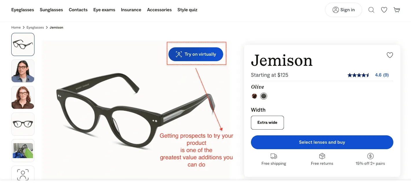
7. Warby Parker — Eliminate the Single Biggest Objection
Niche: Eyewear / DTC | Score: 21/25 | Key lesson: Build the entire page around eliminating the one objection that kills your category
Buying glasses online has one enormous problem: you can't try them on. For something worn on your face in every photo and video call, that's not a small objection; it's the objection. Warby Parker has built their entire product page strategy around dismantling it. Their AR Virtual Try-On places frames on your face using your iPhone's TrueDepth camera with enough accuracy that the hesitation largely dissolves. The highest-converting product pages don't just describe the product. They make you experience it.
What to steal: Identify the one objection that kills the most conversions in your category. Then build the page around eliminating it — not around everything else.
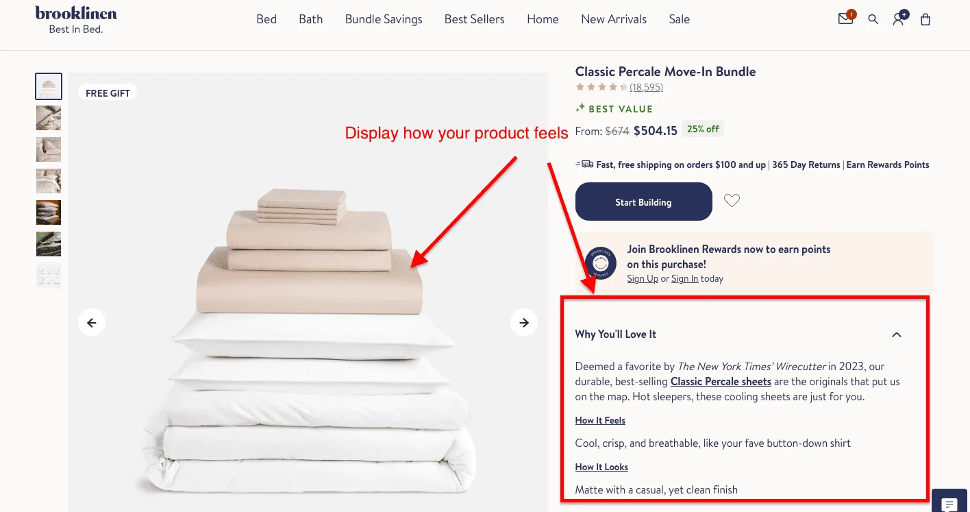
8. Brooklinen — Do the Sensory Work for the Shopper
Niche: Home / Bedding | Score: 20/25 | Key lesson: For products shoppers can't touch, copy has to do the sensory work
Bedding has a fundamental eCommerce problem: you can't touch it. A shopper looking at a product page for sheets has no way of knowing whether they're about to spend $200 on something that feels like a cloud or a hotel ironing board cover. Brooklinen solves this with two sentences: how it feels ("cool, crisp, and breathable, like your fave button-down shirt") and how it looks ("matte with a casual, yet clean finish"). That's it. Two lines that do more conversion work than a full paragraph of thread counts ever could.
What to steal: For any product a shopper can't touch before buying, write the sensory description first. Be specific and plain — not poetic, not technical. Exactly how does it feel?
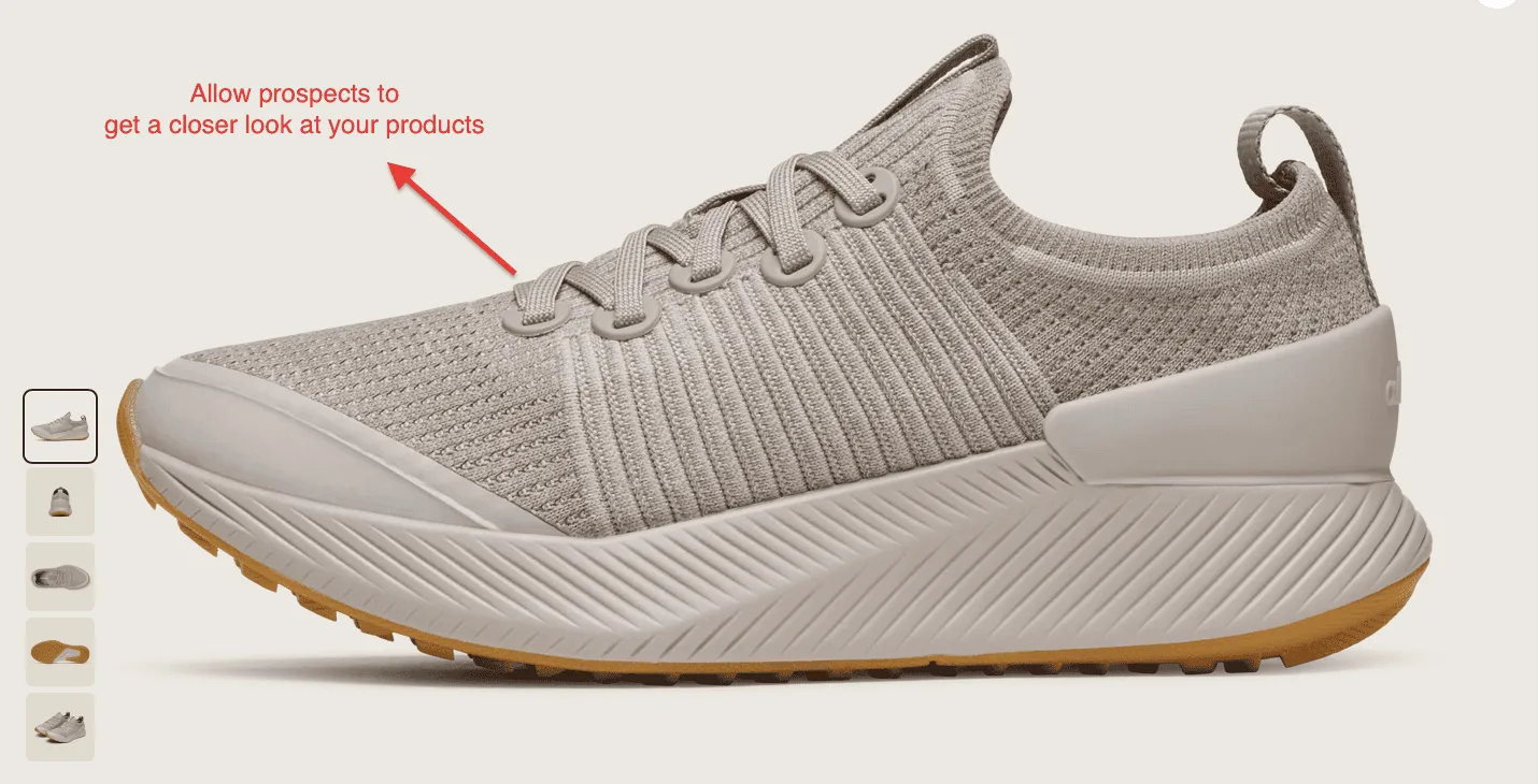
9. Allbirds — Make the Craftsmanship Visible
Niche: Footwear / Sustainable Fashion | Score: 19/25 | Key lesson: If quality is your price justification, your images need to prove it
There's a moment in every online shoe purchase where the shopper squints at a product image and thinks: but what does it actually look like up close? Allbirds answers this by making the product image so large, sharp, and zoomable that you can practically count the individual knit loops on the upper. For a brand selling shoes at $130+ on the strength of their materials, the product image is the proof. It has to hold up to scrutiny, and it does.
Five thumbnail angles cover every dimension a shopper might want to inspect: side profile, outsole, three-quarter front, insole, rear, each answering a specific question.
What to steal: If your product's quality is part of what you're charging for, your images need to prove it. A shopper who can see the craftsmanship up close has one less reason not to buy.
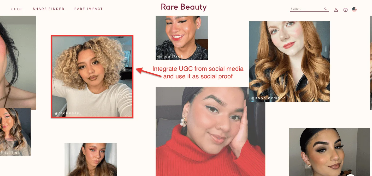
10. Rare Beauty — Let Real Customers Do the Selling
Niche: Beauty / Cosmetics | Score: 21/25 | Key lesson: Real customers selling to real customers outperforms any studio shot
Most beauty brands treat UGC as a nice-to-have, a reviews block at the bottom of the page that shoppers scroll past on the way to checkout. Rare Beauty treats it as the main event. Scroll any product page, and you hit a full-width mosaic of real customer photos pulled from social media, credited by Instagram handle. Different skin tones, hair textures, face shapes, and lighting conditions. The cumulative effect: virtually every shopper can find someone who looks like them and see exactly how the product performs on that person's skin.
What to steal: Your existing customers are already posting about your product. Put that content on your product page, credit them by name, and let real people sell to real people.
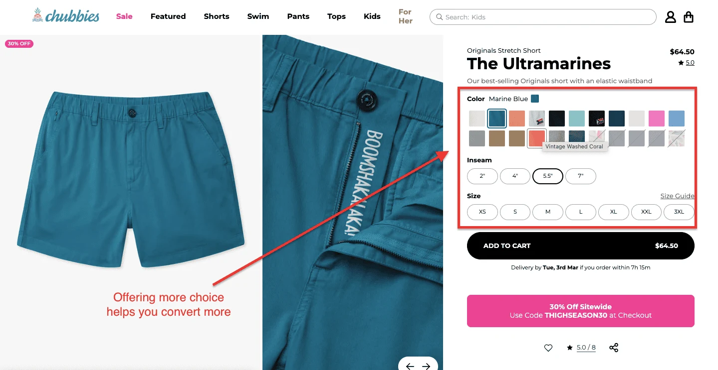
Conventional CRO wisdom says fewer choices mean higher conversions. Chubbies have apparently decided to ignore it entirely, and their pages are better for it. A single product can offer 20+ colorways, four inseam lengths, and seven sizes, yet the page doesn't feel overwhelming, because the variant selection is built for browsing.
Colour swatches are large enough to actually distinguish. Inseam options appear as clear pill selectors. The currently selected combination is always labeled in plain text. The shopper always knows exactly where they are.
What to steal: More variants don't hurt conversions if the selector UX is clean. Give shoppers real choice, label everything clearly, and let them find the version that feels made for them.
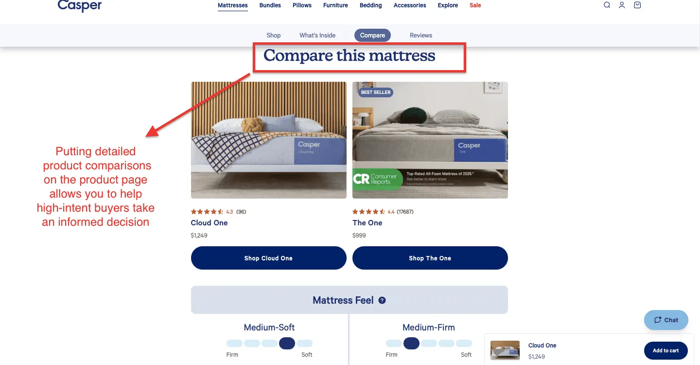
12. Casper — Help the High-Intent Shopper Decide
Niche: Home / Sleep | Score: 20/25 | Key lesson: High-ticket shoppers are doing research help them finish it on your page
Buying a mattress online is, rationally speaking, a slightly insane thing to do. You're committing four figures to something you'll spend a third of your life on, based entirely on what a product page tells you.
Casper's response isn't to hide the complexity; it's to address it head-on with a comparison tool that helps shoppers choose between models without leaving the page. This is the right instinct for any high-ticket product: the shopper who's doing research isn't about to leave. Help them finish it here, or they'll finish it somewhere else.
What to steal: For products above $200, build decision-support tools directly into the page comparison tables, quiz-style selectors, or "which one is right for me" guides. The shopper who stays to decide is the shopper who buys.
Putting It Together
Five brands. Five different problems. Five different solutions. But a few things hold across all of them.
The pages that convert don't try to do everything at once. They identify the single biggest barrier between the shopper and the purchase anxiety about fit, confusion about which product to choose, scepticism about quality, uncertainty about value, and they dismantle it systematically, before asking for the sale.
The other thing they share is a quality that's harder to name but easy to recognise: they treat the shopper as an intelligent adult. The copy doesn't condescend. The structure doesn't manipulate. The design doesn't confuse. It guides.
That, in the end, is what a great product page does. It leads someone by the elbow from curiosity to conviction, and makes the act of clicking "add to cart" feel not just easy, but right.
Use the 25-point framework above to score your own pages. The gaps you find are the starting points.
Want us to audit your product page against the Convertcart framework? Book a free audit →


.svg)

.svg)

.svg)
.svg)
