The two most important things to take care of while optimizing your product pages are: finding out what causes drop-offs and fixing what impacts revenue the most.
Let me tell you a few instances that came up while we were auditing stores this year:
A massive banner screaming "Sale ends in 11m: 42s!" that resets the moment you refresh the page.
A product description that explains stuff that only industry veterans would understand.
A leather boots store was displaying “542 people viewing this exact item right now, ” and shoppers just kept bouncing off because the number was too good to be true.
And guess what: their founders were busy A/B testing the page layout, while the problems existed right where customers were interacting.
The lesson we can all learn: it’s super important to pick the right areas to fix, the ones with the highest revenue impact. Let’s dive in.
The 3 Tiers of eCommerce Product Page Optimization
Tier
Goal
Priority
Tier 1
Remove conversion friction
Highest
Tier 2
Increase persuasion & trust
Medium
Tier 3
Build compounding CRO systems
Long-term
Prioritizing the right tier is only half the battle. Here's exactly what advanced brands focus on within each one.
Tier 1: High Impact Conversion Fixes (fix these first)
These sit closest to the moment of conversion. Fix them first; they produce the fastest measurable lift.
Focus Area
What Advanced Brands Prioritize
CTA Optimization
Reassurance-driven copy, sticky ATC on mobile, stronger visual contrast
Social Proof Visibility
Reviews near the CTA, objection-resolving testimonials, review specificity
Product Imagery
Images that answer buying questions, UGC, demo videos
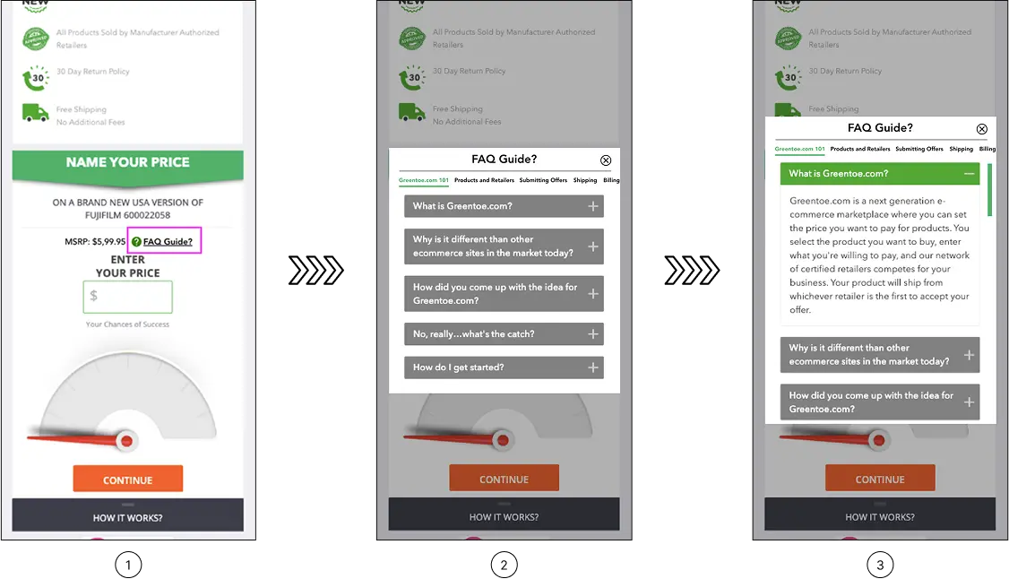
FAQ Placement
Surfacing answers exactly where hesitation occurs
Pricing Presentation
Clear discount framing, BNPL positioning, value perception
Tier 2: High Leverage Persuasion Improvements
These strengthen shopper confidence and make the buying journey easier to process.
These are the operational habits that separate occasional wins from sustained conversion growth.
Focus Area
What Advanced Brands Prioritize
Test Prioritization
ICE-style scoring based on impact, confidence, and ease
Statistical Discipline
Running tests long enough to trust the outcomes
Segmented Analysis
Reading wins/losses by device, visitor type, and customer intent
Experiment Strategy
Testing hesitation, not just page elements
Prioritizing the right tier is only half the problem. The second, usually more important question is: what exactly are you testing within that tier?
TIER 1: HIGH IMPACT CONVERSION FIXES
The CTA Button
The add-to-cart button is among the most-tested elements on any product page, and yet Baymard Institute's benchmark of 120+ leading eCommerce sites finds that more than half still have mediocre or worse UX in their buy section.
a. Test button copy with reassurance vs. ownership language
We've observed that CTA optimization tests commonly produce 5–15% conversion improvements, and the impact is largest when the current copy uses passive language that doesn't encourage action. For instance, "Add to Bag — Free Returns" outperforms plain "Add to Cart" on higher-ticket items because it addresses risk at the exact moment the shopper is weighing it.
b. Test sticky vs. static add-to-cart on mobile
In our experience, a sticky add-to-cart drawer keeps the action available when intent is highest.
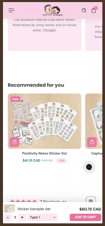
Case Study
We ran this test for one of our clients: Hubman and Chubgirl, a niche eCommerce brand in art supplies and stationery. Keeping the ‘Add to cart’ CTA visible reduced scrolling friction and made the action available. This increased orders by 66% and reduced abandonment by 7.89% post-experiment. You can read the full case study here.
c. Test button colour contrast as an isolated variable
One of our CRO audits found that differentiating the add-to-cart button from surrounding CTAs produced a 20% increase in conversion rate. The problem wasn't the colour. It was that shoppers couldn't immediately identify which button to press.
Mobile Product Page Optimization: A Separate Playbook
Desktop and mobile are not the same conversion problem on different screen sizes. They are different problems.
Mobile CVR still sits well below desktop CVR in most categories. That's not because mobile shoppers are less willing to buy, but because most product pages were designed on a 27-inch monitor by someone who forgot that.
a. Test pinch-to-zoom and tap-to-expand on product images
40% of eCommerce stores don't support touch gestures on mobile images. For any product where close inspection drives the decision, fabric texture, connector type, and stitching detail, that gap is a reason not to buy.
The fix is inexpensive. The cost of skipping it is a shopper who needed one more look and didn't get it.
b. Test thumb-zone CTA placement vs. centre-screen placement
The reachable area for right-handed users is the lower two-thirds of the screen. CTAs that sit outside it get fewer taps because the reach creates friction at the exact moment you need none.
Test moving your primary buy action into that zone before testing anything else about the button itself.
c. Test single-column layout vs. responsive reflow
Content designed side-by-side on desktop stacks on mobile. The ideal way is to design the mobile column order deliberately, then test it against whatever your responsive template produces by default. The gap is usually larger than it looks on a desktop preview.
Social Proof
93% of consumers say online reviews influence their purchase decisions, and yet most brands bury them below the fold, where the hesitant shopper has already left.
a. Test review placement near the CTA vs. below-fold module
PowerReviews' research shows that products with 11–30 reviews convert approximately 68% higher than those with zero.
But that lift only materialises if shoppers actually see the reviews. Surfacing a review snippet directly beneath the product title removes the need to scroll, and that's why it works.
b. Test objection-resolving hero reviews vs. general praise
A review that resolves a specific objection ('I was worried it would run small — it doesn't') does more work than five stars and 'Love this product!'
We've also learnt that most customers view reviews older than three months as less relevant, and reviews that address real, current concerns convert better than vague, timeless praise.
c. Test targeted review prompts vs. open-ended asks
The quality of reviews you receive is directly related to the prompts you send. 'Was it true to size? Did it work for sensitive skin?' generates answers future shoppers can actually use.
In our opinion, open-ended prompts generate 'great product, fast delivery'. Sadly, such a review reassures almost no one.
How do the best eCommerce fashion stores design their PDPs to maximize sales? Explore these tactical apparel product pages to steal their strategies.
Product Imagery
Baymard's research on product page usability found that the average eCommerce site has 24 structural usability issues on its product pages, and imagery is a consistent source of friction.
a. Test UGC vs. professional photography by category
What we've observed in our audits is that most shoppers want to see customer photos rather than professional shots before making a purchase.
For fashion and home goods, UGC tends to build more trust. For technical or functional products, professional imagery with specific callouts tends to hold its ground. As you can see, in this case, the category determines the winner.
b. Test video presence vs. static-only pages
In our experience, most shoppers who watch an explainer video subsequently buy the product. The ceiling for video on considered-purchase pages is higher than most brands assume. We tested this for a client in electronics and appliances.
Case Study
At Convertcart, we ran this test for one of our clients in the electronics and appliances space. Showcasing a “How it works” video helped users understand the process better and boosted conversions by 4%. You can read the full case study here.
c. Test hover-to-zoom selectively, not globally
Hover-to-zoom earns its place on products that reward close inspection: textured fabrics, fine hardware, intricate stitching. 40% of eCommerce stores don't support pinch or tap gestures for product images on mobile — a separate and equally expensive failure.
Pricing Presentation
What we have observed is that charm pricing ($99 vs. $100) still works, but it's table stakes. More than 18% of eCommerce stores have poor discount visibility on product pages. This is a common cause of confusion among shoppers.
a. Test crossed-out price vs. percentage saving
At Convertcart, we've found that the crossed-out original price works better when the original is familiar or widely advertised. The percentage wins when the saving is large and instantly legible.
b. Test BNPL placement and framing
What we've also noticed is that showing '4 payments of $24.75' can lift conversion for mid-range products by making the price feel manageable. It can also signal that the product sits at the outer edge of what the shopper intended to spend.
c. Test membership pricing proximity to the CTA
Surfacing loyalty pricing ('Members pay $79') near the main CTA reframes the purchase: instead of buying a $90 product, the shopper is considering a $72 product and a membership with ongoing benefits. In our experience, stores with personalized pricing can see a significant lift in conversions.
FAQs and Live Chat
53% of US online customers abandon a purchase if they can't quickly find an answer to a question. The brands handling this well don't make shoppers hunt. They put the answer exactly where the doubt arises.
a. Test FAQ microcopy near the CTA vs. a collapsed bottom-page section
It's best to understand that FAQs buried after the reviews, cross-sells, and brand story aren't available when the shopper needs them. The ideal way is to surface such content as a small, precise link near the CTA, 'Will this work for sensitive skin?' positioned right above the buy button, which drives more engagement.
b. Test proactive vs. reactive live chat triggers
You must know that proactive triggers outperform passive chat widgets for considered purchases. This way, catching a confused shopper mid-page with the right prompt costs considerably less than losing them entirely.
c. Test recovery-focused 404 pages vs. generic apology pages
Did you know that 404 pages that surface relevant product alternatives recover a real percentage of otherwise-lost traffic? In fact, what we've observed is that bands that treat their 404 page as a dead end leave a recovery mechanism unused.
TIER 2: HIGH LEVERAGE PERSUASION IMPROVEMENTS
Product Copy
The more interesting question that high-performing teams actually ask is whether the structure of the argument matters as much as the words inside it. It does. Possibly more.
a. Test benefit-led vs. problem-led openings
The core question is whether to lead with what the product does or the frustration it solves. Problem-led copy tends to win for anything addressing a clear pain point: skincare, fitness gear, sleep, storage. That's consistent with what we find when we test product pages for eCommerce brands.
b. Test copy sequence, not just copy content
Nielsen Norman Group's research on product descriptions is instructive: shoppers skim, read the first sentence more carefully than the rest, and abandon quickly when what they find doesn't connect. The opening sentence carries enormous weight. What comes second matters almost as much.
c. Test structured naming vs. branded naming
Clever product names are satisfying to write. Descriptive ones material plus product type convert better on category pages and in search. Our A/B tests show that structured product naming drives significant growth for brands that apply it consistently. It's not glamorous. It works.
Urgency
The question isn't whether urgency works. It's whether your shoppers believe yours. Here are the different types of urgency tests you can run on your product pages:
a. Test specific scarcity vs. vague urgency language
What we've learnt from auditing eCommerce stores like yours is that 'Only 3 left in your size' is believable and actionable. 'Selling fast!' is background noise. The former works because it's specific and plausible. The latter has been deployed so indiscriminately that a growing segment of shoppers now reads it as decoration.
b. Test honest urgency against a retention baseline
Urgency can lift a conversion today while degrading your customer base over time. Shoppers acquired through manufactured pressure show lower repurchase rates and higher returns. Advanced brands now track both the immediate conversion lift and 90-day retention. The results of that second measurement are sometimes so uncomfortable that they prompt a complete change in strategy.
c. Test replenishment framing: convenience vs. commitment
For consumables, 'Never run out' consistently outperforms 'Subscribe and save' — not because the saving is irrelevant, but because convenience is a lower-friction motivation than financial planning. 67% of B2B eCommerce professionals rate back-in-stock alerts as their top conversion strategy. The principle extends to subscription framing: lead with the problem it solves, not the mechanism.
Cross-Selling
You always have an instinct to add more recommendations, more bundles, and more options, don't you? However, the data consistently argues the opposite. Choice paralysis is real, and product pages are not the place to test its limits. Here are some useful testing tips in this arena:
a. Test a mini-cart cross-sell vs. a below-fold recommendations module
The moment immediately after a shopper clicks 'Add to Cart' is prime real estate that most brands underuse. In our experience, a single well-chosen complement at a meaningfully lower price point converts at a higher rate than a full recommendations module below the fold.
b. Test removing social sharing buttons
A test on Finnish hardware retailer Taloon.com, documented by CXL, found that removing social sharing buttons from product pages lifted add-to-cart conversions by 11.9%. The shares on most product pages were zero, which, rather than being neutral, functioned as negative social proof. The product page has one job. Every element that pulls attention away from that job costs something.
c. Test personalised vs. generic recommendations for returning visitors
Stores with personalized recommendations see up to 4.5x higher conversion rates compared to stores without them. Generic 'you might also like' modules are largely wasted on returning shoppers who have already told you, through their behaviour, exactly what they're interested in. The data needs to be clean for this to work, which is where most brands quietly fail.
TIER 3: TESTING & OPTIMIZATION INFRASTRUCTURE
Testing Culture
According to industry research cited by VWO, only 1 in 7 tests produces a statistically significant result. But the same research also found that brands with structured, organised testing programmes see that figure climb to roughly 1 in 3.
Here are some steps to build a testing and optimization infrastructure for our eCommerce store:
a. Prioritise tests before running them
You must score each experiment on three dimensions: likely impact, confidence in the hypothesis, and ease of implementation. High-scoring tests run first. Low-scoring tests get dropped. The alternative: running tests in the order they occur to you, is how teams stay busy without getting faster.
b. Run tests long enough to trust the results
A week of data is almost never enough for anything other than extremely high-traffic pages. Three to four weeks is a more honest minimum. Most brands stop early because a promising result creates pressure to ship the winner before it has earned that status.
c. Read results by segment, not just in aggregate
Don't forget that a variation that 'lost' overall may have won decisively among new visitors, mobile users, or shoppers above a certain order value. That is itself a finding. The brands mining their results this way find more value in their lost tests than most teams find in their winners.
If you examine a failed test properly, you find answers to plenty of burning questions, and that matters a lot.
AI-Generated Product Descriptions: What to Watch For
The economics of AI copy are hard to argue with. A catalogue of 3,000 SKUs that takes years to write by hand takes hours with a language model. The conversion economics are a different conversation.
AI product descriptions fail in three consistent ways.
a. They lead with features rather than the problem the shopper is trying to solve, and problem-led copy outperforms feature-led copy on almost every considered purchase.
b. They are structurally identical across a catalogue, which Google's quality systems are getting better at detecting.
c. And they omit the specific detail that closes sales: "100% New Zealand Merino, Grade A, 17.5 microns" converts better than "premium merino wool" because it answers the question a serious buyer is asking.
The fix isn't to abandon AI-assisted copy. It's to treat the output as a first draft that a human with product knowledge rewrites, not a final output that ships.
In our experience, the teams that do this save most of the time and get maximum conversions.
The Bigger Picture
The advantage isn't in knowing what to test. It's in knowing why shoppers hesitate, and designing every experiment around that hesitation.
Product pages aren't a problem you solve once. They're a standing conversation with your customers, one that shifts as your catalogue evolves and your audience changes. The brands winning aren't the ones that found the right answers. They're the ones who kept asking sharper questions.
See What Your Product Pages Are Actually Costing You
The gap between a 3% conversion rate and a 6% one almost never comes down to a single fix. It comes down to knowing where product page friction lives and which CRO tests will move the needle fastest.
A ConvertCart audit looks at your product pages the way your most hesitant customer does. We identify exactly where shoppers are losing confidence, stalling, or leaving, and build a testing roadmap focused on what's most likely to move your numbers in your category for your audience.


.avif)
.svg)

.svg)

.svg)
.svg)
