Our Audits Revealed That The Best Cart Page Designs Have These 5 Things in Common:
They treat the cart as a trust checkpoint, not just a order summary surfacing security badges, return policies, and social proof right where purchase anxiety peaks
They make the total cost impossible to miss before checkout shipping, taxes, discounts, all of it upfront, because unexpected costs are the single biggest abandonment trigger (Baymard Institute)
They keep the path to checkout short and obvious sticky CTAs, minimal navigation, no unnecessary exits
They use upsells that serve the customer, not just the AOV metric one relevant recommendation consistently outperforms five competing ones
They're built around reducing friction at specific decision points, not around looking impressive in a roundup
A Simple Framework for Evaluating Cart Page Design
Before diving into the examples, it helps to have a lens. While cart pages vary widely by industry, traffic type, and AOV, the best-performing ones tend to address the same core objectives. Think of these as the five pillars:
Cart Page Evaluation Pillar
What High-Converting Cart Pages Do
Cost Transparency(Unexpected costs are one of the biggest reasons shoppers abandon carts.)
Ensure pricing clarity. Display shipping costs, taxes, and discounts early in the journey to eliminate any late-stage surprises.
Trust Reinforcement(Anxiety peaks at the cart stage.)
Build shopper confidence. Position security badges, return policies, and payment icons near checkout actions to soothe purchase anxiety.
Checkout Momentum(Every extra click or moment of confusion increases abandonment risk.)
Maintain a fast pace. Design a low-friction, intuitive path to checkout with clear calls-to-action and a simplified user flow.
The 29 examples below aren't here just to inspire you. Each one illustrates why something works and when you'd want to use it, so you can make deliberate decisions rather than decorative ones.
Takeaways From 29 Successful Cart Pages
Here are the 29 best cart design templates to learn from, to turn yours into a high-converting one.
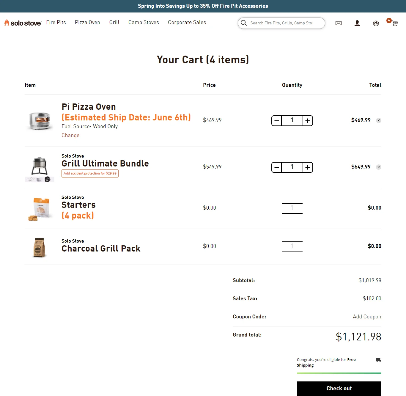
1) Solo Stove – Put convenience first
Pillar: Checkout Momentum + Contextual Upsells
What they do: Solo Stove automatically adds complementary products when a customer adds certain items to the cart. Expected delivery dates appear per product. Accidental damage protection is introduced right below the product, with details opening in a pop-up.
Why it works: The cart acts as an informed sales associate, anticipating needs, surfacing relevant add-ons, and eliminating the need to search for answers. Each element reduces the likelihood of a micro-decision that might otherwise prompt a pause.
Best for: Stores with complementary product ecosystems (outdoor gear, kitchen appliances, home goods) where bundling feels natural rather than forced.
Key takeaway: Make your basket page act like an in-store employee by offering expert advice and services, delivery dates, extra info on product sizes, free samples, and more.
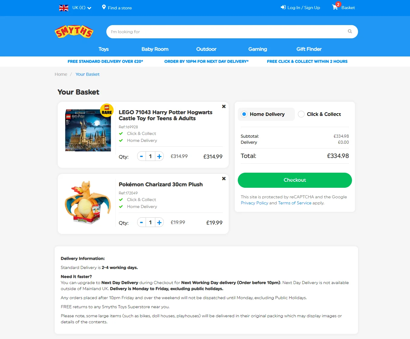
2) Smyths – Give alternate delivery options
Pillar: Cost Transparency + Checkout Momentum
What they do: Smyths offers multiple shipping and delivery options without crowding the interface. Delivery info is summarized in three clickable points under the header; full details are available above the footer. Customers can choose between home delivery and in-store pickup.
Why it works: Delivery flexibility is one of the highest-impact trust signals at the cart stage. Smyths gives customers control without overwhelming them the information hierarchy does the work, surfacing what's essential and tucking detail behind a click.
Best for: Omnichannel retailers with physical store presence, or any store where delivery speed or method is a purchase decision factor.
Key takeaway: Cart design with intelligent font formatting and lots of whitespace aids scanning.
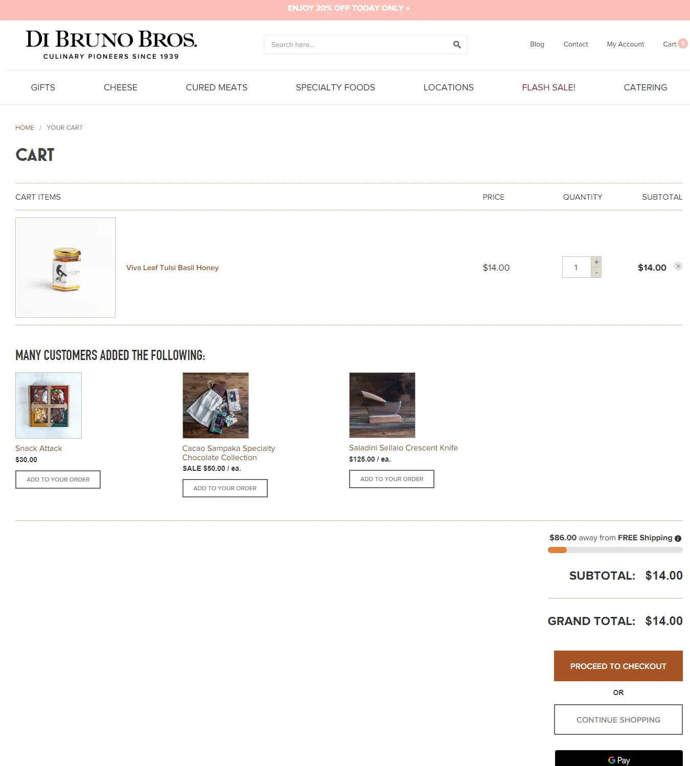
3) Di Bruno Bros – Add some *action* to the cart page design
Pillar: Checkout Momentum + Cost Transparency
What they do: Standard editing options, such as add, delete, and save for later, are cleanly laid out. An orange free-shipping progress bar sits right above the price summary, serving as a nudge toward a higher cart value.
Why it works: The progress bar is a small but effective piece of behavioral design. It shows customers exactly how close they are to a reward, which research consistently shows increases average order value. The edit options reduce anxiety; knowing you can change your mind makes you more comfortable committing.
Best for: Stores with a clear free shipping threshold that's achievable with one or two additions.
Key takeaway: Offer editing options in your shopping cart UI to improve the shopping experience.
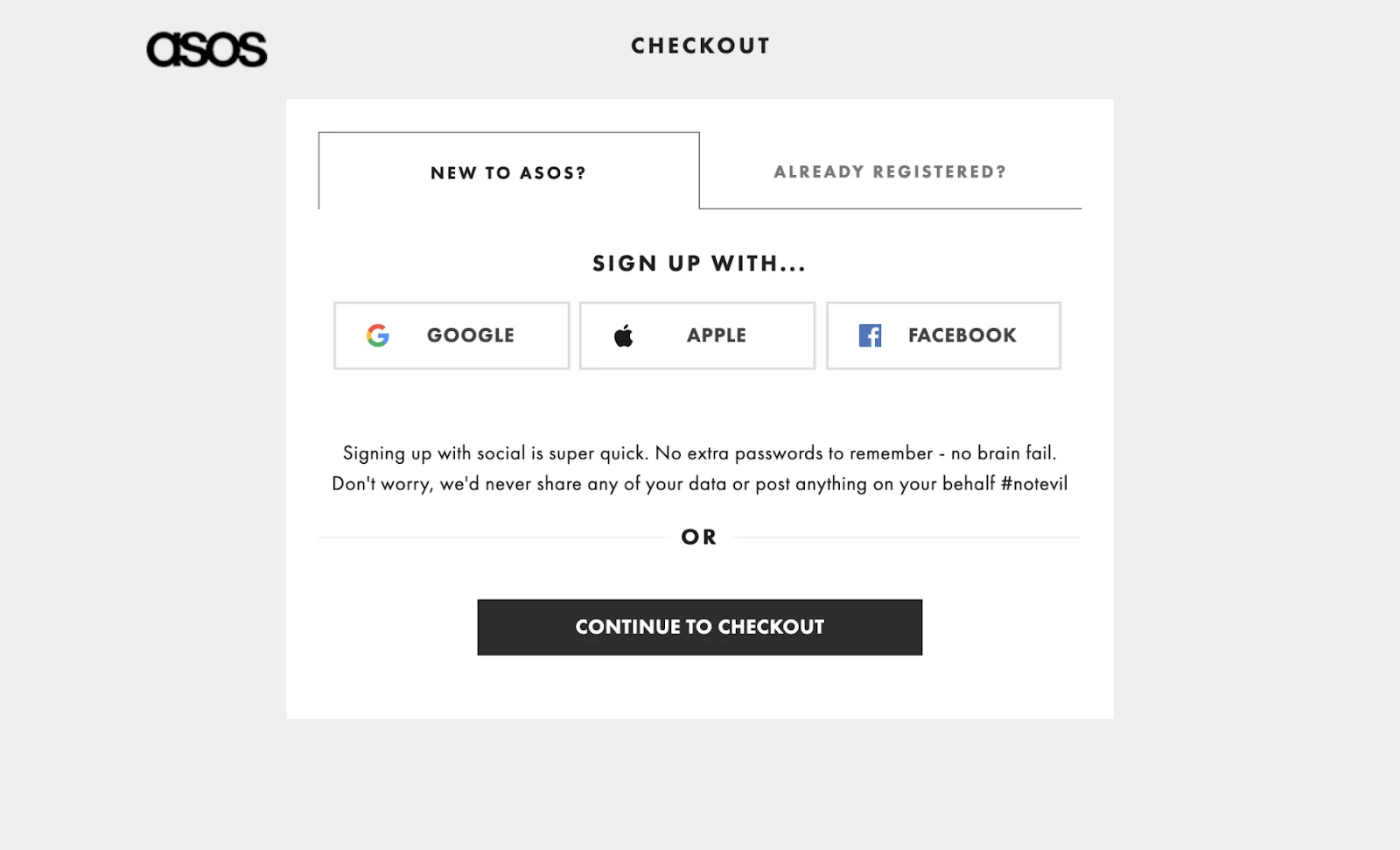
4) ASOS - Enable guest checkout
What they do: Clear color contrast separates the cart area from the header and footer. The pricing area includes subtle conversion triggers. Card applicability and discount codes are visible in the cart UI. Multiple checkout account options including guest checkout are offered.
Why it works: Forced account creation is one of the most reliably cited reasons for cart abandonment. ASOS removes that blocker entirely while still allowing those who want the benefits to sign in. The visual contrast keeps the cart area feeling like a separate, focused zone.
Best for: High-volume stores where a significant portion of traffic is first-time visitors who haven't yet decided whether to commit to an account.
Key takeaway: Make it really easy to check in directly from the cart page, so you can create more personalized offers.
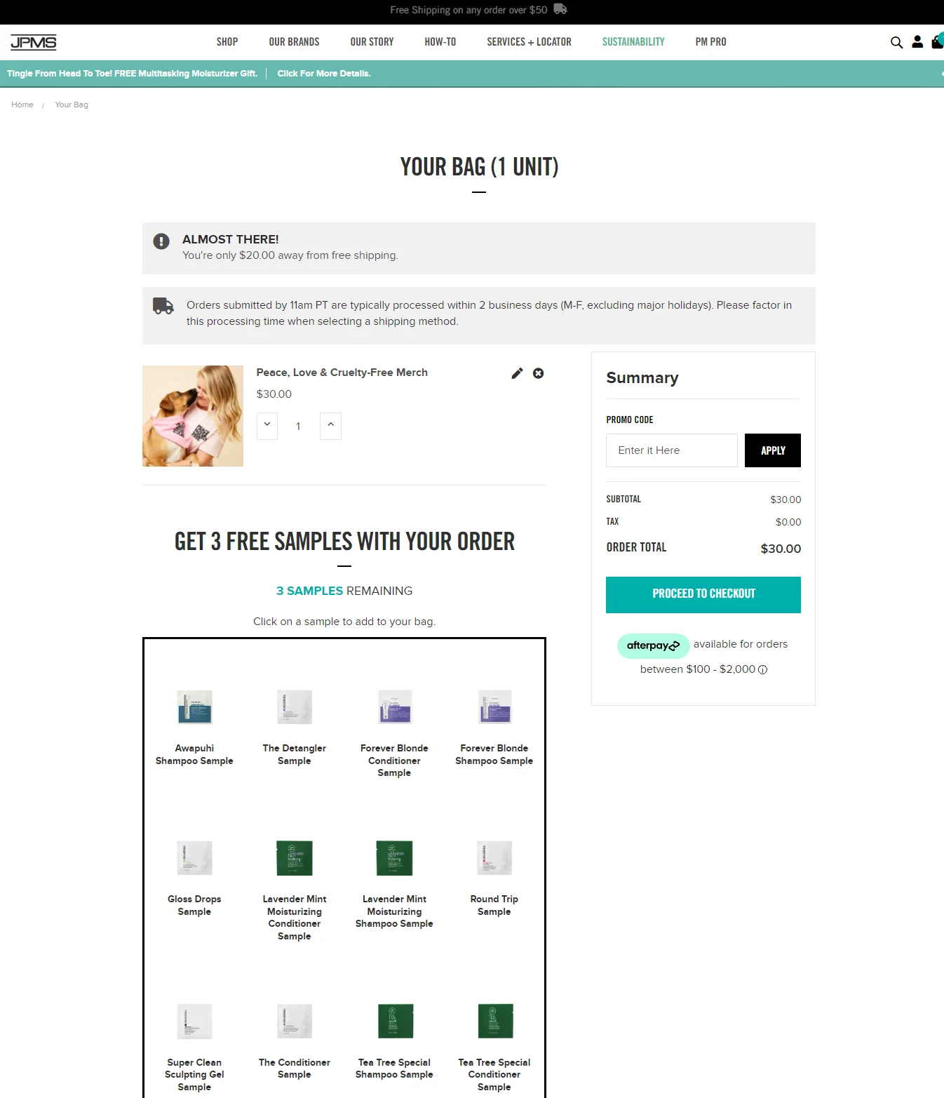
5) John Paul Mitchell – Experiment with free samples in shopping cart
Pillar: Contextual Upsells + Trust Reinforcement
What they do: Critical delivery and free shipping info sits at the top. Every order includes three free samples, and customers get to choose which ones.
Why it works: Giving customers agency over the samples transforms what could feel like a generic giveaway into a personalized experience. It also increases perceived value without discounting the core product, a smarter move for margin protection than a blanket offer.
Best for: Beauty, personal care, and consumables brands where sampling drives repeat purchase behavior.
Key takeaway: Offer samples on your shopping cart page to create a genuinely distinctive value proposition.
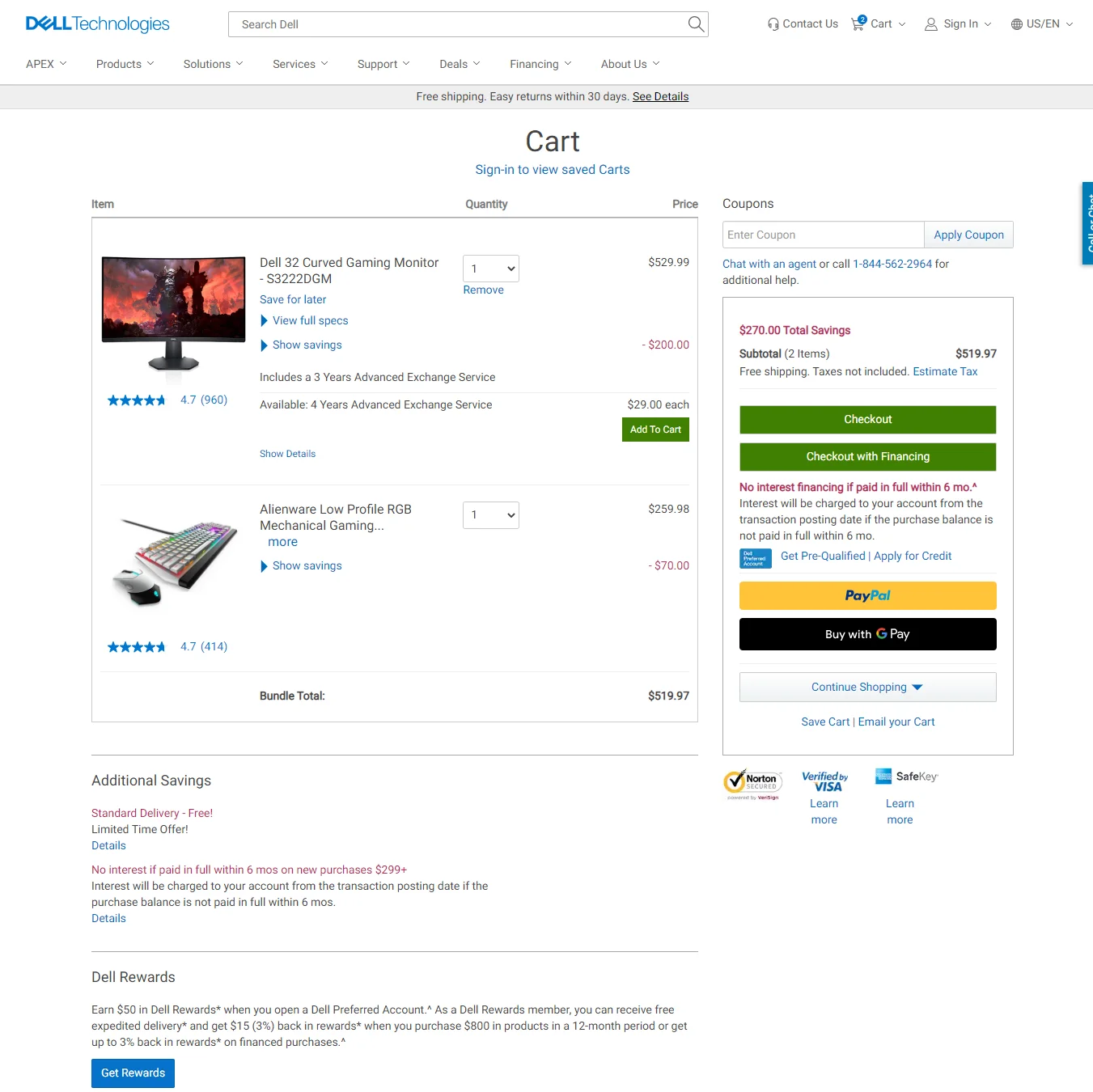
6) Dell – Summarize product descriptions
Pillar: Cost Transparency + Trust Reinforcement
What they do: Dropdowns summarize product specifications and star ratings, keeping customers on the cart page rather than sending them back to the product page. Trust badges appear in the price summary area. A customer service plugin offers multiple contact options.
Why it works: For considering purchases of laptops, monitors, and printers, customers need reassurance that they're buying the right thing. Burying spec confirmation behind a back-button click creates doubt. Dell eliminates that doubt inside the cart itself, keeping momentum intact.
Best for: Electronics, tech, and any category where product specifications play a role in the purchase decision.
Key takeaway: Minimize text in your cart page layout by using dropdowns, and make all non-essential text smaller.
Pillar: Cost Transparency + Trust Reinforcement
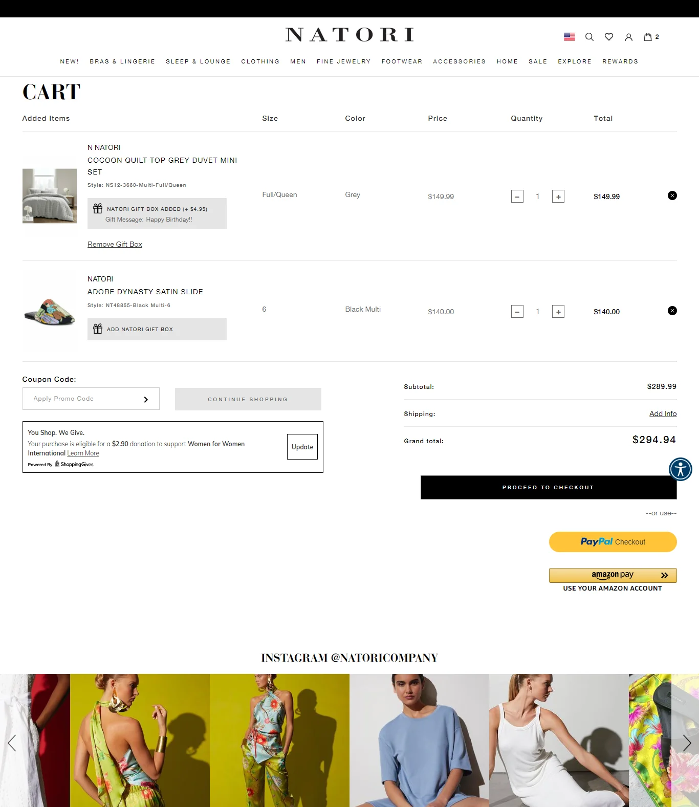
7) Natori – Include a cause marketing nudge in the page design
Pillar: Trust Reinforcement
What they do: A pop-up reveals the different charities Natori supports, establishing brand values at checkout. A social media plugin sits alongside product recommendations. Gift options are available through a pop-up.
Why it works: For premium brands, the cart page is the last place to reinforce why this brand is worth the price. Natori uses it to connect a transaction to something larger. It's not heavy-handed; it's there for the customer who wants to feel good about their purchase, and invisible to the one who doesn't.
Best for: Premium lifestyle brands with a values-driven positioning, especially in fashion or home goods.
Key takeaway: Use vibrant but non-intrusive in-page pop-ups in your shopping cart to spotlight important messages.
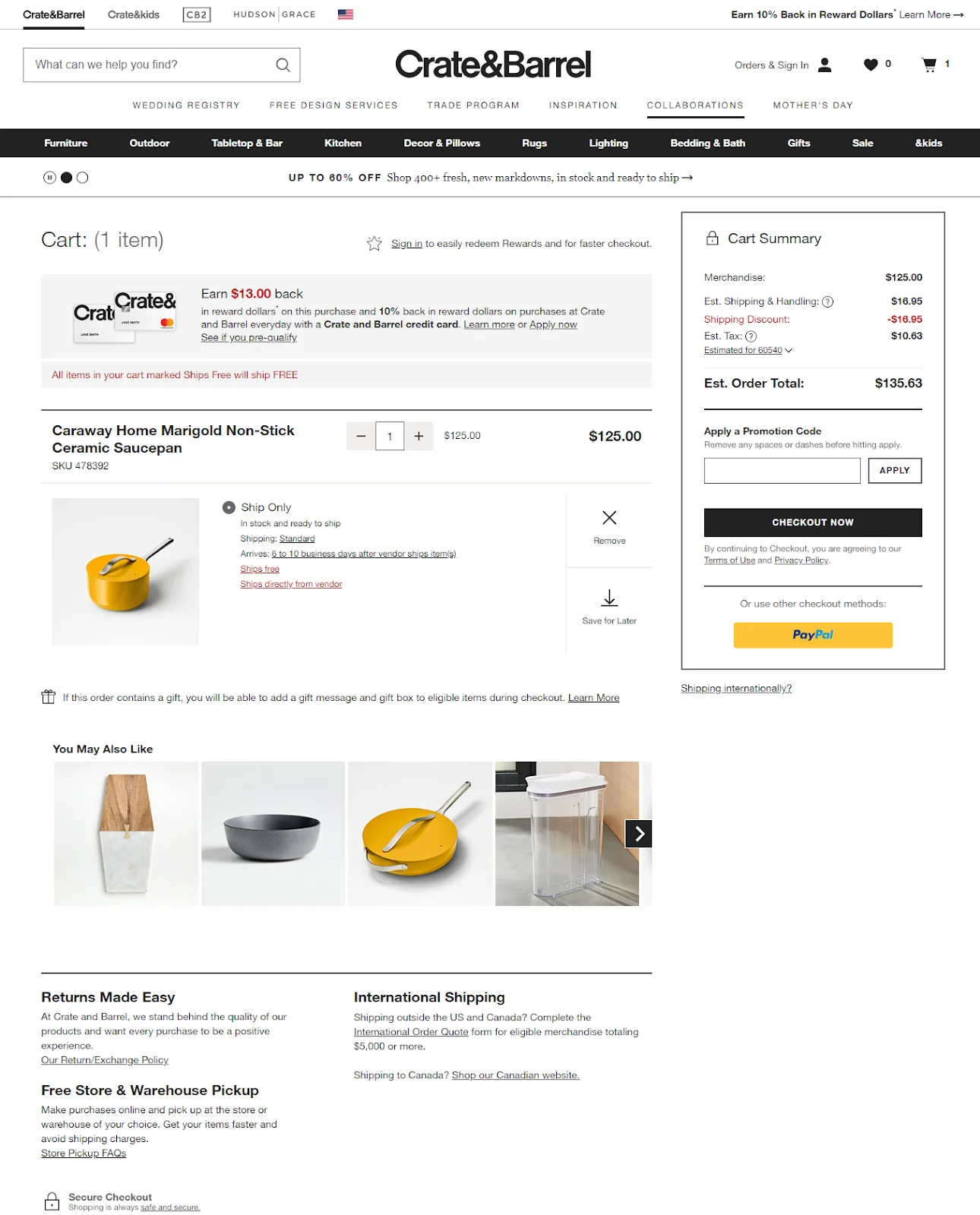
8) Crate & Barrel – Be clear about shipping info
Pillar: Cost Transparency
What they do: Shipping information appears in four distinct places: a 'Ships free' tag above the cart summary, a tag next to the product in the cart UI, upfront costs in the price summary, and pop-ups that reveal the return policy, international shipping, and pickup options.
Why it works: Redundancy, done well, isn't noise; it's reassurance. Crate & Barrel knows that unexpected shipping costs kill furniture conversions. By making the "ships free" message impossible to miss, they remove the #1 objection before it forms. According to Baymard research, unclear shipping costs contribute significantly to cart drop-off.
Best for: High-AOV stores, furniture, and home goods where shipping cost is a significant factor in the decision.
Key takeaway: Pull focus on important messages using contrasting colors and intelligent iconography.
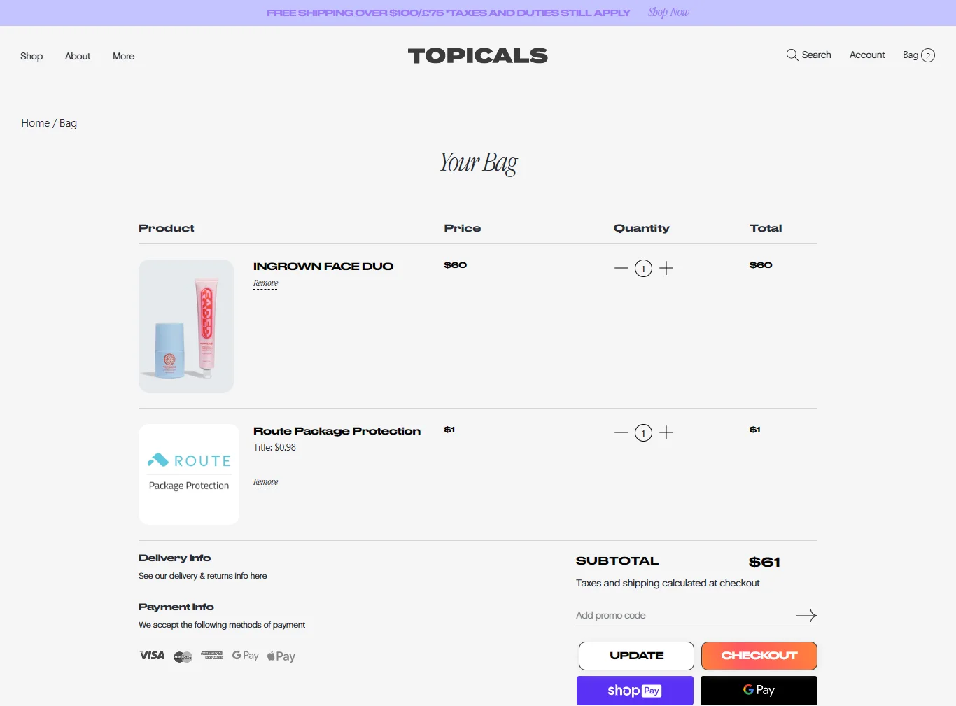
9) Topicals – Let your brand personality shine in your cart template
Pillar: Distraction Control + Trust Reinforcement
What they do: Brand-aligned CTAs, generous whitespace, and a distinct "update" button for order editing.
Why it works: Topicals has built a loyal following through a distinct voice and aesthetic. Carrying that through to the cart page signals consistency the brand doesn't become generic at the moment of purchase. Whitespace, often underused on cart pages, makes the whole experience feel calmer and more deliberate.
Best for: DTC brands with a strong identity and a community-oriented audience.
Key takeaway: Keep your cart page design aligned with your brand ideals, like Topicals does, by giving off a laid-back, premium vibe.
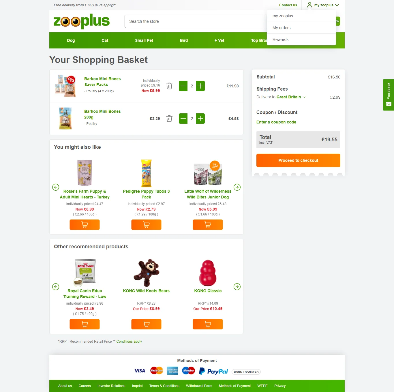
10) Zooplus – Enhance geolocation capabilities
Pillar: Cost Transparency
What they do: Customers can edit the country and pin code to estimate shipping information and cost. Quantity discounts appear as nudges to drive confidence.
Why it works: International customers face a specific anxiety at checkout: "What am I actually going to pay in my currency?" Zooplus answers this inside the cart itself rather than leaving it to checkout, where the surprise of currency conversion can break momentum entirely.
Best for: Stores with significant international traffic or shipping complexity.
Key takeaway: If you offer international shipping or vary taxes, make sure your cart design clearly reflects changes in currency and amounts.
Pro Tip: For non-English-speaking markets, keep the cart page design copy simple enough to translate cleanly using browser tools.
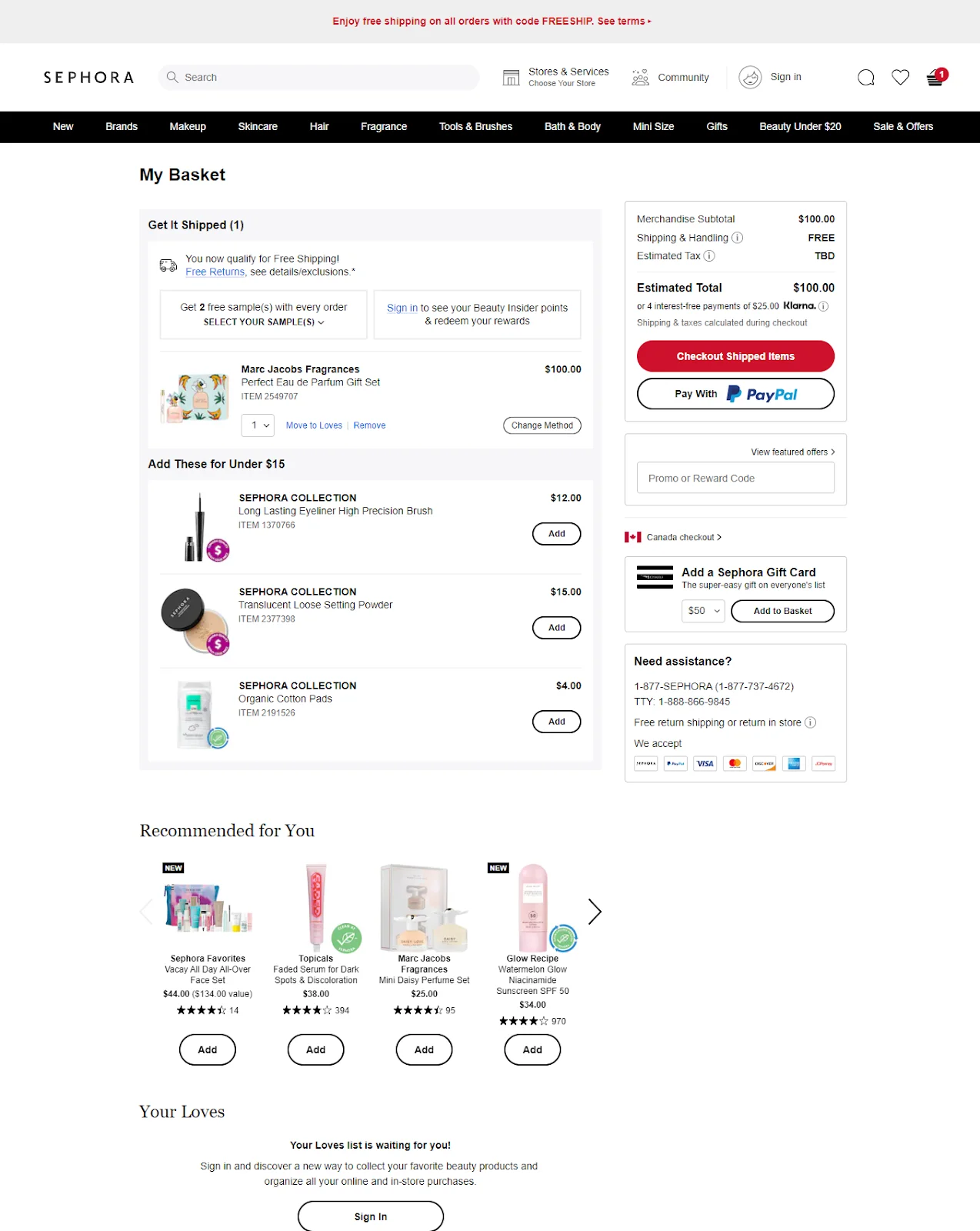
What they do: Two types of recommendations appear: a price-based 'shop under $16' and a personalization-based set drawn from browsing history. Shipping method can be changed directly in the cart — standard, same-day, or in-store pickup.
Why it works: Sephora avoids the common mistake of showing one type of recommendation to everyone. The price-based section catches customers who might want to "top up" their cart cheaply; the personalized section catches those who forgot something they were considering. Both serve the customer, not just the AOV metric.
Best for: Beauty and personal care stores with a broad SKU catalog and a loyalty-driven customer base.
Key takeaway: Tweak your cart design to intelligently upsell and downsell without causing information overload.
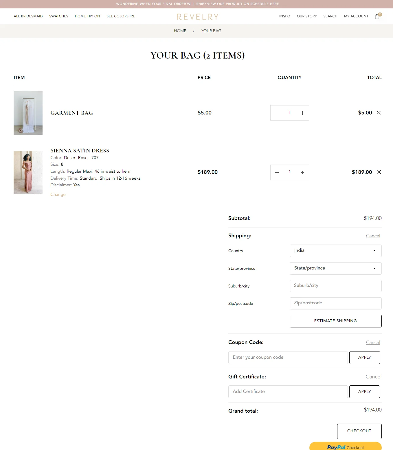
12) Revelry – Show the bag count in the shopping cart template
Pillar: Checkout Momentum
What they do: The number of items in the bag is shown prominently at the top of the cart page. Shipping estimate functionality is available in the cart.
Why it works: For stores where customers frequently add multiple items, bridal, group buying, occasion-based shopping, a clear bag count reduces the "wait, what did I actually add?" anxiety. It's a small thing that creates a sense of control.
Best for: Group purchase scenarios, event-based shopping (weddings, parties), or any store where customers browse and add over multiple sessions.
Key takeaway: Use the cart icon to remind shoppers of their cart items when they're browsing outside the cart.
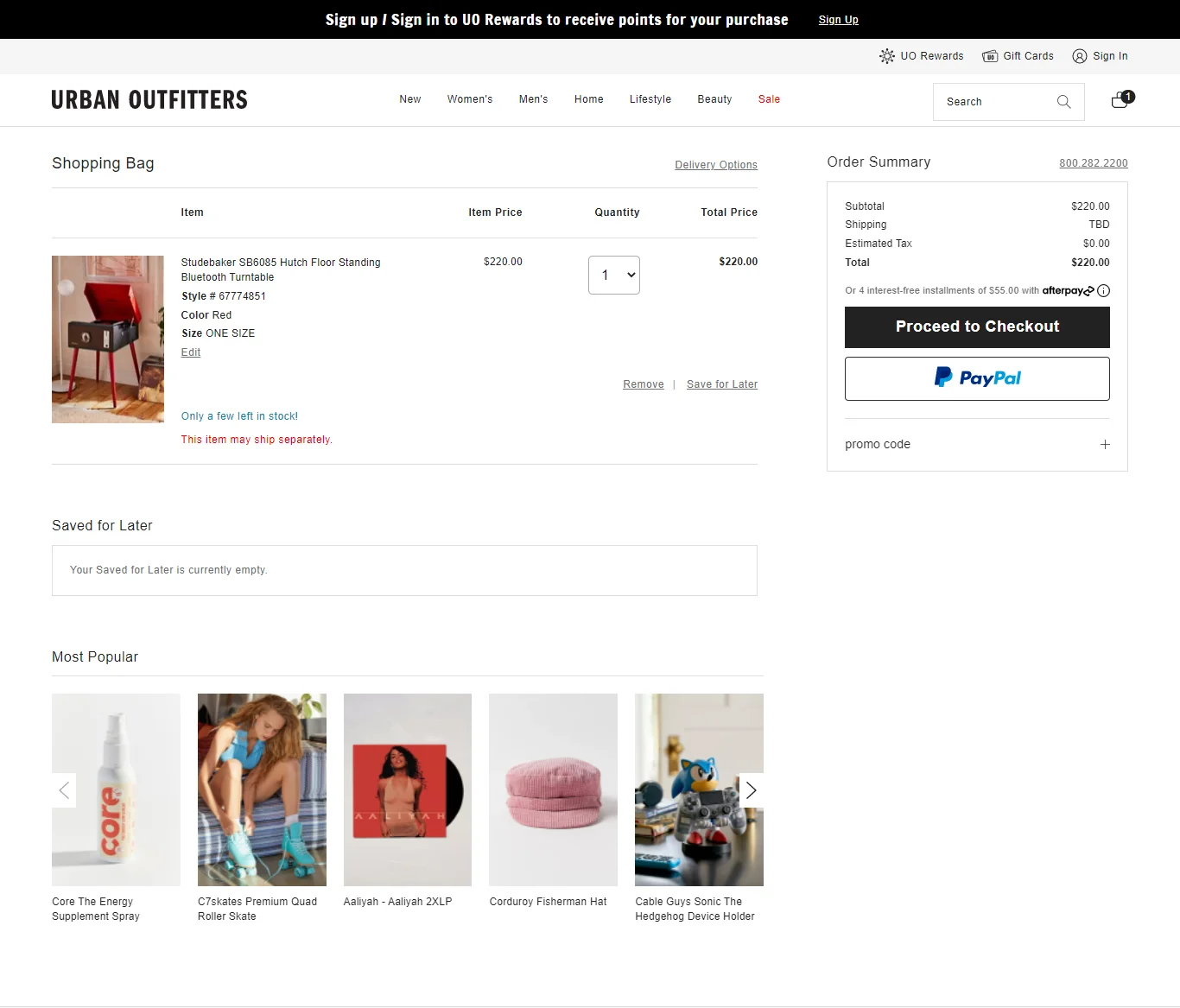
13) Urban Outfitters – Give a clear stock alert
Pillar: Checkout Momentum + Trust Reinforcement
What they do: A low stock alert creates urgency. A cart dropdown preview appears for five seconds when an item is added from the product page. A "saved for later" wishlisting nudge is integrated into the cart UI.
Why it works: The five-second cart preview is underrated it confirms the action without taking the customer out of their browsing flow. The stock alert does the FOMO work without feeling manufactured. And the save-for-later option keeps potential conversions alive without pressuring customers who aren't ready.
Best for: Fashion, lifestyle, and any category where scarcity is genuine, and products sell out meaningfully.
Key takeaway: Include information about stock levels and shipping methods in your website's shopping cart.
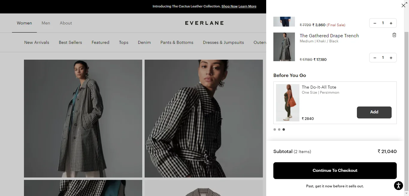
14) Everlane – Try a cart preview instead of a cart page
Pillar: Checkout Momentum + Distraction Control
What they do: A sliding cart preview with nudges like 'before you go' and 'psst! get it now before it sells out'. Product recommendations appear with a swipe effect, optimized for mobile shoppers.
Why it works: A full cart page is a commitment it interrupts the browsing experience. A cart preview keeps customers in their flow while still moving them toward checkout. The copy ("before you go") is particularly smart: it frames departure as the unusual choice.
Best for: Mobile-first stores with strong browse behavior and customers who add items incrementally across a session.
Key takeaway: Avoid leading to a separate cart page; instead, turn your cart into a checkout gateway.
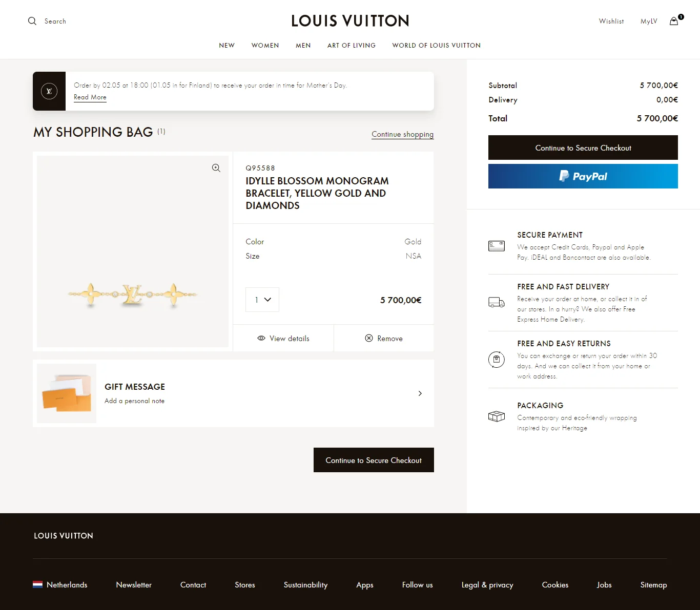
15) Louis Vuitton – Include image zoom-ins in your cart page design
Pillar: Trust Reinforcement + Checkout Momentum
What they do: Image zoom is available for detailed inspection. A delivery deadline message ("shop by this date for Mother's Day delivery") creates contextual urgency. A gift message option is available. Additional information appears via clickable pop-ups in the left panel.
Why it works: Luxury purchase anxiety is real. When you're spending a significant amount, you want to be certain you're getting exactly what you think you're getting. Image zoom removes that doubt. The delivery deadline adds urgency without feeling artificial; it's genuinely useful information.
Best for: Premium and luxury brands where product details matter, and customers spend meaningful time deliberating.
Key takeaway: Give space for consideration and scrutiny on the cart page with sufficient urgency triggers.
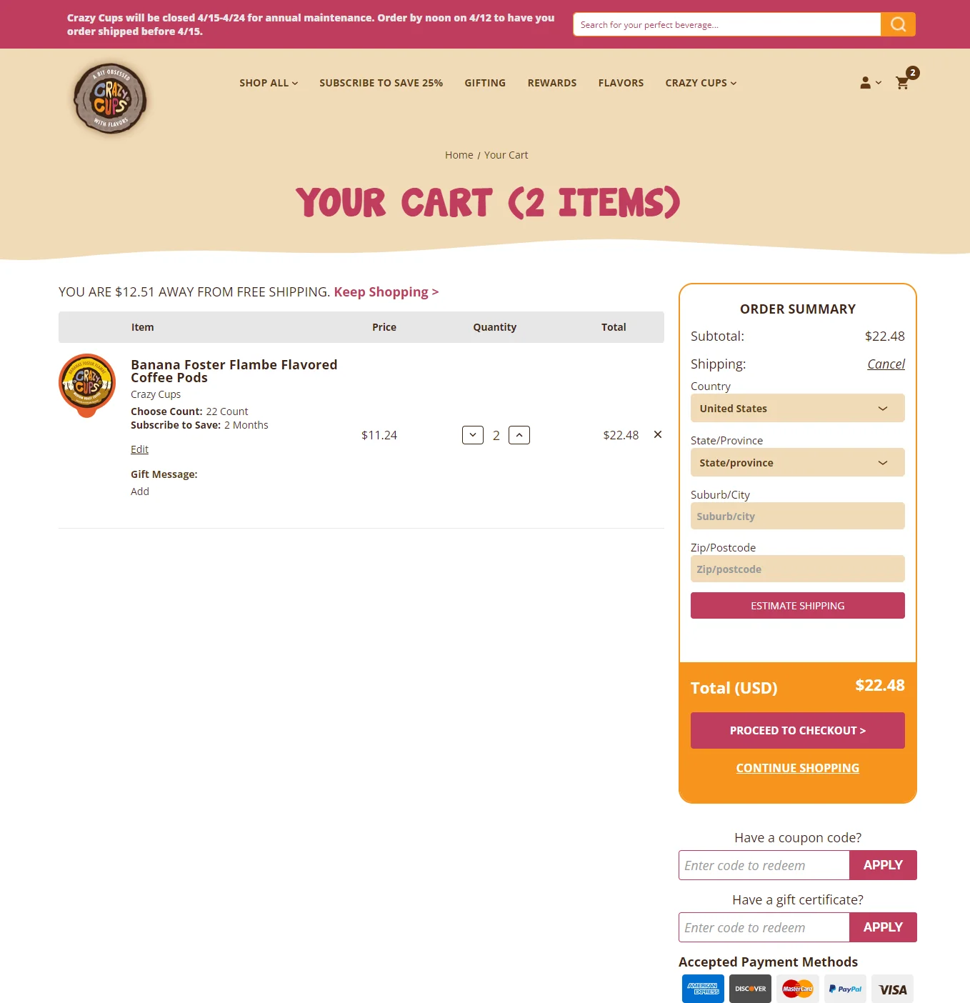
16) Crazy Cups – Balance creativity & info
Pillar: Cost Transparency + Trust Reinforcement
What they do: Bold, contrasted brand colors distinguish Crazy Cups from generic cart templates. Order details are clearly visible; subscription orders can be edited via a pop-up. The shipping cost calculator is built in.
Why it works: Subscription cart pages have a specific challenge: customers need to feel confident they understand exactly what they're agreeing to. Crazy Cups makes every element of the subscription order visible and editable, which reduces the hesitation that often accompanies "commit to repeat billing" moments.
Best for: Subscription-based or DTC brands with customizable order frequencies.
Key takeaway: Design your cart page well, but include the right kind of information so shoppers don't feel anxious.
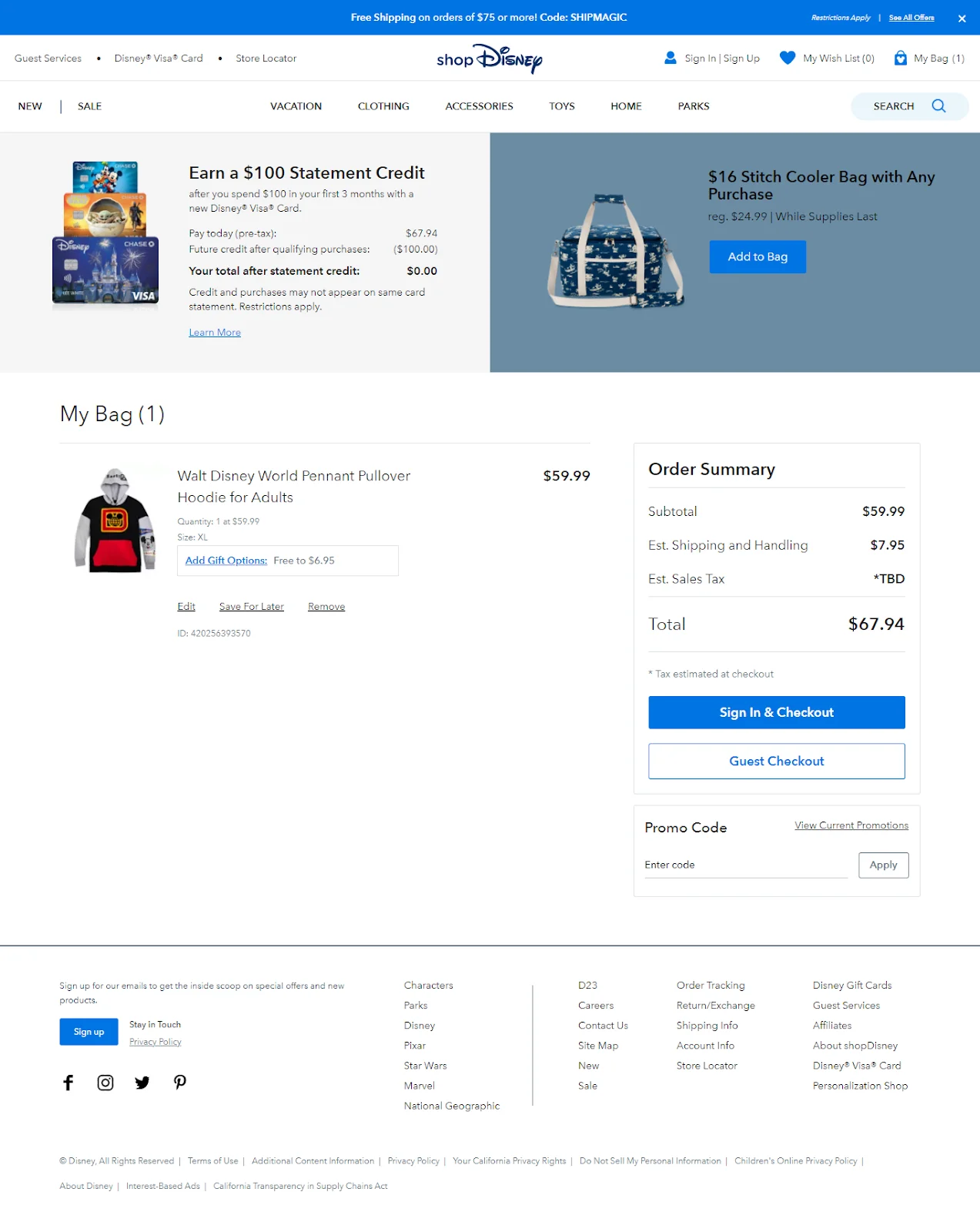
17) Disney – Show clear messaging to increase AOV
Pillar: Contextual Upsells + Checkout Momentum
What they do: A banner above the fold highlights the loyalty program and cross-sells a limited edition product with a direct add-to-cart CTA. Gift option nudges and price range information are visible in the cart UI.
Why it works: Disney's customer base skews gift-buyers and occasion shoppers. The banner-level cross-sell catches impulse moments; the loyalty program mention reminds registered members of benefits they're leaving on the table. The limited edition framing adds urgency without discounting.
Best for: Brands with strong loyalty programs, occasion-driven purchases, or limited-edition product lines.
Key takeaway: Remind shoppers only about offers they can immediately apply to their shopping carts.
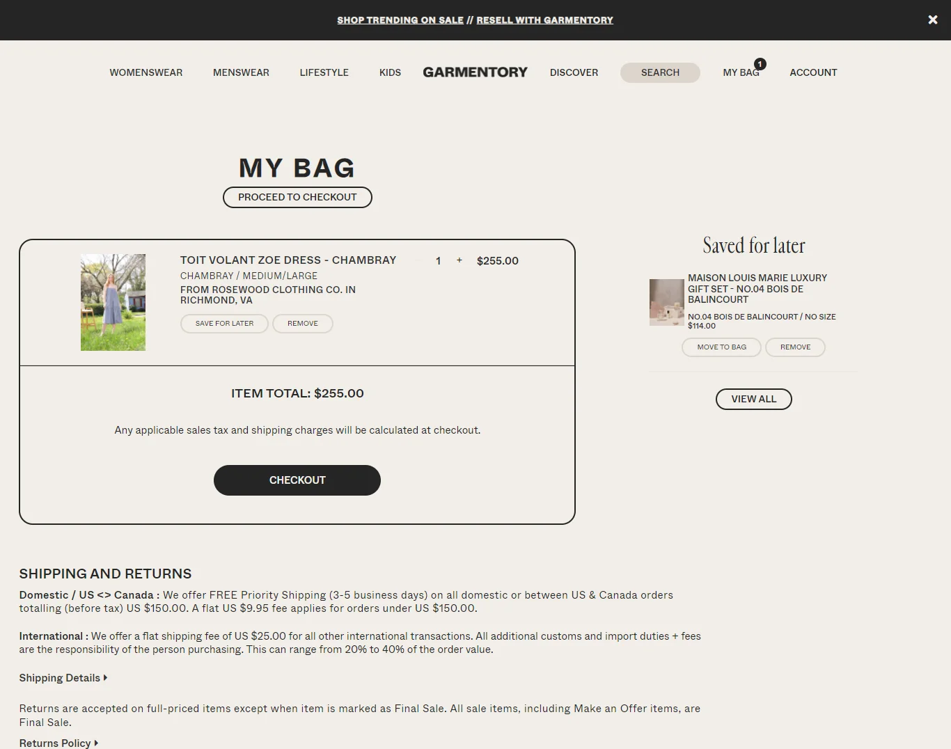
What they do: The "saved for later" tab sits directly beside the shopping bag tab — customers can review their wish list without leaving the cart area. Shipping information is visible without requiring a click.
Why it works: Garmentory solves the "I'll buy this next time" problem by keeping wishlisted items in the same viewport as the cart. The proximity creates a natural tendency to compare, and customers often end up adding wishlist items to their current order. No extra navigation needed.
Best for: Fashion marketplaces and multi-brand stores where browse-and-save behavior is common.
Key takeaway: Close the conversion path by helping shoppers pick up where they left off.
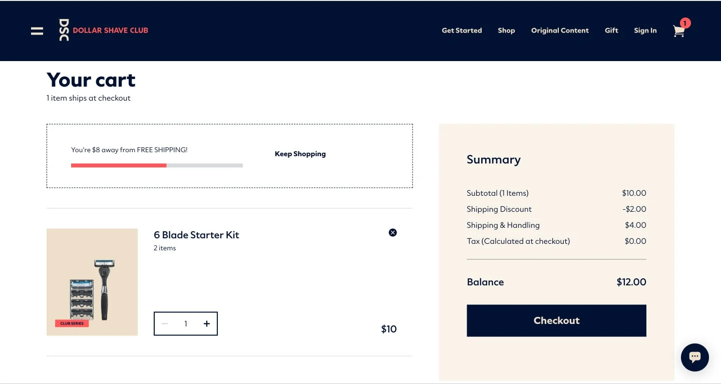
19) Dollar Shave Club – Break down cost in detail
Pillar: Cost Transparency
What they do: The cost breakdown is granular subscription billing, shipping, and tax are all shown separately. The cart is easily editable. A free shipping progress bar sits above the summary.
Why it works: Subscription billing creates a specific form of price anxiety: "What am I actually committing to?" Dollar Shave Club defuses this by showing all the numbers up front. There's no reveal at checkout, no surprise on the credit card statement. That transparency builds the kind of trust that drives subscription retention, not just first purchase.
Best for: Subscription stores, especially those selling consumables where recurring billing can feel opaque.
Key takeaway: Give a detailed cost breakdown in the first fold to maintain cost transparency.
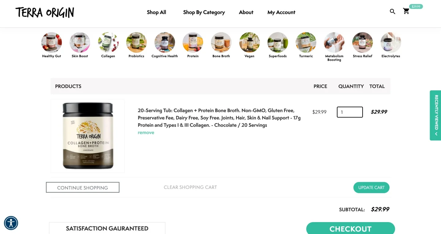
20) Terra Origin – Make solid visuals a part of the cart design
Pillar:Trust Reinforcement
What they do: The categories menu remains accessible alongside the cart. A 'Satisfaction Guaranteed' trust badge is prominently placed. A clear visual hierarchy supports multiple CTAs without causing confusion.
Why it works: For health and nutrition brands, trust is the purchase. Customers are ingesting these products, they need to believe in the brand. The 'Satisfaction Guaranteed' badge, placed in the cart rather than buried in the footer, functions as a last-moment reassurance exactly when hesitation peaks.
Best for: Health, wellness, and supplements brands where product efficacy is part of the purchase justification.
Key takeaway: Design your cart page to put focus on product images alongside trust badges. This makes shoppers feel more secure.
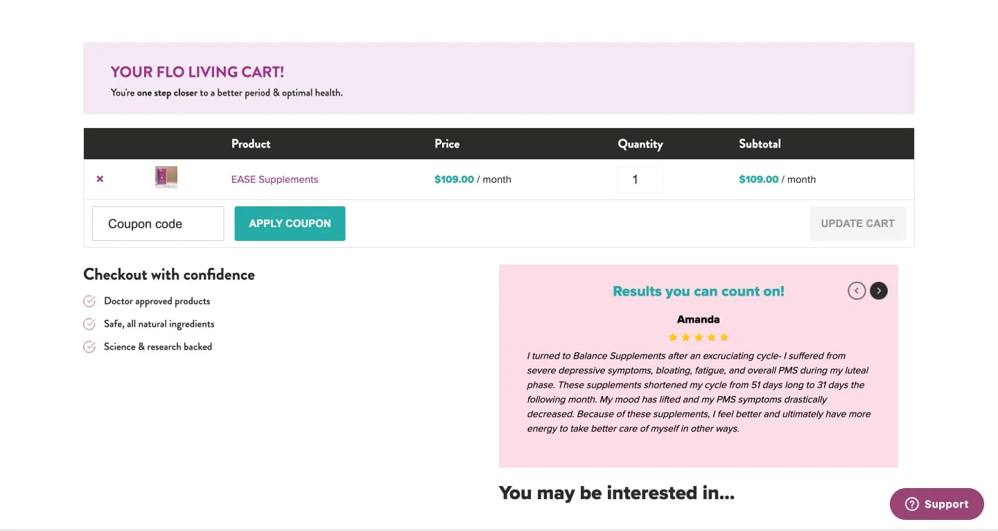
21) Flo Living – Help them checkout with confidence
Pillar: Trust Reinforcement + Contextual Upsells
What they do: A 'checkout with confidence' section prominently features customer testimonials. A highlighted customer review with star ratings anchors the trust section. Upsell recommendations appear for similar products.
Why it works: Nutraceuticals and women's health products face a trust barrier that most eCommerce categories don't; customers are making health decisions, often based on personal recommendations. Social proof at the cart stage directly addresses the "but does this actually work?" question that can derail an otherwise complete sale.
Best for: Health, wellness, and supplement brands where product credibility is a barrier to purchase, particularly for new customers.
Key takeaway: Reaffirm what makes your brand unique with iconography and user-generated content in your cart template.
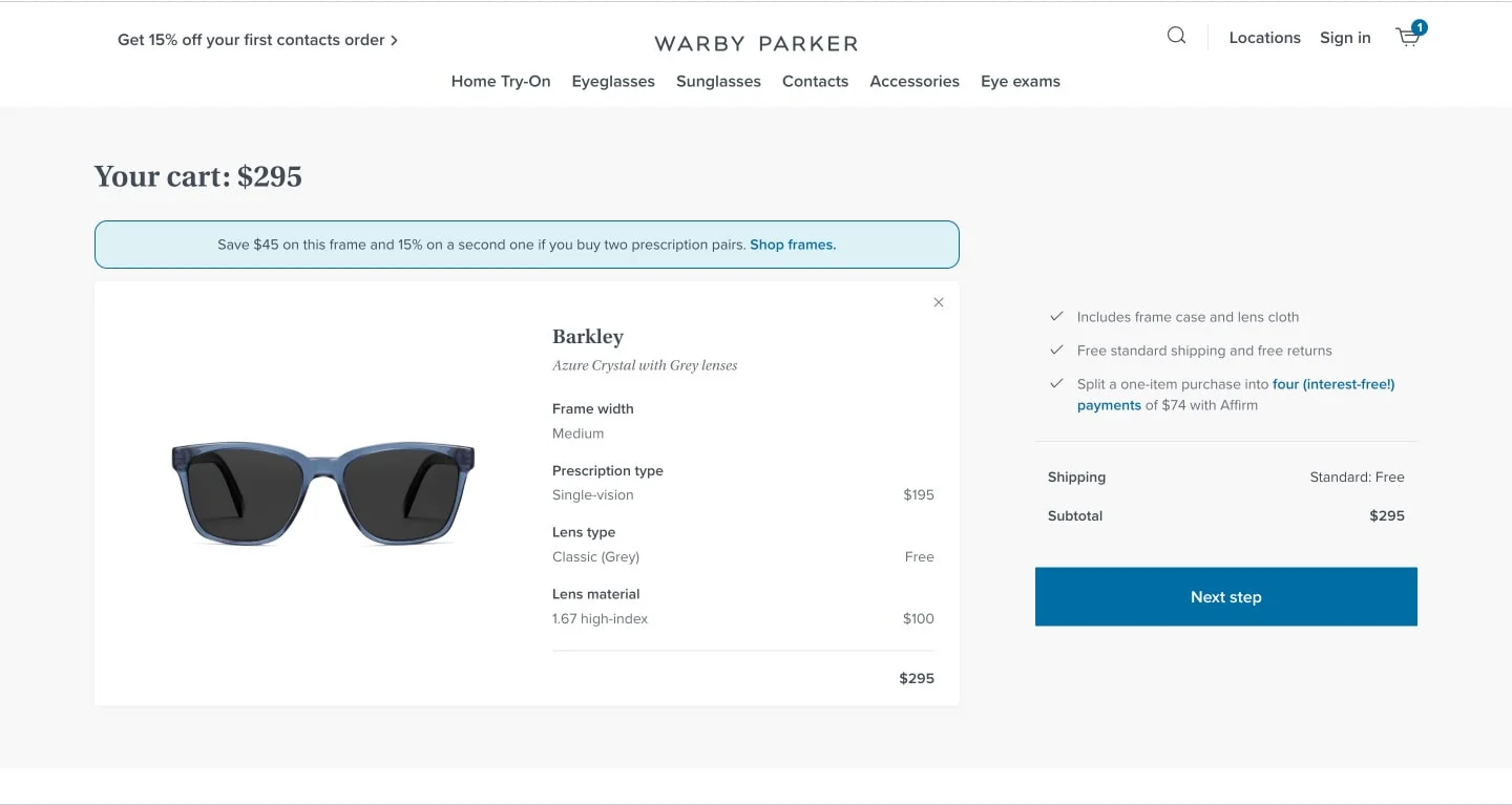
22) Warby Parker – Highlight key information
Pillar: Cost Transparency + Checkout Momentum
What they do: A sleek, minimal cart that surfaces savings, shipping info, and BNPL options clearly. A discount nudge appears above the main cart summary.
Why it works: Warby Parker's cart is a masterclass in restraint. Rather than cramming every conversion tactic onto one page, it highlights the three things that matter most to their buyer: what they're saving, when it arrives, and how they can pay. BNPL visibility, in particular, is well-placed — Warby Parker's eyewear sits in a considered-purchase price range where "pay over time" meaningfully reduces hesitation.
Best for: Mid- to premium-priced stores where payment flexibility influences conversion.
Key takeaway: Never skip key product details in the product summary section of your cart page.
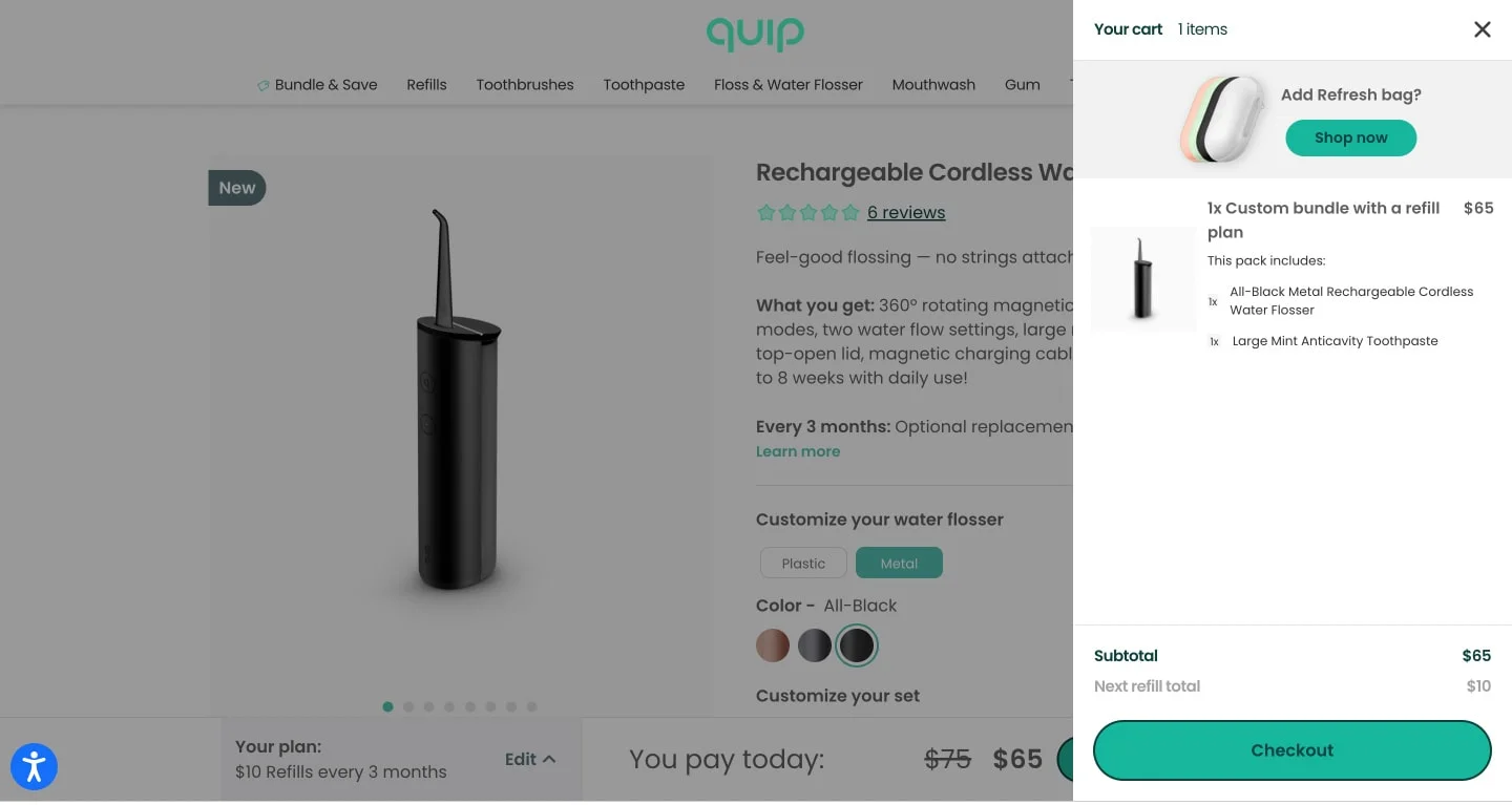
23) Quip – Prioritize UX in the website shopping cart
Pillar: Contextual Upsells + Checkout Momentum
What they do: The bundle contents are shown explicitly, building product recall. A sidebar cart design lets customers keep browsing. The upsell nudge occupies only about 15% of the cart layout.
Why it works: Quip does something clever with its upsell: it shows the dramatically lower "next refill total" in the subtotal area, making the long-term value of the subscription feel concrete rather than abstract. The 15% upsell footprint is also a good rule of thumb, enough to register, not enough to distract.
Best for: Subscription and refill-model products where the long-term value proposition needs to be illustrated.
Key takeaway: Prime your shoppers for the next purchase through your shopping cart design.
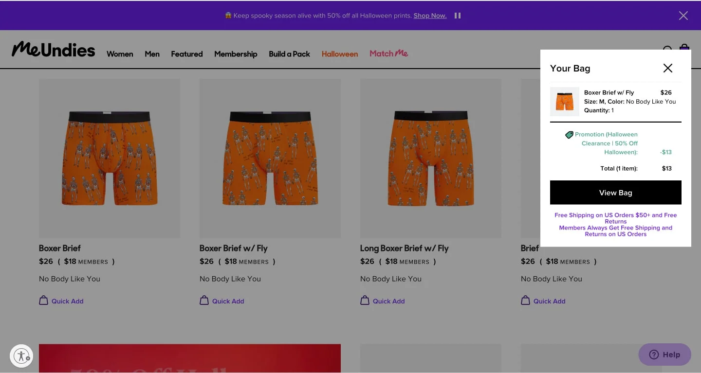
What they do: A quick-add dropdown lets customers keep browsing without leaving the page. A loyalty program membership nudge is integrated into the cart copy.
Why it works: MeUndies has built its brand around the membership model. The cart page isn't just a transaction point — it's a conversion opportunity for the program itself. The mini cart keeps browsing flow alive while the membership nudge plants a seed for higher lifetime value. It's an economical design.
Best for: Brands with a membership or subscription tier that benefits from early introduction.
Key takeaway: You don't always need a full cart page; a small but effective pop-up mini-cart with sharp copy works, too.
What they do: A bold blue 'Checkout Now' button anchors the CTA. A single, highly relevant product recommendation appears to be nothing more.
Why it works: Burton resists the temptation to load the cart with every available upsell. One relevant recommendation, presented cleanly, converts better than any of the five competing options. This is especially true for considered, high-intent purchases, where customers are close to making a decision and don't want to be slowed down.
Best for: High-intent, seasonal, or big-ticket purchases where the customer has spent time deciding and just needs a frictionless path to completion.
Key takeaway: Don't include every "high-converting" element; include only what helps them check out faster.
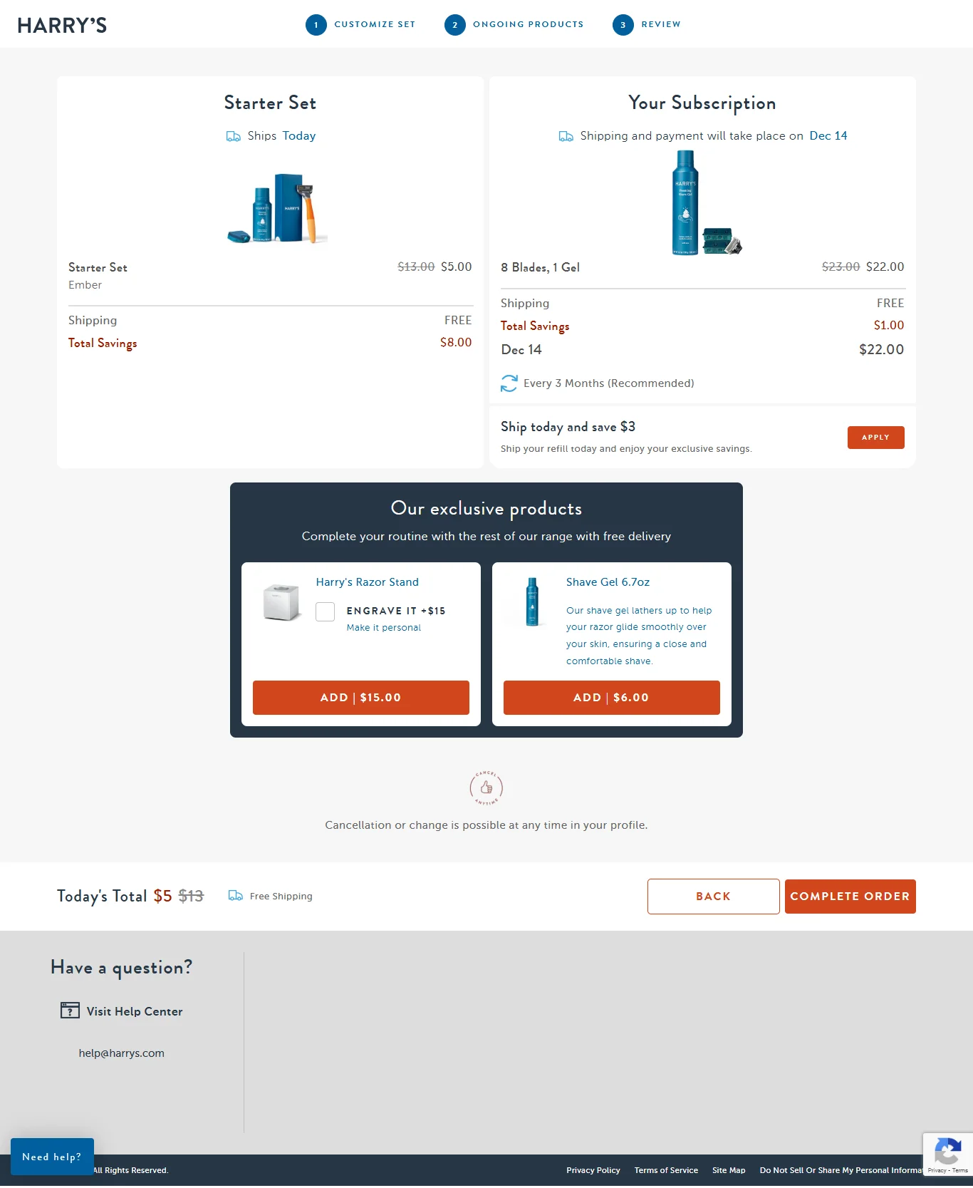
26) Harry’s – Treat the cart design like a landing page
Pillar: Checkout Momentum + Trust Reinforcement
What they do: Three clear steps walk the shopper into the subscription. Colors follow a 60:20:10 ratio, ensuring priority elements pull focus. Risk-reducing microcopy, "cancel anytime," "free shipping," is woven into the design.
Why it works: Subscription commitment is psychologically heavier than a one-time purchase. Harry's acknowledges this by treating the cart like a mini landing page, building the case, reducing the risk, and making the next step feel logical rather than obligatory. The progress-like three-step format also primes users to complete something they've started.
Best for: Any subscription-first product where recurring commitment is the primary conversion goal.
Key takeaway: Show a progress bar in your cart template for subscriptions, it reduces information clutter and builds momentum.
27) Walgreens – Feature ready-to-apply coupons
Pillar: Cost Transparency + Trust Reinforcement
What they do: Coupons appear on the notification bar and directly within product detail sections. Incentives address both first-time and returning customers.
Why it works: Coupon anxiety, 'I feel like I should have a discount code, but I don't know where to find one" is a genuine cart abandonment driver. Walgreens eliminates it by surfacing available coupons directly in the cart. No hunting, no leaving the page to Google for promo codes. The feel-good factor of an unexpected saving also creates a positive brand association at the moment of payment.
Best for: Pharmacy, health, and household goods retailers with loyalty programs or regular promotional cadences.
Key takeaway: Give customers instant gratification by displaying applicable coupons right below the product summary.
28) Victoria’s Secret – Nudge shoppers to log in
28. Victoria's Secret – Nudge Shoppers to Log In
Pillar: Trust Reinforcement + Contextual Upsells
What they do: Copy uses the Barnum effect, felt-personalized for both new and returning shoppers. Available payment mode offers and store-wide coupons are displayed. A login nudge promises personalized recommendations and order history. Country, currency, and language options are visible in the navigation. Save-for-later functionality is included.
Why it works: Victoria's Secret turns the login prompt into a value exchange rather than a barrier. "Sign in to see your offers" is a more compelling ask than "create an account." The combination of coupons, personalization, and visibility into order history gives customers multiple reasons to authenticate, all of which benefit both parties.
Best for: Established brands with large loyalty bases where personalization genuinely improves the purchase experience.
Key takeaway: Create the need to sign in by tying it to tangible, immediately visible rewards.
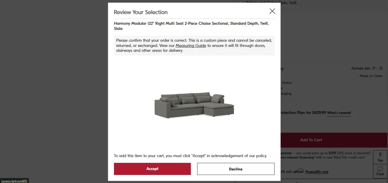
29) West Elm – Give shoppers a heads-up
Pillar: Trust Reinforcement + Cost Transparency
What they do: A screen-blocking pop-up informs customers to measure before ordering. Links to help documentation are available to filter out undecided shoppers. A clear notification flags that the custom selection is ineligible for returns.
Why it works: West Elm is doing something most brands avoid: proactively surfacing information that might slow down a purchase. The logic is sound — a customer who buys a custom sofa without checking dimensions becomes an expensive return and a deeply unhappy brand interaction. The upfront warning actually increases purchase confidence for customers who are ready, and saves everyone from a costly mistake.
Best for: Furniture, made-to-order, and customizable products where post-purchase regret is both common and expensive to resolve.
Key takeaway: Make sure shoppers know about custom return and shipping policies for specific products before they check out.
An order summary on your cart page acts as a nudge for customers to complete the purchase without abandoning it.
Without an order summary, customers have no way to trust you at the last stage.
How to solve:
Use a product image.
If customers don’t get the ‘What you see is what you get’ feeling, they will abandon their carts.
Warby Parker uses a captivating product image in their cart page template:
Break down costs.
28% of customers will abandon their carts if they see unexpected shipping costs.
Give a breakdown of the taxes, shipping, product price, and delivery charges(if any).
Dollar Shave Club in their cart example comes clean with the subscription billing, shipping, and tax (calculated at checkout):
Make it easy for customers to edit.
Provide options to edit the size, type, quantity, and variation to reduce a poor UX.
See to it that the edit in order summary reflects the pricing changes in real-time.
2. No customer support details
Unsurprisingly, 54% of customers say their expectations with customer support have doubled this year.
Including customer support details can stop customers from abandoning their carts owing to queries and hesitations.
How to solve:
Make customer support microcopy / icon easily spottable.
In their shopping cart template, Marc Jacobs mentions the customer support details below the checkout button with microcopy that's hard to miss.
Offer a sticky chat button.
81% of customers prefer live chat support for the convenience it offers.
Case in point, Industrial Hardware includes a simple live chat bubble on the bottom left side of the screen which doesn’t affect the shopping experience.
Pro Tip — Optimize your site for mobile with one-tap action. Tapping on a phone number will open the phone dialer while an email address opens the email app.
3. No trust badges
Cyber frauds have become a menace with 18% of customers citing trust issues in sharing credit card information as the reason.
If your eCommerce cart page design has to convert better, you’ve got to consider this.
How to solve:
Add an SSL certificate.
The SSL is a digital certificate that will verify your website’s identity and create an encrypted connection for your customer’s data. You can get SSL certification from a valid authority.
Authorize transactions only from legitimate payment gateways
Add a trust badge on the cart page to ensure customers don’t withhold their decision at the last minute.
Godiva includes a Norton trust badge as proof in their shopping cart template:
4. No relevant upsells or cross-sells
In a quest to make customers purchase, don’t forget to make product recommendations and increase your AOV.
Without these, shoppers often spend a lot less time in the cart.
How to solve:
Make the upsell subtle.
Here’s an example of displaying product recommendations on the cart page without going hard.
Feature slow sellers as cross-sell nudges.
One way to do this in your eCommerce cart design is to offer smart product bundles at a discounted price. Take a look at how Terra Origin does this:
Use a downsell nudge for cart abandoners.
Use the price point as a difference so cart abandoners have an alternative. Crutchfield does this with an open box version and a version with a dent below
Pro Tip — Ensure you:
Cross-sell when have you too many items in your inventory
Upsell to customers who have a high purchase intent
Downsell when you have popular or expensive items in stock
5. No navigational cues through CTAs
Long checkout and complicated forms are the reason 17% of customers abandon their carts. In the event leading to checkout, brands have to make it easy for customers to inspire confidence.
How to solve:
Use action words to inspire checkout.
Ditch the plain old statements like ‘Next’ and use verbs like ‘Take me to checkout’ and ‘Keep shopping’. This creates a subconscious trigger compelling users to act.
Bed, Bath, & Beyond uses ‘Are you ready to checkout?’ which is a nudge to drive users to take action.
Reframe some key CTAs.
High Sierra uses a 'Continue Shopping' CTA to compel users to look for more items—instead of the traditional “go back” or just a back button:
Pro Tip — Make sure your ‘proceed to checkout’ CTAs are bigger than ‘Continue Shopping’ CTAs so that customers are influenced to complete conversions.
6. No FOMO to create urgency
Your shopping cart design template won’t rake in the conversions if there’s no obvious urgency—shoppers will assume they can use their own sweet time to compare, consider and buy.
How to solve:
Use the “timer” approach.
The majority of shoppers add items to their shopping cart and forget. ASOS adds a reminder that the items in the cart will disappear after an hour.
Not seeing the preferred choice of payment on the checkout is the biggest upset for customers.
A connected problem is not having a faster checkout through a popular payment method.
How to solve:
Offer more payment options.
Nearly 7% of customers abandon their carts because their preferred payment method wasn’t offered.
Familiarity is one of the effective forms of social proof that drives conversions.
Adidas offers six payment methods on its checkout page.
Make express checkout a standard in your store.
8. No BNPL options
45% of customers use BNPL methods to buy products they can't afford.
BNPL payments are usually interest-free with repayment periods spanning over a six-week term.
UnderArmour offers 4 interest-free payments on Klarna in its cart page design to enable faster checkout.
Pro Tip — Offer two to three BNPL options so that customers have ample choice within the cart page template.
Key Takeaways for High-Converting Cart Pages
There's a temptation, after looking at 29 examples, to want all of it: the progress bar, the trust badges, the countdown timer, the loyalty nudge, the upsell carousel. Resist this.
The best cart pages aren't the ones with the most elements. They're the ones that have figured out which frictions matter most for their specific customers and removed them with precision.
Across all 29 examples, a few patterns stand out:
Show the total cost early. Surprises at checkout don't produce gasps of delight. Show shipping, taxes, and discounts in the cart itself.
Keep the checkout path obvious. The primary CTA should never require scrolling, searching, or thinking.
Reinforce trust at the moment of payment. Security badges, guarantees, and reviews belong in the cart — not just on the homepage.
Upsell with relevance, not volume. One well-chosen recommendation outperforms five scattered ones every time.
Reduce exits. Every nav link, banner, and category menu in the cart is a door you've left open. Close most of them.
Instead of copying individual designs, use these principles as a filter. Look at your own cart page and ask: where does momentum break? Where does doubt creep in? Where is the cost unclear?
Fix those things first. The aesthetics will follow.


.svg)

.svg)

.svg)
.svg)
