Before we arrive at the examples, a word about how we're going to judge them. Most checkout "best practices" lists are built from intuition and industry folklore. This one is built from audit data across 500+ US eCommerce brands.
We evaluate every checkout page across five dimensions. Each is scored out of 5, for a maximum of 25 points. You can use this to score your own checkout page right now, be honest with yourself.
Editor's note: This scoring method was developed by our in-house CRO team that consults eCommerce stores to improve their conversion rates.
How to interpret your score: 22–25: Your checkout is a genuine asset. 16–21: You have specific, fixable leaks. Below 15: Your checkout is almost certainly costing you significant revenue every week.
Next, let’s apply the framework to five real-world examples, score them, and tell you exactly what they got right (and where they left money on the table).
5 High Converting Checkout Page Examples
Example 1: Modern Mammals — Score: 19/25
Niche: Men's personal care | Key lesson: The paradox of easy cancellations
Dimension
Score
Verdict
Cognitive Load
4/5
Clean, minimal fields.
Trust Signals
5/5
Cancellation transparency is rare and excellent.
Flow & Momentum
3/5
Could streamline mobile further.
Doubt Reframing
4/5
The cancellation link reframes commitment risk.
Revenue Expansion
3/5
Limited upsell presence.
Most stores are genuinely frightened of anything that resembles a cancellation policy. The prevailing logic is that showing an exit door invites people to walk through it.
Modern Mammals, a men's shampoo brand, has come to a rather different conclusion.
Their checkout page places a clear, accessible cancellation link alongside the standard refund and privacy information. It is not the first thing you see, nor the last; it sits in the quiet middle of the page, neither hidden nor announced with fanfare.
This is, it turns out, exactly right. The psychological reality of checkout is that shoppers experience a sharp spike in what behavioural economists call "loss aversion," the sense that they might be making a mistake that cannot be undone.
When a brand makes exit feel easy, the decision to stay feels less consequential, which paradoxically makes it easier to make.
What to steal: Add a quietly placed cancellation or returns link near your payment section. A/B test between a plain link and warmer copy like "Easy to cancel, see policy." The warmer version typically outperforms.
Where they could improve: The mobile experience has room for further simplification. On smaller screens, even a small amount of layout complexity can disrupt the forward momentum that converts.
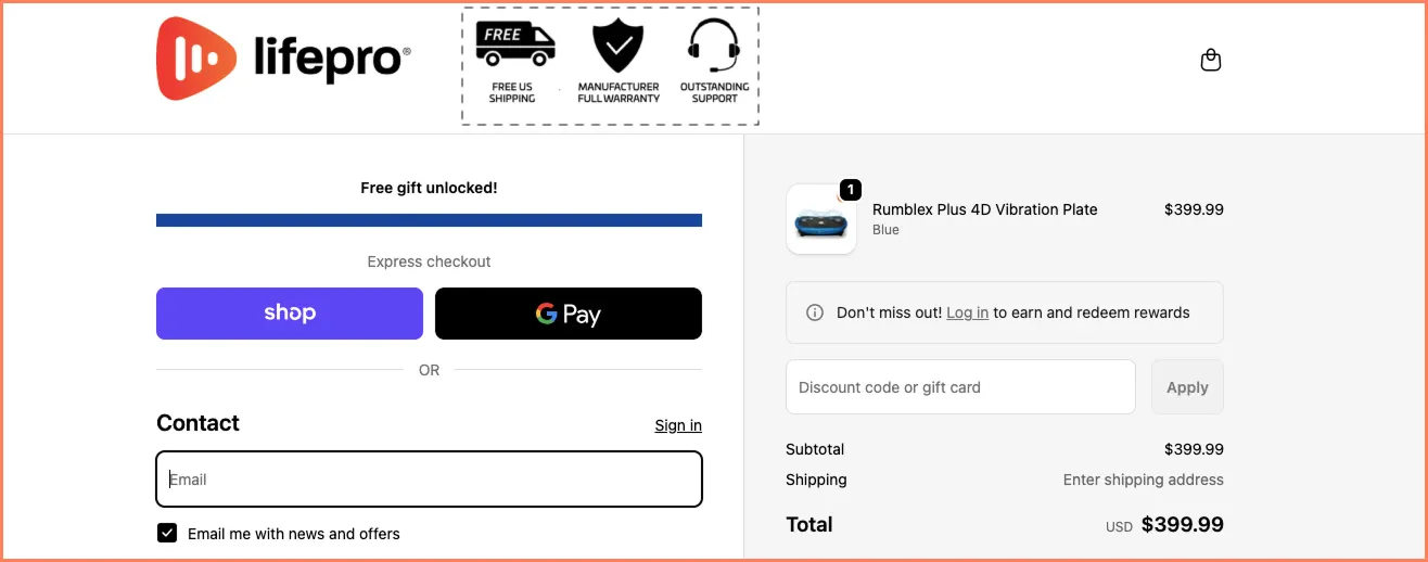
Example 2: Lifepro — Score: 22/25
Niche: Wellness equipment | Key lesson: Trust badges that actually do work
Dimension
Score
Verdict
Cognitive Load
4/5
Well-structured first fold.
Trust Signals
5/5
Exceptional — specific differentiators, not generic badges.
Flow & Momentum
4/5
Strong linear flow.
Doubt Reframing
5/5
Free shipping, warranty, support visible at decision point.
Revenue Expansion
4/5
Solid but could personalise add-ons further.
There is a common belief in eCommerce that the primary job of the first fold of a checkout page is to display familiar payment method logos. The idea is that seeing a Visa or PayPal mark reassures the shopper that the transaction is legitimate.
This is not wrong, exactly.
But Lifepro, a wellness equipment brand, has understood something more nuanced: that shoppers at checkout are frequently in comparison mode.
They have, in many cases, the same product open in two or three other tabs. What they are looking for is not simply proof of payment security; they already have that from the payment icons, but a reason to choose this store over the others.
Lifepro answers this by placing their genuine brand differentiators: free shipping, manufacturing warranty, and pre- and post-purchase support, at the very top of the checkout page.
These are not generic trust badges. They are specific, verifiable claims about what makes this purchase better than the alternative sitting in tab three.
What to steal: Before choosing your trust signals, survey your customer reviews and live chat logs for the three biggest hesitations shoppers express. Then, the engineer trusts content that speaks directly to those specific doubts. Generic badges are fine. Badges that answer real objections are significantly better.
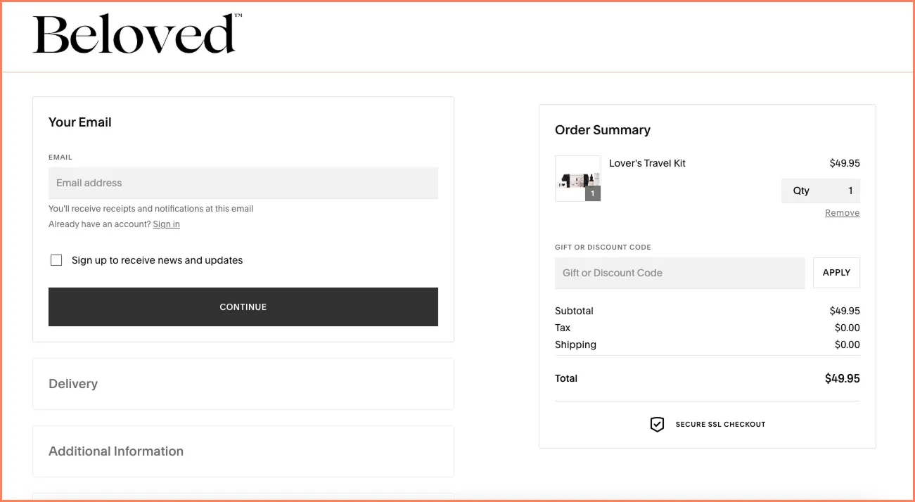
Niche: Sexual wellness | Key lesson: Collapsed sections and the gift of not knowing what's next
Dimension
Score
Verdict
Cognitive Load
5/5
Best-in-class progressive disclosure.
Trust Signals
3/5
Present but not strategically placed.
Flow & Momentum
5/5
Exceptional — shoppers always know exactly where they are.
Doubt Reframing
3/5
Could work harder on pre-payment reassurance.
Revenue Expansion
4/5
Clean add-on placement.
Money is, in the final analysis, a deeply stressful thing to hand over. Checkout is the moment when this stress reaches its peak.
The shopper must fill in fields, confirm details, enter card numbers, and do all of this while battling the sneaking suspicion that something might go wrong, that they might be making an error, and crucially, that they have no idea how much longer this is going to take.
Beloved, a sexual wellness brand, has solved this final problem elegantly.
Their checkout uses collapsed sections that open progressively as the shopper completes each step. You fill in shipping; the next section unfolds. You confirm payment; the next step appears. At no point are you confronted with the full scope of what remains.
This is, it turns out, a remarkably effective psychological trick. Psychologists studying task completion have long known that people are more likely to finish tasks when they feel they are making constant progress. Beloved's checkout creates exactly this feeling. Each completed section is a small victory, and the next step is always just one click away.
What to steal: If you have a multi-section checkout, consider collapsing everything except the active step. Always end each completed section with a small, accessible "edit" link, so shoppers want to know they can go back, even if they rarely do. That knowledge alone reduces anxiety.
Where they could improve: Trust signal placement is somewhat passive. Moving returns and security messaging closer to the payment field, the highest-anxiety moment would likely yield a meaningful uplift.
Example 4: Melinda Maria — Score: 21/25
Niche: Jewellery | Key lesson: Spending anxiety and the power of the gift frame
Dimension
Score
Verdict
Cognitive Load
4/5
Clean, well-organised.
Trust Signals
4/5
Strong, niche-appropriate social proof.
Flow & Momentum
4/5
Linear and focused.
Doubt Reframing
5/5
The gifting nudge is genuinely clever and niche-perfect.
Revenue Expansion
4/5
Gift wrap as a seamless add-on is smart.
More than 70% of shoppers who reach checkout carry with them a background hum of spending anxiety. They want the product. They have gone as far as putting it in a cart and clicking "Checkout." And yet some part of their brain is asking, with increasing urgency, "Is this a reasonable way to spend money?"
Melinda Maria, a jewellery brand, has found a remarkably effective answer to this question, not by reducing the price, not by offering a discount, but by reframing what the purchase is for. Their checkout page includes a gift-wrapping nudge that transforms a personal indulgence into an act of generosity.
This is what we call "doubt reframing," the practice of changing not the purchase itself, but the story the shopper tells themselves about why they're making it.
Spending money on yourself can feel frivolous. Spending money on a beautifully wrapped gift for someone else feels entirely defensible, even virtuous.
The execution is important here. The gift wrap nudge appears as a simple, non-intrusive option within the checkout flow, not a pop-up, not a separate page, not a decision that requires significant deliberation. It adds to the order without increasing cognitive overhead.
What to steal: Think about how your product can be reframed at the point of purchase. In most niches, there is a legitimate gifting angle. Set a minimum cart value to trigger the nudge. $60 is a reasonable starting point to keep it feeling relevant rather than desperate.
Example 5: Wuffes — Score: 21/25
Niche: Pet health supplements | Key lesson: The right kind of social proof (not just any kind)
Dimension
Score
Verdict
Cognitive Load
4/5
Clean and well-prioritised.
Trust Signals
5/5
Authoritative proof matched to science-backed product.
Flow & Momentum
4/5
Smooth and focused.
Doubt Reframing
5/5
The human guarantee face creates remarkable reassurance.
Revenue Expansion
3/5
Add-on opportunities are underutilised.
There is a great deal of muddled thinking in eCommerce about social proof. The standard advice is to "add reviews to your checkout page," which is a bit like being told to "add vegetables to your diet," technically correct, but insufficiently specific to be particularly useful.
Wuffes, a pet health supplement brand, has understood something more precise: that the type of social proof must match the nature of the product and the psychological state of the shopper. Their products are science-backed supplements for dogs.
The shopper who has reached checkout is not merely wondering whether other people liked the product — they are wondering whether it will actually work for their pet, possibly a senior dog with specific health concerns.
Wuffes' checkout page responds to this with authoritative social proof, not just star ratings, but expert endorsements and guarantee-backed assurances, presented with human faces.
The faces are not incidental. Research on trust in online transactions consistently shows that human images near conversion points increase the likelihood of completion.
What makes this especially smart is the specificity. The guarantee isn't a generic "you'll love it." It speaks to the concern that drives the purchase: that this will actually help my dog.
What to steal: Before choosing your checkout social proof, ask one question: What is the shopper's primary fear at the moment of payment? Then find the specific kind of proof that addresses exactly that fear, not proof in general, but proof that speaks to the doubt that is most likely to make them close the tab.
Where they could improve: The add-on and cross-sell section is underutilised for a brand with a natural product range (joint health, anxiety, digestion). Contextual add-ons matched to the item in the cart could meaningfully increase AOV with minimal friction.
What Patterns Emerge Across High-Scoring Checkouts
Having applied the framework to five very different brands in five very different niches, some patterns are worth noting not because they constitute universal laws, but because they appear reliably enough to deserve attention.
High-scoring checkouts address doubt rather than ignoring it
The common instinct is to remove anything from a checkout page that might give a shopper a reason to pause. Modern Mammals, Melinda Maria, and Wuffes all take the opposite approach: they acknowledge the shopper's anxiety and respond to it directly. The result, counterintuitively, is more momentum, not less.
Trust signals are most effective when they are specific
Generic security badges have some value. Specific, verifiable claims about shipping, warranty, and returns have considerably more. The difference is that specific claims answer real questions; generic badges merely signal legitimacy.
Cognitive simplicity is the foundation on which everything else builds
None of the other dimensions function well if the checkout page is too complex to navigate comfortably. Beloved's collapsed sections are the clearest illustration of this by controlling what the shopper sees at any given moment, they make every subsequent element more effective.
Revenue expansion works best when it requires no deliberation. The add-ons and cross-sells that perform at checkout are the ones that shoppers can add with a single click without stopping to think. The moment an add-on requires reading, comparing, or deciding, it has already lost most of its conversion potential.
Score Your Own Checkout Page
The Convertcart Checkout Evaluation Framework is designed to be used, not just read.
Here is how to apply it to your store right now.
Open your checkout page as a fresh visitor, ideally in an incognito window, on the device your customers most commonly use (which is, in most cases, a mobile phone). Work through each of the five dimensions in the scoring table above. Be honest.
The point is not to feel good about your score; the point is to find where the leaks are.
If your total is below 18/25, your checkout almost certainly has conversion leaks that are costing you revenue every day. The good news is that checkout improvements typically show results faster than almost any other category of CRO work, because you are intervening at the moment of highest purchase intent.
If you would like a professional assessment, Convertcart's audit team can review your checkout page and identify the highest-leverage changes.
We've helped 500+ US eCommerce stores improve their conversion rates, and checkout optimisation is consistently among the fastest-payback investments we see.
A Final Thought
The remarkable thing about checkout pages is how much work they are expected to do in a very short time. In the space of perhaps sixty seconds, a checkout page must reassure, simplify, persuade, retain, and convert while simultaneously not doing anything annoying enough to make the shopper change their mind.
The brands that do this best are not the ones that follow a checklist. They are the ones who have thought carefully about who their shopper is, what that shopper is afraid of at the moment of payment, and what they can say or show that will make them feel like the obvious thing to do.
The framework above is a map. The territory is your specific customer, in your specific niche, deciding on your specific product.
The most important thing you can do with the insights from these five examples is not to copy them; it is to use them as a prompt to think more carefully about your own checkout page and what it is that your shoppers most need to see before they click Buy.
Subscribe for more articles like this!
Thank you - we'll see you in your inbox soon!
Oops! Something went wrong while submitting the form.
Read by 5000+ ecommerce store owners
Subscribe for more articles like this!
Thank you - we'll see you in your inbox soon!
Oops! Something went wrong while submitting the form.


.avif)
.svg)

.svg)

.svg)
.svg)
