eCommerce Checkout Optimization: What's Actually Working Right Now


Despite massive investments in traffic and product pages, checkout remains the biggest revenue leak in eCommerce, turning "pay now" into "see you never" for the majority of visitors.
After auditing over 500+ checkouts, we have seen some patterns emerge.
So now our teams know which questions online store owners will ask us.
In this article, let’s cut through the noise with what's actually increasing conversions right now in today's friction-hating world.
In short, yes, absolutely, even in 2026, extra costs like shipping, taxes, and fees remain the #1 culprit for checkout abandonment.
According to the latest research, around 48% of American shoppers cite "extra costs too high" (think unexpected shipping or taxes) as their main reason for bailing.
Surprise fees are a friction point that turns "almost bought" into "maybe later... or never."
Shoppers hate feeling tricked. They browse product prices, add to cart, and expect the total to stay close to what they saw.
When hidden shipping or taxes pop up late, trust erodes fast, especially on mobile, where quick decisions rule.
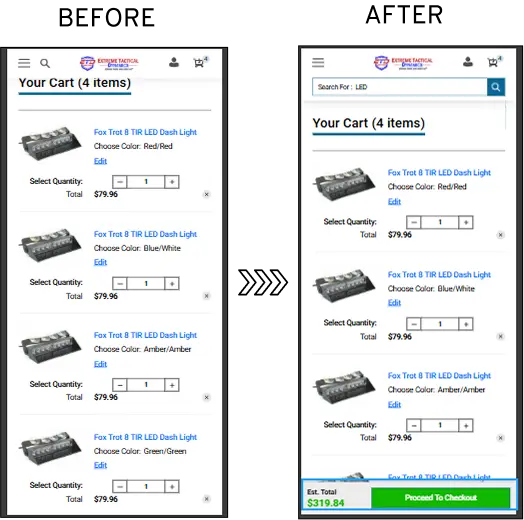
Take our checkout optimization work with Extreme Tactical Dynamics, a tactical gear retailer. (Read the full case study here.)
We dug into their data and found a whopping 63.99% of mobile checkout drop-offs tied to unclear CTAs and confusion around total pricing.
Shoppers were hitting the checkout page, getting lost on what the final amount would be, and bouncing.
Our hypothesis was straightforward - Clarify CTAs and show pricing transparency upfront to smooth the cart-to-checkout flow.
So we optimized CTA placement (making "Proceed to Checkout" crystal clear and prominent) and displayed final pricing (including estimates for shipping/taxes) right on the checkout page.

This resulted in a solid +3.79% campaign gain and +1.65% website-wide gain from this one change alone, plus a 4% reduction in checkout drop-offs.
Combined with trust signals elsewhere, they saw an overall 45% website gain across experiments.
Real revenue recovered by just being upfront, no fancy gimmicks.
Also read: How Many Steps Should Your eCommerce Checkout Have?
Yes, they do! And in 2026, with shoppers' patience thinner than ever, fewer form fields are a low-hanging fruit that keeps paying off.
Every extra field adds cognitive load, typing effort (especially on mobile, where thumbs get cranky), and a chance for typos or "ugh, forget it" moments.
Studies have found that most sites need only 8 form fields in total for a checkout flow. Yet, the average in eCommerce is still hovering at 11.3 form fields.
Removing unnecessary fields can cut abandonment by 12%, while autofill drops it another 8%.
And don't get me started on one-click options like Apple Pay or Google Pay, they slash abandonment by 20-22% in some benchmarks because they basically autofill everything.
We've seen this checkout optimization play out in real American stores we work with.
Online brands that ruthlessly cut non-essential fields (e.g., "how did you hear about us?") and lean hard into browser autofill, address autocomplete, and saved payment details?
They get quick, noticeable lifts, often in the 10%-20%+ range on checkout completion when combined with other tweaks like guest checkout by default.
When we hid optional stuff behind "Add delivery instructions" or a simple checkbox for "Billing same as shipping."
And this resulted in more checkout completions.
We saw even better results on mobile! Autofill is a lifesaver, including the right input types so the numeric keyboard pops for phone/zip, and enabling device autofill.
Shoppers love not having to retype their address for the 47th time.
With some brands, when we mentioned slashing form fields, there was instant opposition.
"But what if we need that data?!"
For those doubters, we suggest collecting extras post-purchase or via account creation later. Right now, the goal is to get the order in the bag first.
Further reading: The Silent Revenue Killer: How to Detect a Weak Checkout Process
Someone's deep in checkout, they've got their items picked, but then they realize "Wait, I need the large instead of medium" or "Add one more, nah, scratch that, remove it."
If editing means hitting "back," reloading pages, or starting over, that's pure frustration fuel.
American checkout usability research points out that rigid flows and poor editing options are big reasons people bail.
Complicated processes alone drive a chunk of that 70%+ abandonment.
If users can't quickly fix mistakes or change their minds on the order summary/review page, hesitation turns into "forget it."
We've seen this exact pattern numerous times.
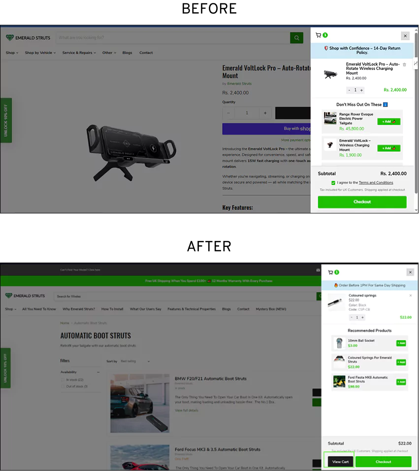
Consider our checkout optimization work for Emerald Struts, an automatic boot strut brand for cars. (Read the full case study here.)
Their data showed shoppers frequently trying to jump back to the cart after starting checkout, a classic sign of needing to make quick changes but hitting roadblocks.

So we repositioned and redesigned the cart CTA button to make it way more prominent and intuitive.
This made it easier to spot and click when someone wanted to adjust their order mid-checkout.
It contributed to their overall experimentation success (they hit a 50% experiment success rate across tests), helping reduce those back-and-forth abandons and supporting broader conversion gains.
Read more: Checkout Pages That Make People Buy: Real eCommerce Examples
Even today, the global checkout abandonment rate is still stubbornly high at around 70.22%.
While surprise fees and complicated flows grab the headlines, something as innocent-looking as a promo code field can trigger a sneaky but massive leak.
That empty "Enter promo code" box catches the eye immediately, especially in checkout, where attention is laser-focused on the total.
Most American shoppers spot it, think "Am I overpaying? Maybe there's a better deal out there," and bounce off to Google "site name + coupon code."
Even if only 10-20% of your traffic does this, it adds up fast when you're fighting that 70% abandonment wall.
We have seen conversions improve when the fields are collapsed or hidden.
And if you have sitewide or user-specific promos, apply them automatically in cart/checkout for that instant "sweet" feeling without manual entry.
Further reading: Clever Ways To Reduce Checkout Abandonment Rate
Forcing shoppers to create an account before they can buy is still a major conversion killer.
When a site hits them with a mandatory sign-up wall right in checkout ("Create account to continue"), it triggers instant resistance in shoppers like, "Do I really need to do this just for socks?"
It adds friction, extra fields, password creation, email verification fears (spam inbox incoming?), and the feeling of being locked in before they've even paid.
Many shoppers in the U.S prefer guest checkout for privacy, speed, or because they're not ready to commit long-term
In our checkout optimization work for eCommerce stores, we’ve also noticed that social/one-click logins serve as excellent backups, especially for returning users.
Options like Apple Pay, Google Pay, or social sign-in (Facebook, Google) let people skip lengthy forms entirely and breeze through, speeding up the process without forcing full account creation.
Certain verticals in retail and grocery eCommerce, where repeat purchases are common, but impulse buys are also huge, post-purchase account prompts perform beautifully.
Shoppers who just bought groceries or everyday essentials are much more open to signing up once they’ve already experienced a smooth, frictionless transaction and received their confirmation.
Also read: Guest checkout: Still a good choice? (+ way BETTER alternatives)
One of the sneakiest things still tripping up checkouts is how American stores talk about shipping.
Specifically, whether vague "shipping speed" labels (like "3-5 business days") beat out clear, calendar-based delivery dates (think "Arrives by Thursday, March 5").
Our usability testing points strongly in one direction.
Specific delivery dates tend to win hands-down for building shopper confidence and pushing more completions.
Shoppers aren't just asking "How fast?", they're really wondering "When will this land on my porch?"
When you leave them guessing (calculating business days, skipping weekends/holidays, factoring in order cutoffs), hesitation creeps in, and that hesitation often turns into abandonment.
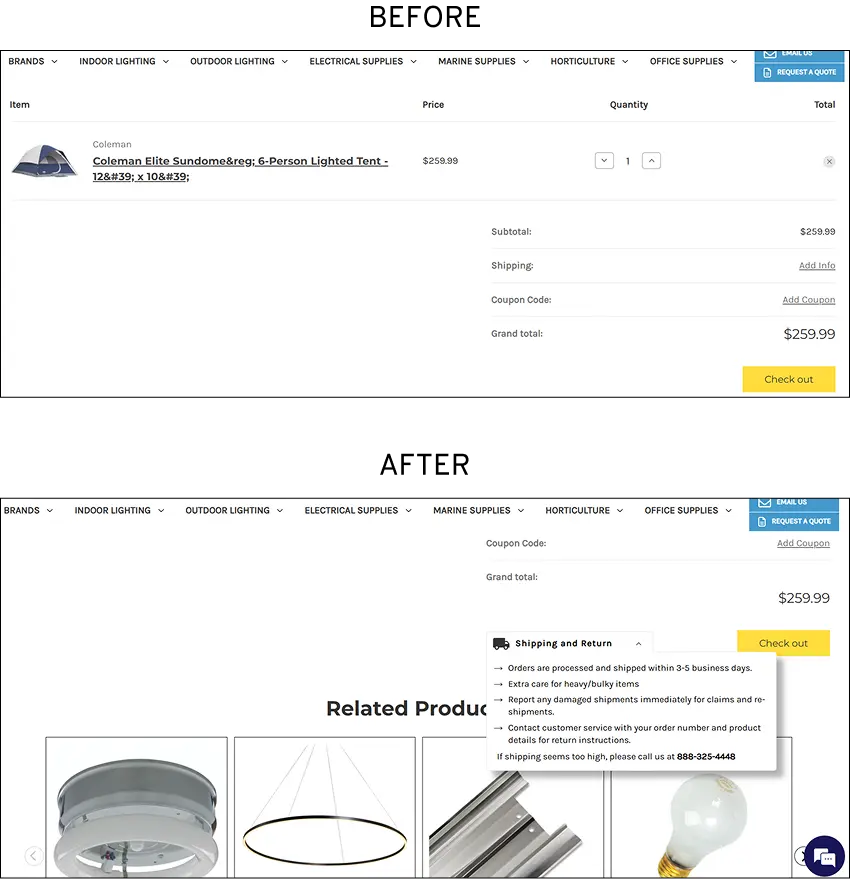
We worked with Lighting & Supplies, a lighting retailer, to optimize their checkouts. (Read the full case study here.)
Data uncovered that 42% of their users dropped off at the cart stage, specifically due to unclear shipping timelines and fees.
As an experiment, we added shipping badges and delivery estimates directly on the cart and checkout page (making timelines visible early, alongside fees), plus integrated FAQs and support touches for extra reassurance.

And the numbers jumped!
Transparency accelerated purchases and built confidence, delivering a 16.57% campaign gain and 4.41% website-wide gain from the core shipping tweaks.
The mobile-focused experiment (with sticky support and clearer details) added another 15.73% campaign gain and 4.01% site-wide, contributing to an impressive overall 54% website gain across our A/B testing program.
Further reading: How Do I Increase My Website’s Checkout Rate?
This question comes up all the time when we're auditing checkouts of U.S stores.
Most online stores keep asking if those little progress bars or step indicators really make a difference, or are they just nice-to-have decoration?
Our take is that they do help, often quite a bit, by reducing anxiety and keeping momentum going.
In today's environment, where the global checkout abandonment rate is still sitting at around 70.22%, anything that clarifies the process and makes it feel less overwhelming.
When shoppers hit a multi-step checkout without a clear roadmap, they wonder, "How many more screens? Am I almost done?" and that uncertainty spikes drop-offs.
Progress indicators solve this by giving a visual sense of control: "You're on Step 2 of 4" or a filling bar shows exactly where they stand and how close they are to the finish line.
In multi-step or accordion-style checkouts, adding clear, color-coded progress indicators (green for completed, active step highlighted) often smooths the experience noticeably.
It pairs perfectly with things like collapsible sections or editable summaries; shoppers know the effort is finite, edits are safe without losing progress, and the whole checkout flow feels more predictable.
However, when it comes to this checkout optimization, make sure to avoid overkill on short flows.
If it's truly one-page, a progress bar can feel redundant, so focus on vertical accordions instead for logical grouping.
Our team universally agrees that offering a variety of payment options, especially ones with biometric authentication like Apple Pay and Google Pay, definitely boosts completion rates and cuts abandonment.
Usability testing research consistently flags "not enough payment methods" or lack of preferred options as a direct contributor of around 10-13% of checkout abandonments.
That's not a tiny slice.
It's real lost revenue from shoppers who get to the end, see only cards or an unfamiliar processor, and think "Nope, not worth the hassle."
You should include major cards, popular wallets (Apple Pay, Google Pay, PayPal), and region-relevant options (BNPL, local methods), but test prioritization to avoid clutter.
On mobile, make Apple Pay/Google Pay buttons big, visible early in the payment step (or auto-detect device compatibility), and use them as the default for eligible users.
Show trust badges, mention "secured by biometric authentication," and avoid forcing card entry when wallets are available.
Read more: Amazing (& High Converting) Mobile Checkout Examples
This is one of those subtle leaks that sneaks up on online stores over time.
When sites don't recognize returning customers or have to pre-fill saved data, it creates unnecessary friction, leading to hesitation, annoyance, and outright abandonment.
Reports show that 30% of shoppers will bail if asked to re-enter credit card info, and 25% drop off when re-entering shipping details.
For returning users, this feels like a step backward, eroding trust and loyalty fast.
From our checkout optimization work, we have seen that stores that don't prioritize saved details for returning traffic see more friction in the payment step, shoppers hit the form, realize "I have to do this again?", and bounce.
Use email lookup, device recognition, or logged-in status to pre-fill info for maximum efficiency.
This might seem like the "nice-to-have" part of running an eCommerce store.
But staying in touch after the sale is one of the smartest moves you can make for turning one-time buyers into repeat customers who stick around longer and spend more.
In today's world, where acquiring a new customer can cost 5–25 times more than keeping an existing one, the post-purchase phase is where real loyalty gets built or lost.
Brands that prioritize thoughtful follow-up communication see measurable lifts in retention, repeat purchases, and overall revenue.
For example, first-time buyers who get personalized post-purchase messages show 45% higher second-purchase rates, while brands focusing on post-purchase strategies report revenue increases of 15–25% compared to those fixated only on acquisition.
American online stores that layer in post-purchase emails or SMS, beyond basic order confirmations, notice stronger repeat behavior.
You can share product care tips, how-to guides, styling ideas, or upsell/cross-sell suggestions tailored to their needs. Personalization like this drives 20%+ boosts in repeat purchases in many cases.
However, you need to time it thoughtfully. Avoid bombarding; focus on 5–7 meaningful touches over weeks/months, triggered by behavior (e.g., no re-engagement for 30 days).
While free hypotheses to test on the checkout page include:
…98% still drop off without buying anything.
Why: user experience issues that cause friction for visitors.
And this is the problem Convertcart solves.
We've helped 500+ eCommerce stores (in the US) improve user experience—and 2X their conversions.
How we can help you:
Our conversion experts can audit your site, identify UX issues, and suggest changes to improve conversions.