At Convertcart, we've spent over a decade auditing mobile eCommerce sites, and the same problems keep showing up.
Let me show you the top problems that came up over the last 6 months:
The good news is that most of these issues are fixable, and none of them require a complete redesign of your mobile checkout process.
Top 10 Mobile Checkout Fixes (Highest Impact)
This isn't a generic list of eCommerce best practices.
We work with eCommerce brands to improve conversion rates, and the optimizations in the table below are the ones that repeatedly create the biggest revenue impact during our audits, tests, and optimization programs. If we had to choose only a handful of changes to prioritize, we'd start here.
Fix
Impact
Effort
01 Enable guest checkout
High
Low
02 Reduce form fields
High
Low
03 Show full cost early
High
Low
04 Enable autofill
High
Medium
05 Lead with digital wallets
High
Medium
06 Single-column layout
High
Medium
07 Sticky CTA button
High
Low
08 Checkout page speed
High
High
09 Inline form validation
Medium
Medium
10 Progress indicator
Medium
Low
Let’s now look at 29 mobile checkouts best practices that you must implement if you’re looking to improve store conversions on mobile devices.
MOBILE CHECKOUT OPTIMIZATION: 29 PROVEN FIXES
Checkout Form Optimization
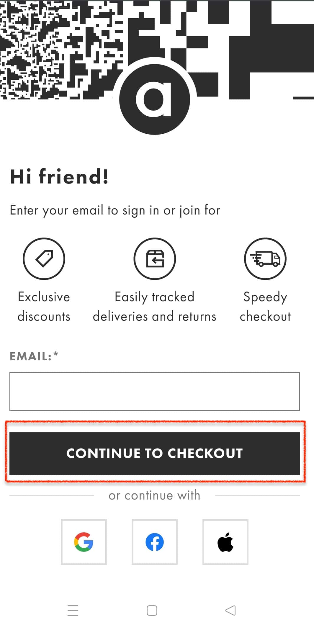
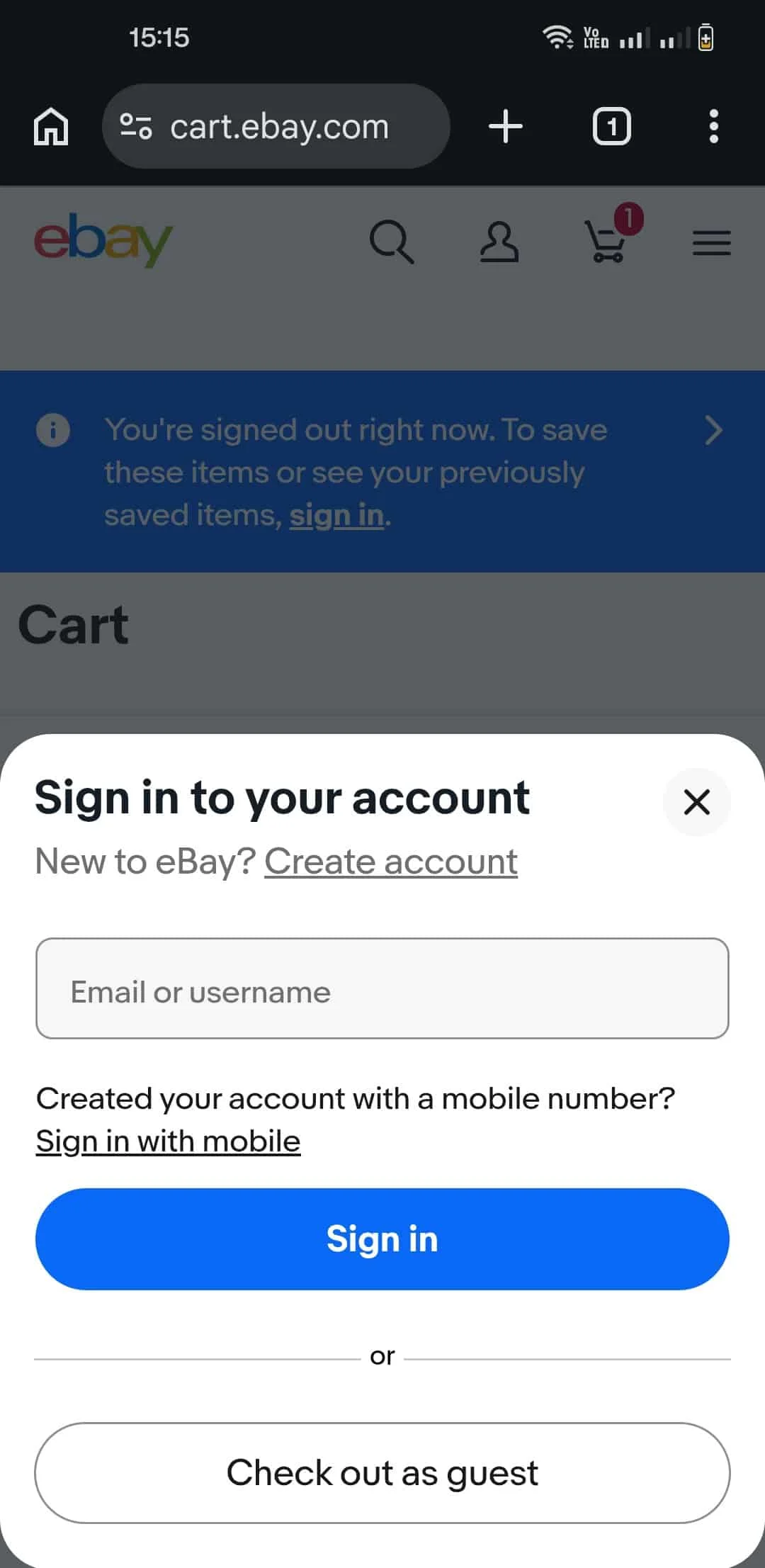
1. Remove Forced Account Creation
ASOS added a guest checkout option and saw 50% more customers complete their purchase. They just removed a barrier that should never have been there in the first place.
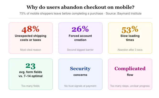
Baymard reports that 26% of shoppers abandon because of forced account creation, yet 62% of leading eCommerce sites still bury "Continue as Guest" as a text link that mobile shoppers routinely miss.
Make it a full-width primary button. Save account creation for the thank-you page when the customer is warm, satisfied, and considerably less likely to object. Removing account creation is one part of the puzzle; if you want to go deeper on eCommerce checkout process optimization, there’s a full breakdown of every lever worth pulling.
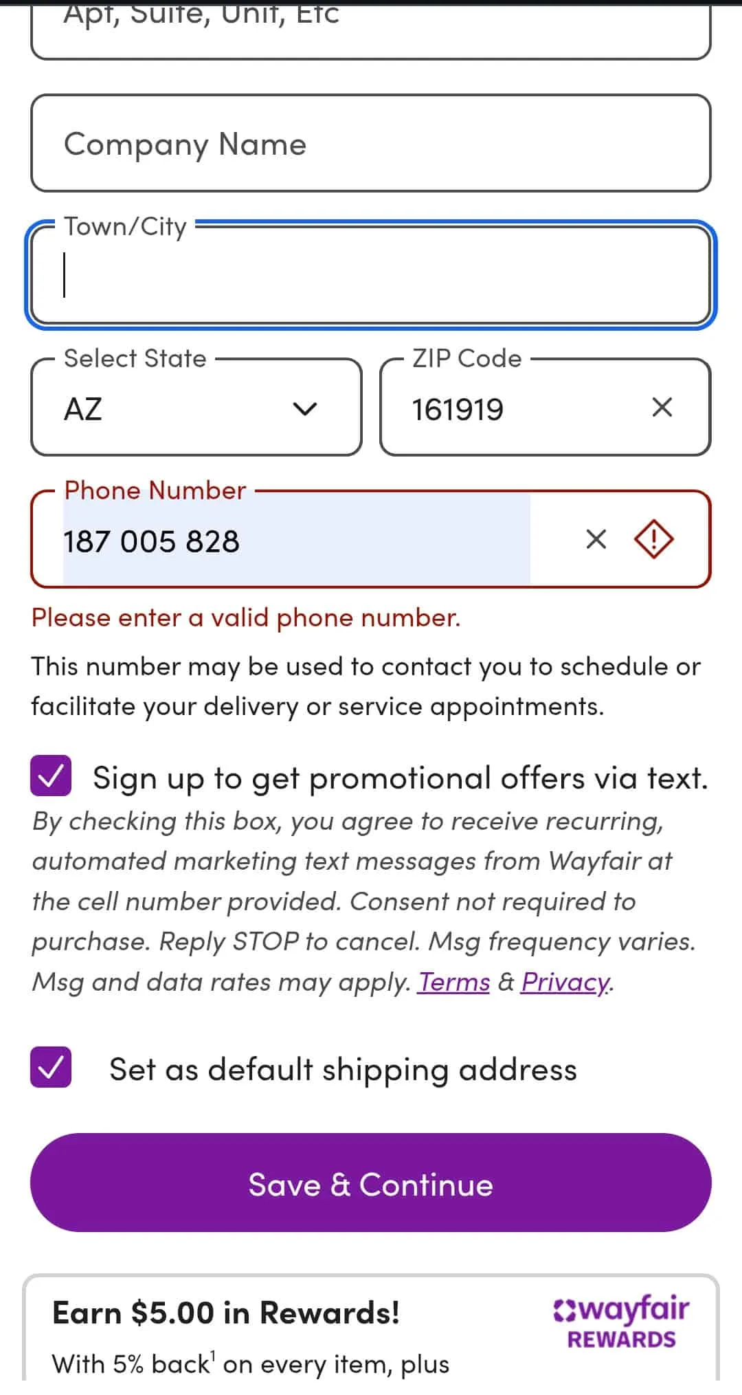
2. Reduce Checkout Form Fields to the Honest Minimum
The ideal range of form fields that a mobile checkout should have is 7–14 fields. Most eCommerce mobile checkouts are nowhere near it. Some of them are filled with fields serving the store's data habits rather than the transaction.
You need to audit everything: combine first and last name, make phone optional, hide "Company" and "Address Line 2" behind an expandable link for the minority who need them.
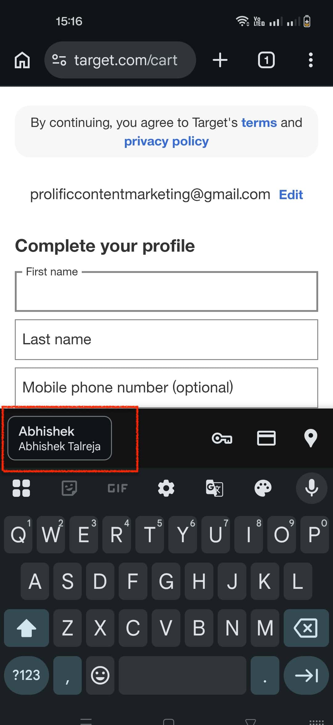
3. Enable Checkout Autofill the Right Way
Target's mobile checkout lets returning shoppers populate name, address, and payment in a single tap, cutting completion time by up to 30 seconds per session.
Many checkouts break autofill and get customers to type it all manually. Some don't bother. You must check your autofill on a real device and make sure it’s working. This way, you can enable auto-checkout for returning customers and make their lives easier.
Product discovery – barriers that prevent shoppers from finding items
Category/collection pages – improvements that drive deeper product exploration
Product page – what to optimize to convert 2–3x more buyers
Cart – ways to ease hesitation and speed up purchase decisions
“The report was deep and super insightful. Can’t believe it’s free.”
Logan Christopher CEO, Empire Herbs
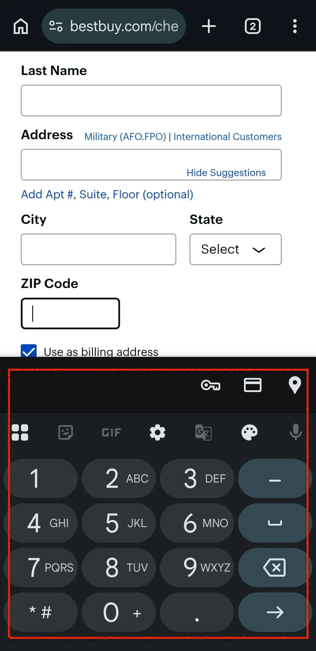
4. Use Mobile-Friendly Input Types at Checkout
Best Buy's mobile checkout shows the right keyboard for every field. Card number field: numeric keypad. Email field: @ symbol front and center.
Phone field: telephone layout. It’s a small thing, yes, but checkout is precisely the moment when small things become reasons to leave. Hence, you must test it on an actual phone.
5. Validate Forms Inline, Not at Submission
Wayfair validates each field the moment a user moves focus away from it. By the time the customer reaches the payment step, every field before it is already confirmed. They need to press the Continue button only once.
Don’t forget that Inline validation reduces form abandonment by around 10%. That’s why it’s such an integral part of the mobile checkout experience.
Checkout Speed Optimization
6. Optimize Checkout Page Load Speed
Google reports that 53% abandonment for pages that take over 3 seconds on mobile. For most brands, the mobile checkout page weight accumulates invisibly. Sometimes it’s a retargeting pixel.
On other occasions, it’s a loyalty widget that fires on every page. You must conduct a quarterly audit of every third-party script on checkout. If it isn't essential to completing the transaction, it’s ideal to defer it until post-purchase.
The ideal way is to measure INP via PageSpeed Insights. Above 200ms, defer heavy JavaScript that runs on user interaction. Assign explicit dimensions to all checkout images. Report both metrics alongside conversion rate, not alongside page weight.
Payment & Trust Optimization
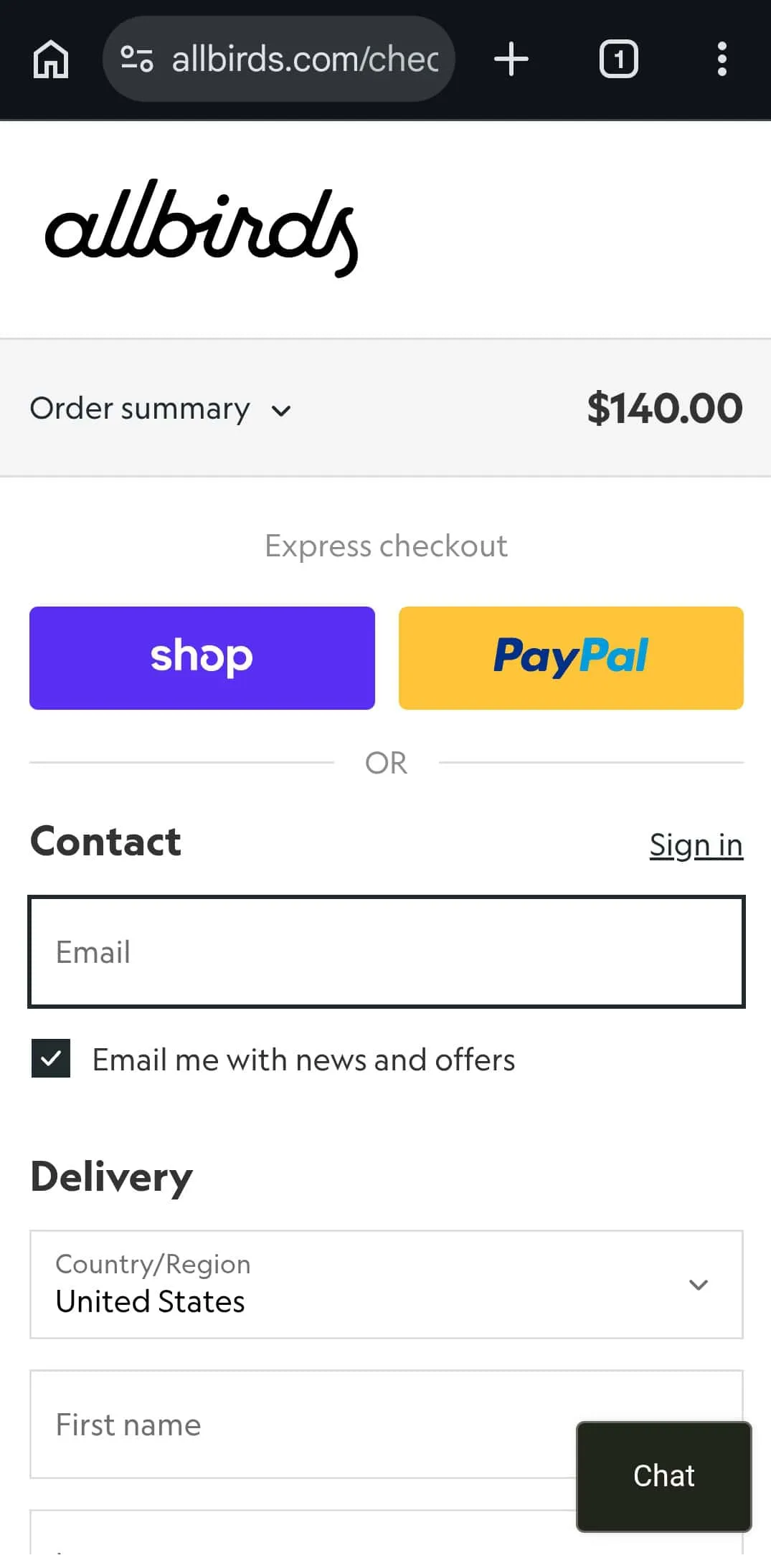
7. Offer Super Easy Access to Popular Payment Methods
Allbirds places Apple Pay and Shop Pay at the very top of their mobile checkout, above any form fields whatsoever. For an iOS user with a saved card, checkout is three taps: confirm cart, authenticate with Face ID, and done. There is no moment to reconsider. There is barely a moment at all.
The best way is to move digital payment options up and test placing them on the cart page itself, before checkout has technically begun.
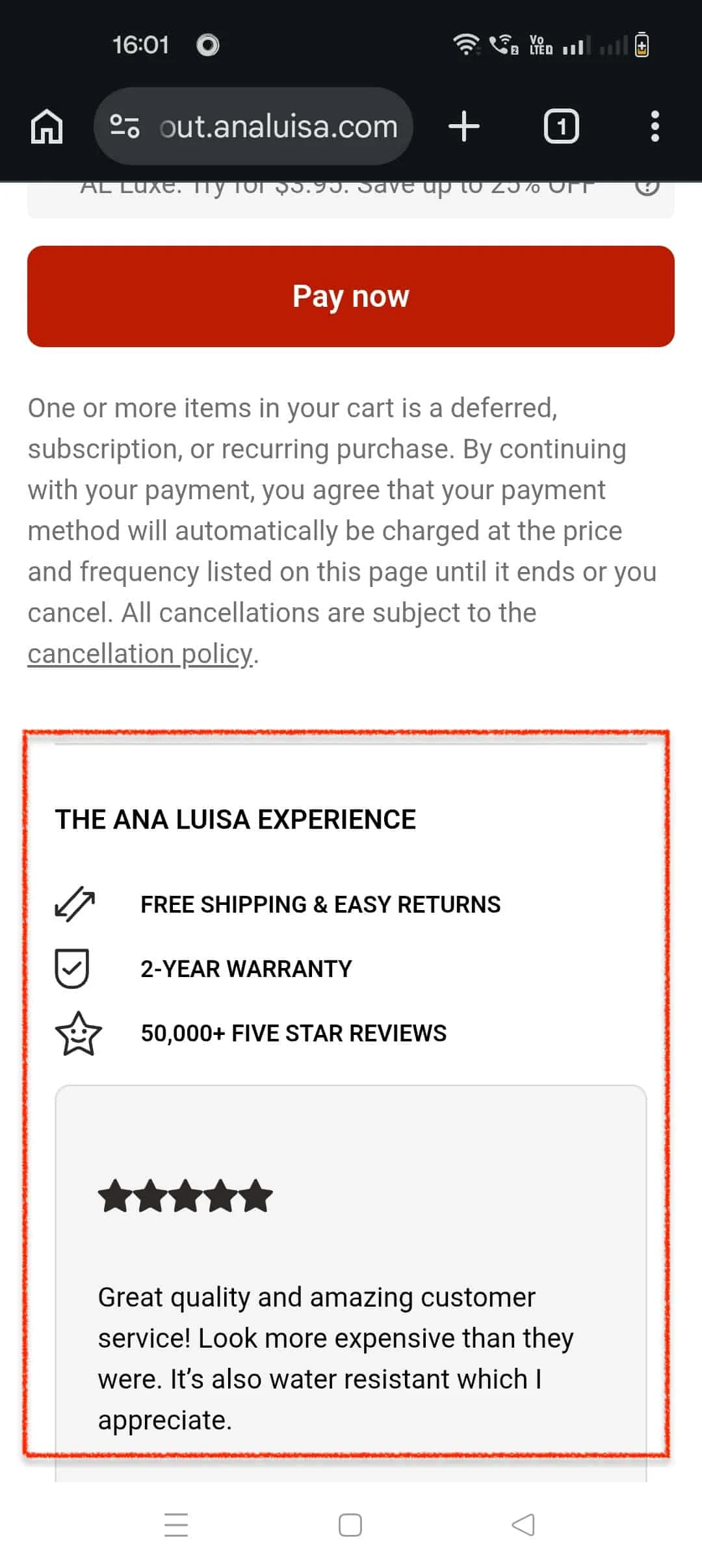
8. Add Trust Badges Strategically
Ana Luisa places trust badges, warranty information, and a free returns promise directly adjacent to the payment CTA, not in the footer, where mobile shoppers are unlikely to scroll at the precise moment they're deciding whether to hand over their card details.
Conversion XL found that trust badges near the payment button increased conversions by up to 32% versus the same badges elsewhere. "Your payment is encrypted and secure," next to the button, does considerably more work than a McAfee logo sitting alone in the footer, visible mainly to people who have already decided to leave.
Case Study
How Convertcart Helped Extreme Tactical Dynamics Reduce Checkout Abandonment by 11%
Extreme Tactical Dynamics, a U.S.-based LED emergency lighting supplier, was losing mobile orders at two specific points: 63.99% of mobile cart drop-offs were caused by unclear checkout CTAs and confusion around final pricing, while 41% of checkout abandonments were traced to weak payment trust signals.
Convertcart fixed both. Clearer CTAs and upfront pricing reduced mobile cart drop-offs by 4%. Adding secure payment badges, return and warranty messaging, and visible product ratings throughout checkout produced a 5.10% increase in mobile conversions and an 11% reduction in overall checkout abandonment.
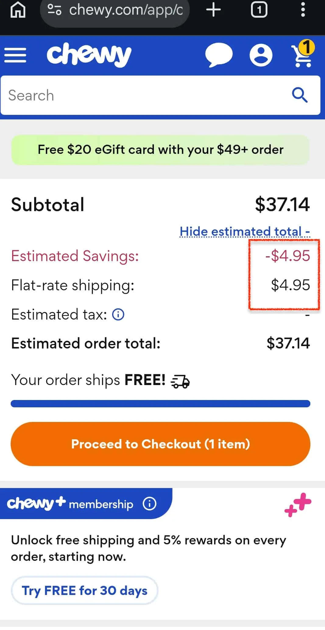
9. Show the Full Cost Early to Prevent Hidden Cost Checkout Abandonment
Chewy surfaces estimated shipping costs on the product page and updates a running total dynamically throughout checkout. There is no moment where the price jumps unexpectedly. There is no moment where a customer who had mentally committed to a purchase recalculates and decides the whole thing isn't worth it.
Baymard identifies unexpected costs as the single largest abandonment driver, 48% of shoppers cite them. The cost itself is rarely the problem. The surprise is.
Case Study
How Convertcart Helped Fastenere Achieve a 57.1% Overall Conversion Rate Improvement
Fastenere, a U.S.-based industrial fastener supplier with over one million SKUs, had 96.44% of mobile users abandoning unanswered questions about shipping and returns, and were sending them elsewhere before checkout.
Convertcart introduced mobile USP badges on product pages (29.75% campaign gain), embedded expandable FAQs into the checkout flow (17.67% campaign gain), and added social proof signals across devices (20% conversion rate bump).
Quality prominence experiments alone grew conversion rates by 172%. Cumulative result: 57.1% overall website gain. Read the full case study →
Case Study
How Convertcart Helped Lighting & Supplies Achieve a 54% Total Improvement in Conversion Rates
Lighting & Supplies, a leading online lighting retailer, had steady traffic, but a mobile checkout was leaking orders at predictable points. A Convertcart audit found 42% of users dropping off at the cart stage due to unclear shipping timelines and fees. Adding shipping badges and delivery estimates directly to the cart page produced a 16.57% campaign gain.
On mobile product pages, 96.97% of users were exiting without converting a lack of trust signals about returns, warranties, and delivery was sending them elsewhere. USP badges ("30-day returns," "Free shipping," "Warranty guarantee") increased add-to-cart rates by 12% and delivered a 43.21% campaign gain.
A further mobile experiment addressing checkout uncertainty around support and shipping FAQs produced a 15.73% campaign gain and a 4.01% website gain.
10. Switch to a Single-Column Mobile Checkout Layout
Curology's mobile checkout has no two-column form layouts borrowed awkwardly from desktop. No compressed fields that require a precise fingertip. Each field occupies its own full row and flows naturally downward, the way a mobile form should.
This sounds obvious. It is not, apparently, obvious enough. Multi-column forms produce compressed fields, higher error rates, and mis-taps at precisely the wrong moment. Enforce single-column layout below tablet breakpoints and test it on a real phone.
11. Add a Sticky CTA Button for Mobile Checkout
Gymshark keeps its primary CTA anchored to the bottom of the screen regardless of scroll position.
Without it, the shopper fills in their details, scrolls to review the order, then has to scroll back up to find Continue, sometimes tapping the wrong thing, sometimes concluding the whole process is more trouble than it's worth. It is an unforced error of notable avoidability. Implement a fixed-position bottom bar, 56–64px tall.
12. Optimize Mobile Button Size and Spacing
Apple's checkout pages adhere to the 44×44pt minimum tap target specified in their own Human Interface Guidelines. Google's Material Design recommends 48×48dp.
The reason is the same in both cases: the contact area of a human fingertip is considerably larger than most mobile UI elements are designed to accommodate.
A "Remove item" link that is visually tidy but 22px in practice is a hazard. Mis-taps at checkout, accidentally removing an item, tapping the wrong shipping option, cause frustration disproportionate to the cause and frequently result in abandonment rather than correction. Audit every interactive element: radio buttons, checkboxes, close icons, edit links.
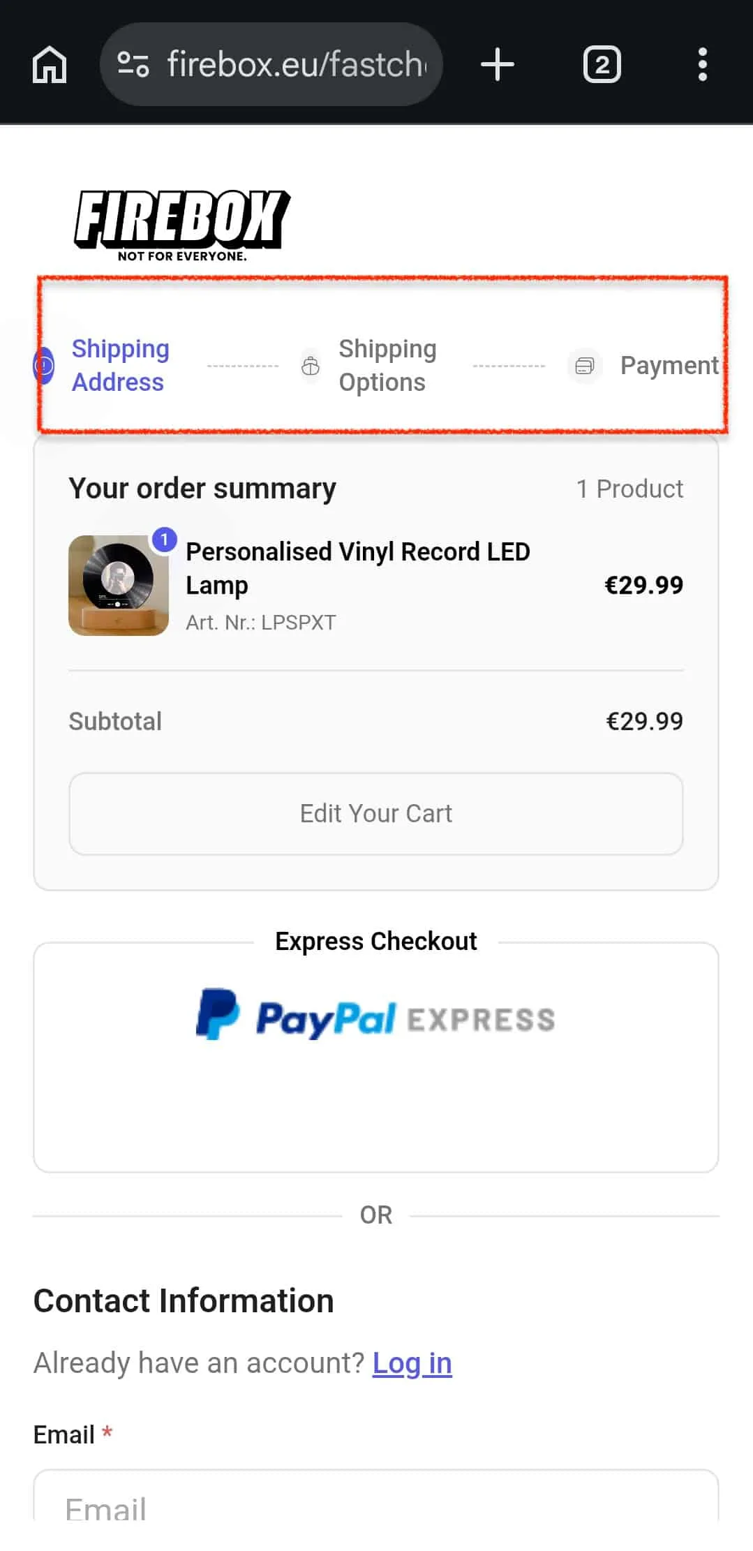
13. Add a Checkout Progress Indicator That's Actually Honest
Firebox shows a sticky 3-step progress bar that accurately reflects a genuine 3-step process: information, shipping, payment. Knowing you are on step 2 of 3 is considerably more motivating than staring at a form with no sense of how much lies ahead.
The mistake is letting the indicator lie. A "3-step checkout" with four screens in step two causes frustration worse than no indicator at all. Count your actual screens. Label them honestly.
14. Remove Unnecessary Distractions to Reduce Checkout Friction
Amazon's checkout removes almost the entire site header. No navigation bar, no promotional banners, no social media links. What remains is a transaction in progress and nothing else. Every element that doesn't contribute to completing the transaction is an invitation to leave, and a meaningful percentage of shoppers will accept it.
A promotional banner at checkout sends customers back to browse. Sometimes they return. Often they don't.
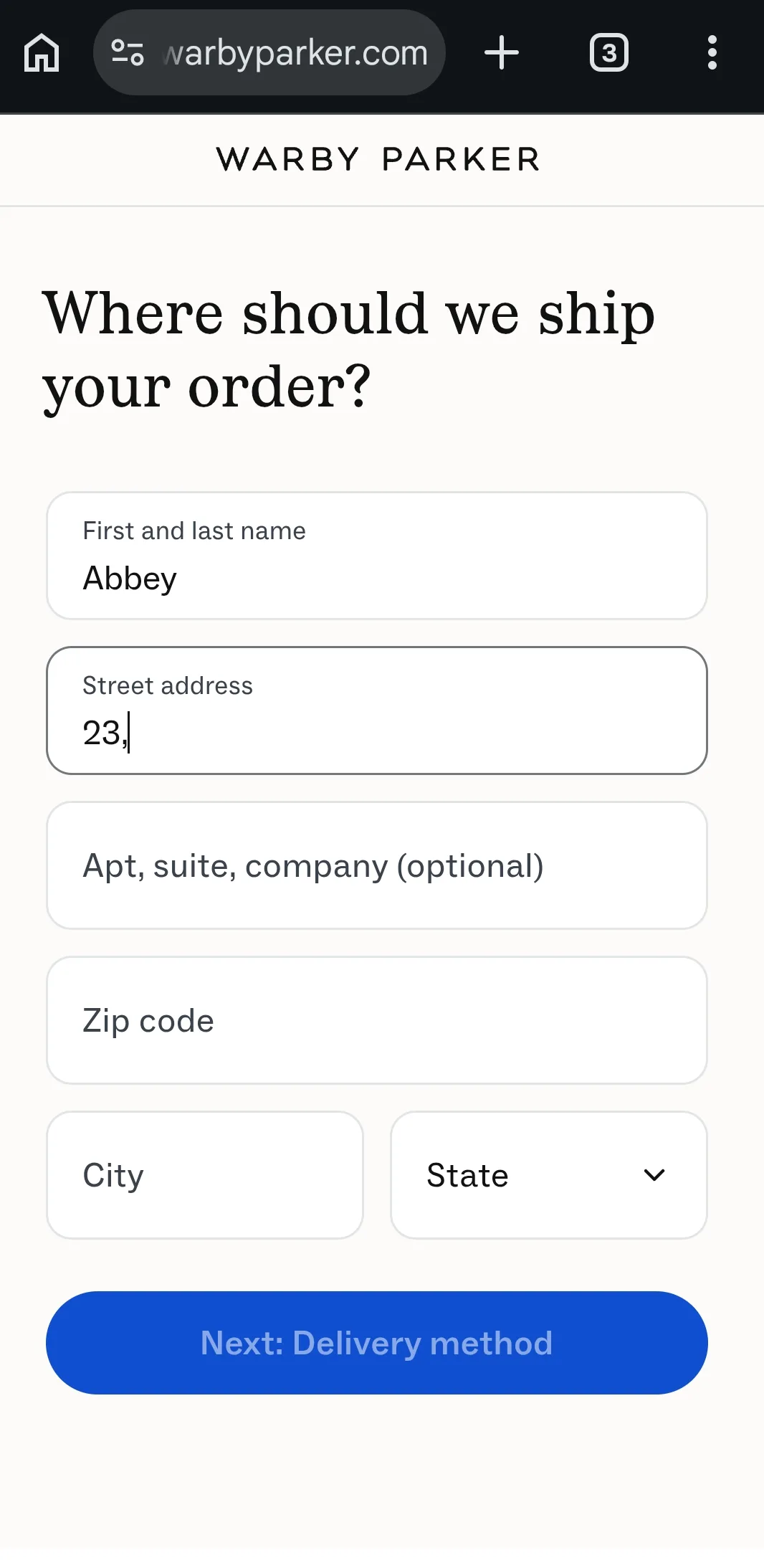
15. Simplify Your Checkout Flow UX Architecture
Warby Parker's mobile checkout groups related information logically: contact, shipping, and payment, with no redundant screens and no surprises.
What started as 3 steps has accumulated, over years of quiet additions, into something functionally 6, wearing a 3-step label; the flowchart still shows 3, the customer experiences 6. Map your entire flow on paper and merge anything that doesn't need its own screen.
16. The Interaction Economics Layer: Designing for the Physicality of Smart Devices
Most checkout UX advice treats mobile as a smaller screen. That is the wrong frame entirely. Mobile is a different physical interaction model, and checkout design needs to account for the actual body doing the interacting.
The average thumb covers roughly 75% of a smartphone screen, with the natural resting zone at the bottom-center. Your highest-stakes elements continue; payment confirmation should live where thumbs land, not where a desktop layout would put them.
One-handed use is the norm; users are standing, commuting, half-distracted. Nothing should require two-handed gestures. And a button that looks unchanged for 400ms after a tap creates a specific anxiety. Did that register? That multiplied across thousands of sessions is a measurable conversion loss wearing a technical costume.
The fix: Map your checkout against a thumb-reach heatmap. Anything critical in the hard-to-reach zone is losing conversions silently.
17. Exploiting Mobile Hardware Capabilities: Camera Scanning & Geolocation
Most mobile checkouts ignore the fact that the device in the customer's hand is a sophisticated computer with a camera, GPS, and biometric sensor, all of which could eliminate friction at the exact moment it costs you most.
Camera-based card scanning
It removes manual card entry entirely. The shopper points their camera at the card, and the 16-digit number populates in under two seconds. The impact is highest on first-time purchasers who haven't set up a digital wallet yet.
Geolocation-assisted address entry
This can pre-populate the shipping address field before the customer has typed a single character with their permission.
For brands where billing and shipping addresses typically match, this reduces a 30-second task to zero.
Reduce Checkout Abandonment
18. Enable Persistent Cart Across Devices
Google found 90% of people move between devices to accomplish a goal, a session-only cart silently fails every one of those journeys. The ideal way is to implement server-side persistence for logged-in users and a recovery email trigger for guests.
19. Use Exit Intent Popups Carefully
A generic discount pop-up trains customers to pause at checkout and wait for an offer, an effect that compounds quietly.
Make any exit-intent message specific to your most common objection, sourced from support transcripts. Reassurance converts better than discounts, and doesn't teach anyone a bad habit.
Checkout Conversion Rate Optimization
20. Implement Biometric Authentication at Mobile Checkout
Apple Pay and Google Pay confirm identity in under a second. Requiring a password instead means switching to a password manager, copying, pasting, and returning to the browser, assuming the customer remembers it.
Baymard found password issues among the most common abandonment causes for returning shoppers. Ensure your checkout supports both wallet options.
Checkout Trust & Transparency
21. Auto-Apply Coupon Codes to Reduce Checkout Abandonment
The promo code field implies a missed opportunity for everyone without a code. Around 25% of shoppers leave the checkout to search for a discount they may never find. Auto-apply any eligible discount.
If a manual entry field is unavoidable, collapse it behind an expandable link so it doesn't broadcast itself to customers who have nothing to enter.
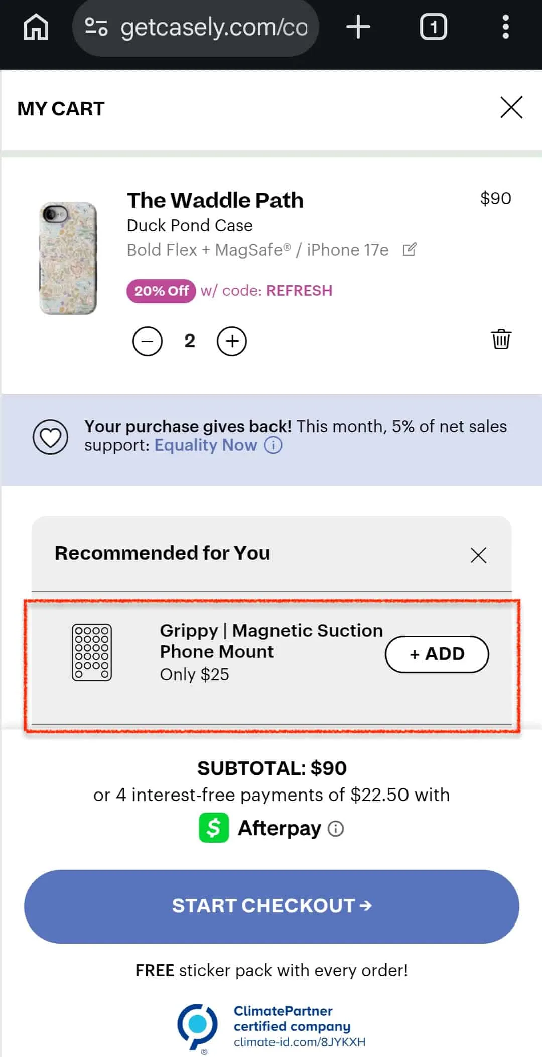
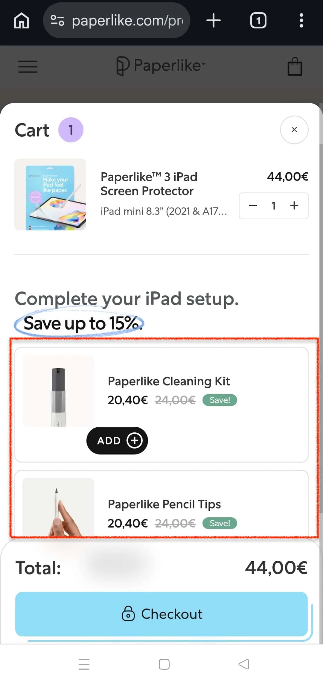
22. Make Cross-Sells Feel Like Service, Not a Sales Pitch
One cross-sell, priced at or below 50% of cart value, selected from purchase history, not a carousel of six options that turns the checkout into an unplanned browsing session. A relevant suggestion at the right moment feels like service.
An irrelevant one at the wrong moment causes abandonment of the entire transaction, not just the upsell.
23. Trigger a Smart Inactivity Nudge During Checkout
Mobile sessions go quiet for reasons unrelated to deciding not to buy a call, arrives, the bus reaches its stop, a child materializes with an urgent question about dinner. Send a calm message after 45–60 seconds that the cart is saved and ready. No countdown.
No pressure. Reserve timers for genuinely limited inventory.
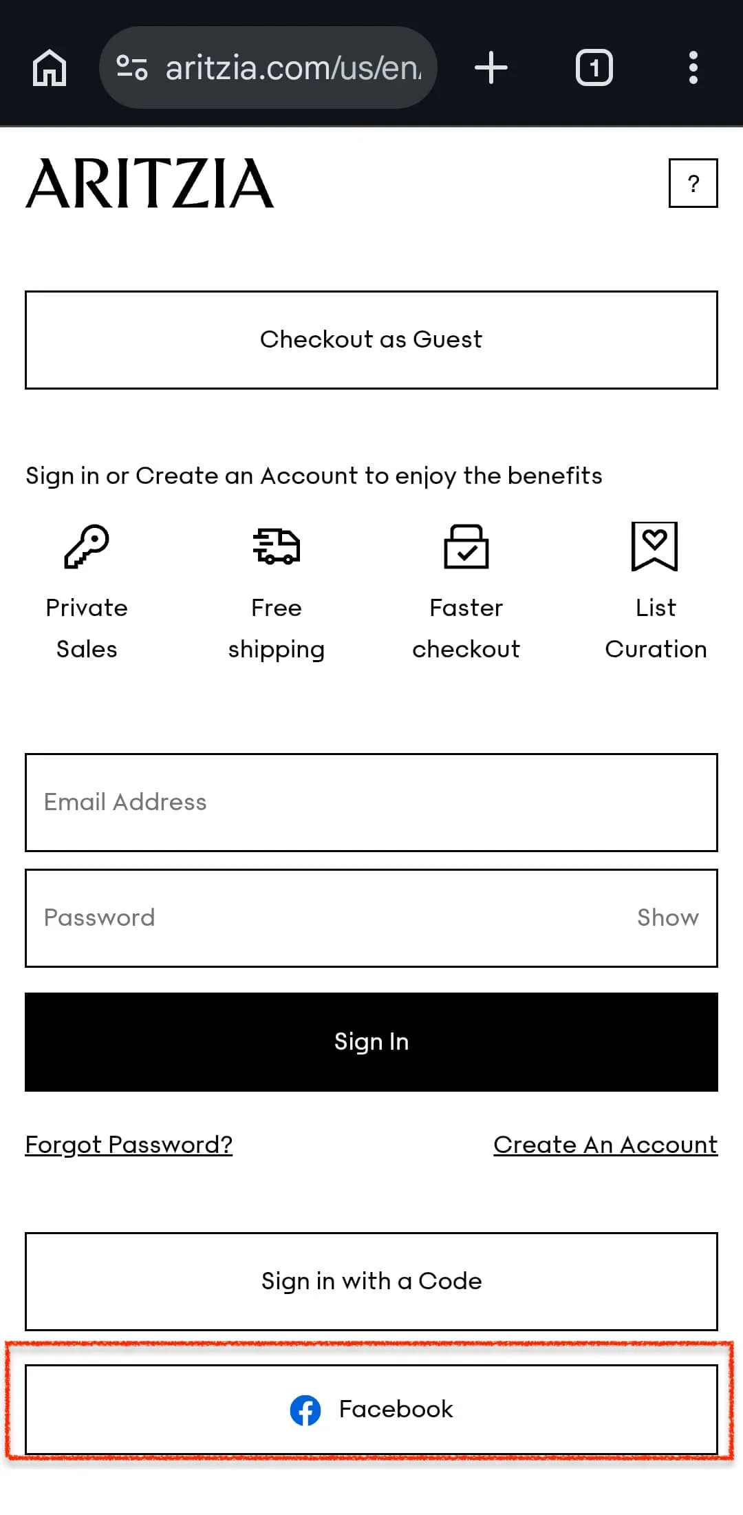
24. Add Social Login to Checkout
On mobile, switching to a password manager breaks checkout momentum. Display Google and Apple sign-in with at least as much visual prominence as the email/password form, not relegated to a secondary row of icons that reads as an afterthought.
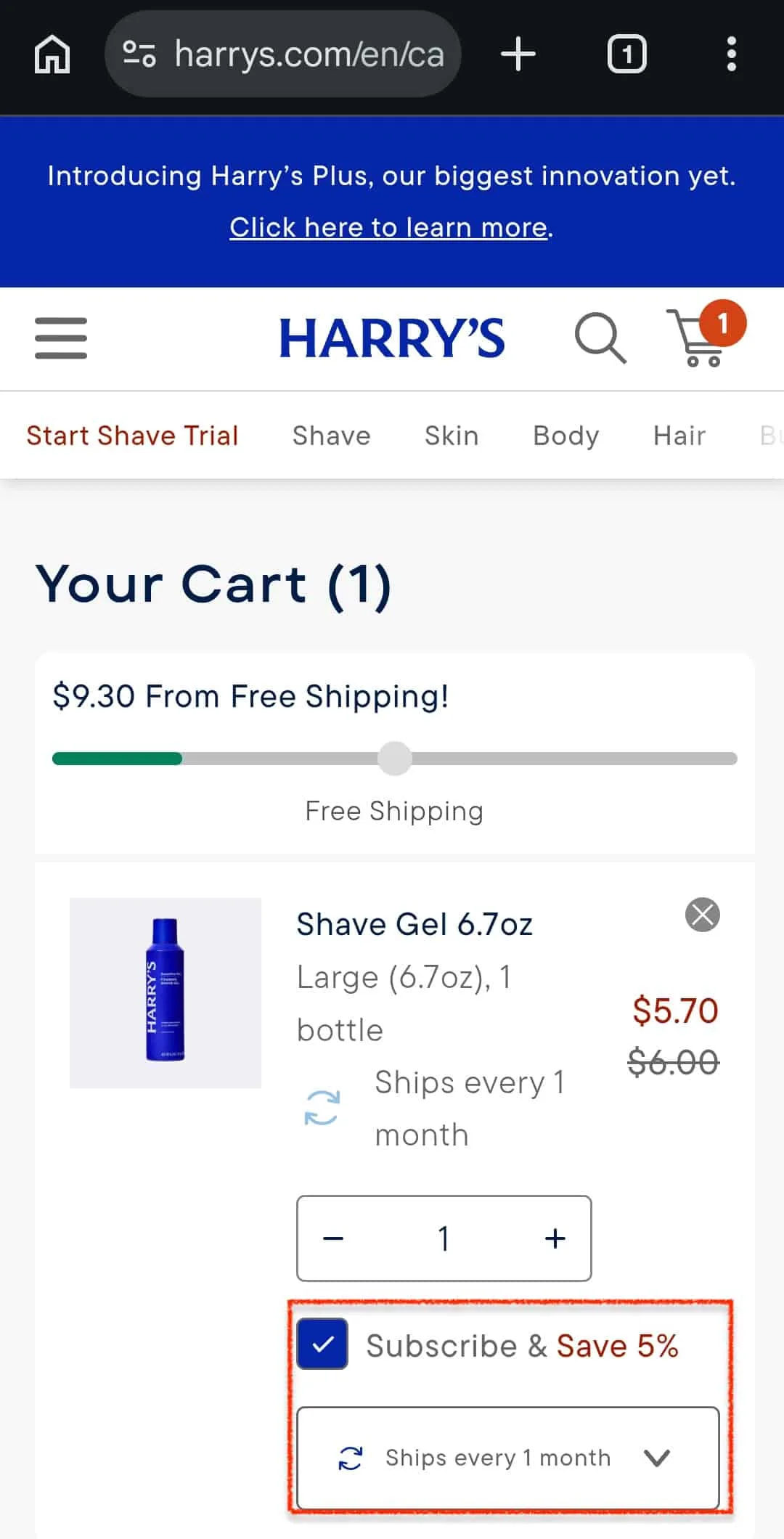
25. Design Subscription Checkouts Differently
Show the next shipment date, billing frequency, per-shipment cost, and a one-sentence cancellation policy all before the payment step, all visible without scrolling.
A customer who knows exactly what they're committing to is more likely to commit, and considerably less likely to cancel in outrage when the second charge appears without warning.
26. Optimize Checkout Copy for Seasonal and Holiday Context
In the final weeks before Christmas, the question isn't "should I buy this?" it's "will this arrive in time?" "Standard shipping (5–7 days)" is accurate but useless to someone calculating whether it lands by the 25th. Update shipping selection to show specific arrival dates during gifting periods.
Honest, useful information not manufactured urgency.
27. Allow In-Checkout Cart Editing
"Please return to your cart to make changes" is approximately equivalent to "please abandon your purchase." On mobile, the return is rarely made. Add inline edit functionality for quantity and variant on the order review screen, with real-time total updates and no full page reload.
28. Design the Post-Purchase Screen with Intention
The customer who just completed a purchase is the warmest they'll be toward your brand for some time. Most stores meet that moment with a transaction number and a goodbye. An account creation prompt with a specific benefit, one cross-sell, or a referral incentive costs nothing to add, just intention.
29. Offer an Incentive to Complete Checkout
A complementary item at a small discount, a free sample, or a shipping upgrade framed as a reward for completing the purchase gives the hesitating customer a concrete reason to finish now. The incentive doesn't need to be a discount; high perceived value and low cost of goods are the only requirements.
⚠️
Find why high-intent shoppers still abandon checkout
Why visitors don’t trust your store within 3 seconds
Why shoppers can’t find what they’re ready to buy
What’s stopping 2-3x more shoppers from clicking “Add to Cart”
Where buyers hesitate right before purchase
Why high-intent shoppers still drop off
“The report was deep and super insightful. Can’t believe it’s free.”
Logan Christopher CEO, Empire Herbs
Mobile Checkout Optimization Checklist
Run through this list before you call your mobile checkout "optimized." It takes ten minutes and will almost certainly surface something worth fixing.
If you want to go beyond checkout and audit your entire purchase funnel, Convertcart’s eCommerce UX audit checklist covers every layer from homepage to confirmation screen.
a. Have you enabled guest checkout?
You want it visible and easy to find, but not so prominent that you lose the email capture that powers your post-purchase sequences.
b. Is autofill actually working?
You need to make sure your autofill is working on an actual iPhone or an Android device. Test it on real smartphones.
c. Is Apple Pay visible above the form?
The ideal way is to ensure it’s not tucked below the card fields. For iOS users with a saved card, this alone can cut checkout time to under ten seconds. Don’t forget you need to make Google pay just as visible.
d. Is there a progress indicator, and is it honest?
You need to ensure shoppers know they're on step 2 of 3 if that is where they are in the checkout process.
e. Are trust signals near the payment CTA?
Security badges, return policies, and payment encryption messages should be easily accessible.
f. Are shipping costs shown before the final screen?
If the price jumps at the last step, you’re going to intentionally lose customer trust. It’s best to show an estimated total early.
g. Is the layout single-column?
Multi-column checkout forms often feel natural on desktop and broken on mobile. You need to ensure every field has its own row by testing it on a real phone.
h. Does inline validation fire on each field?
Errors should appear the moment a shopper moves off a field, not all at once. Make sure it’s one red error message at a time.
i. Is the CTA sticky?
The "Continue" or "Place Order" button should be anchored to the bottom of the screen at all times. You need to ensure that shoppers don’t have to hunt for it after reviewing their order.
j. Does the cart persist across devices?
A shopper who builds a cart on their phone and switches to a laptop to complete the purchase shouldn't find an empty cart. Session-only carts silently fail a significant portion of purchase journeys.
k. Does your checkout page load in under 3 seconds on mobile?
You need to test this on a mid-range Android device on 4G.
If you're on Shopify
6 Ideas Working Really Well for Shopify Stores Right Now
Shopify stores have some specific advantages and some specific traps that generic checkout advice doesn't always account for. Here's what's moving the needle for Shopify brands we work with today.
Enable Shop Pay and put it above everything else
Shop Pay achieves checkout-to-order rates nearly 1.7x higher than guest checkout. For returning customers with saved details, it reduces checkout to three taps. If Shop Pay isn't your primary CTA on mobile, that's the first thing to fix.
Use Shopify's native address autocomplete
It's built in, it's fast, and most stores either don't enable it or don't test whether it's actually working. Check it on a real device, not the Shopify preview, because the preview lies.
Turn off autocorrect on objective form fields
Name, email, phone, address, and card fields should all have autocorrect disabled. Add autocorrect="off" directly in your theme code. It takes ten minutes and eliminates a frustration that's invisible in testing but felt by every mobile shopper.
Pick a performance-first theme
A March 2025 study found themes like Bullet (97.1% CWV pass rate) and Exhibit (96.7%) consistently outperform heavier themes like Flex or Motion, which fail CWV up to a third of the time. If your theme is beautiful but slow, it's costing you more than a redesign would.
Make tappable elements genuinely tappable
Baymard Institute found 88% of mobile eCommerce sites have tap targets too small to hit reliably. Your Add to Cart and Checkout buttons should be at least 44×44px on iOS and 48×48px on Android. Most default themes are fine, but third-party section apps often aren't.
Keep your cart page transparent
Show all shipping costs, taxes, and fees before checkout begins. Add product images to the cart summary; they reinforce the purchase decision and reduce last-minute backing out. A free shipping progress bar nudges customers toward the threshold without feeling pushy.
Mobile Checkout Metrics to Track
These are the points that tell you where your mobile checkout is leaking and whether your fixes are actually working.
Mobile checkout conversion rate
Mobile checkout conversion rate is the percentage of shoppers who start checkout and complete a purchase. The global average sits at around 1.53% for mobile.
Cart abandonment rate
This metric tells you the number of shoppers who add items to their cart but never start checkout. A high cart abandonment rate points to trust or pricing issues. The global average is around 70%. If your rate is above 75%, it’s worth understanding the specific causes before you start fixing why your cart abandonment rate is so high and what’s typically driving it.
Checkout abandonment rate
How many shoppers start checkout but don't finish? This is different from cart abandonment and usually more fixable if the shopper was close. Form friction, unexpected costs, and slow load times are the usual culprits.
Revenue per visitor
This is the number that captures the combined effect of conversion rate and average order value. It's the cleanest way to measure whether checkout improvements are actually moving the needle on revenue, not just on completion percentages.
Form completion rate
This number is the percentage of shoppers who start filling in checkout fields and actually finish them. A low form completion rate points directly at form design issues, such as too many fields, wrong keyboard types, and broken autofill.
Payment failure rate
This metric tells you how often payment attempts fail at the final step. Even a small improvement here has an outsized revenue impact because these are shoppers who wanted to buy. Payment failures are often caused by poor wallet support, confusing card entry, or weak error messaging.
Average checkout completion time
This metric tells you how long it takes a shopper to go from starting checkout to confirming an order. Longer times correlate with higher abandonment. Every extra minute is another opportunity for a distraction to win. Camera card scanning, autofill, and digital wallets all bring this number down.
2X Your Online Store Conversions
Every fix in this guide points in the same direction: fewer clicks, less friction, more completed orders. If you work through even half of these, you'll see the difference in your abandonment rate before the month is over.
Found this useful? You can connect with our team to get a free audit of your mobile store.
Mobile Checkout Optimization FAQ
What is mobile checkout optimization?
Mobile checkout optimization is the process of reducing friction in the checkout flow specifically for mobile users, who now account for the majority of eCommerce traffic but convert at roughly half the rate of desktop shoppers. It covers everything from form design and page speed to payment options and trust signals.
The goal is to make it as easy as possible for someone using their phone to complete a purchase without second-guessing, getting confused, or running out of patience.
What is a good mobile checkout conversion rate?
A good mobile checkout conversion rate is anywhere between 1% and 4%. This range is typical for most stores, with top-performing checkouts reaching 5% or higher.
The global average sits at around 1.53% for mobile, compared to roughly 2.9% for desktop. If you're below 1%, there are almost certainly structural issues in your checkout flow worth addressing before you spend more on traffic.
What is the average mobile cart abandonment rate?
The average mobile cart abandonment is around 70–75% globally. That means roughly three out of four mobile shoppers who add something to their cart don't complete the purchase.
Some of that is unavoidable; people browse, compare, and come back later. But a meaningful portion of it is friction that can be reduced: unexpected costs, forced account creation, slow load times, and trust gaps at the payment step.
Should mobile checkout be one page or multiple pages?
There's no universal answer to this; both can work well when executed properly. Multi-step checkouts with clear progress indicators tend to feel less overwhelming on mobile, especially for first-time buyers. One-page checkouts can work well for returning customers with saved details. What matters more than the format is whether the flow is honest about how many steps there are and whether each step earns its place.
How do I optimize Shopify mobile checkout?
Shopify's native checkout is already well-optimized for mobile; the main lever is Shop Pay. Enable it, place it prominently, and make sure it appears before the card form.
Beyond that: compress your theme's checkout CSS, avoid adding too many third-party checkout apps that slow down load time, use Shopify's address autocomplete, and test your checkout on a real mobile device rather than the desktop preview.
If you're on Shopify Plus, the checkout extensibility tools give you meaningful control over layout and trust signal placement.
Apple Pay and Google Pay, by a significant margin. For a returning customer with a saved card, authentication takes under a second via Face ID or fingerprint, and the transaction completes in two to three taps. There's no typing, no keyboard switching, no password recall.
The speed difference between a digital wallet checkout and a manual card entry checkout on mobile is measured in minutes, not seconds, and those minutes are where most abandonment happens.


.jpg)


.avif)
.svg)

.svg)

.svg)
.svg)
