How Many Steps Should Your eCommerce Checkout Have?


Most eCommerce stores struggle with this great checkout debate. On one side, you have the minimalists. These are folks who believe that every mouse click is a treacherous leap over a shark-infested void.
To them, a single extra step is a personal invitation for the customer to throw up their hands and flee the house. "Fewer clicks!" they cry, as if they’re rationing oxygen.
On the other side are the segmenters.
They argue that cramming every last field, billing, shipping, credit card details, and mother’s maiden name onto a single, sprawling page creates a form so terrifyingly long it looks like a tax audit from the 1950s.
They believe visitors see this wall of data and simply faint from exhaustion.
This post covers:
The Average Checkout Steps Aren’t Surprisingly Low?
Factors Governing the Steps in the Checkout Flow
Storefront Types That Definitely Need a Single-Step Checkout
Storefront Types That Definitely Need a Multi-Step Checkout
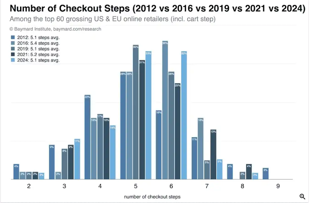
Studies show that the average checkout process is exactly 5.1 steps long. It’s a remarkably strange figure.
Although the average checkout process is high, we believe the ideal number of checkout steps is lower. But before we come to that conclusion, let’s understand the factors that determine the checkout steps.

To find the "Goldilocks" flow for your checkout, the one that feels just right, you must look past the code and at the human being on the other side of the glass.
At Convertcart, we’ve found that the "optimal" flow is dictated by four primary variables:
The nature of what you’re selling changes the user’s psychological state. For low-cost, "impulse" items, speed is your best friend; a guest checkout is practically mandatory.
However, if you are selling a $4,000 espresso machine, a bit of "friction", in the form of trust badges, clear guarantees, and extra verification, is actually comforting.
It tells the user, "We are taking this as seriously as your credit card balance is."

If you’re a household name, get out of the way. Your customers already trust you; they just want their socks. But if you are a smaller, boutique brand, you must use the checkout to build a relationship.
This might mean including customer reviews or security reassurances right where the "Buy" button sits.
A checkout is a very different beast depending on the screen size.
Demographics matter. Younger shoppers expect a "frictionless" experience; they want to tap a button and be done. Older audiences, conversely, often appreciate a bit more hand-holding, clearer instructions, and traditional payment fields.
Knowing your audience’s habits ensures you don't accidentally frustrate them with excessive speed or ceremony.
While we’ve spent a fair amount of time discussing the merits of the "Segmented" approach, for some storefronts, the single-step checkout isn't just an option; it is a moral imperative.
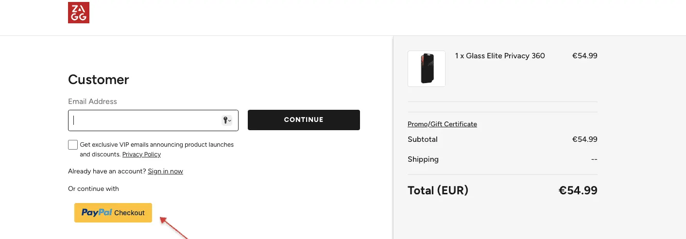
If you sell low-friction, inexpensive items, think phone cases, novelty socks, or digital downloads, every second the user spends clicking "Next" is a second they have to realize they don’t actually need a glow-in-the-dark spatula.
For these transactions, the goal is to close the gap between "I want that" and "I bought that" before the prefrontal cortex can intervene.

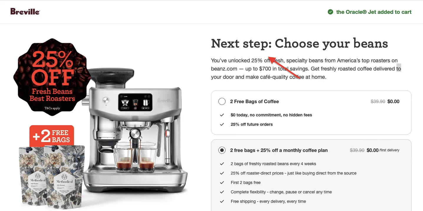
If your customers come back every three weeks to buy the same bag of coffee or bottle of vitamins, they aren't looking for a "journey."
They are performing a chore. For these loyalists, a single-step checkout (or better yet, a "Buy Again" button that bypasses the cart entirely) is a courtesy that respects their time.
If your analytics show that 80% of your traffic is coming from people squinting at their phones in line at the grocery store, you have no business making them wait for five separate pages to load.
On mobile, a single, vertically scrolling page, optimized for a single thumb and a digital wallet, is the gold standard for sanity.
If your entire website is dedicated to one magnificent invention, a multi-step checkout feels needlessly bureaucratic.
The user has already spent the last five minutes reading your copy; by the time they click "Buy," they’re ready to give you their data and get on with their lives.
On the other hand, there are certain eCommerce endeavors where a single-step checkout is about as appropriate as a drive-thru window at a five-star restaurant.
If your business involves any of the following, you ought to be spreading things out:
If you are selling something substantial, say, a bespoke sofa, a high-end camera, or a piece of jewelry that costs more than a used hatchback, a single-page checkout can actually feel suspiciously breezy.
In these instances, a multi-step process acts as a series of reassuring nods.
It gives the customer a moment to breathe, review their choices, and feel that their $2,000 investment is being handled with the gravity it deserves.
If your store frequently handles "Ship to Multiple Addresses," gift wrapping, or personalized messages, a single-page form will quickly begin to look like a blueprint for a nuclear power plant.
By moving these options into their own dedicated steps, you prevent the user from experiencing "form shock" and ensure they don't accidentally send their mother’s birthday present to their ex-boss.

In the world of Business-to-Business, "simple" is rarely the goal.
You’re often dealing with purchase orders, tax-exempt certificates, and complex tiered shipping rates. Cramming all of that into one page is a recipe for data entry errors.
A multi-step flow allows these professional buyers to verify each logistical hurdle one at a time, which, believe it or not, actually makes them feel faster because they aren't constantly scrolling up and down to check for mistakes.
If the user has to spend ten minutes choosing the wood grain, fabric type, and leg finish for a custom chair, the checkout is the final part of a creative process.
A multi-step flow allows for a dedicated order review step, the most important step in all of e-commerce, where the user can confirm that they did, in fact, order the "Electric Lime" upholstery and not the "Forest Green."
So, after all that, did we actually answer the question of how many steps your checkout should have?
The answer is both remarkably simple and frustratingly nuanced.
We have seen that while the industry has stubbornly clung to a 5.1-step average for over a decade, the actual number on the tally sheet is far less important than the perceived effort of the person holding the mouse.
Whether you opt for the brisk, "one-and-done" approach of the minimalists or the thoughtful, "one-thing-at-a-time" pacing of the segmenters, the goal remains the same: to shepherd the user toward the finish line without making them feel like they’re filling out a census form in a gale.
Don't let your software be the boss of you. If your checkout feels clunky, it probably is, regardless of how many pages it has.
Match the flow to the feeling. A $5 pair of socks needs a sprint; a $5,000 watch needs a stroll. Respect the thumb. If your users are on mobile, give them a path of least resistance.
In the end, a checkout process isn't just a collection of form fields; it's a conversation.
And as any good dinner guest knows, it’s not about how long you speak, but whether you’ve made yourself clearly understood. Don’t forget to keep optimizing your checkout flow until you find your sweet spot for checkout conversion rate.