Checkout Pages That Make People Buy: Real eCommerce Examples


Over the last decade, as a CRO agency, we've done thousands of audits.
And from them, every once in a while, we've found standout examples of checkout pages.
In this piece, we bring together 10 of them — leading with what really worked and how some great brands are applying them in real-time.
Many stores are petrified of giving cues that land anywhere close to pre-purchase or post-purchase cancellations.
This is the ONE reason they skip showing the cancellation policy as part of checkout page design.
But in doing so, they skip tending to a big psychological shift that’s most pronounced at checkout.
One where shoppers go into the “What if this is irreversible?” mode?
So, when stores are able to attend to this last-minute anxiety, the purchase decision becomes easier for the shopper.
As paradoxical as it sounds, when it feels easier to cancel, it also feels easier to buy.
Here’s a great example of this checkout UX optimization:
The fact that the Modern Mammals (a men’s shampoo brand) is transparent is clear because beyond refund and privacy policies, they also talk about cancellations on their checkout page.
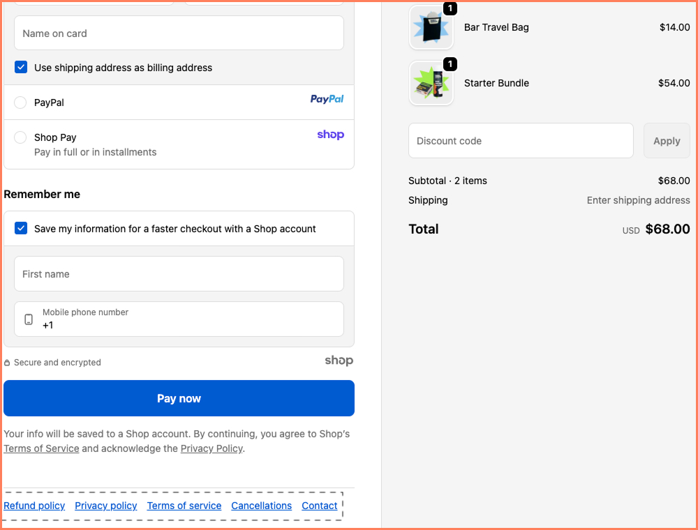
This is especially critical when first-time visitors are taking the risk to buy on a lark.
While they could’ve placed it beneath the order summary or the delivery info, the position they chose is a win-win. It’s not too obvious but also accessible.
Checkout UX Tip: To really know in what form the cancellation disclaimers work, it’s ideal to A/B test between a clear “cancellations” link and another where reassuring copy like “Easy cancellations. See policy” flanks the link.
There’s a strong belief among many stores we audit that the checkout first fold has to cater first to the most popular payment methods.
That it should be clutter-free otherwise.
While we don’t disagree, we’ve also seen how separate trust icons are best featured here.
The reason? Shoppers are usually looking for a strong reason to continue, even if they see familiar payment methods.
Just a crisp inclusion like what LifePro (a wellness equipment brand) does below increases the chances of conversions at least by 2X.
Here’s a great example of this checkout UX element:
We love the fact that Lifepro highlights brand differentiators — which can make a key difference in converting those who also have 5 other checkout tabs open in comparison mode.
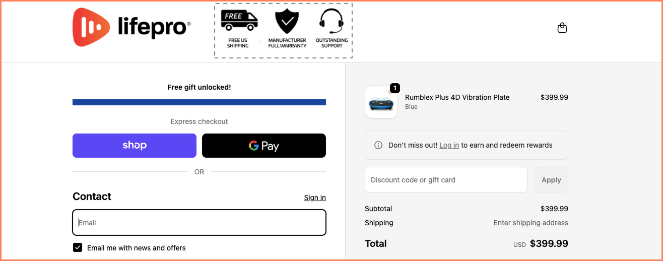
In fact, reassurances that include free shipping, manufacturing warranting and outstanding pre and post purchase support attract high-intent buyers instantly.
Checkout UX Tip: Before plugging trust logos and callouts into your checkout page design, identify the three biggest concerns shoppers say they have across feedback forms, live chat etc. Listen in for return policy confusion, worries around shipping date clarity etc.
There’s money involved, there are potential mistakes involved including buying a not-so-great product and there’s the risk of post-purchase regret.
All of this makes the checkout page a high-stress, high-stakes game.
And cognitive load (and dissonance) often peaks as a result.
Our audits reveal that automatically expanding only that which is being filed can be a game-changer.
Since checkout commitment can feel long, giving it a progressive edge improves both focus and intent in the moment.
Here’s a great example of this checkout UX optimization:
Beloved, a sexual wellness brand, makes their checkout page super focused with collapsed sections, which are also limited in number.
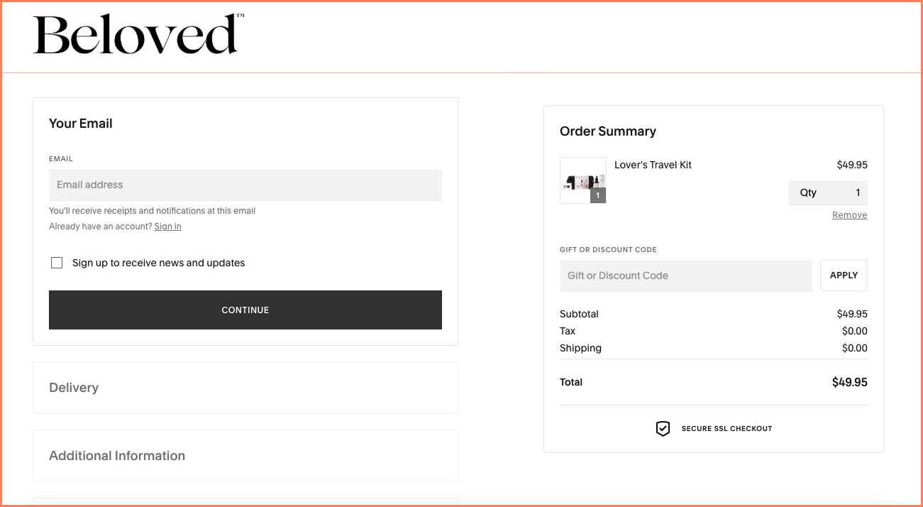
This offers the serious shopper a fuss-free way of moving through checkout — without worrying about what’s next.
Being able to take the load off “Oh! How long is this going to take?” is the easiest way to ensure higher form completion rates to begin with.
Checkout UX Tip: Always conclude each distinct info section with a small edit button that shoppers can go back to when they’re doing a final check of the details they’ve keyed in.
Over 70% of shoppers who reach checkout nurse the concern of spending.
It’s a bit like, “yes! I want it but why does it cost money?”
Now, stores that we audit are often stumped by this.
Because there’s only so much of the price that you can reduce and trust you can generate.
What we’ve begun to lean into across some of our experiments is “doubt reframing.”
The idea is to turn the shopper’s inner voice to say, “Now that’s a great reason to spend.”
And what better way to do it than frame the purchase as a gift?
Here’s a great example of this checkout UX element:
Melinda Maria, an eCommerce jewelry brand, clearly knows how to optimize checkout by leveraging the strengths of the jewelry niche.

Given that jewelry has a high checkout abandonment rate, persuading shoppers to spend for someone else is easier than telling them to buy for themselves.
This checkout UX optimization adds to margins for stores that introduce peak season selling & offers earlier than competitors do.
Checkout UX Tip: Keep a price threshold for the gift box nudge. For example, trigger it only when the cart order total exceeds $60. This makes the nudge feel personalized.
There are stores that come to us for free audits to find out why their checkout page isn’t working.
And quite a few of them work with review snippets and star ratings to convince shoppers faster.
Except that our audits reveal that the right kind of social proof is able to elevate checkout.
The idea of “right” of course is highly dependent on the niche — because while health & wellness conversions depend on authoritative proof, jewelry conversions have got to do more with peer proof (especially for fit, size, occasion).
Here’s a great example of this checkout UX optimization:
Since Wuffes sells science-backed products, their checkout page design works with all the different mentions of social proof.
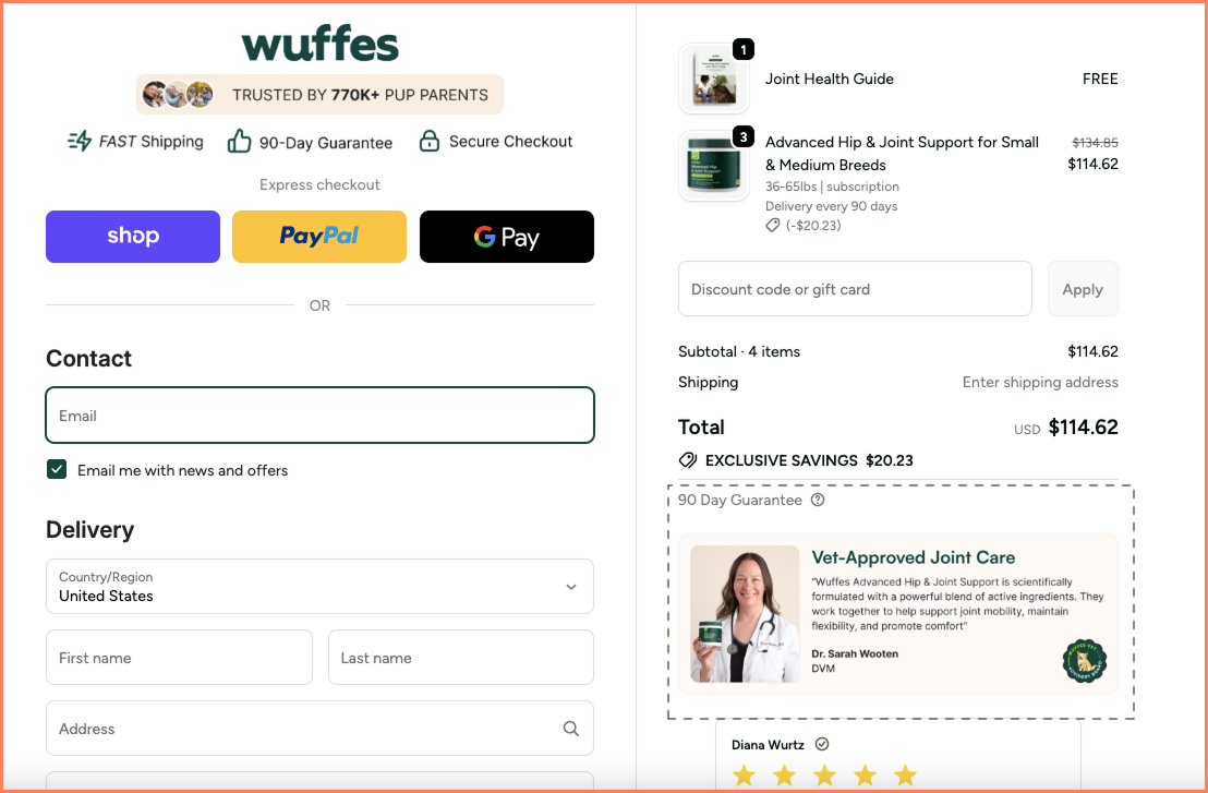
But what is the most critical here is the authoritative guarantee they bring in — which reassures all customer segments, whether they’re old or new in the fold.
The fact that the proof carries a human face just creates additional reassurance, which is something that shoppers need to keep going and stores need to close conversions.
Checkout UX Tip: Show authoritative proof dynamically to target the problem that the shopper is trying to solve. For example, if they’re buying a product for their senior dog, ensure the proof includes information on solving issues specifically for this segment.
The UX concern of keeping checkout linear and non-interactive is a thing of the past.
More recently, we’ve mapped instances of shoppers abandoning carts at this stage simply because they went back to access chat — and surprise, surprise, no human agent was available at the time.
To resolve such detours, it becomes critical to offer a chat hook on the checkout page, even if it doesn’t resemble how chat works on product pages and category pages.
The idea is for shoppers to know they have access to support if they experience any last-minute concerns.
Here’s a great example of this checkout UX element:
Nike gets that conversions can face the heat if buyers don’t have a way to ask questions on sizing, applicable coupons, order changes or even delivery reliability.
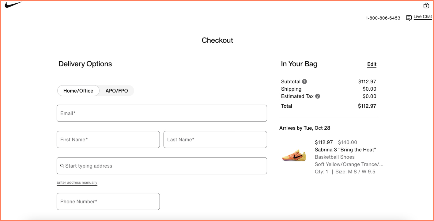
We love how their live chat function doesn’t pop at the bottom, but is a clickable nudge at the top right.
What adds to this last-minute reassurance is the clear delivery date — which cools down the tricky “Do I even know when this will reach me?” kind of hesitating mindset.
Checkout UX Tip: Consider showing it only after hesitation signals (mouse moving toward exit, time on page >30 seconds, form field abandoned). This way your eCommerce checkout page design stays friction-free.
Human beings feel a natural tendency to be philanthropic.
And this is no different amongst shoppers.
Across audits, we began to notice the familiar pattern that whichever periods a store maintained a donation nudge at checkout, abandonment at this stage was lower.
But the trick is always to make it easy for shoppers, because if they feel like they’re going to have to spend more, all of a sudden, it loses its charm.
Here’s a great example of this checkout UX optimization:
Jordan Craig, an elite streetwear brand that began in 1989, and is now known for its eCommerce presence, includes a donation within the price the shopper has to pay.
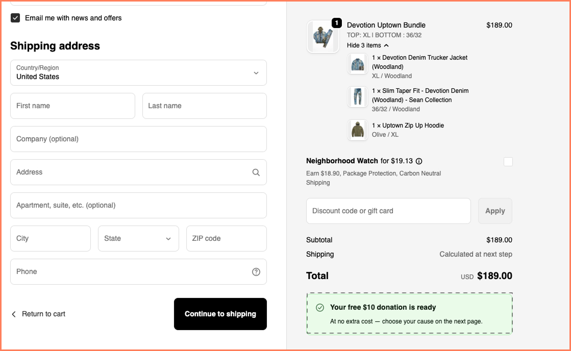
Why this is so strategic is because they don’t ask shoppers to pay extra. They deduct a standard amount from orders, including this amount within the pricing strategy.
What we also love is that they offer a way to switch off the carbon neutral shipping option if shoppers want (in fact, in the cart, they feature two separate CTAs to target i) who want Neighborhood Watch and ii) who doesn’t).
Extra points for checkout transparency.
Checkout UX Tip: No matter where you place your donation nudge, you need to ensure it doesn’t add extra steps to the core checkout flow. What we’ve seen work is to offer shoppers a cause to pick from and feature separate radio buttons suggesting quantities they can donate like $2 or $4, going up to higher numbers. Don’t feature more than 4 options!
Who doesn’t know about the raging debate between showing recommendations and not showing them at checkout.
However, our audit results point more towards how they are shown instead of whether they’re shown.
Put simply, they don’t need to be distracting or overwhelming.
Curated well, they can feel highly relevant to the shopper and also add to the store’s AOV.
Here’s a great example of this checkout UX element:
Pop & Bottle has got this area covered because they feature only two recommendations, which are closely mapped to what the shopper already has in their cart.
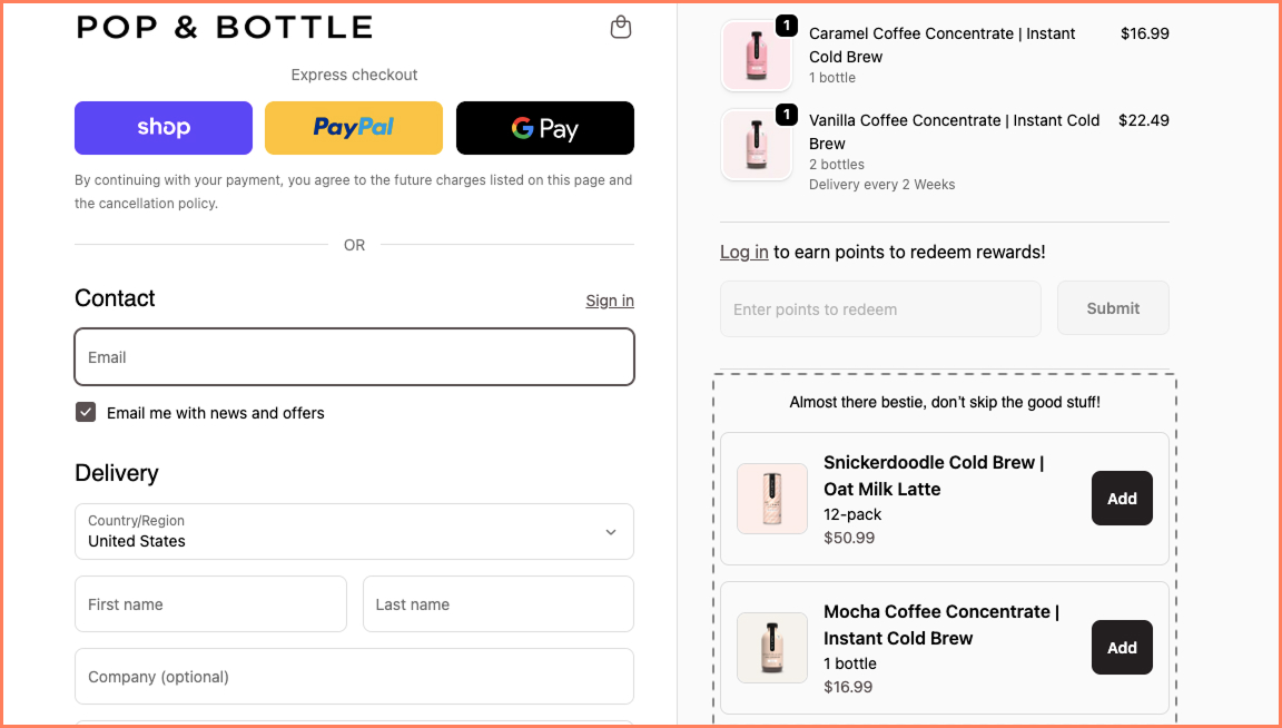
The clear “add” buttons clearly convey that the order total will automatically update if the shopper clicks on them — taking away the doubt of back-and-forth between cart & checkout.
Checkout UX Tip: Feature only add-ons and products that need zero deliberation. Because let’s admit it, at checkout shoppers are closest to completion. So make sure you don’t feature what needs further sizing help, personalization or even heavy reading for that matter.
No matter how much a store incentivizes account creation, it can quickly get repulsive, especially on mobile.
The trick is to remember how the average mobile shopper thinks: they’re usually in a hurry, in a state of comparison and quickly paying up if at all they buy.
So, if a brand has to amp mobile checkout conversions, they have to bring all their focus to how they highlight guest checkout and nudges for repeat customers.
Here’s a great example of this checkout UX optimization:
Since mobile commerce drives almost 78% of traffic, we love what MVMT does for their mobile checkout design.

Apart from being a single page checkout flow, it prioritizes guests and lets returning customers sign in first.
This kind of ease of use creates loyalty subtly and builds traction.
A super short checkout flow also urges shoppers to keep moving forward, without missing a beat.
Checkout UX Tip: Offer a clear “Save for Next Time” step on mobile so that first-time visitors & buyers get a chance to log their info in real time — feeling the ease of it being handy the next time they return.
Last year, we wanted to run a simple in-house, at-our-own-time experiment alongside our audits.
It was to satisfy our combined curiosity around how Free Shipping gets visibility across eCommerce stores.
The pattern we found was tell-tale: there were enough nudges on the notification bar and even product pages, but almost none at checkout.
So, we went ahead and tried it across some of our checkout page optimizations — and lo & behold, some of these stores sold more and others saw a significant drop in checkout abandonment.
Here’s a great example of this checkout UX element:
eCommerce wellness brand Feel Goods creates this callout right above the order summary.
It is compelling because it lets shoppers know they only have to pay the order total.
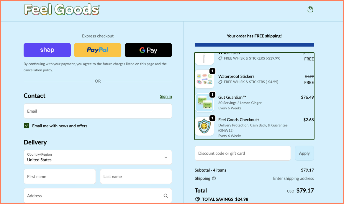
It lays to rest the problem of most shoppers not paying too much attention to fine print like shipping charges until the last moment.
Clear quantity markings and product prices also put the restless checkout mindset to rest.
Checkout UX Tip: Consider tweaking the free shipping checkout callout when you’re ramping up on seasonal selling especially for Halloween or Thanksgiving.
It’s for these times that you can tweak the messaging to “Free Shipping Ends Tonight” to get checkout conversions going.
The checkout process is the final step in the sale. It’s important to make it count.
But the truth is: 98% of visitors who visit an eCommerce site—drop off without buying anything.
Why: user experience issues that cause friction for visitors.
And this is the problem Convertcart solves.
We've helped 500+ eCommerce stores (in the US) improve user experience—and 2X their conversions.
How we can help you:
Our conversion experts can audit your site—identify UX issues, and suggest changes to improve conversions.