Here's a quick checklist to optimize your fashion store's product page:
Visuals
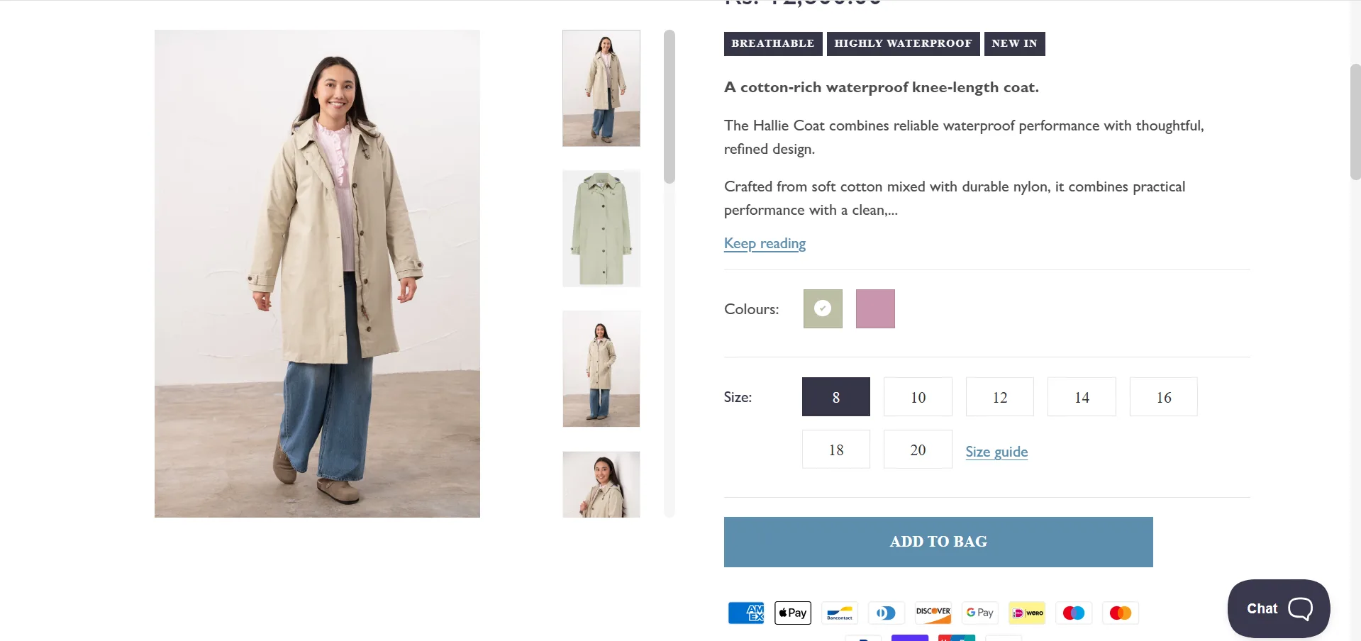
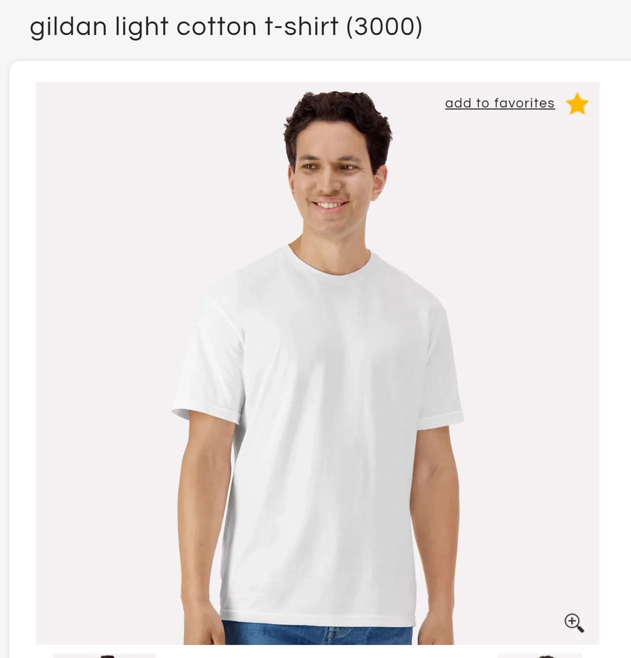
Lead image is a model shot, not a flat lay
At least 3–4 angles covered, including a fabric close-up
Images show the product on more than one body type
Copy & Descriptions
Description answers fit, fabric, and use-case questions
Primary keyword appears in the first 100 words
USP is called out in its own section, not buried in the description
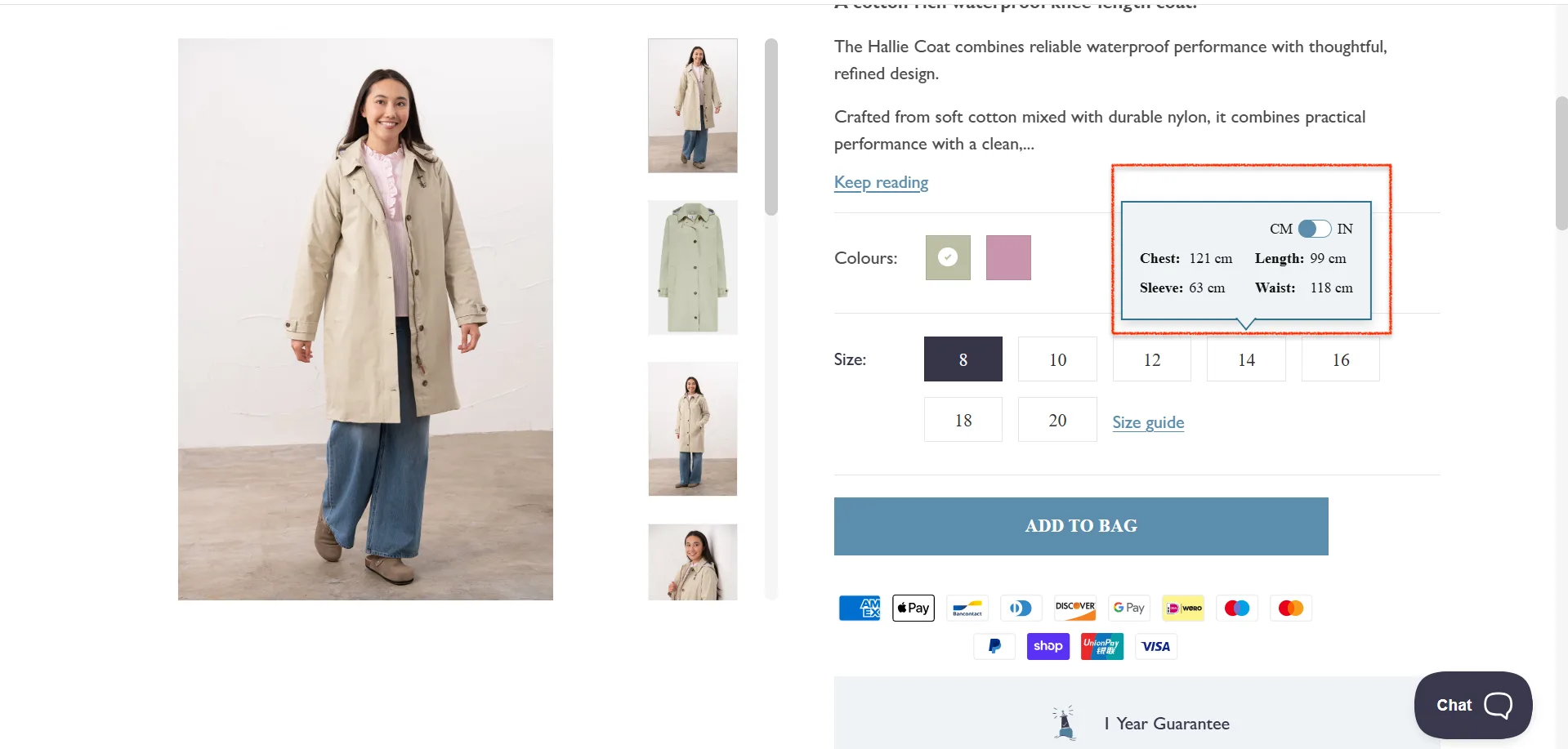
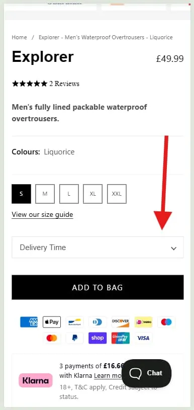
Size & Fit
The size guide is one tap away from the size selector
Guide includes real measurements, not just S/M/L
Model sizing information included ("Model is 5'8 wearing a size S")
Sizing notes are included if the product runs large or small
CTA & Friction
Sticky add-to-cart bar on mobile
CTA is visible without scrolling, on desktop
Returns policy visible on the product page
Pricing and any discounts are immediately clear
Social Proof
Star rating visible above the fold
Review snippet near the product title
Low-stock alerts shown when genuinely applicable
Discovery & Cross-Sells
"Complete the look" section feels curated, not algorithmic
Quick-add option on recommendations
Related categories or collections linked from the page
Fashion eCommerce has a peculiar problem. Getting someone to click "buy" is hard enough. Getting them to keep what they bought is harder still—and most product page advice quietly ignores the second part.
The average fashion return rate sits between 20% and 30%. In most cases, the product page is where that return originates: a shopper who wasn't sure about the fit, or the color, or whether it would work with anything they owned, bought it anyway and thought better of it later.
This guide is about fixing both problems at once. More conversions. Fewer returns. Net revenue that actually holds.
The Fashion CRO Matrix: Scaling Revenue Without Destroying Margins
Here’s something that rarely appears in conversion rate guides, possibly because it is mildly inconvenient: a high conversion rate is meaningless if your return rate is 30% or higher.
Most brands optimize for more orders. The brands that actually grow optimize for net revenue, the orders that stay.
This is precisely where most CRO advice goes quietly wrong. It increases conversions. It also silently increases returns. A shopper who wasn't sure about the fit buys it anyway because the page was well-designed. Then they open a returns label 72 hours after delivery.
The real goal turns out to be a simpler and rather more elegant thing: reduce uncertainty before purchase, so customers don't "hedge" after it.
Bracket buying—ordering three sizes to keep one—is not irrational consumer behavior. It is a rational response to insufficient information. Fix the information problem, and you fix the bracket.
Here's how the best-performing fashion brands think about it:
The Friction Point
The CRO Tactic
The Net Revenue Impact
Size Uncertainty
AI sizing tools; detailed model specs (height, weight, size worn)
Reduces bracket buying—ordering multiple sizes to return later
Color and Texture Doubt
4K zoom, multi-angle shots, video loops in natural light
Reduces "not as described" returns
Styling Confusion
"Shop the Look" bundles, styled outfits
Increases AOV while helping customers visualize usage
Post-Purchase Anxiety
Real-time tracking, proactive updates, fit feedback surveys
Reduces WISMO queries and improves repeat purchase rate
The Convertcart Net Revenue Scorecard (Use it to rate your product page)
Not all product pages are created equal. Some convert impressively but bleed margin through returns. Others are cautious, safe, inoffensive, and fail to convert anyone at all. Neither is a winning strategy.
What you actually want to know is whether your product page drives conversions that stick. That requires looking at four things simultaneously, which is exactly what this scorecard does.
How the scoring works
Evaluate your product page across four dimensions. Score each from 0 to 5, multiply by its impact weight, then add the results. Your total is your Net Revenue Score, out of 100.
Dimension
What You're Measuring
Weight
1. Size and Fit Confidence
Can users confidently pick the right size?
30%
2. Visual and Material Clarity
Can users clearly see texture, color, and details?
25%
3. Styling and Usage Context
Can users visualize how and when to wear it?
20%
4. Risk and Post-Purchase Assurance
Does the page reduce anxiety after purchase?
25%
Scoring rubric
1. Size & Fit Confidence (weight: 30%)
This is the single biggest driver of return reduction. A shopper who can't confidently select their size will either guess—and return—or leave.
Score 0 — No size guide, no model reference
Score 1 — Basic size chart only
Score 2 — Size chart with limited guidance
Score 3 — Model info plus size chart
Score 4 — Fit notes plus multiple body types shown
Score 5 — AI sizing plus personalized recommendations
2. Visual & Material Clarity (weight: 25%)
Poor visual quality is the primary cause of "not as expected" returns. This dimension measures how well your imagery bridges the gap between screen and reality.
Confidence to buy isn't just about fit—it's about knowing where and when you'd wear something. This dimension measures how well the page helps shoppers picture the product in their actual life.
Score 0 — Isolated product only
Score 1 — Single styled image
Score 2 — Limited context
Score 3 — Multiple styled looks
Score 4 — "Complete the look" suggestions
Score 5 — Full outfit bundles plus use-case storytelling
4. Risk & Post-Purchase Assurance (weight: 25%)
The moment a shopper starts wondering what happens if they don't like it, you've lost ground. This dimension measures how well the page handles that hesitation before it hardens into an exit.
Score 0 — No return or delivery clarity
Score 1 — Policies buried in the footer
Score 2 — Basic return information visible
Score 3 — Visible policies plus delivery estimate
Score 4 — Strong reassurance plus FAQs
Score 5 — Proactive tracking plus fit feedback loop
How to calculate your score
For each dimension: multiply your score (0–5) by the weight, then multiply by 4 to normalize to 100. Add the four results.
(Score × Weight × 4) summed across all dimensions = Net Revenue Score out of 100
How to interpret your score
Score Range
What It Means
Priority
0 to 40
High risk: poor conversion and high returns
Fix immediately
41 to 60
Average PDP: inconsistent experience
Prioritize top friction areas
61 to 80
Strong PDP: good balance
Optimize for scale
81 to 100
High-performing PDP
Focus on experimentation
The number that should recalibrate your priorities: a page scoring 70 with low returns is more profitable than a page scoring 90 with high returns. Net revenue, not conversion rate, is the real scoreboard.
Quick self-audit: where are you leaking revenue?
Before running the full scorecard, ask yourself three questions:
Are customers ordering multiple sizes in the same transaction?
Are your returns tagged "not as described" or "wrong size"?
Do users hesitate on size selection—or select, then change their minds?
If you answered yes to any of these, your Size & Fit Confidence score is almost certainly below 3. That's where to start.
⚠️
Find why your online fashion store is not converting
Product discovery – barriers that prevent shoppers from finding items
Category/collection pages – improvements that drive deeper product exploration
Product page – what to optimize to convert 2–3x more buyers
Cart – ways to ease hesitation and speed up purchase decisions
“The report was deep and super insightful. Can’t believe it’s free.”
Logan Christopher CEO, Empire Herbs
How to Use This Guide
The 18 fixes below are not a random list of improvements. Each one maps to a specific friction point in the Return-Reduction Matrix above. Work through them by pillar—starting with whichever dimension scored lowest on your scorecard—and you'll be addressing the things that affect both conversion rate and return rate at once.
18 High-Impact Fixes Mapped to the Fashion CRO Matrix
A. Fix Size & Fit Uncertainty (Highest Impact on Returns)
1. Add model specs: height, weight, and size worn
A single line of text—"Model is 5'9", 130 lbs, wearing a size S"—does more to help a shopper size themselves than a full measurement grid. It gives them a human reference point rather than an abstract one. Customers don't compare themselves to a table of numbers; they compare themselves to people.
2. Include size charts with actual garment measurements
S/M/L tells a shopper almost nothing useful. Chest 36", waist 28", length 28" tells them whether the garment will fit. The difference between these two approaches is the difference between a guess and a decision.
3. Add fit notes where the product deviates from the standard
"Runs small," "relaxed through the hip," "true to size but short in the torso"—these are the notes a good sales assistant would volunteer. They prevent the wrong size selection before it happens, which is considerably cheaper than a returns label after it does.
4. Show the product on more than one body type
One model answers fit questions for one body. Three models—different heights, different builds, different proportions answer them for your actual customer base. It's also, as it happens, simply more honest.
5. Add AI or guided size recommendation
The most direct intervention against bracket buying. A tool that takes a shopper's measurements and returns a confident recommendation removes the core uncertainty that drives multi-size ordering. It costs more to implement than a size chart. It saves considerably more in returns processing.
At Convertcart, we helped Lighthouse improve website conversion rate by 1% and add–to–cart rate by almost 10% by showing the product size on the first fold.
Before
After
B. Improve Visual & Material Clarity
6. Use high-resolution images with zoom
Fabric is tactile. Online shopping is not. High-resolution zoom is the closest substitute you have for letting a customer feel the material before they buy it. If a shopper can't inspect the weave, the finish, or the texture, they're making a semi-informed guess—and semi-informed guesses have a return rate to match.
7. Add fabric close-ups and texture shots
A close-up of the fabric surface answers a question no product description can answer as efficiently: what does this actually look like up close? For any product where material quality is part of the value proposition—and in fashion, it usually is—this is not optional.
8. Include a product video showing movement and drape
A dress that looks structured in a flat photograph can look completely different in motion. A knit that photographs as crisp can drape softly when worn. Fifteen seconds of video resolves more questions about fit and behavior than three paragraphs of copy.
9. Photograph in natural light, not only studio lighting
Studio lighting is flattering, controlled, and almost nothing like the conditions in which your customer will actually wear the garment. A shopper who orders a navy dress and receives what appears, in daylight, to be black has a legitimate grievance. Natural light shots reduce color-mismatch returns more reliably than any disclaimer.
10. Cover all angles: front, back, side, and detail
The back of a garment is not decorative information. Neither is the side seam, the hem, or the way the collar sits. Shoppers who can't see these things will imagine them, and imagination, in this context, is a return waiting to happen.
Want to see how top fashion brands build product layouts that convert? Check out our curated list of apparel product page examples for quick UX inspiration.
C. Increase Styling & Usage Context
11. Add "Shop the Look" or complete-the-outfit sections
Knowing that a piece works is different from knowing how to make it work. A curated "Shop the Look" section answers the second question. It also, rather usefully, lifts average order value—shoppers who can see a full outfit are more likely to buy more of it.
12. Show the product across different occasions
A linen shirt photographed exclusively at a beach setting will not sell to someone looking for something to wear to a Friday meeting. The same shirt, shown three ways: casual, smart-casual, and evening, sells to all three. Context creates permission to buy.
13. Lead your social proof with user-generated content
Real customers wearing real clothes in real light are more persuasive than any studio image, because they're believable. A customer photo of a dress worn to an actual wedding answers "will this look good on someone who isn't a professional model?" in a way that polished brand photography cannot.
14. Include styling tips: "Pair with…" and "Best for…"
Brief, specific styling guidance does two things at once. It reduces the shopper's decision burden—"will this go with anything I own?"—and it signals that the brand understands how the garment is actually worn. Both reduce hesitation at the point of purchase.
15. Add category tiles below the product details
Not every shopper landing on a product page is ready to buy that product. Some are browsing, comparing, or simply not yet sold. Category tiles—visual links to "Summer Dresses," "Linen Sets," "Back to Work"—give those shoppers somewhere to go that isn't your competitor's website.
The key distinction is that they function as editorial guidance, not algorithmic overflow. A tile that says "Linen Sets" positioned below a linen shirt is a stylist's suggestion. Fifteen loosely related product thumbnails is an algorithm hedging its bets. One keeps shoppers on site; the other confirms they're right to leave.
When we implemented category tiles on the product pages of MaC in a SaC, the results settled the argument: conversion rate improved by 59.8%. Shoppers who weren't ready to buy this item found something else worth buying. That's the quiet efficiency of good navigation.
D. Reduce Risk & Post-Purchase Anxiety
16. Put your returns policy on the product page, near the CTA
"Free returns within 30 days" displayed next to the Add to Cart button removes an objection that most shoppers won't bother raising out loud—they'll simply leave. Moving this information from the footer to the product page is one of the simplest and highest-leverage changes available in fashion CRO.
17. Show delivery timelines clearly
"Order within 3 hours for delivery by Thursday" is useful information. "Standard shipping" is not. Uncertainty about when something will arrive is a low-level anxiety that compounds other hesitations. Resolve it with specifics.
We tested a delivery date selector for MaC in a SaC and saw a 23.86% lift in conversions. The mechanism is simple: certainty converts; ambiguity doesn't.
18. Add a wishlist button near the CTA
Not every shopper who loves a product is ready to buy it today. A wishlist button—a small heart icon near the add-to-cart—catches that intent before it evaporates. Without it, the shopper closes the tab, and the product is gone. With it, you have a remarketing opportunity: back-in-stock emails, price drop alerts, and low-inventory nudges.
The mechanism is straightforward. The results, rather less so. When we added wishlist functionality to the product pages of Apliiq, page conversions lifted by 43.66%.
That figure is a useful reminder that reducing friction isn't always about speeding shoppers toward checkout—sometimes it's about giving the undecided somewhere useful to pause.
19. Use social proof that answers real questions
Star ratings are table stakes. What converts is social proof that addresses specific purchase anxieties: "Runs true to size," "Color is exactly as shown," "Fabric is softer than expected."
Filterable reviews—sortable by fit, body type, and occasion—let shoppers find the evidence most relevant to their decision.
20. Provide proactive post-purchase reassurance
The purchase decision doesn't end at checkout. A shopper who receives an order confirmation, a shipping update, a delivery notification, and a brief fit check-in is a shopper who stays bought.
Post-purchase anxiety—the quiet dread of "what if it doesn't fit?"—is one of the more underappreciated drivers of returns.
Why visitors don’t trust your store within 3 seconds
Why shoppers can’t find what they’re ready to buy
What’s stopping 2-3x more shoppers from clicking “Add to Cart”
Where buyers hesitate right before purchase
Why high-intent shoppers still drop off
“The report was deep and super insightful. Can’t believe it’s free.”
Logan Christopher CEO, Empire Herbs
Common Fashion Product Page Mistakes (And How to Fix Them)
No size guide, or one that's impossible to find:
The single most expensive mistake in fashion eCommerce. If a shopper can't confidently pick their size, they either guess and return or leave without buying. Fix: put the size guide one tap away from the size selector, on every product, every time.
Images that show the product but not the fit:
Flat lays and ghost mannequins describe what a garment looks like. They don't describe how it drapes, how it moves, or whether it will suit a particular body. Fix: lead with model shots, add video on high-traffic products, and show more than one body type where possible.
Reviews are buried at the bottom of the page:
Most shoppers never scroll far enough to find them. Fix: pull a star rating and a short review snippet up near the product title, where they're visible to everyone who lands on the page.
Copy that says nothing specific
"Effortlessly chic." "Perfect for any occasion." These phrases appear on so many product pages that they register as noise. Fix: write descriptions that answer real questions—fabric, fit, and use-case—in plain language.
Return policies hidden in the footer
A shopper on the fence will look for a reason not to buy. If they can't quickly confirm that returns are easy, that's reason enough. Fix: bring "Free returns within 30 days" onto the product page itself, close to the CTA.
Urgency signals that have stopped being credible:
A "Only 2 left!" badge on a product that is perpetually almost out of stock. A countdown timer that resets on every page load. Shoppers have seen these techniques often enough that they've learned to distrust them—and distrust, once established, is difficult to recover. Fix: use urgency only when it's genuine.
Recommendations that feel algorithmic rather than editorial:
Fifteen loosely related products below the fold do not read as styling advice. Fix: curate tightly. Three or four items that genuinely work together, with a quick-add option on each.
A mobile experience that's an afterthought:
A beautiful desktop page that's frustrating on a phone is losing the majority of its traffic in practical terms. Fix: design for mobile first, test on real devices, and make sure the add-to-cart button falls naturally under the thumb.
Fashion eCommerce Conversion Benchmarks
Knowing your conversion rate matters less than knowing whether it's good for your particular store. Here's what the numbers look like across the category.
Overall fashion eCommerce average: 1.5–3%. Below 1.5%, something structural is wrong—usually UX, mobile experience, or trust signals. Above 3%, and you're outperforming most of the market.
Fast fashion and mid-market: 2.5–3.6%. Higher purchase frequency, shorter consideration cycles, more impulsive buying behavior. New arrivals and sale events push these figures higher still.
Luxury and premium: 0.7–1.1%. Lower isn't worse here. Luxury shoppers take longer to decide, return less frequently, and spend considerably more when they do buy. A 0.9% CVR for a high-AOV brand can be substantially more profitable than a 3.5% CVR for a fast-fashion store. This is, again, why net revenue is the more useful benchmark.
Mobile: typically 30–40% below desktop. Mobile drives the majority of fashion traffic but converts at a lower rate, largely because of UX friction rather than lack of intent. If your mobile conversion rate is less than half your desktop rate, the gap is worth investigating.
A useful diagnostic: if your add-to-cart rate is healthy but completed purchases are low, the problem is in cart and checkout—not the PDP. If traffic is high but add-to-cart is low, focus on the product page itself.
One Last Thing
A fashion product page is never really finished. Shopper behavior shifts, competitors improve, and what worked last season sometimes stops working this season—occasionally for no discernible reason whatsoever, which is one of the more humbling aspects of the discipline.
The brands that consistently convert well aren't the ones that built the best possible product page at a point in time. They're the ones that kept testing, kept refining, and treated the page as a living thing rather than a problem solved and filed away.
Most of the fixes in this guide aren't complicated. They're just specific. And in CRO, as in most things, specific beats clever almost every time.
Want to know exactly where your product pages are losing sales?
ConvertCart's team audits fashion eCommerce stores every day, identifying the friction points that data reveals but gut feel misses. Get a free audit.
Frequently Asked Questions
What is a good conversion rate for fashion eCommerce?
The average sits between 1.5% and 3%. Fast-fashion and mid-market stores tend toward the higher end; luxury brands typically land between 0.7% and 1.1%, which is perfectly healthy given their higher order values. Below 1.5%, the problem is almost always friction on the page rather than with the product.
Why is my fashion store's conversion rate low?
The most common culprits are poor mobile experience, missing or hard-to-find size guides, weak social proof, and a CTA buried too far down the page. Start by auditing the pages with the highest traffic and lowest add-to-cart rates—that's typically where friction concentrates.
What's the fastest way to improve apparel conversion rates?
Fix the thing shoppers need most and can't find: sizing confidence. Brands that add clear size guides, model sizing information, and filterable reviews see faster gains than those pursuing larger structural changes. It's the highest-leverage fix on most fashion PDPs, and the most consistently neglected one.
How do conversion rates differ across fashion categories?
Activewear and everyday basics convert well because the decision is relatively straightforward. Occasion wear and luxury convert lower—not from lack of interest, but because the decision takes longer and requires more trust-building. Chasing a single benchmark across your entire store is less useful than knowing what "good" looks like for each category you sell.


.avif)
.svg)

.svg)

.svg)
.svg)
