Ecommerce Growth
eCommerce Subscriptions: 15 Amazing Examples (+ Ways to Increase Subscription Sales)
March 28, 2023


If we are to believe the statistics, eCommerce subscriptions are clearly on the rise: across different models, they are slated to bring in 38 billion dollars as revenue by 2023 – and this number is more than double of what 2019 saw.
This makes it imperative for subscription-based eCommerce businesses to step up on the kind of UX delivered across their storefronts – so that increasing conversions become more than aspirational.
In this piece, we’ve identified 15 eCommerce brands that have systematically made their subscription models work – and in turn have taught us a thing or two on how effective UX can get.
Here's what we'll cover:
- 15 inspiring eCommerce subscription examples
- 13 proven UX pointers to make your subscriptions sell better
Let's get started with the examples right away.
No two dogs are the same – and if we go by that logic, no two dog owners are the same too.
Which is what subscription based eCommerce pet brand Barkbox seems to have been leveraging since it was founded in 2011.
However, what’s interesting is that the brand initially was putting together subscription boxes around toys and treats from different vendors.
A detailed review of customer buying & engagement behavior plus customer feedback ensured the brand turned to designing its own products.
By late 2012, the brand had its first in-house product launched and today more than 90% of its products are developed in-house.
- Offers shoppers the choice of subscribing short or long-term (the brand has options right from a month’s subscription to 12 months’ subscription – and they incentivize the long-term options, making them a win-win)

- Makes it easy for new customers to personalize their box (the whole process, which is a quiz, doesn’t even take 5 minutes to fill out – it helps the shopper choose a subscription & box theme)
Steps include asking about the size of the dog (but also ensuring shoppers don’t worry about price changes based on size) and figuring out if the dog has allergies.

- Their “100% happy guarantee” shows up across the storefront (to drive greater trust and confidence)
- Makes the “help” section upfront on the homepage (“Get Help” is part of the primary menu, so that if a potential subscriber wants customer support instead of exploring the website, that’s possible too)
Here's an interesting read: 20 email personalization templates (examples from great brands)
Going by the USDA’s estimates, food supply related waste at the consumer and retail levels was 31% in 2010. By 2019, it had grown to 35% – which means 35% of all the food produced in the US went unsold or uneaten.
As an answer, Imperfect Foods was born in 2015 – to be able to deliver high-quality yet affordable food that otherwise may have been trashed due to stringent perceptions.
The retailer continually makes good use of leftover produce and makes room for produce with “cosmetic imperfections”.
- Uses the ticker strip right up for a very convincing nudge (what we mean is everybody invariably harps on deals, discounts, free shipping – but Imperfect Foods chooses to bring in a link that takes shoppers straight to the about page)

- Creates reassurances through microcopy at every step (what we especially noticed is the power of the reassurances while a shopper takes the quiz to arrive at their weekly box delivery – the following are some snapshots – don’t peel your eyes away from the microcopy)


- Introduces all their top food categories in a detailed way on the homepage itself (major brands are brought in for visual appear and some very precise descriptors help shoppers understand the category better)
Microcopy on your mind? Read this to leverage fineprint content on your storefront.
Founded at a time when Gillete had the market share for men’s razors in the US – Dollar Shave Club is now a household name that combines precise branding & inventive customer service to keep marching forward.
Since they’ve been a direct-to-consumer brand right from the start, Dollar Shave Club has offered world-class razors at a price many competitors can’t easily match.
What works in the favor of their subscription-based business model is that they don’t demand long-term commitment from shoppers and promote an anytime cancellation policy actively.
- Recommends products based on deep personalization (a quiz asks about shaving & trimming preferences of the shopper, if they have skin issues etc. and recommends a unique bundle based on the answers)
- Lets shoppers decide on the quantity of each product in the subscription bundle

- Offers a free product to new members (and makes sure all shoppers know that this is the condition behind a free product, unless otherwise authorized by the brand)
- Nudges starters towards “shop starter kits” (because which shopper doesn’t like choice, even if they’re new to the brand?)
Founded in 2011, HelloFresh is a subscription-based eCommerce brand that currently delivers pre-packaged meal boxes (with fresh ingredients) to almost 10 million customers across the world.
Every meal box from HelloFresh factors in all the necessary produce & ingredients needed for one full meal – be it veggies, meat, dairy or even seasonings.
Pre-portioned ingredients ensure the brand is able to cut back on food waste, and is able to extend the cost advantage to shoppers.
- Showcases what’s popular even while making space for personalization (this can especially be helpful for shoppers seeking reassurance on what’s usually favored by others)

- Has introduced a customization feature that offers more control to subscribers (a greater amount of choice experienced once, can typically make subscribers consider the meal box service for longer)

- Features a menu section to offer complete transparency to (potential) subscribers (the large spread also ensures the brand is able to target more varied kinds of customers
Read 14 eCommerce content marketing mistakes (+ their fixes) for more ideas to put to action
Bulletproof is an eCommerce wellness supplement brand that was founded by well-known biohacker and author Dave Asprey.
The brand hinges on making “functional nutrition” more available and accessible to those who already have a daily wellness routine in place.
Known mostly for being “Bulletproof Coffee”, the brand has branched out to create supplements, proteins and MCT oils.
What makes Bulletproof such an amazing subscription brand is their flat 20% discount offered to every shopper who becomes a subscriber – plus the free shipping forever clause if someone continues to subscribe.
- Offers enriching content that will instantly engage potential subscribers (since subscription is at the least a slightly bigger investment than one-time purchases, reliable content can create the necessary awareness that propels shoppers to take the subscription decision)
Here’s a snapshot of how the brand features a “Learn” section in their primary navigation – the same section appears in their website footer too.

- Gives a very good reason for account creation (the brand ties up account creation with the flexibility of making edits to the subscription order – and that the latter is easier when the shopper creates an account)

When Beer Cartel was born as a beer retailer way back in 2009, they were a brick-and-mortar store.
However, what began as an in-store format in Sydney, soon became a recognized eCommerce brand known for its strategy and innovation – self-admittedly the brand grew to counter the unevolved state of beer drinking where shoppers didn’t have the choice to explore more kinds of beer.
In fact, in 2022, Beer Cartel grabbed the Innovation Award at BigCommerce’s Make It Big Awards – beating thousands of other BigCommerce brands on a worldwide scale.
On the subscription front, Beer Cartel’s game changed during COVID – whereas they’d sold 20, 000 units online in 2019, the number turned into 35, 000 in 2020.
Don't forget to read: 18 Solid Ways To Recover BigCommerce Abandoned Carts
- Drives subscriptions through the idea of gifting (this leverages the idea of beer buddies amongst shoppers – where apart from hanging out with each other now, beer lovers can give each other gifts too)

- Offers a wide range of subscription price points (while the highest is pegged at $89.99, the lowest is marked at $39.99 – this enables the brand to target a wider audience, based on economics)
For more thoughts on pricing, read: Pick the right product price: 8 eCommerce pricing best practices
Now an established eCommerce brand in the health and wellness space, New Chapter was originally founded as a company in 1982.
Since then, the Vermont-based brand has researched and innovated to create natural supplements that are more easily absorbed by the body.
New Chapter has earned a B Corp certification, and ensures they stay truly sustainable as a business by sourcing all their ingredients locally (that is, from in and around Vermont).
The reason why we love the way they do subscriptions is the freedom they offer customers to make their choices – unlike other brands, New Chapter does not push shoppers towards select bundles.
Instead they’ve incentivized subscriptions based on number of products – the more products you subscribe to, the bigger the discount.
- Automatic New Chapter Rewards enrolment (subscriptions instantly sign you up for extra benefits, which don’t just include discounts but also others like earning for referrals and earning points for non-transactional steps like social media shares)
- Anytime changes and cancellations (making it easy for shoppers to be drawn to subscribing than picking one-time orders)

Founded in 2011, Pet Circle is an end-to-end pet needs brand that was born from a crisis personal to the founder: he saw that his ailing father was not able to go out and get his pet dog’s favorite food.
Pet Circle was founded to service the needs of many such pet owners who would rather have their pet’s necessities home delivered.
The best thing about Pet Circle’s subscription service is that they feature a number of popular pet brands in Australia and ensure shoppers get the best price in comparison to competitor brands.
- Free advice from the Pet Circle Vet Squad (which can really be a boon for pet owners who need their pet’s consultation as well as diet and nutrition to be super precise)
- A wide auto delivery window (subscribers can tune their auto delivery window from anywhere between 2 week and 26 weeks – imagine the wide audience base such a window can instantly attract)

Don't forget to read: 51 Marketing Ideas For Online Pet Stores (With Examples)
Ipsy is a beauty subscription service built on the principle that beauty can’t be and shouldn’t be one-size-fits-all.
As a result, the service brings together a host of loved and coveted beauty brands that shoppers have already bought from – and some aspire to buy from.
The thing that caught our attention about Ipsy is the fact that it is highly personalized as a subscription service, which means that every subscriber will enjoy only those products they closely prefer – no matter which subscription plan they prefer to spend on.

- Some really valuable subscription plans featured (whether it’s $13 a month or $58 a quarter, shoppers can see value in what they choose – while the monthly plans will readily attract those who’re just starting out, the quarter one is for the next level of customers)
- A month of FREE membership benefits (the brand knows it takes a little extra to make subscribers stay on as subscribers, given their “cancel anytime” clause – which is why they offer a free month of Refreshments, a series of personal care products that are sustainably created and made to align with the BFA Standard)
Founded in 2014, Scentbird draws its spirit from the ability to turn high-end scents more affordable for those who truly love fragrances.
By making otherwise luxury fragrances affordable, Scentbird has committed themselves to creating a vibrant community of scent aficionados.
Clearly, this brand means business because to make the subscription service be considered seriously, they’ve created access for subscribers to over 600 fragrances.
- An urgency ticker greets you on their homepage (and what’s more, they’re offering a steep discount on their subscription box – so the first instinct for someone serious about a service like this would be to sign up)

- The world’s best-loved fragrance brands are featured while they fetch quiz results (apart from the quiz being very precise and short, the brands showing up one by one increases the likelihood of a quiz-taker hanging on to see the final recommendations)
Here's something right up your alley: Limited Time Offer: 10 compelling examples + how to copy them
Lovevery is an eCommerce brand that’s well-known for their thoughtful toys and kits meant to support early child development.
The brand took a staggered approach in introducing their subscription model to shoppers – initially, they just launched their first year of developmental toy kits.
As of 2023, Lovevery is aiming to launch kits for the fifth year of a child’s development.
The brand makes it easy for parents to figure out which kit would be most suited for their child at any given point in time – a birth date & exact age calculator helps with that.
- Includes recommendations for children with learning difficulties, disabilities and exceptionalities (in this case, parents need to contact the brand directly to discuss options)
- Intelligent add-on recommendations (based on birth date, once the brand recommends a very specific play kit, it also ensures to recommend play kits from an earlier stage of development – just to open up the options for interested parents)

Here's a relevant read: 10 scientific hacks to overcome customer objections in eCommerce
TheraBox is a brand that came to life to make self-care the center of everyday attention.
With the help of practicing therapists and subject matter experts in neuroscience & positive psychology, the brand is known to create monthly subscription boxes that support the overall wellness (mind, body, soul) quotient of the subscriber.
TheraBox was founded in 2017 and ships worldwide at the moment.
The best thing about this subscription-based brand is that they include 5 to 7 products within a box, and together the products reduce stress and promote relaxation through mindfulness activities, brain-training exercises as well as holistic products.
- Features both short and long term subscription options (so that those who want to just try for a month find something to get clued into as well as those who want to prepay for a year and relax)

- Offers a variety of “boxes” for one-time purchase (this is a great approach by the brand to push customers down the funnel towards a multi-month long subscription – these one-time boxes are also super ideal for those looking for gifts)
Adore Me is an eCommerce lingerie brand that has been ranked several times in the Inc 500 list for being one of America’s fastest growing retailing companies.
It was founded in 2012 and is now known to offer access to hundreds of styles to its shoppers & subscribers alike – what’s more Adore Me also features 77 sizes for a wider audience.
The best thing about being a subscriber with Adore Me is the access one gets to the brand’s in-house styling team that then gets to work to match the subscriber closely with their preferences.
- The 7-day try-on anything service (this comes exclusively with the Elite Box, where the shopper can keep anything they’ve liked wearing and return the rest)
- A one-page quiz flow (what’s interesting is that they feature almost as many questions as any other subscription brand would, but they fit them into a seamless one-page flow, which makes the process seem shorter)

Since 2012, Loot Crate has been showing the world what a great fan subscription box can be like.
Originally, the brand pitched itself as “comic con in a box” and has ever since wowed subscribing fans with merchandise across the world of entertainment, sports, pop culture and gaming.
The reason we admire Loot Crate as an eCommerce brand is because the power of their subscription plans is actually driven by the power of original content.
- A wide range of “crate” plans (if the least expensive is currently pegged at $13.99, the most expensive comes at $49.99)
- The freedom to choose multiple crates (the deliveries are all spaced out because some crates are delivered over even months, the others are delivered over odd months – some options also have an every 3 months delivery window)

This is a best practice whether you enable subscriptions on all your independent products or run a subscription box service.
For shoppers who’re likely to not scroll beyond the first fold, this opens up the door to exploring your subscription options.
Will subscribers be able to cancel anytime?
Will they get a set percentage of discount for as long as they subscribe?
Are free gifts in the picture?
Ensure your biggest subscription benefits aren’t hidden on the page dedicated to break down your subscription structure and options.
Labels like “most popular” or “most loved” can also help potential subscribers make a decision faster.

If you’re not a subscription-only service, it becomes imperative for you to feature your subscription benefits right where shoppers can find them to make a choice – between a one-time purchase and a subscription.
This obviously becomes the product page, and we’ve found highlighting them right above or below the primary CTA seems to work the best.
Use separate buttons for shoppers to be able to choose between a one-time purchase and a subscription.
Based on what button they choose, reveal more information.

UX on your mind? Read 18 UX hacks to reduce cognitive load in ecommerce
Call-outs like “Subscribe & Save” or discount information like “30% more savings when you subscribe” drive value for the shopper.
Especially where products are available for one-time purchase, a call-out can convince people to subscribe.
The more you can create differentiation in your subscription plans based on name, contents, price and imagery – the more likely shoppers are likely to explore them independently.

You could make it a dropdown (like in forms) where one line item can be chosen.
The other option is to feature buttons against the time frame in text.
It’s a good thing if you can provide that extra bit of guidance to users on making the right choice – however, this can’t be at the cost of your primary flow of information.
For example, if you have a number of variants of the same product, it’s bad UX to crowd the space above the CTA with chunks of information on each.
The alternative is to bring in clickable microcopy – this can then expand into a small box of relevant textual details.
(Notice “what’s the difference?” and “learn more” in the example below.)

More UX advice right here: Simplify online shopping for senior citizens: 11 UX ideas
This is for the simple reason that citing money savings in one currency might not exactly mean the same amount of savings in every other currency.
If you operate in multi-currency mode, highlighting savings in % becomes all the more worthwhile.
It’s also imperative that you state how much percentage savings each plan offers – typically, the more expensive the subscription plan, the bigger the savings.
“Spend $xxx and get x% more savings” is the kind of language that draws in the typical shopper with a serious intent to subscribe.
Thankfully, product recommendations aren’t limited to just individual/one-time purchase products – they can also be brought in effectively to increase AOV on subscriptions.
However, a good practice is to not bring in a product as expensive as the primary product(s) in the subscription.
Instead, a complementary product that costs lower but completes the experience is more likely to be considered by a subscriber as an add-on.
For one-time add-ons to subscription orders more successful, consider promoting them over email as well – based on buying preferences exhibited so far.
This makes a lot of sense if you’re not an entirely subscription-based eCommerce business – in which case, without an early nudge shoppers may be more prone to considering one-time purchases.
One way to do this more effectively is to match where the shopper/ subscriber is in the funnel.
For example if they’ve just been into one-time purchases, draw their attention to the least priced subscription plan (let’s say one that runs for at least 3 months).
For subscribers already invested in the least expensive plan, feature higher-priced plans but with preferably an exciting yet timed discount.
What can foolproof your brand’s relationship with its subscribers is a sense of freedom & flexibility you can make the latter experience.
One way to do this is to give them the constant autonomy to edit their subscription info.

This can be done by introducing CTAs in priority one after the other in a vertical flow, since a subscriber canceling is the least preferred option – ideally in the “manage subscriptions” section after they’ve set up an account.
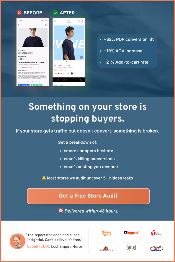
Along with the challenge of maintaining the ideal retention rate of 90%, subscription-based eCommerce businesses also have to tackle the average 98% drop-offs from their storefronts.
Why: user experience issues that cause friction for visitors.
And this is the problem ConvertCart solves.
We've helped 500+ eCommerce stores (in the US) improve user experience—and 2X their conversions.
How we can help you:
Our conversion experts can audit your site—identify UX issues, and suggest changes to improve conversions.
And we won’t charge for this one.
Subscribe for more articles like this!


Read by 5000+ ecommerce store owners
.svg)

.svg)

.svg)
.svg)
2026 Convertcart, All Rights Reserved
33/1, Castle Street, Ashok Nagar, Bengaluru, India