A jewelry product page isn’t just a place to display a product. It’s where intent either compounds or disappears.
Two stores can sell nearly identical pieces at similar price points. One quietly converts. The other watches visitors browse and leave.
The difference rarely comes down to the product itself. It’s how clearly the page answers unspoken questions, how quickly it builds confidence, and how effectively it nudges the next step.
Most brands try to fix this by adding more images, more copy, more features. But more doesn’t always help. In fact, it often makes the decision harder.
The pages that convert well don’t overwhelm. They prioritize. They surface the right information at the right moment, reduce hesitation, and guide shoppers forward without friction.
Jewelry PDP Conversion Framework (High to Low Impact)
Prioritize these tiers on your jewelry product page to dramatically improve conversions in your jewelry ecommerce store
Tier
What It Solves
Key Levers to Optimize
Impact on Conversion
Tier 1: Conversion-Critical (Must-Haves)
Removes doubt and friction at the exact moment of decision
• Key specs clarity (size, materials, benefits translated into outcomes)
• Trust signals (shipping, returns, warranty near CTA)
• Scanability (structured info, badges)
• Long-term confidence (care & packaging info)
• Product guidance (gift sizing, selection help)
• Support access (“Consult an expert”)
🔥 Highest impact — unlocks conversions immediately by resolving hesitation and risk perception
Tier 2: Conversion Boosters
Makes the product feel desirable, valuable, and worth the price
• Visualization (real-life imagery, zoom, video, on-body shots)
• Emotional storytelling (“how it feels to wear”)
• Value anchoring & price framing
• Use cases (gifting, occasions, personalization)
• Guided selling (quizzes, step-by-step)
• Styling prompts (“pair it with”)
⚡ High impact — increases add-to-cart rates by building emotional connection and perceived value
Tier 3: Revenue Drivers
Converts existing intent into higher-value purchases and faster decisions
📈 Medium impact — boosts AOV and conversion speed, but only after Tier 1 & 2 are solid
Pro tip: Most jewelry brands jump straight to Tier 3 (upsells & urgency) while their Tier 1 foundation is still weak. Fix Tier 1 first on every jewelry product page for the biggest conversion lift.
TIER 1: Conversion-Critical (Must-Haves)
1. Remove Friction and Show Decision Cues
At this point, shoppers are thinking: “Okay, I really like this piece… but is it actually good quality? Will it fit right? What if I need to return it?”
If you don’t clear up those doubts right away, they’ll bounce—no matter how beautiful the jewelry is.
The fix? Make your jewelry product page super easy to scan and trust instantly. When you do that well, you cut hesitation and boost your ROI big time.
Here’s what actually moves the needle:
Tell them exactly how it fits and turn those features into real-life benefits they’ll actually feel (like “this chain sits perfectly at your collarbone, no tugging or adjusting all day”).
Show shipping times, easy returns, warranty info, materials, and guarantees above the fold so they don’t have to hunt.
Use short paragraphs, bullet points, and visual badges so people can understand everything in seconds.
Mention packaging, care tips, and how the piece holds up over time.
Add sizing help that makes it easy for someone buying for a loved one.
A simple “Consult an expert” button so they can get quick answers if they’re stuck.
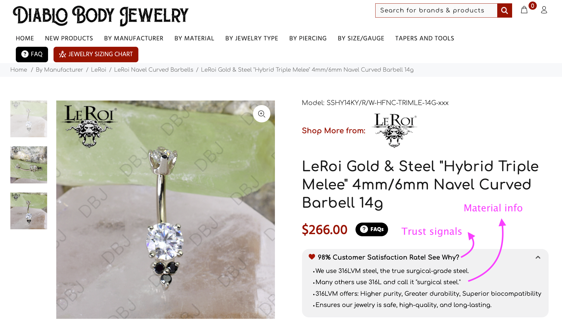
Here's how we helped a Convertcart customer boost conversions: Diablo Jewelry
Diablo is a classic case: great traffic to their site, but conversions just weren’t growing. They had tons of customer reviews, but all those helpful insights were buried and not helping anyone decide.
We fixed it by creating a clean trust and material transparency panel right next to the price and Add to Cart button on their jewelry product page. It pulled the best bits from reviews and turned them into clear, scannable decision cues.
Shoppers could instantly see what mattered: real quality, skin-safe materials, and how well the pieces last. No more guessing.
Result? A solid 12% increase in website conversions.
If you want your own jewelry product page to convert better, focus on speaking like a helpful friend instead of a catalog. People buy with emotion, then justify with facts—give them both without the friction.
Jewelry product page optimizations that work well usually include:
Everyday wearability (“perfect for daily stacking”)
Real customer feedback highlights
Honest material breakdowns
Simple sizing visuals
Care instructions that show you care about longevity
Do this right, and your jewelry product page stops feeling salesy and starts feeling trustworthy. That’s how you turn browsers into buyers.
TIER 2: Conversion Boosters
2. Make the Product Feel Worth It
At this stage, shoppers are thinking: “This looks nice… but will it actually look good on me? Is it really worth the price?”
Once they’ve gotten past the “is this legit?” doubts, they move into value mode.
Now they need to feel emotionally connected and confident that it’s a smart buy.
Your goal is to help them visualize the piece on themselves and clearly see why it’s worth it.
Here’s how to make your jewelry product page feel valuable and irresistible:
Show real-world visualization with multiple high-quality photos from every angle, plus videos and on-body shots so they can picture exactly how it sits and moves.
Use emotional storytelling that describes how it feels to wear — the everyday confidence boost, the special-occasion sparkle, or that “I feel put-together” vibe.
Anchor the price by showing fair value — compare it gently to what you’d pay in stores and highlight quality that justifies the cost.
Share clear use cases: when and where to wear it, how it works for gifting, or how to personalize it for someone special.
Add guided selling tools like simple quizzes or step-by-step selectors (for example, choose setting → choose stone) to make decisions easier.
Include subtle styling prompts like “pairs beautifully with your everyday gold hoops” early in the scroll.
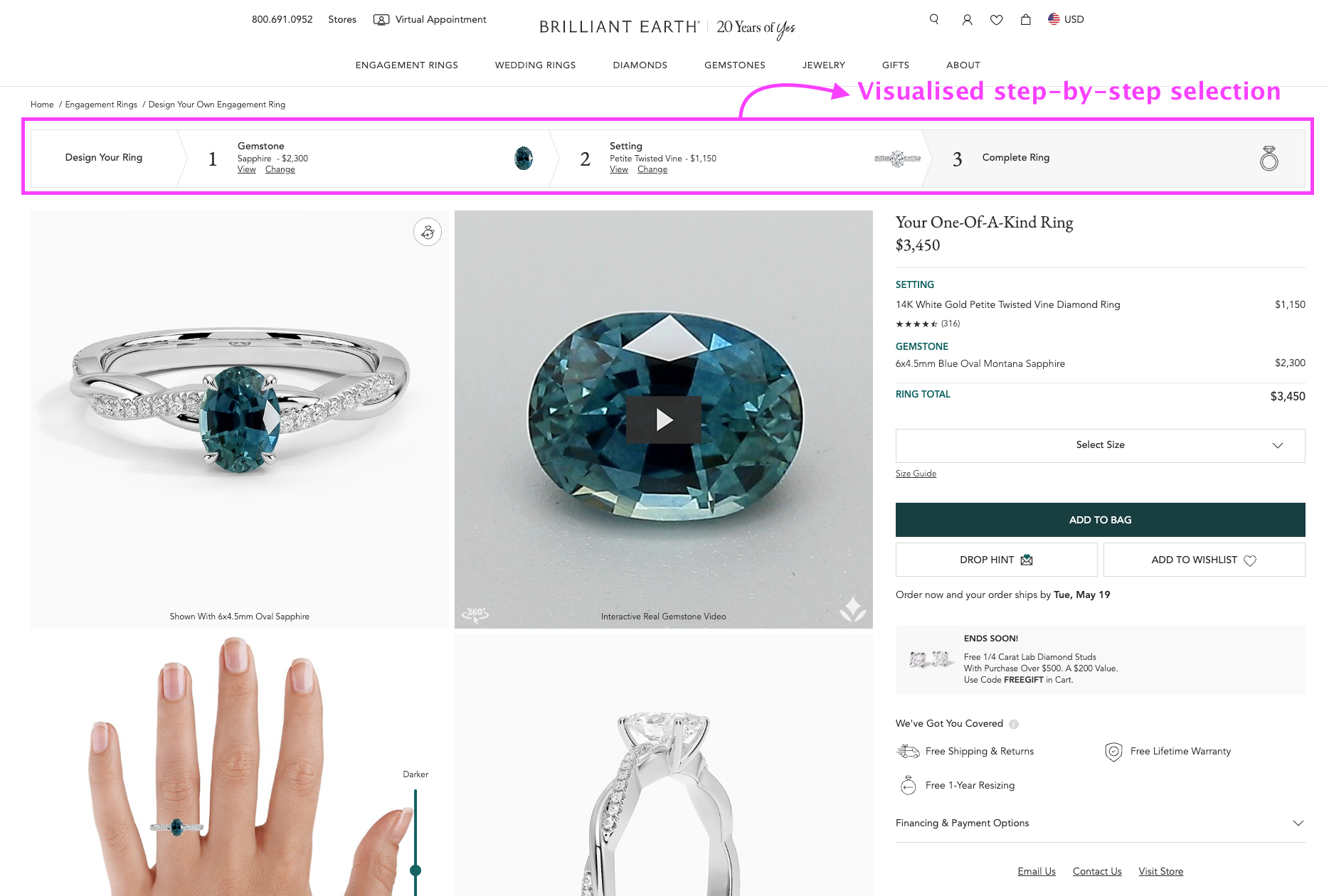
Online Jewelry Example: Brilliant Earth
We love how Brilliant Earth does this so well. They created a smooth, step-by-step personalized shopping experience on their jewelry product page.
Shoppers can easily build and visualize their perfect piece instead of feeling overwhelmed by choices.
This makes the entire buying process feel exciting and tailored, exactly what turns hesitation into “I need this.”
When you apply this thinking to your own jewelry product page, focus on painting a vivid picture.
Good jewelry product pages don’t just list specs; they help the customer imagine the joy of wearing it, the compliments they’ll get, and why it’s a meaningful purchase.
Soon, your jewelry product page stops feeling like just another listing. It starts feeling like something they already own in their mind, and that’s when they happily click “Add to Cart.”
TIER 3: Revenue Drivers
3. Increase AOV and Buying Momentum
At this stage, shoppers are thinking: “Alright, I really want this piece… should I buy it now? And maybe grab something else to go with it?”
They already like the item and trust the brand.
Your job now is to remove any last-minute hesitation, encourage them to add more to the cart, and make the purchase feel smooth and exciting.
This is where you turn a single-item buyer into a higher-value customer.
Here’s how to boost both average order value and buying momentum on your jewelry product page:
Show smart upsells like “wear it with” suggestions, matching bundles, or complementary pieces that complete the look.
Offer personalization options such as engraving or custom choices — these add emotional value and make the piece feel truly theirs.
Display multiple products together so a higher cart total starts to feel normal and worthwhile.
Make pricing easier with visible Buy Now Pay Later (BNPL) options to reduce sticker shock.
Add gentle momentum triggers — like estimated delivery dates, low-stock alerts, or “others bought this recently.”
Keep a sticky Add to Bag button visible as they scroll so they never have to hunt for it.
Use subtle micro-incentives like rewards points, limited-time perks, or soft urgency nudges.
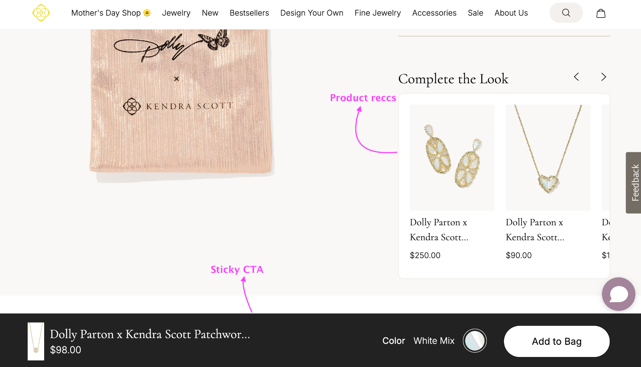
Jewelry Brand Example: Kendra Scott
Kendra Scott does this beautifully. On their jewelry product page, they show a “Complete the Look” section right in view with perfectly matched pieces (like earrings and a necklace to go with the main item).
This makes it effortless and inspiring to add more to the cart.
They also use a sticky CTA at the bottom that stays visible while scrolling, always keeping the “Add to Bag” button within easy reach.
These simple touches remove friction and naturally increase the total order value.
When you apply the same ideas to your own jewelry product pages, think beyond the single item.
Then your jewelry product page doesn’t just convert; it turns casual buyers into happy, higher-spending customers who come back for more.
Jewelry Product Page Best Practices
To make your jewelry eCommerce site actually convert, your jewelry product page design needs to remove friction and build instant confidence.
Here are the non-negotiables that top-performing jewelry stores follow:
1. Keep the photographic focus on the product
Even if you have beautiful models, the jewelry should always be the hero.
A simple earlobe, wrist, or neck shot is usually enough. Clean, well-lit images let the piece shine without distractions.
2. Make images easy to scan
Jewelry is all about fine details, so bold, high-resolution photos work best. If you have more than five images, avoid long vertical scrolling.
Instead, use a horizontal thumbnail gallery with navigation arrows so one image is highlighted at a time. This keeps shoppers engaged without tiring them out.
3. Offer detailed content, but make it easy to scan
Great content plays a huge role on every jewelry product page. Too little information feels suspicious, while walls of text overwhelm people.
The smart approach is to organize everything into clear sections like “Description,” “How to Care,” and “What to Pair With.” This gives shoppers exactly what they need without making them work for it.
4. Don’t hide your social proof at the bottom
If your brand has been featured in major press or trusted publications, showcase it early.
Place a small panel of three to four logos right beneath the product name, or create a wider panel just below the first fold. This builds credibility exactly when shoppers are still deciding.
5. Link shipping and warranty details right under the CTA
Don’t make people hunt for this information. Keep shipping info, return policy, and warranty details easily accessible right below the Add to Bag button.
Adding a customer service phone number here also helps shoppers feel supported and reduces last-minute hesitation.
6. Display trust seals right beneath the product name
Whether it’s World Gold Council approval, traceability certifications, or other authenticity badges, show these trust signals early on the jewelry product page.
Shoppers are still evaluating at this point, and visible seals can quickly ease their concerns.
7. Use plenty of whitespace
Jewelry needs breathing room. Be generous with spacing between images, text, and recommendation sections. Clean, elegant layouts feel more premium and help customers focus on the beauty of each piece instead of feeling visually overwhelmed.
When you apply these jewelry product page optimization principles, your pages stop feeling like typical online stores and start delivering a smooth, trustworthy, high-end shopping experience.
The result is higher confidence, fewer abandoned carts, and better conversions across your jewelry eCommerce store.
Tips for Optimizing Your Jewelry Product Page for SEO
Optimizing your jewelry product page for SEO is just as important as making it look beautiful and easy to buy from.
When Google trusts and ranks your pages well, you get more qualified traffic, which leads to higher conversions in your jewelry eCommerce store.
Here are the most practical and effective tips for jewelry product page optimization:
1. Optimize your page titles and meta descriptions
Your title and meta description are often the first things people (and Google) see. If they’re not well-written, even great products stay hidden.
Use natural, customer-friendly keywords that people actually search for. This small change can dramatically improve your visibility in search results.
2. Target only up to two main keywords per product page
Don’t try to stuff every possible keyword onto one page. Focus on one primary keyword and one strong secondary keyword, then naturally include at least one long-tail keyword in your description and bullet points.
Also, encourage customer reviews that mention these keywords — they add fresh, authentic content that Google loves.
3. Use keywords naturally in your product names
Unique and beautiful product names are great for branding, but they need to be searchable too. Combine your creative name with a clear product type so people can actually find it.
For example, names like “Angela Drop Earrings” or “Jourdan Hoops” work well because they include both the unique identifier and the item type that customers search for.
4. Invest in smart link building
High-quality backlinks still matter a lot for jewelry eCommerce success. One of the best ways is to create helpful blog content around popular jewelry topics and then link to relevant jewelry product pages from those articles.
You can also reach out to jewelry bloggers and influencers whose audience matches your style and propose thoughtful link collaborations.
5. Promote your blog content actively
Don’t just publish blog posts and hope for the best. Share them on social bookmarking sites and other high-traffic platforms to build more visibility and authority.
Every time your content gets shared and linked, it strengthens the SEO of your entire site, including individual jewelry product pages.
When you combine these SEO tactics with strong design and persuasive jewelry product descriptions, your jewelry product page optimization becomes a complete system that drives both traffic and sales.
Consistent effort here pays off with better rankings, more organic visitors, and ultimately higher revenue for your jewelry eCommerce business.


.svg)

.svg)

.svg)
.svg)
